Wind Roses
At the recent Tableau Conference, they had a "Zen Garden" which was part of the expo hall's community area and allowed people to chat with Tableau Zen Masters about various topics. On Thursday morning, I was hanging out in the garden and a gentleman mentioned that he’d been wanting to create a “wind rose” in Tableau (unfortunately, I have since misplaced his business card. If you were that person, please let me know so I can credit you properly).
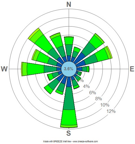
Here’s an example wind rose for LaGuardia Airport, 2008:
Wikimedia Commons
I had never heard of a wind rose, so he briefly explained it to me. They are used by meteorologists to analyze wind patterns and show three key measures: direction, frequency, and speed. Direction is visualized by the angle of each bar, where North is 0° (the top), East is 90° (right), South is 180° (bottom), and West is 270° (left). Speed is visualized by the color of each section of the stacked bars. And Frequency is visualized by the length of each bar. The result is essentially a radial stacked histogram bar chart (that’s a mouthful).
I really loved these because they showed a great use case for radial charts. I was only scheduled to be in the Zen Garden for an hour and had some sessions I wanted to attend, so we took a shot at building a less sophisticated version of the chart. After about 30 minutes, we had a basic approximation using a simple radial bar chart that looked something like this:

Considering our short timeframe, I was pretty happy with the result. It accurately showed direction and frequency, but was only able to show the average speed. But, after we parted ways, I couldn’t help but keep thinking about this exercise. I really wanted to see if we could build a full-blown wind rose in Tableau. So, when I returned home from the conference, I started working on it. In the remainder of this post, I’ll go into some details about the process I took. If you’re not interested in that, feel free to skip to the end where I share the two visualizations that resulted.
Finding and Prepping the Data
The first part of building these wind roses would, of course, be finding data. Initially, I had a really difficult time finding publicly available data for a variety of different locations. After lots of searching, however, I eventually stumbled on the National Oceanic and Atmospheric Administration’s Integrated Surface Database (ISD), which turned out to be a treasure trove of wind data. The NOAA maintains two versions of the database—the full version, which includes comprehensive, detailed information from thousands of stations in locations all over the US and the Liteversion, which reduces the data somewhat. The lite version provides only a handful of key measures and only includes a single wind measurement from each station for each hour of each day. I felt the lite version was more than sufficient for my purposes so I chose to work with it.
The database isn’t actually a true database per se. Rather, it is an ftp site that contains one fixed-length file for each station for each year. So, I was going to need to download individual files, parse them, then merge them altogether. My original idea was to show 9 stations on a single “poster viz”, but I also wanted another version that included 25-30 cities. Manually parsing 30 files then unioning them together was not going to be a fun process, especially if I eventually wanted to update the data. I simply couldn’t invest all of that time. Enter Tableau Prep!!
I leveraged Tableau Prep’s Wildcard Union option (within the input step) and it did the rest, reading my files (I used 2018 data through the end of October) perfectly and combining them together into a single data set—a huge time saver.
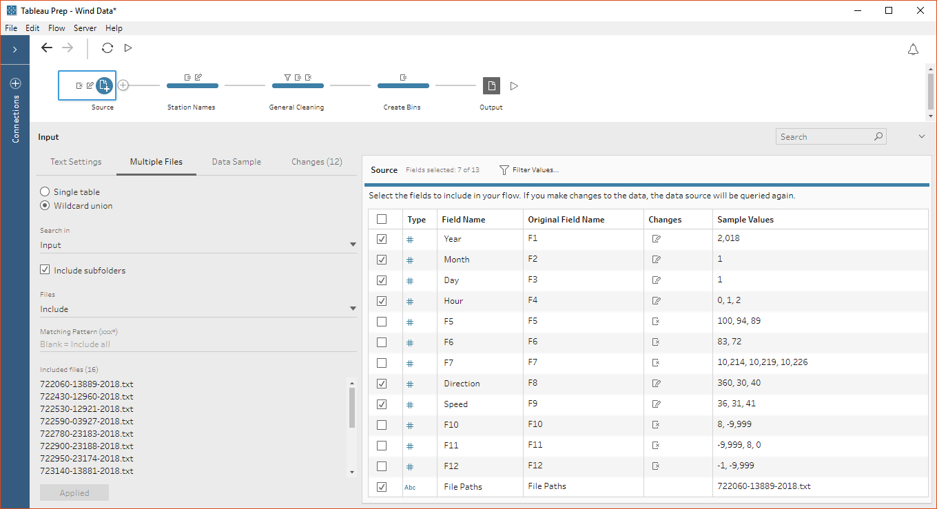
I then used the File Paths field, which is created when you perform a wildcard union, to parse out the station IDs, followed by a general cleaning step, which removed unneeded fields, combined year, month, day, and hour into a date/time calculated field, and filtered out some invalid measurements.
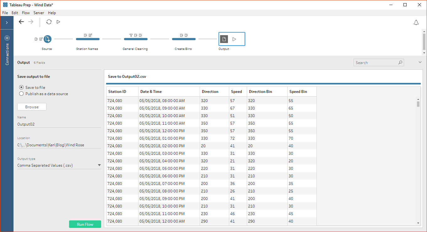
Finally, since I would be creating a histogram, I needed to bin my data. I actually required two bins—one for direction and one for speed. The direction bins would create each of the radial bars, while the speed bins would create each of the “stacks” on the stacked bars. While I could have done this within Tableau, I decided to build that into the data itself, using a couple of calculated fields:
Direction Bin
// Create 10 degree bins.
INT([Direction]/10)*10
Speed Bin
// Create bin sizes of 5, with max size of 110.
IF [Speed]>=110 THEN
110
ELSE
INT([Speed]/5)*5
END
The end result was a simple, clean, merged data set, which can easily be refreshed at the click of a button. Thanks Tableau Prep!!
Visualizing
The biggest challenge to visualizing this data would be creating the radial stacked histogram bar chart. As that’s not a default chart type in Tableau, I was going to have to draw each polygon individually. I won’t be going into all the details of the data scaffolding and calculations required to do this—if you’re interested, feel free to download the workbook; I’ve tried my best to comment each calculated field to make it as easy as possible to understand—but I do want to show a few of the interim steps I took to get there..
Since we’re doing a histogram, why not start with a basic histogram?
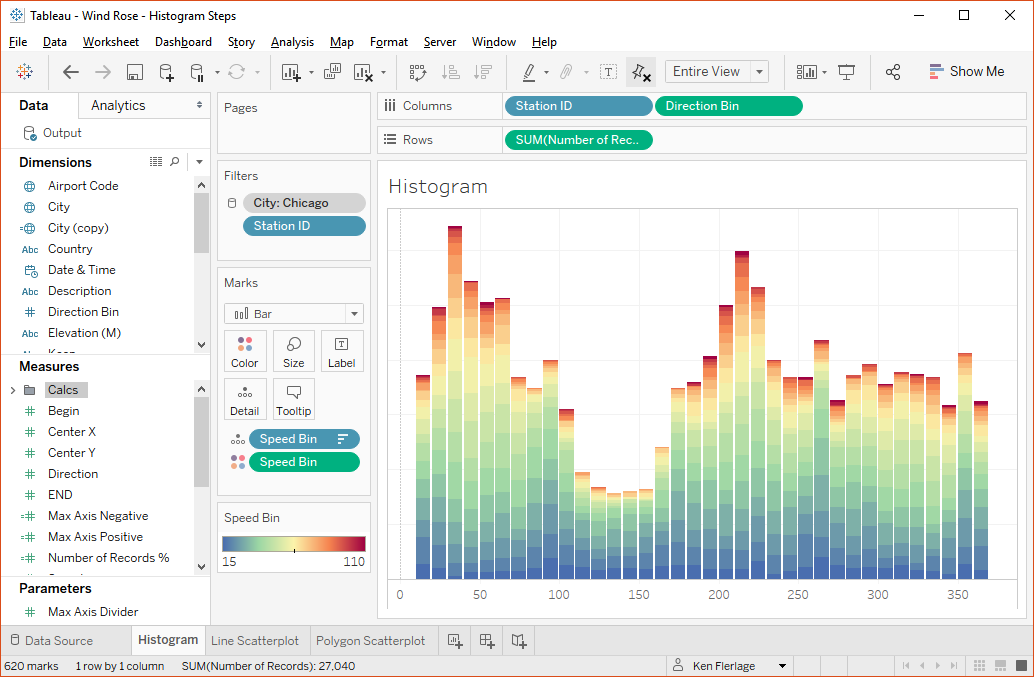
That’s a good start!
As I stated earlier, I needed to eventually draw each colored block on each bar as a polygon. So I took a step in that direction by creating the calculations needed to put each polygon in the right position, but in order to keep it simple, I started by drawing lines on a scatterplot.
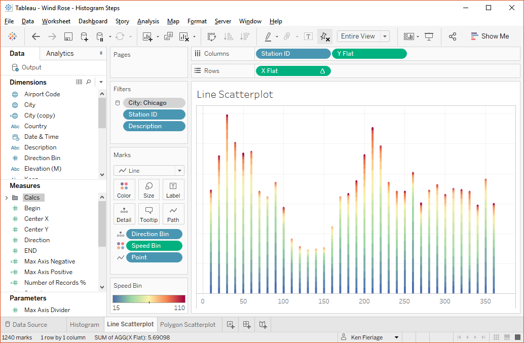
I was able to visually validate my calculations by comparing this to the original histogram and was thrilled to see that the calcs were right on.
Now I needed to turn these into polygons. This required some data densification as I would need four points for each polygon (in truth, the line version above required densification as well to create the two end points of each line). I won’t go into detail about this process, but it eventually resulted in a polygon version of the line scatterplot:

Again, I compared to the original scatterplot and was thrilled to find that it matched exactly.
Finally, I used some trigonometry to take each bar and rotate them around a circle:
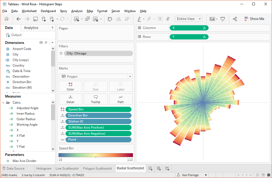
So, why am I sharing these steps? The main point I want to make is that no complex visualization ever emerges fully-formed. I didn’t start out by jumping right to the building of a radial stacked histogram bar chart—that would be too complex. While some people may be able to go from an idea directly to the final result, I think that most of us need to take small incremental steps to get there. So, I’ll encourage you to do the same. Any time you tackle a data project, whether it be a data analysis, a data transformation workflow, a business dashboard, or a complex visual, take it step by step—get one thing right, then move onto the next, keeping your long-term goals in mind as you go. If you stumble along the way (you will!!), then it’s much easier to correct that one problem than if you had tried to do everything at once.
Final Design
With the hard part done, I moved onto design. Interestingly enough, this proved to take way longer than creating the chart itself because it took me forever to find something that I liked. In the end, I created two designs. The first shows small multiple wind roses for 9 selected cities (based on stations at each of their major airports). Click on the image to see the full visualization:
But, I also wanted to create a version that allows you to choose a specific city, so I created one that shows just a single wind rose, but allows you to select from 30 different cities (again, based on stations at their major airports). Click the image to interact with it.
And because I just couldn’t resist playing with Tableau 2018.3’s new transparent backgrounds, I added the option to change the color theme.

Thanks for reading! If you have any questions or comments, let me know.
Ken Flerlage, November 25, 2018


ReplyDeleteDear Ken, Thank you for your article. Would be possible for you to share the trigonometric equations to calculate the paramenters of the circle. I am currently doing a similar chart and I have have the angle in degrees and the vertical bars. Thank you. Best Regards, Alejandra
I'd suggest you read the following where I go through the basics of trig: https://www.kenflerlage.com/2017/11/beyond-show-me-part-2-trigonometry.html
DeleteIf you are still struggling after that, please feel free to email me and we can take this offline (flerlagekr@gmail.com)
Hi Ken, this is fantastic. I am looking at doing something similar - Except just for one location. I am trying to replicate your steps but I cannot seem to find out how your 'Description' dimension was created. i.e. How did you calculate what was "Bottom Left", "Bottom Right", "Top Left", and "Top Right". It doesn't seem to correlate with any of the other fields.
ReplyDeleteSorry, I didn't go into detail on that. That was a separate data source that I built in Excel that had four rows with those values. I then did a cross join of this to my actual data (in Tableau, you can use join calculations with the same constant value on both sides). Does that make sense. Happy to provide more details, but it's difficult in these comments, so feel free to email me at flerlagekr@gmail.com
DeleteHi Ken, I really liked this chart. I have been trying to recreate it as an individual football player passing wind chart. I am having some trouble with regards the size and correct angles where the actual centre is for each player. Also, still trying to grasp the [description] field. Could you give me some hints?
ReplyDeleteBest wishes,
Julio