
A Journey Through The Design Process (Guest Blog Post by Damola Ladipo)
This is a guest blog post is from Damola Ladipo. Based in Washington DC, Damola works as a Senior Data Visualization Specialist for DevTech Systems at USAID Data Services. Damola is a Tableau Public Ambassador, a 7x Viz of the Day winner, and one of the most amazing Tableau Public authors out there. And if you thought his work in Tableau was amazing, wait until you read his writings - wow! We are super excited and honored to welcome Damola as a guest blogger on our site...and he has an open invitation to write for us at any time.
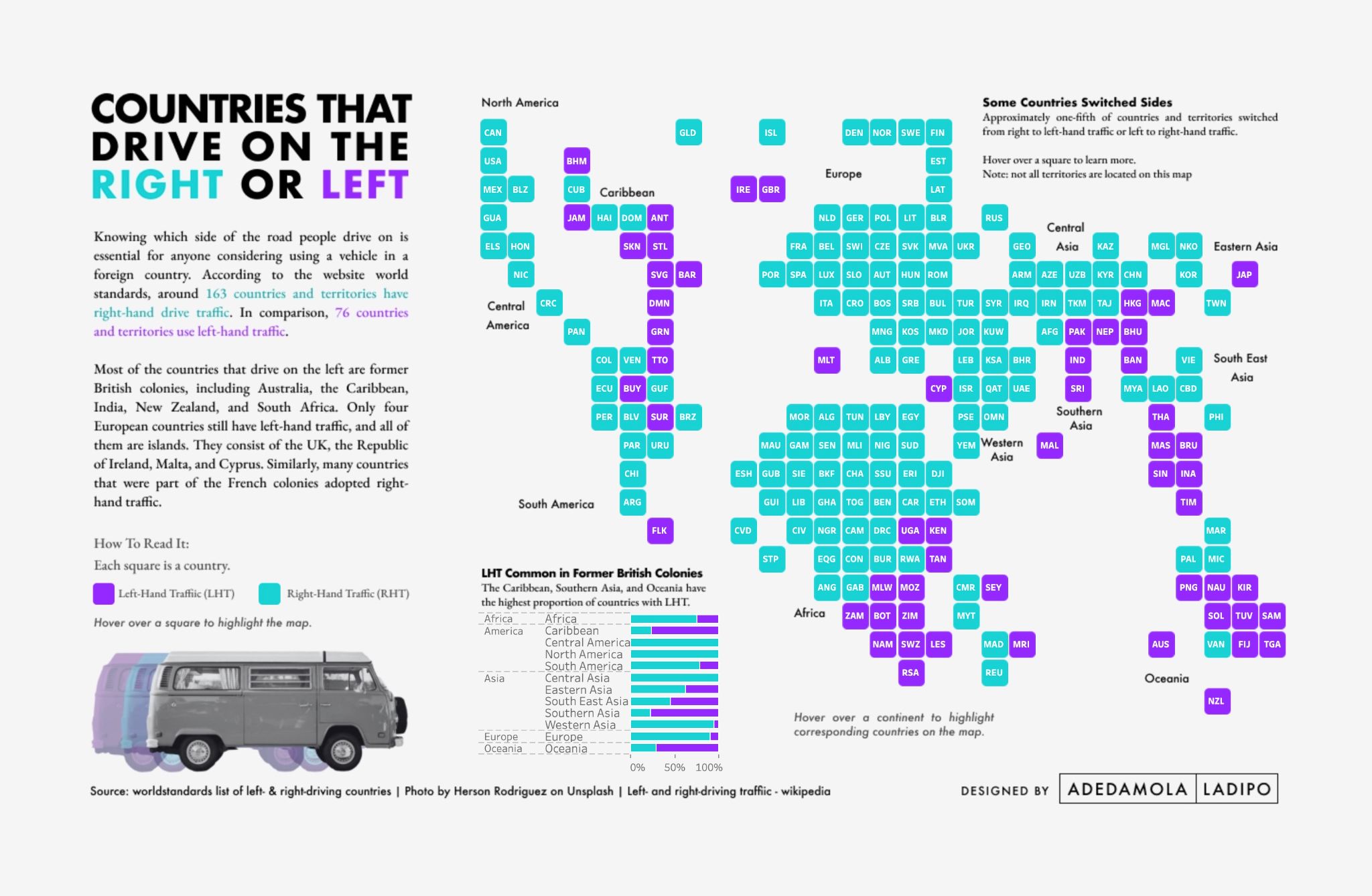
THE ROAD TRIP THAT INSPIRED THE VIZ
Picture this: A thrilling road trip across the stunning landscapes of Europe, from the quaint UK countryside to the picturesque Swiss mountains. It was an amazing journey, but there was a twist for me. Despite growing up in England until my early teens, I had left too early to have ever driven there, so taking the wheel on the 'other' side of the road, opposite to what I was used to in the US, presented a new challenge.
As we ventured through winding roads and tranquil villages, I gradually got used to driving on the opposite side, although roundabouts sometimes initially confused me. But Switzerland, with its familiar right-hand driving, was a breeze. This adventure ignited my curiosity and led me to a question that might pique your interest, too: Which countries drive on the right and which on the left?
Understanding this driving aspect is crucial for anyone contemplating driving in a foreign land. According to World Standards, around 184 countries and territories use right-hand driving, while 76 countries and territories opt for left-hand traffic. This means most of the world's population drives on the right side of the road—a fact I discovered during my road trip. It intrigued me enough to create a data visualization and this blog post. Now, I'll take you on a journey through my process crafting it.
I will review my design thinking process, inspiration, and the rationale for my design choices. I will also briefly cover how I created parts of the visualization, from the background layer in Figma to the map and chart in Tableau.
…but before we dive into the details, let's quickly detour through the intriguing history of left and right driving traditions.
THE HISTORY OF LEFT AND RIGHT HAND DRIVING
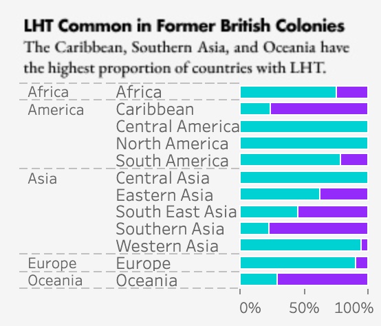
Most countries driving on the left side of the road share a common thread—they are former British colonies across the Americas, Africa, Europe, the Middle East, Asia, and Oceania.
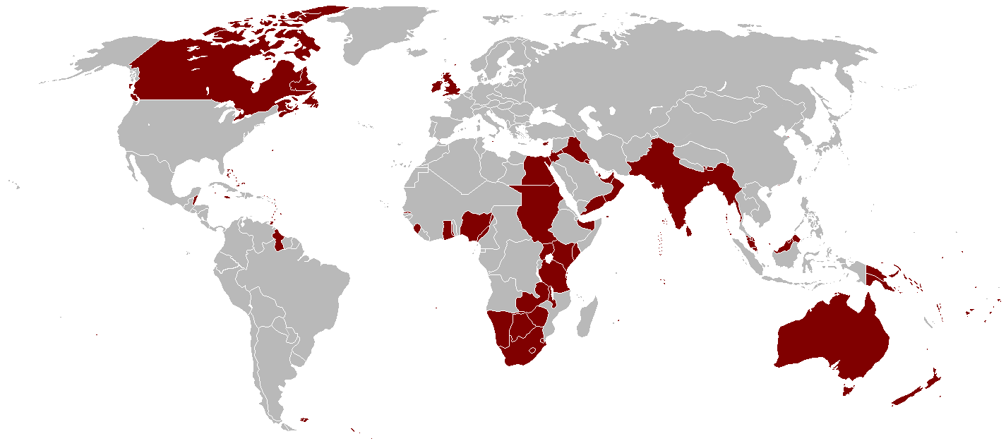
British Empire at its greatest extent in 1921
Source: https://en.wikivoyage.org/wiki/British_Empire
The influence of the British Empire extended its driving norms to these diverse regions. When you look at a European map, you'll find a unique quartet—four island nations that continue to drive on the left: the UK, the Republic of Ireland, Malta, and Cyprus. These European outliers have upheld the tradition, and their island geography is a notable factor.
Conversely, many nations with ties to the French colonies have embraced right-hand traffic, forming a contrasting driving culture. If you're eager to delve deeper into the historical origins of these practices, I recommend starting with the article “Why do some countries drive on the left side of the road?” It unveils a rich history, tracing back to ancient Rome, and even hints at how safety might have sparked the initial adoption of these driving norms.
OK, now back to the viz and my design process…
MY DESIGN PROCESS
While creating this data visualization, I adhered to the non-linear design thinking process. However, similar to my other personal projects, I already had a inspiration from things that would influence the design. Specifically, Judit Bekker's Visible Women and the World Tile Map by Neil Richards served as pivotal inspirations. Their visualizations helped shape key elements of my final design such as the layout, chart type, and aesthetics. I'll go over this more later.
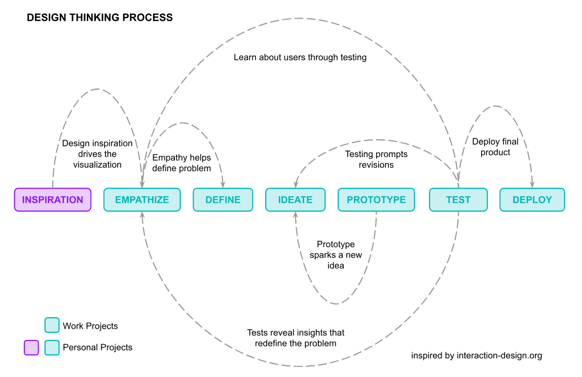
EMPATHIZE AND DEFINE
When I started, I posed four questions about the audience, time, precision, and questions the viz would answer to help steer the direction of my project. The answers to my inquiries served as the compass guiding my choices to empathize with the potential audience and define responses to questions the project proposes.
Who was my audience?
My target audience encompasses diverse individuals who have embarked on journeys, harbor a fascination for travel, or are intrigued by the global variations in left vs. right-hand driving norms.
How much time did my audience have?
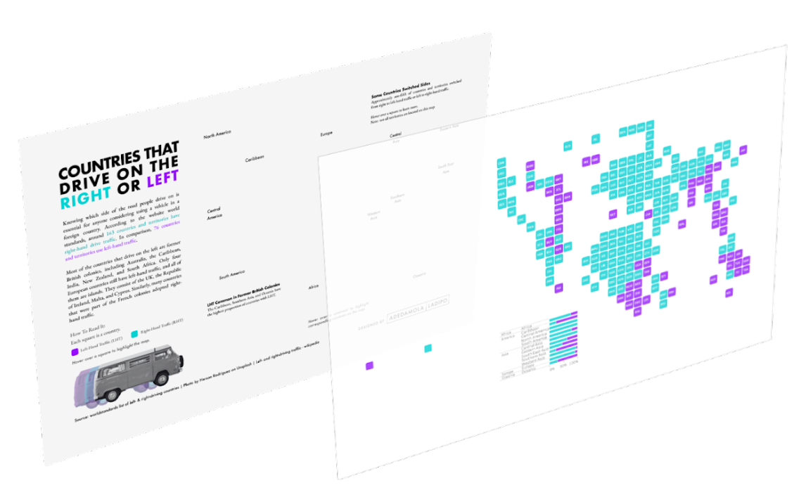
The average human attention span is 8.25 seconds (less than a goldfish, which is 9 seconds), so, not long. Recognizing the value of simplicity and accessibility, I aimed to craft a visualization that required minimal effort to comprehend with optional interactivity. Therefore, a tile map would be used for quick comprehension.
How much precision was necessary?
A tile world map is less precise than a more traditional map. Also, the scale difference between countries or their location relative to one another was insignificant, other than knowing where they generally are. A tile map would be simple and aesthetically appealing. A supporting chart looking at the continent and regional level right and left hand driving trends would provide an informative aggregated view.
What questions did I want the visualization to answer?
Which countries favor right-hand or left-hand driving?
Are there discernible patterns in continents or regions regarding these driving norms?
What prompted some countries to transition from one side to the other?
After answering the four questions I moved on to collecting the data.
DATA COLLECTION
I used three sources to create the dataset for the visualization:
World Standards List of Left and Right-driving countries provided information about which countries drive on which side.
List of Countries and Continents helped categorize countries by region.
Left- and right-hand traffic detailed the history of bidirectional traffic and included the dates and reasons why some countries switched from driving on one side to another.
Each data source was added to a Google Sheets spreadsheet.
The data had to be cleaned, so I removed unnecessary fields, aligned the spelling of country names, and corrected grammatical and spelling errors in the descriptions.
Once the data was cleaned, the relevant fields were pulled into one final Tableau-ready dataset sheet using the VLOOKUP formula. I could have used something like Tableau Prep, but the data cleaning was relatively simple.
Now I had the final dataset it was time to get creative and start the design.
IDEATE AND BRAINSTORM DESIGNS
As I stated earlier, I already had inspiration in mind, but I still needed something specific on paper. It was time to brainstorm and sketch out my designs to benefit the design process.
Why bother sketching when you already have inspiration? The human brain consistently interprets visual and verbal information, and externalizing the cognitive process enhances our ability to communicate and process information more efficiently. Also, "we learn more when we experiment and try new things, and you can surprise yourself with what you see when you try to put your thoughts and ideas down on paper" - How and Why We Sketch When Visualizing Data. Sketching also saves time to make edits or redesigns in draft form rather working on something directly in Tableau first.
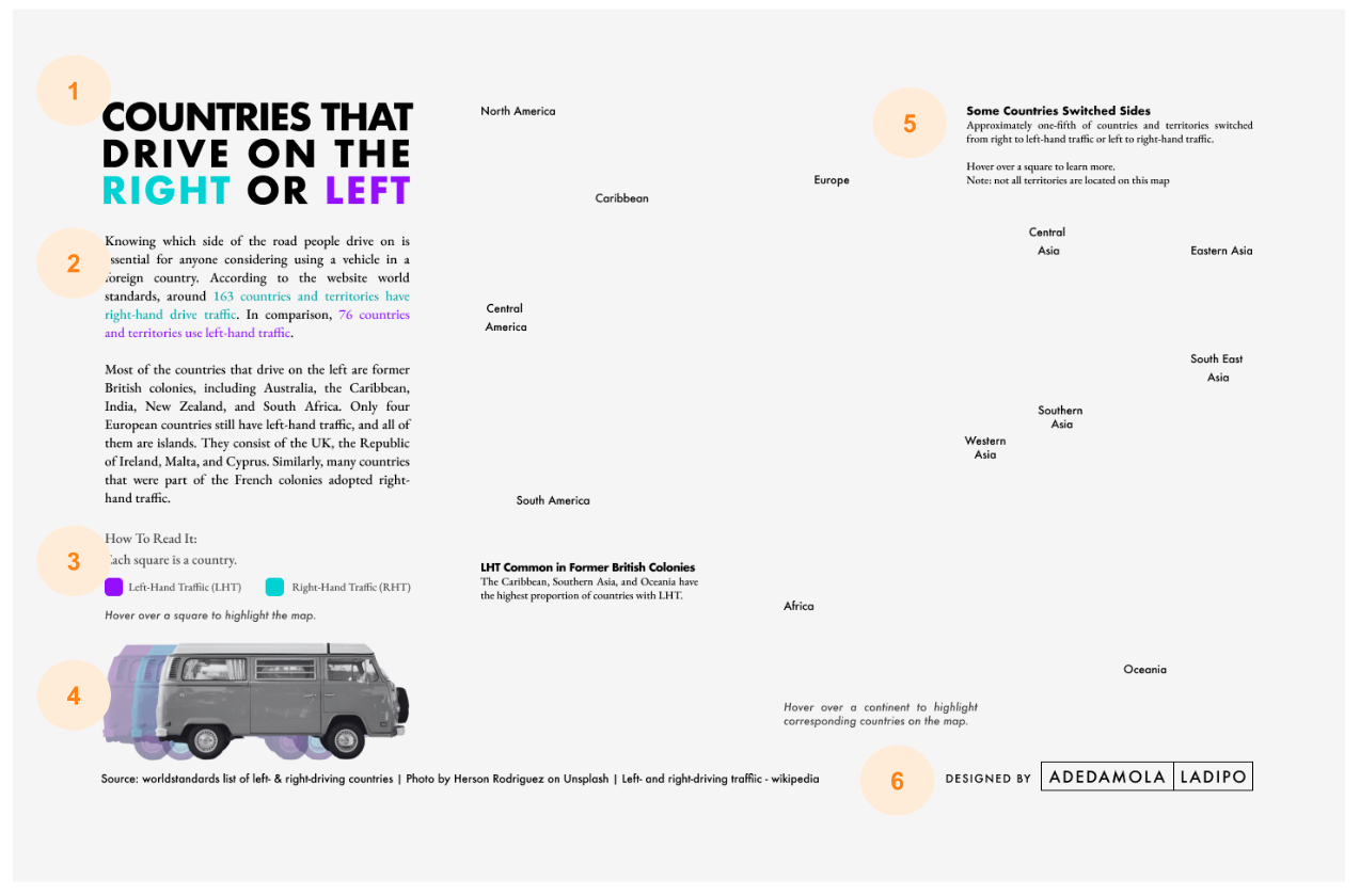
After sketching, I landed on a design that focused on the following:
- Making the primary data visualization a tile map with squares
- Using a bold title as an initial legend
- Adding brief descriptive text to explain the visualization
- Including annotations in the map for additional context
- Incorporating a van image that appeared in motion
- Adding a column chart by continent and Region
Now the data was ready and the design was laid out, it was time to decide on the colors.
CREATING THE DATA VISUALIZATION
Color with Purpose
In data storytelling, color can add depth and meaning. I used teal (#06D2D5) and purple (#9529FF) because they are eye-catching, somewhat neutral when making assumptions about their different meanings when they appear together, and they attract attention against a light gray backdrop without overwhelming the audience.

Color for Accessibility
I always try to check my colors for colorblindness using tools such as Adobe Colorblind Safe. It detects color conflicts that create confusion with colorblindness.
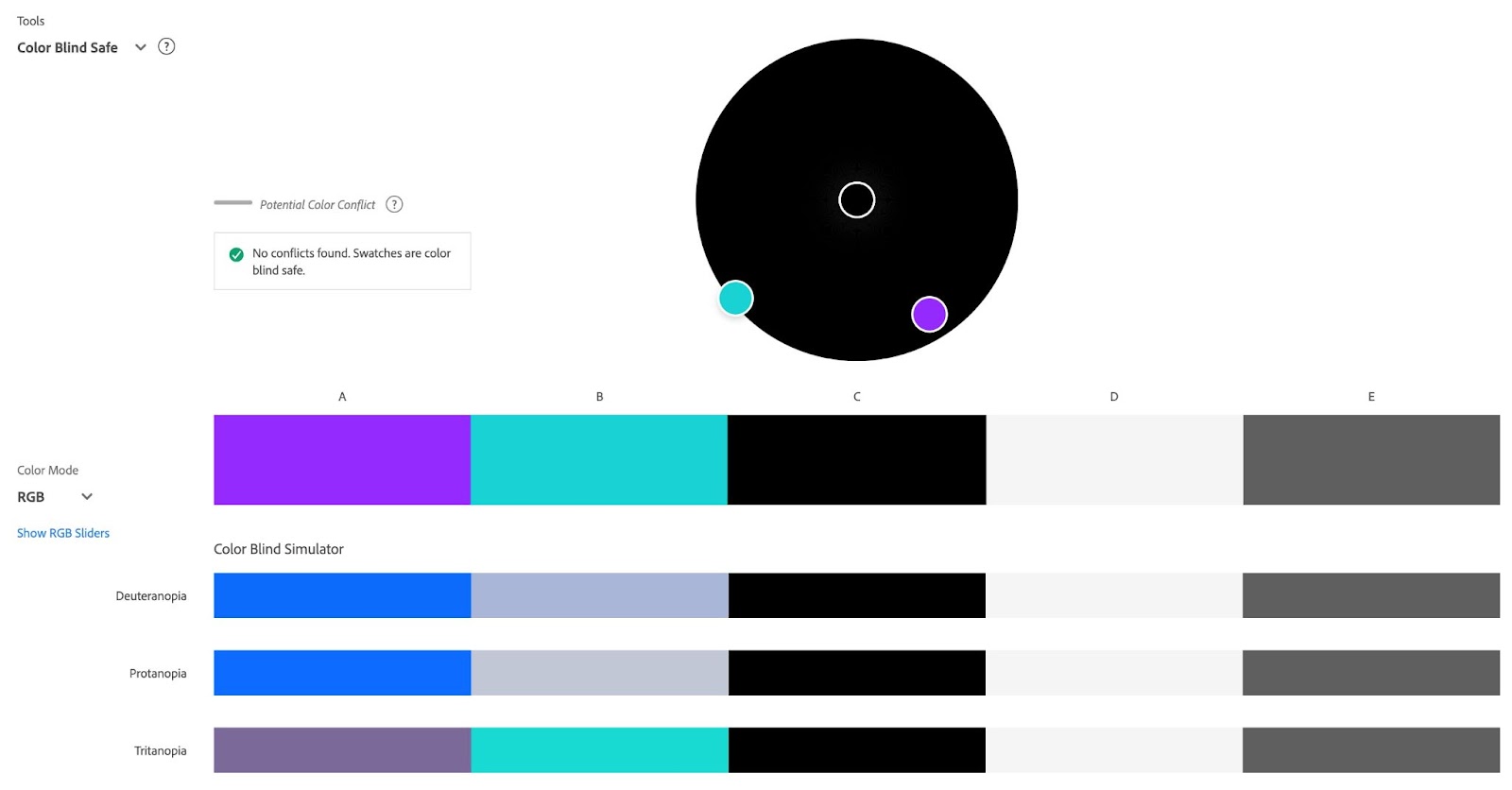
Once the colors were confirmed to be colorblind safe I was ready to create the background design in Figma.
Creating the Background and Custom Shape in Figma
I created the background layout in figma with a landscape dimension of 1450 x 950 pixels to accommodate a world map with room for a title, descriptive text, a legend, and an image. The positioning of the chart elements were based on reading patterns and the rule of thirds.
Designing for reading patterns
The data visualization was designed to be viewed by the “Z” pattern which facilitates natural eye movement. As the reader follows the flow of the visualization, the sequence allows the reader to explore the visualization as they move from the title to the tile map, to the body copy, descriptive text, and legend, and then the interaction instructions and my name.
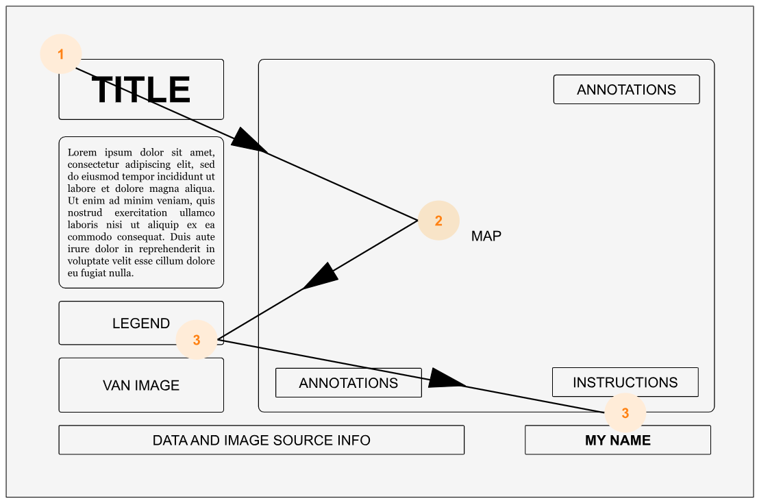
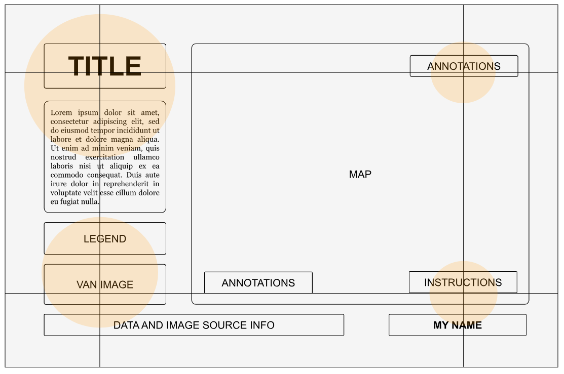
Rule of Thirds
This layout follows the rule of thirds. This rule involves two vertical and horizontal lines crossing on a page. The points where they intersect direct the reader's eyes. I used these points to position titles, legends, van images, source information, some context information, and my name.
If you want to learn more about visual hierarchy check out What is Visual Hierarchy and Why is it important.
Now I’ll walk through each of the six elements of the background layer in the viz.
1. Title and Annotation Subheadings
The typeface Futura was used for the title and subheadings in the annotations. It's a bold, versatile typeface that can be a powerful design choice, mainly when you have limited space. The words "RIGHT" and "LEFT" were colored with teal and purple, which immediately lets the reader know what the colors in the map mean.

2. Body Copy
The body copy and legend text were in EB Garamond because it pairs well with Futura. The text is bolder than the subheadings and smaller than the heading to create a visual hierarchy with the typography. I also colored some relevant body copy text in teal and purple to connect it with the chart and the map. An alt text image layer was added in Tableau at the end so the text could still be screen-readable.
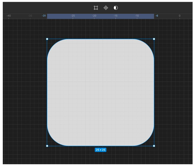
3. Legend
The legend uses rounded edge squares created in Figma. In a later section, I'll explain how these were made and added to the map.
4. Van Image
The van image was from Herson Rodriguez on Unsplash. The design was inspired by the work mentioned earlier by Judit Bekker. To replicate the aesthetic from her data visualization image, I cropped the van image, made it grayscale, copied it two more times, and made one an opaque purple and the other an opaque teal. Overlapping these gave the appearance of the van in motion, as if it was driving by.

5. Regional names and annotations
The annotations and names of regions were added to the background last. As I said earlier, my design process is non-linear. So this required exporting an image of the data visualization from Tableau, placing it back in Figma, and then using the image as a background template layer to know where text needed to be added so everything lined up correctly.
6. Source and Creator Credit
The source and my name were added because citing your data and context information is essential, including crediting any images used and giving yourself credit.
The box design around my name was inspired by the title card intro to the live-action show Cowboy Bebop, which is based on the hit anime. I take a lot of design inspiration from not just data visualizations but also films, shows, documentaries, advertisements, art, packaging, etc.

Here is the final background layer:

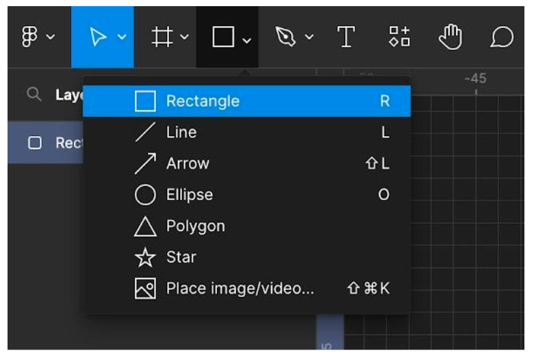
- Go to My Tableau Repository > shapes folder.
- Create a new folder for your custom shape and name it "custom shape" or something else helpful or specific to the visualization.
- Save the new custom shape into this folder.
- Select "Reload Shapes" in your shapes palette to load your custom shape in Tableau, then select your new shape.


No comments: