In a recent blog post, I discussed a scenario where I had weekly data that could not be aggregated in any way. In that blog post, I talked about how to calculate the slope of a line so that we could provide some information about trending. (To learn more about the situation, you can check out the blog post here).
In this same scenario, I wanted to show all the categories over time then allow a user to select a category from a parameter to highlight that value and show the trend line. I'll repeat this in a different way for clarity, there were about 15 categories and I wanted to show a line chart for each over the course of a year. That ended up in a "spaghetti mess". So my goal was to continue to show all lines for all categories (so that we retained the proper context) but allow a user to highlight just one of those lines and to show a trend line for that selected line only. Unfortunately, this isn't super straightforward.
Let's walk through my thought process and talk about the options we have, then I will show you how to do this and only show one trend line among the spaghetti mess.
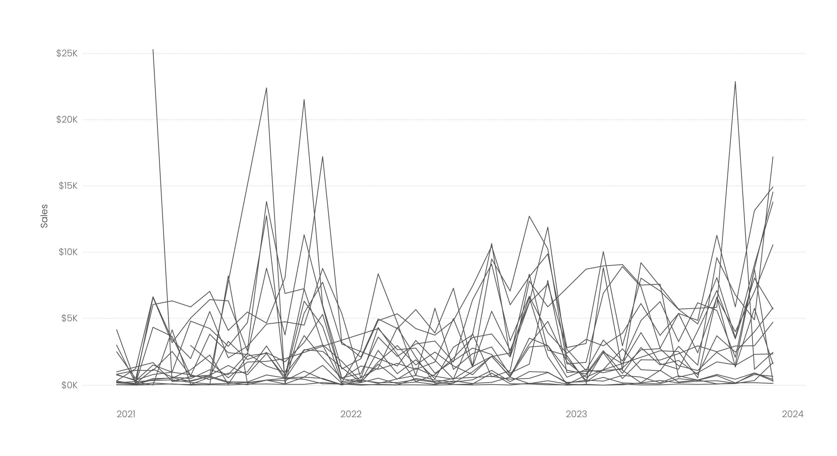
Okay, this is our starting point. In this example, I am using Superstore data and looking at Sales by Month for each Sub-Category. But keep in mind, my original use case did not allow for any type of aggregation.You can see the obvious problem here, it's a "spaghetti mess" with no ability to see any individual sub-category.
.png)
In the below image, I've added a trend line. Helpful? Nope! It just gives an overall trend for all sub-categories. But remember, in my use case, I was unable to aggregate those categories, so showing an aggregated trend line would be outright incorrect.
So, below, I've added Sub-Category to the Color card. Helpful? Nope! In fact, it's way worse. We now have a dozen colors with lines over time and with a dozen colored trend lines. This is a spaghetti mess where someone went crazy with the glitter.
Next, I've created a parameter to allow a user to select a Sub-Category. I've then created a calculation to determine if the Sub-Category parameter equals the Sub-Category in the view. I placed that on the Color card. You can now see the highlighted line more easily, but it's still not great. And we have a trend line for both the highlighted value and one for the remaining Sub-Categories aggregated together. But again, in my use case, I was unable to aggregate those categories, so showing an aggregated trend line would be outright incorrect.
Next, I've taken that calculation to highlight the selected category and also added it to the Size card in order to make the orange line thicker. But we still have the same problem, that gray trend line is showing, but we can't aggregate that data - so the trend line makes no sense.
Ultimately, we want what is shown below. One sub-category highlighted with a trend for that sub-category only (again, because we can't aggregate the others).
THIS IS OUR END GOAL
So now that we've walked through all the problems and the end-goal, how do we build this? It's really fairly simple. (You can download my Tableau Public workbook to see the end result).
Well, we essentially just need to isolate one sub-category, so let's start by creating a list parameter that includes all sub-categories.
From there, we need to create a calculation that recognizes when the Sub-Category in the view is equal to the Sub-Category chosen in the parameter. And when they are equal, we will yield the sales value for that sub-category and a null for all others - isolating the sales for just the selected sub-category.
Sales for Sub-Category Selected
IF [Sub-Category] = [Sub-Category Parameter] THEN [Sales]
ELSE NULL
END
We then place SUM(Sales for Sub-Category Selected) onto Rows next to our original SUM(Sales) field (be sure to make it a sum). You should now see just one line that is reflective of the sum of sales for the selected sub-category.
We will be changing this to a dual axis, but before we do that, change the color of this isolated line to some darker color (I chose orange). Also, increase the size of the line. Now show a trend line on just the isolated line (if you do it after you dual axis them, then you will have to choose which measure to show the trend line on - either will work). I'd also make the color of the trend line match the color you chose for the line.
Next, dual axis these two measures, synchronize the axes, and remove measure values if they are automatically added to the color card. Now as you select a sub-category from the parameter, it will highlight that sub-category and show a trend line for that sub-category only. (You can also calculate and display the slope of the line if you like...and even color your line based on whether it is increasing or decreasing - just follow the aforementioned blog post).
But one last thing is bothering me that, honestly, has very little to do with the trend line, but I think it should be addressed nonetheless. When you choose a sub-category such as Art (and many others), its sales are so low in comparison to others that you can barely see any variations or trending. In one way, I love this chart because it allows you to look at a single sub-category but in context with all other sub-categories - filtering the view would remove that context. However, like with art, this is problematic as you can't see anything that is going on.
So my last step in this process is to allow the users to either view the highlighted line along with all other lines or to simply filter to that line. To do this, create a string parameter with values of "Show All Values" and "Filter to Selected". Next, create a calculation as follows:
Filter or Show all Calculation
IF [Filter or Show All] = 'Show All Values' THEN 'SHOW'
ELSEIF [Sub-Category Parameter] = [Sub-Category] THEN 'SHOW'
ELSE 'HIDE'
END
Now place this on the filter shelf and check just "SHOW". Now when a user chooses Show All Values, it will show all values and when they choose "Filter to Selected" it will filter out all values except the one that is selected in the Sub-Category Parameter.
You can check out the final version (and individual steps when you download the workbook)
here on Tableau Public.
Okay, that's it for today. Although this was a bit of a unique situation, it may come in handy one day like it did for me!
Thanks!
───────────────────────
Need help with anything related to Tableau? Through Moxy Analytics, Ken and I provide consulting services such as Tableau Lifeline (get us for 1 hour to help solve a sticky problem), Fractional Data Hero (get us on your team for N number of hours a month for whatever you want us for), Tableau Training, and of course, project work. Click the Icon below if you are interested.


.png)
.png)
.png)
.png)
.png "THIS IS OUR END GOAL")


No comments: