
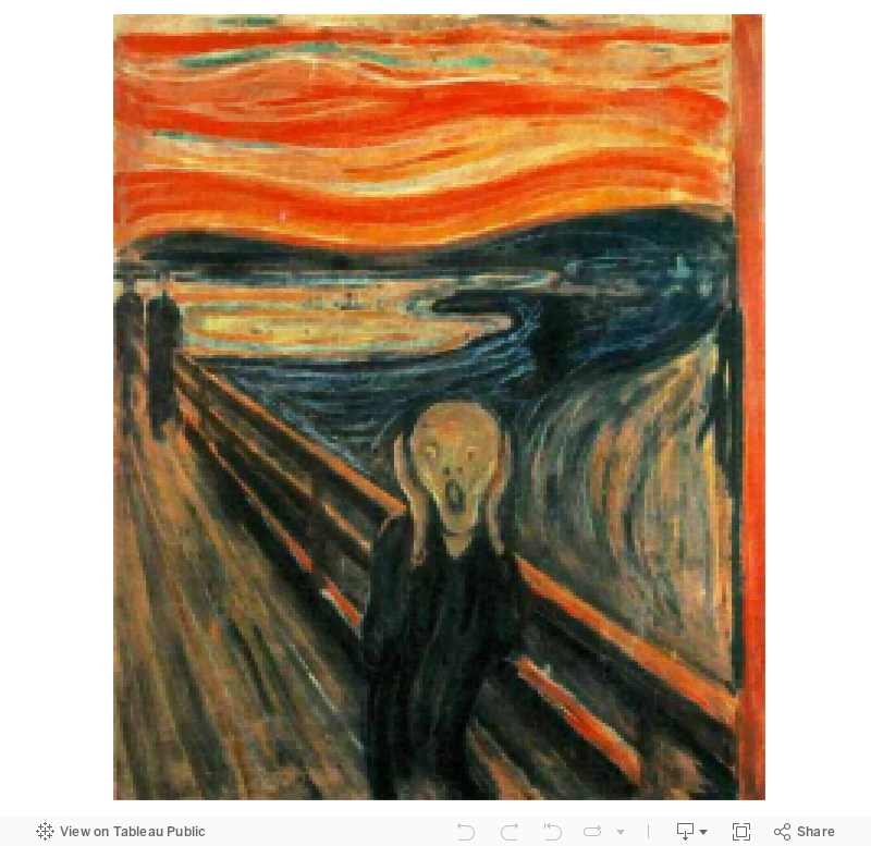
Recreating “The Scream” in Tableau

A few months ago, I saw a post by one of my favorite Tableau authors, Josh Tapley, on how to create ASCII-style images in Tableau (read the full post here: Data Driven Images with Tableau). I thought it was a really neat idea and would definitely be fun to experiment with. After reading the article and playing with the concept myself, I started to think about how we could recreate full-blown pieces of art in Tableau. I decided to give it a try, using Edvard Munch’s “The Scream”. He actually created four different versions of this iconic painting from 1893 to 1910. The most famous and most well-known was his 1893 version which used oil, tempera, and pastel on cardboard and is currently held by the National Gallery in Oslo, Norway. Since this version is the most recognizable, I chose it for my experiment.
Color Extraction
As I have not ever done anything like this before, I wasn’t really sure where to start. What I did know was that a digitized image of a painting is nothing more than a series of colored pixels. And pixels can be translated into a Cartesian graph (x and y coordinates). So, if I could find a way to identify the color of each pixel in the artwork, then I would be able to recreate it in Tableau. So, I started looking for a tool that would allow me to easily obtain a list of all the pixels and their colors. Of course, the most obvious way to do this would be to write some code. There are any number of different examples, using different languages, available on the internet. But I don’t like to write code if I don’t have to. I figured that someone must have already done this and created a tool that is much better than what I could create. Right as I was about to lose hope and dust off my coding skills, I stumbled upon a tool called “Image Color Summarizer” on Martin Krzywinski’s Information: Beautiful blog. The tool, which is also available via API, provides numerous details about an image, breaking down the colors of each pixel into its RGB, HSV, LCH, and Lab components (all different ways to describe color), as well as providing a wealth of other statistical information about the color usage. So, I uploaded an image of “The Scream” and saved the results, which are provided in text format. I took this text and created some mechanisms in Excel to parse out the x and y coordinates and the RGB components of each pixel (Note: the tool resizes the image down to a maximum of 200 pixels by 200 pixels—at total of about 40,000 pixels—so that it is more manageable). Now that I had each pixel, its coordinates, and its color, I started to visualize the data in Tableau. But I quickly ran into a problem with colors…
Building the Color Palette
The issue was that just having the RGB values of each pixel was of really no value when visualizing within Tableau. There is no way to translate that RGB data directly into color within a visualization. So, I needed to create my own custom color palette first. If you’ve never created your own custom color palette, you can check out this simple tutorial on Tableau Online Help. The basic principle is quite simple. You obtain a list of colors, in Hex format, put them into a simple XML format, then add it to the Preferences.tps file in your “My Tableau Repository” folder. The XML looks something like this example taken from the tutorial noted above:
<color-palette name="My Categorical Palette" type="regular" >
<color>#eb912b</color>
<color>#7099a5</color>
<color>#c71f34</color>
<color>#1d437d</color>
<color>#e8762b</color>
<color>#5b6591</color>
<color>#59879b</color>
</color-palette>
<color>#eb912b</color>
<color>#7099a5</color>
<color>#c71f34</color>
<color>#1d437d</color>
<color>#e8762b</color>
<color>#5b6591</color>
<color>#59879b</color>
</color-palette>
I had the colors in RGB format, but needed them in Hex. So, I wrote a simple VBA formula in Excel to perform the conversion (so much for not writing any code!!). I then created some additional formulas to put each color into the required XML format. Finally, I added the XML to the preferences file to create my custom “The Scream” color palette.
Visualizing in Tableau
I was now ready to visualize the data. I connected to my spreadsheet in Tableau, graphed the x and y coordinates, and assigned my custom color palette. Here’s the result.
If you hover over the visualization in Tableau Public, the tooltip will show you the coordinates, RGB, and Hex color of each pixel. The beauty of this is that it’s easily repeatable using the Color Summarizer tool and the Excel template I’ve created. (You can find the template here. Please note that the file is a Macro-Enabled spreadsheet, so you’ll be prompted to enable the macros.). I’ve provided some basic instructions at the end of this post.
Taking it One Step Further
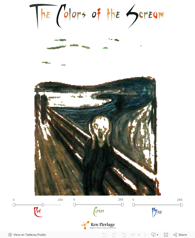
This was a fun exercise and I love that it’s easily repeatable. However, I really wanted to take it one step further. Long before I started working with Tableau, I came across Adam McCann’s The Colors of The Starry Night visualization and thought it was a brilliant piece of work. Using this as inspiration, I wanted to add the ability to break the painting down into its basic color components. I ended up with two different options for this color breakdown. The first allows you to specify the range of RGB values you wish to display on the artwork. For instance, here’s the painting showing Red values 0-150, Green 0-255, and Blue 0-255.
It’s actually quite fun to play with this tool. If you’d like to try it, you can check the full visualization here.
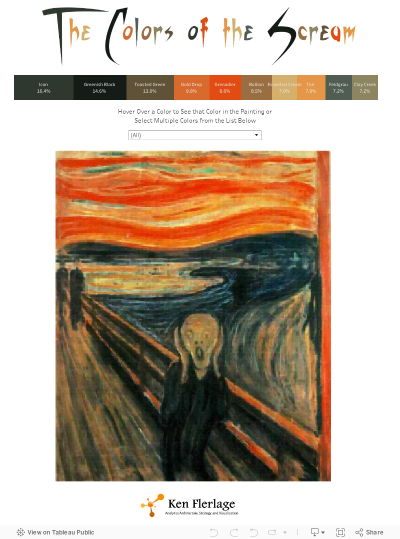
But I wanted to create something a little closer to Adam’s Starry Night visualization, allowing you to break down the artwork into specific component colors. For that, I returned to the Color Summarizer. One feature I did not previously mention was that the tool also allows you to break your image down into ten “color clusters”. It identifies the most representative colors, then groups each pixel into its closest match. So, I used the tool to extract The Scream’s color clusters. I then created a visualization that allows you to hover over one of the clusters to see those colors in the visualization. For example, here’s the artwork highlighting the most common color cluster, Icon, which accounts for 16.4% of the painting.

The visualization also allows you to display any combination of the ten clusters. For example, here’s the artwork showing only the orange-tone colors, Gold Drop, Grenadier, and Tan.

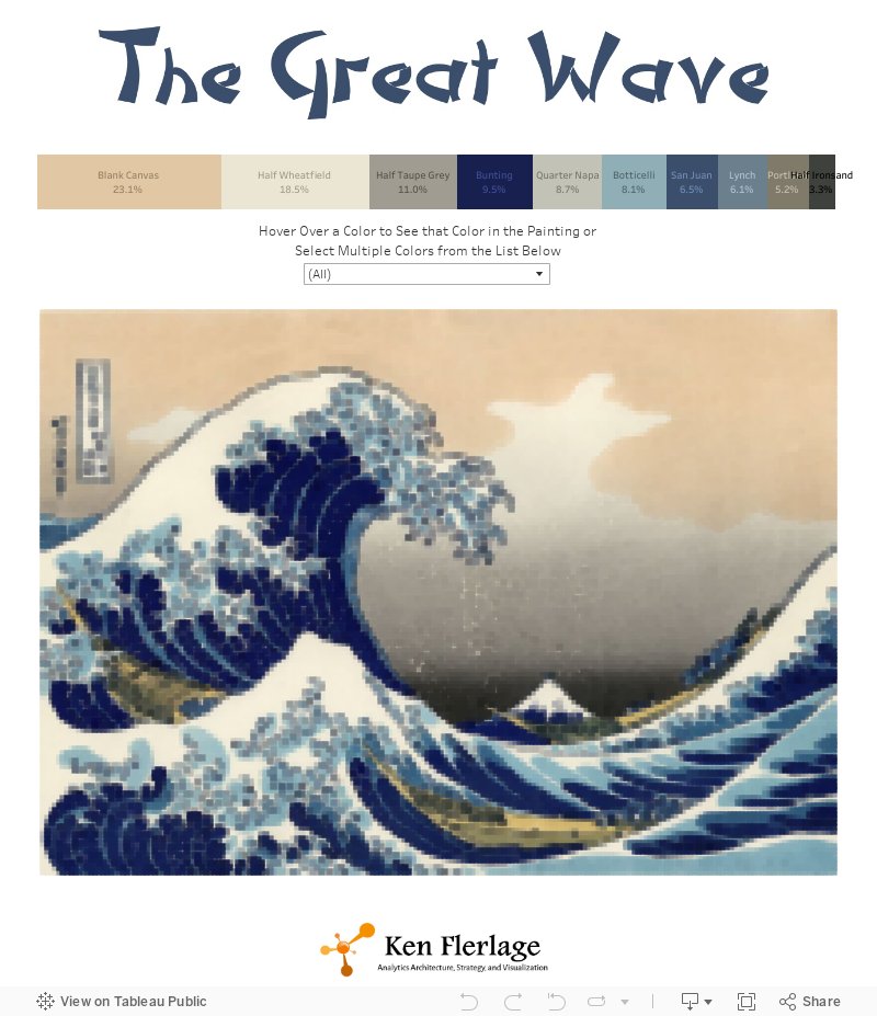
Finally, I enjoyed this so much that I also created a similar visualization analyzing the colors of one of my favorite paintings, “The Great Wave off Kanagawa.”
How To
Here are the basic instructions for recreating your image of choice in Tableau, be it a famous work of art or just some family photos.
- Upload your image to the color summarizer and choose the following options:
- Output Format: text
- Statistics: pixel
- Delimiter: space
- Precision: vhigh (200 px)
- In the output, find all lines that begin with the identifier, “pix” and copy them into the Excel template.
- The template will output the x and y coordinates, the RGB values, the color in Hex, and the XML text needed for the color palette.
- In your preferences.tps file, add the following tag: “<color-palette name="<Your Palette Name Here>" type="regular" >
- Copy the XML text from Excel to preferences.tps.
- Add the closing tag: </color-palette>
- Visualize the spreadsheet in Tableau. This is relatively straightforward for most Tableau users, so I won’t go into detail here. I will note that you’ll need to drag “Color ID” to the Colors card, then assign your custom color palette. You can also download my work from Tableau Public as a reference.
Now, I don’t know if there is any utility to all this, but it certainly was fun. If you create any Tableau artwork using this method, I’d love to see the results!
Ken Flerlage, March 5, 2017
Update, June 18, 2017: Yesterday, Roberto Reif wrote a great post about displaying images using some relatively simple Python code. This method can definitely provide some additional flexibility so check it out: Displaying Images in Tableau (with some help from Python)


Everyone wants to get unique place in the IT industry’s for that you need to upgrade your skills, your blog helps me improvise my skill set to get good career, keep sharing your thoughts with us.
ReplyDeleteTableau Online Training