
8 Random Tableau Tips: Alias a Dimension, Simple Table Sorting, Scaling Problems, and More!

If you’re a regular reader of this blog, you know that Kevin regularly shares fantastic tips. I have only ever written one tips blog myself so I figured I’d try my hand at another. So, in this blog, I’m going to share 8 random Tableau tips that I love.
1) Alias a Dimension
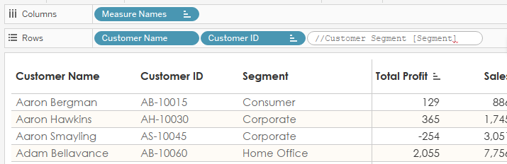
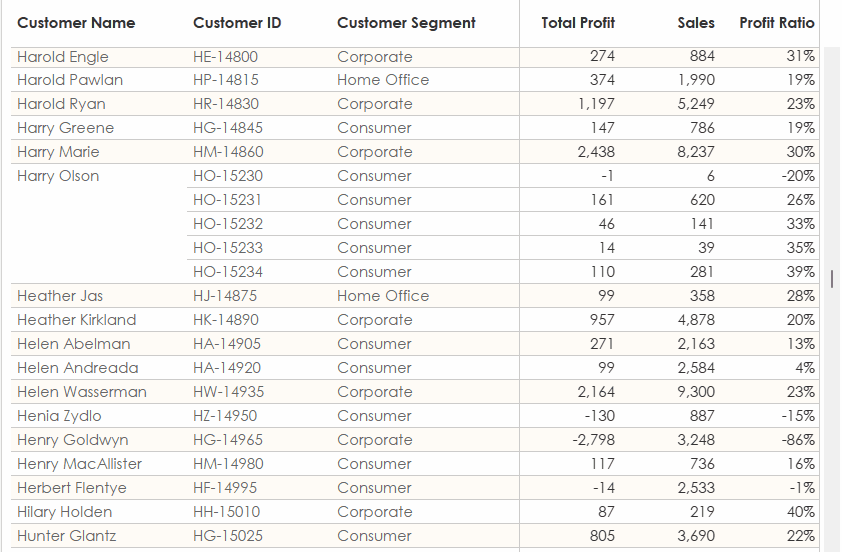
Let’s say you have a table like this.
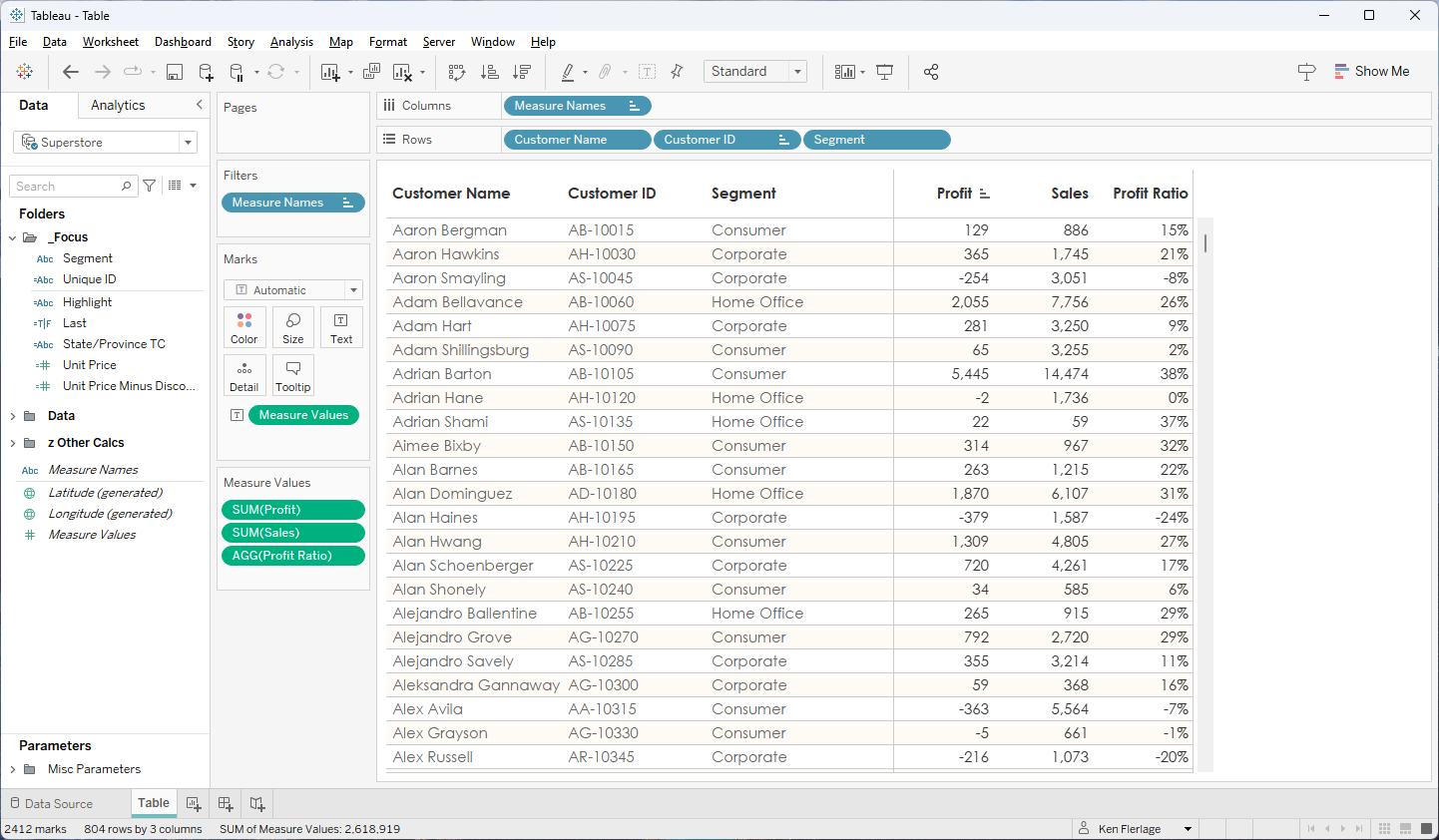
If you want to change the header on
one of the measures, that’s can be easily done by right-clicking it and
choosing “Edit Alias”.
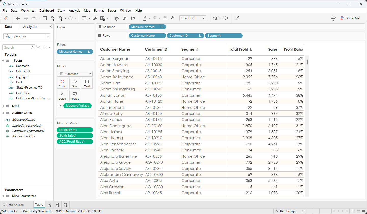
You can then change the alias which
will update the display name of that measure. Here, I’ve changed Profit
to Total Profit. The name of the field remains simply Profit, but
the display name changes whenever it’s shown on a view.
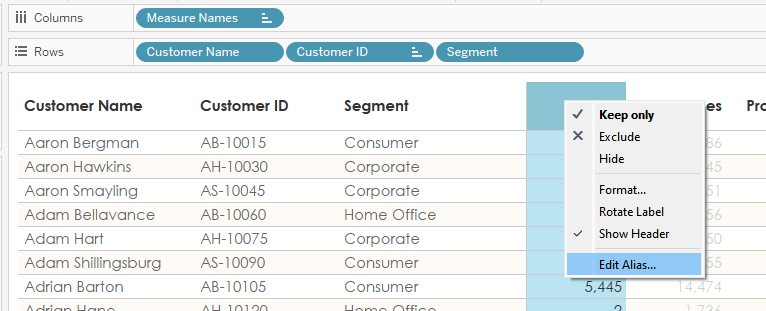
But what if you want to do the same
thing with one of the dimensions? Let’s say we wish to rename Segment to
Customer Segment. You right-click but there are no similar options—dimensions
simply show the name of the field. To show a different name, you have several
options. First, you can rename the field. I don’t love this because it makes it
somewhat difficult to trace back to your data—it’s nice for the field to match
what’s in the database. You can also duplicate the field, give that duplicate the
name you want to display, then use that field on your view. I don’t love this
option either because it just creates all these additional, seemingly unnecessary,
calculated fields.
Fortunately, there is another way to
alias a field if you just want a quick and easy solution. I learned this
recently from Juan Sepulveda, who works for a client of mine. Simply
double-click the blue pill. This allows you to edit it as an inline
calculation.
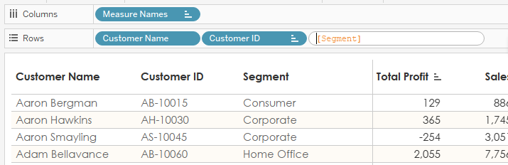
Then type // as you would for a
comment. After the //, type the display name you wish to use.
Next, hold Shift (or whatever
the alternative is on Mac), and click Enter. This will add a carriage
return to the calculation, bringing the field name to the second line. If you
were to copy it to a text editor, it would look like this:
//Customer
Segment
[Segment]
Click enter one more time to save the
changes and voila, the display name changes to “Customer Segment”
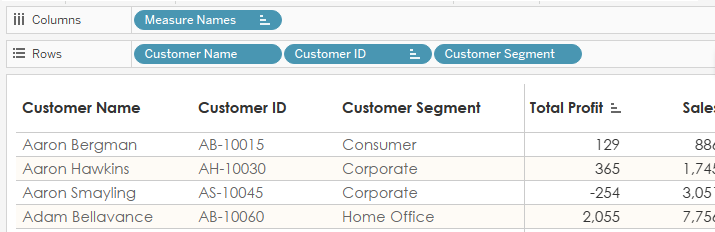
Note that the blue pill itself will
also show the name “Customer Segment” as well. This, of course, creates some
traceability concern as it appears that that there is another field in your
database with this name. But, when you need a quick and easy way to show a
different name without duplicating your pills, this does the trick nicely.
2) Create a New Sheet/Dashboard Where
You Want
Let’s say you have a workbook with
lots of sheets and dashboards, but you need to add another. At the right of
your list of sheets and dashboards are buttons for creating new sheets,
dashboards, and stories. But, if you click them, those sheets get pushed all
the way to the right. You then need to drag those over to the left to put them
exactly where you want them. But, you can save your time by simply right-clicking
any tab and choosing “New Worksheet”, “New Dashboard”, or “New Story” at the
top.
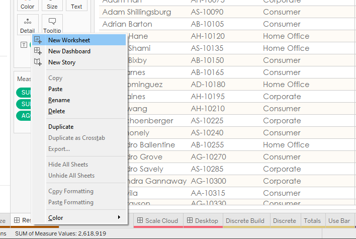
When you do this, that new sheet,
dashboard, or story will be created directly to the right of the tab on which
you clicked, preventing you from having to drag it all the way over to where you
want it.
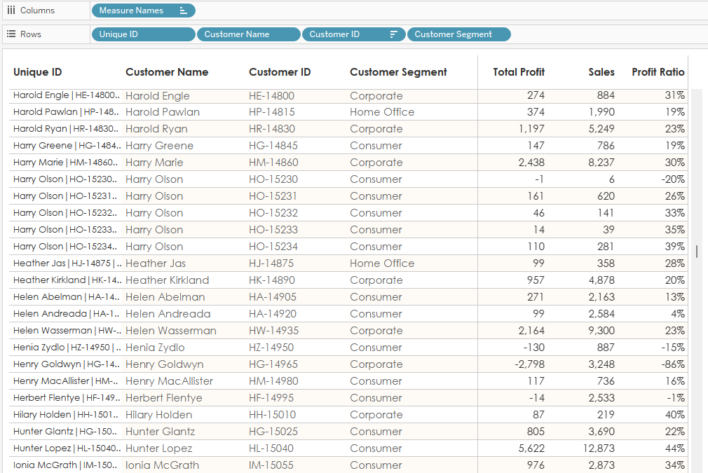
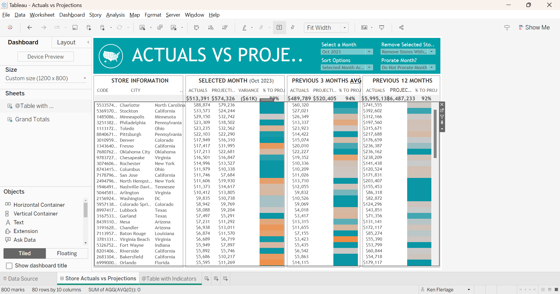
3) Simple Table Sorting
Let’s return to the table we used in
the first tip. We have Customer Name, Customer ID, and Segment
on the rows shelf and we’re displaying three measures. Tableau has a handy
option that allows you to click the header of one of these measures to sort it.
So, you or your user clicks on Profit to sort it…
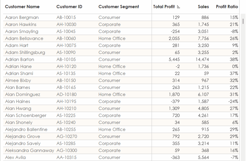
And it does nothing…What is going on
here? Well, if we scroll down the table a bit more, we’ll come to Harry Olson
who, strangely, has five different customer ID’s. Watch what happens when we
sort on Profit with Harry Olson visible…
As you can see, it’s sorting the
values for Harry Olson. What’s happening is a nested sort. Essentially, it
detects that the Customer Name is not unique, but Customer ID
is, so it’s sorting within each Customer Name. Because
most Customer Names only have one Customer ID, it doesn’t seem to
be doing anything.
Ultimately, you probably want your
users to be able to sort the entire table with each row acting independently.
To do that, we need to ensure that the first pill on the rows shelf always
represents a unique value across all the dimensions on the table (e.g.
everything on the rows shelf). To do this, we can create a calculated field to
act as a unique ID:
Unique ID
// Unique ID for
each row of the table.
[Customer Name] + "|" + [Customer ID] + "|" + [Segment]
We then add this as the first pill on
the rows shelf.
Then we right-click the pill and deselect
“Show Header” so it is not visible to our users.
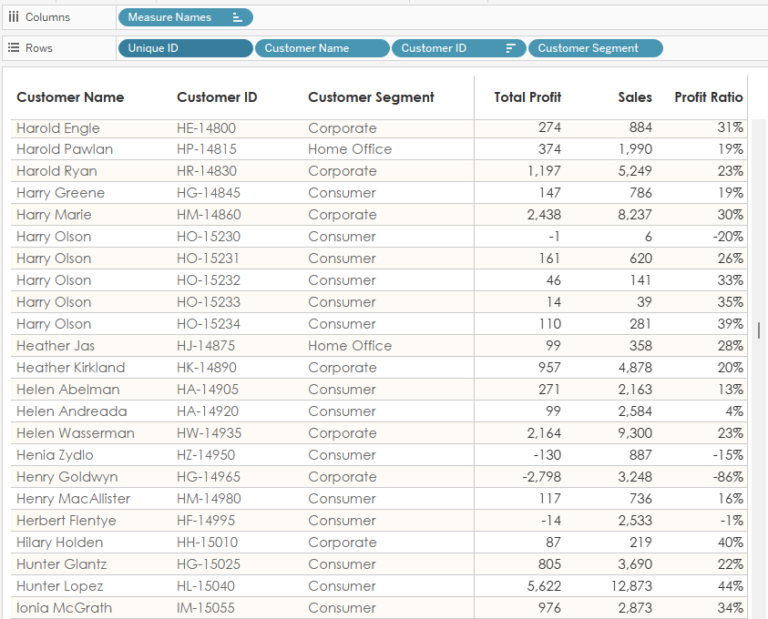
Because that first pill is unique, it
will sort each row individually.
Note: When clicking the sort option
on measures, it acts as a sort of toggle, switching between sorting ascending
by the measure, descending by the measure, and alphabetically on the first pill.
4) Get a Person’s Age
I’ve seen several posts on the forums
asking how to calculate someone’s age based on their birthdate and today’s
date. Some of the solutions I’ve seen are options such as YEAR(TODAY())
- YEAR([Birthday])
or DATEDIFF('year', [Birthday],
TODAY()).
But neither of these yield an
accurate age based on how we measure it. For example, if someone was born June
1, 2000 and today is March 1, 2024, these calcs would say that the person is 24
years old. But that’s not how we measure age—typically, we wouldn’t say that
this person is 24 years old until June 1, 2024. To address this problem, I’ve
seen the following solution offered:
INT(DATEDIFF('day',
[Birthday], TODAY())/365.25)
Instead of finding the difference in
years, this finds the difference in days, then divides by 365.25, the
approximate number of days in a year accounting for leap years. While this
produces a correct age more often than the earlier solutions, it’s still inaccurate
fairly regularly. This is because there are not actually 365.25 days in a year—extra
days are only added once every four years. It’s also because the number of days
in a year is closer to 365.242375. To adjust for this being slightly less than ¼
day per year, leap years have additional rules—they occur every four years
except years that are divisible by 100. And that 100-year rule has an exception
when the year is divisible by 400.
So, if we want a 100% accurate
calculation, we need another solution. My suggestion is to look at the actual month
and day of the birthdate:
// Age accounting
for actual month and day.
IF
DATEADD('year', DATEDIFF('year', [Birthday], TODAY()),
[Birthday])> TODAY()
THEN
// The day is later than today
DATEDIFF('year', [Birthday], TODAY())-1
ELSE
// The day is today or earlier in the year.
DATEDIFF('year', [Birthday], TODAY())
END
5) Create a Stepped Area Chart
When I’m only showing a single line
on a line chart, I often prefer to change it to an area chart to make it a
little easier to read.
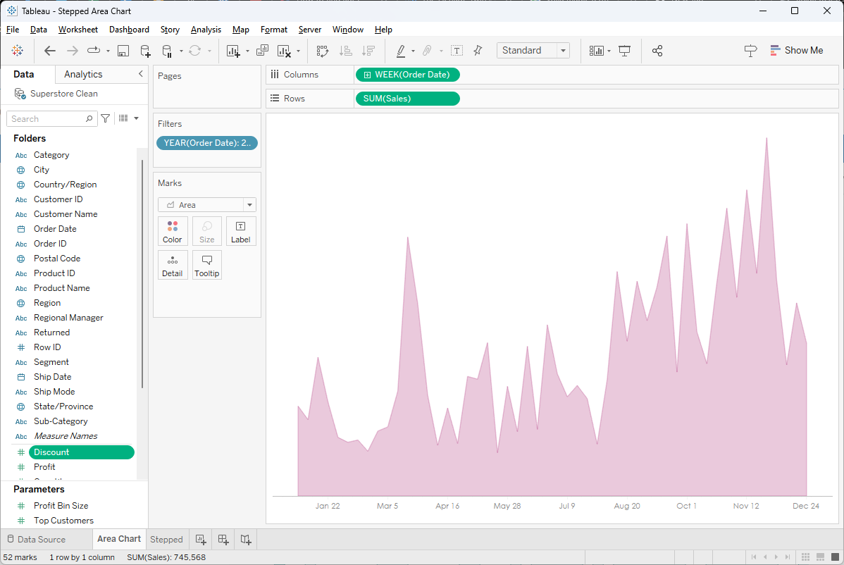
But sometimes these pointy edges are
bit difficult to follow—this is particularly the case when you’re dealing with data
that will be static for a period of time before eventually increasing or
decreasing. In those cases, a stepped line chart might make more sense. Tableau
allows us to change a line chart to a stepped line chart using the Path card.
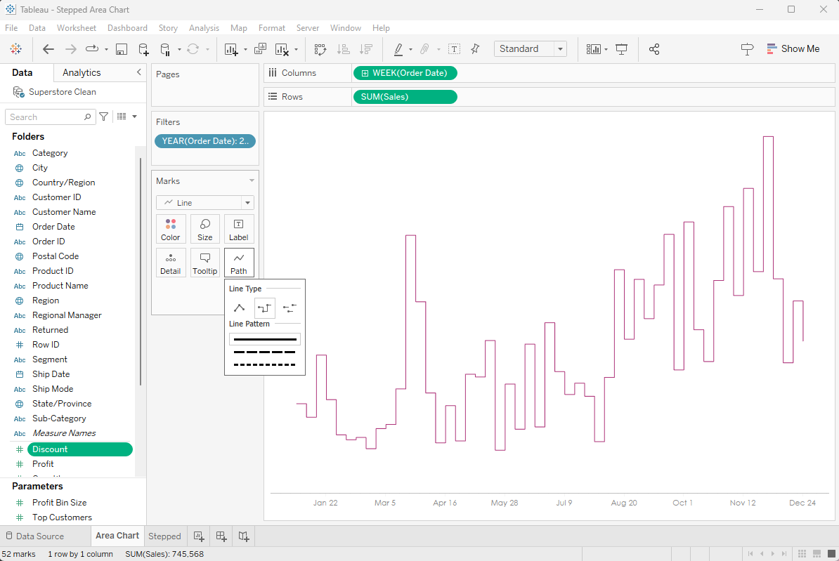
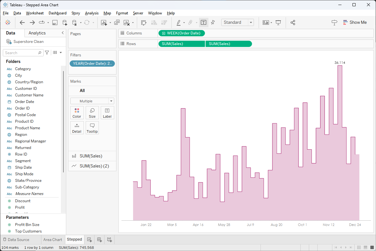
But, when we switch to an area chart,
we no longer have the stepped option. However, we can create a stepped area
chart by changing the mark type to a bar then turning off the mark border. We
then add a dual axis that uses a stepped line chart.
6) Windows Scaling Issues
Here’s a dashboard Kevin created that
we’ve uploaded to Tableau Cloud.
Looks great on Cloud, but then I open
it in Desktop and I see this:
Everything is squished, the text is
larger, leading to it getting cut off, etc. It looks very different than what I
saw on Cloud. I’ve seen this problem more times than I can count and the
solution is a simple one. The issue is that Tableau Desktop does not support scaling
settings that are not 100%. On Windows (I’ve only ever seen this issue on
Windows), go to your “Display Settings” then check the “Scale and Layout”
settings.
If this value is anything other than
100%, change it to 100%. If you have multiple monitors, be sure to change the
setting on each of them. After you’ve made the change, close Tableau then open
it back up. What you see on Desktop should now match what you see on
Cloud/Server/Public.
7) Vertical & Horizontal
Containers are the Same…at Least at First
Yes, that’s right—there is no
difference between a horizontal and vertical container when you first drop them
onto a container. To prove it, drop a horizontal container onto a dashboard.
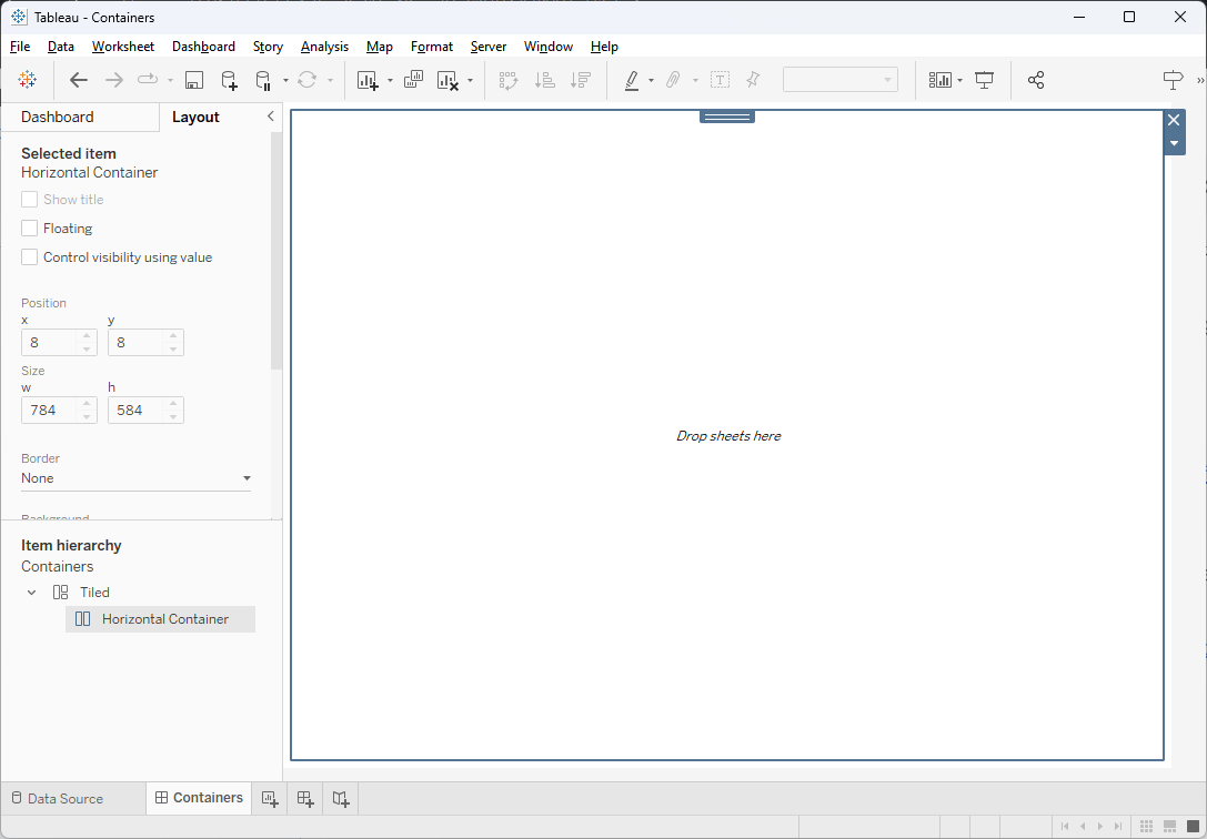
We can clearly see, in the Item
Hierarchy, that this is a horizontal container. But now let’s drag a blank onto
the view then change its background color.
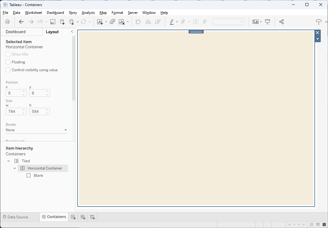
It’s still a horizontal container.
But if we drag over another blank, we can tile it vertically within this
container.
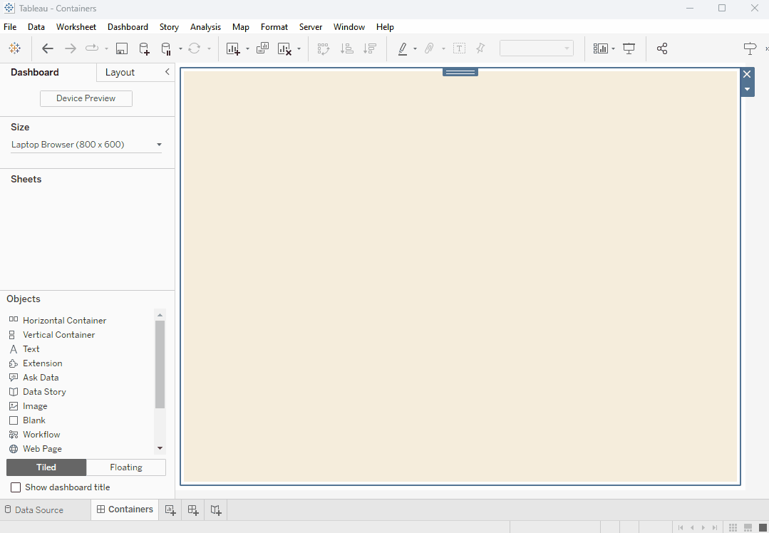
How is this possible with a
horizontal container? Let’s inspect the Item Hierarchy to see what happened.
That horizontal container is now a
vertical container. Whoa!!
Horizontal and vertical containers
are essentially the same thing when you drag them onto a dashboard. They don’t officially
become horizontal or vertical until you add a second object. Once that second
object is tiled in the container, the container’s type is set in stone and any
additional objects must be tiled in that manner. So, the next time you drag on
a container, just grab one—you don’t need to pick the right type as that will not
be established until later.
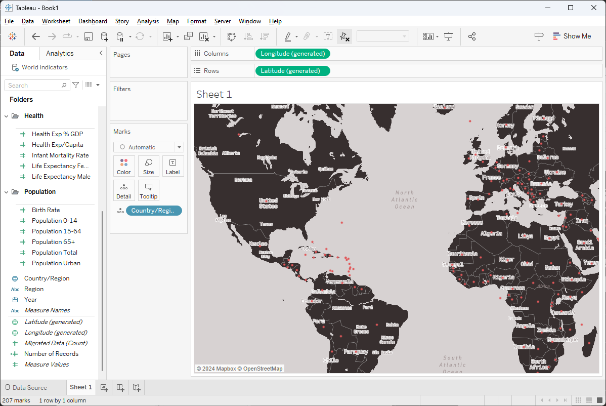
8) Mapbox Labeling Problem
If you’ve tried to use a Mapbox map
in Tableau lately, it’s likely you’ve run into a problem where the labels do
not show. For example, the following Mapbox map clearly has labels.
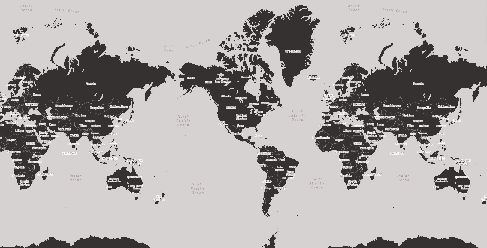
Note: This map was based on the “Monochrome”
template in Mapbox.
When I use it in Tableau, I get this.
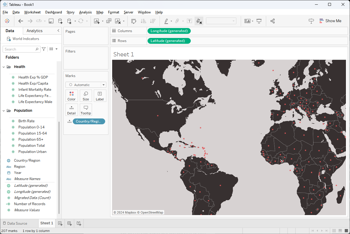
The country labels are all missing. I
can zoom in and out and they never appear. The problem is that Mapbox recently
changed the format of the style json file related to “pitch” and Tableau is not
yet able to handle those changes. To resolve this problem, you must manually download
and edit the json file. I’ve provided detailed instructions on how to do this
on the forums, so check
out the solution there. If you do it right, you should be able to see the
labels in Tableau.
Closing
That was fun! Thanks for reading!! If
you have any questions or comments, please share them in the comments section
below.
Header image Photo
by Ann H:
https://www.pexels.com/photo/close-up-shot-of-scrabble-tiles-on-a-blue-surface-2789779/
Ken Flerlage, March 10, 2024
Twitter | LinkedIn | GitHub | Tableau Public


No comments: