
How Wrong Were the Polls?

Back in November, I wrote a post on my Nate Silver Challenge, attempting to make sense of what went wrong with all the predictive models this election season. One of my main conclusions was that this was a simple case of Garbage In, Garbage Out. For whatever reason, the polls were way off this year, enough so to push the election over to Trump. Since that time, I’ve thought about this off and on and, with Donald Trump’s inauguration coming up, I decided to create a visualization comparing the final poll averages to the actual results (I’m using the final poll averages from 270 To Win.)
The visualization shows each candidate with their poll numbers, by state, on the left and their actuals on the right. At the top, I show a list of the states, colored by which candidate had the larger swing. For example, though Clinton won Maryland quite easily, her actual results were about 3% lower than her polls and Trump’s actual results were about 7% higher than the polls, a total swing of about 10% toward Trump. Thus, I’m showing Maryland in a red color. Here's Maryland.

I’ve also included the ability to filter by a number of different things including the poll leader, state winner, whom the actuals swung towards, and the individual state.
The first thing I noticed when I analyzed the data is that there were far more states that swung towards Trump than Clinton. Trump had a total of 37 states swing towards him vs. Clinton’s 12 (one state, Texas, saw no swing at all). The following show the the states which swung towards Trump, followed by those which swung towards Clinton.

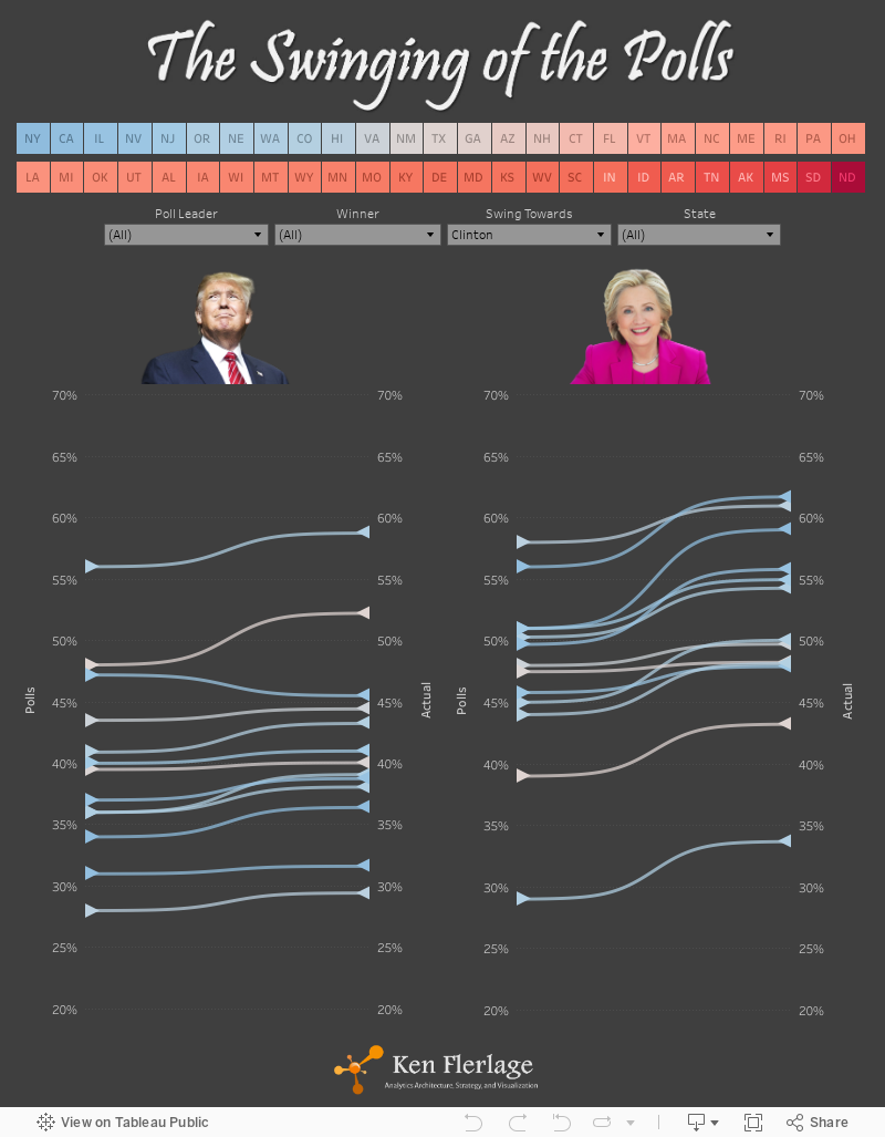
Next, I took a look at which states were led by one candidate, in the polls, but were won by the other. Clinton only had one of these, Nevada. Trump held a 1.5% poll lead prior to the election, but Clinton won the state by 2.5%. But there were five states which showed Clinton ahead and were eventually won by Trump. And, of course, these were that states that ultimately swung the election to Trump: Florida, North Carolina, Pennsylvania, Michigan, and Wisconsin.

Interestingly, Clinton’s poll numbers almost exactly matched her results in all five of these states, but Trump’s poll numbers were way off, seeing swings of anywhere from 3% (Florida) to 7% (Wisconsin). But, this was not an anomaly. The polls seem to have underestimated Trump’s chance of winning in almost every single state. Trump’s actuals were higher than the polls in 49 of the 50 states—Nevada was the only exception—with swings ranging from 0.5% to almost 15%. On average, his actuals were 6.2% higher than the polls. On the other hand, Clinton’s actuals were higher than her poll numbers in 32 states, with swings ranging from 0.2% to 8.2%. In the other 18 states, her actuals were lower than her poll numbers, with swings ranging from 0.1% to 5.9%. Her overall average was an increase of 1.0%.
So, there you have it. The polls were definitely wrong but only, it seems, for Trump. Clinton’s poll numbers were fairly accurate overall. For whatever reason (I’ll leave it to the pundits to speculate), the polls missed a significant number of Trump voters and those voters were enough to swing the election, as a whole, over to Trump.
Tableau Public: https://public.tableau.com/profile/ken.flerlage#!/


Awesome Viz and write up Ken! Really like the work you are doing!
ReplyDeleteThanks so much, Rody. You may not realize it, but I've learned a ton from just observing your work, so this it's great to get such a nice comment from you!
DeleteThanks so much, Rody. You may not realize it, but I've learned a ton from just observing your work.
ReplyDeleteYou are such a great Viz artist. I am really learning lot of things from you these days. Looking forward for more posts. You are amazing
ReplyDeleteThanks Rajeev!
DeleteAmazing Ken.... Looking forward to learn more from you. One suggestion which i would suggest is that when ever you publish a dashboard kindly provide a link for the underlying dataset in case if the data is not confidential. Because that would help learners like me to learn from your Viz.... Anyway thanks for your Viz...
ReplyDelete