
Introducing the Transparent Color Hex Code in Tableau

THE BACKGROUND
A few months ago, Ken and I presented at the combined Australia / New Zealand Tableau User Group. During that presentation, I gave a bunch of examples of how I use transparent shapes in every viz I create....every one! (I cannot begin to tell you how handy these are - check out my Transparent Shapes blog post for more information). During that presentation, there was a lot of talk in the chat window (it was an amazing group) and while I was talking about transparent shapes, Fi Gordon mentioned the transparent hex code. What?????? This, of course, piqued the interest of both Ken and I and we started digging in.
Through some research, I learned that the transparent hex code is actually fairly common in design tools such as illustrator. You can actually apply a hex code color that is transparent. The hex code for transparent white (not that the color matters when it is fully transparent) is two zeros followed by white's hex code of FFFFFF or 00FFFFFF. I'll be honest, I tried this in Illustrator (which I am no expert) and could not get it to work. However, my understanding is that there are additional levels of transparency as you can set them to 10% transparent, 20%, 30%, etc. and each level has it's own hex code.
ACCESSING IT IN TABLEAU
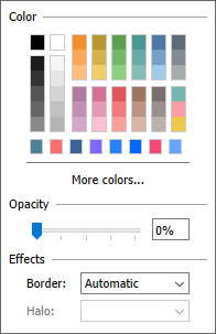
Eager to learn more, I instantly went into Tableau, pulled up the Color Picker and starting typing the code into the hex code field. Unfortunately, it stopped me at 6 characters...because they are hex codes after all, not oct codes!

So, here's the trick...you must create a custom color palette that includes the 8-digit hex and then you apply color from the palette itself. (For more information on creating a custom color palette in Tableau, check out this help article.) Below is the transparent color palette I created within my preference file. This is only for full transparency; I tried it with all the variations (10%, 20%, 30%, etc.) but they did not work.
<color-palette name="Transparent White" type="regular" >
<color>#FFFFFF00</color>
</color-palette>
Okay, so we've talked about the fact that we can bring a transparent color into Tableau via the preference file, but how can we use it? How might it help us? After all, if we want something to be transparent, why don't we just use the Opacity slider in the color card?
That's a really great question and it pretty much boils down to this. What if you had two types of marks in one chart and wanted one mark to be 100% opacity (zero transparency) in red and the other mark to be 0% opacity (100% transparent), how might you accomplish that? Well, I know of one way! The transparent color hex code!
USE CASES
So we've talked about the background and conceptually what it can do, how about we break down a couple of use cases. (Truth is, I don't think I've even scratched the surface on it's potential and I'm super excited to see what this amazing community will come up with). If you want to follow along or just want it as a reference, all of the following use cases are in my Introducing the Transparent Color Hex Code in Tableau workbook on Tableau Public.
Above, I mentioned my transparent shapes blog post. Truth is, the transparent color hex code can often be used as a replacement for a transparent shape. (I should mention some of these problems can be solved using "hide" as Ken shows in his our Australia/New Zealand TUG video at 10:20 in. Note that if you hide a mark, you cannot interact with it, which is why I tend to lean on a transparent shape or color over hiding marks).
#1 ISOLATE MARKS IN LINE CHART
Although the following is not in the transparent shapes blog post, a version of it is discussed in a presentation that I gave regarding the transparent shape. (You can check it out in our Australia/New Zealand TUG video at 51:25 in. The section about transparent shapes in general starts at 45:27). Imagine we have a dual axis chart (line and circle marks) that shows sales by month.

However, we will assume that our job is focused on Halloween and we want to highlight October sales, like the following:

I think that most people would create a calculation that determines if the month in the chart is equal to October and if it is, then yield the sales (note that my calcs are all preceded with an @ symbol):
@October Sales
// If it's October, then yield sales
IF DATEPART('month', [Order Date]) = 10
THEN [Sales]
END
You would then replace one of the pills on the Rows shelf with this calculation.
But the truth is, you don't need to replace one of your dual axis pills with a new pill, and in fact, you don't need to even write this calculation at all! Let's first do it with a transparent shape.
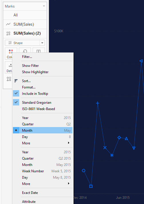
In the original view, change the second Sum(Sales) to a shape mark then move Order Date to the Shape card. Change the Order Date to reflect the month (no year) as shown below.

#2 SELECT ANYWHERE ON A MAP
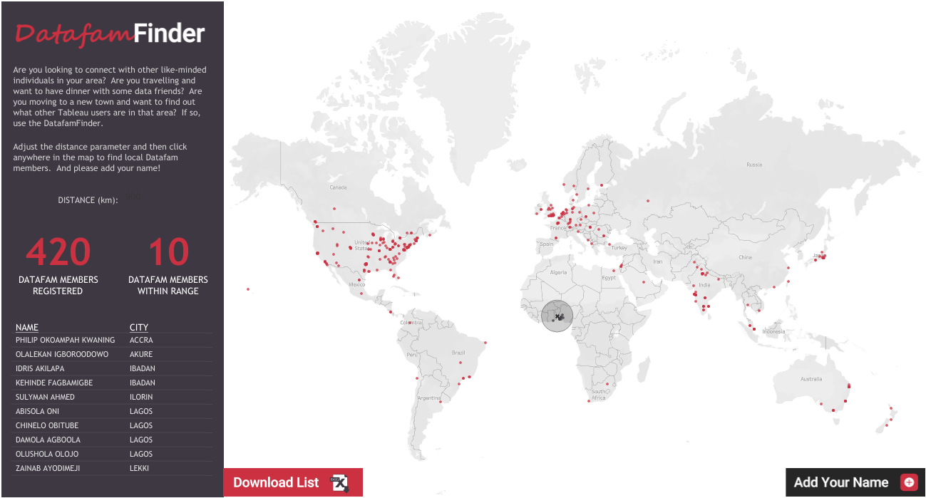
Earlier in the year, I shared my Datafam Finder. The Datafam Finder allowed people in the Tableau Community to register their name and general location. They would then appear as a mark on a world map. To date, over 400 people have registered world wide. The intention of the Datafam Finder was to allow people to find others in a selected area. For example, let's say that I am taking a business trip to Phoenix, Arizona. I could set a radius of say, 200 km, click on or near Phoenix on the map, it would draw a buffer circle and list out everyone within 200 km of where I clicked.
The big trick to this is that I set it up so that you can literally click ANYWHERE on the map to select that location. Well, how does that work? Assume you had a data set that included two customers, one from Chicago, IL USA and one from Tokyo, Japan. That means there are two marks and I can click on either of those marks. But what if I click on London, England. What would happen? Well, absolutely nothing would happen because there is no mark and no data associated with London, England. But in the Datafam Finder, you can absolutely click on London, England or anywhere else for that matter. How did I do that? Well, I found a list of every city in the world, loaded it into a Google sheet then essentially unioned that with the list of people who registered. So now there is always a mark for every city in the world.
But I didn't want all the cities to show, then you wouldn't be able to see where the actual 400+ registrants were located as shown below:
I solved this using a transparent shape...well, about 26,000 transparent shapes. I simply created a calculation that determined what was a registrant and what was a city from the Google sheet. I placed that calculation onto the shape card and then applied a transparent shape to the cities from the Google sheet (which I called "Transparent" in the calculation).
I say all of this because we can utilize the transparent color for the exact same purpose. (Again, you can check out my Transparent Color workbook on Tableau Public if you want to follow along).
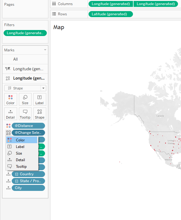
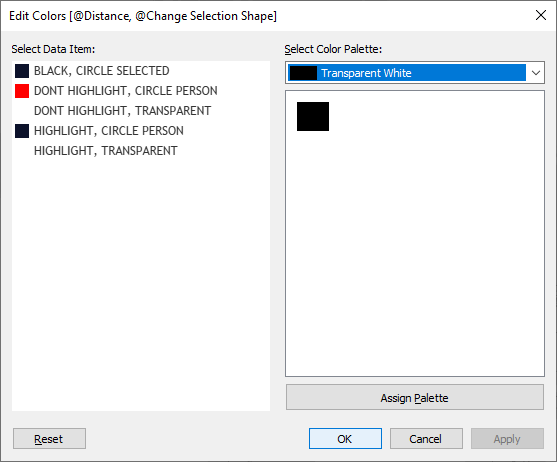
To follow along, download the original Datafam Finder. Go to the map, go to the shape axis, click the icon next to "Change Selection Shape" and change it to Color (rather than Shape) as shown below. We must do it this way because there is already another pill on color. Doing it in this manner will allow us to put two pills on color - essentially the combination of the two of them.
Now just update the colors. We want the city that is clicked to be black as well as any other registrant within the select distance. We want all other registrants to show in red. And then anything that is listed as "transparent" is a city was from the Google sheet and unselected. That should be the transparent color.
# 3 SHOW INFORMATION BEHIND
A few weeks ago, I shared a viz called "Oh the Places We Have Gone". It was inspired by my sister-in-law that has a wooden map hanging in her living room where she has painted each US state that they have visited as a family. So I, of course, just had to build it in Tableau. I decided to do this individually for each family member as well as our family combined. Originally, I just showed the states we had visited in one color and the states we had not visited in another color...but that was boring. I came up with the idea of showing an actual image of the family member behind it and that person would sort of be revealed as more states were visited. (Creating the image took a bit of graphic work. I created a US map using an alternative projection shapefile - the same one I would use for my map, I exported it as an image, I made the center of it transparent and the outside of it white, I overlaid it on a photo, then did some cropping to end up with photos that looked like this). These images would then be placed behind each map:
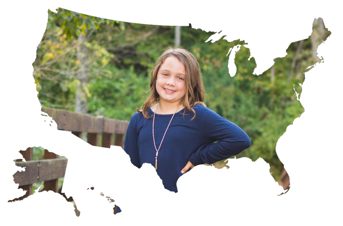
It was at this point that I realized I had a problem. My intention was to overlay an actual map showing the locations we had been (in the above case, the places that my daughter, Addyson, had been). I wanted it all to be semitransparent so you could sort of see her through all then states, but I wanted the states where she had been to be fully transparent...I wanted them to open up the map. Well, how the heck could I give some states 80% opacity and other states 0% opacity? There is no way to control opacity with a calculation.
I considered just filtering to only show states she had not been, but that would eliminate any interactivity or tooltip with the states she had been....and I did not want that. I even tooled around with the idea of two maps overlaid on top of the image, one that would filter to non-visited states only then another on top that was fully transparent for the interactivity and tooltip. But 3 layers, well, I really hated that idea.
And then I had an epiphany! The transparent color would work perfectly! All I did was apply a white color (at 75/% opacity) to the non-visited states and a fully transparent color to the states she had visited. It was simple and the result was EXACTLY what I wanted...and in just one sheet. Again, you can check out the final viz here.

#4 SLIDING REFERENCE LINE WITH COLOR
Okay, now for my favorite example of all. When Parameter Actions were released in version 2019.2, I created a pile of examples in my Playing with Parameter Actions blog post. One of those examples was a sliding reference line. It was dual axis line chart / area chart where a parameter action was feeding the date into a parameter. In a calculation, that parameter was compared to the actual date in the viz and colored the area chart blue if it was before the date and gray if it was after the date (see number 8 in that blog post for the full build). Below is the original gif shown in that blog post.
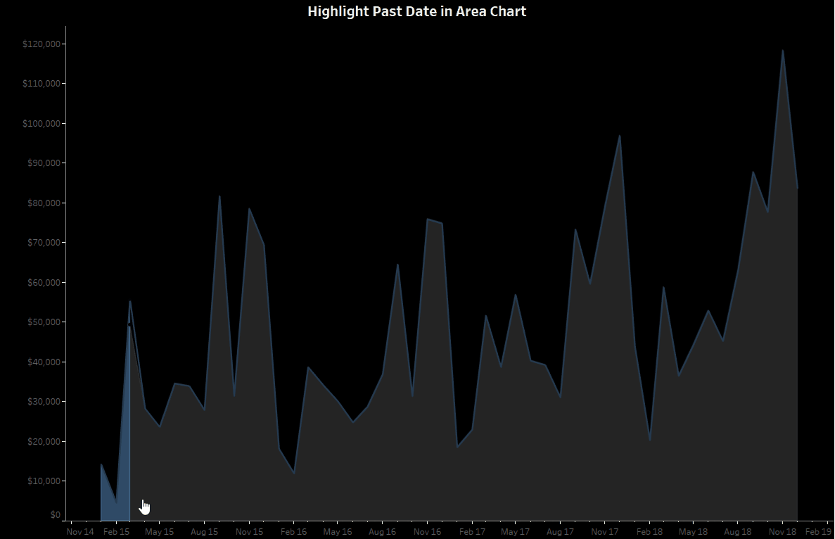
When thinking about the transparent hex color, I realized that we could do this slightly differently. We could replace the gray color with a fully transparent color providing a really clean and clear design (that would also show anything behind it if needed). Using the chart in the above example, essentially replace the gray with the transparent hex color code and that's it! It is shown below in a slightly different chart, but it was built using the same general steps. I just love this one!
WRAP-UP
And that's all for my examples, but since I actually wrote this blog post, I've used this trick at least a dozen times, including in my recent Mario Kart viz (to modify Ken's coxcomb template for vehicles, tires, and gliders)! As I mentioned above, lots of the use cases from my Transparent Shapes blog post can also be accomplished using a transparent color. But in general, I think there are a ton more opportunities for this trick. I'm really excited to see all the different use cases that this wonderful community comes up with. I'm certain you're going to blow people's minds!
Before we go...a HUGE thanks to Fi Gordon who told us about this in the first place. Thanks, Fi!!!
Thanks for reading!
Kevin Flerlage, January 10, 2022
Twitter | LinkedIn | Tableau Public


This was a tremendous help for me. I had a need for transparency in a map I'm doing but didn't know how to achieve it. This fix worked perfectly. Thank you!
ReplyDeleteI got excited when I read this. I was hoping I could use this on the Title>Label dialogue to hide padding characters. I am using a fixed number transparent shapes to pad currently, but characters would allow me to calculate how many padding characters I need dynamically. Too much detail, sorry...
ReplyDeleteStill VERY USEFUL is so many other situations.
Thanks for the blog post,
Dave
I'm not sure I'm following what you're trying to do, but I'm very curious. Any chance you could hit me on Twitter or flerlagek@gmail.com with an example? I'm intrigued.
Delete