
Animated Polygons in Tableau

Today I'm honored to, once again, host a guest post by the brilliant Alexander Varlamov. Alex has been doing some absolutely incredible work in Tableau and has innovated a number of new techniques. So please enjoy the blog and be sure to follow him on Tableau Public and Twitter, and check out his blog, https://coolbluedata.com.
If
you’re a regular visitor to the Flerlage Twins blog, you may remember that I
wrote a guest blog in 2019 on animation called Tableau
in Motion.
In that blog, I showed how you can perform different types of animation in
Tableau. This was before Tableau introduced its new animation feature in the
2020.1 release. Well, I’m back and, once again, animation is my topic. This
time, I’m going to show you how to create the illusion of animated polygons.
The
visualization below shows the evolution of the Batman logo over the last 80
years.

Note: The idea
for this viz came from Zach Bowders. Thanks Zach!
Who
knew that the Batman logo had changed so often over time? While this would be
effective as static images, the animation really helps you to observe the
transitions and amount of change from one to another.
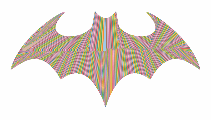
While
these logos look like polygons, they are not. Unfortunately, Tableau does not
animate certain types of marks, including polygons. Instead, I’ve created these
logos using a series of different lines. Since lines can be animated in Tableau, I’m able to mimic polygon animation in
this way. To help you better understand how this works, here’s the same logo
with each individual line assigned a color.
So,
in this blog, I’m going to show you how we mimic the look of polygons using
other mark types, specifically, so that we can then animate them.
Creating the
Shape Contours
Polygons
are not the only thing that prevents Tableau from being able to animate a
chart. In particular, the complexity of the view plays a big role. More complex
views will cause Tableau to render the viz on the server-side, rather than the
client side. When server-side rendering is used, animation is disabled. One key
to avoiding server-side rendering is to limit the number of marks. So that will
be critical here. Additionally, by limiting the number of marks as much as
possible, we’ll be able to ensure a smooth animation. From my own experience,
I’ve found that we need to keep the number of marks somewhere under 10,000. So,
for the Batman Logo Evolution viz, I
used a total of 1000 marks—this is enough to ensure that we can create complete
shapes (without being able to tell that they are made up of lines) and allow
for smooth animation on the web.
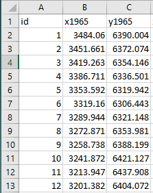
I
started by getting the shape of each logo using a Business Insider article, The
incredible 75-year evolution of the Batman logo. For example,
here’s the 1965 logo:

Note: For some
images, you may need to use a graphics editor to make minor corrections. In our
case, the images were all in good shape so no edits were required.
We
first need to convert the image from its original jpeg file format into a
scalable vector graphic (svg) format (for more on scalable vector graphics, see
Ken’s blog, Polygonize
Images and Other Vector Graphics Fun in Tableau). We can do this
using a variety of tools, such as the following online converter: https://image.online-convert.com/ru/convert-to-svg
After
converting the file to svg, we need to get the X/Y coordinates of the logo’s
contour. To do this, we can use the Spotify Coordinator tool (for more on this tool, see
Kevin’s blog, Make
a Chart Out of Any Image Without Illustrator or Any Math!). You simply
open the svg in the tool then set Number
of Points to 1000.

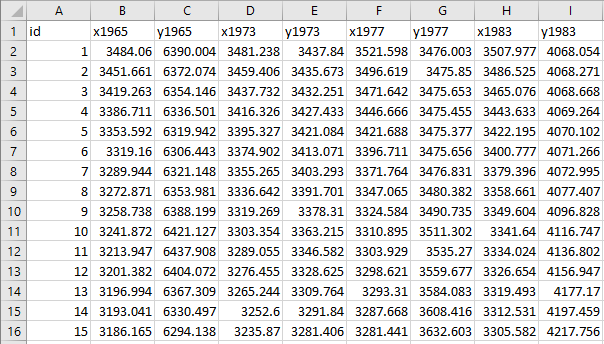
Next,
we download the csv output, which has 2 columns containing X, Y coordinate
pairs for each point. Using this file, you can easily visualize the image in
Tableau by dragging X to the columns shelf and Y to the rows shelf.
Next
we need to create a unique ID for each point row in the data set. There are a
variety of ways to do this, including Tableau Prep, but the easiest way is to
just create a sequential number in Excel.
It’s
important to remember that, during the animation of one shape to the next, we
need each point to correspond to the same basic point on the next (and previous
shapes). So, for example, let’s say that ID # 1 on the 1965 logo is on the far
right side, but ID # 1 on the 1966 logo is on the far left side. If we were to
animate this chart, that point would appear to move from the right to the left,
which would not be a great user experience. So, it’s important for us to
normalize all of our points so that they stay in more or less the same position
from logo to logo. Unfortunately, Coordinator doesn’t always start in the same
place, so we need to choose a place where we wish to start. I chose to start at
the top center as shown below.
When
I created the points in Coordinator, this point was # 113. I, therefore, had to
adjust all of my IDs (in Excel) so that ID 113 became ID 1. ID 114 would then
become 2, etc.
We
now repeat this process for each of our different logos, ensuring that they
each have a starting point (ID # 1) in the top center. Once we’ve collected all
this data, we put it together in a single Excel file which has X/Y coordinates
for each year.
Onto Tableau…
Now
that we have our data set, let’s work in Tableau a bit more. In order to switch
the logos, we’ll create a parameter called Year
which includes the years of all the logos.
The
next thing we need to do is ensure that each logo’s center point is 0, 0 on the
coordinate plane as this will make it easier to work with. Unfortunately, the
data generated from Coordinator does not do this automatically. So you’ll need
to look at the data and choose offsets along the X and Y axes. In our case,
those values are -3250 and -4000 for X and Y, respectively. So we’ll create
some simple calculated fields to make these adjustments.
X
Centered
CASE
STR([Year])
WHEN
'1939' THEN [x1939]
WHEN
'1940' THEN [x1940]
WHEN
'1941' THEN [x1941]
…
END
-3520
Y
Centered
CASE STR([Year])
WHEN
'1939' THEN [y1939]
WHEN
'1940' THEN [y1940]
WHEN
'1941' THEN [y1941]
…
END
-4000
With
this adjustment made, you can see that 0, 0 is at the center of the logo—this
is exactly what we were trying to do.
Note: It is
possible that each image might require its own unique values for each offset.
In that case, it is probably easier to make this adjustment as part of the data
prep stage. But since all of our images share the same basic coordinate space,
the shifts are the same and we can handle that in a calculated field.
We
can now connect these points, in order, using a line mark type in order to
create the contour of the logo. If you enable animation, you’ll then see these
contours shift as the Year parameter is changed.
Important!!: If there are non-aggregated measures on the Columns and Rows shelves, the transition animation will not work. You must aggregate the measures, for example using an aggregation such as AVG, MIN, or MAX.
Filling the
Polygons
While
this looks pretty good already, our goal is to create filled polygons. To create the illusion of a filled polygon, we
need to fill the inner space of the shape. To do this, we will draw a line from
each point on the contour to some point inside of the shape. If we draw enough
of these lines, they’ll begin to overlap, filling in all the empty space.
To
draw lines, we’ll need some additional data that defines the end point of our
lines (right now, we only have one of the two points needed). To do that, we’ll
duplicate our data by unioning it to itself.
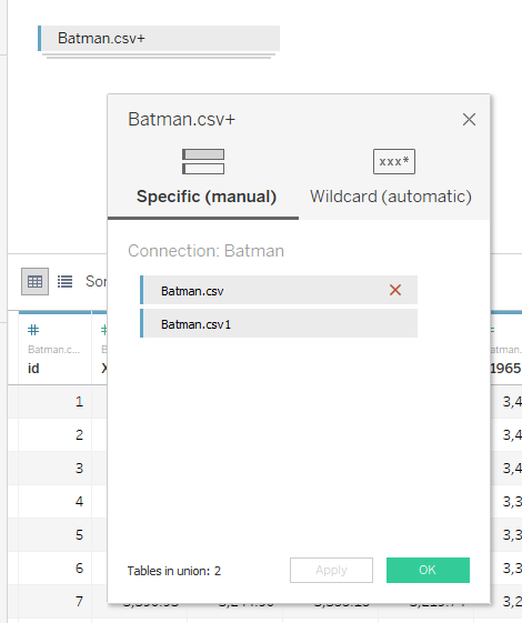
When
you union data in Tableau, it creates a new field called Table Name which indicates which of the two tables the data came
from. In the example above, you can see that one is called “Batman.csv” and the
other is “Batman.csv1”. We’ll use the first table, “Batman.csv” to draw the
point on the contour of the shape and the second table to draw the inner point.
Now
we’ll create a calculated field to define the path of the line (we’ll use this
later).
Path
CASE
[Table Name]
WHEN
'Batman.csv' THEN 1
ELSE
0
END
Next,
we need to find the coordinates of each line’s inner point. This is easier said
than done because we need to make sure that the lines converge in a way that
ensures complete “filling” of the shape, while also ensuring that the lines all
stay within the contour of the shape.
Let’s
start out by placing the inner point at the same X coordinate as the outer
point and setting Y to 200. The result will be a series of vertical lines that
attempt to fill the shape. We can use the existing X coordinate for this, but
will need a new calculated field for Y.
Y
Move
IF
[Table Name]='Batman.csv' THEN
[Y Centered]
ELSE
200
END
The
result is something like this:
You
can see the problem here. The lines drawn from the tip of each wing to the
center are drawn outside of the contour of the image as highlighted here.
We
do not want this so we’ll need to find another method.
I
personally tried numerous methods and mathematical techniques to find an
automated center point. I would find some set of options that worked perfectly
for one logo only to find that it failed on another. I won’t share all of the
iterations and maths here (I’m happy to share more info if you reach out to
me), but I’ll just note that I eventually decided that I’d need to create
specific adjustments for the X and Y coordinates for each of the logos.
Eventually, I was able to find adjustments that worked for all of the logos and
I built them into new X and Y calculated fields. The result was something like
this:
I’ve
used color just so you can see how some lines are drawn at different angles
than others. This worked quite well to eliminate the drawing of lines outside
of the logo’s contours. Unfortunately, when I switched to another shape, I
found another slight problem:
We
can see that the inside is not being completely filled. To help mitigate this
problem, I simply dropped my Path
calculated field on the size card. This makes the inner part of the line
thicker, as shown below (if you see the opposite effect, then just edit the
size legend and reverse the order).
The
result is a completely filled polygon.
Note: When we
size the points of each line, we’re keeping the size of the outer point quite
small. This helps to ensure that we have a sharp outline. If we were to make
points larger, the edges would be somewhat rounded. However, if we make them
too small, we won’t get a complete fill effect. Thus, there is a bit of an art
to adjusting the size of both ends to ensure that we get a complete fill while
retaining our sharp outline.
With
that final adjustment, we’re done! We can switch the Year parameter and watch
our logos transition.

As
you might have already realized, this method won’t work well for every type of
shape. More complex images, such as the tree below, would be very difficult to
draw in an automated way, without a ton of manual work to find lines for each
point. It’s definitely possible, but would require a lot of effort.

Additional
Distortions
In
the examples above, we made the starting point of one shape at the same basic
position as the next/previous shape, so the shapes transitioned from one to
another in a relatively uniform manner, creating the illusion of
transformation.
However,
if desired, we can play with this to create different distortions in the
transitions. For example, if we shift the numbering of each shape ID by 500
(half of our total number of points), we can create the illusion of
disappearance.
Or
we can shift it by a smaller number such as 50 (5% of our points), we create
the illusion of rotation.
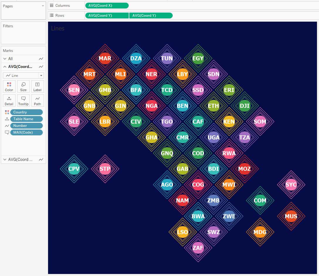
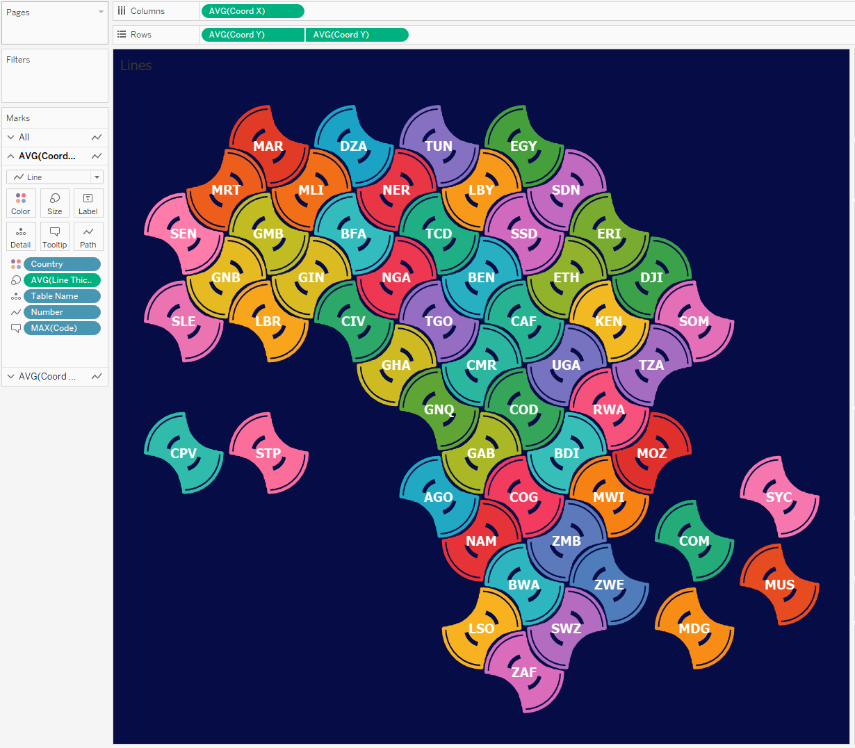
Concentric
Contours
In the method described above, we found the ‘middle line’, but for
simple shapes, you can fill them with concentric contours. This is the approach I used
in the my Africa
Tile Map:
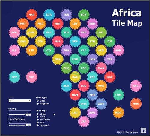
The tiles look like polygons but they
are actually lines:
All
the shapes are described by trigonometric formulas and are
calculated directly in Tableau. The logic is based on the transformation of a
circle. The animation below shows how we can create different types of shapes
when trigonometric functions are applied to the corresponding quadrants.
By
using the different transformations above and playing with the widths of the
inner lines, we can get some interesting tile designs.
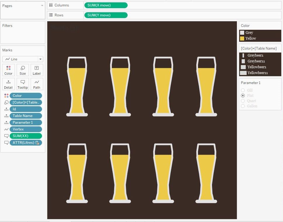
Polygon Splitting
Finally,
I want to show you one more polygon animation technique I’ve been experimenting
with. This technique deals with breaking up a whole into smaller parts.
I
used this technique in my Liquid
Measures
viz, which shows a breakdown of one imperial gallon into quarts, pints, and
gills.

I
first drew all these forms on paper with a coordinate grid, and then
transferred the coordinates to Excel. As I did this, I made sure to give each
individual point its own numeric ID. Like our first animation method, we need
to remember that each ID will transition to the same ID on subsequent figures.
The
fill technique is similar to the tile map in that we draw nested contours
within the figure.
We
can then leverage the size card to increase the sizes of the lines, creating
the illusion of filled shapes.
Conclusion
Animation
is a great way to show how your data changes—that’s the reason why Tableau
recently added this feature. But, as we’ve noted, there are still some
limitations to what can be done with Tableau’s native animations, particularly
when it comes to polygons. However, as we’ve demonstrated here, we can get
creative and use other types of marks to create the illusion of polygon
animation.
Of
course, what we’ve shown here isn’t something that would be suitable for
business use cases. It is, however, quite fun to experiment with. Furthermore,
as you’re experimenting with the tool and forcing it to do things it’s not
meant to do, you’re always learning new tips and techniques, many of which will be applicable in your work.
I
hope you enjoyed this post. If you have any questions, feel free to leave them
in the comments section below.
Alexander Varlamov,
December 7, 2020
Twitter | LinkedIn
| Tableau Public


This is great, as usual!
ReplyDeleteAlex is a genius!
DeleteThat is genius! And it looks like a ton of effort to get the correct co-ordinates.
ReplyDeleteYeah, he went through a few different iterations and lots of mathematical calculations to get it just right.
DeleteThis is a fantastic post. Thanks so much for this.
ReplyDelete