Datafam Colors: A Tableau Color Palette Crowdsourcing Project
If you're just looking for links to the tool, you can find them below. Otherwise, read on to learn all about Datafam Colors!!
Update May 26, 2023: New Color Contrast Checker
A couple weeks ago, I had an opportunity to attend the Accessibility Tableau User Group for their Global Accessibility Awareness Day event. The TUG is hosted by Collin Smith and Emily Kund. Emily, in my opinion, is one of our community's preeminent experts on accessibility as well as its greatest advocate, so I was excited to learn a bit more about accessibility during the event. It was a good one, featuring presentations from Dr. Kevin Lee Elder, Research Professor of Analytics at Louisiana Tech University and Blake Burgess, Product Manager Director at Tableau/Salesforce, with responsibility for accessibility. Sarah Bartlett, Tableau Enablement Consultant at Red Hat and a Tableau Visionary, also did a short presentation on color contrast ratios and the recommendations made by Web Content Accessibility Guidelines (WCAG). In the talk, she discussed WCAG recommendations that text elements meet a 4.5 to 1 contrast ratio and user interface and graphical elements meet a 3 to 1 threshold. She then introduced a handful of fantastic tools to help you check your color contrasts, including coolors.co and the Color Contrast Matrix Generator, a tool created by Lisa Gaudette. At that point, I decided that it would be good to add some basic contrast tools to Datafam Colors as well. So I'm happy to reveal these recent updates.
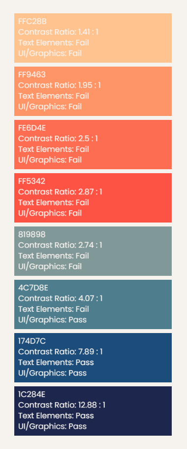
In the updated tool, you can click on the options menu and turn on the Color Contrast checker. When you do that, you'll then need to enter a color code in hex format. Datafam Colors will then calculate and display the contrast ratios between that color and each color on each palette. It will also display whether the ratio meets the WCAG recommendations for both text and graphical elements. Here's an example calculating the contrast ratios with #F6F2EE.

So, for example, let's say that you are going to be creating a bar chart and want to put labels on the bar themselves. Enter the color of the text you want to use, then check to make sure it meets the text contrast ratio requirements. Or, perhaps you want a bar chart with no labels and want to be sure that the bar colors will work okay with your background color. Enter the color of the background, then check to make sure it meets the UI/graphical element requirements.
One of the limitations of the above, however, is that it only displays the contrast ratios compared to the color you've entered--the text and background remain either white or black. So that you can actually see the palette with the color specified as the background and/or the text color, you can now click on a palette and you'll be taken to a website that uses the specified color on the background and the text. And, like the above, it will also display the contrast ratios and whether or not the color pass based on WCAG requirements.

Huge thanks to Sarah for this idea! I certainly hope it's helpful. And if you have any questions or comments, please let me know!
-------------------------------------------------------
Original Blog Posted June 7, 2021
A couple of weeks ago, I saw the following tweet from Rodrigo Calloni:
Should @tableau open a contest asking the #datafam to share their favorite color pallets? And then include those in the out of the box pallets (naming them after their creators)?
— Rodrigo Calloni (@tableauing) May 6, 2021
I absolutely loved the idea of a contest where Tableau would add some of
the community’s most popular custom color palettes. But I also wondered if we
could go even further and find a way to easily crowdsource palettes from the
community. I reached out to Rodrigo and we began discussing how we might be
able to collect people’s favorite palettes then make them readily available. And thus was born our Datafam Colors project. Here’s how
it works:
1) Community members (you!!) complete a simple Google Form to submit your
palette. The form asks for your name, email (don’t worry—it will be kept
private), palette type, palette name, and a list of the hex colors. You can
submit as many palettes as you like.
2) A Tableau workbook automatically updates to include your palettes. The update uses
Tableau Public’s Google Sheets connector so it will update once daily.
3) Using the workbook, community members can browse all the different
palettes, then download a preferences.tps
file containing all the palettes (this file just needs to be placed in your
Tableau Repository directory).
4) You now have access to all the palettes submitted by the community!
The Workbook
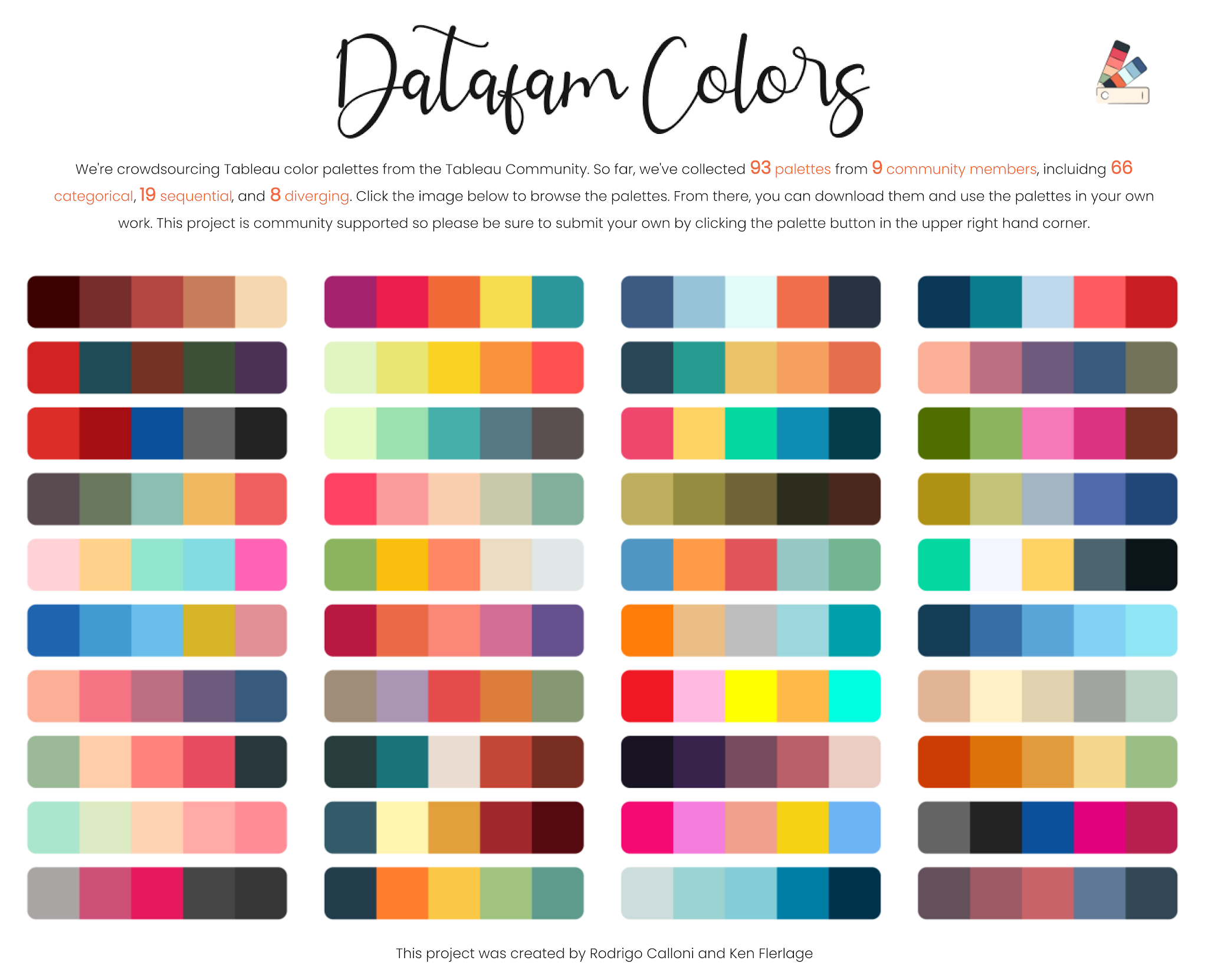
The start page of the workbook gives you basic information about project, the number of palettes,
contributors, etc., as well as some samples of the palettes that have been
submitted.

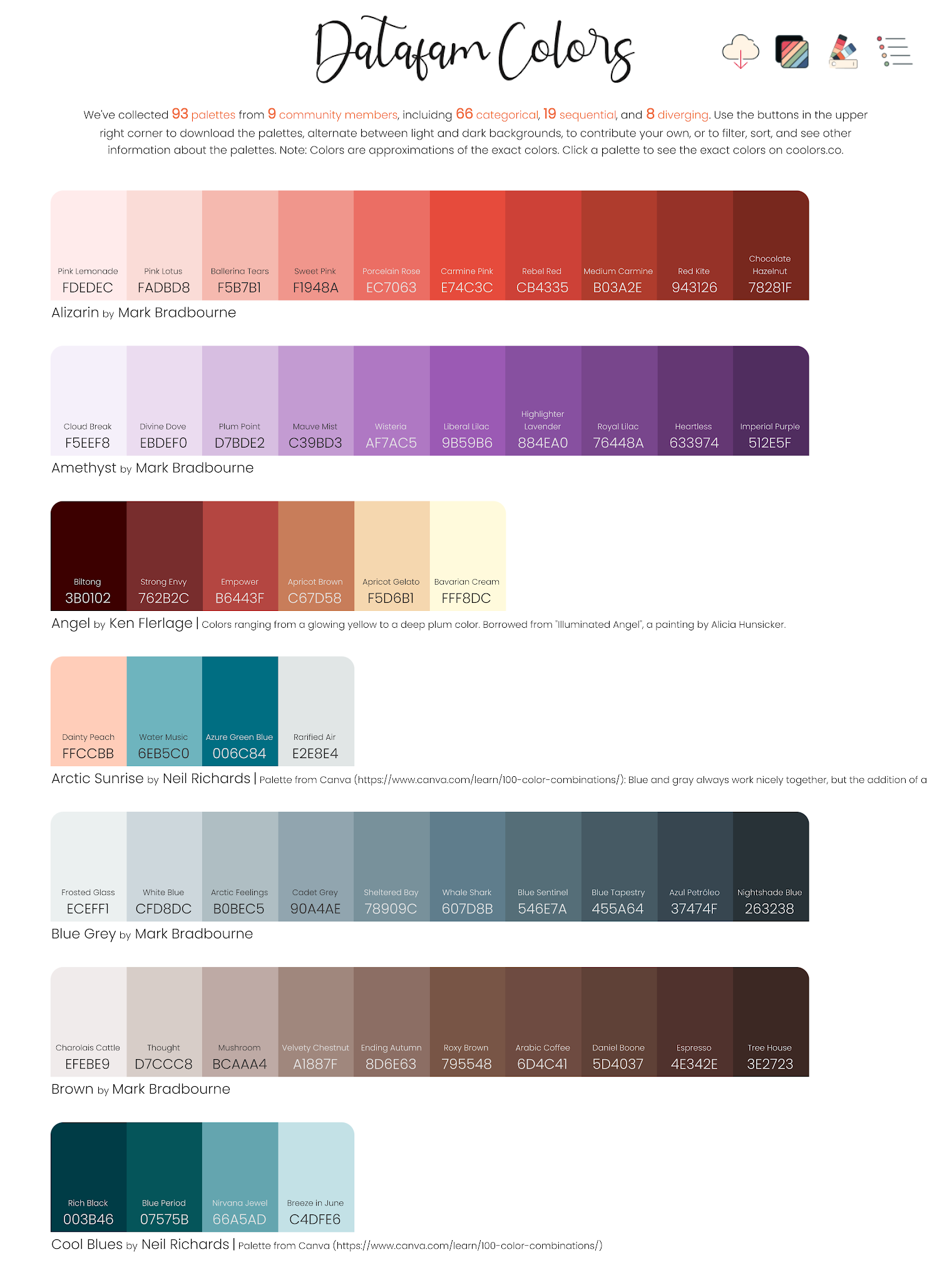
If you click on the palettes (at the bottom), you’ll be taken to a detailed
page where you can browse all the palettes:

You’ll see the name of the palette, who submitted it, the description (if
one was provided), along each of the colors, including the hex code and the
color name (courtesy of the color-name-list
project). I should note that all the colors displayed are approximations of the
actual color. While the differences should negligible, you can click the
palette to see the exact colors on coolors.co.
The buttons in the upper right hand corner allow you to (from left to
right):
1) Download the preferences.tps file.
2) Toggle between dark and light backgrounds.
3) Submit your own palettes to the project (opens the Google Form
referenced earlier).
4) Open a menu which allows you to sort and filter the palettes.
Examples
At the time I’m writing this blog, there are 93 palettes, submitted by 9
different community members (I’m hoping to see those numbers grow quickly!). All
of the palettes are quite nice but a few of them are so beautiful, I just have
to share them here.
Mark Bradbourne shared 8 “Flat”
palettes which are absolutely gorgeous (these are also available on Mark’s website,
along with many others: Sons of Hierarchies Palette Archive).

We also have some lovely palettes from Neil Richards, which were
borrowed from his viz, 100 Colour Palettes, which visualized Canva’s 100 Color Combinations.

And there are many others, including two large palettes from Jonathan Drummey which are meant
for visualizing satellite vegetation index data; there are color deficiency-friendly
palettes from Catherine Tsouvaltsidis; and many more!
Of course, this project is community-driven, so I’m hoping that you’ll add
your favorite palettes so that this can continue to grow and add value to the
larger Tableau community.
Other Color Resources
Before I wrap up this blog, I just want to share a handful of other useful
resources for Tableau color palettes:
Sons of Hierarchies Palette Archive – As note earlier, Mark Bradbourne has compiled
a collection of palettes that you can easily download and add to your
preferences file.
100 Colour Palettes – Also referenced earlier, Neil Richards has a collection
of 100 palettes.
Color Palette Generator – Josh Tapley
has created a tool which allows you to see how various palettes look on actual
charts.
Color Palettes for Tableau – Jacob Olsufka’s
beautiful workbook provides numerous downloadable palettes.
Generate Tableau Colour Palette – Seffana Mohamed has created a free Alteryx tool which allows you to quickly generate palettes for your Tableau preferences file.
Tableau Color Palette Generator – Tool created by Luke Stanke/Tessellation allowing you to generate your own Tableau color palettes.
Of course, the Tableau community is amazing, so I’m sure there are tons of
other color resources available, which I haven’t included here. Feel free to
share your favorite resources in the comments.
Thanks for reading and please be sure to submit your most useful palettes
so we can continue to grow this project!
Ken Flerlage, June 7, 2021


How do you download preferences.tps file ?
ReplyDeleteOpen the visualization (https://public.tableau.com/app/profile/ken.flerlage/viz/DatafamColors/StartPage), then click the palettes at the bottom. This will take you to a detailed list of every available palette. From there, click the first button in the upper right (the cloud with a down arrow).
DeleteI followed your directions to the anonymous poster above. Not sure if I did something wrong? This file isn't in a recognizable format for me. Thanks!
ReplyDeleteDid you read the Tableau help article about the preferences file? https://help.tableau.com/current/pro/desktop/en-us/formatting_create_custom_colors.htm.
DeleteFeel free to email me at flerlagekr@gmail.com
Hi Ken, your link is not avaiable any more.
DeleteWhich link are you referring to?
DeleteHave any good instructions/posts involving allowing end users to change a color palette on demand. I have a use case involving allowing color blind users to change the palette to something more interpretable for them but still default to the specific color palette in our requirements. All the workarounds I've found involve things like duplicate datasources and/or duplicating measures; which create downside. Thanks much!
ReplyDeleteThis can be pretty easily done using a parameter. Create a param with the options. Then create a calculated field referring to that parameter. Then drop that on the detail card, then click the icon to the left and change it to color. You can have multiple pills on the color card (though you need to first add to detail as described above). By doing that, you can specify different colors for each dimension.
DeleteDo you have any good mechanisms for allowing an end user to select/change the color palette on a dashboard? I have a color blind related use case and the workarounds (duplicate data source/duplicate measures) I've found so far create downside. Basically, I want to use a default palette per requirements but allow color blind users the ability to change to Tableau's color blind palette. I'd like to offer this solution within the workbook itself and not via javascript api/embedding if that's possible.
ReplyDeleteThanks for this great resource. It would be helpful to be able to filter the 'Datafam Colors' Tableau Public dashboard by the number of colors in the palette.
ReplyDeleteIs anything lost or changed by replacing the current 'preferences.tps' file in my directory with the 'preferences.tps' file from your Tableau Public dashboard.
ReplyDeleteIf you've created any of your own custom palettes, then those would be wiped out, unfortunately. I've been just putting all my custom palettes into this tool so they will always been in the tps file I download.
DeleteThis is fantastic, thank you so much for leading this project. Miller Stone is also my fav default pallet btw. One hint for those who are copying and adding like I did to their .tps file...watch out for single vs double quotes! This just saved me sooooo much time and gave me a much needed expanded color palette without garish reds and greens alarming everybody.
ReplyDeleteThank you!
DeleteThe intention is that you simply download the tps file then save it over top of your existing one. Where are you running into issues with single vs double-quotes?
Hey Kevin. This really is a great tool. I do wonder if there is any way to filter for the most accessible palettes? e.g ones that are the greatest for Colour Vision Deficiencies?
ReplyDeleteThat would be a great feature! But, no you can't do that at the moment.
DeleteJust revisiting this blog post again to get help with colours and just realised I called you "Kevin" by mistake, Ken! Please accept my apologies!
DeleteI'm used to it!
DeleteNo worries!
Delete