
Inflation-Adjusted Federal Budget

For as long as I can remember, people have been complaining about overspending in Washington. This year, particularly since it’s an election year, is no exception. Republicans have accused President Obama of irresponsible overspending, just as Democrats accused President Bush of the same. After thinking about this a little bit, I decided to get past all the talk and analyze the budget myself. In this post, I will attempt to cut through the rhetoric and present just the facts.
Luckily for me, the White House has made available every year’s budget back to 1976 (https://www.whitehouse.gov/sites/default/files/omb/budget/fy2017/assets/hist05z1.xls). I obtained a copy and set to work. I quickly noticed that the budget hasincreased every year and by every president. To illustrate this, here are the budgets at the beginning of each President’s term (rounded to the nearest billion):
- 1977 (Carter) - $470 billion
- 1981 (Reagan) – $740 billion
- 1989 (Bush) – $1,196 billion
- 1993 (Clinton) – $1,474 billion
- 2001 (Bush) – $1,959 billion
- 2009 (Obama) – $4,077 billion
And, in 2016, the budget is estimated to be $3,991 billion. Those are some pretty significant increases! But, of course, this is not an accurate way to look at these types of numbers because the true value of a dollar changes every year. A more accurate analysis would adjust each year’s numbers to account for inflation. Fortunately, this is fairly easy to do using the yearly Customer Price Index (CPI). CPI essentially measures the average prices of a variety of consumer goods. So, when evaluated over a period of time, it can provide the relative value of a dollar. The United States Bureau of Labor and Statistics reports CPI monthly; they also report yearly numbers, which go back to 1913.
I used the CPI rates to adjust each year’s budget, from 1976 to 2014, into 2015 values (I used 2015 largely because the 2016 CPI is still in flux). I then mapped the results using Tableau Public. Here is an area chart showing the total budget amounts adjusted for inflation:
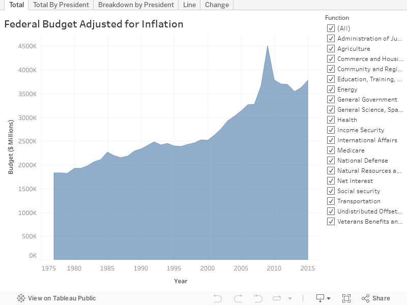
Even after adjusting for inflation, the budget has increased steadily year after year, with the biggest increases coming at the beginning of George W. Bush’s term and continuing through Barack Obama’s term. The biggest spike came in 2009 and can be largely accounted for by the American Recovery and Reinvestment Act of 2009 (ARRA), which added approximately $500 billion (inflation-adjusted) to the budget for that year (the act was largely written before Obama’s inauguration, though he did sign it into law).
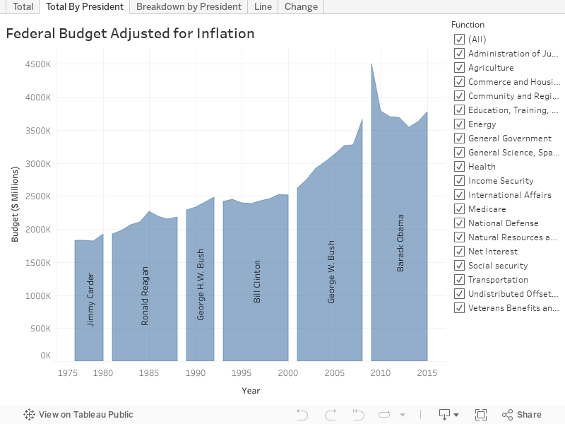
The following chart is a variant of the first, but inserts breaks in order to show the different Presidents.
From here, I began to break down each of the major categories of the budget.
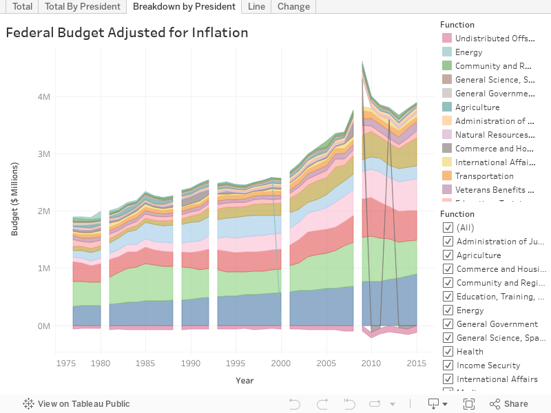
This is where the data starts to get really interesting. A few observations:
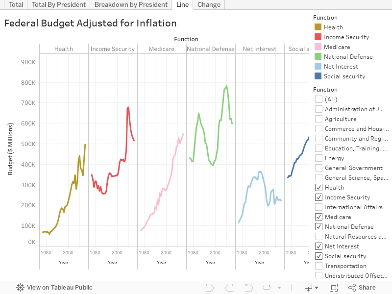
- Defense (Republicans) – Most of the time, Republicans increase spending on National Defense.
- In Reagan’s first year in office, the Defense budget was $469 billion. By 1985, that had grown to $649 billion, before tapering off to $585 billion his final year in office.
- When George W. Bush entered office, the Defense budget was $448 billion. By his last year in office, that number had ballooned to $766 billion, largely fueled by the wars in Afghanistan and Iraq.
- George H.W. Bush seems to have been the one exception. During his four years in office, he reduced the Defense budget from $573 billion to $498 billion.
- Defense (Democrats) – Democrats tend to reduce Defense spending:
- Clinton reduced Defense spending from $461 billion to $418 billion.
- From 2009 to 2015, Obama reduced Defense spending from $771 billion to $598 billion.
- Income Security – Spending on Income Security—housing assistance for low-income families, aid to those with disabilities, unemployment benefits, etc.—remained relatively static through 2000 (its budget was $349 billion in 1977 and $344 billion in 2000). But it began to increase dramatically in 2001, reaching its peak of $678 billion in 2010.
- Social Security – Social Security spending has increased in an almost linear fashion every year, regardless of the President.
- Healthcare & Medicare – Healthcare and Medicare spending has increased almost every year, but like Income Security, began a significant increase around 2001, reaching their peak’s in 2015.
The following line chart provides a different view of some of the big ticket items on the federal budget, including those discussed above:
And here’s one more view of the data. The bump chart below (created in Raw, instead of Tableau), is similar to the area chart, but also shows when one item overtakes another in magnitude. For instance, we can see when Social Security spending bypassed National Defense in 1993 (Clinton), when Defense took back the # 1 spot again in 2006 (Bush), only to be overtaken by Social Security again in 2011 (Obama).
Finally, I wanted to analyze the change from one President to the next. I wondered which party was best at preventing the growth of the budget. It turns out that, while some Presidents do better than others, neither party does a particularly good job. The following chart shows how much each President increased the yearly budget over the course of his term (based on average yearly budget vs. the prior President’s average yearly budget).
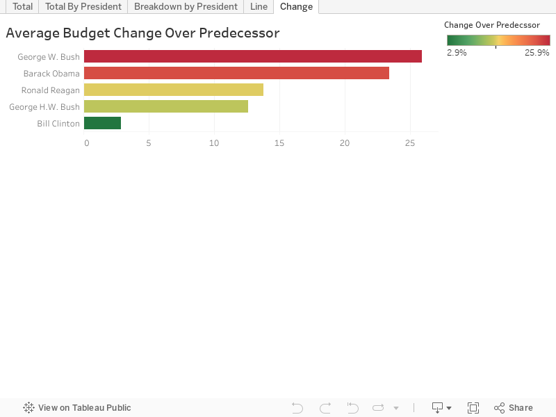
George W. Bush clocks in at a whopping 25.9% increase, with Barack Obama right behind him at 23.4%. Bill Clinton did the best job, only increasing the budget by 2.9% during his eight years in office.
So, what does all this mean? Generally speaking, it is very disconcerting to see the budget increase so drastically, especially over the last 15 years or so. But, there is really no indication that one political party is better than the other at keeping the budget under control. The differences between the parties are not how much they spend, but rather what they spend on, with Republicans favoring National Defense and Democrats favoring social programs.
If you’d like to interact with the dashboard I created, you can check it out on Tableau Public:
Ken Flerlage, September 21, 2016


I'd love to see this updated!!
ReplyDeleteGreat article. If you have the time and desire, would love to see an updated version. Question: Treasury shows in one column as percentage of GDP which is very useful. I ahve looked for a population-adjusted one too, as it is entriely understandable why the budget of a growing population should grow,
ReplyDelete