
The Most Valuable Fantasy Football Players of the Last Decade - Take 2

On Monday, I finished up an analysis and visualization showing what I thought were the top Fantasy Football players of the last decade (here’s the original visualization). Thinking it was good stuff, I decided to share it on Reddit, specifically r/fantasyfootball. Shortly after posting, I saw the views on my blog and the visualization skyrocket. I thought, “Wow! People are really loving this.” Unfortunately, this couldn’t have been further from the truth. When I finally had a chance to check the comments on the post, my heart dropped as I read how awful it was. Their critiques boiled down to a few key issues:
- Active Players Only – I had only included active players (i.e. players who played in 2016). But, with the title indicating the most valuable players of the last decade, this was a bit misleading. What about Calvin Johnson and Peyton Manning who played 9 out of the past 10 seasons, retiring just last year? Can we really analyze the top players of the decade without these?
- No Game Minimum – Two of the top 10 were rookies who had only completed a single season. When stacked up against veterans like Aaron Rodgers and Adrian Peterson, this hardly seems a fair comparison.
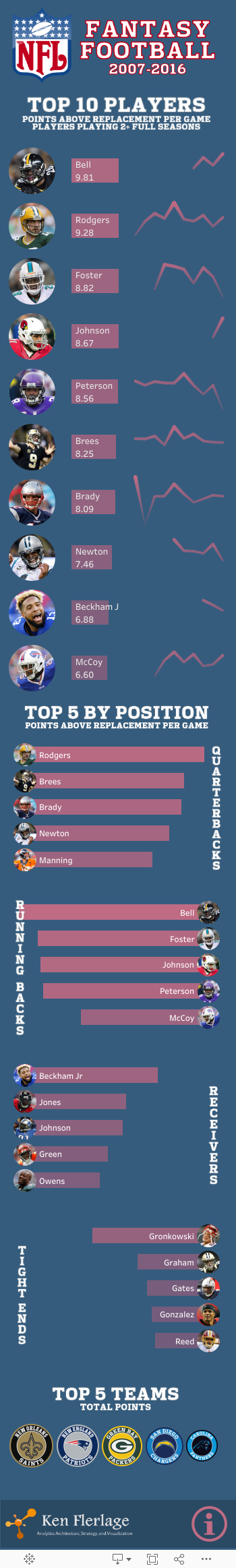
- Poor Metric Choices – The primary metric used on the visualization was points-per-game. The redditors readily pointed out that this is a poor metric as it will always favor high-scoring quarterbacks, but it in no way measures player “value”. They suggested that a much better metric would be Points Above Replacement which is the number of points a player gets above a typical “baseline” replacement player. Since it compares a player’s points to other players, it is a much better metric for measuring true value.
So, once I was able to pick my ego up off the floor, I sat down and took a closer look at my analysis. And, to my dismay, I found that they were right—they were 100% right on every single criticism. The visualization was quite nice visually, but what value is that when I’ve failed to measure what I set out to measure? I’d have been much better off with an ugly visualization with solid analysis. To be fair, I didn’t set out to mislead anyone. I’ve played Fantasy Football casually in the past, but I’m not a serious player, so I thought points-per-game was a good measure (I was wrong and I’ll talk more about this later). Now, having been properly schooled, I went back to my data and gave it another shot, focusing my visualization on Points Above Replacement and removing some of the poorly chosen filters. Here’s the result (as with the original, it is designed for mobile consumption):
Methodology
Hovering over the Information icon at the bottom right of the visualization will provide a bit of detail on the methodology, but I’ll also go into here. I’ll first note that all of my data comes from The Huddle and I used NFL.com’s default scoring method.
A redditor, /u/rbksmart1 was kind enough to suggest a calculation for Points Above Replacement. The calculation itself is as follows:
PAR = Player Score - Replacement Score
Player Score is easily obtained, but we also need to determine Replacement Score. This is a bit trickier, but rbksmart1 suggested the following formulas where “LS” stands for “League Size” (i.e. number of teams in the league).
QB = LS * (QB Slots) + Bench + 1
RB = LS * (RB Slots + 1/2 Flex Slots) + 1
WR = LS * (WR Slots + 1/2 Flex Slots) + 1
TE = LS * (TE Slots) + 1
I had to make some assumptions here, so once again at his suggestion, I assumed the following:
LS = 12
QB Slots = 1
RB Slots = 2
WR Slots = 2
TE Slots = 1
Flex Slots = 1
Once calculated, we find that the 31st ranked Running Back, 31stranked Wide Receiver, 20th ranked Quarterback, and 13thranked Tight End represent our typical baseline replacement player. Note: He also provided formulas for kickers and defense, but I have decided to leave these out of this particular analysis.
From here, I determined the name of the replacement player (based on the points ranks) for each position and each year (most likely different players for each year). I then summed the points over the course of the last decade for each position. Finally, I calculated a per-game average.
Once I had my per-game average replacement player points, I was able to calculate each player’s Points Above Replacement by subtracting the value from their points-per-game (for the given position, of course).
Filters
To address the concerns about my filters, I made a couple of changes. First, I eliminated the “active players only” filter, which will bring in players like Calvin Johnson and Peyton Manning. Second, I added a minimum games filter, which will require a player to have played at least two full seasons (32+ games) for them to be included. This is a bit of a balancing act, unfortunately. Clearly, including rookies makes no sense, but what about two year players like David Johnson who have been amazing in their two years? Though it may get some criticism, I thought that 2 years was a reasonable compromise.
Lessons Learned
While getting something so wrong is not a fun experience, there were many invaluable lessons learned. I’ll share 4 of those here:
- Be Thick Skinned – If you’re going to post your work on Reddit, you better have a thick skin. Reddit is a great community, but people can be brutal. However, the feedback you get will often be the most valuable feedback you’ll ever hear. Get over yourself, suck it up, and use it to make your work better.
- Consult with Experts – Perhaps the biggest issue in my original visualization is that I failed to understand what make a fantasy football player truly valuable. I should have taken a bit more time to do some research or to talk with serious players so that I was better prepared.
- Avoid the Echo Chamber – It’s easy for us to post our work to an audience that we know will praise it. It’s fun to get praise, but this echo chamber never allows us to grow. Find a community who will provide constructive criticism. Without that, your work will never improve.
- Choose the Right Metrics – The most important lesson is to choose the right metrics. The most beautiful visualization in the world is completely useless if your data or metrics are wrong. And, as noted above, if you’re not sure of the right metrics, consult the experts or your clients.
Ken Flerlage, February 13, 2017


I needed to thank you for this incredible read!! I unquestionably adored each and every piece of it. I have you bookmarked your site to look at the new stuff you post. click over here now
ReplyDelete