
The Beauty of Pi

If you read my blog regularly, you’ll know that my work is often inspired by someone else’s work. This post is no different. In September, Jacob Olsufka posted an incredible animation of the digits of Pi.
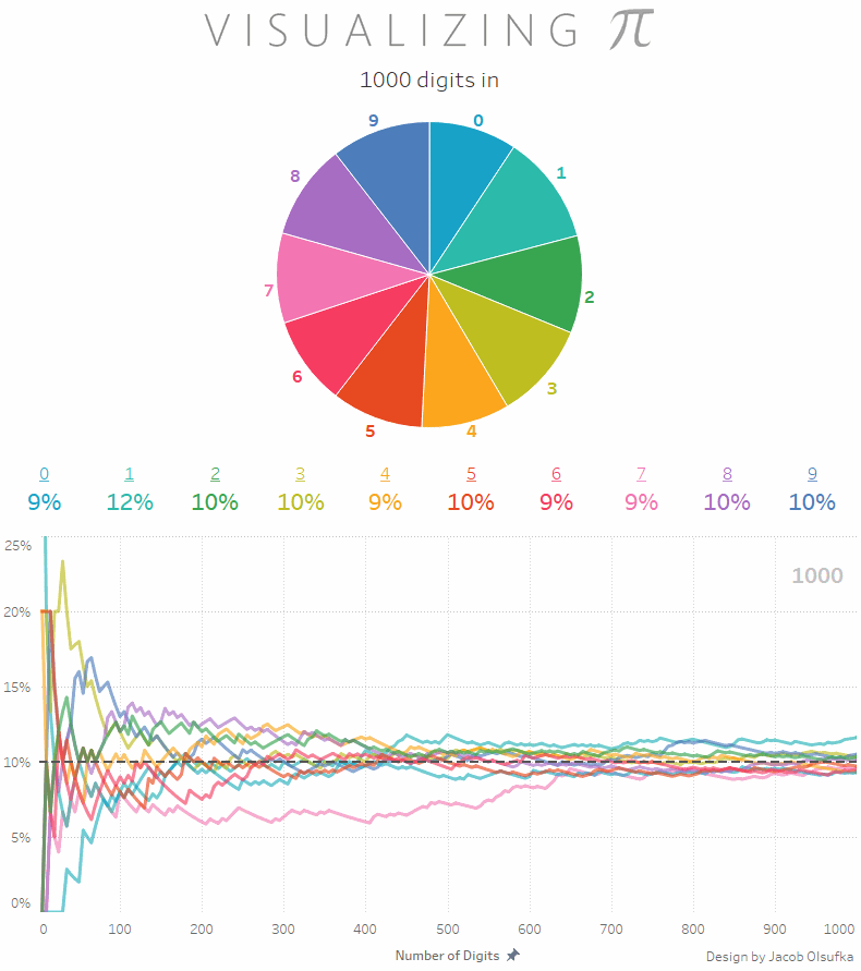
This was based on a Tableau visualization he created, which you can find here. Alas, since pages do not work when Tableau visualizations are published, it doesn’t animate, but it’s still very cool and worth checking out.
Then, a couple of weeks ago, I happened to notice the following background image on Nai Louza's twitter profile.
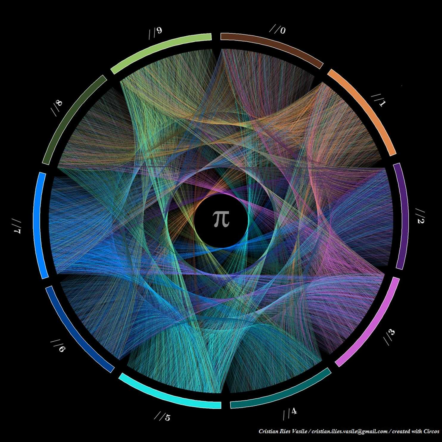
After some discussion about the image with Nai, she referred me to a Washington Post article which detailed some amazing Pi artwork by Martin Krzywinski and Cristian Ilies Vasile, including this image. Each number 0-9 are grouped in their own sections around the circle. The chords (more specifically, Bezier curves) connect each digit to the next. So the first line connects 3 to 1 then 1 to 4, etc. (Pi is 3.14…). They even created a video animating the drawing of the lines over time.
Who knew that a number could be so beautiful!
Creating My Own Pi Art
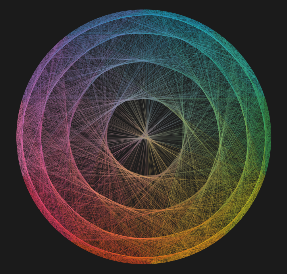
Having seen this, I was inspired to create some of my own Pi artwork based on the work of Krzywinski and Vasile. Starting off, my goal was to see if I could create something close to this in Tableau. I wasn’t entirely sure how their visualization worked and I wasn’t overly concerned about making it exact, but it seemed like a good opportunity to push my skills in Tableau while creating something beautiful along the way.
For my first attempt, I decided to forego the complexity of the curves and just try to build a similar visual using straight lines and it turned out quite nicely.
After creating this, I had a flood of new ideas on how to visualize the digits of Pi. For instance, my next visual created one row of numbers, 0-9, across the top and one row across the bottom, then connected digits in the same way as the circular visual.
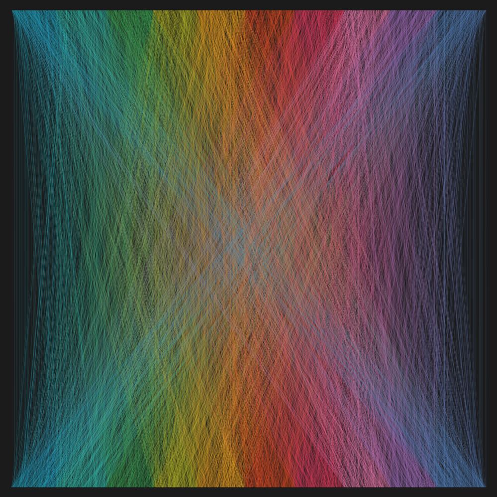
And I kept going, in the end creating a total of eight different pieces of Pi art (pun intended!). Chris Loveeven pitched in, adding a slight variation to my original circular visual. So, now I had a total of nine different visuals, but I still hadn’t attempted to create the one which so inspired me in the first place. In all honesty, I was having so much fun creating these that I think I just wanted to let the creative juices keep flowing, knowing that the curves were going to be much more complex than the straight lines. But, now I was out of ideas, so I figured I’d better get to work on those curves.
Ultimately, this visual would be pretty much the same as my first circular visual, with two exceptions. First, I needed to create a little space between each grouping of numbers. And, second, I needed to connect each digit using a Bezier curve. At that time, I had never used Bezier curve, but I’d done plenty of sigmoids and figured it would be the same basic concept. Not knowing where to start, I dug up some of the work of the king of Bezier curves in Tableau, Chris DeMartini. I dug into his blog posts and samples on Tableau Public and, after a push in the right from Chris, was finally happy with the result. Click on the image to explore all ten visuals yourself. But please be patient—some of these are quite complex and take some to load.

Update 10/29/2017: I couldn't help myself and added one more piece of Pi art, bringing the total number of visuals up to 11.
Ken Flerlage, October 27, 2017
Ken Flerlage, October 27, 2017


Nice!
ReplyDeleteAny chance of a comparison between pi and Euler's number?
Well, probably not. But my guess is that Euler's would look pretty similar.
DeleteBeautiful!. Here is something along the same lines, but in my case I went for the 3d Mesh look and feel - https://public.tableau.com/profile/alexandru.singeorsanu#!/vizhome/BeautifulParametricMeshes/Dashboard?publish=yes
ReplyDeleteI took the liberty of mentioning you in my viz, since I felt inspired by your work.
I actually just saw that in my Tableau Public feed. Very nice!! Are you on Twitter? You should definitely share it there.
DeleteWhat about doing the circular thing in some base other than decimal?
ReplyDeleteWell, this isn't circular, but Jacob Olsufka recently did an exploration of Pi in different bases: https://public.tableau.com/profile/datavizard#!/vizhome/VisualizingPi-indifferentbases/Pi
DeleteLovely! Math can be beautiful. I'm in love with all things Fibonacci.
ReplyDeleteHi Ken,
ReplyDeleteI was really awed with your visualizations. I downloaded the workbook to try to understand the calculations but didnt find any calculations in the workbook. Does this mean that all the calculations are done in the Excel? If so, is it possible for you to share that Excel somehow?
Thanks
Mehul
Some of this was done in Excel. Happy to share further details if you can send me an email. flerlagekr@gmail.com
DeleteThats not bad cary on .
ReplyDelete