
Shapeshifting Tile Maps in Tableau

In the past few days, we’ve seen a resurgence of innovation with hex maps in Tableau. The technique was first developed by Matt Chambers in his post, How To: Hex Tile Maps in Tableau and was based on the square tile map technique developed by Brittany Fong in her post, Periodic Table Map AKA Tile Map. In the two years since Matt developed the technique, it has become ubiquitous in the Tableau community, but recent innovation by Rody Zakovich has turned the hex map into polygons in order to avoid problems with sizing of the shapes (Polygon Hex Map in Tableau) and Joshua Milligan has converted Rody’s polygons to a spatial file in his post, Hex Map Spatial File.
I just love how the community takes one idea and builds upon it. Paired with a platform like Tableau Public, which enables this type of collaboration, it is truly what makes our community great. But, I have to admit that after seeing these four people work together to innovate this technique, I was a bit jealous that I wasn’t part of it. So, I’m going to attempt to add something to the conversation. In all honesty, I’m not entirely sure my technique will be of much value, but it was fun to create, so I’m going to share it with you.
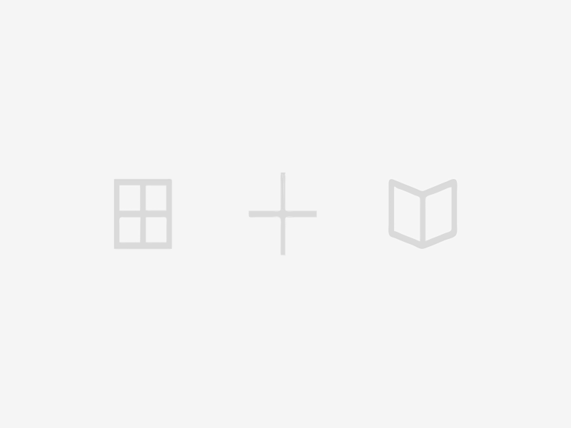
Regular Polygon Maps
Here’s my idea: What if we could create a template that allows you to build a tile map using any type of regular polygon, be it triangles, diamonds, squares, hexagons, octagons, or circles (circles are just polygons with lots of sides). Note: A regular polygon is one that is both equilateral (the lengths of all the sides are equal) and equiangular (the angles are all equal). So that’s what I set out to do.
The basic idea would be that you would use five parameters to build your map:
1. Number of Points – This will specify the number of points on the polygon.
2. Rotation – This will rotate the polygon. So, if you chose 4 points, you’d get a square, but if you rotate it, you’ll have a diamond.
3. Row Offset – In order to aid in tessellation (fitting the polygons together nicely), you may need to move some of your rows to the left or right. For example, on Matt’s hex map, every other row is moved in by ½ in order to make the hexagons fit together. This row offset will allow you to adjust the offset as desired.
4 & 5. Horizontal and Vertical Padding – Sometimes your polygon may seem too large or too small or you may wish to have some padding between them, so these parameters will allow you to adjust the padding so you can get it just right. Note: This is not the same as the issue Rody was trying to address. Once you set these parameters, everything will look the same when you place the sheet on a dashboard.
I’m pleased to say that, after hacking away at it, I was able to get everything working as desired. Here’s a short gif showing the functionality of the tool.

How Does it Work?
I’ve built my sample workbook to act as a template. So, if you’re not interested in the internals of how it was built, feel free to download the workbook, add in your data, and use it in your own projects. You can find the workbook here: Configurable Regular Polygon Maps. But, if you’re interested in the details, keep reading.
If you read my post on creating Geometric Art in Tableau, you’ll remember that I had originally created some artwork using circle shapes (if you haven’t read it, then why not??). But, I ran into similar problems as Rody encountered with the hex map shapes. First, shapes have a maximum size, so that limited the size of my overall artwork. Second, you have to manually size the shapes to get it just right and then make adjustments when you put your sheet on a dashboard. To overcome this problem, I decided to draw each bubble as separate polygons (with 100 points to make it look like a smooth circle) using the parametric equation for a circle. As a bonus, I had used an adjustable bins technique to allow you to change the number of points on each polygon. So, instead of circles, you could change the polygons to squares or triangles or hexagons. Here’s an example showing The Great Wave Off Kanagawa with triangles:
The polygon map uses the exact same technique. Essentially, each shape will be an approximation of a circle with the number of points specified. While you may not think of a square as a circle, strictly speaking, it is an approximation of one, just with 4 points. Thus, the parametric equation for a circle will be all we need to calculate the points of each polygon. Obviously, we’ll be using parametric equations in this process so, if you’re unfamiliar with them, I’d suggest reading my blog, Beyond Show Me Part 3: Parametric Equations.
The Data
Let’s start by taking a look at our data set (you can find the template here: Poly Map Template.xlsx). The data includes two worksheets:
1) Polygons – Defines the center point of each state. This is based on Matt’s original hex map data, with some slight modifications of my own. The center x point is in a field called CX and the center y point is in CY.
2) Range – This has one column with two rows with values of 0 and 100. This will be used to create our bins, which we’ll use for determining the points of each polygon.
Onto Tableau
Now let’s build it in Tableau using the following steps:
1) Connect to the Data
Connect to the spreadsheet then join Polygons and Range using a join calculation, 1 = 1.
2) Create Parameters
Create the parameters I discussed earlier:
Number of Points – Integer with values ranging from 3 to 100. If you like, you could limit the number of options further using a list, as polygons with more than 20 or so points look pretty much like a circle. In my case, I’ve limited it to 3, 4, 5, 6, 8, 10, 15, 20, and 100.
Rotation – This will be the rotation in degrees, so this should be an Integer with values from 0 to 360.
Row Offset – Float with all allowed values. Typically, you’ll want this to be either 0 or 0.5.
Horizontal Padding – Float with all allowed values.
Vertical Padding – Float with all allowed values.
3) Calculations for Adjusted Center Points
CX and CY define the default center points of each polygon, but we’ll need to adjust them to account for the row offset and the padding. So, create the following calculated fields:
Center X Adj
IF [CY] % 2 = 1 THEN [CX]+[Row Offset]+([Horizontal Padding]*([CX]+[Row Offset])) ELSE [CX]+([Horizontal Padding]*[CX]) END
The map will have a reversed y-axis, so our first row at the top will be row 0 (Alaska & Maine). Every other row, starting with 1 (Vermont and New Hampshire) will be affected by the Row Offset, so the calculation above will make those adjustments for odd numbered rows. All rows will receive the adjustment for horizontal padding.
Center Y Adj
[CY]+([Vertical Padding]*[CY])
There is no offset for the y-axis, so the calculation to adjust the Y center point is a bit simpler.
4) Create Adjusted Bins
Range, which will have values 0 and 100 will be used to create bins, which will then be leveraged in the plotting of each polygon point. However, we want the number of points to be adjusted based on what we’ve specified in the Number of Points parameter, so we’ll need to first create a calculated field called Range Adjusted with the following calculation:
[Range]/(100/[Number of Points])
Then we’ll create bins on this field with a size of 1.
4) Parametric Equations Calculations
Next, we’ll need to deal with the parametric equations. For this, we’ll need to determine our value of T, then use it to calculate X and Y. First, we’ll create a field called Index with the formula:
Index()
As discussed in my post on Parametric equations, the ideal range of values for T when creating a circle are 0 to 2π. So, our formula for T will be:
[Index]*6.28318/[Number of Points]
Next, we’ll use T to calculate our X and Y coordinates:
X = WINDOW_AVG(AVG([Center X Adj])) + COS([T])*COS(RADIANS([Rotation])) - SIN([T])*SIN(RADIANS([Rotation]))
Y = WINDOW_AVG(AVG([Center Y Adj])) + COS([T])*SIN(RADIANS([Rotation])) + SIN([T])*COS(RADIANS([Rotation]))
These calculations use the standard parametric equation for a circle with some slight adjustments to account for the rotation and each polygon’s center point.
5) Plot It
Now we’ll plot it in Tableau:
A) Drag State and Range Adjusted (bin) to the Detail card.
B) Remove the auto-generated Latitude and Longitude from the Rows and Columns shelf.
C) Drag X to the Columns shelf and Y to the Rows shelf. They will become table calcs. Change them both to compute using Range Adjusted (bin).
D) Reverse the y-axis. You should now have something that looks like this:

E) Change the chart to Polygon.
F) Drag T to the Path card.

From here, you can add your sheet to a dashboard, adjust your parameters as desired, and blend the data with your own data set. And that’s all there is to it!! Here’s my final version using the Superstore data set. Click on the image to interact with the visualization and play with the different options.

Again, I’m not sure that there’s a lot of utility to this, but if you use it, I’d love to see what you create.
Update, 12/23/2017: Using this methodology and the coordinates I developed for a square tile map of Africa, I also generated a version of this tool for Africa. You can see the visualization here: Africa Shapeshifting Tile Map
Update, 12/23/2017: Using this methodology and the coordinates I developed for a square tile map of Africa, I also generated a version of this tool for Africa. You can see the visualization here: Africa Shapeshifting Tile Map
Ken Flerlage, December 22, 2017


Great work done, I really love to appreciate your hardwork to make this blog very informative. Currently I am using my Scratch Off Map which I bought from an Amazon Store. Thanks.
ReplyDeleteso can you add labels to it.. I dont see how.
ReplyDeleteRody Zakovich has an approach that should work. See http://www.datatableauandme.com/2017/12/polygon-hex-map-in-tableau.html?m=1
Delete"join Polygons and Range using a join calculation, 1 = 1" makes no sense. Can you explain this?
ReplyDeleteTake a look at the Cross Join section in the following. Hopefully that will clear it up. If not, let me know. https://www.kenflerlage.com/2018/09/sql-part2.html?m=1
DeleteLove you website! I found it through Zen Master: The "Tableau Twins" Take You Beyond Show Me video.
ReplyDeleteI tried downloading the template here from your tableau public website however, when I try to join the migrated data to my excel sheet, it gives me the error code below.
An error occurred while communicating with the data source
Invalid table name value
Error Code: 38346B5C
Invalid table name value
The table "[TableauTemp].[Hex$]" does not exist.
How do you recommend navigating this?
That was a fun presentation!! That error is so frustrating. Any chance you could send me an email with the workbook and the data set you're trying to use? flerlagekr@gmail.com
Delete