
Custom Tile Cartograms in Tableau


A number of people, including myself, had been using Tableau to visualize our own election projections, so this method came in quite handy. Just recently, I started wondering how we might be able to create custom tile cartograms based on our own data sets. Then I discovered a utility called Tilegrams, which allows you to do just this. So, in this post, I’m going to take you through the process of generating your own and visualizing it in Tableau.
Tilegrams
Before we jump into the how-to, let’s start with some details on the Tilegrams tool. Tilegrams is an open-source web-based utility, developed by the data visualization studio, Pitch Interactive. It allows you to create custom hexagon-based tile cartograms. It comes with some pre-loaded base maps(United States, Germany Constituencies, France Regions, and France Departments), four tilegram options (Pitch Electoral College, Pitch Electoral College 2016, FiveThirtyEight Electoral College, NPR 1-to-1), and some pre-loaded data (population, electoral college, GDP). When you combine these three together, you’re able to generate a custom tile cartogram. For instance, here’s one showing US states by population, where each hexagon represents 1 million people.

But, in addition to the preloaded options, the tool allows you to upload your own data—it also allows you to upload your own custom tilegrams, but we’re not going to get into that here—which means you can create a completely customized tile cartogram. Now let’s talk about how to create one and visualize it in Tableau.
Creating Your Tile Cartogram
1) Go to the Tilegrams web site: https://pitchinteractiveinc.github.io/tilegrams/. (Note: I’d strongly recommend reading the manual before jumping into these instructions as it has some very useful information.) From here, you can select your base map, tilegram, and data.

2) To use your own data, select the “Custom CSV” option in the “Generate from data” section. The app will show you some sample data, then provide a box for you to upload your own comma-separated data.

3) Tilegrams expects the CSV data to include two columns. You can have more than two, but all others are ignored. The first column must be the “Geo ID” and the second must be the measure/value. For the United States, the Geo ID is the state FIPS code (you can find a list of FIPS codes on the US Census website). Once you’ve combined the FIPS codes and your measure into a comma-separated format, paste it into the box provided, then click Submit.

4) You can now adjust the “Resolution” (the number of values represented by each hexagram). For example, the population map generated earlier had a resolution of 1 million.
5) Automatically generating this type of cartogram is complex, even for computers. Unfortunately, the Tilegrams utility is imperfect and will generally struggle to create a geographically-sound map that includes all the tiles you need. So, scroll down on the left panel and, under Refine, it will show each state along with its “surplus/deficit” (the number of tiles too few or too many). To remove tiles, click on a tile and press Delete. To add new tiles, click and drag a tile from the left panel onto the map. And, to move tiles around, simply click and drag them to an empty spot. Be sure to address the surplus/deficit for each state or you’ll end up with an incorrect map.
6) Finally, we’ll export the map. Two export options are available, TopoJSON and SVG. Since I’ve been doing a lot with SVG’s lately, my first thought was to parse the SVG files, but I found that the state information is not encoded in the SVG so it would be a manual process to link each polygon to a state. Plus, TopoJSON is a bit easier to work with. So, choose the Export to TopoJSON option. Note: TopoJSON is an extension of GeoJSON which includes topology.
7) But there’s a problem—Tableau cannot read TopoJSON. However, I found that TopoJSON can be converted to a few different Tableau-readable spatial formats including GeoJSON and ESRI Shapefile. So, head over to the web-based utility, MyGeodata Converter. Upload your TopoJSON file, then select your output file format (I chose Shapefile, but Tableau can read many of the available formats).
Visualizing in Tableau
1) Connect to your spatial file.
2) Drag Geometry to the Detail card.

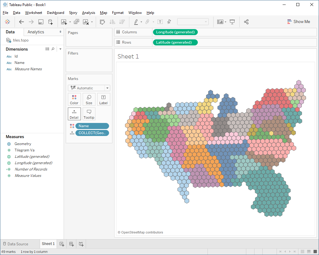
3) Unfortunately, each hexagon is essentially its own polygon and there’s no easy way to draw lines separating each state. So, we’ll use color for that. The field, Name, will have the state name, so drag it to Color.
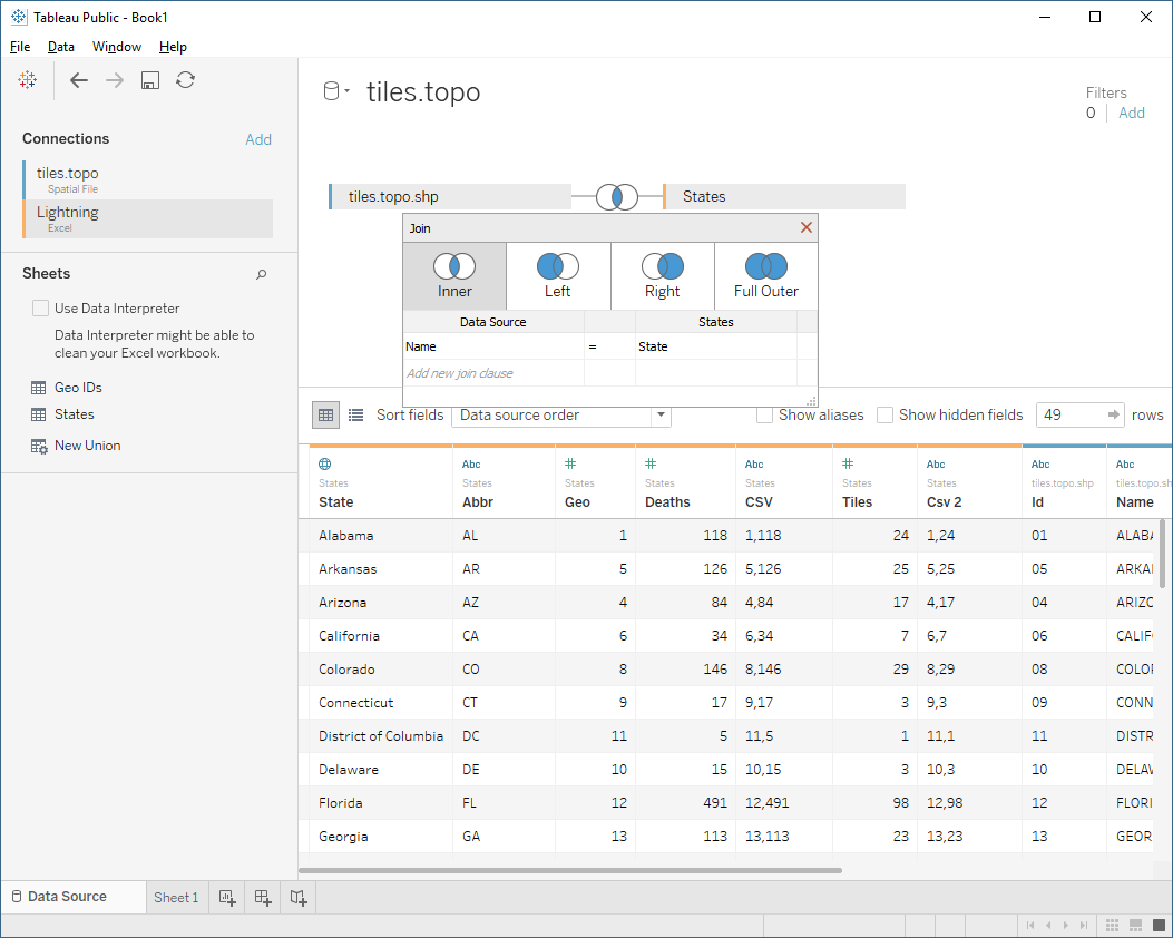
4) Your measure value does not get encoded into the spatial file, so most likely, you’ll need to add another data source and join it to your spatial file, as shown below:
And that’s all there is to it. To demonstrate the process, I used a data set from the National Oceanic and Atmospheric Administration to create the following visualization showing fatalities from lightning strikes in the US. Click on the image to view the interactive version.

I should note that, when published to Tableau Public, I found that the hexagons can be somewhat distorted. I’ve reported this to the Tableau team and I’m guessing they’ll have a fix for it soon, but even so, I kind of like the effect, so I’m totally okay with it.
If you use this method to create any custom tile cartograms, please let me know. I’d love to see the results!!
Ken Flerlage, December 16, 2017


Hello Ken,while we click on the link of MyGeodata Converter then the website displays an invalid request.Could you please again share the link of MyGeodata Converter?
ReplyDeleteTry now.
DeleteThanks for the blog Ken. I converted the Topo json file to shapefile and then connected it in tableau but the geometry field is null. Can you please help in fixing the error?
ReplyDeletePlease email me. flerlagekr@gmail.com
Delete