
A Template for Creating Sunbursts in Tableau

In this post, I’ll share a template for creating sunburst charts in Tableau. This template is based on the original work of Bora Beran and a subsequent blog by Toan Hoang, both of which have given their permission for me to use their work in this blog. Of course, it's likely that others have also created sunbursts in Tableau whom I've missed here. If that's the case, my apologies. My goal in writing this blog is simply to help make this chart more accessible to a broader audience of Tableau users.
Before I jump into sunbursts, however, I want to give a bit of background in case you didn’t read any of my previous posts. If you did read them, then feel free to skip right to the sunburst chart section as this is mostly a repeat of what I’ve already shared.
Before I jump into sunbursts, however, I want to give a bit of background in case you didn’t read any of my previous posts. If you did read them, then feel free to skip right to the sunburst chart section as this is mostly a repeat of what I’ve already shared.
Templatizing Complex Charts
Unfortunately, some chart types can pretty difficult to create. They tend to include data scaffolding, data densification, unorthodox joins, table calculations, trigonometry, etc. So when I create one of these, I find that it's very helpful to templatize them as much as possible. These templates typically consist of a relatively simple Excel spreadsheet into which some data can be plugged and a Tableau workbook, which simply connects to the spreadsheet. In the end, the process becomes relatively plug-and-play.
While having a plug-and-play template can be valuable, I still want to encourage you to drill into these chart types further. Taking apart complex charts is a really good way to learn some of the more advanced features of Tableau, so I highly recommend that you to take some time to understand how these work under the covers.
Sunburst Charts
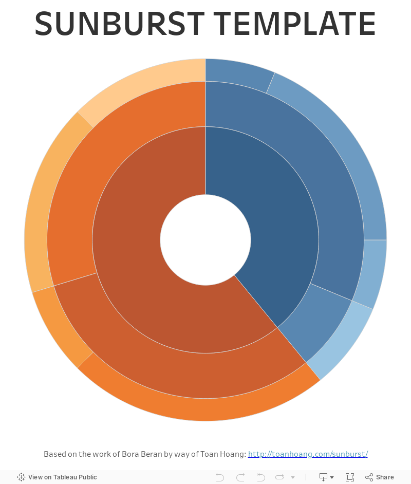
A sunburst chart is really just a treemap which uses a radial layout (thus the alternative name, “Radial Treemap”). Sunbursts are a series of rings, which represent the different hierarchical levels. The innermost ring is the first level, followed by the second level which shows a breakdown of the components of the first, and so on. Like the more common rectangular treemap, the size of each sections represents the magnitude of some measure.
The key use case for sunbursts are visualizing hierarchical data. In general, I feel that other types of treemaps, specifically rectangular treemaps and icicle charts (see Adam McCann's blog for more details on icicle charts), are much better for visualizing hierarchies than sunbursts. And, sometimes, a series of bar charts can be even more effective than all of the above. But there are times when sunburst could make sense for your particular use case. Plus, there is definitely something aesthetically pleasing about circles.
Implementation in Tableau
To my knowledge, the first person to implement sunburst charts in Tableau was Bora Beran, in his blog post, Radial Treemaps & Bar Charts in Tableau. In a subsequent blog post called Sunburst, Toan Hoang dug into a Bora's sunburst chart in a bit more detail. I've relied heavily on Toan's blog here, while adding a few additional things to help automate some manual steps, particularly in the data prep side.
The structure of a sunburst chart in Tableau is quite beautiful in its simplicity—each section of the sunburst is its own polygon, which are sized based on proportion of the whole. Since each polygon is drawn in a circular fashion, the calculations used to generate the polygons rely heavily on trigonometry. Building these polygons also requires data scaffolding and some relatively complex table calculations, which I won’t go into here.
The Template
This template includes two components—an Excel spreadsheet and a Tableau workbook, designed to make it as easy as possible to plug in your own data. That being said, it does make certain assumptions. First, it assumes that you have already aggregated your data. Second, it assumes you have a complete hierarchy (i.e. the sum of all values in one level of the hierarchy equals the sum of all values in all other levels of the hierarchy). Adjustments can be made to handle divergent use cases, but I won’t be addressing them here.
Since sunbursts show hierarchical data, it has a sort of recursive nature to it. Data on one record sums up to data on another record. This definitely adds some complexity when building an Excel template and, ultimately, there were many different directions I could have taken. To be totally honest, I’m not sure that the approach I ended up taking is the best, but I’ll let you be the judge of that.
The Excel spreadsheet (you can find it here) has three sheets: Data, Widths, and Paths.
Paths is used to handle the data densification needed to build the polygon arcs, but you need not worry about how it works. You won’t need to modify it—just make sure it’s in your spreadsheet.
Paths is used to handle the data densification needed to build the polygon arcs, but you need not worry about how it works. You won’t need to modify it—just make sure it’s in your spreadsheet.
The Widths sheet defines the widths of each level of the sunburst. It has three columns:
Level – This is the level of the hierarchy and will join to the Level field in the Data sheet.
Distance – This is the distance from zero where the level will start when you plot the x/y coordinates. In other words, this defines the size of the innermost circle of each level.
Width – This defines the width of each level. Many times, you’ll want the levels to be the same width, but in some cases you may not, so this provides some flexibility.
You’ll want to fiddle with these options until they look the way you want. Generally, you’ll only need to update Distance for the first level then enter the Width of all three levels. The remaining distances will calculate automatically based on the first distance and the widths of each level. Note: The yellow highlights indicates that the value is calculated within Excel.

The Data sheet will be used to populate your pre-aggregated data. It contains just seven columns. You can add more if needed, but these are the seven that are required by the Tableau template. The columns are as follows:
Join – The purpose of this column is simply to join each row in the Paths sheet to each row in Data sheet for the purpose of creating the polygon arcs. But don’t worry too much about this. You simply need to make sure that every row has a value of “link” in this column. Note: Strictly speaking, we could use a join calculation in Tableau to join these sheets together, but for simplicity sake, I often like to include a separate column in my data set.
Level – This column defines the level of the hierarchy (1, 2, 3, etc.).
Component – This column describes the component or element we are visualizing.
Parent – This column includes the hierarchical parent of a component. Except for level 1 components, this must link directly to an existing Component (by definition, level 1 components have no parent).
Lowest Level Value – This column contains the aggregated value to be visualized, but only needs to be populated for the lowest level of your hierarchy. By “lowest,” we are referring to the most detailed level of the hierarchy. So, if your hierarchy has three levels, then you’ll need to populate this column for level 3 only. All others will be calculated automatically by summing based on parents.
Value – This column contains an Excel formula that will sum up the values based on parent. You should not modify the formulas in this column.
Sort – This column defines the order in which the sections will be visualized and is critical to ensure alignment of one level to the next.
To populate the Data tab, enter your aggregated data, for each level, into the Level, Component, Parent, and Lowest Level Value fields. As you enter this data, be sure that you order your records in a consistent manner from one hierarchical level to the next. For example, if your first level contains Office Suppliesthen Technology, be sure that your second level starts with components whose parent is Office Supplies, then move onto components whose parents is Technology. As you populate the spreadsheet, you’ll notice that Valueis automatically calculated. Finally, once all your data is populated and ordered as desired, simply populate the Sortfield with 1, 2, 3, 4, etc.

Once you have populated your data, you’ll need to connect it to Tableau. Start by downloading the Sunburst Template workbook from my Tableau Public page. Then edit the data source and connect it to your Excel template. The workbook should update automatically to reflect your data. From here, you can do whatever you like with the chart—change the colors, add filters, update tooltips, etc. just as you normally would. Here’s how it looks with the sample data shown above.
Single Axis Donut
In addition to sunbursts, this method can also be used to create a single-axis donut chart. I recently came across a question on the Tableau Forums which noted a problem with with the most common implementation of a donut which includes a pie chart on one axis and a circle on the second axis, which sits over top the middle of the pie. The forum post noted that, when you hover over or click on a pie slice, you get the following effect.
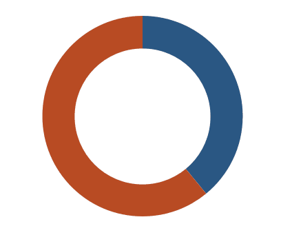 A solution to this is to float a blank over top of the donut after you've placed it on a dashboard, but that eliminates the possibility of interactivity. So, one potential solution for this is to use a sunburst. In this case, the sunburst would only have a single level. The data would look something like this.

The resulting donut will not have the same issues as the pie-based donut, as you can see below.
 And that’s all there is to it. If you use this template to create your own sunburst, I’d love to see it. But please don’t create one simply because you can. Be sure to closely scrutinize your use case and make sure it’s the right chart type first.
The resulting donut will not have the same issues as the pie-based donut, as you can see below.
Ken Flerlage, June 19, 2018
Twitter | LinkedIn | GitHub | Tableau Public


Thanks for sharing your knowledge, Ken. One question - what if a Level 2 component has more than one Level 1 parent? For example: Level 1 is Sales Regions (West, East, South, North) and Level 2 is different sales items (Printers, Fax machines, Copiers). Printers are sold in West and East regions, and thus can have more than one parent component. Would you need to create 2 rows for Printers, and other components with more than one parent?
ReplyDeleteAh that's a good question. Yes, you'd just need separate rows for each parent/child relationship. But, if parents are duplicated (e.g. Printers have another level of detail) then that'll be a problem since the Excel template uses the parent to calculate the total "value". In that case, my recommendation would be to make sure all of your parents have a distinct value in the "Parent" field. You could then create another set of fields you call "Label" or something like that, which is what you actually display on the workbook, tooltip, etc. Hope that makes sense.
DeleteExcellent!
ReplyDeletethis is really great, is there an explanation for how to introduce more than 3 layers?
ReplyDeleteYes, you'd need to add more rows to the bottom. For instance, if you had to add a 4th level, you'd add rows to the bottom with "4" in the Level field. You'd then fill in the Component and Parent (which would link back to a level 3 component). You'd also need to copy the formula for the Value field from an existing row on the spreadsheet. Finally, you'd want to clear out the values in level 3 of "Lowest Level Value" as that should only be included on the most detailed level (in this example, level 4). It'll require a bit of Excel work, but nothing too crazy. I'm happy to work with you to add additional levels, so feel free to reach out to me.
DeleteHi, I've done this - your blog is amazingly clear - but when I try and import the data it will only import Levels 1-3 (I have 5). It works beautifully for levels 1-3! Is there anything I need to specify at the Tableau end to get it to work?
DeleteDid you also update the "Widths" tab in the Excel spreadsheet? You'd need to add those additional levels there too? (sorry, I forgot that part)
DeleteHi Ken, Thank you this is super helpful!!
ReplyDeleteWhat do you suggest for dealing with data where not all the parents have same children level, meaning that the outer layers don’t end up being a circle, like on your linkedin post on religion data.
(https://www.linkedin.com/pulse/visualizing-hierarchies-using-religion-data-ken-flerlage/)
Thank you!
Good question. There are solutions out there, but it would break by Excel template. One solution is to include "Other" in there to complete the hierarchy.
DeleteHi Ken, Thanks for sharing your knowledge. It is really helpful. Is there any explanation on calculated fields created for Sunburst.
ReplyDeleteThanks.
This blog was meant to just provide the template, but you can check out the blog by Toan Hoang which I referenced, as he goes into more detail about the calcs: http://toanhoang.com/sunburst/
DeleteHi Ken, Thanks for this post. I do not have field called 'Path' in the source. Please advise how can I make use of this template without this field.
ReplyDeleteThanks.
Could you reach out to me directly via email? flerlagekr@gmail.com
DeleteHi Ken, Thanks for this post. I have downloaded the tableau file and trying to recreate the same using my data. In your data source, You have mentioned about one column called 'Lowest level value'. Please let me know where have you used it in your published Tableau file.
ReplyDeleteThanks
That field is not used in the Tableau workbook. It is used in the Excel workbook in order to calculate "Value" which is used in Tableau.
DeleteHi Ken,
ReplyDeleteThis was a very helpful tutorial! I'm trying to add Labels to my sunburst graph that will show up, but as the sunburst is a polygon the Text box on marks is grayed out. I've tried some work arounds (Such as adding a second axis with a gant or text mark type) that work on map Polygons, but then the entire chart disappears. Do you have any advice for this?
Thanks!
Labeling polygons is definitely difficult. Why exactly do you want labels? In my opinion, they can often make a chart like this very difficult to read, particularly if there are a lot of different sections.
DeleteIn this case, we're both presenting sharing the published Tableau, and printing "leave-behinds" that we'll want to be labelled. However, upon further digging I was thinking of making use of the transparent worksheet options that is present in the latest desktop version, and layering to only create the labels I want. Thank you!
DeleteI'm unable to open your workbook because of version compatibility and my organization is still working off of tableau 10.5. Would you be willing to export the sunburst template workbook as a downgraded version (10.5) and share? Much obliged!
ReplyDeleteHere's a version in 10.5 format: https://www.amazon.com/clouddrive/share/RBEiiofjiq7vyuPgxds4MeOP2Ail4FAmK42A7o7Mxv7
DeleteIs there a version available for 10.2 ???
DeleteSure. I've just uploaded a 10.2 version which you can find here: https://www.amazon.com/clouddrive/share/sBJnP0xvZEJUElny97szTEcc4zw4UTl4wYr6BtBL6Sw
Deletehi! Thank you for this tutorial. I am trying to visualize my family tree and it works fine. Just one question: how can I show labels? It is inactive in the tableau workbook. "Component" in the excel template contains the names I want to show. Thank you!
ReplyDeleteLabels can be very difficult with polygons. Would you be able to send a sample of your workbook to flerlagekr@gmail.com so I can take a look and potentially provide you with a solution?
DeleteHi Ken,
ReplyDeleteThanks for the great template! I have got one question: Is it possible to color the segments based upon a measure?
I would like to change the coloring of the parts based upon the Value. But when I remove Component from the color marks card and try to replace it with something else, the sunburst breaks (the X and Y calculations turn red). Do you know any solution to this problem, or can you explain why this problem occurs?
Thanks a lot!
Component is required by the table calculations used throughout the visualization, so you can't remove it. Instead, click the icon to the left of the Component pill and change it to detail (instead of color). Then you'll be able to drop Value on the color card.
DeleteHi Ken,
ReplyDeleteThank you for great post!
Can we apply filters on the view? Filter field which is not not in view (parent , child) or hierarchy ?
Example: There is no Region in the view. It would be great if we can filter the view data based on Region (though Region not required/there in view).
Regards,
Hari
Sure you can do that. But be aware that this uses FIXED LODs so you may need to add those filters to context for them to work properly. If you are having trouble, feel free to email me and we can chat offline. flerlagekr@gmail.com
DeleteHello Ken! Thanks for an awesome template! Has this ever been solved? I think I'm struggling with a similar filter, but for range of dates (there are pre-calculated daily values in my dataset so user can aggregate them dinamically on period they need)
DeleteI'd need to know more. Can you contact me? flerlagekr@gmail.com
DeleteHello Ken - Thanks for this awesome idea. I don't have any level , just a straight data For exp Plant, case% counted, case% renaming, Reserve% counted, Reserve% Remaining, Pick% counted & pick% remaining. I want each burst layer for case, Reserve & Pick ? how can I actually do it.
ReplyDeleteHello Ken - Thanks for this awesome idea. I don't have any level , just a straight data For exp Plant, case% counted, case% renaming, Reserve% counted, Reserve% Remaining, Pick% counted & pick% remaining. I want each burst layer for case, Reserve & Pick ? how can I actually do it.
ReplyDeleteAlso how can I reduce the size of the Burst chart and enable Label and Size ?
ReplyDeleteIt's hard to talk back and forth via these comments, so it might be best if you emailed me at flerlagekr@gmail.com
Deletehow can we get Category Displayed on the chart? Not just the hover tooltip.
ReplyDeleteYou mean like a label?
Deleteyes, Label is what i meant.
DeleteI typically recommend not trying to label a sunburst, if at all possible. It can be tricky with polygons in Tableau and often hurts readability.
DeleteThank you, Ken. I am really fascinated by these unusual diagrams like Sunburst or Sankey. I usually built them from scratch though, that's why this blog has been very handy. I appreciate the way you present the information, that is why I decided to reach out with question.
ReplyDeleteI'm currently working on a project where there is a need to remove the first level(s) if the number of its alias is 1. What do you think, is it possible to make the levels dynamic (based on, let say, the differences in security access to the data we connect to - some users see fewer info therefore have fewer alias as a result)?
That might be possible, but I'd need to better understand the data and the use case. Is there any chance you could email me at flerlagekr@gmail.com and include some details about what you're trying to do along with some sample data?
DeleteI emailed you a sample, thank you.
DeleteHi Ken,
ReplyDeleteThank you for this amazing post, can sunburst chart be controlled with a date filter.
Thanks,
Megha
You should be able to use date filters, yes.
DeleteHi Ken, thanks for your blog, while adding other field to the tooltip it is reflecting null. How can we add another field in tooltip?
ReplyDeleteCould you send me an email? flerlagekr@gmail.com
DeleteI have mailed you Ken.
ReplyDeleteThanks,
Shreyash
Hello Ken,
ReplyDeleteI want to add some fields to the tooltip but while adding the field it is reflecting null. Could you please help me to fix the error?
Hey Ken,
ReplyDeleteCool blog post. I have been messing around with the workbook, and would like my final layer to show just a fragment of the total (i.e. if there are 100 datapoints, and layer 2 categorizes all 100 to show a complete second layer, layer three will only show one component branching off from one component of layer 2 with 10 datapoints). If I don't include components in level 3 that sum to the total, my last layer goes a bit haywire. Any ideas?
Cheers!
This template doesn't work well in those situations, unfortunately. The simplest approach would be to fill in the rest and then just color those sections the same as the background, but that's less than ideal.
DeleteHi Ken,
ReplyDeleteAmazing tutorial, I have almost got this working however, when I replace the excel file with my data there are a few components that seem to go missing (i.e., the outside rim doesn't make its way 360 degrees around the outside due to the missing rows). These rows that are missing appear in the data source/data preview page, but just aren't being included in the chart. I checked the component field to see if they were filtered out and it is as if they do not exist in the component field. Sorry for the long comment, just wondering if you have seen this issue before? (For context, my levels split in thirds at each iteration, so 3 sections on level 1, 9 on level 2 and 27 on level 3)
Thanks!
Could you email me? flerlagekr@gmail.com
DeleteThanks for sharing, this is great!
ReplyDeleteHi Ken,
ReplyDeleteGreat tutorial! This is exactly what I need and beats out the 'many pie overlay' method as far as clearly displaying selected hierarchies.
But I wonder whether it is possible to use sets or groupings with parameter and highlight actions to highlight sections across hierarchy levels e.g. licking an innermost parent category can highlight all of their children, but then second-tier categories only highlighting their specific children (or even the outermost children highlighting their specific parents if they span across categories)?
I've been trying to crack it with actions and parameters but your template is rock solid and doesn't let me slip a fast one by it.
Do you have any recommendations?
Cheers,
Matt
I can't think of a great way to do this, unfortunately--at least not with the way the data is set up--because it would require us to be able to recursively run through all the different levels to see if they are related in some way. While possible, it would likely require a completely different way of modeling the data.
DeleteHello Ken,
ReplyDeleteLove the post! I currently have a situation where I need to have different targets based on a selection on a filter:
Originally, I have a donut chart showing the progress of the revenue against the target (for example: the target for 2023 is $100M, and currently it's at $12M). What I did for this was use a calculated field: 100000000-SUM([Actual Revenue]).
However, now the Actual Revenue has a new column [Type] in the raw data to determine between whether the revenue belongs to Team A or Team B, and so now there is a filter [Type]. Team A and Team B have different Revenue Targets (e.g. Team A=$80M and Team B=$20M, and they all fall under the Grand Target of $100M).
So now the problem I'm encountering is when I try to select Team A and Team B, the donut chart will stay at $100M regardless, but I would like the pie chart Target to change to $80M when Team A is selected, $20M when Team B is selected.
I've tried a CASE calculated field to define the Target first where:
CASE [Type]
WHEN 'Team A' THEN 80000000
WHEN 'Team B' THEN 20000000
END
But it doesn't seem to work when I drag it onto the chart, the target numbers become astronomical. (Measure Values field are: 1) SUM(Actual Revenue) 2) SUM(Target - Actual BR))
Do you have any ideas where I've gone wrong?
Many Thanks,
Rafter
Probably best to email me. flerlagekr@gmail.com
Delete