
Creating 538’s Election Prediction Chart in Tableau 2018.3

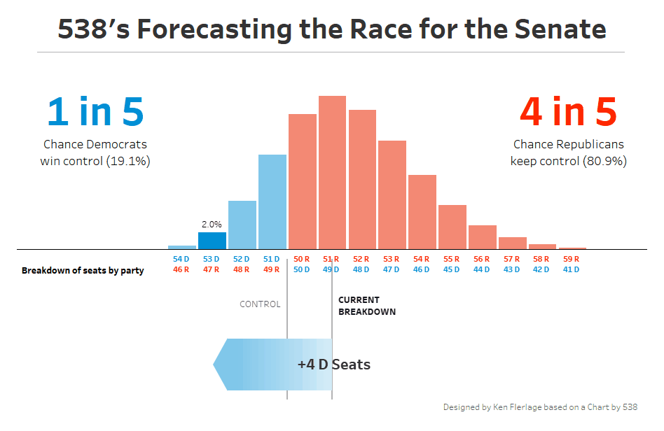
Nate Silver’s 538 site always has great visuals and the November US mid-term elections was no exception. As I was catching up on their pre-election projections, one chart in particular caught my eye.
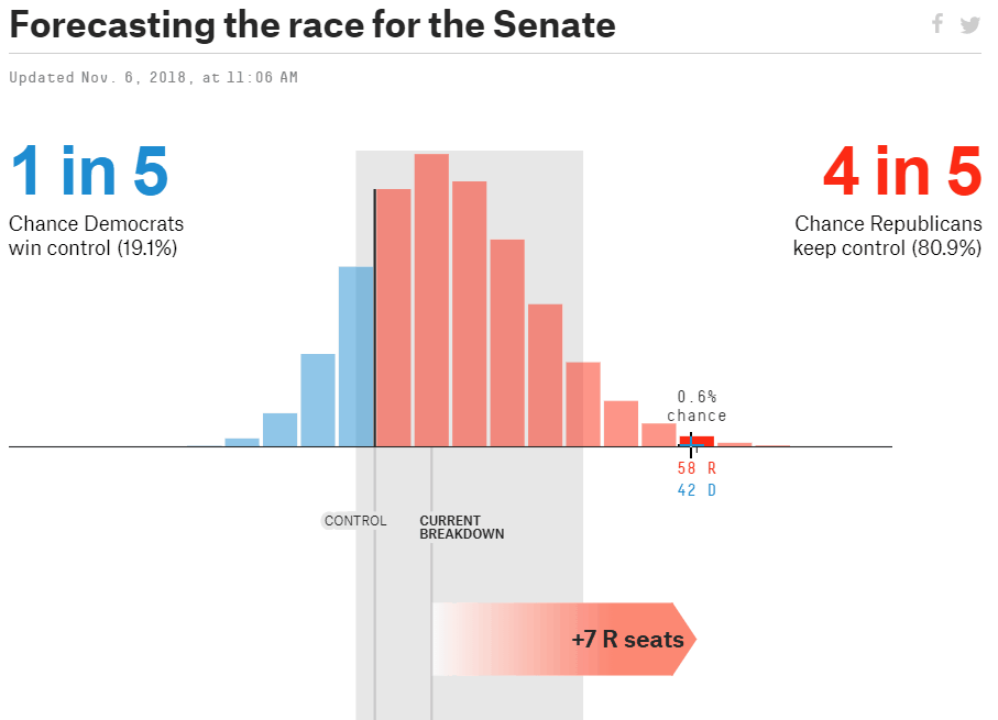
The chart shows the chances of different outcomes of the election, based on their predictive models. There were a number of things I loved about the chart, including its general simplicity, its colors, and the actions that occur on hover. So, being a Tableau guy, I just couldn’t resist taking a shot at creating it in Tableau.
Creating it in Tableau
Let’s start by breaking the chart down into its key components and functionality. The main component is the bar chart that shows the chances of different splits of seats won by Republicans and Democrats. This is pretty simple to create, but the bar chart has a number of other more complex features:
1) Hovering over the bars cause them to change colors.
2) Hovering causes labels to appear above the bar showing the 538’s predicted chances.
3) Hovering causes an arrow at the bottom to grow, showing which party would be gaining seats and how many.
While all of these features were very nice, the last was the one that most caught my attention (and would prove to be most challenging in Tableau).
Before I move on, I’ll note that the chart has a few other features I did not mention. There is an 80% confidence band, which I did not create simply because I didn’t have the data underlying it. The chart also has some BANs on the left and right showing the general chances of each party winning the Senate. I did include those on my chart, but they are simple text boxes, again because I didn’t have the underlying data needed to create these automatically.
Data
Of course, I needed to start with some data. As noted above, the underlying prediction data is not readily available on the site. So, the best I could do was manually collect the chances of each of the different Republican/Democrat splits. My resulting data set was pretty simple.

Bar Chart
Creating the basic bar chart was pretty simple, but I immediately ran into a problem labeling the horizontal axis. The original chart has the number of seats for each party sitting atop each other, in color that represents each party. There is no way, that I know of, to do this using out-of-the-box axis labels in Tableau, so I leveraged some calculated fields and a dual axis to place those labels exactly where I needed them.
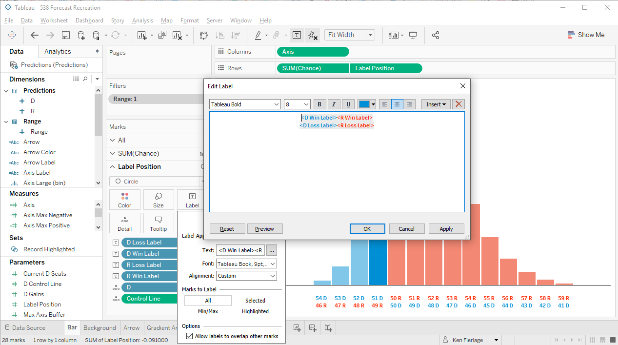
I won’t go into any further detail on this, but feel free to download the workbook to see exactly how it was done.
Bar Color
Next was the bar colors. By default, the original chart colors the bars based on who would control the Senate. If the Republicans were able to maintain at least 50 of the seats, they’d control the Senate (Note: The Vice President would act as a tie breaker). So, all bars where Republicans have 50+ seats are red and all others are blue. But, when you hover over the chart, the color of all other bars are dulled, which has the effect of pushing them to the background. To address this, I used the new feature of 2018.3, Set Actions. I created a set called Record Highlighted then created a Color calculated field that would make the bar red if Republicans have 50+ seats and blue if Democrats have 51+ seats, but would make the color a bolder red or blue if that particular bar was in the set. Finally, I created a set action on the dashboard that would add the record to the set on hover.
Note: My highlighting works slightly differently than the original as my default colors are dulled and the highlight color makes each a bit darker and bolder. I had originally created something that looked exactly like the original but that required the set action to remove all values from the set when clearing the selection. Unfortunately, this caused the screen to be a bit “flashy” as the set actions continually fired. Thus, I settled for a slight compromise, but I think it works pretty well. I’m hopeful that the flashing issue is resolved in a future update to this amazing feature.
Bar Labels
As noted earlier, hovering over a bar causes the chance % to show. I could have set up a highlight action then set the labels to only show when highlighted, but the highlight action causes the non-highlighted marks to dull in color. I was already controlling that myself and didn’t want the automatic dulling to occur. So, to deal with this, I just tied onto the existing set actions. I created a calculated field called Chance Labelwhich would show the % only for members of the Record Highlighted set. If the bar is not a member of the set, the calculated field is simply NULL. Thus, when I hover over a bar, the label will appear only for the highlighted bar.
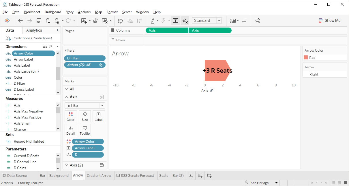
The Arrow
I stated earlier that my favorite part of the 538 chart was the arrow at the bottom that grows as you hover and shows which party would be gaining seats and how many. Creating the first iteration of this was relatively simple—it was just a bar chart that is either red or blue and grows in size based on a filter action sourced from the primary bar chart.
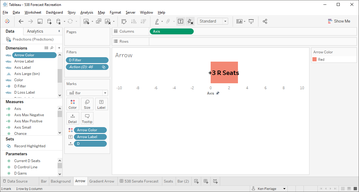
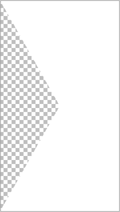
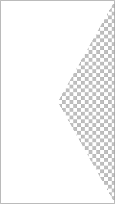
To create the arrow points on each end, I used PowerPoint to create two custom shapes. Each shape is essentially a white rectangle with a transparent triangle cut out of either the left or right. Note: In the images below, the checked area indicates that it is transparent.
Using a dual axis at the end of the bar chart, I was able to create what looks like an arrow point.
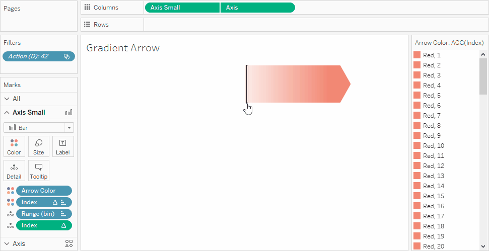
But, the original 538 chart used a gradient color from white to red/blue and I wanted to do the same. Unfortunately, Tableau does not allow bar charts to be colored using gradient color palettes. So I needed to get a bit creative. I decided that I would try to break up the bar chart into 100 separate stacked marks using bins. So I created an additional data set which I called Range with just one column and two rows.

I then joined that to my original data set and created bins on the Range field. Next, I created a calculated field that divided the original bar size by 100. Then, by placing the bins field on detail, it created 100 individual stacked marks. Since each is 1/100th the size of the original bar, the 100 marks added up to be the same size as the original. Then, using an Index table calculation, computed using the bins, I was able to assign a stepped gradient color to each individual mark. Finally, I used a dual axis and the same custom arrow end shapes to create the arrow point. The gif below attempts to show the individual marks.
My apologies if this is a bit confusing; feel free to download the workbook if you’d like to see exactly how it works. And let me know if you’d be interested in a more detailed explanation of how to create a gradient colored bar chart.
Bringing it All Together
Finally I pulled everything together on a dashboard. The chart has some reference lines in the background showing party control and the current seat breakdown. Part of the issue with these reference lines is that they span multiple charts, so while I won’t go into detail here, I leveraged 2018.3’s transparent sheets to push these refence lines to the background. From there, I just aligned the charts, added titles and the BANs. In the end, we have a chart that looks pretty darn close to the original by 538. Here's an animation showing it in action, but feel free to check out the interactive version on my Tableau Public page.
Thanks for reading! If you have any questions, feel free to leave them in the comments section below or reach out to me directly.
Ken Flerlage, January 6, 2019


Very smart work. Keep it up sir.
ReplyDeleteThat's why you're a Tableau Zen Master.
ReplyDeleteSuperb Ken!
ReplyDeleteThanks!
Delete