
More Tableau Sankey Templates: Multi-Level, Traceable, Gradient, and More!!

Note: I'll be leaving this post here, but I want to make you aware of another blog which addresses a flaw of the original approach and generally provides more flexibility: Equal-Width Sankey: A New Approach to Drawing Sankey Curves. If you still want to use the old method, read on, but I highly recommend this alternative for almost all use cases.
Sankey charts are often criticized in the data visualization community, largely because they are very regularly misused (perhaps more often than they are used properly), but I love them nonetheless. When used in the right way and for the right use case, they are incredibly insightful, not to mention visually stunning.
Sankey charts are often criticized in the data visualization community, largely because they are very regularly misused (perhaps more often than they are used properly), but I love them nonetheless. When used in the right way and for the right use case, they are incredibly insightful, not to mention visually stunning.
That said, these charts are pretty difficult to create in Tableau. There is no shortage of tutorials, but they inevitably get into some pretty tough table calculations and other tricky business. So, to make them a bit easier, last year I posted a template for creating sankeys, based on the polygon sankeys built by Olivier Catherin and Jeffrey Shaffer. To date, this has been one of my most popular blog posts. But I often receive questions from people asking how to make various adjustments. These have led to this post where I’m going to share six new sankey templates which attempt to address many of these questions. So let’s get started!!
Before I start, I want to say a big thanks to my brother, Kevin Flerlage (you'll hear from him directly soon) for his help in testing these templates. His feedback was critical to making these templates as useful as possible.
Before I start, I want to say a big thanks to my brother, Kevin Flerlage (you'll hear from him directly soon) for his help in testing these templates. His feedback was critical to making these templates as useful as possible.
Quick Note: I’m going to run through these six new sankeys first before showing you how to create them. Many of them use the exact same template and process as my original template, but others require some slight adjustments. I’ll address all of this at the end of the blog. That said,
Adjustable Whitespace
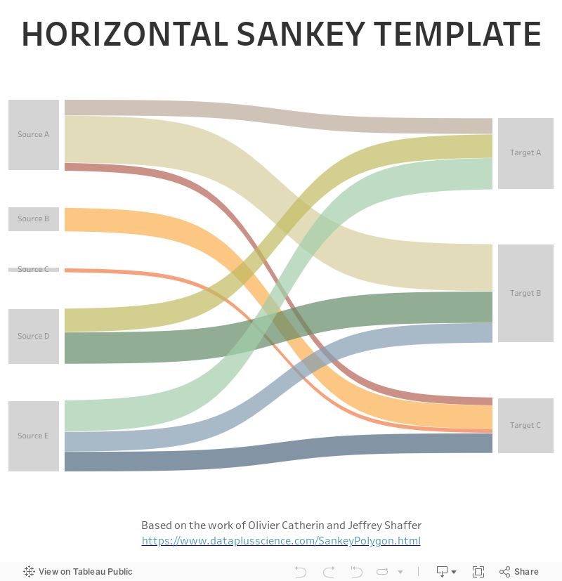
The sankey from my original post looked like this:
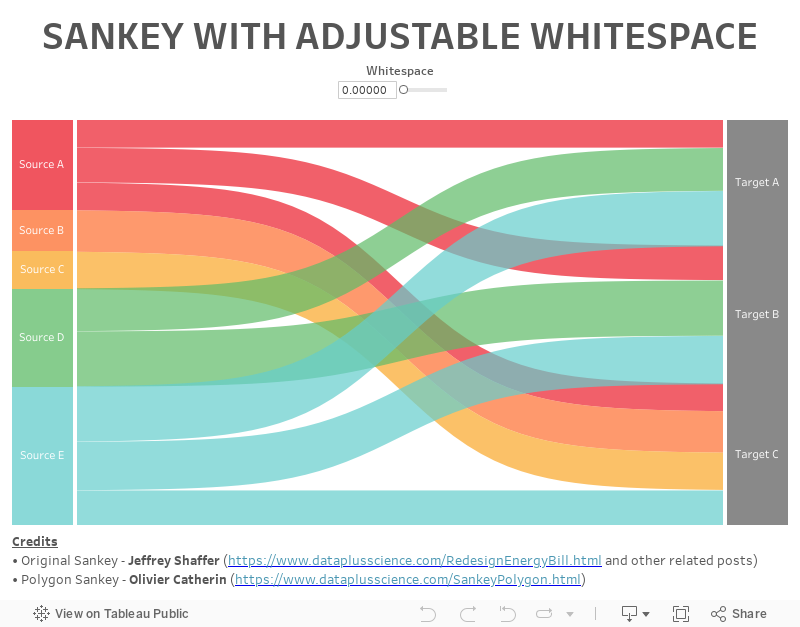
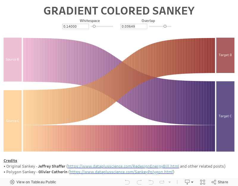
One problem with this is that there is a lot of space between each of the bars on the left and right sides, so a common question has been how to reduce that whitespace. I’ve generally provided a hacky solution which involves changing one of the calculated fields then adjusting the axes on all the sheets, but I’ve never loved that solution and really wanted to make it adjustable via a parameter. Unfortunately, this was not exactly a straightforward change and required some pretty fundamental changes to almost all of the calculations. But, in the end, I was able to create a sankey that allows you to adjust the amount of whitespace anywhere from zero, which will look like this:
…to 1, which because the sankey is drawn on a scale from 0 to 1, means that it’s pretty much all whitespace (and completely useless). But you could make the bars really small, if you’d like:
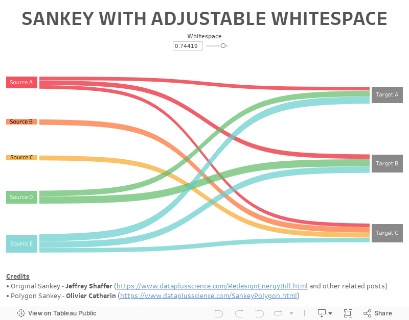
In most cases, you will probably want something in between. It is important to note here that the whitespace defined in the parameter is the totalamount of whitespace added to the bars on the left and right sides. That whitespace is distributed evenly between the bars. For example, if you specified a whitespace amount of 0.3 and you had four bars, the template would place 0.1 whitespace in the three gaps between them. But, if you only had two bars, the entire 0.3 whitespace would fill the single gap between them. This ensures that the bars’ sizes are not compressed which would lead to changing flow sizes from the left to the right.
Okay, so this one isn’t really a new template so to speak—it’s really more of a feature I’ve added to make it more flexible. That being said, I’ve included this feature in all the additional templates to follow.
New Look and Feel
A second comment I often get is that people don’t like is that, when you highlight a flow, the bars’ labels are not highlighted, so it’s difficult to see where the flow is going, as shown below:

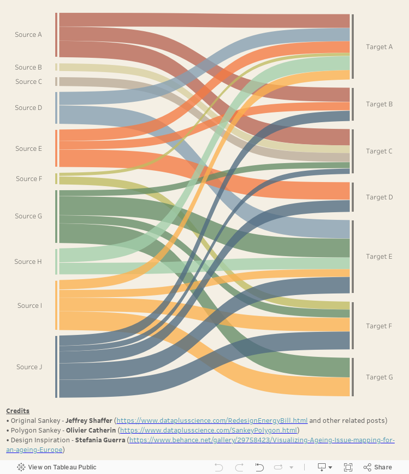
This has a pretty simple fix—you just need to adjust the highlight action so that the bars aren’t a target. But I wanted to come up with a different solution to this problem. One day while looking around the web for sankeys, I came across this beauty by Stefania Guerra (see Visualizing Ageing - Issue mapping for an ageing Europe for this and more of her related work.)

There is so much to like about this sankey, but one thing that caught my eye was that the labels were separated and placed to the left/right of small thin colored bars. So, I decided to build a template that looks very similar to Stefania’s work.
The highlight actions are set up to not include the text as a target, so that means they’ll always be visible, thereby addressing the original problem. Plus, it just looks really nice.
Multi-Level Sankey
Another common request I receive is for help creating a multiple-level sankey so that a larger flow, with multiple steps, can be visualized. The design of the original sankey template is such that you can create a multi-level sankey by copying many of the calculated fields, copying the sheets, adjusting the table calculations, and adding them all to the dashboard. But that can prove to be a ton of work and an understanding of the table calculations used is pretty important. So I decided to create a multi-level sankey template (click the image to see the interactive version).

Those colors are pretty bold, but you’re free to change them however you like. You will notice that I chose to stop at 5 levels. I thought that would be enough, but if you need more, feel free to reach out to me and I can provide some direction on adding more.
Traceable Multi-Level Sankey
The multi-level sankey above was, admittedly, the first time I’d ever built a sankey with more than two levels and, as I was looking at it, there was one thing that bothered me about it—there’s no easy way to trace a record through then entire flow. Granted, a sankey is an aggregated chart, so it’s purpose is to give you an overall idea of the flow, at an aggregate level, but I just though it would be nice to have the ability to trace a single item (or person or order or whatever) through the flow. So, to address this, I created a traceable multi-level sankey (click the image to see the interactive version).

In this sankey, every detailed record in your data set results as its own separate flow. All of the record identifiers are available in the dropdown list (a parameter). When you select an item, it is highlighted in a different color. When you hover over a specific bar on any of the levels, it will highlight the entire flow, but hovering over the flow itself will highlight the individual record through the entire flow. The combination of these features give you the best of both worlds.
I’d also point out that, if you look closely at the image, you can see that there is a faint white border around each individual flow. These were not intended and are not visible in Desktop. But, when published to Public or Server, they show due to how HTML5 Canvas renders adjacent polygons on the web. However, I really like them in this case as they add some depth to the chart and make it clear that there are multiple “strands” in each flow. Note: Keep this in mind as it will impact our next chart.
In addition to the ability to trace a single item through the flow, I created version that allows you to trace an entire flow. You can select which step you'd like to trace then which value. For example, below I've chosen to trace from the first step, then trace the D value.

In addition to the ability to trace a single item through the flow, I created version that allows you to trace an entire flow. You can select which step you'd like to trace then which value. For example, below I've chosen to trace from the first step, then trace the D value.
Gradient Sankey
The final template is a gradient colored sankey. If you’re a regular reader of my blog, you probably saw my recent post on how to create gradient bar and area charts. So, after spending all this time experimenting with sankeys, I decided to see if I could do the same here.
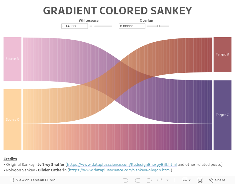
In all of the sankeys I’ve shown previously, each flow is a single polygon in Tableau (except for the traceable sankey, of course). So, similar to my approach for creating gradient bar charts, my idea was to break each of those polygons into small slices then color each slice a slightly different color, creating the gradient effect. This required some changes to the underlying data model built into the template (I’ll get to that shortly). In the end, I was able to create this:

But there’s a problem. Notice those thin white lines between each individual polygon. This, of course, is the same problem noted earlier, but in this case, I don’t care for the way it looks. Unfortunately, we can’t eliminate the lines altogether, but there are a couple of things we can do to reduce the impact. First, we can create a slight overlap between each polygon in an attempt to cover up the white lines. So, I added a parameter that allows you to specify the amount of overlap you’d like to have. A value of zero will give you what I showed above, but you can then tune it a bit to reduce the impact of the white lines. For instance, here’s the sankey with 0.0073 overlap.

That kind of pushes it the other direction, creating darker lines instead of lighter ones, but I prefer this over the light lines. But what’s nice about the flexibility of this parameter is that you can really embrace the lines. For instance, you can make them a bolder dark color:
Or you can make the value negative to create larger white gaps:

But, if you really want a smooth color transition, there’s one more option. Jeffrey Shaffer’s website, Data + Science, includes a blog detailing methods to create high resolution images from your Tableau workbooks. If you’ve never read this, then do yourself a favor and go read it right now. It’s incredibly valuable when you need a high res image, be it for an image on your blog, a desktop background, or to print yourself some wall art. My personal favorite is the pixelratio trick, which essentially increases the number of pixels displayed. Interestingly, you can use this trick to help reduce some of the impact of the thin white lines. For example, here’s the sankey with a pixel ratio of 15:
The drawback of this, however, is that it increases the load time of the chart. This sankey is already somewhat complex, so that may not always be ideal.
How to Use The Templates
Okay, now that you’ve seen all six new templates, let’s talk about how to use them. The first two templates—adjustable whitespaceand new look and feel—follow the exact same process as shared in my original blog, so go check out the steps documented there. The remaining three follow the same basic process with a few slight modifications.
Multi-Level
The multi-level sankeys require a slightly different template, which is different than the original in a two ways. First, instead of two fields, Step 1 and Step 2, it now has Steps 1-5. The second difference is the addition of an ID field. This field is to be used to uniquely identify a record. The purpose of this field is to enable traceability in the traceable multi-level sankey. Strictly speaking, it isn’t required in the regular multi-level sankey, so it can be left blank, unless you’d like to have record ID’s for filtering or other purposes.
If you’re building a traceable sankey, then once you’ve loaded your own data into Tableau, you’ll need to populate the Select IDparameter. You can use the Add From Field button on the parameter to populate the list from the ID field.
Before I move on to the gradient sankey, I would like to point out that my original blog suggested that you aggregate your data before populating the Excel template. This isn’t really necessary as the template is built to aggregate the data automatically. So, unless you are concerned about the number of records, feel free to populate the template with detailed data.
Gradient
The process for creating the gradient sankey is the same as the original blog, but requires a slightly modified Excel template. However, the tab on which you populate your data will remain unchanged. The only difference in the template is an adjusted Model tab.
Coloring the flows with the gradient color requires a bit of explanation. If you look at the marks card, you’ll see that the flows are colored by Step 1, Step 2, and Polygon.

Step 1 and Step 2 are the to and from fields that define a flow overall; polygon is a numeric field which identifies each of the 120 polygons used to break the flow into multiple pieces which are then colored individually. To color a flow, click the color card, then click Edit Colors. You’ll see something like this:
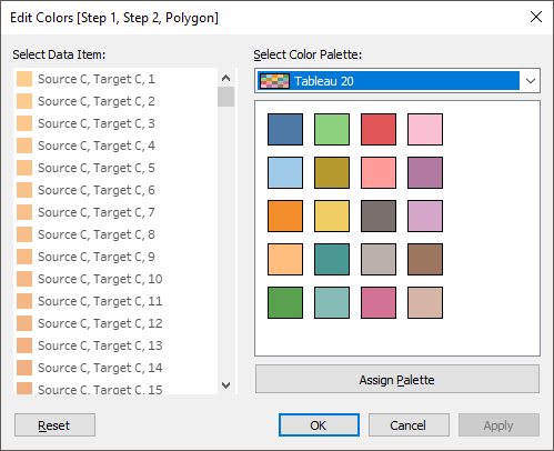
Select all 120 polygons for a given set of Step 1/Step 2 values.

Finally, select your favorite continuous or diverging color palette then click Apply. Tableau will the automatically distribute that palette across all 120 values, giving you the nice gradient color we’re looking for.

You’ll then need to repeat this step for all of your individual flows.
The Files
You can find all the Excel and Tableau templates using the following link. I’ve included the Tableau workbooks in both 2019.1 and 10.4 formats, so that you can use them even if you are not using the latest and greatest version of Tableau. If you need an even older version, then please reach out to me.
All the Files
All the Files
Using in Real-Life
Finally, before closing this out, I wanted to note that I often have people tell me they can’t use these templates because they can’t put their data in Excel. But that’s not exactly true. If you can get your data into the basic structure of the template, either through use of data prep tools, such as Tableau Prep, or custom SQL, then you can easily replace the data with your own. Not convinced? Here's a quick testimonial from my brother, Kevin Flerlage:
If you need to do this and get stuck, please feel free to contact me and I’d be happy to help you out.
Different Curve Types
I recently utilized one of Ken’s Sankey templates at work, specifically the multi-level Sankey template. I simply structured my data using SQL to include the data points shown in his Excel template. I brought that into the Tableau workbook template as Custom SQL, replaced the “Data” sheet, and created a join calculation of 1 = 1. From there, all I had to do was to replace references of his column names to my column names. The process was quite simple and it only took about 20 minutes from start to finish.
If you need to do this and get stuck, please feel free to contact me and I’d be happy to help you out.
Different Curve Types
Okay, one last thing before you go. All of these templates use a curve type called a sigmoid, but other types of curves can be used as well and, in many cases, these other curves can work better than sigmoids. If you want to learn how to leverage these curve types in your sankeys, then check out the amazing work of Chris DeMartini: More options for your Tableau Sankey Diagram
Update February 4, 2020: One question I get pretty regularly is how you can extend the template so that it has additional flows. I won't go into a lot of detail here, but the process basically entails the following:
1) Add a new "Step" to the spreadsheet--you can just call it Step 6 for consistency.
2) In Tableau, copy the "Bar" calculations. For instance, copy the calcs in the "Bar 5" folder to create "Bar 6" calculations. Then edit each of those new calculations to refer to the "6" version.
3) Similarly, create copies of the calcs in the "Curve 4-5" folder to create "Curve 5-6" calculations.
4) Copy the Bar 5 sheet to one called Bar 6 and Curve 4-5 to Curve 5-6, then edit the fields used on those sheets to use the Bar 6 and Curve 5-6 calculated fields.
For a more detailed explanation of how to add additional curves, see the following post on the Tableau Community Forums: Adding Steps to a Sankey
A note of warning: Often, when you copy the sheets then switch the calcs to use the new ones you've created, you may find that one of the table calcs turns red, indicating an error. If you hover over the calc, it will say that a field is missing. Despite all your efforts, you won't find a way to fix it. I've found that advanced table calculations, especially those with lots of nested calcs, sometimes get errors like this even though everything looks good under the covers. My best guess is that there is some missing pointer somewhere that causes it to get confused. The only way I've found to deal with this is to right-click on the red pill then set it to compute using some field (any field will do). You then have to go back and edit the table calculation, setting all the nested calcs to compute as desired. It can be a bit of a painful process, but it works.
Ken Flerlage, April 13, 2019


Excellent article, Ken. NOt really a fan of gradient fills, but the white-gapped gradient version is quite striking.
ReplyDeleteKen, I used your last Sankey template to create a multi-level (with 3 sets of curves!), and whilst it was a bit tricky, the layout of your templated dataset made it much less troublesome than I thought it would be. Now, with this multi-level template, I can maybe relax a bit more next time.
ReplyDeleteOne point I would like to add, is that the sankey I was making did not have 100% of step 1 flowing all the way through to step 4, and actually, new outside influences came in at step 2 and 3. I had to do some creative resizing to make it work (because I am hopeless at the math behind this!) - is this something that you think could be possible to create effectively with the calcs?
Great work on this post, the gradients look pretty cool!
Thanks Stewart. That is certainly a challenge, especially the addition of new influences. I don't have any thoughts on how to approach that at the moment.
DeleteI have the same issue with new sources coming in after level 1. What I've done is made a bunch of NULL rows at Level 1, renamed it to something like "No Level 1 source" and worked through the rest as usual.
DeleteKen, your amazing work has made my life SO much easier :D I can trial new datasets and flows easily without tearing my hair out with new diagrams every time!
:)
DeleteHi Ken, this is a great post, definitely helped a lot with getting a Sankey to display with multiple levels in Tableau. I'm just wondering what I would need to do in order to adjust the position of some of the nodes, i.e. reorder them vertically. I'm also wondering if you have any suggestions around how I may be able to terminate some flows once they get to a certain node?
ReplyDeleteLastly, how would I change the colours of a flow between two nodes in the aggregate traceable multi-sankey?
Thanks
Glad it was helpful! Your questions would probably be better addressed offline. Would you be able to send me an email at flerlagekr@gmail.com?
DeleteThis too would be incredible to figure out. Especially the termination of flows on a null level 2, 3 etc.
DeleteI'm actually working on something exactly like that!
DeleteHi Ken,
ReplyDeleteThis is indeed a great post. I'm so glad I came across this post when trying to wrap my head around the functioning of the Sankey diagram at work. The best part is that the example you mentioned about it being suitable for colleges to see where students go(in your original post) is exactly my use case because I work at the University of Cincinnati. I am trying to revamp an existing Sankey and upgrade it a little to allow for the nice features that you have presented in the aggregate traceable multi-level sankey. Ended up deciding to re-do it altogether using your incredible template. So easy!
I have a couple of questions:
1. I want to show multiple lines of flow with one line for each student, is that what is essentially happening where you have the unique identifier 'thing001' column?
2. Also, what best way do you suggest to improve performance of the Sankey as my dataset is really large and I plan to add filters to be able to filter by each major.
Thank you in advance.
Roshana
That's great to hear. I'm originally from the Cincy area myself!
DeleteI'm not quite sure I understand what you're saying on the first question. Can you explain that a bit further? For performance, that's tough because this template sort of explodes the data set's size a bit. In some cases, you can pre-aggregate (if you don't need individual students, for example). In any case, might be better to have this conversation offline. Would you be able to send me an email? flerlagekr@gmail.com
Hi Ken,
ReplyDeleteI have found your templates really helpful but have run into something with your Aggregate Traceable Multi-Level Sankey. I have all my data in and it works really well, except it doesn't seem to actually be aggregating up to the fields I am showing. In other words I have multiple lines that are actually the same paths but they aren't combining together (likely because of other fields that are not on the dashboard). Do you have any solutions for this? I tried to remove the ID to see if that would make it aggregate to a higher level but it didn't seem to work.
I haven't run into that and would probably need to see the workbook. Any chance you could send me a sample? My email is flerlagekr@gmail.com
DeleteHi Ken,
ReplyDeleteI have date fields for my flows, and it feels like a waste of a valuable data point. How do you suggest using dates into Sankeys (if at all)? I have looked online and Sankeys with dates are not a generally used thing.
One method I've thought of is using aggregated Date months on the Y-axis on one of the segments.
Any suggestions would be appreciated!
Cheers!
Probably depends on the use case and the data. I'd be happy to explore further offline. Feel free to send me an email. flerlagekr@gmail.com
DeleteHi Ken,
ReplyDeleteCannot thank you enough for this post! This is amazing and exactly what I was looking for. I've been asked to do a bit of customisation, including ordering step 1 and 2 differently. Can you advise?
Yes. If you need to change the sort order of Step 1, you just need to set the order of the Step 1 pill on the first bar, then do the same on the curve. Same thing for Step 2. Just remember that, whenever you change the sort order of a bar, you need to do the same thing on each of the attached curves. Give it a try. If you get stuck, feel free to contact me via email. flerlagekr@gmail.com
DeleteHi Ken! Do you have any supporting documentation on your Sankey Funnel template? Reference:
ReplyDeletehttps://public.tableau.com/profile/ken.flerlage#!/vizhome/SankeyFunnelTemplate/Sankey
I've seen in some articles the process of duplicating the data. Was that done in this example?
A second part to my question, what are the calculations that you ETL'd for the following columns:
Min or Max
Path (Model)
Size
t (Model)
The sankey funnel is coming soon. Not sure how soon, but I should have a blog about it at some point. In the meantime, if you'd like to know how to create it, feel free to email me at flerlagekr@gmail.com.
DeleteIn this example, data is duplicated using a cross-join to a model data set. I explain that process in a bit more detail, though generalized, here: https://www.kenflerlage.com/2019/05/intro-to-data-densification.html
Those are all part of the model data set. If you download the Excel template, there is a sheet in there called Model which has all of these fields (except Size, which comes from the Data sheet).
Happy to talk more via email.
Hi Ken,
ReplyDeleteI'm having a weird issue where the bars don't line up to where the record is. For example, A-B but the bar points at C. Any thoughts on how to resolve that?
I'd need to see the workbook. Any chance you could send me an email? flerlagekr@gmail.com
DeleteHello Ken, thanks for providing the amazing templates! I was able to get my viz working perfectly and easily using the Sankey layout inspired by Stefania Guerra. I do have one question that I hope you can help me with. Is there a way to have the source displayed similarly to this design here - https://public.tableau.com/en-us/gallery/flow-human-migration? I want to keep a horizontal layout but would live to see if I can have the source start from one point and flow out versus a block. Thanks in advance for any assistance you can provide.
ReplyDeleteThat would probably be doable. Any chance you can send me an email so we can chat offline? flerlagekr@gmail.com
DeleteI love all your detailed work and explanations, but none of your Sankey diagam satisfy me because the flow lines do not maintain a constant width which is, I think a defining characteristic of Sankey diagrams. Notice that Stefania Guerra's have constant width (compare to your reproduction of her graph). Is that possible within Tableau?
ReplyDeleteYep, you are exactly correct. Jeff Shaffer wrote a great post about this here: https://www.dataplusscience.com/Sigmoid.html and gave some alternatives, such as different curve types. However, the issue exists with this method no matter what type of curve you use. It's a fundamental problem with this approach. I am in the middle of a project to address this problem. It's going to take some time to work out all the details and implement a solution, but keep an eye on my blog.
DeleteHey Nick. Check out my new blog which addresses this issue: https://www.flerlagetwins.com/2020/01/equal-width-sankey.html
DeleteHi Ken,
ReplyDeleteThanks so much for these templates! I was wondering if it is possible to assign different non-highlight colors to different flows in the Traceable Multilevel Sankey Template. I was using the Funnel Template before and was able to do so, but I can't figure it out here...
Thanks in advance for your time!
I'm not entirely sure I follow you. Might be best to take this offline. Can you email me? flerlagekr@gmail.com
DeleteHi Ken! I was wondering, how did you create traceability? I am trying to do something similar in a different viz (network graph). I'm not sure where to start. I've looked into your workbook and see you've created a bunch of parameters for this?
ReplyDeleteThis required a combination of data modeling and a bunch of table calcs. Happy to help if you'd like to reach out to me via email. flerlagekr@gmail.com
DeleteHello, first of all, thanks a lot for sharing all these templates! I'm using the multi-level template with the slight modification to exclude null entries:
ReplyDeleteIF ISNULL(ATTR([Step 1])) or ATTR([Step 1])="" THEN
NULL
ELSE
RUNNING_SUM([N1 Flow Size]+ [N1 Whitespace]) - [N1 Flow Size] - [N1 Whitespace]/2
END
I use the multi-level Sankey diagram to represent connections between different systems (5 levels). In some cases, I just need to represent a connection between level 3 and level 4 (without having a line going from level 1 all the way to level 5). I can make that part to work without any problems, however things get completed when I have let’s say 1 line coming to Bar #3 and 2 lines going out, for instance:
1 2 3 4 5 Value
- A B - - 1
- - B C - 1
- - B D - 1
In this case the size of B is the sum of all the values coming in and the ones going out, here 3.
What should I change so that the size of B is the greater between what’s coming in and what’s going out, here 2? Is this something that can be done?
Thanks!
This sounds like it could be tricky. It's hard to have these discussion on this comments section, so could we take this offline? Could you email me at flerlagekr@gmail.com.
DeleteSounds good. I sent you an email. Thanks!
DeleteThis is absolutely great. Thanks a lot!
ReplyDeleteHi Ken,
ReplyDeleteWould love to know how to create a gradient Sankey with an additional "Step 3"... Do you think this is possible?
Yes, but I start to wonder if the juice is worth the squeeze as your are adding a lot of complexity to the chart to get these colors and I'm just not sure that they add a lot of value. Happy to help if you'd like to give it a try and run into problems. Feel free to email me at flerlagekr@gmail.com
DeleteLove the how this is setup but I can't seem to reproduce it, does this work in 2018.3? When I try to add the Curve Polygon it says I am missing a field but it looks exactly like your workbook.
ReplyDeleteYes, this will work in 2018.3 (and lots of versions prior to that). See the "A note of warning" section at the very end of the blog. Try the suggestions there. If that doesn't work, let me know.
DeleteHi Ken, this is a great post, definitely helped a lot with getting a Sankey to display with multiple levels in Tableau. I'm wondering if you have a published answer around how I may be able to terminate flows once they get to a certain node?
ReplyDeleteEg.
A B C 10 ids
A B 5 ids
A B D 10 ids
I'm having difficulty with the sankey on the AB flow that ends.
I think you may find my Sankey Funnel post useful: https://www.flerlagetwins.com/2019/11/sankey-funnel.html. Let me know if that works for you. If not, please reach out to me at flerlagekr@gmail.com.
DeleteHi Ken, I am working on a Sankey diagram which requires 6-7 levels. Can you give me some direction on adding more? I tried to copy the worksheet, but always got a red pill. I also fixed table calculation, but still no luck. Any help would be appreciated! Thank you!
ReplyDeletePlease see "A note of warning" at the end of this blog. It addresses that issue. If you have problems after that, please let me know.
DeleteIt works!!! Thank you so much, Ken!
DeleteGreat!!
DeleteHi Ken! Sorry for bugging you again. I am facing another challenge. I have 2 Sankey diagrams: one is a high level lineage, one is a granular level lineage. Is it possible to connect these 2 diagrams together? Like creating a drill down in Sankey? Thanks a lot!
DeleteI'd need to see it to better understand what you mean. Any chance you can email me at flerlagekr@gmail.com?
DeleteHi, I came across your templates when searching for ways of doing Sankey Diagrams in Tableau - it worked first time! Thanks for all your efforts putting this together. Just one thing is that I didn't see any tool tips and they seemed to be included in the Tableau workbook. Viz showing traffic flow through an area of London is here: https://public.tableau.com/views/KentishTownSankey/Sankey?:display_count=y&publish=yes&:origin=viz_share_link
ReplyDeleteYou can add them. Just go to the sheets, click on the tooltip card, turn them on, and add your fields.
DeleteHello Ken, appreciate your work! I started studing Sankey earlier this week and whatever I learnt is coz of your efforts. Simple question for you though, 30 steps Sankey...worth the time? Trying to convert a Flowchart Data/Diagram for a warehouse into Sankey chart.
ReplyDelete30 Steps!! Wow. That would be a huge sankey. One thing I'd be worried about is simply how you'd fit all that on screen. That in itself could be a challenge. Honestly, whether or not it's worth it all depends. Do you think you'll get a lot of value out of it? If so, then it may be worth the effort.
DeleteHi Ken, this is really useful. I'm struggling with creating a step 6 though due the error missing field. I followed your instructions and it semi works but the flow isn't plotted correctly. As a test a duplicated Curve 4-5 and changed to Compute using then recreated the table function however even on Curve 4-5 it plots the curves weirdly. Any ideas? I'm using 2018.1. Thanks
ReplyDeleteMy guess is that you haven't updated all of the nested table calcs. There is a dropdown box at the top--you'll need to make sure to update all of those. Happy to help if you could send me an email. flerlagekr@gmail.com
DeleteThank you very much Ken, the pointers in your mail really helped me out and IO have extended this to 7 levels. A key thing was I hadn't appreciated the multiple nested table calcs in the drop down.
DeleteYep, that is something that is often missed. Glad you got it working!
DeleteHi Ken, I have been playing around with your template, it's incredibly useful. Thank you so much for sharing! I am stuck on what I hope will have a simple solution- any idea how to calculate the percentages of each path coming from a source? For example, in the Multilevel Sankey, the percentages of Source A that flow to E, F, and G. Any help is greatly appreciated!
ReplyDeleteHi Samantha, I actually wanted to display percentages as well and found the following formula helpful:
Deletesum([Size])/sum({ FIXED: SUM([Size]) })
Depending on how your data is structured and the purpose of the Sankey you may have to add some additional fields to the FIXED calculation.
Best of luck!
Sorry, I missed your question from yesterday. Daniel's formula should work. Otherwise, could you send me an email? flerlagekr@gmail.com. It's just too difficult to address these questions in this comments section.
DeleteDaniel's formula works fine on 'Bar 2' sheet, but somehow gives wrong results on 'Curve 1-2' sheet. Could you advise why?
DeleteIt probably has to do with how the table calculations are being computed. Happy to take a closer look if you could send a sample workbook. flerlagekr@gmail.com
DeleteHi Ken, I'm using your Multilevel Sankey for a report I'm working on and so for it looks great! My only concern at this point is performance. I understand that data duplication is necessary to produce those nice curves, but even reducing the duplication to 4x instead of 98x doesn't drastically boost performance. For this reason, I believe the lack of performance is more so due to the calculations themselves and the impact that filtering & other dashboard interactions have on those calculations.
ReplyDeleteIf you were to fine tune some of the calculations used in the Sankey, which calculations are the most resource intensive and is there a way to reduce some of that intensity while still maintaining a multi-level Sankey? Any suggestions would be helpful.
Thanks,
Daniel
Performance issues with these sankeys tend to be due to the number of records. While this template will work with non-aggregated data, I highly recommend pre-aggregation of your data. If you can find ways to reduce the amount of data by aggregating, that should make a huge difference.
DeleteThe data set that I'm working with is randomly generated sample data and only ~1k records. Even with the duplication this is only ~100k records for the Sankey, which usually isn't a lot for Tableau to handle. This is why I believe the performance issues are due to the calculations themselves and not necessarily the volume of data.
DeleteIf it makes any difference, I'm relating the model to the data set rather than joining them together. Though, joining them at the start doesn't seem to make any sense, since it would impact the rest of dashboard that doesn't need the duplication.
The calculations for this are super-complex, there's no doubt about that, but I still think it should perform pretty well. Is there any chance you could share a sample workbook with me via email? flerlagekr@gmail.com
DeleteAwesome templates! Exactly what I need. I so appreciate that the Tableau community shares its resources. Quick question: Do you know if anybody has been able to associate and display conversion rates on the curves? i.e. X% of Source A went to Target D
ReplyDeleteYes, this is definitely possible. Please email me. flerlagekr@gmail.com
DeleteThanks for the templates. I'm having difficulty with one though, the Multi-Level Sankey. I'm using Prep to clean up my data from a SQL database and was able to replace the template data source with mine. However, the Curve pages are giving me trouble and an error on the Curve1-2 Polygon pill. When I edit the table calc, I'm seeing a selection for the Path, but that's not in the template as a choice. what are the formulas for Path(model) and t(model) in your template, maybe I can add those to my prep flow and then it will work. Thanks!
ReplyDeleteThat's a secondary data source that gets joined to your business data. Take a look at the Excel template included above and it'll show you the structure of this data. You'll then need to either join the Excel "Model" tab to your SQL data or create a table in SQL with this structure.
DeleteThat worked great, Thanks!
DeleteHi Ken, I love these templates! I used a combination of these to create a mash up of Stefania's Sankey and a multi-level traceable Sankey with two curves. I have it set up such that the user can select categories from Bar 1 and Bar 2 through the use of two parameters. The curves and thin bars would only highlight those that fall in those specific categories. However, I'm having trouble getting Bar 3 to highlight, since it is dependent on the parameter selections. I would appreciate any insights you might have in getting that last bar to highlight correctly. Thanks!!
ReplyDeleteHmmm. I'd probably need to see an example in order to better understand what you're trying to do. Any chance you could send me an email? flerlagekr@gmail.com
DeleteFor the "Aggregate Traceable Multi-Level Sankey" could it be possible to show the complete trace by simply mouse over the A,B,C,D... blocks? Selecting a value from "Value to Trace" dropdown is making this nice experience a little cumbersome.
ReplyDeleteYes, that's just a parameter so you could create two parameter actions to change the "Step to Trace" and "Value to Trace".
DeleteI'm trying to combine these two datasets into a single output for a Tableau Sankey. I'm having the darndest time figuring out what the final Size values should be... Can someone help?
ReplyDeleteDataset 1
A > C 5
A > D 7
B > C 9
B > D 3
Dataset 2
C > E 10
C > F 4
D > E 8
D > F 2
Final Dataset (for Tableau)
Step 1 > Step 2 > Step 3 | Size
A > C > E ?
A > D > E ?
A > C > F ?
A > D > F ?
B > C > E ?
B > D > E ?
B > C > F ?
B > D > F ?
There's no way to combine these together in a way that will allow you to create a multi-level sankey. Take A>C, B>C and C>E. In order to combine these, you'd need to know how much of the 10 from C>E came from A and how much came from B. Your data doesn't have enough information to understand this full relationship.
DeleteHi Ken,
ReplyDeleteThank you so much for creating these templates, they've worked an absolute treat!
My difficulty now is around filtering the multi-level sankey by the measure value used for size. I've added an ID field for each row of the data (before joining with the model) but have not found a way of getting the filter to work correctly on the sankey.
What I'm after is using the measure value filter to only include (in the sankey) IDs that are above a certain value. What would you recommend?
Many thanks,
Ann
Hmmm, that could be tricky. Any chance you could email me? flerlagekr@gmail.com
DeleteHi Ken,
DeleteWhen I was actually recreating my issue with superstore data to send to you, I saw that it worked! So figured the issue must have been with my data so I went back and cleaned my data up, got rid of any null or 0 value rows and it did the trick!
Thought I'd share in case anyone else has the same issue.
Thanks Ken,
Ann
Great news!
DeleteHi Ken,
ReplyDeleteThanks so much for this in-depth tutorial and the files to go with it. I've built an aggregate traceable sankey to visualize the progress of KPIs month over month into 4 categories: not at entry, entry, target, and stretch. All of the metrics have differing monthly value ranges as well as goals. For example, 75% of goal is the target for one metric, 80% of the goal is the target for another metric. I had originally built a heatmap with metrics as rows and months as columns, but found it wasn't as intuitive for users to understand changes and know which metrics to spend time investigating.
My current problem is with the order of the sankey lines. When a metric moves from "not at entry" at the bottom to "stretch" at the top, it appears at the bottom of the "stretch" bar. But then the following month, the line of the metric is listed in alphabetical order. Because the lines don't match up from, for example, curve 1-2 to curve 2-3, it becomes a little counterintuitive to watch a metric move in and out of the different bar categories month over month.
I would like to be able to change the order of the sankey lines so that they always line up in the correct order, rather than having the left side of the curve ordered alphabetically, and the right side of the curve ordered by bar order and then alphabetically.
Any idea how to accomplish this? Any insight you have would be immensely helpful - thanks!
- Dani
These questions are a bit difficult to answer in this comments section. Would you be able to send me an email? flerlagekr@gmail.com
DeleteHi Ken. I have liked Sankeys as a viz tool for a number of years. I have been using intervals in the columns and converting the values to text fields to make it work. This supports finding relationships within data at different scales: for instance, if my data are 0-100, I break it up into bins of different sizes, 2 bins of 50, 3 bins of 33, etc to quantify relationships. I used your template:
ReplyDeletehttps://public.tableau.com/profile/scott.lilienthal#!/vizhome/TraceableMulti-LevelSankeyTemplate_16082440524790/Sankey
I would like to have a few more columns of data--ten would be more ideal. Is this a big deal? I am a novice Tableau user.
Thanks,
Scott
I added something to the end of the blog above (see the section prefixed "Update February 4, 2020") which explains basically how to add additional flows. Give that a try and, if you get stuck, feel free to email me at flerlagekr@gmail.com.
DeleteYou rock! Thanks. I will try to figure it out. I have not delved into Tableau other than to inject data into the Excel template, incorporate the workbook and produce the product. Tweaking formatting and adding columns is non-trivial, but something I will have to learn. You are quite the artist. Amazed at how far you have come so fast!
DeleteIf you get stuck anywhere, don't hesitate to reach out.
Delete...and thanks for the kind words :)
DeleteKen, I'm working on 13 level Sankey. (Why? It's just one of those things, I guess.) I tried to follow the advice you've given in various comments and in the warning section, but they're not quite working out. I've got two separate issues.
ReplyDelete1. On one curve page, I end up with a very, very cool (but completely useless) cornucopia shape. As I said, very very cool. Very very useless.
2. On another curve page, I tried resetting the nested calculations like you suggested, but it looks more like a ski slope and the sizes don't make much sense. Plus, the scale on the y axis jumps way up, and when I fix it on 0-1, you (obviously) only see the bottom fifth or sixth of the curve.
Sorry for not responding in any of the threads, but it's been a while, and I don't know how the notifications work on here.
Could you email me at flerlagekr@gmail.com? It'll be easier to work through this via email I think.
DeleteI also am having a similar issues (visual outcomes) as listed by ken when trying to add one more step and following the updated fixes. I will be interested to see if there are any other fix attempts shared. that may fix this for me as well.
DeleteThank you for all of this great work though! it has been fantastic!
Hey Mike. The issue is almost always the table calculations. Make sure you check each and every one of the nested table calcs in the dropdown and set them to compute properly. If you continue to struggle, feel free to email me.
DeleteThank you so much for the clarification! I was definitely not changing all of the nested calcs nor was I changing them separately to get them all computing properly. Your comment helped to lay all that out and make it all "click". Thank you again for this and all the other great work you guys do!
ReplyDeleteGreat. Glad to hear it!! And it's our pleasure--Kevin and I just really love this stuff!!
DeleteThank you for these! Question: I removed some rows of data from my source (which I used your excel template for), and somehow that changed the height of bar 1, but nothing else. Has that ever happened to you? Anything you know of that could fix that? Or should I just start over?
ReplyDeleteI'm not entirely sure what you mean. Any chance you could email me? flerlagekr@gmail.com
DeleteHello Ken, I have been trying to create a multi-level sankey for a project, but I keep getting the same error when I try to include the Curve Polygon on the view (table calculation requires a missing field).
ReplyDeleteI followed all the steps from the aggregate multi-level sankey dashboard, but I keep getting that same error.
Can you help me get through that barrier?
Thank you!
Did you see the "A note of warning" section at the end of the blog? That addresses this problem. Give that a try and let me know if it works.
DeleteHello, Ken! Many thanks for u templates! Please tell me how to turn on mark lables on bars? I mean, I want to show group sizes(counts) not on mouseover only, but constantly on my dashborad. Ideally, not for all groups, but exceeding the X value. Because some groups are very small.
ReplyDeleteDrop the field on the label card then make sure it's set to allow overlap.
DeleteCan you add a label to the curve, not the bar? I've tried and can't seem to do it. We have a request to add a label when part of a curve is clicked on and I've tried by using static x, y coordinates but know I'll need the y to be dynamic. I've tried using one of the midpoint calcs with no luck. Any thoughts? Thanks, Kate
DeleteMight be best to email me. flerlagekr@gmail.com
DeleteHello, Ken. Thanks for the blog. How can we add Polygon to color and from where will we get the data?
ReplyDeleteI don't quite understand what you're asking. Can you clarify?
DeleteHi I am using the Template Funnel and I noticed that it duplicates each record 98 times, when it merges it. I have a ton of data and was wondering if you have a template version, that does not replicate the rows that much. Or is this unavoidable?
ReplyDeleteThanks
The duplication is required to draw the curves, unfortunately. If you have a ton of data, my recommendation is to do some pre-aggregation of your data before using it for a sankey.
DeleteHello Ken,
ReplyDeleteThanks a lot for sharing this great work to public. I was amazed while going through all these fine options of Sankey diagrams.
I am intended to use the multi level traceable Sankey chart, however when I looked at the template (Model) I found that the ,the path are pre-calculated in the template. I hope that I am using the correct version. Therefore, I am wondering whether it would be possible to generate them in Tableau. my dataset is large and I am afraid that the Links won't be enough
Many thanks in advance
Hello Ken,
ReplyDeleteplease ignore my previous message. I was a bit confused at the beginning because I used to generate the t and the path in tableau so it took me a bit to understand that it is the same thing.
I have just uploaded the data to the multi level Sankey and it looks very well. I am wondering whether it would be possible to add a date dimension for example to the template. what I am trying to achieve is to measure the changes from one step to another in a given date range.
for example to add a date slide bar to show the changes in the size of the moves between the steps
Thank you
You can add any fields you wish to the data.
DeleteHello Ken,
ReplyDeleteI have a question for you, would it be possible to filter by the number of moves between two steps. for example, let's imagine that I am using 4 steps (multi level Sankey) and I want to filter to show only the moves > 6 between step1 and step2 so I can see their flow in the rest of the diagram ( between step2-3 and step 3-4 ). I hope that I made it clear for you.
Many thanks
Yes you could probably do that, but it'd be tricky to find the right calculation to use as a filter. Happy to help further if you could email me. flerlagekr@gmail.com
DeleteHi - This is probably overly basic, but I'm struggling to pare down the aggregate traceable multi-level sankey from the default five steps to just three. Is there a step-by-step tutorial you might be able to point me to, please? Thanks in advance!
ReplyDeleteYou can just remove Steps 4 and 5 from the spreadsheet then connect to Tableau. All the calculated fields related to those steps will be in error, but you don't need them. You can then just remove the sheets from the dashboard (bar4, bar5, curve 4-5, curve 3-4). If you want, you can also completely delete the sheets and all the bad calculated fields.
DeleteOK, thanks. I'm still struggling with figuring out how to get the curves to line up with the bars. They use the same whitespace number, but aren't aligned properly. Is there a step-by-step tutorial anywhere by chance, please? Thanks!
DeleteNo tutorial, but I'm happy to help if you could email me. flerlagekr@gmail.com
DeleteHello,
ReplyDeleteThis is great! I am using Multi-level sankey. I have flows of various length (2-5 steps). It looks like if a row ends for example at step 3, the visual still continues to step 4 and 5 using NULL Step values. Is there a way to end those at the appropriate step? Thanks
I don't quite follow the question. Could you email me with further details? flerlagekr@gmail.com
DeleteI sent an email, let me know if it makes sense. Basically trying to understand if it's possible to top drawing the curve after a specific flow reaches last non-null step. In other words, if I use your Five Step Template can I properly draw flows that have less than 5 steps. Thank you.
DeleteHi Ken
ReplyDeleteThank you for your post about such a great technique.
Could you please publish a video or a blog to explain the calculations you used to create the Bar1, Bar2 and the Curve at the file of "Adjustable Whitespace 2019.1"
I am a kind of naive in using Sankey Techniques in Tableau, so I could not catch those calculations.
I would appreciate it if you help us with this issue.
The calcs in this chart are very very complex and build upon each other, which was the reason I set out to templatize them (so you can just plug in your data and go). However, if you want a deeper understanding, take a look at the following which is what most of my sankey templates are based upon: https://www.dataplusscience.com/SankeyPolygon.html
DeleteHi Ken,
ReplyDeleteI have a question regarding the multi-step Sankey. I have an entry in the data where there is a size from step 1 to Step 2, then no other entries in Steps 3-5. Kind of similar to the original Sankey of the engine in your original blog post, here some arrows flow off the diagram and stop.
The template handles these by adding a blank entry for Steps 3-5 (for the Null value). Is there a way to remove these from Steps 3 - 5 (where there is a null?).
Thanks for this great template and walkthrough.
Cheers,
Bryan
Might be easier if you could email me with details. flerlagekr@gmail.com
Deleteis there a way to change the height of bar one?
ReplyDeleteMight be easier if you could email me with details. flerlagekr@gmail.com
DeleteKen, this article is still saving lives! Thanks so much for creating these templates. I have a unique need for a modification of the multi-level Sankey that hopefully, you can assist with. I need to color each of the step levels individually. In the final output, A-D would use a dimension to indicate which color it should be and E-H would use a different dimension to indicate color all the way through the 5th level. When I attempted to replace Bar Color with the dimension onto color everything went bottom-up! Any suggestions on what I'm doing incorrectly are GREATLY appreciated!
ReplyDeleteThis is amazing and so helpful! I've been trying to adapt it to use 2 metrics for the curves (i.e. Size 1= Count of IDs and Size 2 = Sales...and use Size1 for Curve 1-3 and Size 2 for Curve 4-5). Is that possible or have you seen anyone try that? Thank you!
ReplyDeleteI don't entirely understand. Can you email me? flerlagekr@gmail.com
DeleteDear Tableau Experts, In order to understand the logic behing the sankey diagrams I experimented a little bit with your artful diagrams. So I have removed the [Curve 1-2 Polygon] variable from the rows and expected when placing it back with the same settings the diagram would not be changed. However it turned out to be different. The diagram was destroyd. Is there a certain seqence that has to be followed when creating the sankey worksheet with [t (Model)], [Curve 1-2 Polygon], [Step 1], [Step 2], etc. Thank you and BR Arno
ReplyDeleteYou'd need to check the way the table calculation (and all nested table calculations) are computed.
DeleteDear Ken I tried to check it out several times - nevertheless I'm still lost. Once I remove the green pill [Curve 1-2 Polygon] and try to place it back with exact the same settings it remains red. I thought that if you enter exactly the same settings in the same worksheet it must work just as the original one. What is the root cause for this. Thanx and BR Arno
DeleteCould you send me an email? flerlagekr@gmail.com
DeleteHi Ken,
ReplyDeleteIt seems like my bars for the aggregate traceable sankey are kind of finicky -- 2/3/4 are currently working but 1 is not (I currently just see the message that the N1 Bar Position axis has 3 null values). Not sure why this is the case, because it is identical to the other bars. And when I tried to redo the bar from scratch, it sometimes works -- but refuses to manually sort the categories within the bar.
Yesterday, the issue was that 1 was showing up but 2/3/4 were not -- this happened after I changed the whitespace and all the bars disappeared and showed the same error message as above.
In general, not sure why this is happening since I didn't change your template and was wondering if you have any insight! For context, I am using Tableau 2022.3.
Can you email me? flerlagekr@gmail.com
DeleteAbsolutely love these templates that you have made for the community! I do have a question regarding replacing the data source and some errors that I have experienced. When I replaced the data source for both the horizontal template and the aggregate traceable template The calculations for my 'Curve 1-2 Polygon' is showing an error saying:
ReplyDeleteError: The Curve 1-2 Polygon table calculation requires a field that is missing from the view. Add the Node2 field to the view to resolve.
However, when I go to Edit the Table Calculation and go through each Nested Calculation there are no missing/red fields and I can't for the life of me figure out what is wrong. When I bring these calculations into a table to check what's going wrong. There seems to be something wrong with the Curve 1-2 Min calculation, which is odd because this id dependent on the Curve 1-2 Max calculation which has no error.
Hoping this is some easy thing that I might have missed. Appreciate your help on this when you get the chance! Thank you.
Craig Heard
See the last paragraph in the blog that starts with "A note of warning". Give that a try and let me know if it corrects the problem.
DeleteWow, I feel like an idiot now haha! Worked great. Thanks again for all the amazing work that you two publish! This sankey template will be perfect for the account movement visual I'm trying to make!
DeleteThanks again!
Oh my god, I'm such an idiot! Was there all along!
DeleteThank you so much for everything that you two give to this community! These templates are amazing! This template is going to be used to look at account volume movement through different channels and payments systems at a bank!
Thanks again!
My pleasure!
DeleteHi Ken, thank you so much for the template! I was using the sankey funnel template and was able to successfully create all the charts I wanted. When I try to move all individual charts to the dashboard and try to press "more option" to change the width of the workbooks, I get following error message
ReplyDelete"ERROR: The field [Node 2] in the datasource 'federated.xxxx' does not exist in your database. It was either modified or removed."
This error only occurs for the "Curve" charts where "Bar" charts doesn't throw any error. Do you know what may cause this problem?? I tried extracting the data again, try out in the new tableau dashboard.
I'd need to see the workbook. Can you email me? flerlagekr@gmail.com
DeleteHi, have you thought or do you have a tableau extension to your sankey funnel graph https://public.tableau.com/app/profile/ken.flerlage/viz/SankeyFunnelTemplate/Sankey? That is what I need but I also need to add filters of date and dimensions and I think that would change the distribution from the static view that is available (correct me if I am wrong), thanks again for what you have done :)
ReplyDeleteYou should be able to add filters. Feel free to email me. flerlagekr@gmail.com
DeleteIf I have too small and too big values in the sankey, the flows disappear for the items that are too small. I tried adjusting the N1 flow size but the bar position moves. How can I avoid the flows disappearing for small bar and curve?
ReplyDeleteHi, I have a sankey with too small and too big values that causes the curves for the small items disappear. I tried adjusting the N1 Flow Size to log but I think the Bar Positions moved out of view.
ReplyDeletePlease email me. flerlagekr@gmail.com
DeleteHi Ken. Tableau beginner here. Sorry if this question has been asked before. Im using your multli level sankey template. I cant seem to get the bars and the curves to match extactly. Any advise. Sorry cant post workbook etc as data is sensitive
ReplyDeleteHard to be sure without seeing the workbook. Check to make sure all Y axes are fixed to go from 0 to 1 and that the padding is the same on all sheets on the dashboard.
DeleteHello! My labels aren't all fitting inside of the bars (even with text wrapping). I can get them to adjust by manipulating the Size values in the data source with trial and error, but that throws off the size of other bars. Is there another way to control the height of the bars, even if it's manual?
ReplyDeleteHey Ken, is there a way to make sure the same "unique id" in the traceable sankey chart stays "anchored" to the same position across each graph, as if it was a seamless line chart?
ReplyDeleteKind of....please email me. flerlagekr@gmail.com
Delete