The US election ended a few months back, which means we’re seeing lots of predominance maps showing the election results. Whether you know the term or not, you’re probably very familiar with predominance maps. In simple terms, a predominance map uses to color to encode two pieces of information—who “won” and by how much? (For a detailed explanation, see ArcGIS: What is a Predominance Map?)
Update October 15, 2022: With the introduction of map layers, predominance maps become a little easier and largely eliminate the need for the three methods presented here. To see two ways to create predominance maps using map layers, go to the end of this blog.
Let’s look at an example. Below is the Alabama 2016 presidential vote by county:
Counties which voted majority Republican are red and counties which voted majority Democrat are blue. But this type of map only tells part of the story—who won. It can be misleading because it doesn’t actually show the differential in each county. For example, Winston County went 90% to 8.5% in favor of Republicans while Conecuh County went 52% to 47% in favor of Republicans. Yet, both counties show the same red color on the map. Fortunately, we can address this flaw by adding some color gradients to the map so that we have shades of blue and shades of red.
The lighter the shade, the lower the margin of victory, the darker the shade the higher the margin of victory. This now tells us a much different story than the previous map. We can see where the race was close and where it was a blowout.
Unfortunately, it’s not entirely straightforward to create predominance maps in Tableau because they require you to essentially use two separate continuous color palettes. So, in this blog, I’ll share three different methods for creating them.
Quick Note on the Data: For this blog, I’ll be looking at the 2016 Presidential election and will be using a data set created by Tony McGovern. The data source has one column for Republican vote % (Percent Republican), another for Democrat vote % (Percent Democrat), and one showing the difference (Percent Difference Positive). Note: The difference field is always positive. I’ve also created a calculated field called Base Color which determines whether the base color should be Red (Republican win) or Blue (Democrat win).
Difference Bins
For the first method, we want to color by both the base color and by the percent difference. But Tableau will not allow us to color by a discrete field (Base Color) and continuous field (Percent Difference Positive). It will, however, allow us to color based on two discrete fields. We could turn Percent Difference Positive into a discrete field, but then when we assign color based on that, we’ll get a separate color for every single difference percent. We don’t want that so, instead, we’ll use bins.
1) Start out by building a basic filled map and coloring each county by the winner.
2) Create bins on the Percent Difference Positivefield and pick a bin size that makes sense for your data. I’ve chosen 0.05 (or 5%):
3) Drag Percent Difference Positive (bins) to the Detail card, then click on the icon to the left of the pill and change it to Color (if we drag it directly to Color, it will replace the Base Color pill and we don’t want that). We now have two discrete fields controlling the color. Tableau is pretty intelligent here and assigns a range of color shades to each combination of base color and percent difference bin.
4) But, we want different colors, so click on the Color card to edit the colors. Manually select all of the blue colors, then select the Blue color palette and click Assign Palette.
5) Do the same thing for red colors, using the Redcolor palette.
Diverging Palette
The second method is to use a diverging palette.
1) We’ll use the same base map as we created in step 1 above.
2) Our percent difference field is always positive, so we’ll create another one, called simply Difference, that subtracts Percent Republican from Percent Democrat. So, when Democrats win, the value will be positive and when Republicans win, the value will be negative.
3) Drag Difference to the Color card, then click the Color card to edit the palette.
4) Select the Red-Blue Diverging palette.
Dual Axis Map
Our final method involves use of a dual axis map.
1) Again, we’ll use the same base map.
2) Duplicate either the Latitude or Longitude pill in order to create a second axis.
3) On the new axis, drag Percent Difference Positive to the color card. You’ll now have something like this.
4) We’re going to overlay the second axis over top of the first. The colors will blend to create the effect we’re looking for. For this to work properly, we want the continuous palette to go from white (hex FFFFFF)to black (hex 000000). Since this is not a default palette, we’ll need to create a custom one. (I won’t go into detail about how to create custom palettes, but if you’re unfamiliar with the process, see Create Custom Color Palettes.)
5) Assign the palette to the second axis.
6) Change the color opacity to a somewhat low value (I’m using 33%.) We’ll now have something like this:
6) Finally, change to a dual axis.
Which is Best?
So, which one should you use? Like all such questions, it depends. Each option has its own strengths and weaknesses:
Diverging Palette – This is the simplest method, but it has one serious limitation as it only works when there are exactly two competing entities. In the case of US elections, this is fine, but it won’t work for countries that do not have a two-party system.
Dual Axis – This method is fairly simple and very flexible—it can handle as many competing entities as your data requires. But, as you can see in the image above, this method distorts the color, which could create problems.
Bins – This method is able to handle multiple competing entities and does not distort the color. But it requires some manual work, which could eventually break down. And, most importantly, the bins won't always break up into nice chunks as in our example. These gaps can cause your colors to be applied inaccurately.
As always, it comes down to your use case and requirements. So, before creating a map like this, think through all of these details before deciding on your approach.
Thanks for reading! If you use any of these methods to create a predominance map, I’d love to see the result.
Update October 15, 2022: Using Map Layers
As noted above, the addition of map
layers to Tableau makes it much easier to create predominance maps and
eliminates the limitations of the three methods I’ve shared above. So here are
two ways to create predominance maps using map layers.
Single Data Source
In this first method, I’ll share how to
create these maps using a single data source (you’ll see in a moment that
multiple data sources can actually make things a bit easier). The trick here
will be to create separate county fields for each political party. For example:
County Democrat
// Show only if
Democrats won.
IF [Votes
Democrat]>[Votes Republican] THEN
[County Name]
END
County Republican
// Show only if Republicans
won.
IF [Votes Republican]>[Votes Democrat] THEN
[County Name]
END
When Republicans win a county, County
Democrat will return NULL, which will allow us to hide those counties on
the Democrat map layer (and vice versa). Note: Be sure to change the geographic
role of each of these calculated fields to “County”.
We’ll also need separate measures to
control the color. Theoretically, we could use a single measure, but when we do
that, Tableau will leverage the same color palette—we don’t want that.
Difference Democrat
// Difference
between R and D votes.
[Percent
Democrat]-[Percent Republican]
Difference Republican
// Difference
between R and D votes.
[Percent
Republican]-[Percent Democrat]
Next, we’ll build a layer for
Democrats:
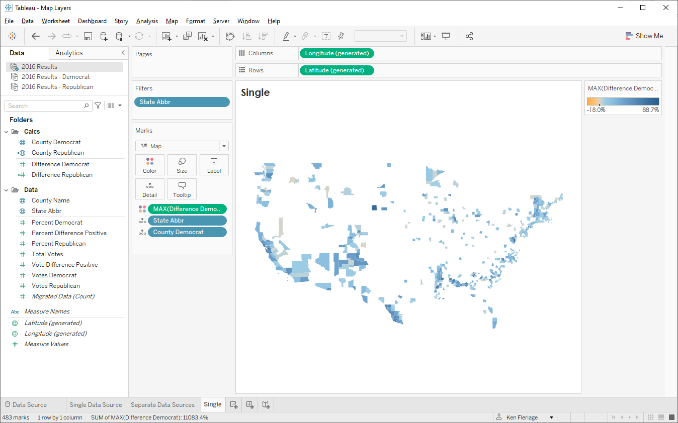
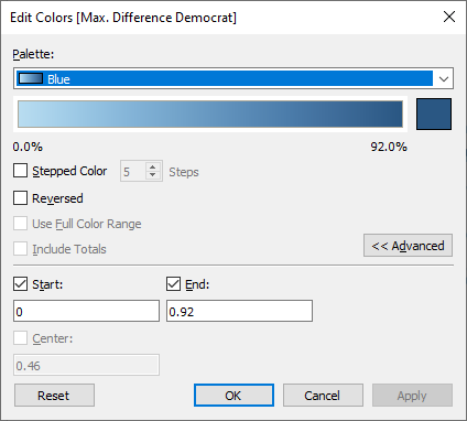
Then we’ll edit the color palette,
choosing the blue continuous palette, setting the start value to 0 and the end
value to 0.92. I’ve chosen 0.92 because that’s the largest percent difference
in my data set. To be safe, I could just set it to be 1, but that tends to dull
the colors a bit.
Next, we drag State Abbr to our
view and choose the option to create a new map layer. We then set it up to use
the Republican calculated fields and the red palette, also setting the start
and end to 0 and 0.92, respectively.
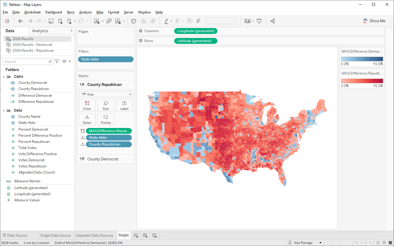
If you had additional parties, you’d
continue this process, creating a separate map layer for each.
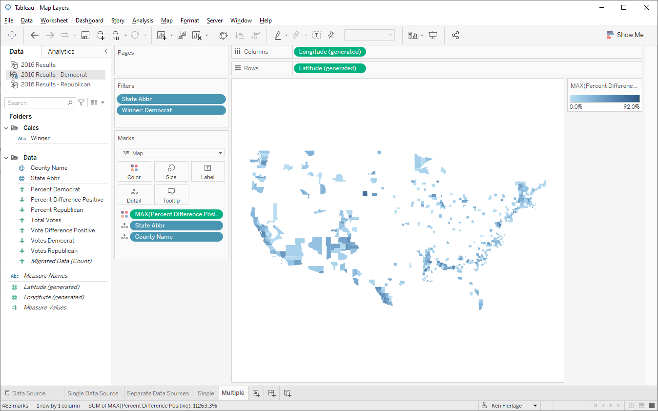
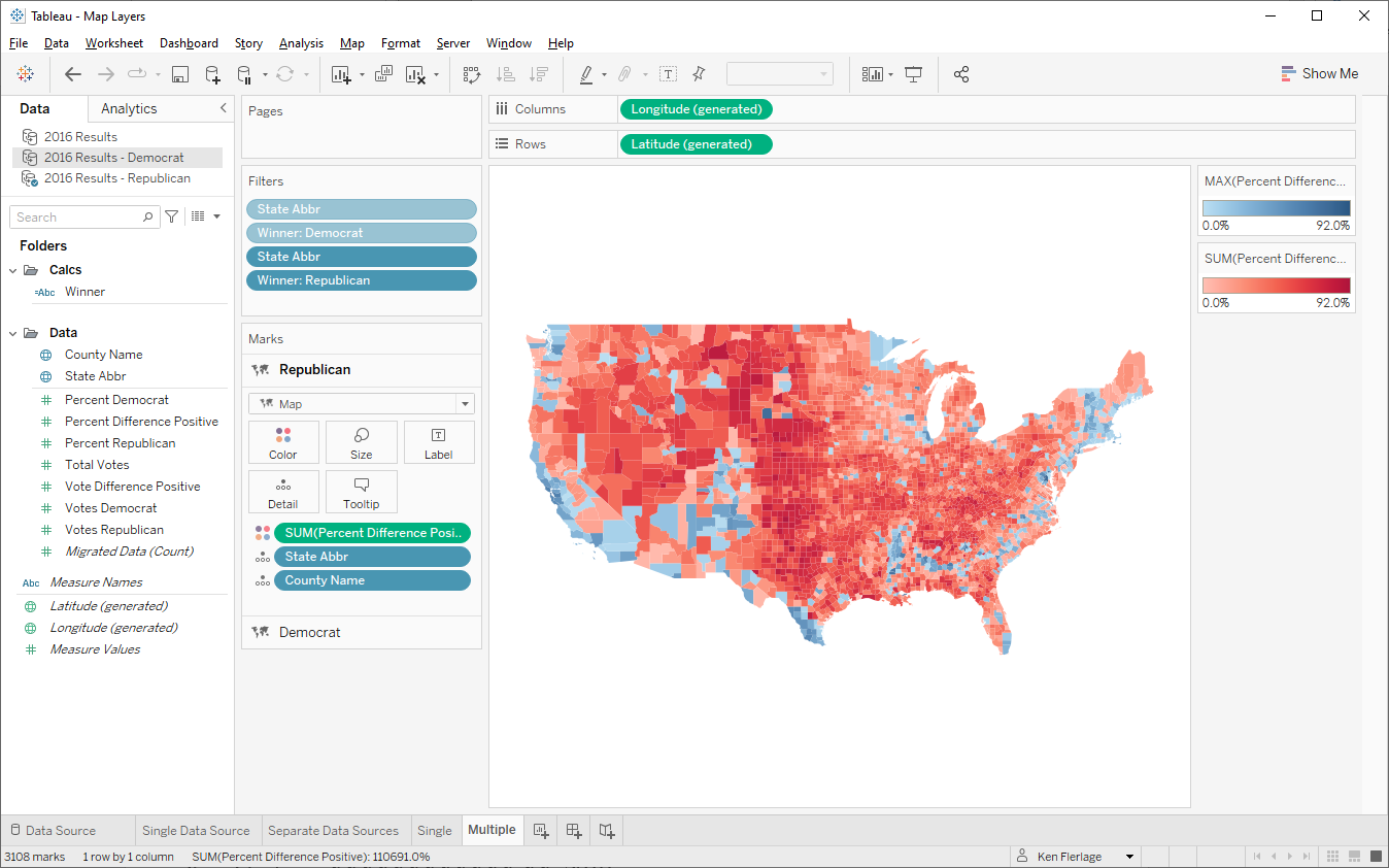
Multiple Data Sources
When you create map layers using
multiple data sources in Tableau, you can filter each data source individually
without impacting the others. Because of this, we can avoid creating calculated
fields for each party. So, in this example, I’ve started by duplicating my data
source—I now have one for Republican and one for Democrat. We’ll need one
calculated field for the winner which we’ll use for filtering—this should be
created in both data sources.
Winner
// Who won?
IF [Votes
Democrat]>[Votes Republican] THEN
"Democrat"
ELSE
"Republican"
END
Then, using the Democrat data source,
we’ll create a map layer as shown here, once again using the continuous blue
color palette and setting the start to 0 and end to 0.92.
Next, we’ll add a filter based
on the Winner field, only keeping “Democrat”.
Then we repeat the process creating a
new Republican map layer using the Republican data source and filtering Winner
keeping “Republican”.
I like this method since we don’t have
to create separate calculated fields, but it does create multiple data sources,
which might not always be desirable. Ultimately, however, both of these map layer methods are much better than the three original methods I provided as they can handle an unlimited number of elements (parties, in my case) and do not have the color issues we found in some of the prior methods.
Ken Flerlage, April 6, 2019


No comments: