
Creating a Scrollable Timeline in Tableau

If there’s one
thing I’ve learned about Tableau in the four years I’ve been using it, it’s
that you can make it do pretty much anything. Even those things that seem
“impossible” usually aren’t. This is even more the case now that we have
features like set actions, parameter actions, and dashboard buttons. So, when I
recently saw a scrollable timeline on the web, I knew right away that we could
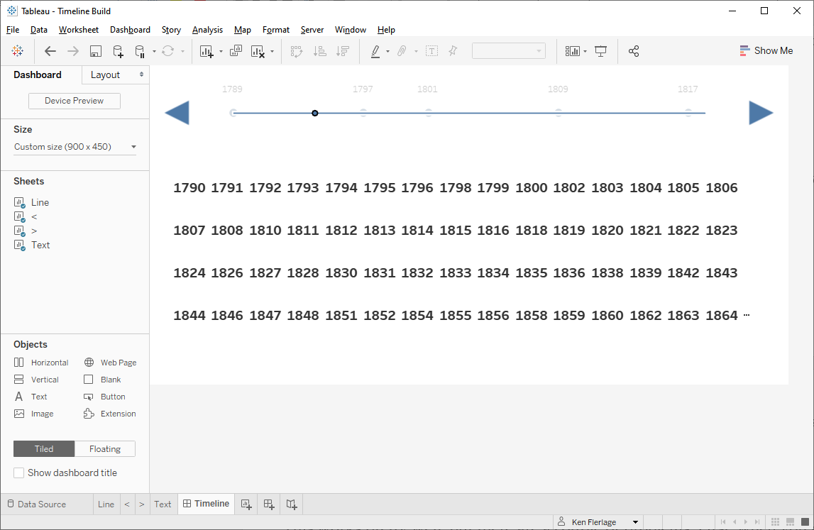
create this in Tableau. Here's what I created:
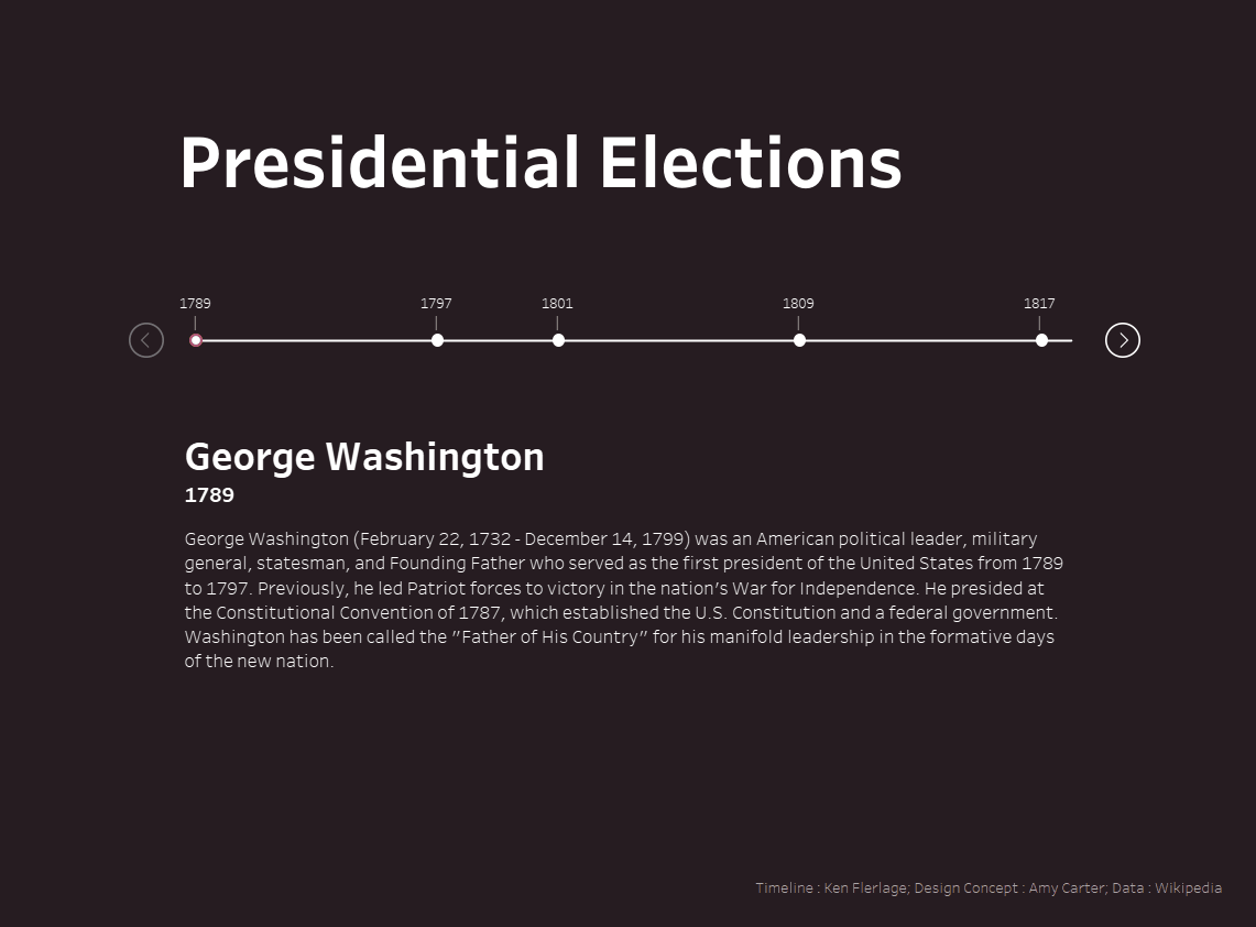
I was really
excited about how this turned out, so, in this blog, I’ll show you how to
create a scrollable timeline for yourself.
The Basics
For this tutorial, I created a data set
showing each of the Presidents of the United States and the year they first
took office. The data has four columns:
Year – Year the event
occurred (in this case, the year the President took office).
Event – Numeric ID of
the event.
Text – Short text for
the event (in this case, the President’s name).
Description – Description of
the even (in this case, a description from Wikipedia about the President)

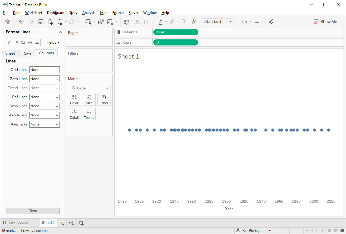
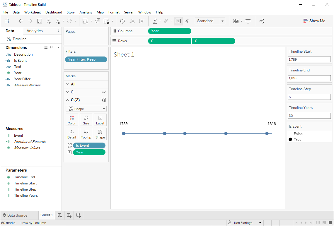
We’ll start by bringing this data into
Tableau. We’ll place Year on the columns shelf and create a “fake”
y-axis by placing a zero literal on rows. Then we’ll show each year as a
circle.
Next, we’ll duplicate the 0 pill to
create a dual axis. We’ll change the first axis to a line and leave the second
as circles.
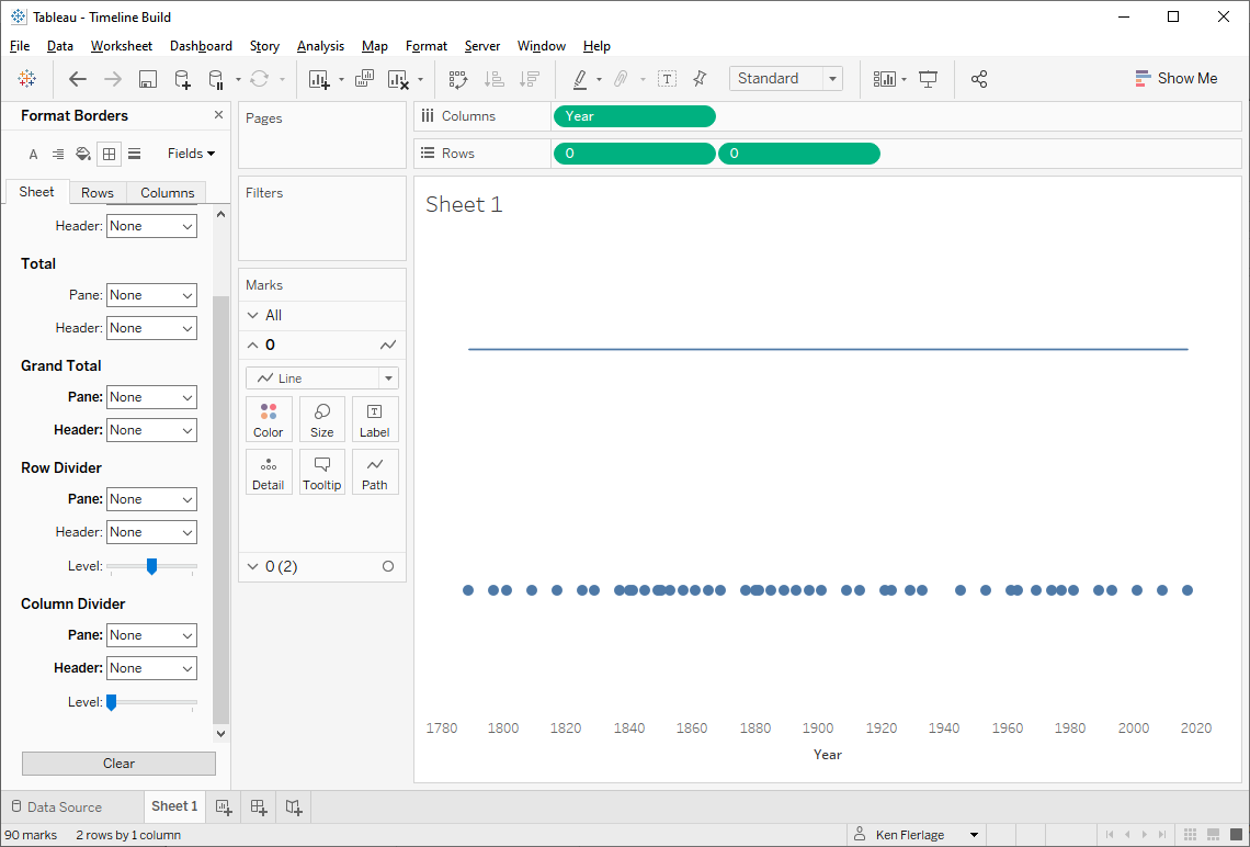
Then we’ll make these a dual axis (don't forget to synchronize the axes too).
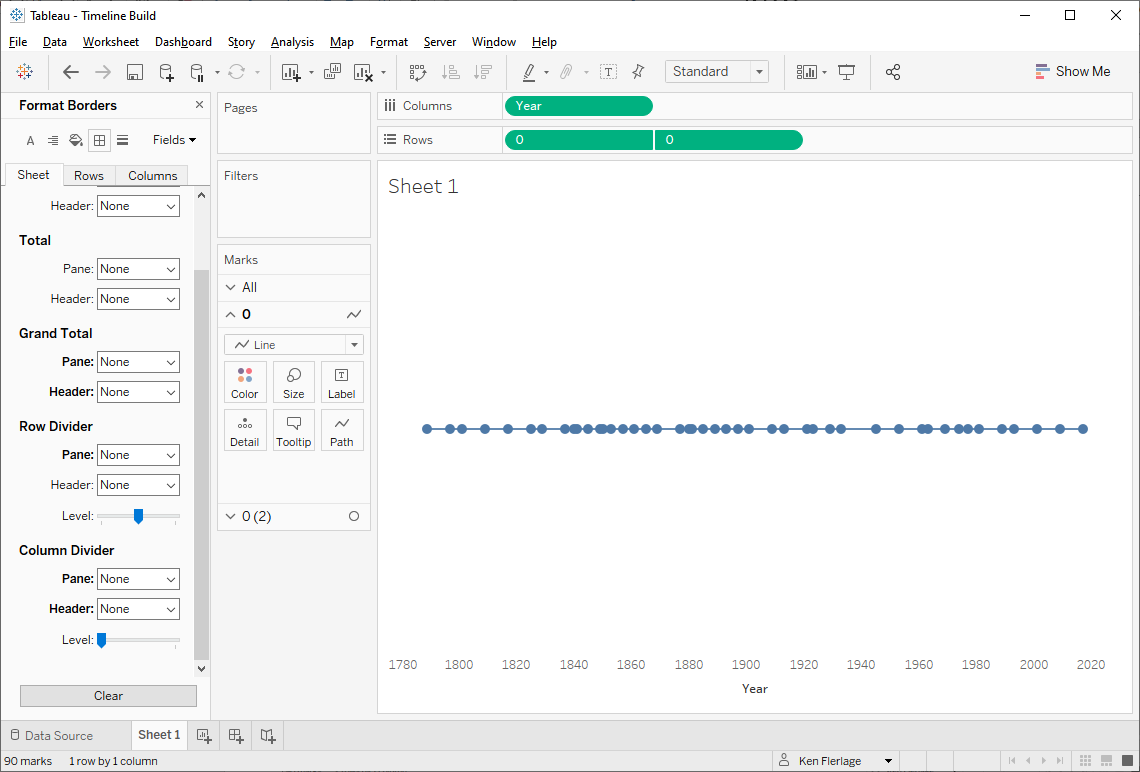
And now we have a simple timeline!
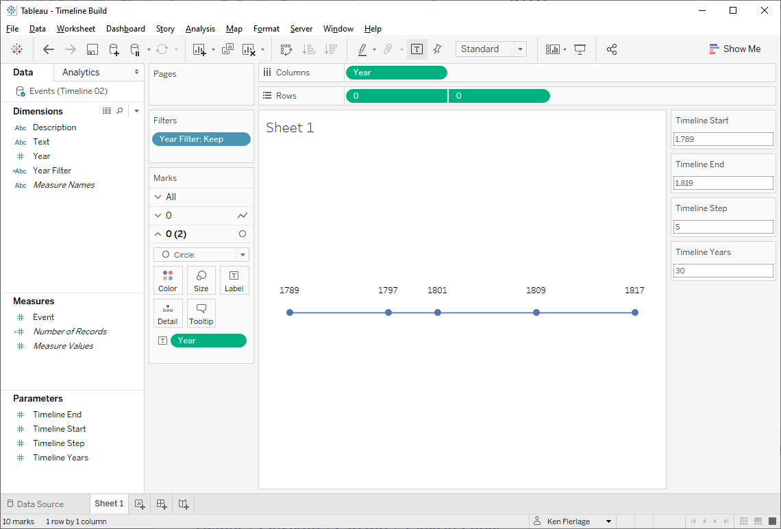
Making it Scrollable
There’s a lot crammed into that
timeline so we want to make it scrollable. To do that, we’ll need to filter to
sections of the timeline in small chunks at a time. We’ll start by creating a
few parameters. All will be integer parameters:
Timeline Start – Year on which the
visible timeline will start. I’ll default this to the very first year, 1789.
Timeline Years – Number of years
we’ll show at one time on the timeline. Default: 30
Timeline End – Year on which the
visible timeline will end. Default: 1818
Timeline Step – Step size (i.e.
number of years we’ll jump to the left or right when we scroll). Default: 5
Now we’ll create a calculated field to
act as a filter. The idea of this field is to only keep years between the
Timeline Start and End years.
Year Filter
// Only keep years within the timeline dates.
IF [Year]>=[Timeline Start] AND [Year]<=[Timeline End] THEN
"Keep"
ELSE
"Exclude"
END
We’ll then add this as a filter, only
keeping the “Keep” values.
Not bad! But if you look closely, you
may notice a problem. Our goal is to show 30 years at a time. Initially that 30
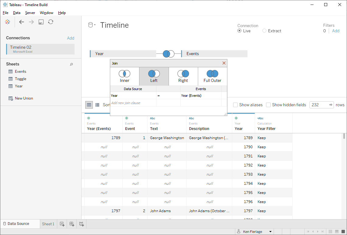
year period is 1789-1818. But, our data only has the years that a President
started his first term, so the timeline stops at 1817. For this to become a real
timeline—with a “point” for each year—we’ll need to densify our data. So, I
created another table with one column, Year and rows for each year from
1789 to 2020. I then performed a left join from this new table to the events
data, as shown below.
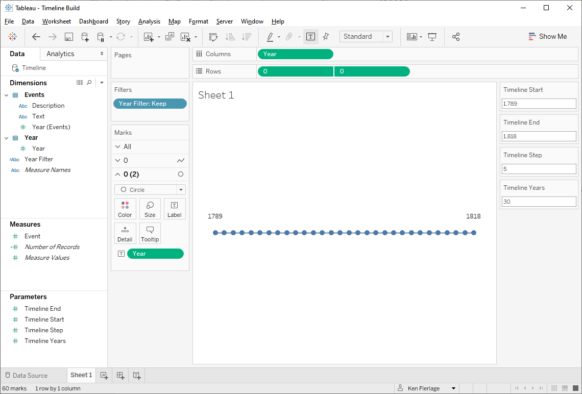
Now when we look at our timeline, we
have a point for every year.
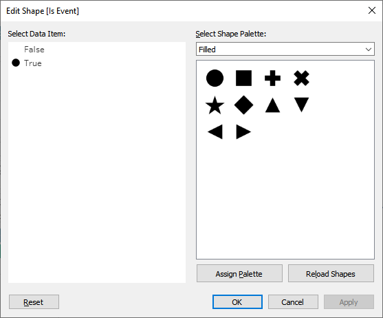
But this creates a new problem.
We have circles for every year, but we really only want a circle for each real
event. So let’s create a calculated field to delineate between years with and
without events.
Is Event
// Is this a real event?
IF ISNULL([Event]) THEN
FALSE
ELSE
TRUE
END
We’ll then drop this on the shape card,
then assign a filled circle to TRUE and a blank shape (a custom shape that is
100% transparent) on FALSE:
Tip: I use these blank shapes all the
time in order to make something invisible. However, if you put these shapes into
a custom shape folder along with other shapes, particularly ones that are hard
to see against a white background (semi-transparent or white shapes, for example),
then it can be difficult to tell which shape is the blank. My suggestion is
that you create a custom shape folder called “Blank” then place only that blank
shape inside—that way, you’ll never get it confused with other shapes.
Now that’s more like it!
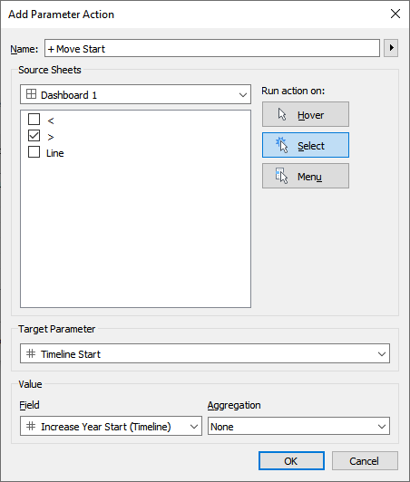
Next we need to create the user
interface needed to scroll the timeline. We’ll use a sheet to create a left
button and another sheet for a right button. Then we’re going to leverage
parameter actions to cause the Timeline Start and Timeline End
parameters to increase or decrease when one of the buttons is clicked. Let’s
start with the right button. This is just a simple sheet using a shape mark
type:
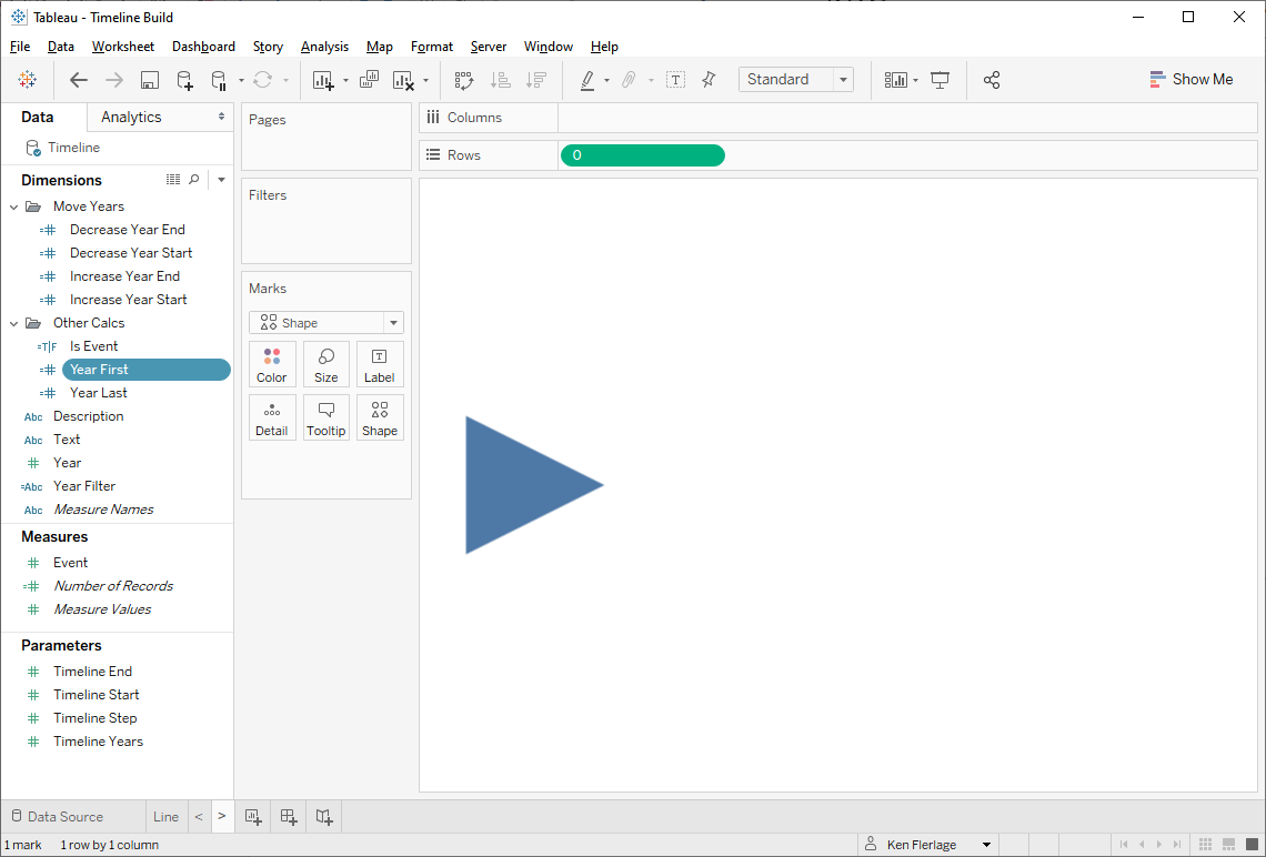
Note: I used a fake 0 axis here as
well. Strictly speaking, this isn’t necessary, but there are times when certain
functionality requires an axis, so I tend to use an axis by default.
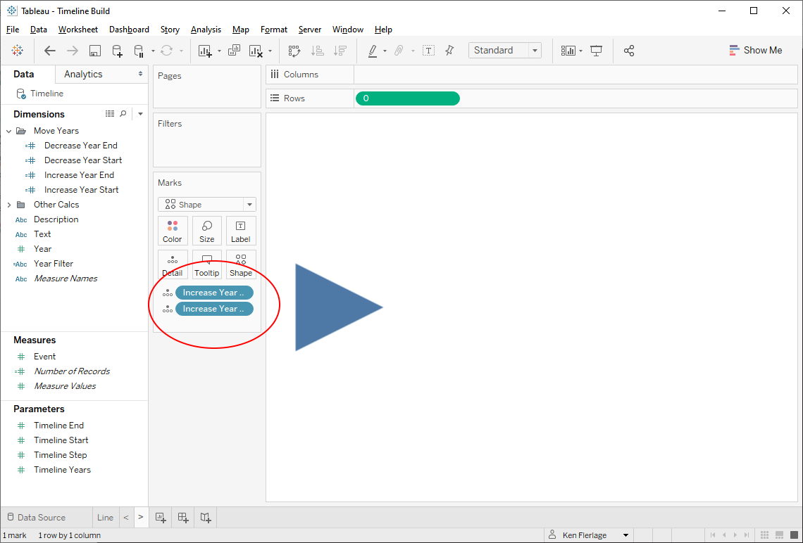
Now we’ll create two calculated fields
which will contain the values we wish to push into the Timeline Start
and End parameters when the button is clicked. These calculated fields will also
need to account for the possibility that we might be reaching the end of the
timeline, so we’ll first create a calculation to get the last year in our data
set. Then we’ll use that to make sure we don’t scroll past the last date.
Year Last
// First year in the data set.
{FIXED : MAX([Year])}
Increase Year Start
// Adjusted start year if we move right.
IF [Timeline End]+[Timeline Step] > [Year Last] THEN
[Year Last]-[Timeline Years]-1
ELSE
[Timeline
Start]+[Timeline
Step]
END
Increase Year End
// Adjusted end year if we move right.
IF [Timeline End]+[Timeline Step] > [Year Last] THEN
[Year Last]
ELSE
[Timeline End]+[Timeline Step]
END
So that these fields are available for
use in our parameter actions, we’ll drop them on the detail card.
For the left arrow, we’ll do the same
basic thing, except our calculated fields will decrease the value of
each parameter, ensuring that we don’t go past the first year in the data set.
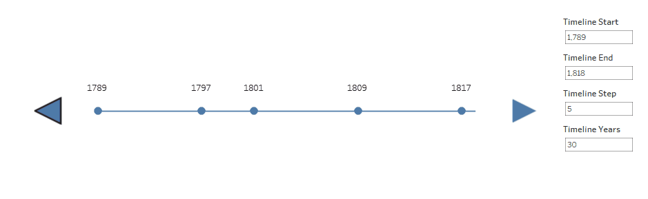
Now we’ll add all of our sheets to a
dashboard.
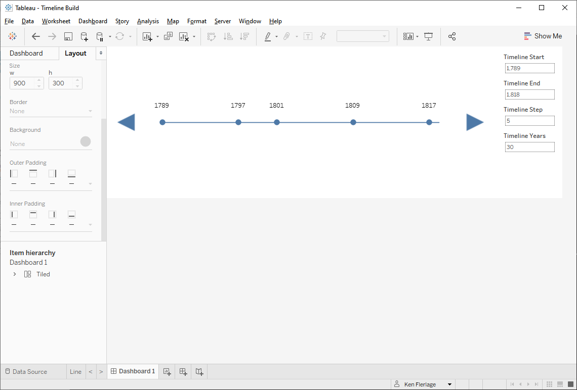
Each button will now have to fire two
parameter actions—one for both the start and end dates.

And we’ll do the same thing for the
left arrow as well.
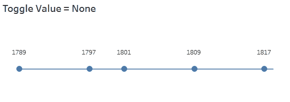
With those in place, we can click on
the arrows and the timeline will move back and forth.
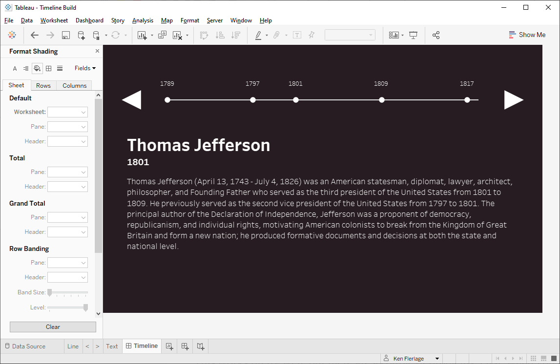
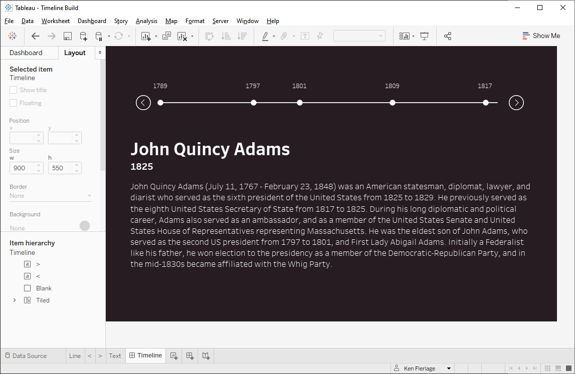
Selecting Events
Now that we have a functional scrolling
toolbar, we need to create interactivity such that, when you click on an event,
it updates the rest of the viz. In my case, I simply want to show some text
describing each President. So, I’ll start by creating a sheet with the text I
wish to display:
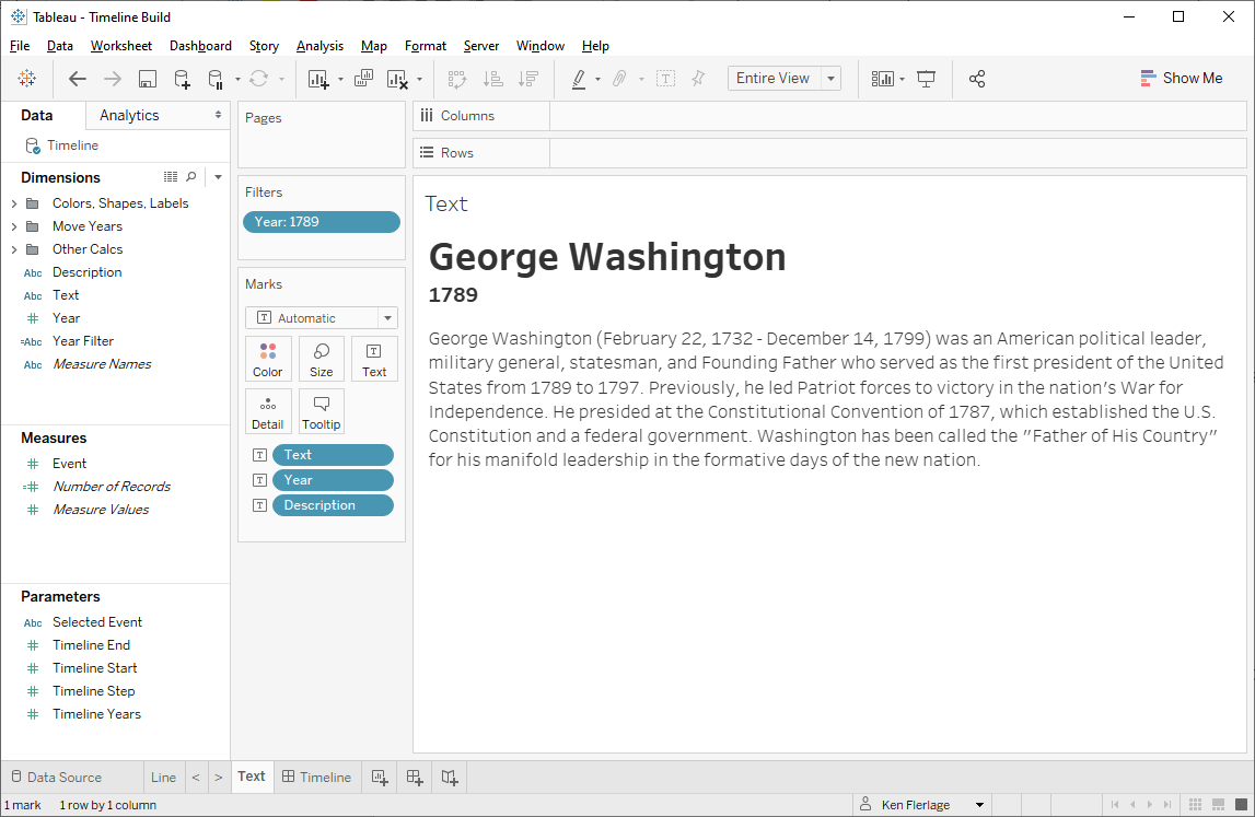
I’ll add it to the dashboard then create
a filter action that filters this sheet when the user clicks on an event on the
timeline.
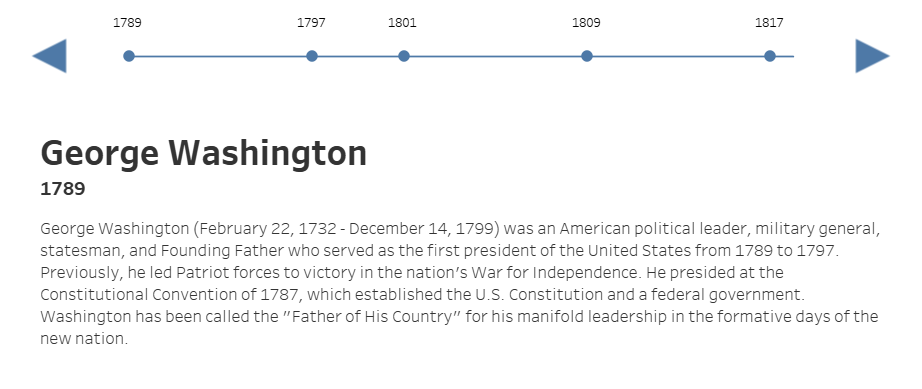
This works pretty well, but there are a
couple of problems. First, when you click on part of the line that does not
have an event, you get this:
The value of the Event field is
NULL and it breaks the filter action essentially clearing it and showing all
values.
The second problem is that I don’t want
the line (or even the circles) to be selected/highlighted when I click them. I
want to use some other methods to show which event is selected (we’ll get to
that in the next section). So I need to find a way to prevent the selecting of
the line.
Let’s start by addressing the issue
with NULL events. To address this, we’ll use a parameter action instead of a
filter action. First we’ll delete the filter action we created above. Next we’ll
create a parameter called Selected Event. Then we’ll create a parameter
action that, when the timeline is clicked, sends the value of Event into
Selected Event.
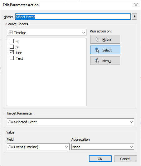
The great thing about this is that,
when you click on the line where there is no event, Tableau will not write a
NULL value to the parameter—it just keeps the same value as it had previously.
Finally, we’ll create a calculated
field that uses the parameter to filter our text sheet.
Increase Year Start
// Show the event if it's selected in the
parameter.
IF [Event]=[Selected Event] THEN
"Keep"
ELSE
"Exclude"
END
Add this as a filter on the text sheet,
keeping only “Keep” values.
It now works perfectly when we click an
event, while not doing anything strange if we click a point on the line where
there is no event.

OK, now we need to fix the line
selection problem. This is standard functionality when you click a mark in
Tableau, but in this case, I don’t want it. So I’ll prevent it using a trick that
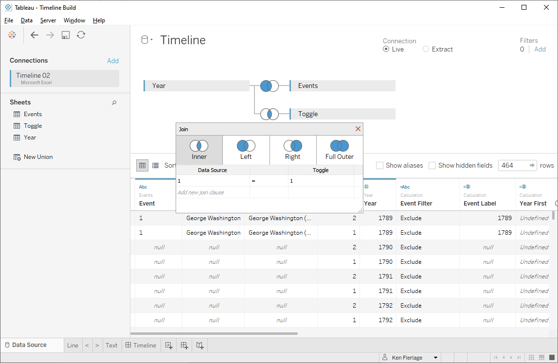
I learned from the great Jacob Olsufka. This trick requires duplication of my data so I’ll create one more table
called Toggle. This will contain one column, also called Toggle,
with two rows with values 1 and 2. I’ll add this into my data model using a
cross-join. A cross-join joins every record in one table with every record from
another. In my case, that means all of my years will now have two records, one
with Toggle = 1 and one with Toggle = 2. Cross-joins aren’t built into Tableau,
but you can use join calculations with the value 1 on either side to mimic one.
Note: This could also be done with a union, but I personally find the table to
be a cleaner solution—though it’s also a bit more confusing (sorry!).
Having 2 of each record will allow us
to initiate a filter action when the timeline is clicked, forcing it to filter
over to the other toggle value. Since each toggle value has the complete data
set, we won’t notice any change in the chart. Let’s start by creating a
calculated field:
Toggle Next
// Switch to the next toggle
IF [Toggle]=1 THEN
2
ELSE
1
END
So, if the timeline sheet is currently
filtered to Toggle = 1, then the above calculated field will return 2 (and vice
versa). We’ll now create a filter action that feeds the Toggle Next value
into the Toggle filter. To make this available to our filter
action, we need to drop Toggle Next on the detail card. Then we create
the filter action (it’s best to do this from the sheet, rather than the
dashboard).

Now, when you click on the line (and
the circles), the filter action toggles the value of the filter. This filter
forces the mark selection to disappear. Pretty cool, eh?
Note: Duplicating your data isn’t
always ideal. In my case, the data is small and duplicating it isn’t much of a
problem. However, if you wish/need to avoid duplicating, then be sure to check
out this great trick by Jonathan Drummey: Hiding Selection Borders in Tableau.
Styling It
Our timeline is turning out really
nicely. And we could certainly just be done here. But I personally think the
design needs some work, so let’s clean up a bit—both to help it aesthetically,
but also to enhance the user experience. When searching around for ideas on how
to style the timeline, I came across a “pen” on codepen.io by Amy Carter, which showed a beautiful timeline:

Note: I originally found this timeline
on uicookies.com, so if you’d like
to style your timeline differently, the following article is a good place to
start: 28 Engaging Horizontal Timeline Examples To Copy This 2020
I really loved this design so I decided
to borrow it for my timeline. A few key things I’ll point out:
1) Color – The
color is amazing. Who would’ve thought to have pink on top of this dark brown
background.
2) Buttons –
The buttons are much more elegant than my triangles.
3) User
Interface – As you click on a timeline event, a pink line is drawn from the
start to the selected point. The selected point, and those between, are also
colored in pink. This allows you to more clearly see which event is selected.
So, let’s try to implement all of this
in our own timeline.
The first item is simple—we just need
to change the colors.
I’m skipping the pink for now as we’re
going to add that when we get to # 3.
For # 2 (buttons), I turned to The Noun Project, which has tons of
great icons. I found some icons that were close, but none of them were exactly
what I was looking for. So I decided to create my own in PowerPoint.
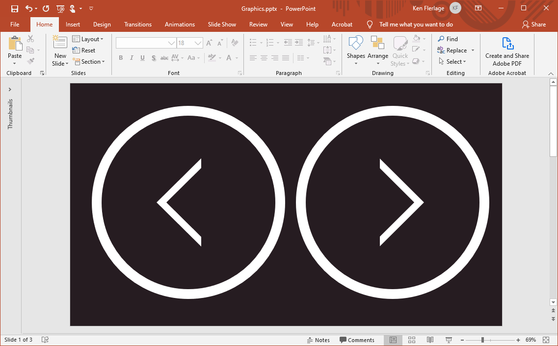
After adding these as custom shapes, we
can use them for our buttons.
And the final piece is the user
interface. As noted above, as you click on a timeline event, a
pink line is drawn from the start to the selected point. The selected point,
and those between, are also colored in pink. This allows you to more clearly
see which event is selected. To create this, we’re first going to need a few
calculated fields. The first will give us the year associated with the selected
event.
Event Year
// Year of the
selected event.
{FIXED : MAX(
IF [Event]=[Selected Event] THEN
[Year]
END
)}
Then one to determine the shape we’ll
use:
Shape
// Show different
shapes for items later in the timeline than the selected event.
IF ISNULL([Event]) THEN
"None"
ELSEIF [Year] > [Event Year] THEN
"Future"
ELSEIF [Year] = [Event Year] THEN
"Current"
ELSE
"Past"
END
For each of these values, I created custom
shapes in PowerPoint:
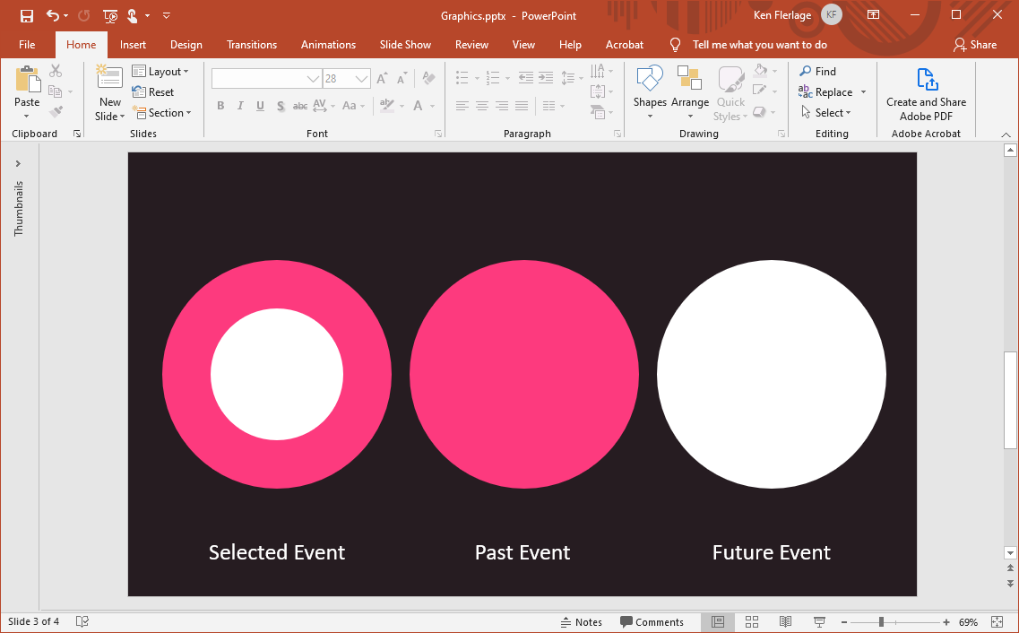
We had previously placed the Is
Event field on the shape card of the second axis, but we’ll now use the Shape
field instead. We’ll assign the shapes as follows. Just as we did earlier, “None”
will be assigned a blank shape.
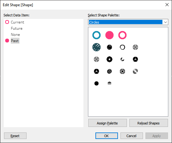
In the screenshot above, it’s difficult
to tell, but the white circle is assigned to “Future”.
Now, when we select an item on the
timeline, that event gets the white circle with pink outline, past events get
the pink circle, and future events remain white. Next, we’ll color the line.
For that, we need the following calculated field:
Color Line
// Color line
differently for items later in the timeline than the selected event.
IF [Year] >= [Event Year] THEN
"Future"
ELSE
"Past"
END
We’ll drop this field on the color card
on the first axis (the line axis). This will actually cause the line to break
into two separate line segments. To avoid this, right-click the pill and change
it to an attribute. Then edit the colors, assigning pink to “Past” and white to
“Future”. Now, as we click on an event, the line is colored pink in the past
and white in the future, making it even easier for us to see where we are on
the timeline.
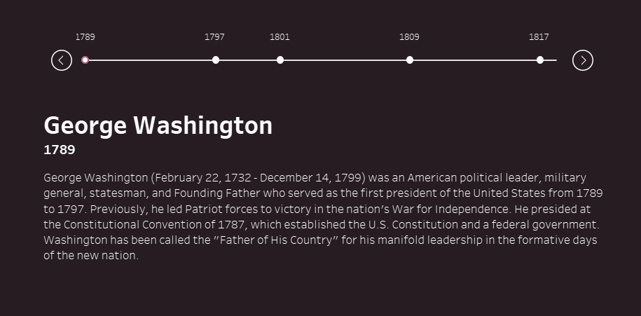
And we’re done!! I don't know about you, but I think this looks pretty good!
Using My Workbook as a Template
Okay, that seemed like a lot of steps,
but trust me when I tell you it doesn’t take that much time to build. And, if
you have a need for a nice timeline like this, I think it will be worth the
effort in the end. That being said, if you’d rather not build this from scratch, you can use my workbook as a template. Here are the basic instructions:
1) Download my Excel Template.
2) On the Year
sheet of the template, create a row for each year from your start date to your
end date.
3) On the Events
sheet, populate the Year field with the year of the event, the Event
field with a sequential number, the Text field with a short name for the
event, and the Description field with a longer description. You can also
add other fields to this, if desired.
4) Download my Tableau workbook and connect it to the spreadsheet.
5) Update the following
parameters:
Timeline Start – First year of the timeline.
Timeline Years – Number of years to show at one time.
Timeline End – Last year of the visible timeline (Timeline Start + Timeline Years - 1)
Timeline Step – Number of years you wish the timeline to jump when you click the left
or right button.
With those steps, you should have an
instant scrollable timeline!
Thanks so much for sticking around for
this whole blog. I hope you find this useful and, as always, if you end up
using this, I’d love to see it! If you have any comments or questions, please
feel free to leave them in the comments section. If you have questions that are
too long or complex to be easily addressed via text-based comments, then feel
free to use the contact form on the website. Thanks for reading!!
Ken Flerlage, March 9, 2020


Many thanks for this post - I already see some uses of this method :)
ReplyDeleteFantastic!
DeleteHey Ken, awesome article as usual. And great minds think alike ;) I did something similar recently that might be interesting to you, but I really like some of the extra things you thought of here: Create an image gallery in Tableau
ReplyDeleteOh this is cool, Daniel--I hadn't seen this before. Looks like we used some very similar techniques for our timelines. Just followed you on Tableau Public!
DeleteHi Ken,
ReplyDeleteI have seen your posts on community page but recently i attented your webinar that was part of #datafamcommunityfam. Your session was very motivational. Thanks you for amazing post and your contribution to the community.
keep it up..
Thanks and stay safe!!
Thanks for your kind words, Nitin. I'm glad you enjoyed my presentation. If you ever need any assistance, don't hesitate to reach out!
DeleteThanks Ken for this Wonderful article. This is really helpful. Can you please help me to get the source Excel file. I am Unable to download the file from Amazon Drive
ReplyDeleteSure. Could you email me at flerlagekr@gmail.com. I will send you the file.
DeleteHi Ken, I just wanted to thank you for your wonderful blog that I follow all the time - as a beginner, your detailed examples help me enormously. It is absolutely amazing! Thank you! Orchid
ReplyDeleteThank you Orchid! You are too kind.
DeleteHi, I really liked your content and was really useful.
ReplyDeleteI was wondering if this can only be done with the latest version of Tableau or can we do this with previous versions?
Because of the use of parameter actions, you'll need to use 2019.2 or later (2019.2 is about a year old at this point).
DeleteHi Thank you for your response.
DeleteI have one more query, I tried building a timeline with the same steps but instead of years I have dates in this format 12/05/2020. It seems to be a problem when setting parameters and actions for those. I was wondering if you have an example of working with dates? I am not able to put them as integers.
Thank you
I don't have an example, but it should work in very much the same way. Happy to take a look if you could email me a sample workbook. flerlagekr@gmail.com
DeleteHi ken, Thanks you shared, can we make it auto used the pages?
ReplyDeleteSo you want it to automatically scroll?
Deleteyes yes,have you good idea.
DeleteNo, I don't. This is generated by parameters and you can't change parameters with pages. This would need to be reworked to make animation possible.
DeleteHi Ken
ReplyDeleteMany thanks for posting this great tutorial. I’m new to Tableau so please excuse my ignorance. The data I’m currently working with could benefit from a scrollable timeline so I’ve been working through your instruction. I’m stuck on ‘Making it scrollable’ because I need to use a date (mmm yy) for the parameter rather than an integer. Is there a way of creating the parameters you’ve detailed (Timeline Start, Timeline Years (in my case mmm yy), Timeline End & Timeline Step) using Date as the Data type? The number of months (as opposed to years which can be used as an integer) to show on the timeline and the step size need to be measured in date form (months), not integers. I can’t see a way of doing this.
Specifically I’m looking at the approval dates (FDA & equivalent) of a cancer drug globally (past and predicted future) across time. The drug was first approved in the USA in April 2017 with registrations approved or expected to be approved in 19 different countries at various times during this period with the last expected approval for Greece in 2021. I'd like to display all countries with names but this isn't possible without scrolling.
Any help gratefully received even if it’s “there’s no way of doing this!”
thanks Ken, Mat
Good question. I think what I would probably do would be to create numeric values for the months and years. For example, if the first month in the data is April 2017, then that would be 1, May 2017 would be 2, April 2018 would be 13, April 2019 would be 25, etc. You could then use that numeric value for the timeline and everything else should fall into line. But you'd display the actual months/years instead of the number. Does that make sense?
DeleteYes that makes sense Ken, I'll give that a go. Many thanks for taking time to respond.
ReplyDeleteHi Ken, I really enjoyed this article! Unfortunately, I'm having a little trouble with the labels for every event year. My "Is Event" works at filtering real events, and my timeline has my "Timeline Start" and "Timeline End" dates at each end. I wonder whether you have a solution for that. It would be greatly appreciated! Thanks!
ReplyDeleteHi Ken, just a follow up: no worries! I just fixed it! Thanks again!
ReplyDeletehow to add the parameter action for Selected Event .... In the Edit Parameter action field unable to get the Event(Timeline) field option .
ReplyDeleteCan you email me? flerlagekr@gmail.com
DeleteHow to create Selected Evvent Parameter
ReplyDeletefantastic ken love this.
ReplyDeleteThanks!
DeleteThanks for the blog Ken. How did you make the arrow sign thin in Power Point?
ReplyDeleteJust drew them with lines and circles. Happy to provide you with the Powerpoint file if you send me an email. flerlagekr@gmail.com
DeleteThank you so much sir. I got to learn so much from your post. I am very grateful!!
ReplyDeletethank you so much, this is fantastic!! is there any way to have multiple events happening in the same year on the timeline?
ReplyDeletePossibly. I'd probably just combine them into a single event, if possible. Otherwise, it would get tricky because you'd have overlapping marks. There are ways to handle this, of course. Happy to help further, if you'd like to email me. flerlagekr@gmail.com
DeleteHi Ken, I'm new to Tableau and just wanted to say thank you for being such an inspiration. I've managed to get the timeline moving but am struggling to get the Event(Timeline) to come up when changing Editing Parameter action field.
ReplyDeleteMy pleasure. Might be best if you could send me an email. flerlagekr@gmail.com
DeleteOur tableau developer is working on a timeline and was sent a link to this post. Do you have any ideas for how to make a mobile-friendly version of such a timeline?
ReplyDeleteYou should be able to make this mobile friendly. Have you tried it? What problems are you running into?
Delete