
Lego Art in Tableau

Though it’s now a few years
old, I recently discovered Italian artist, Marco Sodano’s Lego
versions of famous artworks, as displayed on the Huffington Post article, We Only Wish DaVinci Could Have Seen This Lego Mona Lisa.
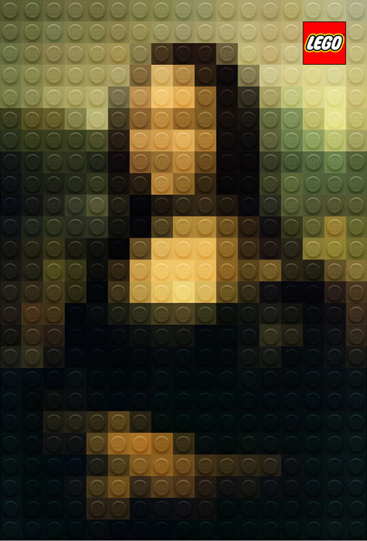
He created a handful of
different works, including the Mona Lisa (above), Girl with a Pearl
Earring, Lady with an Ermine, and Van Goh’s Self Portrait. These
works were part of a Lego advertising campaign called “All children are artists
with LEGO.”
When I first saw these, I
was in awe. But it didn’t take long before I started to wonder if I could
create something like this in Tableau. After thinking about it a bit, I concluded
that this was definitely possible through some Python code, Tableau, and a bit
of image work. In the end, I created my own version of the Mona Lisa
which, other than a few coloring differences, is pretty similar to Mr. Sodono’s
original.

The process I built (I’ll
share a detailed how-to shortly) allows you to recreate any image in Tableau
using “Legos”. You can specify the number of columns you’d like to have, which
means you can have low resolution images, such as the Mona Lisa above or
higher resolution images such as this one of Pennywise from IT.

To help show this a
little more, here’s a gif of Neil Leifer’s famous photo of Muhammad Ali vs. Sonny
Liston. Here’s the original:
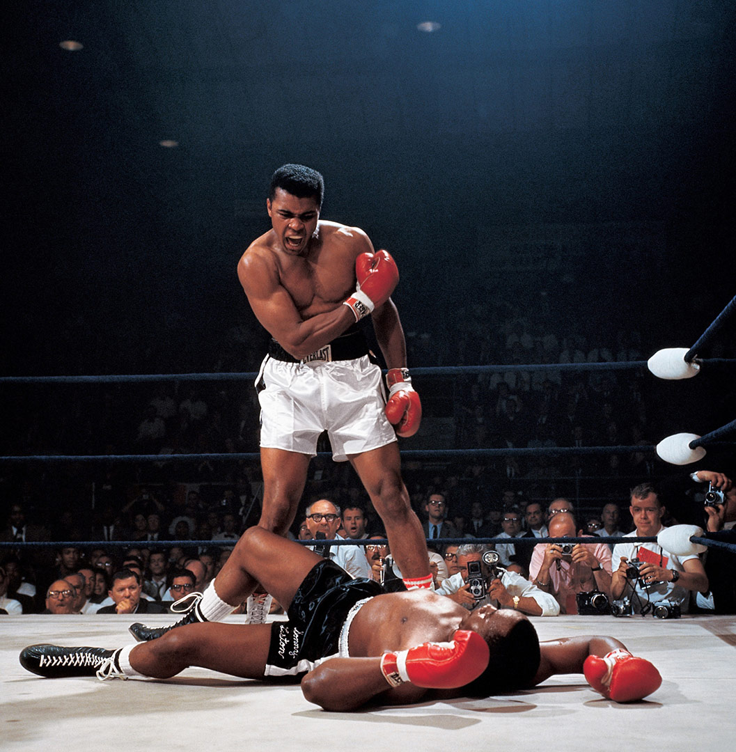
And here are five Lego
versions going from 10 to 300 columns.
I’ll share a few more
examples at the end of this post, if you’re interested, but now let’s talk
about how this was built.
The Build
These Tableau visualizations
have two primary components. The first is a Python program I wrote. The program
will prompt you for an image file (png or jpg) and the number of columns you’d
like. It will then essentially pixelate the image based on the number of columns
specified. It records the color at the center point of each of these larger “pixels”,
then outputs two csv files—one that provides the coordinates of each pixel and
one that can be used to create a custom color palette. I’ll get into a bit more
detail on these in the How-To section.
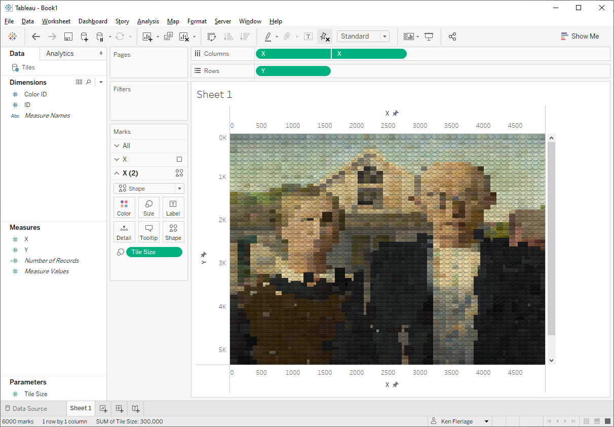
The second component is
Tableau. Using the X & Y coordinates, you can easily plot each image. You
can then use your new custom color palette to color them. But that only gives
you a pixelated image like this:

This is kind of cool as is,
but we really want this to look like Legos. So I used PowerPoint and
a free image-editing program, paint.net
to create semi-transparent Lego shapes. It’s important that these shapes be
semi-transparent so that we can use them as overlays on the pixelated image
above. In the end, I created four different styles, each with slightly
different sizing, highlights, and shadows. Each style has two versions—one with
a logo and one without. Below are the images, shown on top of a blue “tile” background.

We then use these on a dual
axis. Because they are semi-transparent, the color from the first axis shows
through giving us the 3D look we’re going for.
How-To
Let’s talk about how you
can create your own Lego art in Tableau. First, get the Python code and/or
executable package required. If you’re familiar with Python, you can download
the Python code from GitHub. If not, you can download the
executable package, Lego.zip. Extract all the files to your
computer, then run Lego.exe. Sorry Mac users, I think this will only
work for Windows, but if you really want to try this, I’m happy to help you get
Python set up on your machine. While you’re on GitHub, also download the overlay
images, Lego Shapes.zip.
Now follow these steps:
1) Run the Python
program. It will prompt you for the number of columns, then will prompt you for
an image file.
2) The program will
then do its thing. Once done, you’ll get a message the location of the 2 output
files—Colors.csv and Tiles.csv.
3) Colors.csv looks
something like this:

Copy the Hex Color
column and create a new custom Tableau color palette. If you’re not familiar
with creating a custom color palette, read this.
4) Tiles.csv looks this:

The file has 4 columns:
ID – Unique ID for the tile.
X – X coordinate for the center of the tile.
Y – Y coordinate for the center of the tile.
Color ID – In order to avoid creating a huge
color palette, the Python code assigns an ID to each unique color used. We’ll
use this to assign the color palette we created earlier.
5) Connect to Tiles.csv
file in Tableau.
6) Click over to a
new sheet. Drag X to the Columns shelf and Y to the Rows shelf.
Change both to dimensions.
7) Fix both the X and
Y axes so that they start at 0 and match the width/height of the original
image. Also, reverse the Y axis.
8) Change the mark
type to Square.
9) Drag Color ID to
the color card then assign the palette we created earlier:
10) Create a
parameter called Tile Size and set it up like this:
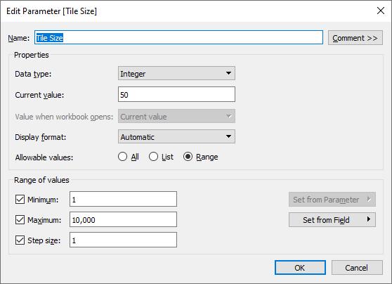
Edit the size legend so that it looks something like this. We’ll
use this to fine tune the tile size once the image is on a dashboard.

11) Duplicate the X
pill on the columns shelf to create a second axis. On this axis, remove the Color
ID pill and change the mark type to shape. Then select one of the Lego
shapes.
12) Create a dual
axis from the two X pills and synchronize the axes.
13) Turn off all the
axis headers and all lines.
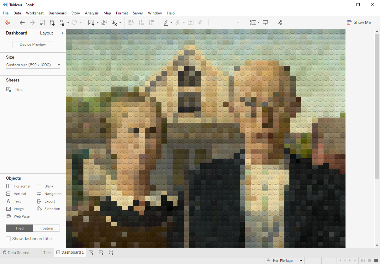
14) Create a
dashboard. Use the width and height of the original image (or dimensions that
use the same aspect ratio).
15) Add the sheet to
the dashboard. Turn off the title. I also like to remove all padding from the
sheet and the main container.
16) Turn on the Tile
Size parameter and make it floating. Then adjust the size until the tiles
fit nicely together. This is a bit easier if you make this a type-in parameter.
And, once you do a bit of fine tuning, you should be done!!
Using Real Legos
Theoretically, this program could be used to create a recipe for creating artwork using real Legos. In fact, I created a version of the Python program that found the closest color match for each tile from the currently available palette of Lego colors. My goal was to then create my own physical Lego artwork. Unfortunately, I found that the current 42-color palette simply doesn't provide enough variety to create a good rendering of most artwork as it results in very hard transitions from color to color. I have to conclude that Marco Sodano had access to additional colors not currently available to the general public--whether those be older, now discontinued colors, or they were provided by the Lego company for the sake of these works. I have to admit that I was pretty disappointed by this. However, if you would like to try your hand at creating some real Lego art, please reach out to me and I'd be happy to share the code.
A Few More Examples
I promised a few more examples, so here you go. I’ve shown
each next to the original image.
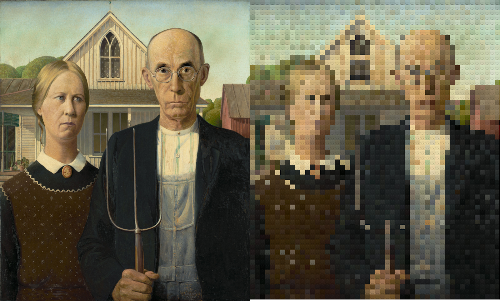
Grant
Wood’s American Gothic (50 Columns)

Iconic Image
of “Rosie the Riveter” by J. Howard Miller – (50 Columns)
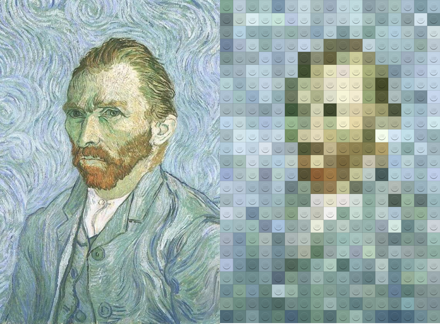
Van
Gogh’s Self Portrait – (17 Columns)
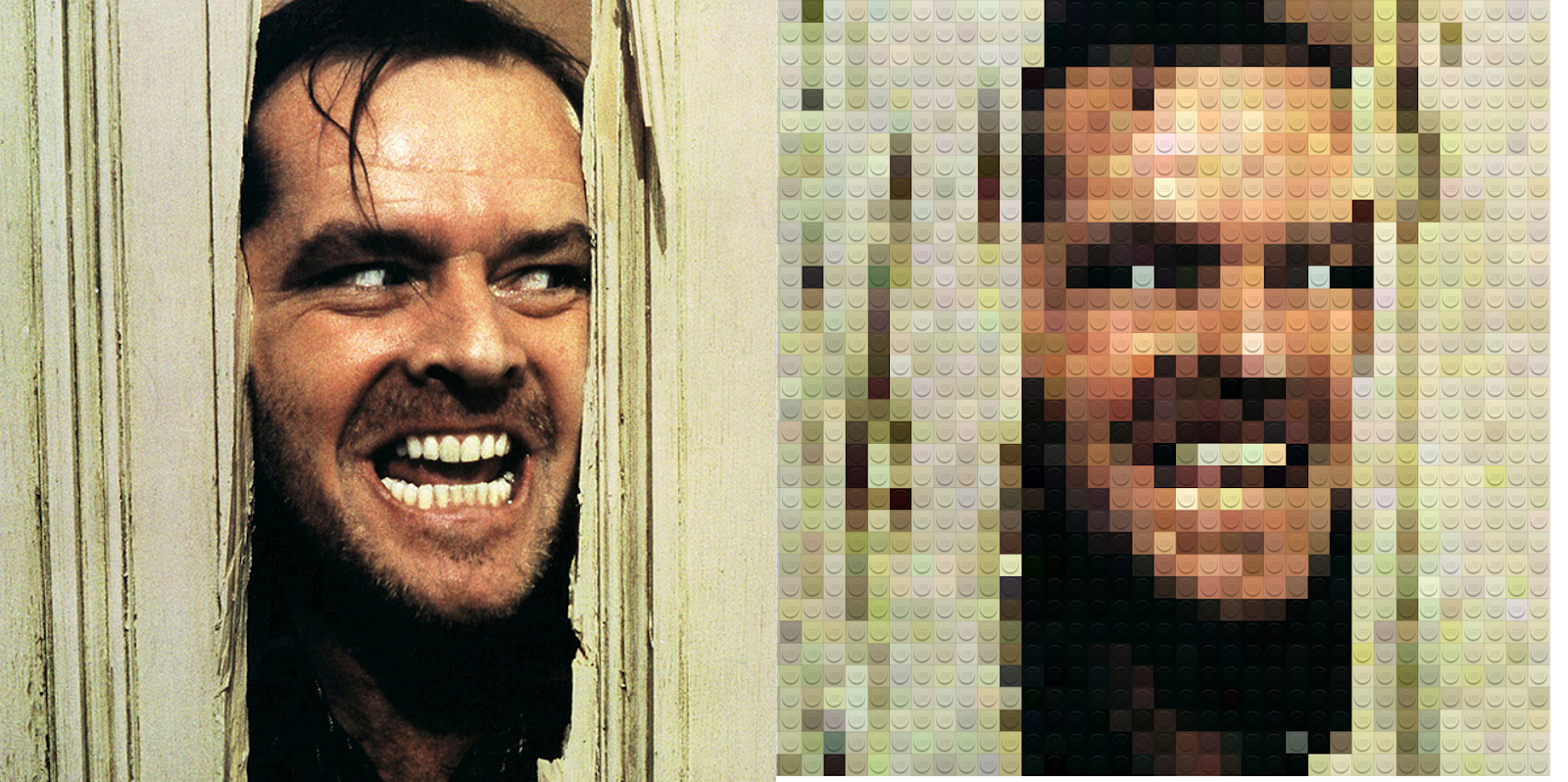
Iconic
Image from Stanley Kubrick’s The Shining – (40 Columns)
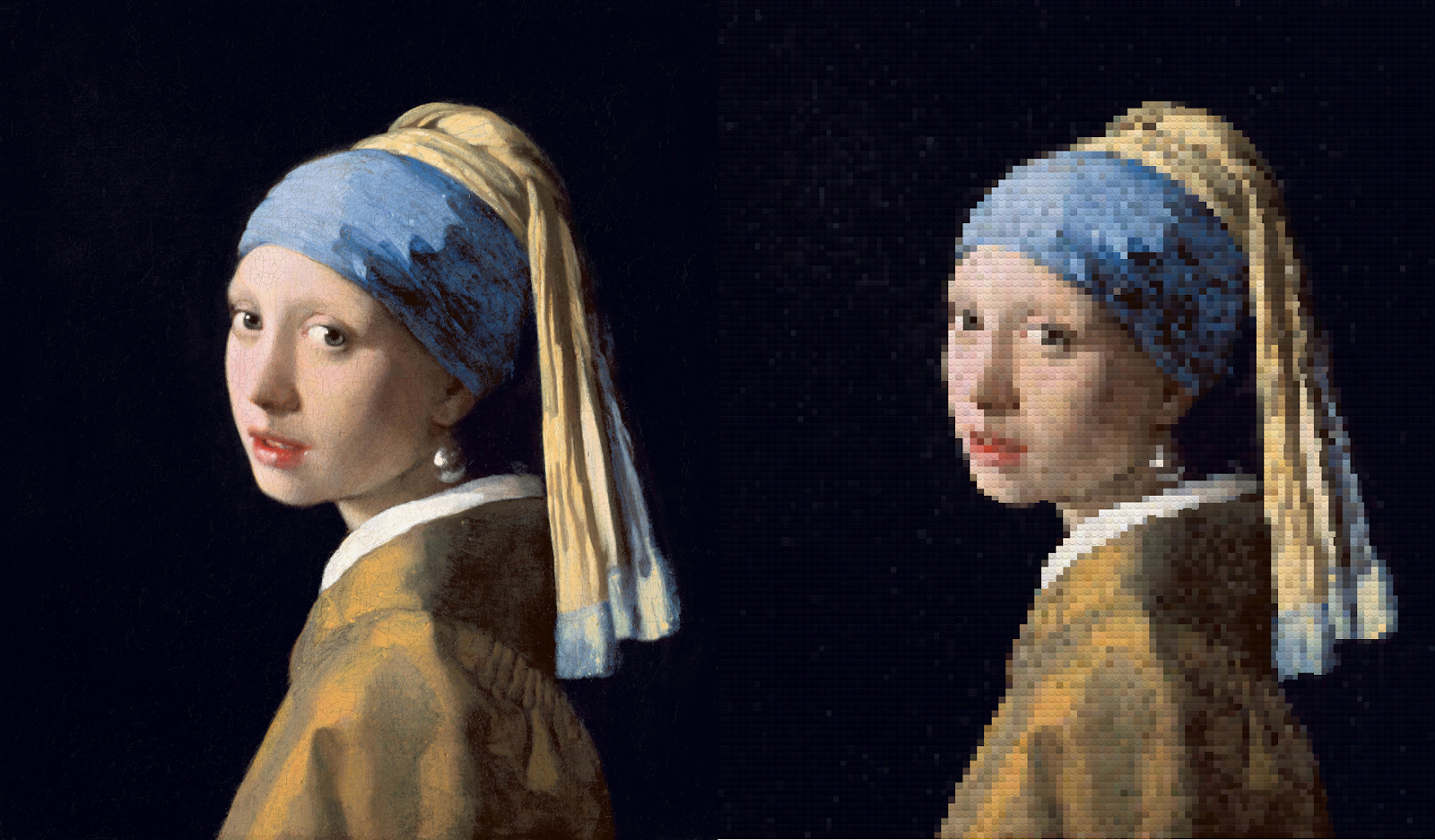
Johannes
Vermeer’s Girl with a Pearl Earring – (100 Columns)
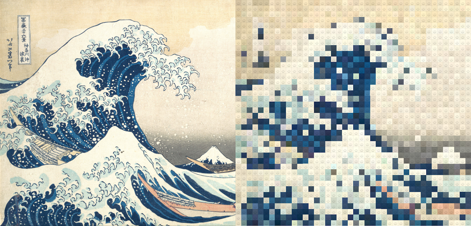
Katsushika
Hokusai’s The Great Wave off Kanagawa – (60 Columns)

NASA Photo
of Earth – (50 Columns)
Hope you enjoyed reading this post. If you create any Lego
images using this technique, I’d love to see it!
Ken Flerlage, June 1, 2020


I love this, but am stuck at possibly the simplest part of the tutorial; "13) Turn off all the axis headers and all lines."
ReplyDeleteHow??? Thanks in advance!
To turn off the axis headers, right click the axes and de-select "Show Header". To turn off the lines, right click the chart and choose "Format". Then, on the left panel, choose the Lines option at the top. On the sheet tab, set everything to "None"
DeleteThank Ken!
ReplyDeleteHello Ken Sir,
ReplyDeleteI have a Question. Will this tutorial work with Zip Files
I'm not sure what you mean? If your image is in a zip file, you'll need to extract it.
Delete