
Creating a Basic Beeswarm Plot in Tableau

In this blog, I’m going
to show you a method of creating a simplified beeswarm plot. I use the term
“simplified” (or “basic”) because this method won’t provide some of the more
advanced functionality provided by other methods of creating this chart. My
goal, however, is to provide you with a method that allows you to create this
chart with just a handful of relatively simple calculations. I’ll also discuss
some of the limitations of this approach and provide you wish some alternatives
for creating a more full-featured beeswarm.
What is a Beeswarm?
Before we get into the
details of how to build this chart, I think it’s important to understand what
it is and how it works. A beeswarm plot is a way of showing distribution of a
given of a variable while also showing each individual data point. To help
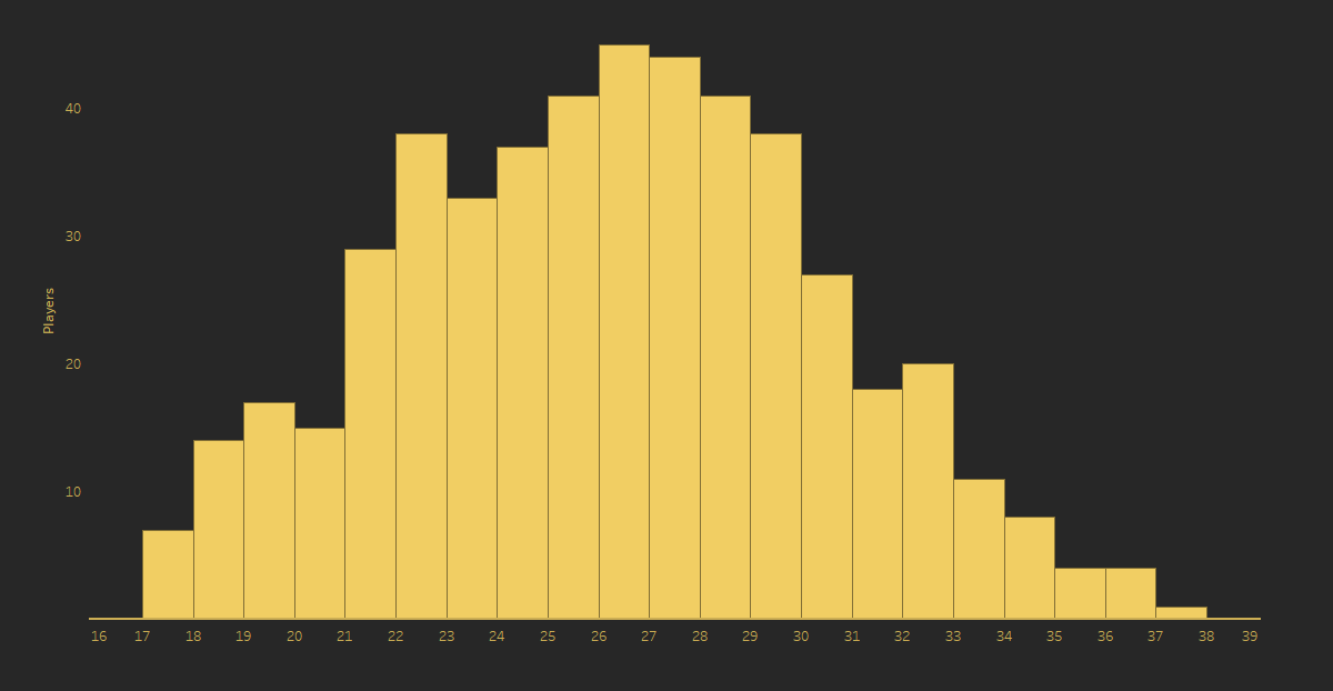
demonstrate the chart, let's start with a simple histogram. The following shows
ages of Premier League players. The y-axis shows the number of players and the
x-axis shows the ages. With this chart, we can easily see the distribution of
the ages.
But what if we wish to
show each player individually, while still seeing the distribution? One option
would be to create separate marks for each, making it a unit histogram.
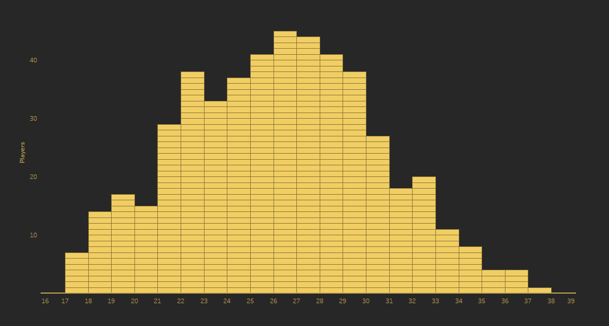
We still retain the
ability to see the overall distribution of ages, but we are also able to see
each player by hovering over the marks. If we now take the unit histogram and
align each "stack" along a common center point, we start to see
something like a beeswarm.
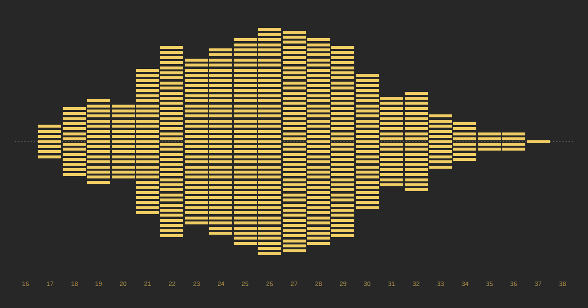
In fact, we might
consider this a beeswarm that uses rectangular shapes. Like the unit histogram,
we can still see the distribution of ages based on the various bulges within
the plot. But beeswarms typically use dots, not rectangular shapes, like shown
below.
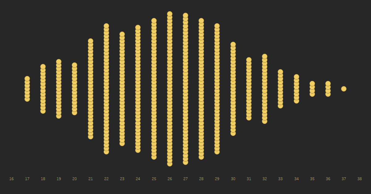
The problem with this beeswarm,
however, is that we see some overlapping of dots. One of the main goals of a
beeswarm is to avoid this overlapping. To correct this, we could make this
chart much taller or we could make the dots much smaller. But, in this case, we
might be better off just rotating the chart.
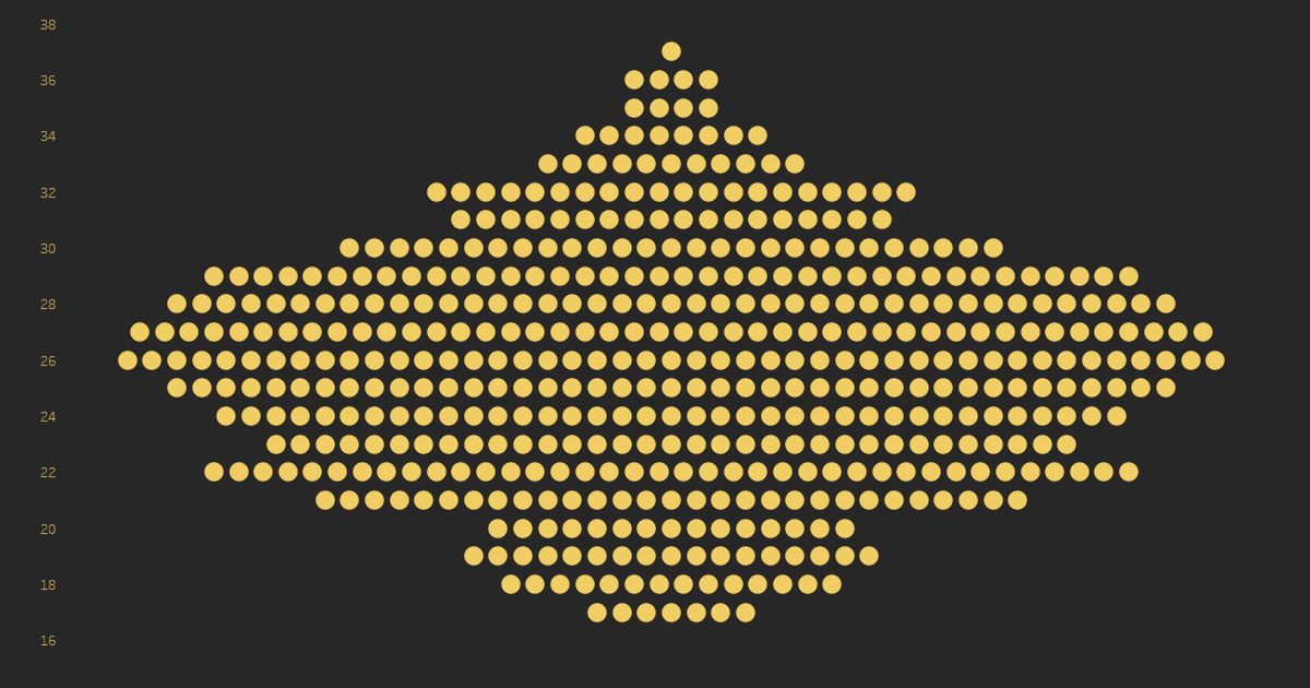
This rotation gives the
beeswarm a relatively tight packing of the dots.
In addition to a beeswarm
showing all players in the Premier League, we can also break them down into
small multiples. For example, below I’ve created separate plots for the top 10
Premier League teams of 2020.
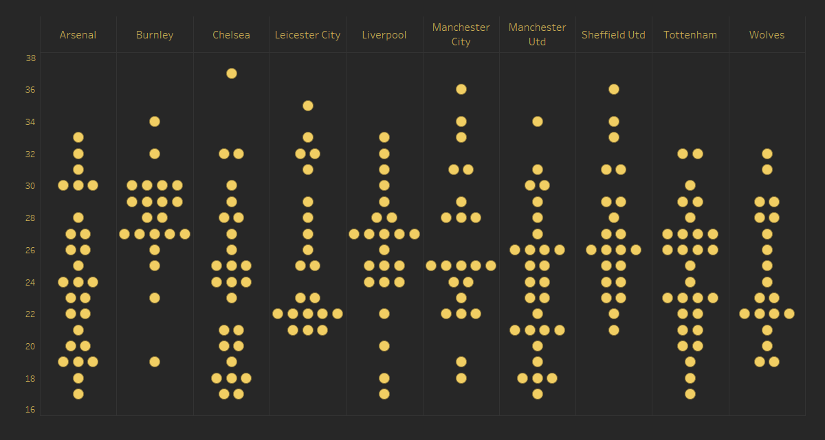
This allows us to compare
the distributions of player ages across various teams. The general shape of
each plot immediately gives us some good information, such as the fact that
Arsenal’s player ages a fairly evenly distributed between ages 17 and 33, while
Burnley has a much higher distribution of players who are 27+.
A logical next step from
here might be to turn this into a violin plot. Violin plots show the
probability density of data at different values and smooth them through use of
a kernel density estimator. Because of the need for such a smoothing algorithm,
these aren’t easily built in Tableau, but just to demonstrate these, I used an
online tool called BoxPlotR to create one:

Like the beeswarm, we can
see the relatively even distribution of ages for Arsenal and the aging players
of Burnley. While violins have some advantages over beeswarms (and other plots
such as box plots), we do lose visibility of individual players. So, if that’s
something we need to see, a beeswarm may be a good option.
How to Build One
So, let’s talk about how
to build this chart. As I’ve previously noted, this is not a true beeswarm
plot, but rather a simplified version that bins the data. Later in this blog, I’ll
share links to techniques for creating true beeswarms in Tableau.
The data we’re using is
pretty simple—it looks like this:

We’ll start by creating
our bins. We can do this using Tableau’s bins functionality, but I generally prefer
the BYOB technique
courtesy of Joe Mako and Jonathan Drummey, as it provides more flexibility. We
don’t really need that flexibility here, but we’ll use it anyway, just in case.
1. Bin
// Custom bins. Allows more flexibility than default
bins.
INT([Age]/[Bin Size])*[Bin Size]-IIF([Age]<0,[Bin Size],0)
In the above, Bin Size
is a parameter that allows us to set the bin size (in this example, we’re just
using 1).
Next, we create a
calculated field to get the number of points in each strip (each line of dots).
This will allow us to then figure out the positioning of each dot so that they
are center aligned.
Points
in Strip
// Number of points in the "strip".
// We could fix on Bin, but excluding ID gives...
// ...us more flexibility to add dimensions to our
view.
{EXCLUDE [ID]: COUNTD([ID])}
Then we create a
calculated field to get us the maximum coordinate for each strip. It’s
important to note here that our shared center axis will be 0 so half of the
dots will have a positive coordinate and the other half will be negative.
Max
Coordinate
// Highest positive
coordinate.
[2. Points in
Strip]/2 - 0.5
Finally, we use INDEX() to
calculate the placement of each individual dot.
Coordinate
// Coordinate for
each point.
MAX([3. Max Coordinate]) - INDEX() + 1
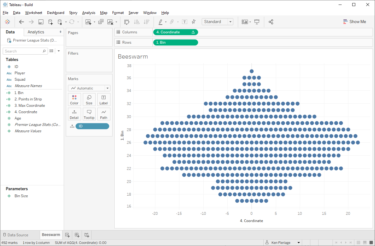
We wish to create a
beeswarm with age on the vertical (y) axis, so we’ll drop 1. Bin on the
rows shelf. It’s possible, at this point, that Tableau will interpret this as a
measure and try to aggregate it. If so, right-click the pill and change it to a
dimension. Then we drop ID on the detail card so we get a mark for each
player. Finally, we drop 4. Coordinate on the columns shelf; once there,
we right-click the pill and edit the table calculation, setting it to compute
like this:
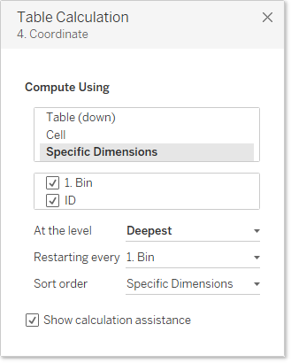
One of the keys here is
that we set it to restart on every bin—essentially causing it to restart
counting at 1 each time.
If you’ve done everything
correctly, you’ll have a simplified beeswarm that looks exactly like the one I
shared earlier.
Why & When to Use a
Beeswarm
One question you might be
asking is why and when might we use this type of chart. It really isn’t much
different than our unit histogram, which is much easier to build, so why choose
a beeswarm? That’s a great question and it reveals one of the key flaws of the
simplified approach I’ve shared here. The key difference between a unit
histogram and a beeswarm (other than the alignment of the data points) is that
beeswarms typically do not bin the data, as I’ve done here. They typically show
the actual value of the data point. So, the result of a beeswarm is
generally not a set of straight horizontal lines, but lines that curve slightly
as you move towards the ends.

Example
beeswarm from EDU Pristine’s How to create a Beeswarm Plot in R
That said, I personally
find this type of beeswarm to be difficult to understand. The lack of
consistency in the placement of the dots, to me, creates a sort of visual
clutter that makes it hard for me to tell what’s going on. And I question
whether or not showing the actual value gives us that much additional
information than what we get from binning the data. In many cases, I think a
binned version of the chart is more effective.
All this being said, the
question remains—when and why would we use this simplified beeswarm? And that’s
a great question. In most cases, I think that a unit histogram is probably
easier to read and understand, but the beeswarm does provide a viable
alternative that could be very effective in some situations. The key, as
always, is to understand your data, the target audience, and the questions
you’re trying to answer. If, after carefully considering these three things,
you find that this simplified beeswarm is viable chart, then now you know how
to create it!
Alternative Approaches
There may come a time
when you need a more full-fledged beeswarm plot without the limitations of this
simplified approach. In that case, you are in luck! There are a few different
methods for creating full-blown beeswarm plots in Tableau.
R + Tableau
R has a few different
packages that allow you create beeswarms. In his blog, Beeswarm Chart in Tableau … via R,
Dorian Banutoiu details how he leveraged these packages to create the
coordinates need to plot a beeswarm in Tableau.
Pure Tableau
If you’ve ever seen the
work of Rody Zakovich, you know that he’s a genius. He is able to make Tableau
do things that I would’ve never thought possible. In his blog, Automatic Bins and Beeswarms in
Tableau, Rody details a method for creating beeswarm plots 100% in Tableau.
This approach is pure genius, so it’s definitely worth checking out.
Extensions
One final method is extensions.
Zen Master, Chris DeMartini has done some amazing
work leveraging Elijah Meek’s Semiotic to create a variety of
charts, including beeswarms. His extensions can be found on the Tableau Community Extensions Page.
Ken Flerlage, November 9, 2020


Ken
ReplyDeleteThanks for this easy to understand guide. I've looked to use this as part of a project I'm working on but I'm having trouble when I add another dimension - say to colour some of the plot points.
What seems to happen is that the points start to overlay rather than remaining separate. I've tried an alternative in the 2. Points in Strip calc ({FIXED [1. Bin] : COUNTD [ID]} but it still results in the same effect.
It looks like the final 4. Coord calc is the one that shifts with the introduction of the additional dimension (for colour). Any ideas?
Thanks
Simon
Check the table calculation and make sure it's computing using that other dimension as well.
DeleteI had a look at that but still couldn't deal with the overlapping. Can I send you my basic Tableau working file? You may be able to quickly see where I've gone wrong. Or should I post to the Tableau forum?
DeleteTa!
Simon
Sure! You can email me using flerlagekr@gmail.com
DeleteI really like this technique and I have used it to good effect! I was trying to create one for a new data set I have generated and it seems dropping a measure onto the colour mark, despite appearing in the colour legend, has excluded a lot of points. Any idea why that may happen? Thanks!
ReplyDeleteAny chance you could email me? flerlagekr@gmail.com
DeleteThanks Ken, but there is actually no need! I figured it out accidentally. When I set the colour to ATTR(), the missing points magically appeared. Not sure why that made any difference, but it did! And I had a dummy dataset with working examples set up and everything :)
DeleteIs the dataset used downloadable from somewhere, please?
ReplyDeleteHello, I am having some troubles with your points in strip calculation because my data set doesn't have an ID so I created a RowID, but you can't use LOD expressions with calculated fields. Is there a workaround for this?
ReplyDelete