
Learn to Build this Sectional Radar Chart and Other Non-Traditional Charts

Although I rarely do anything like this when building business dashboards, in my personal work, I love building non-traditional charts. I know that in most cases, they are not the quickest to insight and to be perfectly honest, they probably aren’t the best chart for the job. However, they are beautiful and engaging (at least I think so). But most importantly, building these types of charts really allow you to stretch your skills and understanding within the Tableau platform. Although I may not build these types of charts at work, the skills obtained while building these charts on my personal time have helped me time and time again while building actual business dashboards. Should you end up building this chart, please use it with caution.
The interesting thing about building non-traditional charts is that so many of them employ the same general techniques. For example, below are three very different charts. The first comes from my Tornado viz, the second from my NCAA Football Top 25 viz, and the third from a very recent viz that looked at player attributes from the 1993 video game, NBA Jam.


Although all three of these charts look very
different, the techniques used to build them are very similar. All build upon the fundamentals of trigonometry, all employ
methods of data
densification, and all utilize polygons.
Today I am going to walk through step-by-step how I
created the last set of charts to show player attribute rankings for the NBA
Jam video game. Although I’ve seen
similar charts, I don’t know if they have a true name. So I’m going to refer to it as a “Sectional
Radar Chart”.
The idea here isn’t necessarily how to build this
specific chart (although that exactly what I’m going to do), but to talk about
these common aspects of building non-traditional chart types. I hope that by walking through this
particular chart build, you’ll be able to design and build your own custom
chart types.
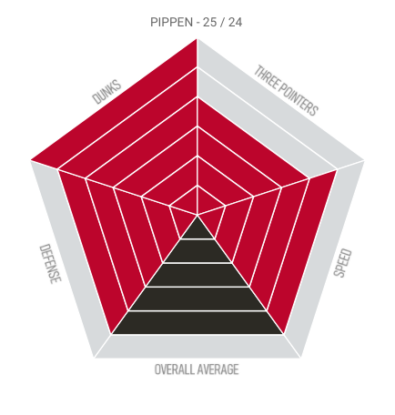
If you want to follow along, I warn you to NOT use my original NBA Jam workbook. I played around with a lot of different options and never really cleaned it up. I also had very different naming conventions in my tables. So to make this a bit clearer, I created a Sectional Radar Chart workbook (as I wrote this blog post) that would be easier for you to follow along with. During this build, we will focus on one player, Scotty Pippen from the Chicago Bulls. The main page of the viz shows two players (Pippen and Grant, both from the Bulls), but when following along, please utilize the “Chart - PIPPEN Only” worksheet.
Many of the main concepts that I will apply in the
build were discussed in the presentation Ken and I did at TC19 - The "Tableau Twins"
Take You Beyond Show Me as well as Ken’s Beyond Show Me Blog Posts. I strongly recommend watching this video and
reading the blog posts if you are not familiar with the utilizing Trigonometry
and Data Densification.
The Data
Let’s first talk about the data. Each player is measured with four attributes
on a scale from 0 to 6: dunks, three pointers, speed, and defense. In addition, we are capturing the overall
average. (Although not shown below, I’ve
also added Player # and Attribute # - just 1 – 5 which will help us with the
calculations later). I sourced the data
myself and it is very simple:
TEAM PLAYER ATTRIBUTE ATTRIBUTE VALUE
Chicago Bulls Pippen Speed 5
Chicago Bulls Pippen 3 Pointers 4
Chicago Bulls Pippen Dunks 6
Chicago Bulls Pippen Defense 5
Chicago Bulls Pippen Overall Average 5
So we have 5 attributes each with a score ranging from 0 to 6. When building this visualization, I decided that I wanted to show each attribute as its own “section” and have 6 segments to represent the 0 – 6 rating. The segments would be highlighted with team colors to show the particular rating (I used a different team color for the overall average). For example, Scotty Pippen has a rating of 4 for 3 Pointers. In that case, the innermost 4 segments are highlighted red and the outermost 2 segments are light gray. This is shown below. (Note that any values of 0 would simply show with all 6 segments as gray).
So let’s examine this chart a bit further.
Again, we have 5 sections each with 6 segments. When building this chart, we are going to
need to draw these segments and we will do so using polygons. If you’re not familiar with using polygons,
we basically need to figure out the points for each corner of the polygon then
tell Tableau the path order to draw them.
(Check out my Yes Polygons blog post for a quick starter lesson). Take a look at the segment highlighted in
blue below.
In order to draw the polygon highlighted in blue, we
need four points:
Okay, so let’s review.
For each of our 5 attributes (or sections), we are going to draw 6
polygons, all of which require 4 points to draw them. That means for every player and every
attribute associated with that player, we need 24 rows of data (6 segments X 4
points) to be able to draw all the points we need for this chart.
Data Densification
Okay, remember our data looks like this:
TEAM PLAYER ATTRIBUTE ATTRIBUTE VALUE
Chicago Bulls Pippen Speed 5
Chicago Bulls Pippen 3 Pointers 4
Chicago Bulls Pippen Dunks 6
Chicago Bulls Pippen Defense 5
Chicago Bulls Pippen Overall Average 5
I just stated that we need 24 rows of data for every
player attribute. However, our data only
shows 1 row for every player and attribute.
So how do we turn 1 row into 24 rows?
Well, we could manually add 23 rows in our Excel spreadsheet for every
player and every attribute, but that would take a while, wouldn’t be very fun
and it certainly wouldn’t work when we go to visualize NBA 2K21 where players
are ranked 0 – 100 rather than 0 – 6.
Instead of 6 X 4 for 24 rows, we would be looking at 100 X 4 for 400
rows. I ain’t doing that manually!
We can accomplish this fairly easily by performing data
densification. If you are not familiar
data densification, all it really does is allow you to add additional points to
your data, in this case, we are turning 1 row into 24 rows to allow us to draw
these individual segments. (For more
information, check out Ken’s Introduction to Data Densification).
For our use case, we will do a cross-join (or
Cartesian join) to another table (in this case a spreadsheet) to accomplish
this. What is a cross-join? A cross-join essentially links every record
in one table with every record from another table. As Tableau doesn’t support
this type of join type naturally, we have to trick it by using a join
calculation with the value, 1, on each side (this value could be anything—a
number, string, etc.—the key is that it be the same on both sides). So we take our data that currently has one
row for each player attribute and we cross-join it with another table to turn
that one row into 24. So based on the
definition above (a cross-join essentially links each record in one table with
each record from another table), in order to turn 1 row into 24, we are going
to need 24 rows in the data we join to.
(Again, Ken’s Introduction to Data Densification would be a really great read if you’re not
familiar with this concept).
So let’s build this second table of 24 rows. The first thing I would recommend is to
simply number the rows 1 – 24 as it’s likely we will need something like this
(let’s just call it #). Remember how we got
to a number of 24? Well, we had 6
segments each utilizing 4 points. So we
may need that information as well, so let’s add it. In my secondary table (spreadsheet), I added
Segments of 1 to 6 each with 4 points 1 – 4.
Below is a snapshot of this table.
And you can also download the main data (Attributes tab) and secondary
table (Join tab) from my Google Drive. These appear in the same
spreadsheet, but on different worksheet tabs.
(If you have any issues accessing the file, please email me at flerlagek@gmail.com).

Now our main table (Attributes) contains one row for
every player attribute when we actually need 24. Our secondary table (Join) contains 24 rows
of data. When we cross-join them, we
will have 24 rows for every player attribute.
So let’s do that!
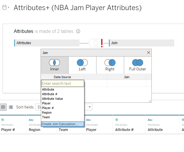
In Tableau, connect to the NBA Jam Player Attributes spreadsheet you
just downloaded. Drag in the Attributes
table. To keep things simple and because
so many people don’t have the later versions using the new data model, we will
use an old-school join. If on a newer
version, you’ll need to double-click on that Attributes table you just added to
allow this type of join. Now, drag over
the Join table and join it to Attributes.
Tableau will now ask for the join conditions. As mentioned above, Tableau doesn’t support a cross-join naturally, so we have to
trick it by using a join calculation with the value, 1, on each side (again this
value could be anything—a number, string, etc.—the key is that it be the same
on both sides).
So choose “Create Join Calculation” as shown below:
A join calculation window will appear. In that window, enter a 1…nothing else, just
a 1. Click OK.
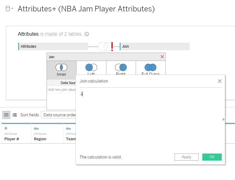
Do the same thing on the secondary table, select
Create Join Calculation, enter a 1 and click OK. Note the resulting join condition of 1 = 1.

Since 1 always equals 1, that means that every record
in your Attributes table (1 for every player attribute) will join up to every
record in the Join table (24 records) so that you now have 24 rows for every
player attribute.
Okay, data densification complete!
Trigonometry
Now onto some Triangle Math otherwise known as
Trigonometry.
I don’t use tables as a visual in my in my work all
that often, but I do use them constantly as a means to an end. Any time I am building a complicated chart
type, I utilize a table to help me construct my calculations. (I do the same thing for Fixed LODs, Table
Calcs, etc.). So let’s get this stuff
into a table before we go much further.
As a first step, we want to turn several measures into
dimensions (you can drag them to a dimension or just right-click on each and
change them). From the Attributes table,
these include Attribute # and Player #.
From the Join table, these include #, Segment, and Point. Now let’s build the following chart and
filter down to just Pippen (see the “Table” worksheet in the Sectional Radar Chart viz
example).

In the table, you can begin to see what we talked
about earlier. For each player, there
are 5 attributes. Each attribute has 6
segments and then each segment has 4 points to build that polygon. We will come back to the table
momentarily.
Earlier in this blog post, I reference the
presentation that Ken and I did at TC19 - The "Tableau Twins" Take You Beyond Show Me. This presentation breaks down in detail how
to utilize Trigonometry to build non-standard charts. If you are not familiar
with these technique, I’d strongly recommend that you watch the first 30
minutes of this video. If you are
familiar, then let’s move on!
Okay, so you may look at this chart shaped like a
pentagon and might not consider it a “radial chart”, but in reality, it
is. This chart uses the same basic math
that any circular chart would utilize.
And it’s all about the X, Y (right Ken?). To build this chart, we need to figure out what
all the different X, Y coordinates will be for all of our points and we will do
this using trigonometry.
If you’ve used trigonometry to build charts before you
know that there are two key elements, the radius and the angle. If we can get both the radius and the angle,
we can figure out the x and y coordinates.
Here’s a crash course on how it will work (and again, please watch the TC19 video).
Let’s start with the radius. In our chart, we have 5 attributes each with 6 segments. We will need to measure the length from the center point (0, 0) out to each point. This is, in fact, the radius. Let’s look at the second segment in one of these attributes (segment #2).
In our chart, the width of each segment is relative so
we can make them whatever we like. So,
for easy math, let’s make the width of each segment 1. Knowing that, we should be able to calculate
the radius to point 1 of the highlighted segment.
As mentioned, we set the width of each segment to be
1, so from the center point out to the inner edge of the second segment (out to
Point 1) is just 1. Now let’s do the
same thing with point 2.
For point 2, the line stretches out past two segments, so our radius is equal to 2.
If we continue, you see that Point 3 also has a radius
of 2 and Point 4 has a radius of 1, like Point 1. So for Segment 2, Point 1 & 4 have a
radius of 1 and Point 2 & 3 have a radius of 2. To put that in terms of a calculation:
IF [Point] IN (2, 3) THEN
[Segment]
ELSE [Segment] - 1
END
So let’s create that calculation in Tableau, call it
Radius and add it to our view.

The radius looks accurate to me. Now let’s move onto the angle.
As mentioned previously, you might look at this chart
in the shape of a pentagon and not initially think of it as a radial chart, but
it is. And calculating the angle to
obtain each point will be done in the same way.
Basically, we are going to divide the entire 360 degrees into chunks for
each attribute. So let’s take a look at
our chart.
Remember we have 5 attributes. These are divided by the dotted lines
above. The top, vertical line…that is
our starting position and any points that fall on that line will have an angle
of 0. From here, we break the entire 360
degrees into 5 for our 5 attributes. So going
clockwise, the points on the next dotted line will be at 360/5 or 72
degrees. It will take us another 72
degrees to get to the next dotted line, for 144 degrees. The points on the third dotted line will be
at 216, fourth at 288 and then back to our starting point 360, which is
equivalent to 0.
When calculating angles, I always start with what I
call an Angle Increment. Basically, how
are you going to divide up the entire 360 degrees? Well we are going to divide it up by 5. But I hate hardcoding. In fact, for this viz, I initially tried a
bunch of data sets where some had 10 attributes, others had 4 and if I
hardcoded the numbers in there, I would have had to manually change them every
time. So let’s calculate the number 5 in case it ever changes.
Angle Increment (Degrees)
360/{ FIXED : COUNTD([Attribute])}
(Note: since I numbered my attributes 1-5, instead of
counting the attributes, I could have simply taken the max of the attribute #
and that would have probably been slightly more efficient.)
Let’s add that to our view for now. You should see 72 degrees for every row.
Next, we need to calculate the actual angle. Remember before, we started at 0 then added
72 then added another 72 to get to 144, then 216, and 288. Well that’s what we need to do within a
calculation. But this is going to differ
for every point. So let’s take another
look at our diagram and calculate the angles for Attribute # 1…and we will
start with Segment 2 again.
Okay, for Attribute # 1 / Segment 2, we know that
points 1 and 2 have an angle of 0 degrees and that points 3 and 4 have an angle
of 72 degrees, we established that previously. In fact, the angle of all the
points for Attribute 1 will be exactly the same for all segments within
Attribute 1 (always 0 or 72). But how do
we calculate it? Well, our angle
increment is 72 degrees, so for points 1 and 2 is the angle increment multiplied
by 0 and for points 3 and 4, it’s the angle increment multiplied by 1. Now we need to express this as a calculation
using the Attribute #. Well that’s
actually quite simple.
Angle (Degrees)
IF [Point] IN (1, 2) THEN [Angle
Increment (Degrees)] * ([Attribute #]-1)
ELSE [Angle Increment (Degrees)] *
[Attribute #]
END
I added it to my view and it looks correct.

Now Tableau doesn’t work with degrees, it works with
Radians, so I’ll create a new calculation to convert the above to Radians.
Angle (Radians)
RADIANS([Angle
(Degrees)])
I’ll add that to my view as well. One good double check is to ensure your
degrees measure runs up to 360 and that your radians measure runs up to 2Pi or
~ 6.28. And in this case, they do.
When we first started in this Trigonometry section, I
said that if we can obtain the radius and the angle, we could calculate all the
x and y coordinates. This all has to do
with right triangles. We dug deep into
this during our TC19presentation and Ken really dives into this in his Beyond Show Me Blog Posts. But I will explain very briefly how this
works using our chart and point 3 of segment 2 of Attribute 1.
First, let’s draw the radius from the center point to point 3.
Now if we draw a right triangle using the center
point, radius, and point 3, we see something like this:
And when you take the time to think about it, the purple horizontal line is the X coordinate for that point and the vertical line is the Y coordinate for that point.
So how do we calculate the X and Y values using this
right triangle? Well, we need the
previously calculated Radius, Angle and a couple fairly simple trigonometric functions:
X = COS(Angle)*Radius
Y = SIN(Angle)*Radius
In Tableau, it would be calculated as:
X
COS([Angle (Radians)])*[Radius]
Y
SIN([Angle (Radians)])*[Radius]
Okay, trigonometry complete!
The Polygons
Now that we are finished with the trig (I know, I’m
sad too), it means we have all the x and y coordinates for all of our points
and we can start building this chart. Go
to a new sheet and start by filtering down to just Pippen again. Now drag X to Columns and Y to Rows. You should see one point. We need to break that point out. So add Attribute to the detail card. Then add Segment to the detail card. And finally, add Point to the detail
card. You should see something like
this:

It may not look like it, but we actually have all the points we need…a lot of them just overlap. Let’s change the mark type to Polygon and you’ll get one crazy looking shape. But if you read or watched any of the stuff I mentioned previously, you’ll know that we need to tell Tableau in what order to draw our polygons. To do this, we will use the Path card that just appeared when we changed our mark type. Drag Point onto the path card and you should see the entire pentagon fill in blue. Believe it or not, there are 30 polygons here, they are just all fitting snuggly together. To see them better, click the Color card and add a white border. You should now see the following:

Okay, polygons complete! Yay, Polygons!!!!
Rotation
Okay, we still have a bit of work to do to finish this
off. You’ll probably notice that this
thing is rotated. Well, oddly, within
Tableau, 0 degrees starts at the 3:00 position.
I should also note that if you put Angle (Degrees) on the tooltip, you’d
see that the angle increments in a counter clockwise fashion. In most cases, you will have to reverse your
X axis to make the angle increment in clockwise fashion, but in our case, we
don’t’ care about that.
Okay, now to fix that odd rotation of the shape. I like to cheat a bit on this. I often don’t know the exact positioning I
want, maybe I want the flat side up or the flat side down, not sure. So I like to create a parameter called Angle
Adjustment, add it to my Angle calculations then just tweak it until it is the
way I want it. So create a parameter
called Angle Adjustment and make it a float (just in case we need to get really
precise). We will then go back to our
Angle (Degrees) calculation (I think it is easier to think about the adjustment
in degrees) and subtract that adjustment:
Angle (Degrees)
(IF [Point] IN (1, 2) THEN [Angle
Increment (Degrees)] * ([Attribute #]-1)
ELSE [Angle Increment (Degrees)] *
[Attribute #]
END) - [Angle Adjustment]
I then show the parameter and tweak it until it is the
way I want it. As you change the number,
you should see the chart rotate accordingly.
In my case, I want the overall average to be on the bottom, so setting
the parameter to 54 put the chart in that position.
Color
Now how do we color this based on the actual attribute
values? Well you’ll recall we have
attribute values ranging from 0 – 6 and we have Segments running from 1 –
6. So we want to highlight the color of
the segment as long as the attribute value is equal or greater than the
segment. Simple enough:
Color
IF [Attribute Value] >= [Segment] THEN 'COLOR'
ELSE 'DONT COLOR'
END
(Yes, this could be done with a true false, but I
believe this is easier for me to interpret, let alone another person reading my
calculations).
Place this on color, change the “COLOR” values to red (for Pippen at least) and change the “DONT COLOR” values to a light gray. The result should look like the following:

Now in the actual viz, I showed players for every team
and chose to use team colors. The 4
attributes would be colored with the main team color and the overall average
with the secondary team color. So in the
actual viz, I used an alternative color calculation:
Color by Team
IF [Attribute Value] >= [Segment] AND [Attribute] = 'Overall Average'
THEN [Team] + ' Overall'
ELSEIF [Attribute Value] >= [Segment] THEN [Team]
ELSE 'DONT HIGHLIGHT'
ENDEND
Using this calculation the four attributes would be colored using the team name, the overall average would be colored using the team name + Overall, and then we color the DON’T HIGHLIGHT in the same way.

With a bit of clean up, the chart looks like
the following:

And there you have it!
It took a fair number of steps, but once you do this a time or two, it
will start to become second nature.
As a reminder, in my original NBA Jam workbook, I
played around with a lot of different options and never really cleaned it
up. I also had a different naming
conventions on both of my tables (attributes and join). So instead, please utilize the Sectional Radar Chart viz
as an example. Remember to utilize the “Chart
- PIPPEN Only” worksheet.
Alright everybody. As always, thanks for reading and I hope that while building some non-traditional chart types, you’ll pick up some tools and techniques that will be incredibly useful in your day to day work. As a final word, please use non-traditional chart types with extreme care. Like many charts, this one would probably be better as a bar chart!
Thanks!
Kevin Flerlage, April 19, 2021
Twitter | LinkedIn | Tableau Public


Thank you!
ReplyDelete