
Ten Tips including "Show the Axis on the Top but Not the Bottom"

Well, I've done two previous Ten Tableau Tips blog posts, how about a third one? These are my absolute favorite blog posts to write and share with the community. I hope at least one tip is something you've never seen before.
Please note that some of these GIFs may appear small on screen. They are recorded in a higher resolution and you should be able to simply zoom into your web browser for a closer look.
1. Change the Sort Order of Values in a Filter
If you have a dimension filter, you'll often want to put it in a very specific order. Let's say you have a filter for the books of the bible. You'd likely want Genesis to come before Exodus as Genesis is the first book of the bible and Exodus is the second. However, the filter will probably default to alphabetical, placing Exodus in first and Genesis second.
To change the sort order of the values in a dimension filter, you simply need to change the default sort order on that field itself. Just click on a pill then choose the down arrow, choose Default Properties, then Sort. From there, simply sort the field as you like and it will default that way, even in the filter itself.
Note: the same will work with a parameter that is being fed by a field in your data. Follow the steps above with the field that is feeding the parameter, clear the values from the parameter, then feed the values back in using the same field.

2. Labels Don’t Recognize Shape Color, but do Recognize Circle & Square Color
Labeling can be challenging when you have both light and dark colors in your chart. Take a hex map as an example and assume you are coloring it from white to black based on profit. In this case, do you label the state with white labels or black labels or somewhere in between? All of those are going to be a problem. And matching mark colors or automatic won't work either...well, it won't for a hex shape that is.
What makes this example very interesting is that labels in Tableau don't seem to recognize the color when using the shapes mark, but it does recognize the color when using the circle or square mark. Check out the GIF where the labels are set to automatic and you can't see them on the black California hex. The label text is black and the hex is black...so you can't see the label. However, if you change that mark to a circle, Tableau seems to recognize the color of the mark and it changes that label text from black to white.
That said, if you ever run into this issue with any shape (most common would probably be a hex map), you can simply create a dual axis, make one a hex and the other a circle, and size down the circle so it sits inside the hex. Then label the circle, not the hex.

3. Hide Field Labels for Rows - How do I get them Back?
Tableau gives you an option to hide the field labels for rows. For example, imagine you created a bar chart showing Sales by Category and Sub-Category. When you do so, Tableau will add small labels at the top for Category and Sub-Category. Rarely do I use them, so I tend to hide them by right-clicking and choosing "Hide Field Labels for Rows".
That's not really the tip. The tip is how the heck you get them back! It's something I remember struggling to find as it isn't in the most of intuitive places. To do so, go to the Analysis menu, choose Table Layout, then select "Show Field Labels for Rows". Check out the image and GIF below.


4. Left Click & Drag Your Pills? How About Right Click & Drag?!!!
I learned this little trick many years ago. However, I recently did a Tableau tips presentation for an awesome company with an awesome team and when I showed this, they went nuts! So I figured I should share it in a tips blog post.
Typically, when you drag a pill to Columns, Rows, or the Marks cards, you press the left mouse button then drag it to the desired location. The pills drops in as you expect and aggregates as its either Tableau defaults or the pill is defaulted. However, if you right-click and drag instead of left-click and drag, when you drop the pill in your location, it will provide and additional context menu. This allows you to choose a myriad of options all in one quick step. It's awesome and I use it all the time.
5. "Break the Code" to Find the Viz in Tooltip Sheet
We've all had this scenario. You have a dashboard and one chart has a viz in tooltip. You finish the dashboard and hide all your sheets. But during one last review, you notice a problem with the viz in tooltip. You go to the dashboard and unhide all your sheets. But where is the viz in tooltip? How the heck do I find it again?
Well, here is some Jeff Shaffer wizardry. All you need to do is "Break the Code" to unhide your viz in tooltip worksheet. Go to the chart with the viz in tooltip, click the tooltip card, type some junk into the viz in tooltip code, and click okay. Your viz in tooltip sheet will then magically appear! I actually showed this trick at the TC18 TUG Tip Battle and it received a lot of "oohs" and "ahs". (Yeah, I know you just need to right-click the sheet and select Unhide All Sheets, but this is way cooler.)
6. Format Text Across Workbook
I think most people will know this, but recently I've shown this trick to a couple of people and it blew their minds. To change the fonts across the entire workbook, simply go to the Format menu at the top, choose Workbook, and a Format Workbook menu will appear on the left side. If you modify the first option "All", it will change the fonts throughout your workbook.

7. Alternative Views for Worksheets & Dashboards
Similar to PowerPoint, there are multiple ways in which you can view the sheets and dashboards in a workbook. However, you may not have ever clicked them because they appear to be grayed out.
At the bottom right of your Tableau Desktop window, you'll see three icons that look like the following (and it's most likely that the last one is selected as shown below):

The default option looks like tabs in an Excel spreadsheet:

If you click on the first option, you will get a grid view like the following:
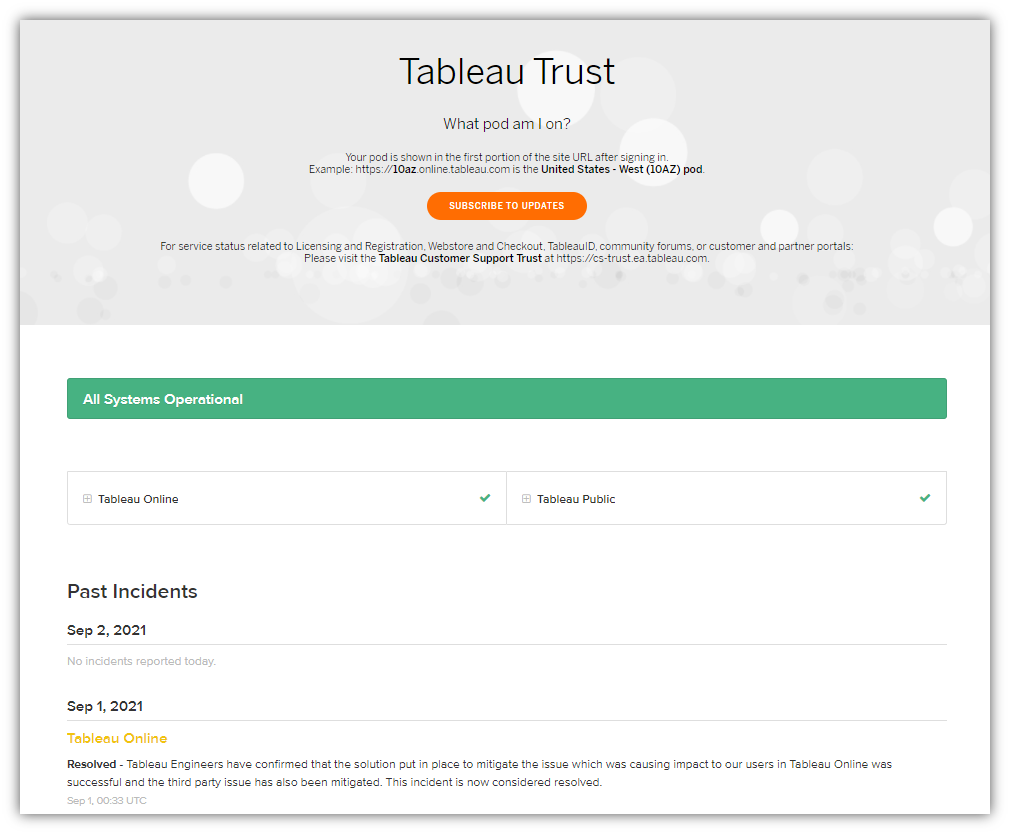
8. Get Notifications when there are Tableau Outages
My company has a large number of clients and partners that are accessing dashboards on Tableau Online. We also have about a dozen dashboards available to the public (as well as our clients) on Tableau Public. Because of this, it's important to know when there are Tableau outages. (And because I'm on Tableau Public all the time because I love it so much!)
You can, in fact, be notified when outages occur. Just go trust.tableau.com. On this page, you can see and monitor the current status as well as recent incidents. In the middle of the page, you can click to the orange button to subscribe by email, text, or RSS feed. Once you subscribe, you will be notified of any incidents and you'll be be better suited to manage your clients' data.
9. Careful Floating Objects Outside of the Canvas
You may have seen the trick where you can float an object outside of the canvas. This is great for a developer as it allows him to add notes or other options that you don't want the end-user to see. All you do is float it onto the canvas then use the X positioning in the Layout tab to move it off to the right of the canvas. You can also do it by simply dragging the right side then the left side as shown below. Take a look, maybe you didn't know you could do that, but BE CAREFUL (more information below the gif).

Why be careful? Well certain objects, like parameters, fall in the "tab order" within Tableau even when published. For the example above, I included not only a text box speaking ill of Mike, but also two parameters. I've opened it on my Tableau Server and started pressing the tab key. Watch as it tabs through objects and eventually gets to the objects I placed outside of the canvas. That's certainly not a good experience for users, clients, and especially for Mike (and your relationship with Mike). Note that text boxes alone do not seem to appear in the tab order when published, but I am not certain as to what other objects do or do not.

10. Show Axis on the Top but Not the Bottom
Let's say I create a bar chart showing Sales by Category and Sub-Category. In that case, my axis will be shown at the bottom (as shown below):

What if I want to wanted to show the axis at the top? Well, I've read about a couple of tricks to move the axis to where you want it, but they don't work in all situations. My preferred way of doing this is super simple.
First, duplicate the SUM(Sales) pill on the Columns shelf. Click the second pill to make it a dual axis and then synchronize your axes. It's at this point that many people try to just uncheck "Show Header" on the bottom axis just to find out it hides both axes. (You can do that on the top axis, but not the bottom). You may have also tried making the text white (like the background) on the bottom axis, just to find out that it formats both axes as white. So try this instead: double click on the bottom axis and in the first pop-up menu, remove the Axis Title - just delete it. Then click on the Tick Marks tab at the top then under Major Tick Marks, click the radio button next to None. The bottom axis seemingly disappears. It is actually still there, but it shows nothing, while the top axis remains unscathed.

Okay, that’s all the tips I have…for now! Thanks for reading.
Kevin Flerlage, September 13, 2021
Twitter | LinkedIn | Tableau Public


#10 makes me happy
ReplyDeleteMe too!
DeleteOn tip 10, you can also double click into Columns to get an empty pill and just type in quotations and then your axis label within quotations and that will work also. Especially useful if you only have one field to be shown.
ReplyDeleteThanks for the tip, Ryan!
DeleteIs there any way to Show Axis on the Top but Not the Bottom without using a dual axis? We have several fields to add and worry about performance if we have to use a dual axis for every column to be added.
ReplyDeleteYeah, you can but it takes a bit more Tableau trickery. Check out this blog post: https://dataplusscience.com/SecondaryAxis.html
Delete