
Tableau Coxcomb Chart Template
Other than helping people with the calcs on the forums, I’ve never created a coxcomb chart in Tableau, but I recently had a use case for one and decided to build it from scratch. As a result, I’ve created a versatile plug-and-play template which I’ll be sharing here.
Note: I’m going to be going into some
detail about coxcomb charts and how they work as well as my build process. If
you’re comfortable with this, feel free to jump to the Template section to see how to use it. Or, if you feel like you can
figure it out without reading that section, you can find the Excel and Tableau
template files here: Coxcomb Template Files
What is a Coxcomb?
Coxcomb
charts, also known as rose diagrams or polar area diagrams, were made famous by
Florence Nightingale who used them to show the number of British soldiers who
died each month during the Crimean War.
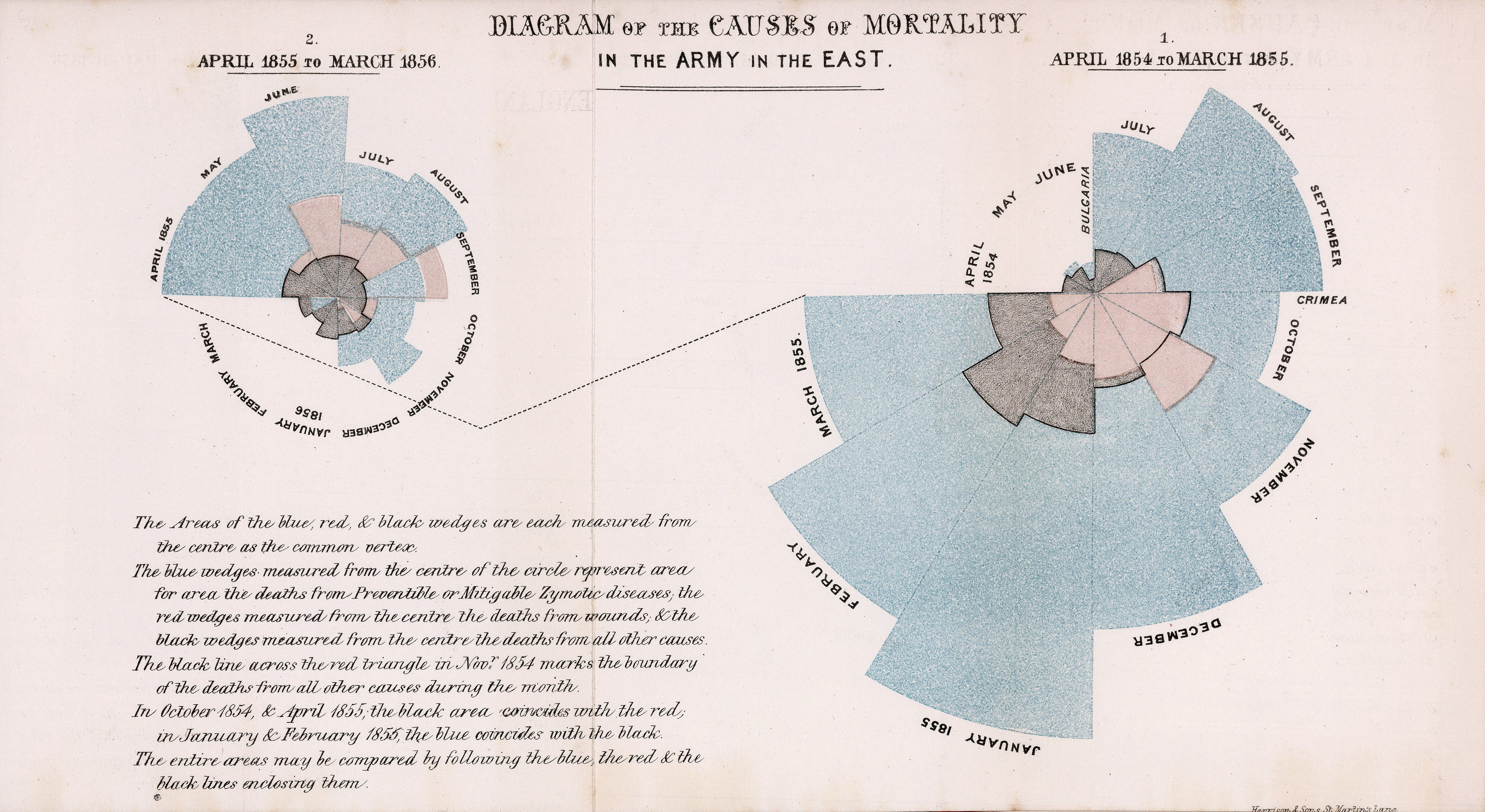
Image Source: Wikimedia Commons
The
chart successfully showed that there were significantly more deaths due to
disease than from wounds (right side of chart). Armed with this insight, she fought
for better living conditions for troops, which helped to reduce the number of
deaths from disease (left side).
Interestingly,
she seems to have never called the chart a “coxcomb”. Rather, she used word
“coxcomb” was to describe the books which contained the charts and that name
was later given to the chart itself.
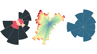
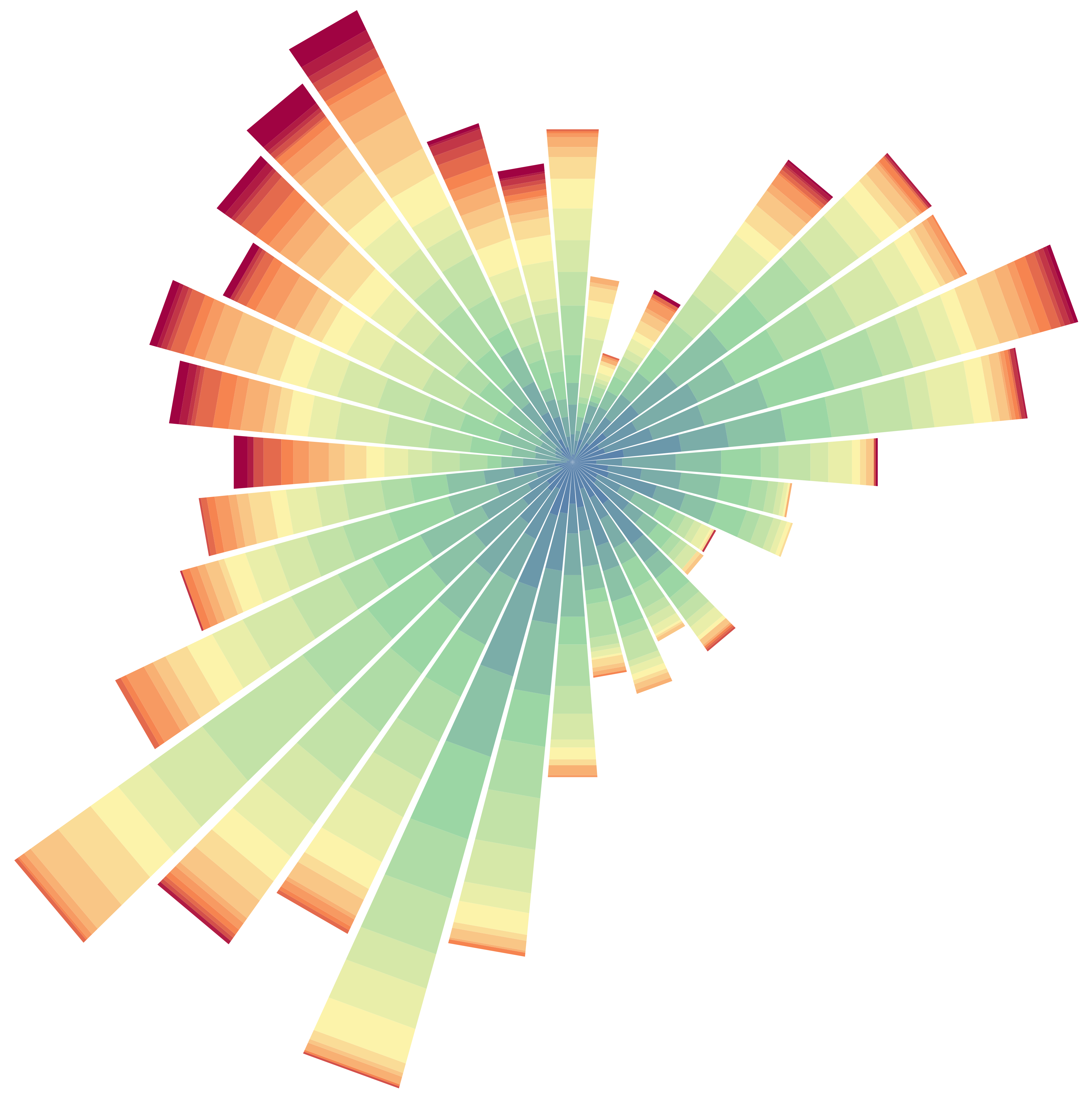
Coxcomb
charts are a sort of modified pie chart where each slice/section represents some
category or interval (in Nightingale’s chart, these represent a specific
month). In a pie chart, measures are encoded using angles—larger values have
larger angles. However, in coxcomb charts, all sections have equal angles and the measure is encoded
using the area of the slice. Thus,
unlike pie charts, the slices extend to different radiuses. A common
misconception with coxcombs is that they are scaled by radius (linear scaling),
but this is incorrect. The scaling by area leads
to the different radiuses.
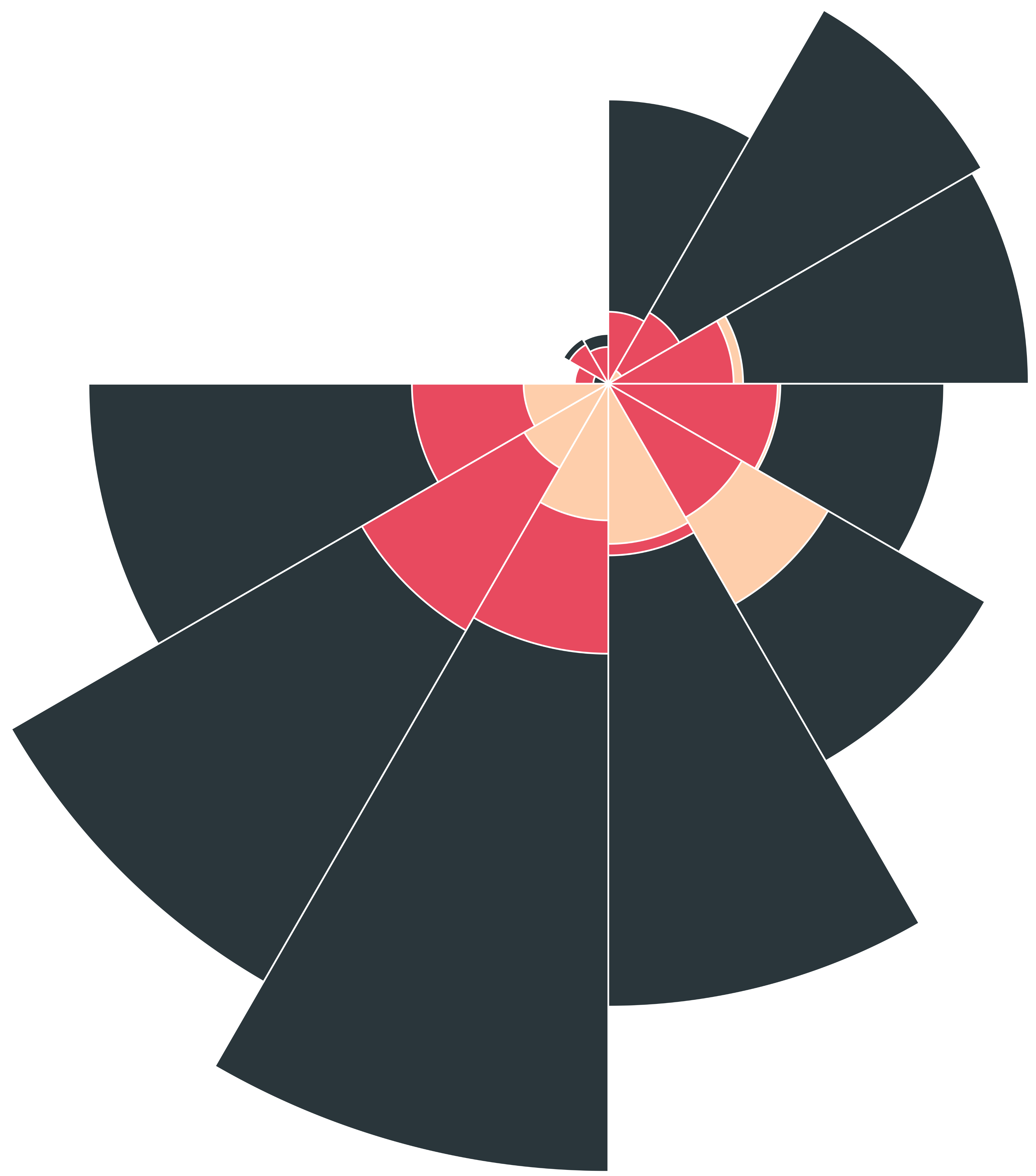
Each
section of a coxcomb contains sub-sections encoded with different colors, each
with their own areas. For example, Nightingale’s chart included sub-sections
for deaths from wounds sustained in battle (red), disease (blue), and all other
causes (black). Importantly, these sub-sections are not stacked as with a
stacked bar chart. Rather, they overlap each other, all starting from a shared
center point. Because of the overlapping nature of each sub-section, smaller sub-sections
appear on top of other sub-sections so that they are always visible.
For a
more detailed explanation of the chart and its history, I highly recommend the
video by Robert
Kosara, Florence
Nightingale's Famous Rose Chart (aka "Coxcomb").
Building a Coxcomb
When I started
building my first coxcomb, I made a huge mistake. Instead of taking the time to
understand how they work, I just started building it. I assumed that a coxcomb
was just a type of stacked radial bar chart, which led me to making two
mistakes. First, I scaled each section linearly, rather than by area, which as
detailed in the previous section, is inaccurate. Second, I stacked the sub-sections
on top of each (like a stacked bar chart) rather starting each from a shared
center point. These issues, of course, led to an inaccurate chart, but the
second mistake, in particular, also made the build much more difficult than it
needed to be. So, take this bit of advice—before building any non-standard
chart, always be sure you have a clear understanding of how it works. 😉
Side note: Are you wondering exactly
why coxcombs are encoded using area instead of radius? If so, I’d recommend
another Robert Kosara video, Linear vs. Quadratic Scaling: How it
Distorts Infographic Bar Charts, And How to Get It Right, which does a phenomenal job of
explaining why we use area over radius.
Having
realized my mistake, I returned to the chart and was able to modify it to work
correctly.
I was
very pleased with this and ready to share it with the world when I started
thinking about whether or not there might be value to radial scaling and/or
stacked sub-sections. I had recently created a data viz showing C-SPAN's Presidential Historians Survey and had used something similar to a coxcomb.
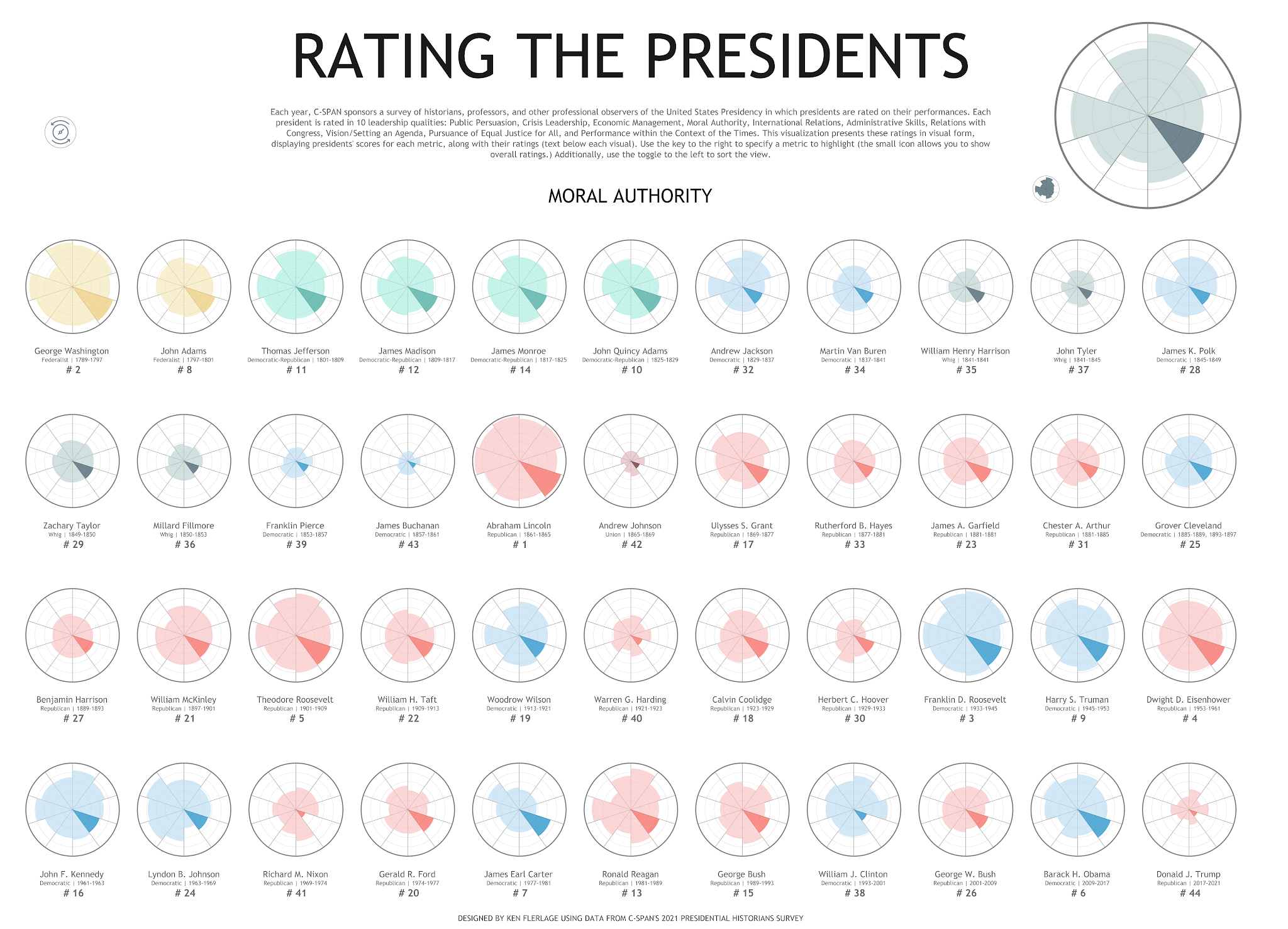
The
chart shows the ten leadership qualities on which the historians scored
presidents, each of which are measured on a scale of 0 to 100. In this case, it
felt more natural for me to scale the sections by radius instead of area. This
is particularly the case due to the fact that I added a grid to the background
of each chart, showing intervals of 20.
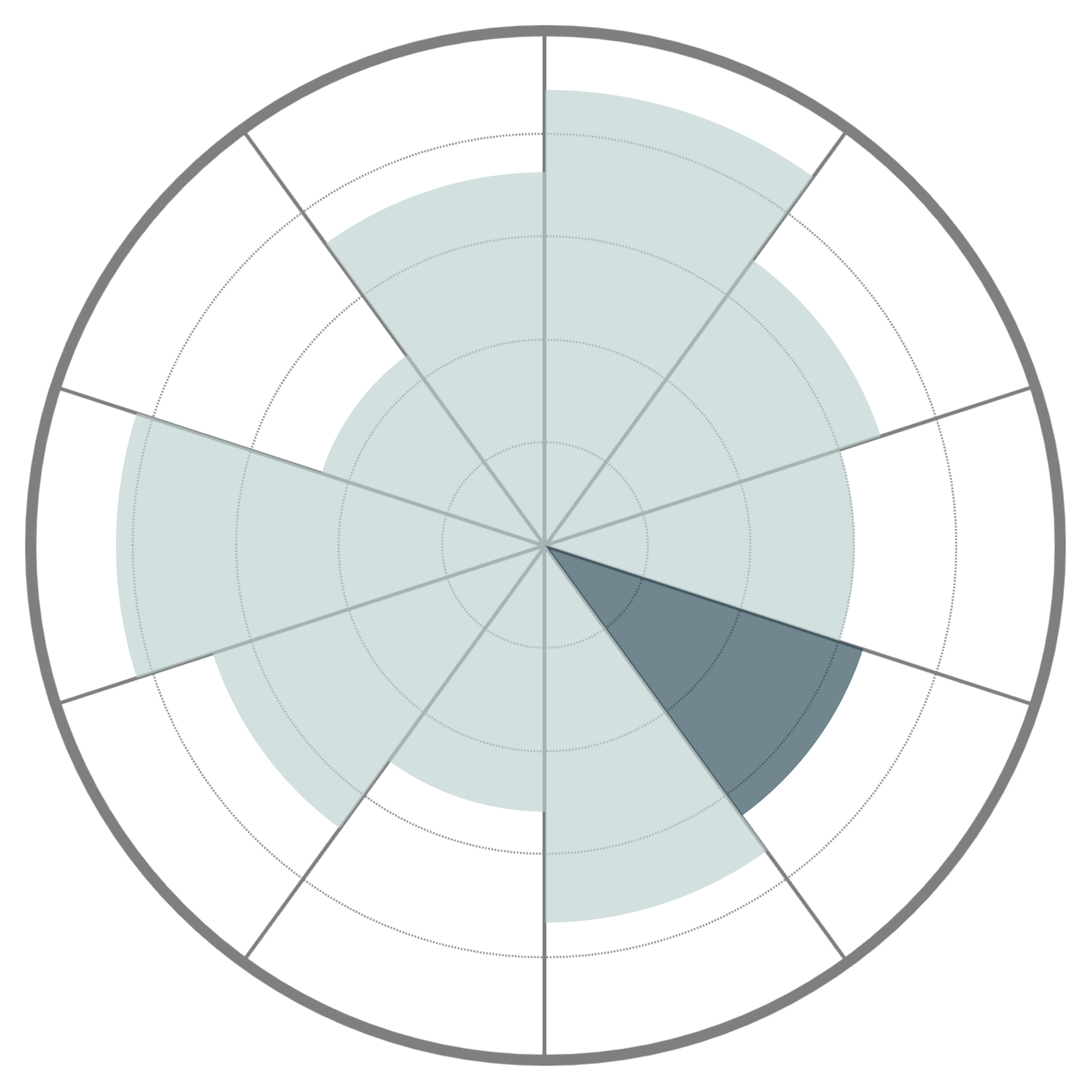
With
radial scaling, you can easily align each section to one of those grid lines.
While that would have been possible scaling by radius, the linear distance
between the gridlines would have decreased as the numbers grew, which I felt
would be more confusing to viewers. Did I make the right choice here? I cannot
be sure without a bit more research, but it felt like right approach in this
case.
After
doing a bit more digging for similar types of charts, I found a number of use
cases (I’ll give some examples in a moment) where linear scaling and/or stacked
sub-sections might make sense, so I
decided to modify the template to provide you with a variety of options:
1) Scaling – Area or Radius
2) Stacking Option – Standard (no
stacking) or Stacked
3) Whitespace – Specify a percentage of
each slice which will be consumed by whitespace. This allows you to create some
spacing between sections.
With
these options, you can create four different charts:
1)
Standard, Scaled by Area – A standard coxcomb chart
2)
Standard, Scaled by Radius
3)
Stacked, Scaled by Area
4)
Stacked, Scaled by Radius – A radial stacked histogram bar chart
The Template
Like
our other templates, this one includes two components—an Excel spreadsheet and
a Tableau workbook. You can find them here: Coxcomb Template Files
The
Excel spreadsheet has two sheets, Data and Model. Model is used to
handle the data
densification needed to draw the different sections of the chart. You don’t
need to modify this sheet at all—just make sure it’s in your spreadsheet. The Data
sheet is used to populate your data. It contains three columns. You can add
more if needed, but these are the three that are required by the Tableau
template. The columns are as follows:
Section – Dimension
defining the sections (in Nightingale’s rose diagram, this would be month/year).
Sub-Section – Dimension
defining the sub-sections (colors) within each section (in Nightingale’s rose
diagram, this would be cause of death).
Measure
– Measure to be plotted by the chart (in Nightingale’s rose
diagram, this would be number of deaths).
Note:
The template needs to include all combinations that will be shown on the chart.
If there is a sub-section with no data, then make sure there is a row showing zero
as the measure.
Once
you have populated the Data sheet, then you need to connect it to
Tableau. Using the Tableau template, edit the data source and connect it to
your Excel file. The workbook should update automatically to reflect your data.
Next, be sure to change the options to match your requirements. There are three
parameters—Option, Scaling, and Whitespace. Once you’ve
chosen the proper options, you can do whatever you like with the chart—change
the colors, add filters, update tooltips, etc. just as you normally would.
Note:
One common problem with any type of stacked chart is the inability to properly
compare sections due to the lack of a common baseline. This template has the
same problem when the stacked option is in use. To address this, I’ve used a
sorting technique previously described by Steve Wexler and Ryan Sleeper. You can click on a sub-section to sort that sub-section to the
middle. Additionally, in order to avoid that sub-section staying “selected”, I’ve
leveraged the “fake highlight” trick described by Brian Moore.
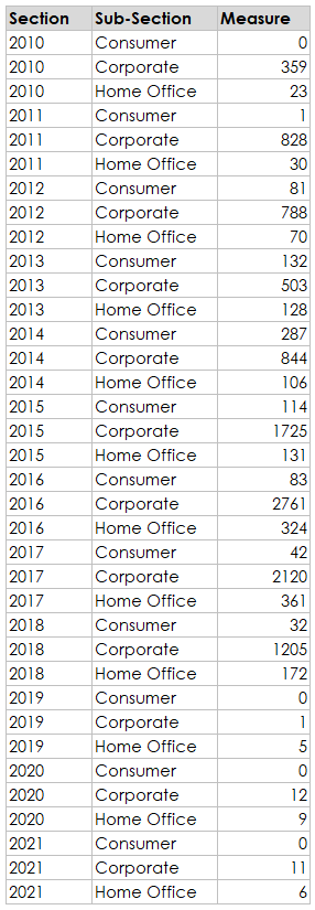
Use Cases
In this
section, I want to give a few example use cases outside of the standard
coxcomb.
Pizza Charts
In my
research, I came across “pizza charts”, which have been used quite
effectively with football/soccer data, as illustrated by FiveThirtyEight, and the Football
Slices twitter account. These charts generally only make sense
when using a single sub-section. This is essentially the same chart as I used
in my presidential ratings viz. We can use the template to create this by
choosing to scale the chart by radius. As there is only one sub-section, the
stacking option won’t matter.
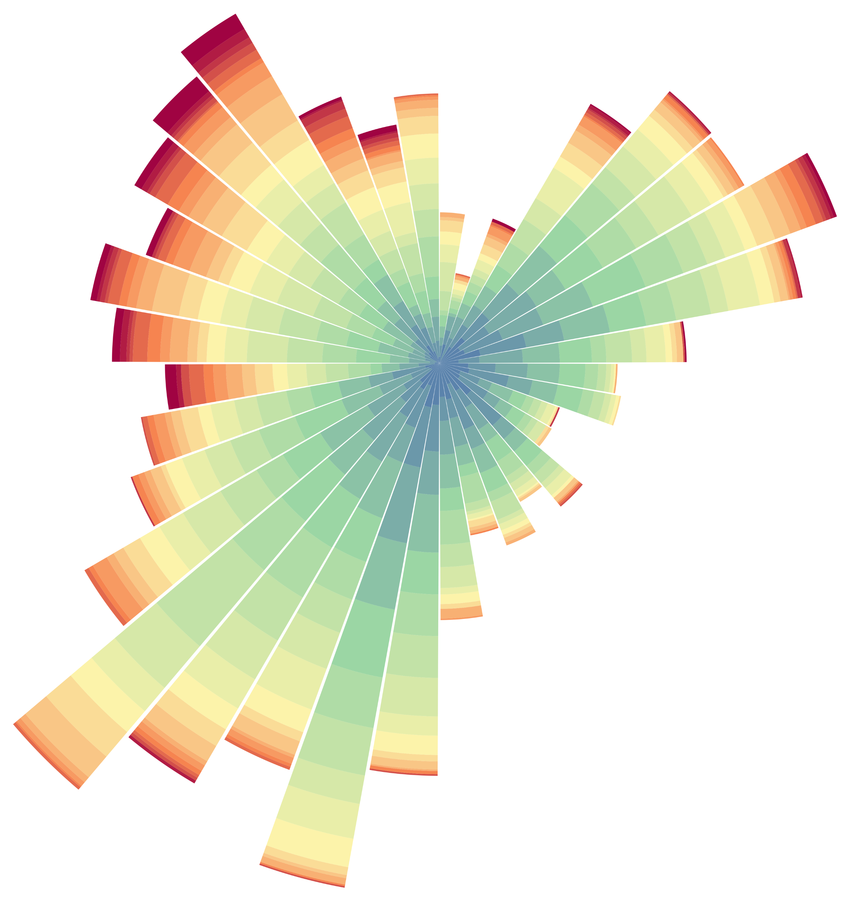
Radial Stacked Histogram
Bar Chart
In,
2018 I used Tableau to create a Wind Rose.
These
charts are used by meteorologists to analyze wind patterns and show three key
measures: direction, frequency, and speed. Direction is visualized by the angle
of each bar, where North is 0° (the top), East is 90° (right), South is 180°
(bottom), and West is 270° (left). Speed is visualized by the color of each
section of the stacked bars. And Frequency is visualized by the length of each
bar.
So,
essentially, a wind rose is a radial stacked histogram bar chart (that’s
a mouthful!), where the measure is encoded by radius and the sections are
stacked on top of each other, not overlapping. We can create this using the
template by choosing the Stacked option and scaling by Radius.

One
thing I did with the original wind rose was add whitespace to create a bit of
separation between each section, so if we change the whitespace option to 5%,
we can do exactly that.
Or, if
you’d like very thin sections, you could make it 50%
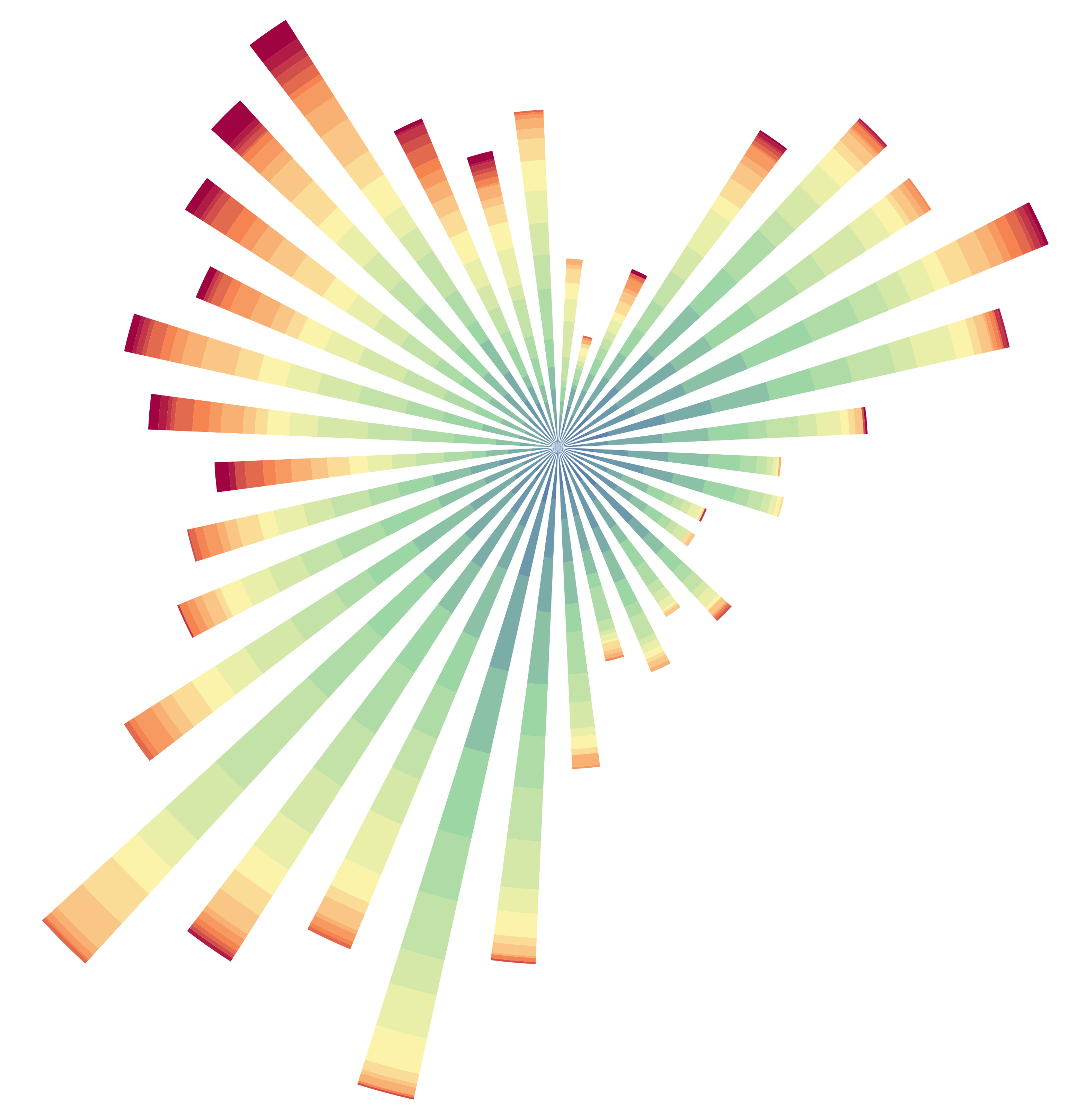
If
you’re feeling really crazy, you can even set the whitespace to a negative
percentage, which will create overlap on the sections. Now, I don’t know why
anyone would ever want to do that, but it’s possible!
I don’t
have specific use cases for every possible option, but if you happen to run
into such a use case, the template should handle it without any problems.
Final Thoughts
Thanks
so much for reading! As always, I want to make sure to stress that you should
be very thoughtful about your chart choices. Coxcombs (and the related charts
we’ve discussed here) have niche use cases, so be sure that you properly
consider your data, your audience, and the questions you’re trying to answer
before using this in your own work. And, once again, please be sure to view the
videos from Robert Kosara because they do a fantastic job of describing this chart,
its use cases, and the pitfalls you should try to avoid.
Ken Flerlage, January 18, 2022


Thanks for blog Ken. Can you make your viz "Wind Rose (Created Using Coxcomb Template)" downloadable?
ReplyDeleteSorry about that--didn't realize I hadn't already done that. Done.
DeleteThanks Ken for making it downloadable.
DeleteIs there a way of making this work with .hyper files? This would be extremely useful for something we plan on doing at work, but I am having trouble getting it to work with a .hyper file (I am thinking it is to do with the second tab and the relationship there). Thanks!
ReplyDeleteWe could probably make it work. Any chance you could email me? flerlagekr@gmail.com
DeleteThanks so much for the tutorial! Do you know of a way to put circle chart lines on the coxcomb chart image?
ReplyDeleteI should have called it the radial scaling grid lines like you have in the image above. Is there a way to show that in Tableau with the coxcomb chart image?
ReplyDeleteYes, I created it as an image outside of Tableau then used it as a background image in Tableau.
DeleteThanks for the advice!
Deletethank you for sharing
ReplyDeleteThank you so much for sharing this.
ReplyDelete