
QGIS for Tableau Users # 5: Outlines, Fills, and Custom Labeling Locations!
We’re once again excited to have Sarah Battersby joining us for the fifth post in her series about QGIS for Tableau users. Sarah has been a member of Tableau Research since 2014. Her primary area of focus is cartography, with an emphasis on cognition. Her work is focused on helping everyone to visualize and use spatial information more effectively—without the need for an advanced degree in geospatial. Sarah holds a PhD in GIScience from the University of California at Santa Barbara. She is a member of the International Cartographic Association Commission on Map Projections, and is a past President of the Cartography and Geographic Information Society (CaGIS). Sarah can be contacted at sbattersby@tableau.com or on Twitter @mapsOverlord.
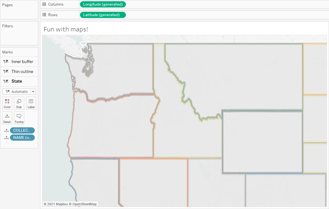
With support for map layers in
Tableau starting in version 2020.4, there is a lot that we can do to enhance
the design in our maps! Recently I’ve been answering a lot of questions about
how to do more with changing the color, size, and transparency of polygon outlines and how to move point symbol
& label locations for polygons. So, I’m just writing up all of the little
tricks so you can see how incredibly easy
this can be!
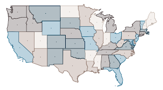
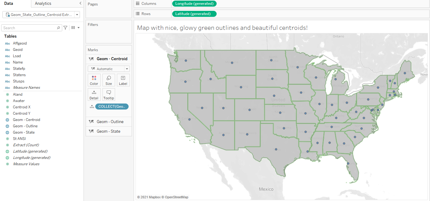
Here is a fun, quick example with
three layers–one with polygons and two outline layers (one in color based on
state name, and one regular outline that is just a thin grey line).
All you need is QGIS (or any other
geographic information system, or similar tool) to do a tiny bit of
pre-processing for you. I like QGIS because it’s quick, easy, and you can SEE
exactly what is happening with your data to tailor it just how you want it.
I’ll demonstrate in this blog post by
making a super-duper Tableau .hyper file with Polygon, Outline, and Point
geometries all in one.
Data
I’m going to work with a states file
from the US Census as my dataset but this should work with any polygon spatial file that you have. If you want to play along
as I go, the file I’m using is US States at 1:5million resolution from the US
Census–download it here.
This file comes from the US
Census Cartographic Boundary Files, where they have
all sorts of great spatial data to work with.
Problem
Here is a bit more detail on the
specific problems that I’m solving in this post…
You want custom outline
symbolization!
By
default, Tableau provides limited options for customizing the look of polygon
outlines. You can change the border color, you can remove the border completely,
but you can’t do much else to change the style.
You want labels in a different place.
Always. And you don’t want to move them by hand each time!
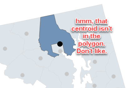
Tableau uses an algorithm to identify a centroid location for your polygons. This
centroid is where point symbols and labels are placed by default. It works
great for some polygons, and not for others. There are LOTS of different ways
to calculate centroids and they all have
problems with some types of polygons. If you don’t like where Tableau
dropped the label, you can move them manually…or if you’re going to use that
same polygon file a bunch, it’s probably worth the effort to just make your own
labeling file where the points are just where you want them - every time.
1.
Let’s Make Some Outlines!
Add your States file to QGIS. I just
drag the shp portion of the files in, but you can also click on Layer -> Add Layer -> Add Vector Layer.
Note: all of these basics of working with files in QGIS can be found in the first
post in this series
With my file, QGIS asked me about a
transformation on the data–most of the time you can just take the default, so
go ahead and do that if you’re asked about it. No need to get into the weeds
with too much discussion of that right here and now.
Great, I now have some pretty
polygons in QGIS! Let’s make outlines out of them. It’s kinda embarrassingly
easy…Just use Vector -> Geometry Tools
-> Polygons to Lines
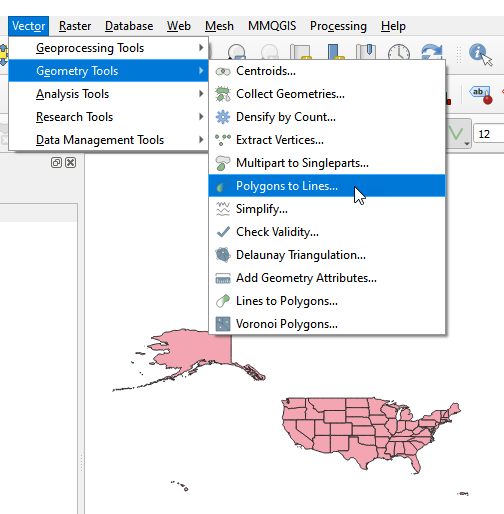
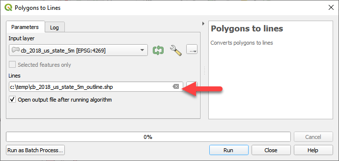
Using the nice interface, give your
output file a name (I use the original file name + _outline.shp...the .shp at
the end just says “make sure it’s a shapefile.” Tableau really likes shapefiles
as a file format), remember where you are saving it…and click Run.
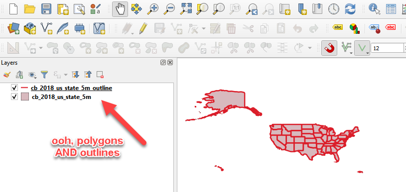
Super, now we have a file with
outlines.
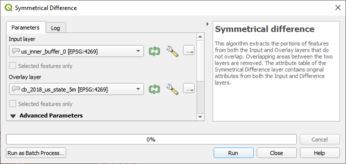
Bonus: “Inner Glow” Creation
Instructions
The outlines that are generated in
QGIS are literally just the outline, and when you change the thickness of the
line in Tableau it’ll be centered on
the border of the polygon. If you want the “outline” to just fill one side of
the polygon (e.g., for an ‘inner glow’ or ‘outer glow,’ you’ll need to be a
little creative). Here are the steps for that bit of outlining bling for your
map, in case you want to have some fun! If not then :( but feel free to skip to
the next section.
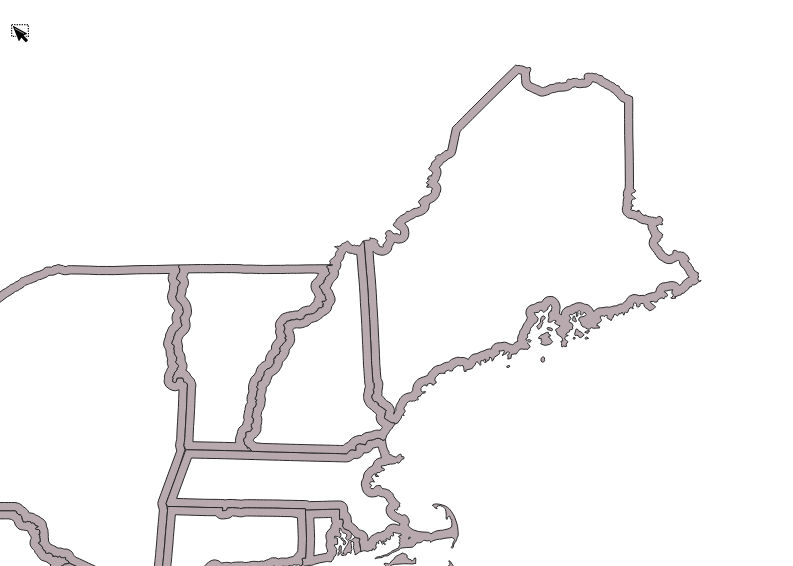
The image at the top of the post had
a little “inner glow” inside each
polygon. This is actually a little different than the outlines that we
generated above; it’s really a thin polygon
(not a line) that is drawn inside the
border of each of the state polygons. If you just use a regular outline for a
glow like that, it’ll extend on BOTH sides of the polygon so you’ll see it
inside and outside. To get the interior line / polygon only, the process is a
little more involved, but not much:
Create an interior buffer–this is a regular buffer in QGIS, but you use a
negative distance value. That gives you an interior polygon that is your
specified distance inside the polygon
boundary.
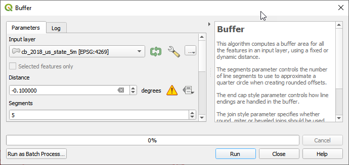

Take the symmetrical distance between the interior buffer and the original
polygon. This is your “inner glow!” It’s just the part of the polygon that is
closest to the polygon edge, with the interior of the polygon clipped out.
If that’s all you want, and you don’t
care about getting custom locations for your polygon labels / point
centroids–just skip straight to the end of the post to learn about squishing
these together into a single super hyper file to keep them together for all of
your awesome maps in Tableau.
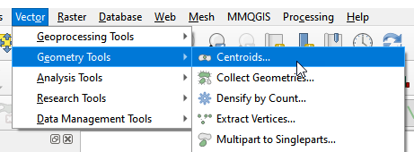
2.
Let’s Make Some Point Centroids!
Tableau uses a centroid calculation
algorithm to place labels for polygons. If the locations aren’t to your
liking–and you’re going to be labeling the same locations repeatedly, it is
worth the time to make a dataset with the centroid locations that you’d like.
Let’s get some better centroid
locations for our states! (To be fair, I rather like the centroid placement for
this file in Tableau, but since I was using it for outlines anyway, I’m just
going to keep going with it…)
Use those same Geometry tools that we
used for the outline, but this time, you’ll just use Centroids.
Make sure you pick the polygon file
from the drop down (if you’re doing this after you made the outlines, that may
be the default choice...so change it). Then put in the location/name for your
output file and click Run:
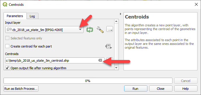
Yay, now I have polygons, outlines,
and centroid points! But, maybe I want to move some of those centroids. I don’t
like New Jersey. I mean, I like the state of New Jersey– it’s a totally fine
place, but I want the labeling location to be a little farther away from the
border.
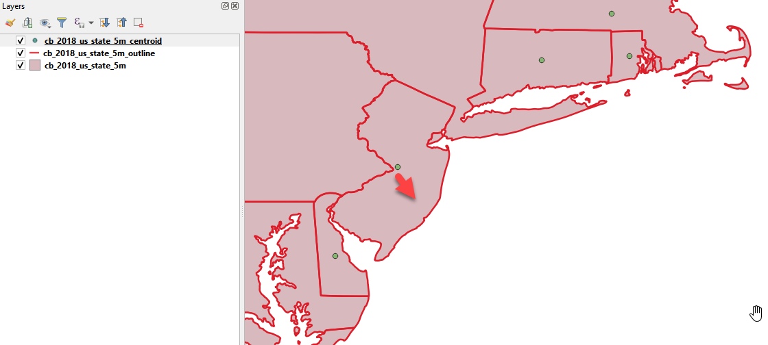
If you find point locations that you
don’t like, all you have to do is start editing and move them! Make sure you
have the layer you want to edit highlighted in the list of layers (just click
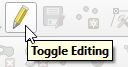
on it once). Now hit the edit button–it looks like a little pencil:
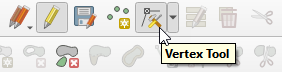
Use the “Vertex” tool, grab the point(s) that you want to move and drag them where you want them.
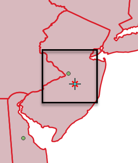
When you’re done, click the pencil
again to save your edits. Cool, now you have a customized centroid file!
All that’s left is to get everything
all combined together.
3.
Combine Into One Big Happy File in Tableau
There are a few ways to go about
this:
A)
One-Off Solution: Just add all three files to the
workbook that you’re using and join them or set up a relationship between them.
Since they are all based on the same original polygon file there should be at
least one unique attribute that is in common across all of the files (if there
isn’t, you really ought to make sure there is a unique identifier in your
data!)
B)
Reusable Solution: Combine the three files into an
awesome hyper file with three geometry fields! Personally, I like to do this in
Tableau Prep, but you can do much the same thing by setting it all up in
Tableau Desktop and then creating an extract. Prep just makes it easier for me
to rename fields and remove the duplicates...because if you’re joining THREE
files together, you really don’t need THREE copies of the state name (one from
each input file), so just vote those off the data island.
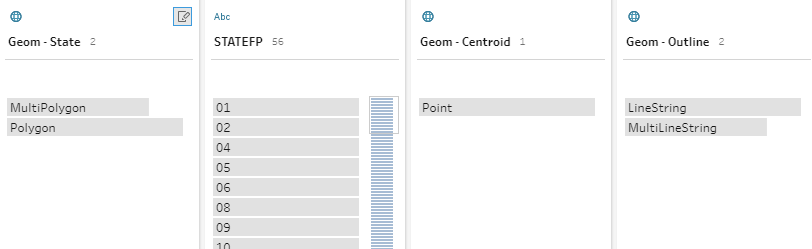
Below shows a step after my final
clean in Prep where I have THREE geometries (State, Centroid, and Outline) and
my unique identifier (the FIPS code in STATEFP). Note that this particular file
also has a ton of attributes that came from the Census, and I left those in the
State file, but deleted the duplicate copies in the Centroid and Outline files.
Here is an example of my workflow to make a hyper file with polygon geometry,
outlines, and centroids. It’s really just a matter of adding the files (in this
case, polygons, outlines, and centroids), joining them together, removing the
duplicated fields, cleaning up the duplicate fields, and renaming the geometry
fields so that they make sense (e.g., Geom-Polygon, Geom-Outline, and
Geom-Centroid…as opposed to Geometry1, Geometry2, Geometry3 or whatever the
default would be).
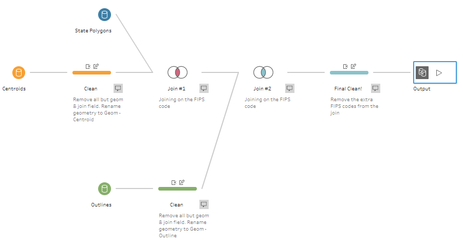
At the end, you get one, super nice,
clean hyper file ready for mapping in Tableau!
I hope this was helpful! Show off all
of the fun maps you make! We would love to see what you’re up to!
Sarah Battersby
March 7, 2022


Thank you Sarah! Really appreciated your instructions
ReplyDelete