
4 Ways to Create Highlight Tables in Tableau Using Discrete Color

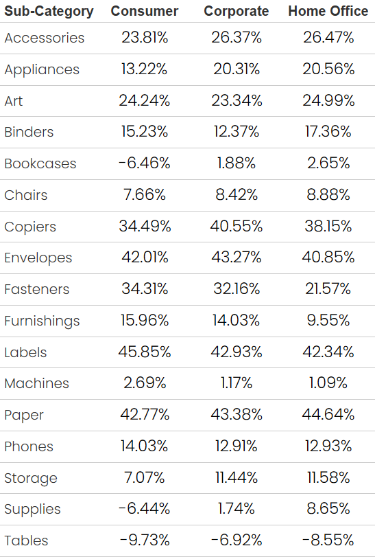
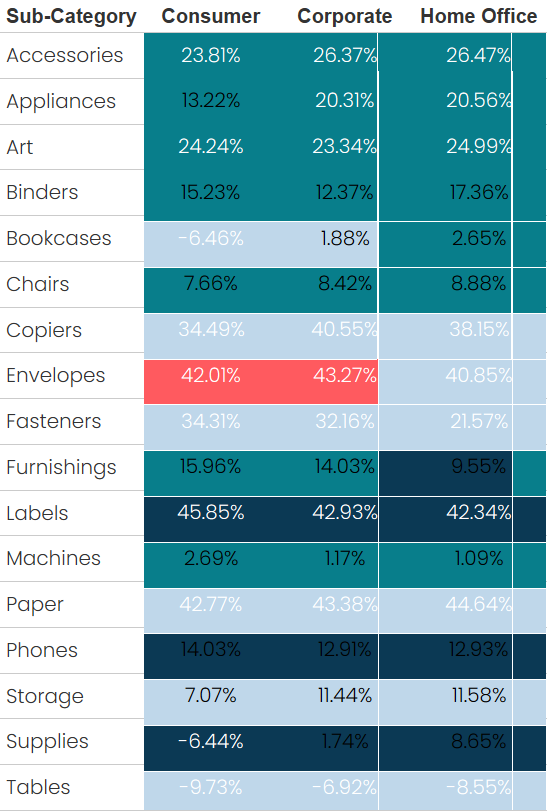
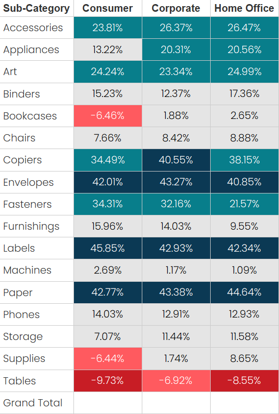
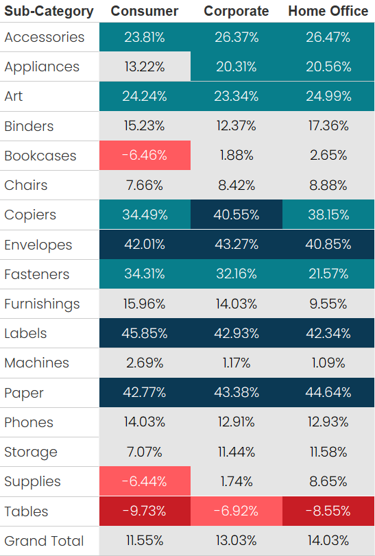
The general consensus in data visualization is that tables aren’t great. This is because they don’t leverage any preattentive attributes. But sometimes tables are unavoidable—either because you really need to show detailed raw data or, more commonly, your constituents are demanding them. For example, here’s a table showing Profit Ratio by Sub-Category and Segment.
When faced with the need to build
such tables, dataviz practitioners will typically first try to argue for more
effective visuals. But, if we lose that argument (you can’t win them all!!), we’ll
generally recommend converting those tables to highlight tables.
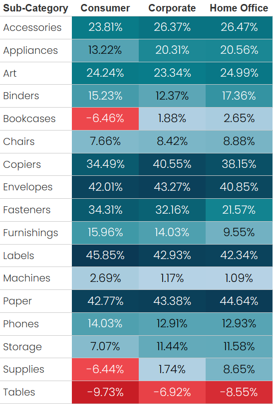
By highlighting the cells, we are able
to integrate color as a preattentive attribute, making it a much easier for our
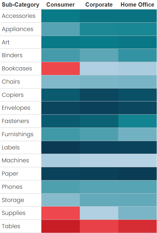
users to find quick insights. This color is so powerful that we can even remove
the text from the chart, leaving just colored cells, and we can still get powerful
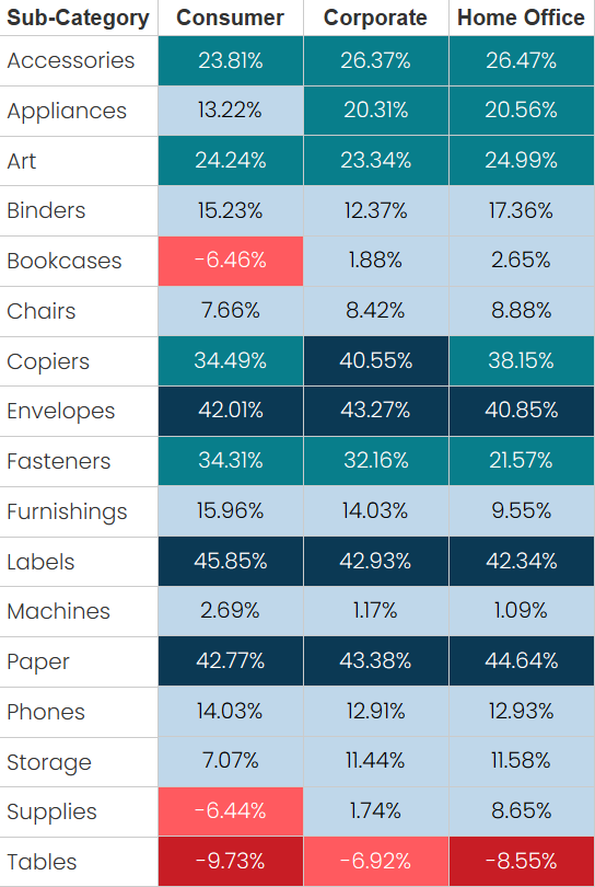
insights from the table. For example, in the following example, we can clearly
see that the poorest performing Segment/Sub-Category is Consumer
sales of Tables—because it’s the darkest red. And the best performing is
Consumer sales of Labels—because it’s the darkest teal.
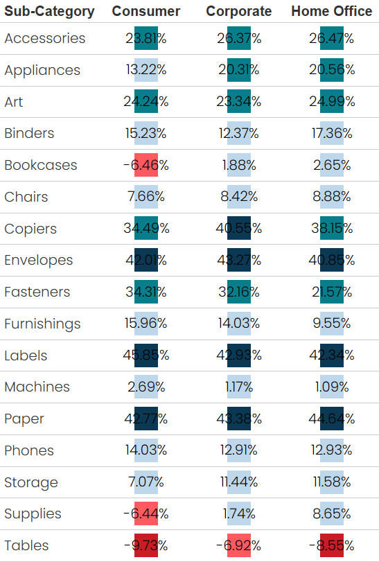
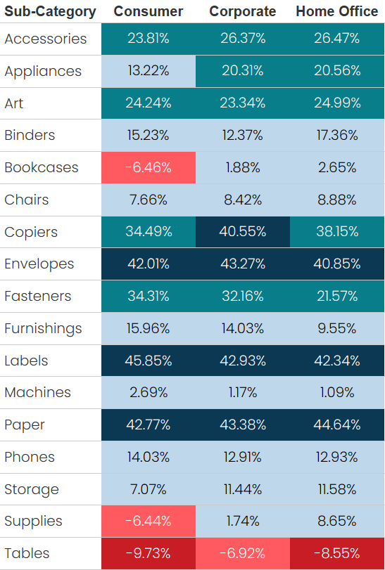
These tables are quite easy to build
in Tableau as long as you’re coloring using a continuous field. In the example
above, I’ve simply dropped Profit Ratio on the color card. But, when you
try to use a discrete field, things can go haywire.
So, in this blog, I’m going to walk
you through four different techniques for using a discrete field to create a
highlight table in Tableau.
The Problem with Discrete Color
Using the example above, let’s say
that we wish to break the profit ratios into five different ranges, going from Very
Poor Performance (very low profit ratios) to Very Good Performance
(very high profit ratios). We might create a calculated field like this:
Profit Ratio
Ranges
// Break the profit
ratio into five groups.
IF
[Profit Ratio] < -0.07 THEN
"Very Poor Performance"
ELSEIF
[Profit Ratio] < 0 THEN
"Poor Performance"
ELSEIF
[Profit Ratio] < 0.20 THEN
"Mediocre Performance"
ELSEIF
[Profit Ratio] < 0.40 THEN
"Good Performance"
ELSE
"Very Good Performance"
END
We then drop this on the color card
and…
That’s not what we want! So, we then
try to increase the size to see if it will fill the cell.
That’s not what we want either! The
colored squares are overlapping other cells, creating a terrible mess. We
really need to find a way to make those colors stay at home and
not overlap…

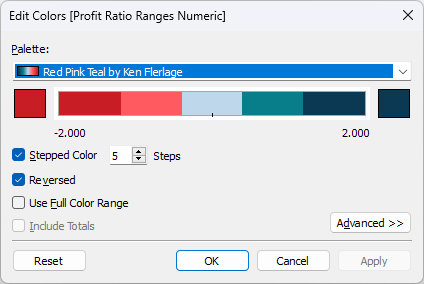
Approach 1: Make it Continuous
Okay, yeah, I know I’m cheating here,
but…one approach is to find a way to change this discrete field into something
numeric so we can make it continuous. We can do that by changing our calculated
field to the following:
Profit Ratio
Ranges
// Break the profit
ratio into five groups.
IF
[Profit Ratio] < -0.07 THEN
-2
ELSEIF
[Profit Ratio] < 0 THEN
-1
ELSEIF
[Profit Ratio] < 0.20 THEN
0
ELSEIF
[Profit Ratio] < 0.40 THEN
1
ELSE
2
END
We change this to a continuous field
then drag it to the color card and get something much better.
Unfortunately, this method has a few
drawbacks. First, it’s not always possible to convert a discrete field into a
continuous one. Our example was relatively easy, but sometimes that simply is not
the case, especially when you’re using some complex logic in your calculations.
Second, with a continuous field, we must
use either a continuous or diverging palette. In the example above, I’ve used a
continuous palette with 5 steps.
But what if we wanted more granular
control over the individual colors? For example, I’d really like that middle
range to be a neutral grey color instead of light blue. I can’t easily change
the color for just that one range. To do this, I’d need to create a completely different
diverging color palette with grey in the middle. That seems like a lot of work,
so there must be a way to do this with a discrete field, right?
Approach 2: Empty Strings on Rows and
Columns
Good news—there is a way to do
this with a discrete field! Let’s go back to the previous example where we
dropped a discrete field on color and ended up with overlapping colors. Now let’s
create an inline calculation on the Columns shelf with simply “” (an empty
string).
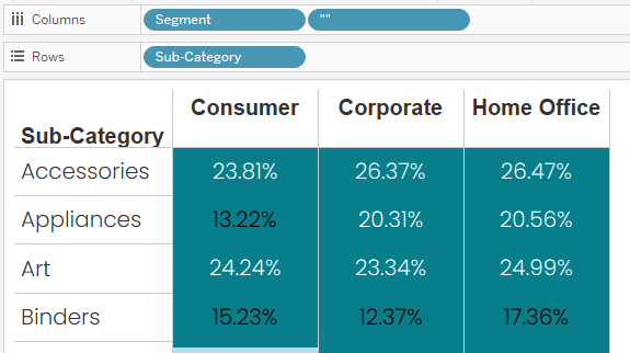
Now hold Ctrl and drag that “”
pill down to the Rows shelf, copying the pill.
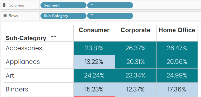
Note: You could do this with
virtually any static value—it doesn’t have to be an empty string.
Now right-click one of the “” pills
and deselect “Show Header” to hide that value. Because we copied the pill, this
will hide the header on both pills.
Look at that! The colors now stay at
home!!

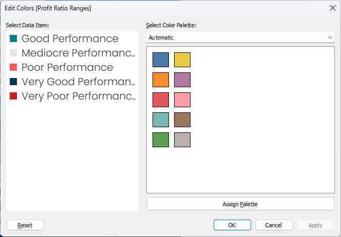
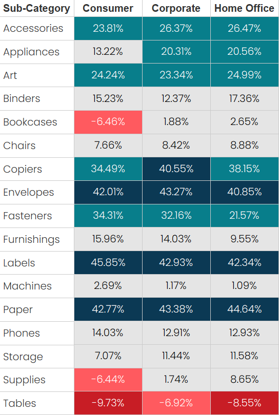
And, because this is using a discrete
pill, we can change the colors to be exactly what we want. Let’s change that
middle range to a neutral grey.
I’ve been using this technique since
I first discovered it and it usually works perfectly. But I just recently identified
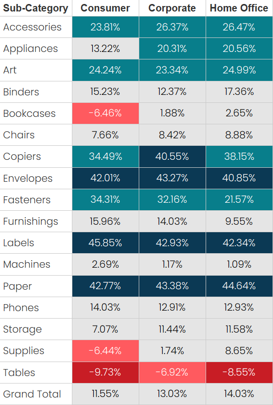
a problem with it. Let’s add grand totals to this chart…
The grand totals are blank. Argh!!!

Approach 3: Separate Pills
What’s going on here? Well, those extra
“” pills are messing with the grand totals. Fortunately, there is a simple
solution to this problem. Instead of using the same “” inline calculation, let’s
create two calculated fields—Empty 1 and Empty 2—that are both
just empty strings (“”). Instead of the inline calcs, drag one of these to Rows
and one to Columns
That seems to do the trick!
But somewhere in my mind, I suspect
that this could have some limitations as well. I haven’t found any yet, but I
just have a suspicion. So, let’s look at one more solution to this problem.
Approach 4: Bar or Gantt Mark
Once again, let’s go back to the
original chart where the discrete pill was causing overlapping colors. And let’s
also turn on column grand totals.
Now change the mark type to either Bar
or Gantt. The result should be the same.
Now create an inline calculation on
the marks card, MAX(1).
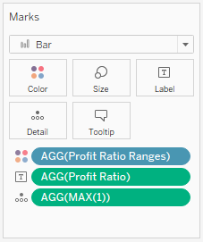
…and move that pill to the size card.

The bars (or gantts) will fill the
cells perfectly!
And, because we don’t have any
additional pills on Rows or Columns, the grand totals work nicely as well.
Closing
If you’ve been using Tableau for a
while, I’d pretty much guarantee you’ve run into this problem. If so, I hope
that this blog provides a few different approaches to deal with it in the
future. If you haven’t run into this problem yet, you will eventually—and I
hope this blog saves you some time and headaches when that time comes!

Thanks for reading!! If you have any
questions or comments, please share them in the comments section below.
Ken Flerlage, April
15, 2024


I'm blown away by this! This issue has been vexing me for the longest time, and I finally decided to look it up. Thank you!!
ReplyDeleteSo glad it's helpful!!
Delete