
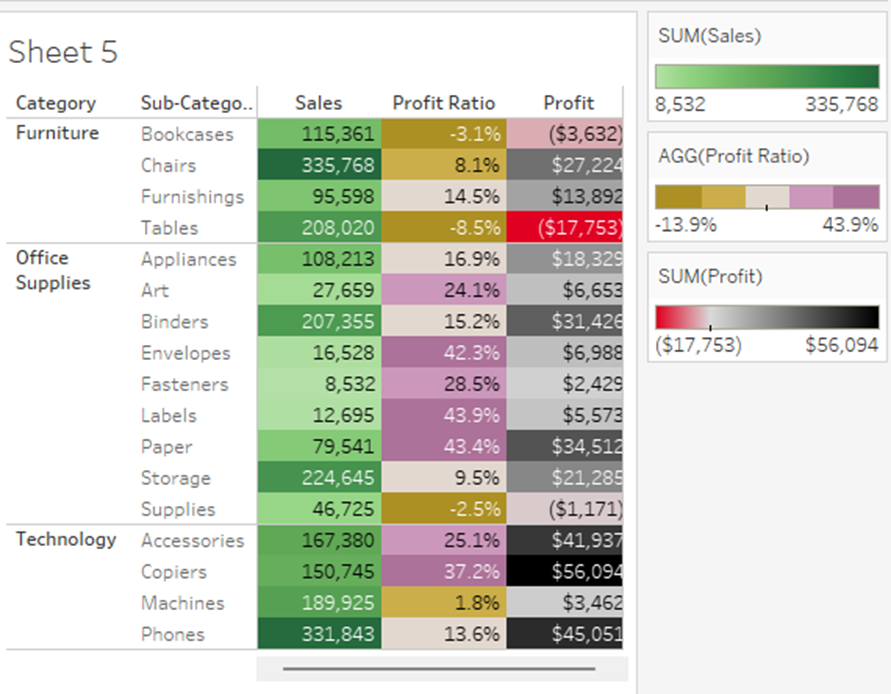
Measure Names & Values Overiew with Some Tips & Tricks (Guest Blog Post from Ethan Hahn)

The following is a guest blog post from Ethan Hahn (a regular contributor on our site). Ethan works at the University of Cincinnati and runs a small analytics team in the Office of Research. Previously, he spent 27 years at Unifund working with Jeff Shaffer, Dinushki DeLivera, Jennifer Dawes, and myself. This was my first job using Tableau, so I learned a lot from Ethan and we learned a lot together.


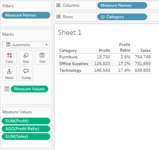
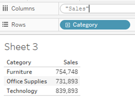
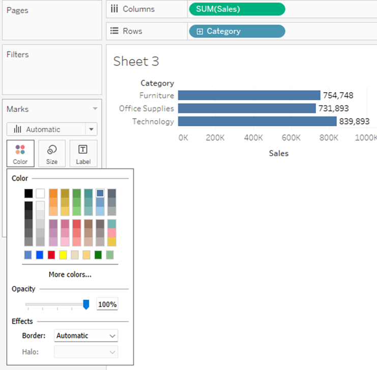
Now let’s drag Profit onto the canvas – I’ll drop it right on top of “754,748” – and check out all the changes!

1) It replaced SUM(Sales) on Labels with Measure Values
2) It moved SUM(Sales) down to a new card, the Measure Values Card, and added SUM(Profit) there
3) It put Measure Names on Columns
4) It also put Measure Names on Filters
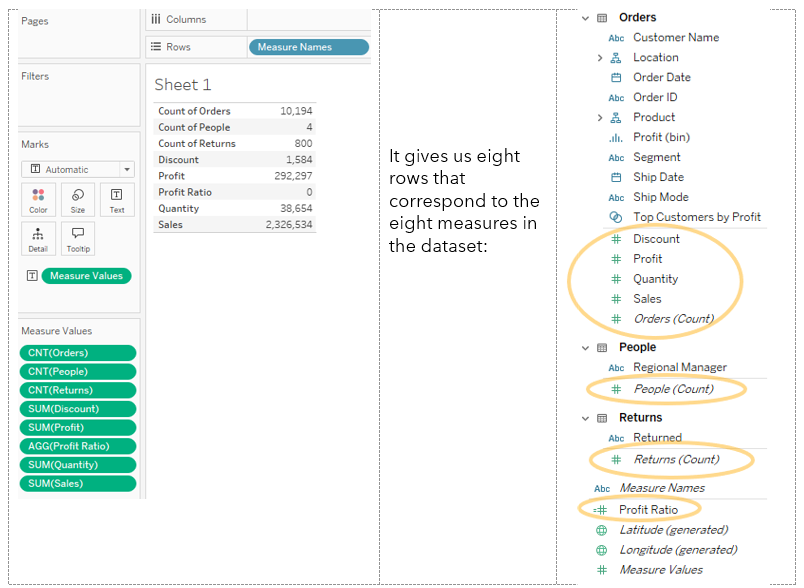
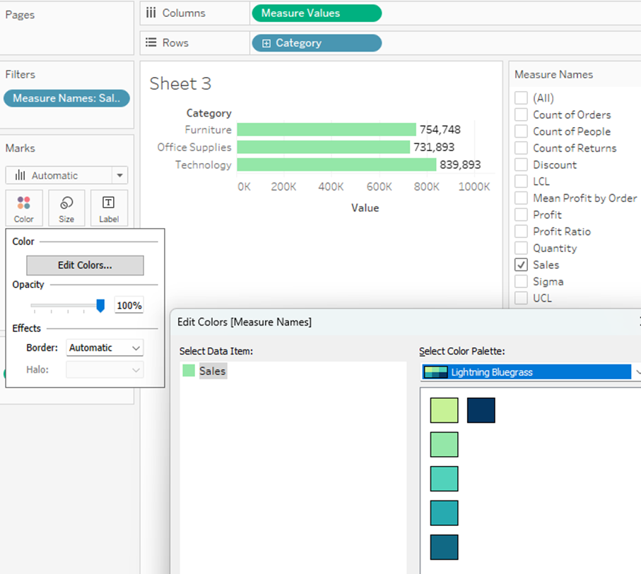
This is a fantastic illustration of what Measure Names and Measure Values do. First, think of Measure Values as a mystical portal into the world of the Measure Values Card. You can load up anywhere from one to all your measures on that card. Next, you’ve got Measure Names – a blue pill, a dimension – sitting on columns. Remember, we use dimensions to split data apart – Measure Names is on columns to split out Profit from Sales into separate columns. Check out what happens without that – I’m just going to remove Measure Names from Columns and leave everything else the same:
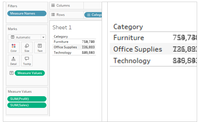
Measure Values is on Labels, acting as a portal to the Measure Values Card – anything on that card goes through the portal onto the canvas. But without Measure Names splitting the data up, it just gets jammed into the same spot! You’re seeing 754,748 superimposed on 19,730. But use Measure Names as a dimension and it’ll split the measures back out – put it on Rows:
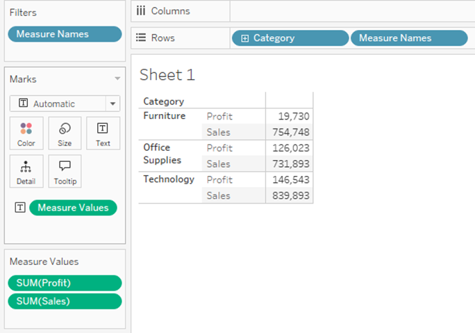
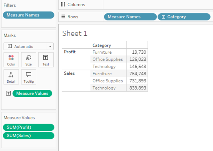
Move it to the other side of Category:
It’s just a dimension, like any other dimension! (With one important exception that we’ll address later…)
The other change we saw above was Measure Names on the Filters card – let’s right-click and edit the filter. Again, it’s just a regular old dimension filter:

The checked boxes align to the measures on the Measure Values Card. So the Measure Values filter is just another mechanism you can use to add or remove Measure Values from the Measure Values Card. You can show this filter then check other boxes, you can drag measure onto the Measure Values Card directly, or in cases like this crosstab, you can drag pills on and off the canvas itself.
Another thing I’d like to note: as I’ve said, Measure Values is just a portal. Let’s say we add Profit Ratio to our display – I just clicked on Profit Ratio in the Measure Names filter to add it:

It came through as 0 for each row – that’s because the values are below 20%, or 0.2, and with the default formatting they round down to 0. But I can change the default formatting for Profit Ratio – right click the pill in our field list, select Default Properties, Number Format and change that – and when I do that, it changes the format displayed:
Again, Measure Values here is acting as a portal – the field-level formatting adheres to the pill and follows it through the Measure Values portal straight onto the canvas.
BAR CHART ILLUSTRATION
We’ve talked a lot about crosstabs so far, but Measure Names/Measure Values are useful for a lot more than just that! Let’s make a bar chart, sum of sales by Category:
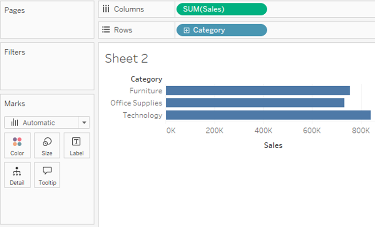
Next, I’m going to replace SUM(Sales) with Measure Values:

Nothing changed on the bars, but we see a bunch of measures on the Measure Values Card. What happened? Remember when we pulled Measure Names off Columns above, and ended up with two numbers jammed on top of each other? That’s the same thing that’s happening here – SUM(Sales) happens to be the biggest measure we have, so without Measure Names to split our data, SUM(Sales) dominates the other measures. Let’s fix this by adding Measure Names to Columns:

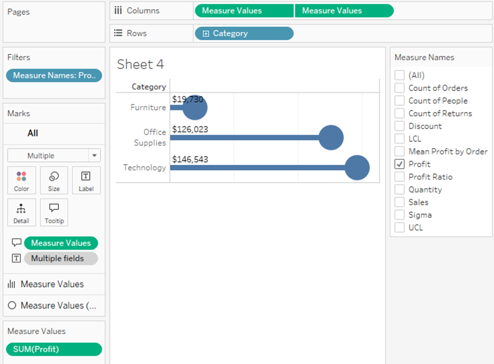
I’m going to make this more manageable by just using Sales, Profit and Quantity. This time, I’m just going to grab the pills from the Measure Values Card and drag them away – we’re left with this:

Remember that Measure Names is a blue pill – it can go anywhere you’d use a dimension (with that exception I will discuss below). Let’s drag it from Columns over to Color. Although the chart isn’t all that useful, we get a stacked bar chart, and each measure gets its own color:

CONTROL CHART
This is all well and good, but let’s talk about a cool application that Measure Names/Measure Values makes possible – a Control Chart! This isn’t really the right dataset for a true control chart, but it will work to illustrate the point. I’ve got a continuous Day of Order Date on the x-axis, SUM([Profit]) on the y-axis, then I split everything up by putting Order ID on details – a little formatting and I’ve got a nice chart showing the spread of profit amounts by order over time:

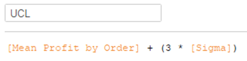
Let’s treat this like it’s an industrial process, where we want to know which instances are “in control” – those where the variance from the mean is expected – common cause variation – compared with those where the variance is “out of control” – special cause variation. You calculate the mean, the standard deviation, and then use those to find the “upper control limit” and “lower control limit” – normally 3x the standard deviation above and below the mean.
NOTE: Please feel free to skip the section below if you don’t care about the details of these calculations – you don’t need to understand them to be able to use them.
Step one, we calculate the mean – note, this isn’t the weighted average, so we can’t just calculate AVG([Profit]); we need to know the profit for each order. We can do that with a Fixed LOD like this: {FIXED : AVG({FIXED [Order ID] : SUM([Profit])})}
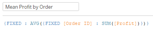
(…from the inside out, we calculate the sum of profit at the Order ID level; then we calculate the average of those sums across the entire viz).
Step two, calculate the standard deviation the same way: {FIXED : STDEVP({FIXED [Order ID] : SUM([Profit])})}

Then we can just use these for the Upper and Lower Control Limits:
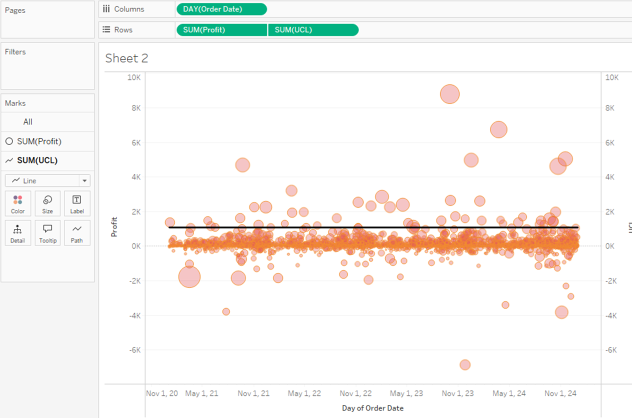
But here is where we hit a wall – we can’t add the Lower Control Limit, because we one get one dual axis.
And this is where Measure Names and Measure Values come in! Measure Values is just a portal to one or more measures, so instead of putting UCL on rows, let’s put Measure Values. At this first step, it looks like hot garbage:
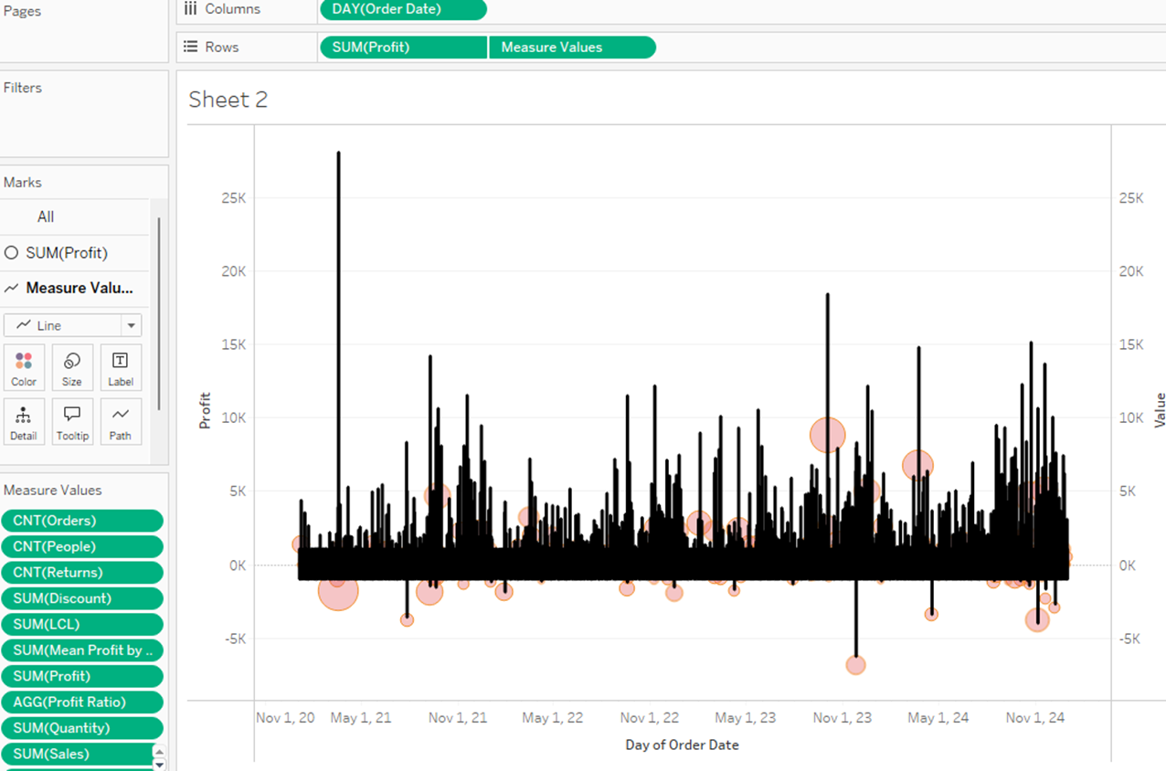
…by default, Tableau put every single measure on the Measure Values card. We need to clean those up, just leave on the UCL and LCL:

…and finally, remember that we need to split the measures up using Measure Names:

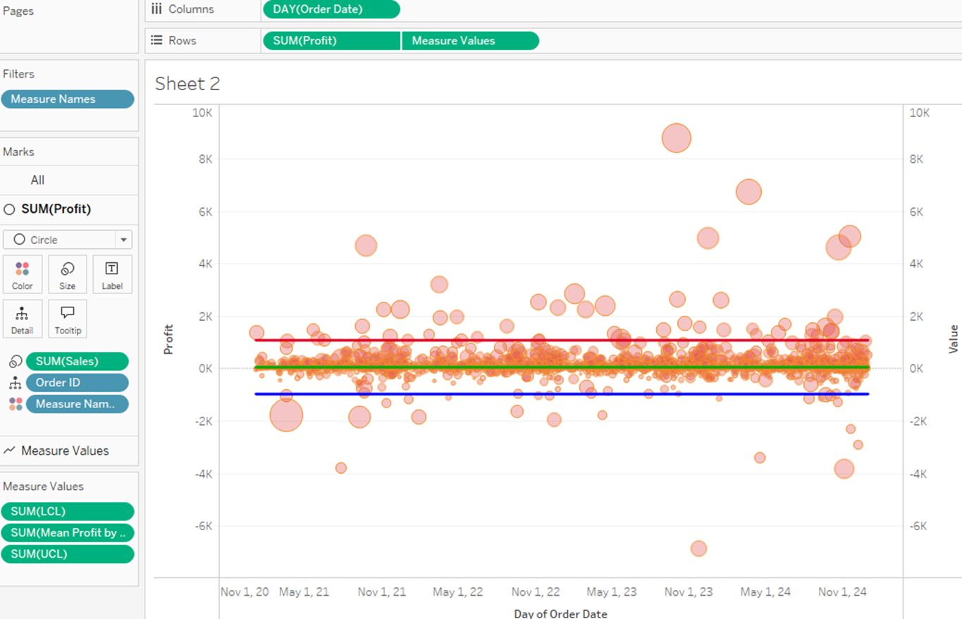
…but they all have to be lines (or whatever chart type they are), all have to be sized and colored by the same pills.
MEASURE NAMES LIMITATION
One other limitation I alluded to above, and one significant difference between Measure Names and any other dimension: you cannot use Measure Names in a calculation. For example, let’s say we wanted to make the UCL and LCL thick lines, and [Mean Profit by Order] a thin line. What I want to do is create a calculation: IF [Measure Names] = ‘Mean Profit by Order’ THEN 1.0 ELSE 2.0 END – but that doesn’t work. Tableau won’t let you type that pill name, you can’t drag it onto the Calculated Field – it doesn’t work.
(Note: there are ways around this, but they introduce their own problems. For example, you could go into your data source and pivot your measures – that gives you a fields called Pivot Field Names and Pivot Field Values, which you can work with similarly. However, that also creates three rows for every original row for you to handle, often requiring LODs and other complications)
OTHER FUN TIPS AND TRICKS
1) No Labels
I’ll set up a simple crosstab with Category and SUM([Sales]) – notice that there’s no header for Sales:


Thanks!
Ethan


Thank you for sharing this guest post about Measure Names and Values. It's packed with information that helped me understand Measure Names and Values better. I shared this post with my team, too. :-)
ReplyDeleteThank you, Lisa!
DeleteThank you for this post. I've always been intrigued by Measure Names/Values and it took some time to become familiar with it.
ReplyDeleteFor the control chart, I followed the example but replicated it using a reference band (instead of Measure names) with the LCL and UCL as the minimum and maximum , as I was curious to see if the reference band could achieve the same thing.
You’re right – if you put LCL and UCL on Details, you can create a reference band, format it with lines at the border and no fill, and it works great! There may be a few formatting limitations with reference bands that lines don’t have, but this approach frees up that dual axis to do other work. It’s a really clever alternative in this use case – I love it!
DeleteThanks so much for reading and commenting!