
Creating NPS Gauges in Tableau

Update April 18, 2020: This
has become one of my most popular blogs since I first wrote it back in 2017. Unfortunately,
I’ve found that there were certain aspects of the how-to process that I failed
to explain thoroughly. I’ve also since discovered an easier technique for
building this chart. So, to address both of these items, I’ve added an updated
section at the bottom of the blog. Feel free to read through the whole blog as
it explains NPS and the basic concept used to create the chart, but if you just
need to know how to apply it, I’d recommend skipping to the A New Technique section.

He also reached out to me directly to see if I could help, so I figured why not give it a go.
What is NPS?
Before jumping into how to create this gauge in Tableau, let’s start with an explanation of NPS. According to Medallia.com, “The Net Promoter Score is an index ranging from -100 to 100 that measures the willingness of customers to recommend a company’s products or services to others. It is used as a proxy for gauging the customer’s overall satisfaction with a company’s product or service and the customer’s loyalty to the brand.” I won’t go into detail about how NPS is calculated, but if you’d like to learn more, you can check out the Medallia’s full explanation.
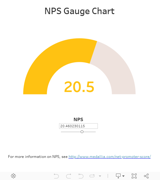
While there are a number of different ways to visualize this metric, one of the most common seems to be a sort of gauge as seen in the image above.
The Chart
Let’s start with some observations about this chart.
- First of all, it looks basically like a half of a donut chart (and donut charts in Tableau are essentially pie charts with a hole in the middle).
- The first slice of a pie chart in Tableau always starts at 0°, but this chart would need to start at 270°.
- The values of the chart will need to go from -100, starting at 270°, to 100, ending at 90°.
So, how to create it? The biggest challenge of this chart is the fact that it needs to start at 270°. I decided that my approach would be to create a donut chart with 5 pre-defined slices, as shown below.

- Slice 1 – Variable sized slice starting at 0° and ending between 0° and 90°. This slice will be used to show the second part of the NPS (if the value is greater than 0). Otherwise, this slice will have 0 size, making it invisible.
- Slice 2 – Variable sized slice starting and ending somewhere between 0° and 90°, after slice 1. If NPS is less than 100, then this slice will be visible and will appear in a light grey color.
- Slice 3 – Hidden slice starting at 90° and ending at 270°. This slice will always be 180° and will always be the same color as the background, rendering it invisible, essentially making it a half-donut.
- Slice 4 – Variable sized slice starting at 270° and ending between 270° and 360°. This slice will be used to show the first part of the NPS (values between -100 and 0).
- Slice 5 – Variable sized slice starting and ending somewhere between 270° and 360°, after slice 4. If NPS is less than 0, then this slice will be visible and will appear in a light grey color, like Slice 2.
Using this relatively simple idea, I created a very small data set containing five records, one for each slice, with the following information about each:
- Slice # – Numeric identifier of the slice (1, 2, etc.)
- Slice – Name of the slice (Slice 1, Slice 2, etc.)
- Details – Description of the slice and how it’s used.
Strictly speaking, we could get by with just Slice # in the data set, but I decided to add a bit more information to make it less confusing to someone using the template.
Notice that there are no measures in the data set. We’ll create the measure within Tableau, based on the NPS score. Note: I’m assuming that the user will have an NPS score which can be fed to the visualization. For demonstration purposes, I’ll just create a parameter allowing the user to select an NPS.
The Calculations
Calculating the pie chart size measure is a matter of some relatively simple math. To simplify my formulas, I created five calculated measures, one for each slice. Here are the formulas for each.
Value_Slice_1: IF [NPS]>0 THEN [NPS] ELSE 0 END
Value_Slice_2: IF [NPS]>0 THEN 100-[NPS] ELSE 100 END
Value_Slice_3: 200
Value_Slice_4: IF [NPS]<0 THEN 100+[NPS] ELSE 100 END
Value_Slice_5: IF [NPS]>0 THEN 0 ELSE 100-[Value_Slice_4] END
Note: “NPS” is the name of the parameter noted earlier.
Then, I combined these values into a single measure, which I called Chart Value:
CASE [Slice #]
WHEN 1 THEN [Value_Slice_1]
WHEN 2 THEN [Value_Slice_2]
WHEN 3 THEN [Value_Slice_3]
WHEN 4 THEN [Value_Slice_4]
WHEN 5 THEN [Value_Slice_5]
END
Finally, I created a calculated field called Color:
IF [Slice #]=3 then "None"
ELSEIF [Slice #]=5 OR [Slice #]=2 THEN "Grey"
ELSEIF [NPS]>[Highest Normal Value] THEN "Green"
ELSEIF [NPS]>[Highest Bad Value] THEN "Yellow"
ELSE "Red"
END
Note: This formula references two other calculated fields, Highest Normal Value and Highest Bad Value, which refer to the maximum “Yellow” NPS score and the maximum “Red” NPS score respectively. In this case, I’ve used values 60 and 20 per Rajeev’s requirement.
Next, based on these calculations, I created a very simple pie chart, as shown below:

I then changed to a dual-axis chart, with the second axis showing a manually sized white circle.

Note: I’ve colored the NPS score the same color as the gauge. Doing this required that I create three separate calculated fields as follows:
Value_Bad: IF [NPS]<=[Highest Bad Value] then [NPS] END
Value_Normal: IF [NPS]>[Highest Bad Value] and [NPS]<=[Highest Normal Value] then [NPS] END
Value_Good: IF [NPS]>[Highest Normal Value] then [NPS] END
I then combined those into the Label as follows: <Value_Bad><Value_Good><Value_Normal>. As only one of these calculated fields can have a value, you’ll only ever see one color.
With that complete, I had the basic NPS chart in place.
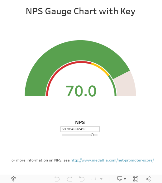
But, I was missing one key component. The original chart had a small key right below the gauge showing where the values would change from red to yellow to green.


So, how do we create this? I experimented with a few different options, but all seemed to require use of a dual-axis and, since I was using the dual axis for the hole in my donut, I could not find a way to make it work. In the end, I decided that the best approach would be a custom image with a transparent background, which would float over the pie on a dashboard. While I’d definitely prefer not to having to piece together floating elements to make the chart work, I just couldn’t find any other way (If anyone reading this has another idea, I’d love to hear it.)
Since I would be floating an image on top of the chart, I decided to just use the image to double as my donut hole. The image I ended up creating (using mostly PowerPoint and a little Paint.NET) looks like this (the checkered background indicates transparency).

With this element acting as the donut hole, I removed my dual axis and the center circle, taking it back to the original pie chart.
From here, it was just a matter of adding the pie to a dashboard and floating the image over top of it. Finally, I added one more sheet to display the actual NPS value, which was then floated over top of the image.

Here’s the final result:
From here, it was just a matter of adding the pie to a dashboard and floating the image over top of it. Finally, I added one more sheet to display the actual NPS value, which was then floated over top of the image.
Here’s the final result:
Required Files
If you have a need to create a gauge like this, then feel free to download my examples from Tableau Public. You can also find the Excel template image here. If your customer requires different ranges for bad, normal, and good, then that will require some slight changes to the image. In addition, if you need to change colors (yes, I know that traffic light colors aren’t necessarily the best option), then you can fairly easily recolor the image.
Update 09/05/2017: New Approach!
The other day, I saw the following comment on this blog post, from Sr. Tableau Developer, Tim Hughes (check out his Tableau Public Profile):
Very cool, Ken!
Instead of floating the key image over the donut, I think it would work to instead
1. Make the key image a full circle with the bottom half white
2. Save the image as a custom shape in your Tableau repository shapes folder
3. Change your second mark card from a white circle to that custom shape (keeping the existing label)
Thanks,
Tim
Okay, so this is a great idea. Essentially, he's suggesting that we dispense with the floating image, go back to our original dual-axis approach and simply replace the white circle with a custom shape. So, I created the image as he suggested. Here's how it looks (again, the checkered area indicates transparency):

As Tim suggested, I created this as a custom shape in my Tableau repository. I then went back to the original NPS chart and changed the white circle to use this custom shape. And here's the result:
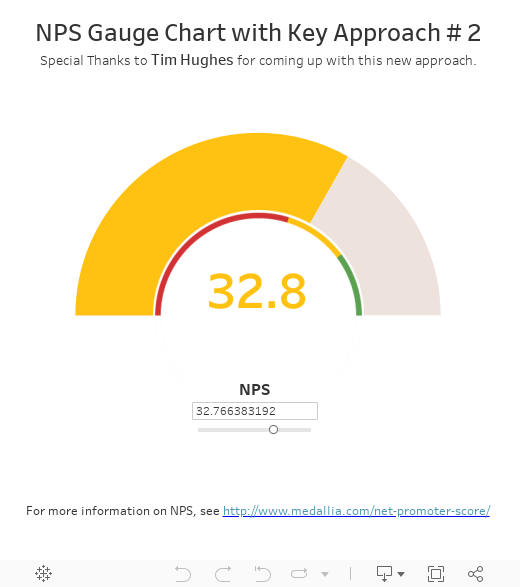
Obviously, it looks exactly like my previous version. However, this is a much more elegant solution as it does not require you to float an image over top of the chart. Thanks a lot for the tip Tim!! If you'd like to try this method out, you can find the full circle image here.
Update 09/27/2017: Some Alternatives to NPS Gauges
Since writing this blog post, something has been nagging at me—I’m just not sure that this is really the best way to visualize this data...Read more here: Alternatives to NPS Gauges
Update March 15, 2019: A common problem with this blog has been an inability to make it work with your own data instead of the parameter. I apologize for that as I failed to properly explain how to do it. If you are struggling with this, I'd refer you to the following post on the Tableau Community Forum in which I show how to do this. Note: The post deals with percentage gauges but the process should be almost exactly the same for NPS gauges: Percentage Gauges with Your Own Data

Update 09/05/2017: New Approach!
The other day, I saw the following comment on this blog post, from Sr. Tableau Developer, Tim Hughes (check out his Tableau Public Profile):
Very cool, Ken!
Instead of floating the key image over the donut, I think it would work to instead
1. Make the key image a full circle with the bottom half white
2. Save the image as a custom shape in your Tableau repository shapes folder
3. Change your second mark card from a white circle to that custom shape (keeping the existing label)
Thanks,
Tim
Okay, so this is a great idea. Essentially, he's suggesting that we dispense with the floating image, go back to our original dual-axis approach and simply replace the white circle with a custom shape. So, I created the image as he suggested. Here's how it looks (again, the checkered area indicates transparency):
As Tim suggested, I created this as a custom shape in my Tableau repository. I then went back to the original NPS chart and changed the white circle to use this custom shape. And here's the result:
Obviously, it looks exactly like my previous version. However, this is a much more elegant solution as it does not require you to float an image over top of the chart. Thanks a lot for the tip Tim!! If you'd like to try this method out, you can find the full circle image here.
Update 09/27/2017: Some Alternatives to NPS Gauges
Since writing this blog post, something has been nagging at me—I’m just not sure that this is really the best way to visualize this data...Read more here: Alternatives to NPS Gauges
Update March 15, 2019: A common problem with this blog has been an inability to make it work with your own data instead of the parameter. I apologize for that as I failed to properly explain how to do it. If you are struggling with this, I'd refer you to the following post on the Tableau Community Forum in which I show how to do this. Note: The post deals with percentage gauges but the process should be almost exactly the same for NPS gauges: Percentage Gauges with Your Own Data
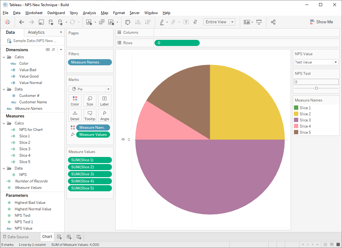
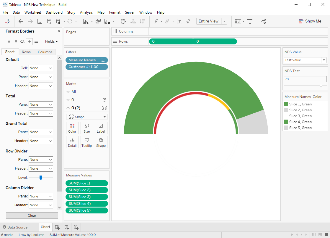
A New Technique (April 18, 2020)
The technique used
previously required you to cross-join your data to my data set of five rows in
order to create the five pie slices. Fortunately, I’ve since found that there
is a much easier way to build this chart, which I’ll share now. The same basic
concepts exist so if you haven’t read the full blog, that may be a worthwhile
first step.
We’ll start with a
sample data file that has 10 customers with each of their NPS scores.
Unlike my previous
method, this is the only data we need—we do not need the additional slice data
set.
We’ll connect to
the data, then create four parameters:
Highest Bad Values – Integer or Float showing
the highest value that is considered bad (red color). I’ve set this to 20 in my
workbook.
Highest Normal Values – Integer or Float showing
the highest value that is considered normal (yellow color). I’ve set this to 60
in my workbook.
NPS Test – NPS Test value. We’ll
use this to make sure all the slice colors are set properly before using the
real NPS value.
NPS Value – Parameter that will
determine whether we use the actual NPS value from the data or the test value.
The parameter should be a string and contain two values, “Test Value” and “Real
Value”
Now we’ll create the
following calculated fields (feel free to just copy these from my workbook):
NPS for Chart
// Which NPS value
to use
IF [NPS Value]="Test Value" THEN
// Use parameter
[NPS Test]
ELSE
// Use real value
[NPS]
END
Slice 1
// Slice 1 size
// Slice starting at
0° and ending between 0° and 90°.
IF [NPS for Chart]>0 THEN
[NPS for
Chart]
ELSE
0
END
Slice 2
// Slice 2 size
// Slice starting
and ending somewhere between 0° and 90°, after slice 1.
IF [NPS for Chart]>0 THEN
100-[NPS for
Chart]
ELSE
100
END
Slice 3
// Slice 3 size -
Will always be 200
// Hidden slice
starting at 90° and ending at 270°.
200
Slice 4
// Slice 4 size
// Slice starting at
270° and ending between 270° and 360°.
IF [NPS for Chart]<0 THEN
100+[NPS for
Chart]
ELSE
100
END
Slice 5
// Slice 4 size
// Slice starting
and ending somewhere between 270° and 360°, after slice 4.
IF [NPS for Chart]>0 THEN
0
ELSE
100-[Slice 4]
END
Color
// Color for the
gauge.
IF [NPS for Chart]>[Highest Normal Value] THEN
"Green"
ELSEIF [NPS for Chart]>[Highest Bad Value] THEN
"Yellow"
ELSE
"Red"
END
Value Bad
// Text to show if
the chart's value is Bad.
// Separate text so
that we can color differently.
IF [NPS for Chart]<=[Highest Bad Value] THEN
[NPS for
Chart]
END
Value Good
// Text to show if
the chart's value is Bad.
// Separate text so
that we can color differently.
IF [NPS for Chart]>[Highest Normal Value] THEN
[NPS for
Chart]
END
Value Normal
// Text to show if
the chart's value is Bad.
// Separate text so
that we can color differently.
IF [NPS for Chart]>[Highest Bad Value] and [NPS for Chart]<=[Highest
Normal Value] THEN
[NPS for
Chart]
END
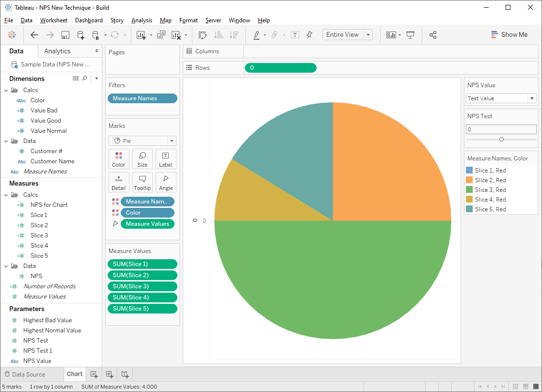
Now that we have
all of our calculated fields, we’ll create a “fake” axis on the rows shelf.
Just type 0 into the shelf, then right-click the pill and change it to a dimension.
Then drag Measure Names to the color card and Measure Values to
the angle card. This will put all of your measures in the Measure Values
pane—remove everything except the five slice measures.
Now move the Color
field to the detail card. Once it’s there, click the icon to the left of the
pill and change it to color. Our slices will now be colored by a combination of
the measure name and the color.
Now we can set our
colors. Set slice 3 to white (or whatever background color you’re using),
slices 2 and 5 to a shade of grey, and slices 1 and 4 to the color specified in
the Color field (in the case below, red).
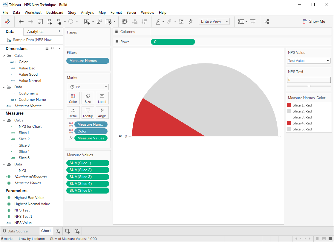
But there’s a
problem because our slices have only been colored for the current value of Color
(i.e. Red). When the color is changed to Yellow or Green, then it will be set
back to default colors. This is where we need to use the NPS Test value. Make
sure NPS Value is set to “Test Value”, then change the value of NPS
Test so that it changes the value of Color. For instance, a value of
50 will change everything to Yellow.
Set the colors
again as we did above.
Do this once more
for green.
Now duplicate the 0
pill on the rows shelf to create a new axis. Remove all pills from the marks
card on this new axis. Change the mark type to “Shape” then select the shape
created for the key. Adjust the size a bit so the shape is smaller than the pie
chart on the first axis. Then make it a dual axis and synchronize the axes.
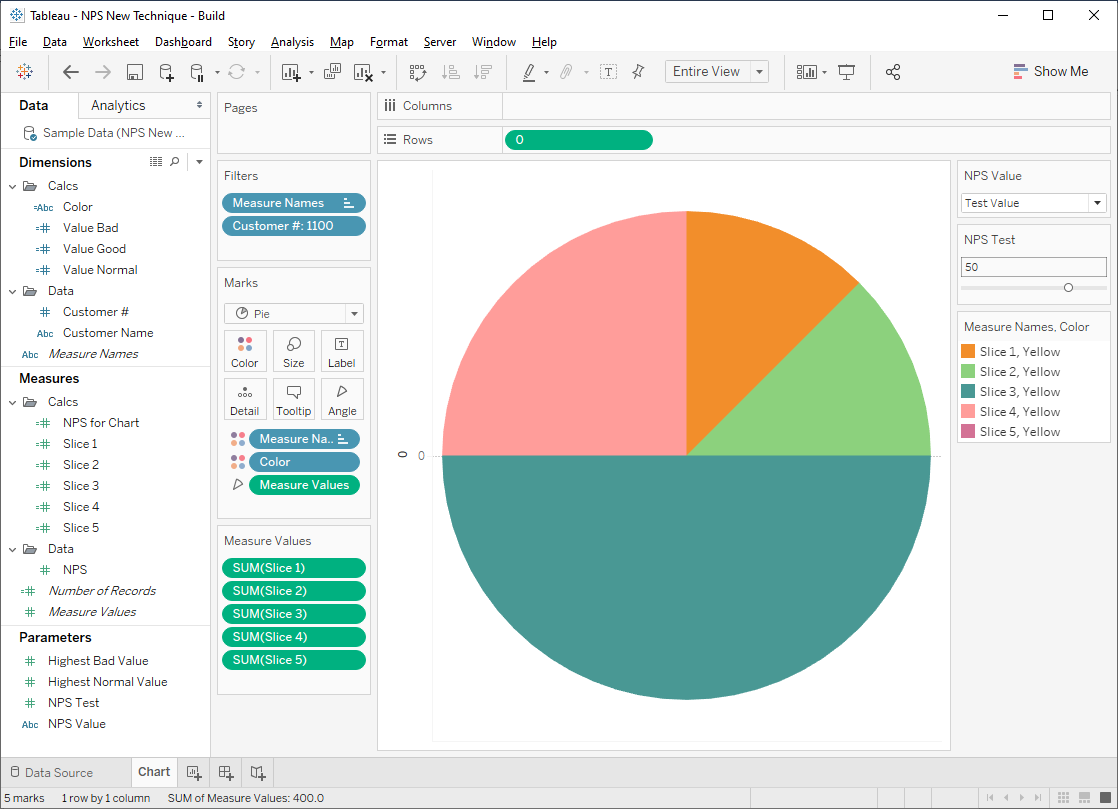
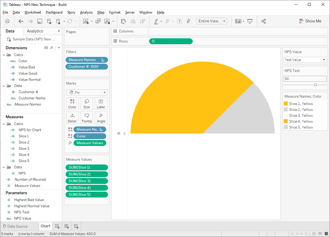
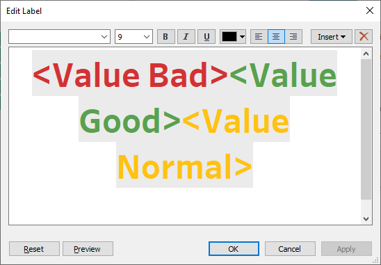
Finally, drag Value
Bad, Value Normal, and Value Good to the label card of the
second axis. Set the label to be aligned center/middle, then click on the label
card to edit it. Add color to each field and place them side-by-side like this:
Only one of these
fields will ever have a value—the other two will always be NULL—so only one
will ever show a value. (see Dynamically Control Formatting Using Multiple Calculations for more details on this
technique).
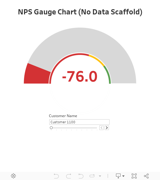
Finally, change the
NPS Value parameter to “Real Value” and filter on one of your customers.
My final workbook is below. Feel free to download it and use it as desired.
Ken Flerlage, July 25, 2017.


Ken,
ReplyDeleteVery cool.
Ken,
ReplyDeleteBeing novice in Tableau, I wasn't able to create the pie chart exactly as displayed. Mine looked like a full pie chart as opposed to the 'half moon' you had created. Am I missing something simple?
Ed
Mine's a full pie chart as well. I've just colored the bottom half (slice 3) white so that it blends into the background, making it invisible.
DeleteGreat tutorial for building an NPS guage. I'm currently doing something a little different (converting the scale of -100 to 0 to 100) for any kind of value or metric to display (counts of something, percent progress, etc.), but my greatest question has to do with "how did you remove the wedge highlighting when the mouse hovers over the gauge?" I cannot figure this out for the life of me. I am currently using a professional license for v10.1.3. Thank you for any assistance you may offer!
ReplyDeleteSimple trick--just float a Blank over top of it. It will prevent users from interacting with the pie.
DeleteThis is great Ken. I'm not a fan of NPS, nor Gauges...but still find this to be incredible work and I'm certain this will be useful for many.
ReplyDeleteI'm not a big fan either :) But people do naturally understand them as they are used everywhere in our lives (cars, in particular), so they can be a good gateway for people not familiar with more appropriate ways to visualize the data.
DeleteNice job working that one out :)
ReplyDeleteKen, this is awesome! I tried to replicate and the pie kept looking like it was on it's side and then I realized that my dimensions/measures on the marks were not in the same order as what you had (I had them ordered Color (on color mark), Avg(Chart Value) (on angle), Slice (on detail)) so when I re-ordered them to look like your workbook (Slice (on detail), Color (on color), Avg(Chart Value) on angle) the chart flipped back to what it should look like. Can you explain why the order of the marks has this impact?
ReplyDeleteGlad you found it valuable. The order of the pills on the marks card defines the precedence in the sorting hierarchy. So, by moving Slice to the top, it took precedence on the sorting.
DeleteThis blog post explains a little further: https://public.tableau.com/en-us/s/blog/2016/03/order-things-how-control-layout-marks
Thanks so much for follow-up.
DeleteHi Ken,
ReplyDeleteI'm trying to use an NPS calculated from a different data source (my NPS results source) but it is struggling to work. When I use the measure from a different data source instead of the NPS parameter it many of the calculated fields don't work as it wants to aggregate the values.
Any idea on how to get around this?
Apologies, Ryan. I just now noticed this comment. See my response to Dylan below. I hope this should put you on the right track.
DeleteDefinitely a lot closer! I still can't get the colour to work as it doesn't like the NPS value being calculated as an aggregate.
Delete(doing SUM(IF [NPS] >=9 THEN 1 ELSE 0 END)
/
count([NPS])
-
SUM(IF [NPS] <=6 THEN 1 ELSE 0 END)
/
count([NPS])
)*100
I've tried playing around with the INCLUDE LOD to get in the customer but don't feel like it is the right approach?
Any suggestions for getting the colour to work properly if the NPS is an aggregated number?
Take a look at this workbook: https://public.tableau.com/views/NPSGaugeChartwithAggregatedData/NPS?:embed=y&:display_count=yes&publish=yes
DeleteThe data is here: https://www.amazon.com/clouddrive/share/jtEGtQZivTIh1xyfi3BHAzxTHbqVHu1PJ3ZM5SIr9cI
Mine assumes that you are averaging a set of NPS scores, but if the operation were something other than average, then you'd just switch AVG for whatever else you're using.
Hi. I have the same issue but I cannot find the response to Dylan. Any help much appreciated!
DeleteCan you email me? flerlagekr@gmail.com
DeleteVery cool, Ken!
ReplyDeleteInstead of floating the key image over the donut, I think it would work to instead
1. Make the key image a full circle with the bottom half white
2. Save the image as a custom shape in your Tableau repository shapes folder
3. Change your second mark card from a white circle to that custom shape (keeping the existing label)
If you give it a try, let me know if it works. I didn't bring my computer with me this weekend to check it myself.
Thanks,
Tim
That's a fantastic idea. I'll give it a try.
DeleteHey Ken, how would you tie this in with a blended data set so that instead of using a parameter to determine the NPS score you a customer dataset and maybe NPS would be an aggregated value from that set. The user would be able to choose the customer from a drop down filter and see a view about that customer with the NPS guage being one item in the view?
ReplyDeleteYou'd need do do the following:
Delete1) Join your data set with my data template. You can create a field called "Link" with the same value for each record in each data set.
2) Replace all references to the NPS parameter with the NPS value from your data set.
3) You'll want to add a filter so that it only shows a single customer.
Here's a workbook with some sample data in it: https://public.tableau.com/views/NPSGaugeChartwithSampleData/NPS?:embed=y&:display_count=yes&publish=yes
And here's the source data I used: https://www.amazon.com/clouddrive/share/8WRouAqgiH0LRDu4s5LpuYxKS3UD5JT2fSql2FTKGS7
I hope this helps. Sorry, I'm just now seeing your comments.
Thanks Ken Ive got it working now! Now if only tableau would allow me to set some of the slices to an assigned color and others to a scale....
Delete
DeleteKen, you used the data in excel, I am using a .tde relating to excel, but it has not worked, can you help me? Always an aggregation value error when I make the data relation.
Can you send me your .tde and workbook? flerlagekr@gmail.com
DeleteVery nice! Do you have a sample or a modification to this that will set a 0 value at 270 deg, 50 at 0 deg, and 100 at 90 and fill appropriately? Or one that looks more like a spedometer?
ReplyDeleteNot exactly sure what you're asking. Do you have an example?
DeleteThere are lots of good examples of speedometer-type charts in Tableau. Adam McCann has some good posts on gauges here: http://duelingdata.blogspot.com/. But I'd also recommend you read my latest post on visualizing NPS. You may find that another chart type will work much better (and be much easier to create) than a gauge.
Hi Ken, Need your help, I need to build a dial chart for my organisation, scenario is this, I got the median value, I need to show the median value in a dial between 3 buckets, for example if median is 17 then, I need to show the median 17 between 0-20 which should be green color, if it is 20 then it should be in yellow, if it is 40 then it should be in red, I am unable to achieve this in tableau, could you pls help me on this. I am reachable at 9046147652 anytime.
ReplyDeleteI got my pie chart built exactly same as yours, I followed all your instructions, but it looks like vertical chart, whereas for you it was a horizontal pie chart, how do I need to change the vertical pie chart to horizontal pie chart>?
ReplyDeleteCan you send me some further details via email. flerlagekr@gmail.com
DeleteHi Ken
DeleteThank you for your kind kind guidance. I am Tableau 10.2 and unable to download your workbook. Do you have any video or 10.2 version for us to refer?
Thank you
Jaini
Hi Ken
DeleteWe sincerely appreciate your kind guidance.I am using tableau 10.2 and unable to view or download your tableau book.Would you have a coyy in 10.2 and would like to request a video on how to.
Thank you
Sure Ken.. thank you so much
ReplyDeleteHi Ken
ReplyDeleteAlso my scale scores are from 1 to 100. Could you please advise workaround?
Thank you
Jaini
You can use the following tool to convert workbooks to 10.2. Just download my workbook then run it through this program: https://www.dataplusscience.com/ConvertTableau.html
DeleteAs for the scale from 1 to 100, you should be able to modify the data set and calculations to handle this. Give it a try and let me know if you need any help.
How can we have None/white color in pie chart
ReplyDeleteI'm not sure what you're asking. Can you clarify?
DeleteThank you so much. I sincerely appreciate your help.
ReplyDeleteHi Ken:
ReplyDeleteI sincerely thank you for your kind support and guidance. I was finally able to make my gauge charts for KPI.
Jaini
Great. Glad to hear it!
DeleteHi,
ReplyDeleteI want to implement for 6 slices(5 different colors in half donut). Can you help to get this done?
-
Sai Manikanta
Hi Ken,
ReplyDeleteThanks for sharing about The Gauge Chart. Overall, I already did successfully followed by your instructions. But I have a question, can I rotate the chart? Although I've already sorted a few dimensions in order to make Slice 3 or the white area is in the bottom. It's still not work for me, the white area's lead vertically.
Could you please share to me, how can I rotate the chart, so the white area is in the bottom horizontally.
Thanks Ken..
Regards,
RIA
Can someone provide a little detail on how you connect Ken's example to your data. In other words, replace his NPS parameter and connect it directly to your data. TIA!
ReplyDeleteYou'd need do do the following:
Delete1) Join your data set with my data template. You can create a field called "Link" with the same value for each record in each data set or you can do a join calculation (1=1 for example).
2) Replace all references to the NPS parameter with the NPS value from your data set.
3) You'll want to add a filter so that it only shows a single customer.
Here's a workbook with some sample data in it: https://public.tableau.com/views/NPSGaugeChartwithSampleData/NPS?:embed=y&:display_count=yes&publish=yes
And here's the source data I used: https://www.amazon.com/clouddrive/share/8WRouAqgiH0LRDu4s5LpuYxKS3UD5JT2fSql2FTKGS7
I hope this helps.
Hi Ken,
ReplyDeleteMy scale scores is from 0 to 10
Could you tell me where is mistake in my formula?
Value_Slice_1: IF [NPS]>5 THEN [NPS] ELSE 5 END
Value_Slice_2: IF [NPS]>5 THEN 10-[NPS] ELSE 10 END
Value_Slice_3: 10
Value_Slice_4: IF [NPS]<5 THEN 10+[NPS] ELSE 10 END
Value_Slice_5: IF [NPS]>5 THEN 5 ELSE 10-[Value_Slice_4] END
Could you send me an email to flerlagekr@gmail.com with more details and, if possible, a packaged workbook?
DeleteHi Ken, is any solution for Lukaz problem?
DeleteBcoz, I have same problem.
Thanks.
Dimas
Yes, but I'd need to see some data and a sample workbook. Could you email me at flerlagekr@gmail.com?
DeleteCan you please explain the formula on Slice #, what makes up Slice#. If you can forward me the packaged wkbk will definitely help as well. email : anthony.erdene92@gmail.com
ReplyDeleteThere is no formula for slice number. It's in the data, just 1 through 5. And you can download the workbook from my Tableau Public page: https://public.tableau.com/views/NPSGaugeChartwithKeyApproach2/NPS?:embed=y&:loadOrderID=2&:display_count=yes
DeleteThe link gives me page not found error.
DeleteHmmm. works for me. Try this I guess: https://public.tableau.com/profile/ken.flerlage#!/vizhome/NPSGaugeChartwithKeyApproach2/NPS
DeleteHello Ken thanks for your indication , i managed to implement something inlcuding the over run possibility. However I have a question, since to plot the data into the gauges you blend your data from another datasource. For example in myc ase in plotting cost status vs budget. How can you later on use it combined with other worksheets in a single dashboard?. What i see is that since the data is blended, the blended fields when activated as filters at dashboard level can only be applied to this specific worksheet but not to the other worksheets. I can shortcut with a parameter and a calculated field, but this impact my current authorizations scheme ( based on blended field) and make the solution static in terms of updating the parameter options. Any ideas?
ReplyDeletePerhaps we could take this question offline. Would you be able to email me more details at flerlagekr@gmail.com?
DeleteHi Ken,
ReplyDeletethanks for the post. this will help us lot.
actually i am looking similar kind of chart.
iam not able to open it after download, the error shoes as incomplete data.
can you help me.
Could you email me with more details at flerlagekr@gmail.com?
DeleteThanks ken. i will mail you!!
Deletethank you!!!
Srini
Hi Ken, Thanks for sharing this, it is impressive you you approached the subject! Hence it is very helpful for me. I just have one question though. I would like to combine this NPS visualization with a NPS score data set. What I am trying to do is to put a data set and filters for the users so that they select the filtering for Tableau to calculate the NPS and visualize it, rather than putting an NPS score manually. However since the visualization you created already uses a data set (which you defined for Slices), I am not able to embed another data set it for NPS calculation, without blending or joining the data. Since these 2 data sets are totally independent, I am not able to work with both of them in a single Tableau worksheet or link them somehow. Hoping I could explain what I am trying to do :) Do you have any ideas or any comment on how to do this? I would highly appreciate if you come back to me on this. Thanks!
ReplyDeleteThis has been a common ask (perhaps I should update the blog to explain how to do it). It's more than I can write in this comment, so would you mind sending me an email with these details and a sample of your data? I can then provide you with the steps required. My email is flerlagekr@gmail.com.
DeleteHello, I finally got this to work (mostly). Two things I am looking to resolve. I am using % vs. whole numbers, so my scale is 1 to 2. First, I have data that exceeds 100%, and the amount over 100% shows up as a small grey wedge at the top. Somehow I need to be able to have that colored green. Second, the text value in the middle shows as 21% in red, should actually be 105% and in green. I tried to insert a screenshot, but I am not sure how to do that.
ReplyDeleteThanks for your help and advice.
Mike
Would you be able to send me an email with the details and, possibly, a sample workbook? flerlagekr@gmail.com
DeleteHi Ken
ReplyDeleteThanks for the insights.
I have five variables that present five brand. that variable contain index score between 0 to 10. i need to show average of individual variable on gauge. variable will change by parameter control, then that variable score show on gauge chart. please suggest. how i can handle.
This would probably be better handled offline. Would you be able to send me an email explaining the problem along with a sample data set? flerlagekr@gmail.com
DeleteHey Ken, love the viz creating NPS Guage.
ReplyDeleteI'm trying to recreate this using my own data. I've swapped your parameter "Percent" for my own percentage field "Store %" but i am not able to make it. Can you please help me to get this done. I have mailed you my workbook. Thanks
I joining your data with my data as per your instruction using 1=1 relation,but i cant create same chart gauge chart.
ReplyDeleteI am using single aggregate measure for NPS.
When I create chart value variable that time error msg display that you cant used variable from second data.
Are you trying to blend?
DeleteHi Ken,
ReplyDeleteI have one variable that contains the month codes.
e.g. 30 for Sep18
31 for Oct18
32 for Nov18
33 for Dec18
34 for Jan19
I need to create a 3-month rolling Variable from the above variable.
Like
Sep18-Nove18
Oct18-Dec18
Nov18-Jan-19
Can you please help me
Is this related to creating the NPS chart? Sorry I'm a bit confused. Any chance you could send me an email with more details to flerlagekr@gmail.com?
DeleteHi Ken,
ReplyDeleteHow does Tableau know which point is 0 degrees and from where to start drawing the chart. The reason i am asking is because i am getting a vertical dome shaped like "C" and not the one that you have got. Please assist.
On a pie chart, it always starts at the top then moves around the circle in a clockwise manner. That's why we have to do these tricks with the slices to get them to show correctly. Hard to address your specific issue here. Perhaps you could send me an email with details to flerlagekr@gmail.com?
DeleteVery detailed and informative. I am not sure that it's the right platform to ask this question but I am curious that such kind of knowledge will be tested in getting tableau certification? I have seen few threads online but not sure exactly.
ReplyDeletehttps://www.quora.com/What-are-different-types-of-Tableau-Certifications
https://www.takethiscourse.net/tableau-certification/
I doubt that anything like this would be covered on a certification as this is sort of a hack.
DeleteThanks Ken.
DeleteHi Ken,
ReplyDeleteHow to make its start from left pie?
Not sure what you mean. It starts from the left as it is.
DeleteHi Ken,
ReplyDeleteI followed the instructions and formulas you suggested and I am almost there. The only problem though is that my semi-circle keeps turning and does not stay horizontal with differing NPS values.Did I miss anything?
Could you email me at flerlagekr@gmail.com?
DeleteCan we create the same chart without custom data fro slice 1=1 etc, i just have NPS scores in my dataset
ReplyDeleteCan't you join it to the slice data set as detailed above?
DeleteSo, I dont know how to create that data set ? could you expand on that please?
DeleteLove the gauges!! great way to display KPI as well, but I have a question,how can I create the data set Slice # – Numeric identifier of the slice (1, 2, etc.)
ReplyDeleteSlice – Name of the slice (Slice 1, Slice 2, etc.)
Details – Description of the slice and how it’s used.
Could you email me at flerlagekr@gmail.com?
DeleteHi,
ReplyDeleteHow can i Create the "slice #" calculated field?
You need to join your data set with my data template. You can join them using a 1=1 join calculation.
DeleteThis is great! I Just walked through the newest method (from 4/18/2020) with a sample of data that matched yours. When you create the second axis shape, how did you get it to remove the area of the original pie chart behind it? For the legend on that second axis, is it dynamic based on the highest bad/normal values parameters, and how do you get that to show up? Or is it still a solid image that you overlayed? Lastly, the data I want to use this for is only 0-100, I assume I would just adjust the slice calculations, but I can't figure out which ones.
ReplyDeleteThanks again, this is wonderful!
This might be too much to answer properly on this comments section--could you send me an email (flerlagekr@gmail.com) so I can answer properly? Regarding the values of 1-100, I think you may be better out using my percentage gauge tutorial. It's basically the same, but deals with percentages instead of NPS: https://www.flerlagetwins.com/2018/01/percentage-gauges-in-tableau_61.html
DeleteHey there Ken, thanks a lot for these steps and following up with questions.
ReplyDeleteI've got a similar question about switching over to the "Real NPS" score, where I'm calculating the Real Score with a calculated field instead of reading in a column from a data file. During the switch, all goes haywire as the calculation is a part of the Measure Values and the slices are no longer resembling a gauge.
I know you said the work around is too lengthy to explain here, but can you share any hints to the first steps that would need to be taken? I'm not sure if I'm able to share a workbook with company data, sadly.
It's hard to talk in this comments section. Any chance you could send me an email? flerlagekr@gmail.com. If possible, I think a couple of screenshots would be all I'd need to troubleshoot.
DeleteHey Ken,
DeleteThanks for this fantastic idea. I am facing the same issue. My NPS is a calculated field and calculations like color,value bad, value good and value normal are in measures rather than dimensions. Can you please help?
Sure, could you send me an email? flerlagekr@gmail.com
DeleteThank you for this useful feature.
ReplyDeleteI would like to create it, but not from -100 to 100. My chart need to display from 0 to 15.
I tried to modify the calculation of the slices, but it doesn't work.
Could you please tell me which values are supposed to be in the formulas, to have a chart from 0 to 15 ?
Would you be able to send me an email? flerlagekr@gmail.com
DeleteHi Ken,
ReplyDeleteThnanks for this important Aritcle.
In my dashboard NPS score calculated using measure hence that score is aggregate score.
So due to aggregate score while creating color and chart value what change we need to do exactly.
I have created as per below
>>Color
IF ATTR([Slice_No])=3 then "None"
ELSEIF ATTR([Slice_No])=5 OR ATTR([Slice_No])=2 THEN "Grey"
ELSEIF [NPS]>0 THEN "Green"
ELSE "Red"
END
>>chart value as per below
CASE ATTR([Slice_No])
WHEN 1 THEN [Value_Slice_1]
WHEN 2 THEN [Value_Slice_2]
WHEN 3 THEN [Value_Slice_3]
WHEN 4 THEN [Value_Slice_4]
WHEN 5 THEN [Value_Slice_5]
END
after that chart is not show result as per requirment.
Please help
Could you send me an email with a sample packaged workbook? flerlagekr@gmail.com
DeleteThank you so much, Ken!! This helped very much
ReplyDeleteHello Ken - Thanks so much for your trailblazing work on gauge charts. I have one question - how can I change the colors from 3 to 4 - like red, yellow, light green and green?
ReplyDeleteI received an email yesterday, which asks a similar question. Can I assume that's you? If so, I'll get back to you via email as soon as I can.
DeleteHi Ken, Thank you for your work on NPS Gauge Chart. I have a requirement at work to build this. However, I can't get it to work. My dataset is not setup exactly like yours. I have survey results with each line item being a survey answer. NPS is a calculated field.
ReplyDeleteDetractors=countd(if [Answer]='1' or [Answer]='2' or
[Answer]='3' or [Answer] ='4' or
[Answer]='5' or [Answer]='6'
then [Answer Id] end)
Promoters = countd(if [Answer]='9' or [Answer]='10' then [Answer Id] end)
NPS = [Promoters]/COUNTd([Answer Id]) - [Detractors]/COUNTd([Answer Id])
I am trying to duplicate your 2020 workbook. But Slice 3 keeps taking up most of the pie. Couple of things I have noticed that are different from your workbook are
1) "Color" field on marks card gets pulled in as an aggregate "AGG(Color)"
2) Same with Slice 1,2,4 & 5. They get pulled in as Agg rather than Sum. Only Slice 3 gets pulled in as Sum.
Could that be causing this or is it the NPS calculation?
I wish I could have given you a screenshot here.
Thank you for your help.
Can you send me an email with some sample data? flerlagekr@gmail.com
DeleteIs there a published solution for this? I am having the same issue with the NPS field being an aggregate sum already. Thanks in advance!
DeleteYes, please email me. flerlagekr@gmail.com
DeleteHi Ken. These visuals helped me out last year with my excel data and were just amazing.
ReplyDeleteNow, since I have been working on live data now (from Salesforce) and I have scheduled refreshes set for that, I was wondering if this NPS gauge chart would work for that as well? (in context with scheduled data refresh)
And apologies beforehand if you already answered this question above in the section.
Yes, you should be able to do that.
DeleteHello Ken, I need your help: which values do I have to change to get the following scale:
ReplyDelete0-60: red
61-80: yellow
81-100: green
As soon as I try to adjust the values, it ends up in chaos for me. Thank you for your help. Emir
Set the "Highest Bad Value" parameter to 60 and the "Highest Normal Value" parameter to 80.
DeleteHello Ken, thank you for answering my question, but I forgot to mention that I also try to move the scale only from 0-100 and not from -100. And that's where I'm failing at the moment ... can you please help me? Thank you and greetings, Emir
ReplyDeleteYes. Happy to help if you could email me. flerlagekr@gmail.com
DeleteThe measure values are somehow getting duplicated when coloring i.e. (I have slice 1, red and then slice 1 green) not sure what's going wrong here
ReplyDeleteCan you email me? flerlagekr@gmail.com
DeleteHi Ken.. I tried your approach and am failing. I have a seperate data source and replaced the NPS to my data set but still seeing issues with creating this one. I followed both your original one and the latest and still have issues.
ReplyDeleteThe problem with it .. I dont know how to replace the values correctly. I dont have 100 and -100 but different values ... I have been requested to create this data set fairly shortly but struggling to create this properly. I dont know if if its because I am a newbie or simple dont know how to follow and set it up. theoretically I get it but the actual work .. seems tougher than it is.
Can you email me? flerlagekr@gmail.com
Deletehow to put labels at the start and end of gauge chart? like for me it ranges from 0 to 1000
ReplyDeleteI'd just float text boxes on a dashboard.
DeleteHey, I wanted to ask about the parameters: the NPS test, is that a float or integer? What should I put as "current value"? And NPS Value, I'm trying to set it to "String", so I put "Test Value","Real Value" in "current value"?
ReplyDeleteCould you email me? flerlagekr@gmail.com
DeleteHi Ken, I tried your guide material but failed. Been followed both your original one and the latest and still have issues.
ReplyDeleteI have issue as I don't have negative value, I am doing a KPI meter means it start to 0-100%, trying to follow the 3 color indicator yet still failed. I am a newbie so seems tougher than it is. Hope you able to help.
What I am trying to set
0-30% - red
31-50% - yellow
51-100% - green
Did you try this? https://www.flerlagetwins.com/2018/01/percentage-gauges-in-tableau_61.html
DeleteHi Ken, thank you so much for your fast respond. It works now! May god bless you!
Delete