
Alternatives to NPS Gauges

While I expected this to be a niche requirement, the post turned out to be one of my most popular. I’m certainly happy about this, but something has been nagging me about it ever since—I’m just not sure if this is really the best way to visualize this data. So with this post, I want to revisit the NPS gauge chart and note some of my concerns with it. Along the way, we’ll introduce some alternatives. And by the end, hopefully, we will have come to some conclusions on how best to visualize NPS.
Alternative # 1
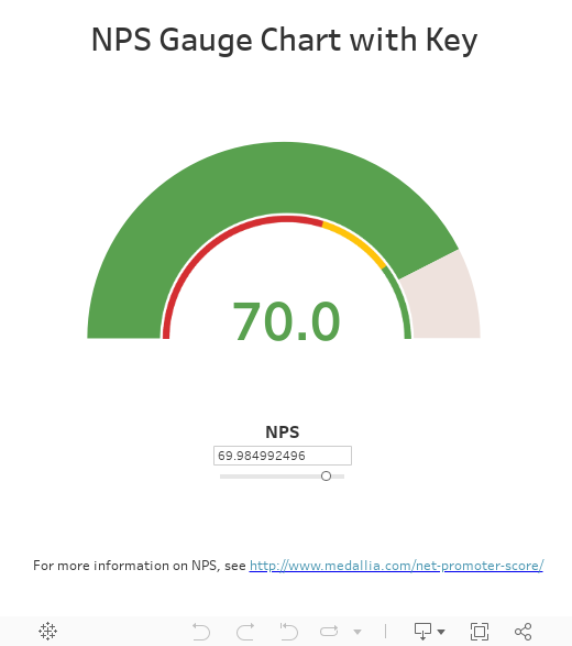
Let’s start with color. As you can see above, the gauge uses a traffic light color palette—red, yellow, green. I used this palette because I was attempting to make it look exactly like an example I had been given. But about 4.5% of the world’s population has some form of color blindness and the most common form is red-green color blindness. With such a high percentage of people having difficulty distinguishing green and red, using a traffic light color palette is not always the best choice. So, our first alternative would be a simple change of colors, moving away from the traffic light palette to a color-blind sensitive palette.
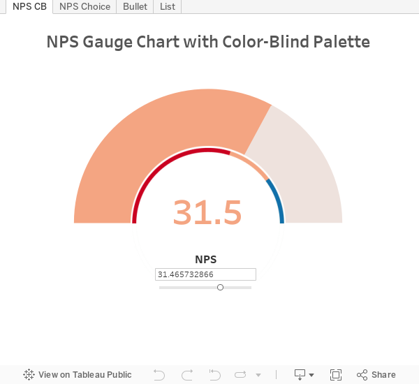
Tableau has a built-in color-blind palette, but I’ve chosen to use a palette from Color Brewer. Of course, you can use any color-blind sensitive palette you wish.
I think it would be fair to ask whether or not this is truly necessary. After all, the color is only a small part of the chart and it has both the length of the gauge and the numeric value to help you understand the actual value. You could also argue that the traffic light palette has so much meaning to our society that removing it could actually take something away from it. That brings me to the second alternative.
Alternative # 2
How about the best of both worlds? Instead of choosing one or the other, why not let your audience choose. With a parameter and some simple changes to the calculated fields, we can do just this.
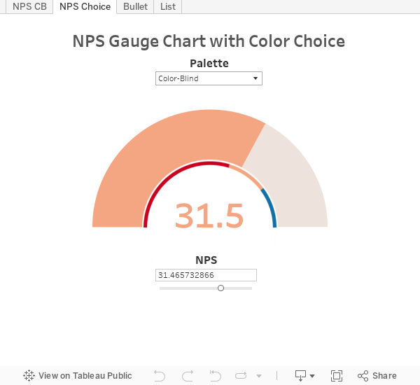
You now have the choice to view the gauge using a color-blind sensitive palette or the more traditional traffic light palette (and you could add many other palettes if desired).
Alternative # 3
Now that we’ve addressed the color issue, what about the gauge itself? The data visualization community has a lot to say about these charts and most of it is bad. There are lots of problems with gauge charts. Adam McCann has written a few posts on gauge charts and I think he details the problems with the chart quite nicely in Bullet vs Gauge. I’ll note a couple here:
- Gauges are less accurate because you have to account for the angle.
- Gauges require a lot more space than other types of charts
So, what is the best alternative? Again, as Adam discusses in his post, bullet charts are the most viable option. This chart, a variation on a standard bar chart, was invented by Stephen Few in 2005 largely in response to the heavy use of gauges and similar widgets on dashboards. So, alternative # 3 is a simple bullet chart.
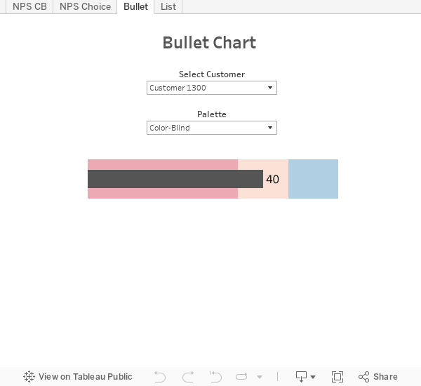
Bullet charts typically compare one measure to a second measure or target. In this example, I’ve excluded the target as the color ranges give you that additional information. Bullet charts have some nice advantages over gauge charts. Here are a few of them:
- Generally speaking, they are much easier to create.
- They use less vertical space than gauges.
But I’d argue that we don’t see the real value of bullet charts until we compare multiple values at once.
Alternative # 4
If you are comparing multiple NPS values at once, then a bullet chart really shines.
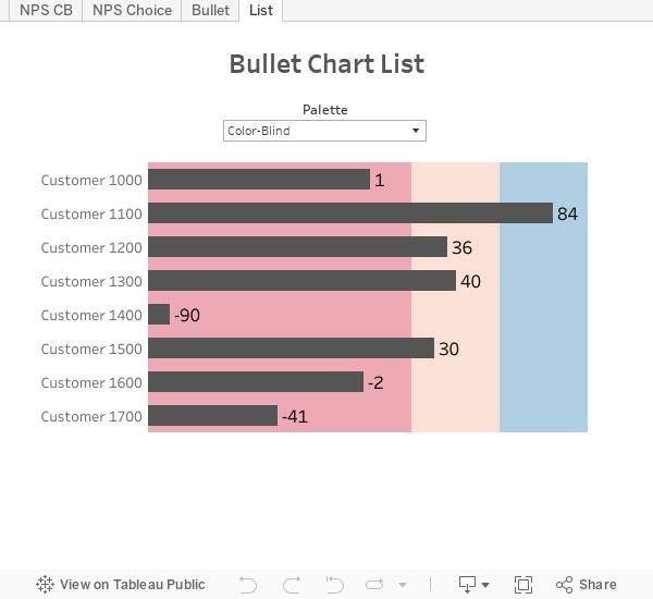
There is a reason why bar charts are a tried and true type of visualization. Our eyes are very good at distinguishing even minute differences in the lengths of lines (bars are essentially thick lines). As soon as you introduce a second dimension—in the case of a gauge, the curvature—our eyes loose that ability to make such distinctions. So, when looking at multiple NPS values at once, the bullet chart works very well as it is much easier to see differences and, of course, it saves a lot of space over multiple gauges.
So What’s Best?
Considering the discussion so far, you may be expecting me to argue that you should always use a bullet chart for this type of data, but not so fast. While gauge charts have gotten a bad rap, there are definitely use cases where they make sense. Again, Adam discusses some of these on his post, but I want to focus on just one: Pretty much everyone understands gauges. They are everywhere, most notably the cars we drive every day. And because they are so familiar, they are incredibly easy to understand. You will be hard-pressed to find someone, even the least technically inclined, who will need you to explain a gauge chart. So, there are definitely times when a gauge can be a simple way to provide a high-level KPI to your audience.
All this being said, I’d propose using three questions to help you decide on whether to use a gauge or a bullet. I’m sure some people will disagree with these guidelines (and I welcome your opinions), but I’m going to give it a shot anyway:
Question 1: Do you need to compare multiple dimensions?
If yes, use a bullet chart. Gauges are terrible for comparing multiple values. They will use way too much space, require that you add a new one for each new dimension, and cannot be easily compared.
If no, a gauge chart could be an option. Go on to question 2.
Question 2: Who’s your audience? Are they hip to the latest data visualization best practices?
If yes, use a bullet chart. Your audience will understand this chart type.
If no, consider using a gauge chart. Your audience will understand its meaning without a lot of explanation.
Question 3: After answering questions 1 and 2, is a gauge chart still on the table? If so, how critical is it that the chart be extremely easy to understand?
If it's not that critical or you have no concerns about providing some explanation, then use a bullet chart. Bullet charts are a default chart type in Tableau and are incredibly easy to create. If you don't have a very compelling reason to use a gauge, then don't go through all the pain and difficulty that is required to create one. Just choose the bullet, get it done, and move onto other things.
Conclusion
Generally speaking, best practices would definitely steer you away from gauges and, while I believe in leveraging best practices, I also feel that compromises can and should be made in certain situations.
When I first started doing data visualization a number of years ago (long before I started working with Tableau), I had a work assignment to build a sales dashboard. We wanted to get people away from looking at 100% of the data 100% of the time, so we proposed a dashboard that showed them lots of simple charts—bar graphs, line charts, and some large numeric KPIs. Pretty simple stuff, right? When we first unveiled it, people thought it looked great and would be very valuable, but it was very clear that they were uncomfortable with the fact that they couldn’t see all the low-level details. We felt this anxiety from almost every single one of our constituents—after all, they were used to viewing every detail of their data in Excel spreadsheets. To address this, we created a separate tab on the dashboard which allowed them to see the detailed data. The graphical dashboard remained their entry point into the tool, but the details were there if needed. And what happened? The detail tab gave people a level of comfort with the solution that wasn’t there previously, so they were more willing to try it out. But, over time, they became more and more comfortable with the graphical dashboard and leveraged the detailed data less and less until it was eventually obsolete.
The moral of this little story? Sometimes, we just need to get our audience to the table and if that means breaking a best practice or two temporarily, then it’s worth it in the long run. I believe the same goes with gauges. Gauge charts are very visually compelling and easy to understand, so if you can use them to get your audience engaged, do it! Then, over time, as your audience becomes more comfortable with data visualization techniques, you can use the gauge as a gateway to more best-practice visuals.
Ken Flerlage, September 27, 2017


You haven't addressed the relative difficultly of producing these. Some visualisation packages include charts as an out the box but if you're using Tableau then why would you go to loads of effort to create a gauge when a bullet does a better job?
ReplyDeleteWhen discussing bullet charts, I did note "Generally speaking, they are much easier to create," but I agree that this could have been given more attention since they are so much easier to create in Tableau than a gauge. I guess I don't necessarily agree on the second point. Bullets are definitely better in terms of best practices, but as I noted, I think gauges, though much maligned, can be a pretty successful chart in certain circumstances, especially when working with people who may not be used to data visualization techniques. That being said, I see gauges as more of a gateway to better visuals and that the ultimate goal should be to move people to better charts that adhere more closely to best practices.
DeleteChris, based on your note, I added a third question to help guide people when to choose a gauge vs. a bullet. I was sure to call out the fact that bullet charts are much much easier to create in Tableau than gauges. I still think a gauge is okay in certain circumstances, but unless there is a really compelling reason, it's best to go with the bullet chart since they are so easy to create.
DeletePhenomenal work on this! I downloaded the workbook but have not had success in recreating the Bullet list as you demonstrated. What is a good resource to see how it was created?
ReplyDeleteYou can start with this: https://onlinehelp.tableau.com/current/pro/desktop/en-us/qs_bullet_graphs.htm
DeleteBut I have used a modified approach which is essentially just a regular bar chart with three reference bands.
If, after reading the above, you still have issues, feel free to reach out to me directly at flerlagekr@gmail.com.
That was exactly what I needed. I was missing how to pass parameters into the Good, Neutral, Bad reference line bands and now it makes sense. Looking forward to implementing! Thanks again for the quick response!
DeleteAny time!!
DeleteThanks Helped me alot
ReplyDelete