
What Size Should Your Dashboard Be?

A few weeks ago, I was collaborating with Dinushki De Livera on a work dashboard. I had changed the size of the dashboard to be 1400 x 800 and she commented that she thought it was a bit too wide and suggested 1200 x 800. It was then that I downloaded some of my favorite business dashboards on Tableau Public to see what size they were...I wanted to prove myself right. But what I saw was that these dashboards had a huge variance in size - they were all over the board.
It was then that I added a question on both Twitter and LinkedIn asking the Tableau community, "what is your standard size for a dashboard?". I thought I'd see consistency in the answers, but no...not even close. Of course, being a data guy, I collected the responses. In about 5 hours, I had 50 responses so I decided to utilize those.
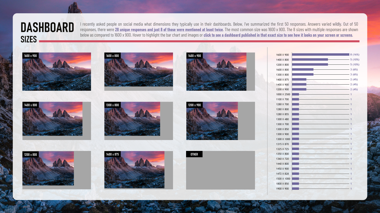
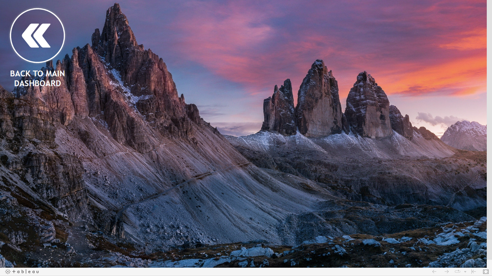
Out of 50 responses, there were 28 unique sizes - 28! And out of those responses, only 8 were mentioned at least twice. The most popular size was 1600 x 900 (8 responses) followed by 1200 x 800 and 1400 x 800 (each with 5). Note that these are the two sizes that Dee and I disagreed upon. (It should be said that I didn't vote, so if I did, I would push my response up to 2nd place). I thought this was so interesting, I actually created a dashboard ranking the sizes and providing a visual of each dashboard size compared against 1600 x 900. You can even click on the images to go to an actual dashboard of that size.
All of this was super intriguing to me. 50 people providing 28 unique responses, wow! So I started doing some research and I thought I'd share some of my findings with you. I should note, I'm not an expert on screen resolution and optimal this and that, but all of this seemed worth sharing with all of you.
Automatic Sizing & Mobile Design
Let's first discuss the automatic sizing option in Tableau. I personally do not use this. It's hard to design a dashboard at a fixed size let alone design one in a way that will automatically adjust to screens. In fact, I believe it to be impossible. So, for this blog post, we are talking about fixed-size dashboards.
In this blog post, we also won't be discussing designing for mobile. There are ways to design dashboards in a way that makes them useful on computers and mobile phones alike. For this blog post, we will be focusing on a variety of devices (tablets, phones, laptops, etc.).
The Why
A lot of the people that responded provided reasons as to why they prefer a certain size. Most of the people that responded with 1600 x 900, said that it drops perfectly into PowerPoint. A handful of others designed their dashboards at smaller sizes, but also at that 16:9 ratio. I personally design most dashboards at 1400 x 800. I typically stick to 800 in height because in Tableau Desktop, that's all I see on one screen without a vertical scrollbar. I'll adjust the width to a max of 1600 and a minimum of 1200 based on the need.
Screen Resolution
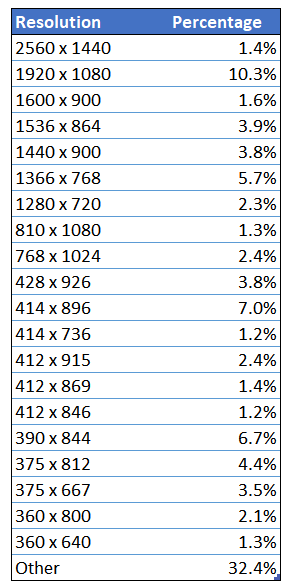
When I saw a number of people responding about using 1600 x 900, my concern was that they would be too large for a number of different screen resolutions. (Remember that resolution and the size of the dashboard are directly related. A 1600 x 900 dashboard should fit perfectly on a screen with 1600 x 900 resolution). I did a bit of research and honestly still don't believe the results. Below is a breakdown of screen resolutions in the United States from Dec 2021 - Dec 2022 according to Stats Counter.
Thanks!
Kevin Flerlage, March 6, 2023
Twitter | LinkedIn | Tableau Public


I always thought Tableau should make this data available to dashboard authors so they could decide how best to adjust the size their dashboard according to the most common screen sizes of the dashboard's viewers. You can also use the tablet and phone layouts to build customized versions of the dashboard for screens between the screen size "break points" even if you aren't actually expecting mobile users since even a resized browser could be considered a "mobile" device by Tableau if the viewport ends up small enough.
ReplyDeleteThank you for this blog post! I almost always stick with a 16:9 ratio - 1600x900 specifically - unless the content looks absolutely ridiculous with that size then I chose something smaller. I think unless you are using Tableau to present to unknown/vague/wide audiences, choosing a few dashboard sizes to standardize on in your team shouldn’t be rocket science.
ReplyDeleteThe other factor we've run into is the window's screen scaling option in the display settings. You can have a 1600X900 resolution monitor, but if the scaling is set to 150%, then the dashboard will not fit on the screen. What I see as fitting well will have scroll bars for other users if they don't have the scaling set to 100% in their display settings.
ReplyDeleteAbsolutely! I'm starting to think dashboards that aren't wide, but tall are the way! I mean, we are all used to scrolling on our phones, it's just become natural. But a horizontal scroll is just plain weird.
DeleteThank you for the great post. I’ve recently reworked a series of dashboards that I’d like to have serve as the supplemental figures for a paper, that, when viewed together, would basically serve as a visual/interactive version. I work on this data on a Mac with a large screen, and frankly, I’d make my dashboards 2400x1200 and cram as many views and as much information as possible into a single screen. Alas, I can’t even get my own lab members to look at these things on large screens, so I’ve taken to making things narrow and long…very long. I have structured most everything to be 1200 wide and about 800 px chunks for height with vertical scroll bars to tell the story. But having to make things smaller makes me cranky…come on people, big data…big monitor. Aloha
ReplyDeleteHa ha, I love this! Maybe the best comment we've received on this website!
DeleteI don't understand why people shy away from automatic sizing. It seems to me to be the best solution to the huge variety of screen resolutions, further complicated by scaling. Also, not everyone runs their browser window at full screen. Alternatively, use range instead of fully automatic, setting a minum size but no maximum. This forces it to start scrolling if the window gets too small.
ReplyDeleteThere are some tricks to this. I avoid floating objects. I also avoid tiled containers. I build up my dashboard using horizontal and vertical containers. I judiciously choose certain objects to be a fixed width or height while others are variable. I also make use of even distribution.
That's very interesting. You should totally do a blog post or video about it. I would love to see how you work around the issues I've run across (like not being able to use floating objects can really be an issue and it's difficult to design a dashboard that will "adjust"). Honestly, I'd love to see this at work.
Deletethanks!
ReplyDeleteThank you for the great post. I work in a commercial organization had the same question so I grabbed data from Adobe Analytics. The intent is to analyze screen environment when employees access an internal website as most of visualizations are consumed through browser (i.e., Tableau Server) in our organization. Out of 60+ million pageviews, nearly half (48%) of pageviews was made with 1280x720 monitor, followed by 1920x1080 (28%) and 1600x864 (13%). It is understandable that 1280x720 is the most popular size because it not only includes employees with that size but also includes employees who scale 1920x1080 monitor to 150%. I also looked at the viewable browser space and found that it follows the same pattern.
ReplyDeleteThis is fantastic information! Thanks for sharing.
Delete