
Percentage Gauges in Tableau

Update April 18, 2020: This has become
one of my most popular blogs since I first wrote it back in 2018.
Unfortunately, I’ve found that there were certain aspects of the how-to process
that I failed to explain thoroughly. I’ve also since discovered an easier
technique for building this chart. So, to address both of these items, I’ve
added an updated section at the bottom of the blog. Feel free to read through
the whole blog as it explains the basic concept used to create the chart, but
if you just need to know how to apply it, I’d recommend skipping to the A
New Technique section.
For Makeover Monday, Week 2, Andy Kriebel used Highcharts to create a nice dashboard, which used a series of gauges (click on the link to see the interactive version):

In this case, I thought the gauge charts worked pretty well. Gauges are a default chart type in Highcharts, but Tableau doesn’t do gauges out of the box. So, opportunist that I am, I figured that I’d write a quick blog post on how to create charts like these in Tableau.
The Gauge
A few months ago, I wrote a blog on creating NPS gauge charts in Tableau. When I saw Andy’s visualization, it struck me that the Highcharts gauges were pretty similar to my NPS gauges. So, I figured I’d be able to pretty easily modify my NPS methodology to work for a percentage gauge. In case you haven’t read my post on NPS gauges, let’s start with observations about this chart.
First of all, it looks basically like a half of a donut chart (and donut charts in Tableau are essentially pie charts with a hole in the middle). The first slice of a pie chart in Tableau always starts at the 12:00 mark, but this chart would need to start at 9:00. The values of the chart will need to go from 0, starting at 9:00, to 100, ending at 3:00. This is the biggest challenge.
My approach creates a donut chart with 5 pre-defined slices, as shown below.


Slice 1 – Variable sized slice starting at 12:00 and ending between 12:00 and 3:00. This slice will be used to show the second part of the percentage (if the value is greater than 50). Otherwise, this slice will have 0 size, making it invisible.
Slice 2 – Variable sized slice starting and ending somewhere between 12:00 and 3:00, after slice 1. If the percentage is less than 100, then this slice will be visible and will appear in a light grey color.
Slice 3 – Hidden slice starting at 3:00 and ending at 9:00. This slice will always be the same color as the background, rendering it invisible, essentially making it a half-donut.
Slice 4 – Variable sized slice starting at 9:00 and ending between 9:00 and 12:00. This slice will be used to show the first part of the percentage (values between 0 and 50).
Slice 5 – Variable sized slice starting and ending somewhere between 9:00 and 12:00, after slice 4. If the percentage is less than 50, then this slice will be visible and will appear in a light grey color, like Slice 2.
The data set for this chart is exactly the same as the one I used for the NPS chart. It contains five records, one for each slice, with the following information about each:
Slice # – Numeric identifier of the slice (1, 2, etc.)
Slice – Name of the slice (Slice 1, Slice 2, etc.)
Details – Description of the slice and how it’s used.
Strictly speaking, we could get by with just Slice # in the data set, but I decided to add a bit more information to make it less confusing to someone using the template.
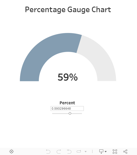
There are no measures in the data set. We’ll create the measure within Tableau, based on the percentage. Note: I’m assuming that you will have a percentage which can be fed to the visualization. For demonstration purposes, I’ll just create a parameter allowing you to specify the percentage.
The Calculations
Calculating the pie chart size measure is a matter of some relatively simple math. To simplify my formulas, I created five calculated measures, one for each slice. Here are the formulas for each.
Value_Slice_1: IF [Percentage]>.5 THEN [Percentage]-.5 ELSE 0 END
Value_Slice_2: IF [Percentage]>.5 THEN 1-[Percentage] ELSE .5 END
Value_Slice_3: 1
Value_Slice_4: IF [Percentage]<.5 THEN [Percentage] ELSE .5 END
Value_Slice_5: IF [Percentage]<.5 THEN .5-[Value_Slice_4] ELSE 0 END
Note: “Percentage” is the name of the parameter noted earlier.
Then, I combine these values into a single measure, which I call Chart Value:
CASE [Slice #]
WHEN 1 THEN [Value_Slice_1]
WHEN 2 THEN [Value_Slice_2]
WHEN 3 THEN [Value_Slice_3]
WHEN 4 THEN [Value_Slice_4]
WHEN 5 THEN [Value_Slice_5]
END
Finally, I create a calculated field called Color:
IF [Slice #]=3 then "Hidden"
ELSEIF [Slice #]=5 OR [Slice #]=2 THEN "Grey"
ELSE "Colored"
END
Next, based on these calculations, I create a very simple pie chart, as shown below:

I then change to a dual-axis chart, with the second axis showing a manually sized white circle.

Finally, I drag Percentage to the label card to add the text.

From here, you can add your sheet to a dashboard. In order prevent people from interacting with the individual slices of the pie, I’d recommend floating a blank over top of it.
Here’s the final result:
Should You?...
Before I wrap this post, I think it's really important to address the question of whether or not you should use this type of chart. And, as always, the answer is "it depends." But, in most cases, you probably shouldn't. Gauges can be good when they are used to display a standalone KPI, as they are easy to understand. But they are pretty bad in situations where you're comparing multiple values. Our eyes simply aren't good at distinguishing the lengths of arcs, whereas are eyes are fantastic at distinguishing the lengths of 2 dimensional lines (i.e. bars). So, in these cases, you will definitely be better with a bullet chart or some other more linear visual. Plus, these are way easier to create in Tableau. For more on this topic, I'd recommend the following blogs:
Alternatives to NPS Gauges - My exploration of alternatives to gauges, including bullet charts.
Accurate vs. Emotional Comparisons - Zen Master, Steve Wexler, discusses the use of bars, pies, and other chart types and when to use them.
All this being said, I'd simply caution you if you're thinking about using gauges. I share this technique not because it's the way you should do it, but because there could be a time where it makes sense, for whatever reason. But you should avoid using a chart like this simply because it looks cool. While visual appeal is often important, you can still create visualizations with both visual appeal and strong analytical precision at the same time.
Required FilesAlternatives to NPS Gauges - My exploration of alternatives to gauges, including bullet charts.
Accurate vs. Emotional Comparisons - Zen Master, Steve Wexler, discusses the use of bars, pies, and other chart types and when to use them.
All this being said, I'd simply caution you if you're thinking about using gauges. I share this technique not because it's the way you should do it, but because there could be a time where it makes sense, for whatever reason. But you should avoid using a chart like this simply because it looks cool. While visual appeal is often important, you can still create visualizations with both visual appeal and strong analytical precision at the same time.
If you have a need to create a gauge like this, then feel free to download my examples from Tableau Public. You can also find the Excel template here.
Update March 15, 2019: A common problem with this blog has been an inability to make it work with your own data instead of the parameter. I apologize for that as I failed to properly explain how to do it. If you are struggling with this, I'd refer you to the following post on the Tableau Community Forum in which I show exactly how to do this: Percentage Gauges with Your Own Data


Update March 15, 2019: A common problem with this blog has been an inability to make it work with your own data instead of the parameter. I apologize for that as I failed to properly explain how to do it. If you are struggling with this, I'd refer you to the following post on the Tableau Community Forum in which I show exactly how to do this: Percentage Gauges with Your Own Data
A New Technique (April 18, 2020)
The technique used previously required
you to cross-join your data to my data set of five rows in order to create the
five pie slices. Fortunately, I’ve since found that there is a much easier way
to build this chart, which I’ll share now. The same basic concepts exist so if
you haven’t read the full blog, that may be a worthwhile first step.
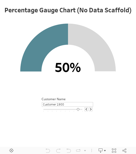
We’ll start with a sample data file
that has 10 customers with each of their percentages.
Unlike my previous method, this is the
only data we need—we do not need the additional slice data set.
We’ll connect to the data, then create the
following calculated fields (feel free to just copy these from my workbook):
Slice 1
// Slice 1 size
// Slice starting at 0° and ending between 0° and 90°.
IF [Percentage]>0.5 THEN
[Percentage]-0.5
ELSE
0
END
Slice 2
// Slice 2 size
// Slice starting and ending somewhere between 0° and 90°, after
slice 1.
IF [Percentage]>0.5 THEN
1-[Percentage]
ELSE
0.5
END
Slice 3
// Slice 3 size - Will always be 1
// Hidden slice starting at 90° and ending at 270°.
1
Slice 4
// Slice 4 size
// Slice starting at 270° and ending between 270° and 360°.
IF [Percentage]<0.5 THEN
[Percentage]
ELSE
0.5
END
Slice 5
// Slice 4 size
// Slice starting and ending somewhere between 270° and 360°, after
slice 4.
IF [Percentage]<0.5 THEN
0.5-[Slice 4]
ELSE
0
END
Now that we have all of our calculated
fields, we’ll create a “fake” axis on the rows shelf. Just type 0 into the
shelf, then right-click the pill and change it to a dimension. Then drag Measure
Names to the color card and Measure Values to the angle card. This
will put all of your measures in the Measure Values pane—remove everything
except the five slice measures.
Now we can set our colors. Set slice 3
to white (or whatever background color you’re using), slices 2 and 5 to a shade
of grey, and slices 1 and 4 to the color you wish your gauge to be.
Now duplicate the 0 pill on the rows
shelf to create a new axis. Remove all pills from the marks card on this new
axis. Change the mark type to “Circle”, adjust the size a bit so it is smaller
than the pie chart, and change the color to white (or whatever background color
you’re using). Then make it a dual axis and synchronize the axes.
Finally, drag Percentage to the
label card of the second axis. Set the label to be aligned center/middle, then fiddle
with the sizing of the text until you’re satisfied.
My final workbook is below. Feel free to download it and use it as desired.
Ken Flerlage, January 8, 2018


Hi,
ReplyDeleteHow do you get the Slice # parameter?
Do you create a table with slice # in the db? and how do I connect this table with my measures source/??
That's a dimension in the data file. You can find the sample Excel sheet here: http://www.kenflerlage.com/2017/07/creating-nps-gauges-in-tableau.html
Deletegreat solution but i'm struggling to figure out how to integrate my data source that has actual percentages that I want to use with the slices template you've demonstrated. I looked at your sample excel sheet and it was just the slices data. While the parameter approach allows me to input and number, how would I join/link the slices data to my own percentage data that I want to display?
DeleteI'm having the same issue as Elizabeth.
DeleteYou'd have to join in your own data set. If you could send an email to flerlagekr@gmail.com with some sample data, I could show you how to do it.
DeleteHi Ken,
DeleteI have issue about "Slice #" and I sent a mail for you!
Thanks so much!
Hi as data is a confidential, can you provide an example of how to join the sheet of Slices # into the DB... how do you define the relationship to join the DB?
DeleteExactly what I needed for a project I'm working on. Fantastic tutorial!
ReplyDeleteThanks Andy! :)
DeleteGreat tutorial ... Is it possible to replace percentage with a calculated field?
ReplyDeleteYes, should be able to do that pretty easily. I just used a parameter for demonstration purposes.
DeleteI tried but this is returning an error in the calculation "Chart Value", error of comparison with aggregation
ReplyDeleteHere are some tips on how to deal with that error: https://kb.tableau.com/articles/issue/error-cannot-mix-aggregate-and-non-aggregate-arguments-with-this-function-when-creating-a-calculated-field
DeleteAlso, I'm happy to help you with it if you can send me some details via email.
Ken - Great article! How to align the tableau chart like high charts (as shown above) without floating?
ReplyDeleteYou could tile it. Floating is not required.
ReplyDeleteHello Ken
ReplyDeleteThis is a very insightful blog. I was wondering if it's possible to develop this technique using % and over run scenarios?
Meaning if my % is between 0 and 90% the area become red ( not on target). If between 90% and 110% is green ( im on target) if above 110% i display red only the proportional data related to over run ( X - 110%). Thanks for your comments.
Interesting idea. I'm sure you could do something like that, but I'm not sure how'd you'd visualize the overrun %. Would you extend the arc further, past horizontal?
DeleteHello, I'd loved this idea but I'm struggling to implement it using my data. I mean, it can be implemented with the parameter but how about using a calculated percentage that is changed with different dashboard filters?
ReplyDeleteYou'd just need to switch out the parameter value with your measure. I'm happy to help if you'd like to reach out to me via email. flerlagekr@gmail.com
Deletewhat about if i want to go over the goal
ReplyDeleteThen you've hit a limitation of this type of chart and you should really consider a different chart type. Ryan Sleeper just wrote about this recently, so I'd suggest you take a look at his recent blog: https://www.ryansleeper.com/dashboard-gauge-1-how-to-make-bullet-graphs-in-tableau/
DeleteHi Ken! Thank you for this! It's actually perfect for what I need. The problem I'm having though is in rotating the chart so that the hidden portion is at the bottom. I searched online and the only solution I've found is to sort on Color. But no matter how I fix the sorting, my Slice 3 never gets in the bottom position neatly, like yours. It's always at an angle. Any suggestions on how to fix this?
ReplyDeleteI've seen this before and it does typically come down to sort orders and the order of pills on the marks card. I'd suggest taking a look at my original workbook and make sure the pills are placed on the marks card in the exact same order. Also check the sorting to make sure that's the same.
DeleteIf that doesn't help, then I'll probably need to see a screenshot or a workbook. We'd need to do that offline, so you can email me at flerlagekr@gmail.com. I'm happy to help so don't hesitate to reach out.
Thanks again, Ken! I fixed it by dragging Slice to color instead of the calculated field Color. Then I assigned White to slice 3, the color I want to slices 1 and 4, and gray to slices 2 and 5. I figured the sorting order we really want is on Slice asc anyway.
DeleteNow it's perfect!
Great. Glad you worked it out!
DeleteHey Ken, love the viz. I'm trying to recreate this using my own data-- I've swapped your parameter "Percent" for my own percentage field but it seems I still need the Slice# field. Would I go about recreating that by using some percentage to radians calculation?
ReplyDeleteYou'd still need all of the same calculations as I included above. You'd just swap out the [Percentage] parameter for your actual data field in each of the Value_Slice calculated fields.
DeleteThanks for this, Ken!
ReplyDeleteBut I'm struggling on the basic. The measure "Chart value" contains the following "Slice #".
--> is this a calculated field or how I get this?
Slice # comes from the Excel file.
DeleteWould you mind contacting me via email at flerlagekr@gmail.com and supplying a sample data set? I can then show you how to bring it all together.
DeleteHi Ken,
ReplyDeleteI am struggling with the same issue as Gian. I have all the calculations per above, I created my own percentage using my own data, but I can't quite figure out how to get the Slice # and Slice. Ideally it would be derived from my data.
Any suggestions?
Thanks,
Mike
Would you mind contacting me via email at flerlagekr@gmail.com and supplying a sample data set? I can then show you how to bring it all together.
DeleteHi Ken,
ReplyDeleteFor some reason, color and slice fields are in measures in my dataset and i am unable to convert to dimension and it ends up getting aggregated. Please advise.
Right-click on the fields (on the left hand side) and choose the "Convert to Dimension" menu. That should change them to dimensions (and will make them discrete), which should prevent the automated aggregation.
DeleteHey Ken,
ReplyDeleteI have it working and have a MS SQL data source that I need to use to get the % to feed into the percentage measure, but when I try to refer to it it wants me to build a relationship,-
First just tried referencing the variable directly (Tried window_sum([otherdataset].[PercentageCalculated]) for example) and it wants me to create a relationship which I don't know that I can.
When I try window_sum
the problem I'm having is that the MSSQL data set is huge and I'm not sure how I would be able to link them together. (Tried window_sum([otherdataset].[PercentageCalculated]) for example but tried other variations). Pretty new to Tableau so hopefully this isn't too obvious of an issue :-)
Any chance you could send me an email offline? flerlagekr@gmail.com
DeleteThe size of the data could be a problem, but we may be able to find a solution.
Hi Ken,
ReplyDeleteSent you an email with some sample data and the question of the hour. Trying to get this in sync with our data vs the data template you provided was an exercise in frustration as we are probably missing something simple. Any assistance would be greatly appreciated.
Hector
Hi Ken I want to show 10 to 20 range values instead of 0 to 100,how can this achieve
ReplyDeleteWell, the simplest way might be to subtract 10 from your value then multiply by 10. That will change 10 to 0, 15 to 50, and 20 to 100, allowing you to trick it into thinking it's a range of 0 to 100. Then you'd just display the actual value instead of the "fake" value.
DeleteHi Ken, thanks for the example. But I find it hard to follow your instructions as my result is not the same as you. How can I use hidden color btw??
ReplyDeleteand when I use 'Dual Axis', it's still pie chart (doesn't have a hole in its center)
Hi Ken!
ReplyDeleteThanks for the explanation, but somehow in my case the color is not hidden (still have color in slice #3). How can I use hidden color?
And after I check 'dual axis', it's still pie (doesn't have a hole in its center)
Might be best to deal with this offline. Can you send me an email at flerlagekr@gmail.com?
DeleteHey Ken,
ReplyDeleteThank you for your many posts and examples you have shown. I have read a number of them as I am a relatively new user of Tableau. With that though, I have followed all of your examples on this but I'm trying to apply this to my data that I want to use and I would like to use a Calculated Field instead of a parameter as you did. I have all of that done but my calculated field is using a sum which causes me an error on the "Chart Value" equation because of the aggregate and non-aggregate error. Any thoughts? I appreciate the insight.
Thanks.
That's a tricky little problem and is difficult to troubleshoot without seeing the workbook. Any way you could send me an email at flerlagekr@gmail.com?
Deletei think a video from start to finish would help a lot if you're trying to make this work with your own data set. i just have a decimal for the monthly figure as my result and the 5 slices seem more involved than needs to be. really cool graph if i could make it work.
ReplyDeleteFeel free to email me at flerlagekr@gmail.com if you need some assistance.
DeleteI have had to create an aggregate percentage to capture the % of a condition to a whole. Struggling to get that to be representative of the condition on an individual gauge The percentage does not retain the overall percent to whole. Any help would be welcome
ReplyDeleteDifficult to troubleshoot here, but feel free to send me an email at flerlagekr@gmail.com.
DeleteGreat thanks!
DeleteHi, I'm a new Tableau User and just learning on my own. Can i recreate the Slice# without having to use the template as a joined data source? Can i recreate it using a calculated field instead?
ReplyDeleteI don't think there's a good way to do this, unfortunately.
DeleteHi Ken, I've been following this tutorial now religiously for the past few hours (also very new to Tableau). I feel like I've done it correct up to the point where the half-pie appears, except there's no half pie for me. What I have instead is a full pie of 5 equal slices, 2 for colored, 2 for Grey, and 1 for hidden. Even though I can manually change the Percentage parameter with a slider, the size of the pie slices remain unchanged (when I hover the cursor over a slice it pops up with Color. Slice, and the Avg. Chart Value as determined from the calculated fields Value_Slice_1-5).
ReplyDeleteAny idea where I went wrong?
Thanks!
-Yacob
Nevermind. I had to click the three dots to the left of Chart Value and switch in to Angle. It shows that in the screenshot image you provided as well, but I missed it. Thanks for posting this and for all your patient help with everyone!
ReplyDeleteGlad you figured it out! If you need any further help, you know where to find me!! :)
DeleteHi Ken,
ReplyDeleteGood morning,
It was very good post. Only thing i am seeing here is the performance will degrade when i am using the external excel merged with my data. Do you have any idea which we can enlarge the actual measure to distribute in the pie so that we can eliminate the external excel.
Thanks
Hari
I'm not sure I understand your concern or your suggested approach.
DeleteHi Ken,
ReplyDeleteI am having an issue where my hidden slice is on the left side and not on the bottom of the pie chart. How can I change this?
This usually means your pills are out of order. On the marks card, drag the "Slice #" pill up to the top. I think that should fix it. If not, please email me. flerlagekr@gmail.com
DeleteHi Ken,
ReplyDeleteI have percentage in my own dataset from redshift. How to join my datasource with your excel sheet to replace the percentage parameter?.. Is there any other way to replace the parameter with my percentage without joining my datasource?..
Why can't you join the Excel sheet to Redshift?
DeleteHi Ken,
ReplyDeleteThank you for this post. I am just wondering if I can have different colors for my gauge based on the value? For example, if it's below a certain threshold it will turn red. I tired manipulating the color calculation but I can't seem to get it. Please let me know if this is possible.
Thank you in advance
Yes that's definitely possible. I'd suggest that you send me an email with some more details on your problem and I'd be happy to help out. My email is flerlagekr@gmail.com
DeleteKen, thank you for the second solution. that looks more understandable than the first one :-) Having said that, I have values primarily as text field and its percentage in decimal (0 to 1).
DeleteI implemented your approach 2. However, I want to tweak to get thus:
If percentage >=0.9 green
If percentage >=0.7 and <0.9 then Orange
If Percentage < 0.7 then Red
I tried a few tweaks by sizing the slices. It ended up very badly for me. Any suggestions please?
Might be best if you could email me. My address is flerlagekr@gmail.com
DeleteHi Ken great work and i learned a lot, and to be honest i'm newbie on creating chart on tableau. I have question, is it possible to create a half progress chart in tableau with only 2 colors indicator?
ReplyDeleteSure--that should be doable. Might be best to send me an email. flerlagekr@gmail.com
DeleteHi Ken,
ReplyDeleteCan we use this on an aggregated field (percentage)?
Yes, but you need to then adjust a bunch of other calculated fields because you'll get the error noting that you cannot mix aggregate and non-aggregate fields. Happy to help further, but we'll probably need to do it via email.
DeleteI cannot figure out how to apply your approach on my data set because you have many fields in your data set that helps you a lot. Could you give a hand ?
ReplyDeleteHappy to help, but not quite sure what the problem is. Can you send me an email? flerlagekr@gmail.com
DeleteWould you be able to send me an email? flerlagekr@gmail.com
ReplyDeleteGreat Tutorial, and thank you for sharing the chart, it helped a lot!!!
ReplyDeleteHello, I have trouble with the Chart value. It gives me the error message "cannot mix aggregate with non aggregate comparisons". Would you please update the formula in your blog post? Thanks!
ReplyDeleteYou must be using an aggregate value (my values are not aggregates). Try this:
DeleteCASE ATTR([Slice #])
WHEN 1 THEN [Value_Slice_1]
WHEN 2 THEN [Value_Slice_2]
WHEN 3 THEN [Value_Slice_3]
WHEN 4 THEN [Value_Slice_4]
WHEN 5 THEN [Value_Slice_5]
END
Thank you a lot for this tutorial !
ReplyDeleteI saw your answer concerning the subject "Percentage Gauges with Your Own Data" : https://community.tableau.com/message/893457
If I understand, you need to multiplicate by 5 the number of lines of your dataset ?
Maybe it is written on an other message but I used a simpler version with Measure Names & Values :
- Measure Names (Value_Slice_x) on Color (same colors as yours)
- Measure Values on Angle
- Use ATTR for Value_Slice_3
So, you don't need to add an external file or duplicate your dataset.
I don't know if I am clear :)
Regards,
Gerald
Yes, that's exactly right. In fact, I'm planning to update this blog soon so that it includes this method. There are some potential drawbacks of this as Measure Names and Values have some limitations, but I think this is the best approach in most scenarios. So, keep an eye out as I'll be adding this soon.
DeleteHi Ken,
ReplyDeleteI'm using your new method from A New Technique (April 18, 2020).
It works great but I'm having issues about plotting the average % on past 30 days of data for example. If you change slice 1-5 under Measure Values from SUM to AVG, the visualization is a little wrong. Wonder if you have any approach to visualize average % based on how many days the user wants?
Would you be able to send me an email with a small sample of your data? flerlagekr@gmail.com
DeleteHey Joseph, it is possible if you calculate average in the slice calculations,
Deleteeg: IF AVG([%change 2020])>0.5 THEN AVG([%change 2020])-0.5 ELSE 0 END
and then you will see that it works just fine.
Hi Ken, is there a way to draw a target line on the gauge like for example at 80%? So that we can visualize whether our actual percentage hit our target percentage. Thank you.
ReplyDeleteHmmm. That could be tricky since this is ultimately just a pie chart. I can't think of a great way to do that, to be honest.
DeleteA newcomer to Tableau and was trying to find out how to display KPIs and then came across this. Very useful. Thanks
ReplyDeleteHi Ken, kudos to you for your amazing tutorials, I actually just merged both New methods for the % gauge (this one) and the color coded NPS gauges https://www.flerlagetwins.com/2017/07/creating-nps-gauges-in-tableau_87.html.
ReplyDeleteI used the slices in this tutorial but instead of percentage used the "NPS for chart" calculated field; then used the "test" and "highest values" parameters plus the "Color", "Value Bad", "Value Good" and "Value Normal" calculated fields from the NPC Tutorial. Basically created the donut from this tutorial, then coloured it using NPS method, and finished the chart with color labels using a white circle in the second axis.
The result is amazing, a 0-100% gauge that colors itself and the text depending on preset values. Actually been looking for this chart for months. Thank you.
Nice! Well done.
DeleteThanks Ken. You saved my day.
ReplyDeleteHello Ken! Wonderful tutorial. When I pull my slices into measure values, it aggregates the measures instead of summing and slice three take up the entire pie (and for some reason changes its value to 164,000)...any idea what's going wrong? Unfortunately I am working with PHI data so I cannot share a dataset or even export my workbook out of our secure server...
ReplyDeleteTry changing it to MAX instead of SUM.
DeleteHi! Your tutorial is awesome! But I got a question... How you can put the percentage a little up in the middle? because when I put in the middle and center option in puts me in the middle center of the circule and I think thats correct but in your case in puts you the percentage a little above de center.
ReplyDeleteRegards and thank you!
Click on the label and edit the text. Then just add a couple of carriage returns and spaces after the text. In order to make it perfect, fiddle with the size of the font for the spaces. If you download my workbook, you'll see what I mean.
DeleteHi! very helpful tutorial! I just have one question how did you put the percentage a little above the center? Regards!!!
ReplyDeleteHi Ken! Nice guide btw :)
ReplyDeleteMay I ask what if i have only some values over 100%? For example one customer with 130%, is there a way the speedometer will do something like a second layer instead? Currently if there are values above 100%, there will be visualization issue.
Thanks.
I would not recommend this type of chart if your values can exceed 100%. If you absolutely need something like this, you could leverage this polygon-based option:https://community.tableau.com/s/question/0D54T00000F35xBSAR/gauge-or-donut-chart-for-three-dimensions?t=1595870338595. But even that will have a maximum of 200% before it starts to overlap itself.
DeleteHi Ken,
ReplyDeleteIt is a nice and easy example to create gauge. I have created this but I have one problem here, I want to set target line on gauge. Let's say if in parameter we have 70% but our target is 90%,then gauge should display color till 70% and target line on 90%. If it is possible then please share the solution..
Thanks
Prashant
I don't have a solution for that at this time, to be honest, though you could check out this alternative: https://community.tableau.com/s/question/0D54T00000F35xBSAR/gauge-or-donut-chart-for-three-dimensions
DeleteHey Ken,
ReplyDeleteNice tutorial. I see that your Slices when moved to Marks show as SUM. When I do it, it comes as AGG. How do I correct this? I see slices 5 and 2 in the top half of pie chart, while your tutorial shows slices 4 and 2. Would you know how to rectify my mistakes?
Thank You!
Sure. Might be best if you could email me. My address is flerlagekr@gmail.com
DeleteHi Kent,
Deletethanks for the great description. May I ask what the solution was for Priyanka as I am having the same challenge?
Thanks in advance.
I don't remember. Can you email me?
DeleteHi Kent,
Deletethanks for feedback. Did send you an E-Mail related to this.
Ken I would like to create your "3 measure gauge" but I can't seem to find the blog entry for that project! Can you point me in the right direction please? Love all the great tutorials on the topic of gauges!
ReplyDeleteI never wrote a blog about that one, but here's the forums post that led to the creation of that: https://community.tableau.com/s/question/0D54T00000F35xBSAR/gauge-or-donut-chart-for-three-dimensions
DeleteGive that a try and let me know if you have any problems. If you get stuck, feel free to contact me at flerlagekr@gmail.com
Hey Ken,
ReplyDeleteExcellent tutorial. I have created this but I have one problem, my slices 1 and 4 (both green) keep having a grey area in between (slice 5). I assumed it's a problem with a calculated field, how you think i can solve this problem?
I'm not sure without seeing the workbook. Any chance you could email me? flerlagekr@gmail.com
DeleteHi Ken
ReplyDeleteI just sent you an email
Hi guys, thanks to Ken for this great tutorial. I'm having the same issue a few have mentioned above. My chart is based on a long list of individuals with percentages in one column, one for each individual. This method is displaying perfectly when I filter to just one individual but it's not working when I use the average percentage for all individuals, which is what I need. I opened Ken's workbook and I think it's the same there, i.e. select all customers and the chart displays colours out of place (slice 1 I think in this case). So I guess my question is how do I adapt the calculated fields to use an average percentage for all rows rather than just using the percentage of one row? Thanks, Victor
ReplyDeleteCould you email me at flerlagekr@gmail.com
DeleteWas there a solution for this? I want to use AVG for all customers. Works fine if all customers are below 50% or all above 50%. Doesn't work if some above some below... it distorts the chart.
DeleteYes, but it requires changes to each of the calculated fields to handle an aggregate vs a non-aggregate value. Happy to show you how if you could email me. flerlagekr@gmail.com
DeleteHi Ken! This tutorial is awesome. Like a few others, I would love to have a target line on the chart, so just checking in if you may have come up with a solution for that?
ReplyDeleteI have not added that at this time.
DeleteHi Ken!, I wonder if there's a way of not seeing the slice lines when hoovering over. Using a floating blank over the gauges hides the tooltip as well, so not ideal. Thanks
ReplyDeleteWhy do you need to hover?
DeleteI don't need to, but users will eventually do when they move around the dashboard, to check a tooltip for example.
DeleteI'm a proponent of only using tooltips and interaction when they add value. In this case, I can't really see much value in having tooltips on this chart, as the chart tells you everything you need to know. If there were a need for tooltips, then there are other solutions to the problem, but I'd need to know more about the use case. Happy to help further if you'd like to email me. flerlagekr@gmail.com
DeleteThanks for the blog.
ReplyDeletehow can I show the different percentages in the same gauge chart with different colouring
ReplyDeletePlease email me. flerlagekr@gmail.com
DeleteHi Ken!, Thanks for the great blog, is there a way we hide the slice lines when hoovering over, without using a floating blank object over the gauges, because it restricts the tooltip and drill-down functionality.
ReplyDeleteWhat information do you want to put in the tooltip? I haven't seen a lot of use cases where you'd really want any interactivity with this type of chart. Can you explain more? That said, the only alternative for this might be to create the chart using polygons. I've done this before, but it's much more copmlex.
DeleteI have been able to replicate with my dataset but the guage is coming upside down , wanted to ask how to sort the slices (what condition to use for sorting the slices ) ?
ReplyDeleteI have been able to resolve the issue.. slice pill is to be first on marks card
ReplyDeleteThis was really helpful -- you should consider adding zn to your calcs for missing percentages (I had to adapt this into my calcs to get it to work)
ReplyDeleteFor some reason I have an issue with aggregation. I have one more dimension (for example Custom and Product). If I pick one customer and one product, works fine. If I pick one customer and both products, I want it to simple average the percentages... So I switched from SUM as shown in the example above to AVG... everything works fine if both percentages are above 50% or both below 50%. Doesn't really work when one is above and one is below. Any suggestions?
ReplyDeleteYes, but it requires changes to each of the calculated fields to handle an aggregate vs a non-aggregate value. Happy to show you how if you could email me. flerlagekr@gmail.com
DeleteI tried everything in here.. The different approaches.. I am not sure if its because I havent understood the basics but I am not getting the expected results 😔 my values are a bit different
ReplyDeleteit starts from good 13-117 bad
Can you pls share the 5 rows dataset to which we need to make join in the first method ?
ReplyDeleteSee https://www.flerlagetwins.com/2017/07/creating-nps-gauges-in-tableau_87.html
DeleteHi Ken. Any recommendations on altering the slice calcs for instances when the measurement is over 100%? Using your color example, I would expect to see the entire range as blue but instead I get a gray slice in between two blue slices.
ReplyDeleteProbably best to email me. flerlagekr@gmail.com
Delete