
Fun with Tableau 2019.2 Parameter Actions

Before I jump in, please note that all the workbooks used in this blog are available for download on my Tableau Public page: Fun with Parameter Actions
Primary Use Cases
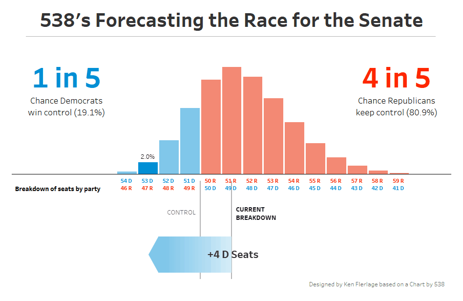
Before I jump into this experimentation, let me first talk about where I think this feature will be most valuable. I have personally always wanted to be able to hover (or click) on a mark and be able to highlight those marks in a very specific way. Sure, you can use the highlight feature, but that doesn’t always do what you want. What I’m talking about is the ability to hover or click on a mark and have it change colors or shapes, for it to get larger or smaller, to create tracking reference lines, etc. Set actions, released in 2018.3 allowed us to do this and was, in my opinion, one of the most powerful new features I’ve seen in years. For example, I used it in my recreation of 538’s US Senate forecast chart.
What’s great about parameter actions is that you can do many of these same things, but in a simpler and more straightforward way (for some examples, check out Kevin’s blog). So, it is my belief that this kind of functionality will be the most common use case of parameter actions.
What Makes Parameter Actions Unique
As noted earlier, Jonathan Drummey wrote a very detailed explanation of parameter actions and included a fabulous comparison of set actions and parameter actions. And Kevin discussed some of those differences as well. So, I won’t spend much time comparing them, but I do want to mention a couple of areas where I see parameter actions being unique.
First, parameters can be any value—they do not have to be a value in your data source. So you can store any value in a parameter that you like. It’s almost like using a variable in code. Of course, you’ve always been able to do this with a parameter, but how you populate those values was limited—essentially, the user had to select or enter a value. That was it. But, with parameter actions, they can be populated using any interaction with a dashboard, which opens up lots of new possibilities. For example, you could create a counter that just increments every time some action is taken. In the following, I created a basic scatter plot, then used parameter action to increase the value of a counter every time I click on a mark.
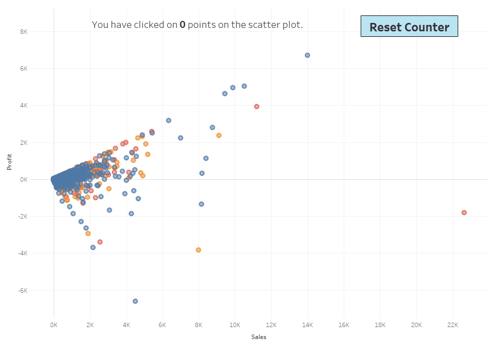
You can’t do something like this with set actions. While this may seem like just a cool trick, I think there are many potential use cases. In fact, I’ll show one such use case later on in this blog.
Another key advantage is the fact that parameters are global. This should not be underestimated. Sets are part of a single data source, but parameters are not. This allows you to do some very creating things. For example, you could create a data source for the express purpose of updating a parameter which is then used in another data source. Like the counter idea, this may not seem valuable, but it will make many things way easier than they have ever been in the past. Again, I’ll show an example of this later on.
Visual Controls for Mobile
As mentioned earlier, parameter actions open up a lot of options for user interfaces. You no longer have to use ugly dropdowns, sliders, or type-in boxes to populate a parameter. You can now use visual elements instead. This will be huge for mobile apps where such methods can often feel antiquated. For example, we could do something like the following where we give the user three buttons to choose from three different date ranges: last week, last month, and last year.

If you pair this with navigation buttons (available in 2018.3) for switching to different screens (i.e. dashboards), you can create a powerful user experience on a mobile device.
Joystick
Another idea for visual controls is to create a sort of joystick with buttons that allow you to move up, down, left, and right. Why? Not sure there are many use cases here (except maybe for games), but let’s explore it anyway.
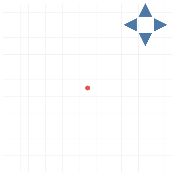
In Tableau, we create a simple scatter plot. We then create one parameter for the X coordinate and another for Y and we plot a single point at that coordinate.

We now create four sheets that include nothing but a shape—1 for up, 1 for down, 1 for left, and 1 for right—and we float these on a dashboard along with the grid in order to create a sort of control pad (Note: This could be done with a single sheet as well, but it would complicate the parameter actions a bit).

Next, we create calculated fields to go with each of these direction controllers. The calculated field for Up will simply add 1 to the Y coordinate, while Down will subtract 1. Likewise, Right will add 1 to the X coordinate, while Left will subtract 1.
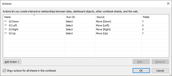
Finally, we create parameter actions that change the value of the X and Y coordinates to one of the calculated fields.
The end result is that we can click around on the control pad to move the dot as desired.
Overlays
After posting the above (and a couple other ideas) on Twitter, a comment from Zak Geis gave me an idea which will allow us to take this concept a bit further. Instead of a control pad, we could build a sort of overlay chart that will allow the shape to follow our mouse movements. The idea is to build a transparent with a large set of X and Y coordinates then overlay that chart on top of the grid. Then parameter actions can be used to move the point based on where we move our cursor on the overlay.
We’ll start out by using the same basic grid/scatter plot as before. But then we’ll create a new data set for our overlay (I’m creating it in Excel). I’ll have one sheet for my X coordinate which will contain values from 360 to -360 (I just chose these numbers somewhat arbitrarily). Something like this:

Note: I chose to make these increment by 5, but you could have every single integer value if you choose.
I created another sheet in Excel for the Y coordinate, which has the same list of numbers. Then, in Tableau I perform a cross-join of these two data sets using 1=1 join calculations (for more on cross-joins and a couple of examples, see SQL for Tableau Part2: Combining Data).
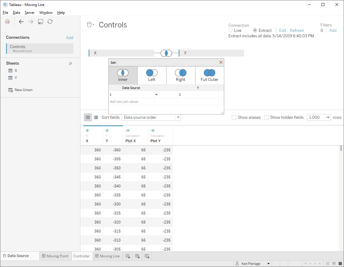
This will pair each X coordinate with each Y coordinate. I then build a grid to plot each of these points:
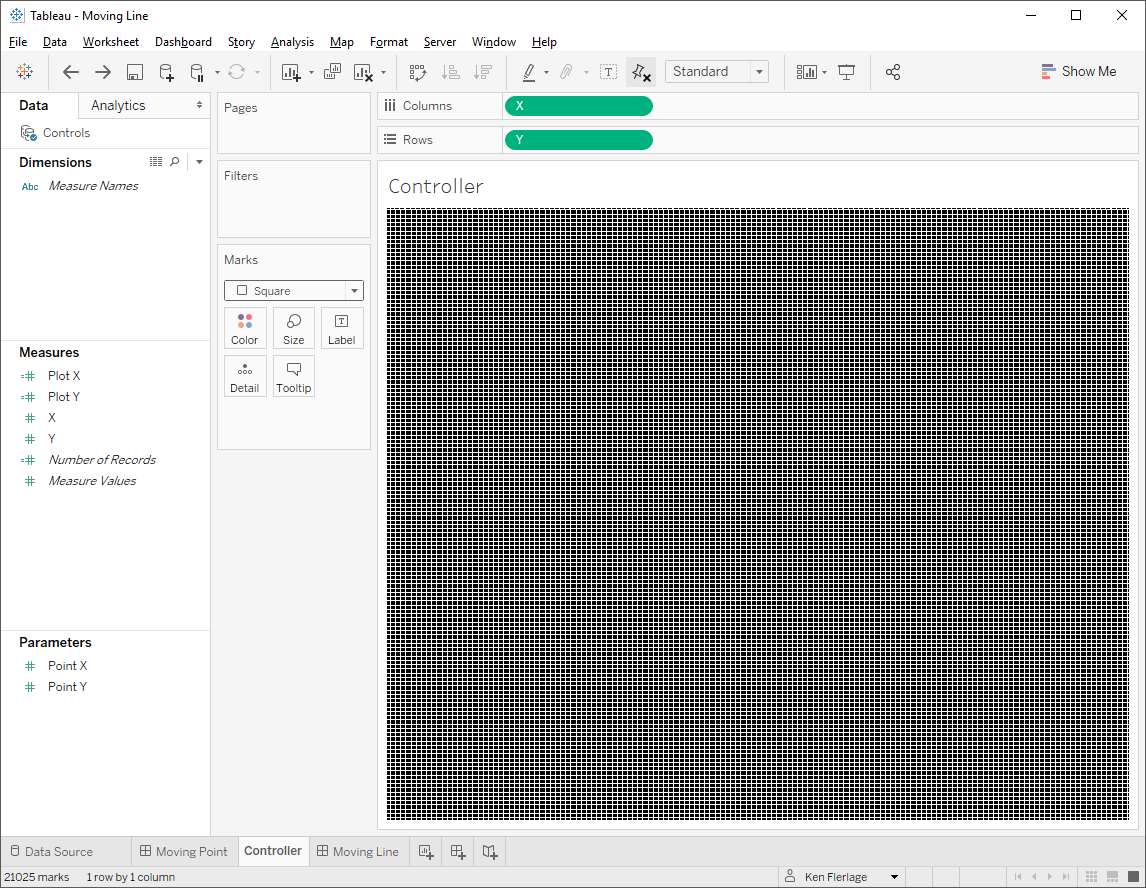
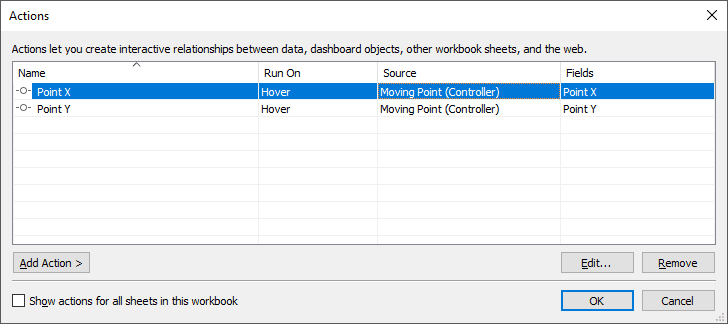
Next I change the opacity to 0% so that the marks are invisible and I change the sheet background to None. Then I float that overlay sheet over top of my existing grid. We can still see the grid because the overlay is completely invisible. However, since the overlay is on top, that is the sheet that we will interact with when we hover. Finally, we create two parameter actions that trigger on hover that will set the X and Y coordinates to the value we’re hover over.
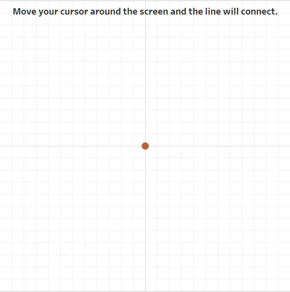
Now, as we hover over the chart, the point will follow the cursor.

Of course, we could also do something similar to this and have Tableau draw a line from one point to our cursor.
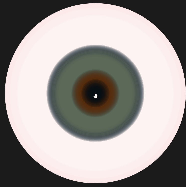
At this point, I was having fun, so I decided to place an overlay over my 3D eyeball so that it would rotate based on my movements.
Multiple Parameter Actions
I’ll continue to expand on this overlay idea in a moment, but I want to take this opportunity to note that that above use case uses two parameter actions that trigger on the same event (hover). This allows you perform lots of different actions all at once and can be quite powerful. In fact, in a later example, I have one button that triggers 5 parameter actions all at once. However, I do want to point out a one thing here. You can’t have multiple parameter actions which act on the same parameter or attempt to use a changed parameter to set another. OK, technically speaking, you can. There is nothing to prevent you from doing this, but Tableau will not change the parameters until after all of the parameter actions have completed. Thus, you can’t try to change one parameter value, then change another based on that new parameter value.
Map Overlays
Okay, let’s talk about one more type of overlay we can create. Using a similar approach to the grid overlay used earlier, we can do this with maps as well. I found a data set of almost 27,000 different US cities from www.simplemaps.com, which includes latitude and longitude for each. I then used that to create a transparent map overlay. Paired with 2019.2’s new MAKEPOINT and MAKELINE features (see Jeffrey Shaffer’s blog, Mapping Paths in Tableau 2019.2 for a great tutorial), I was able to draw a line from some origin point to wherever I hover my mouse.
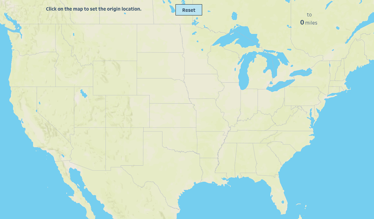
But I wanted to take this one step further and create a more useful tool, which would allow me to select an origin and destination point, then draw a line between the two, as well as provide the distance between them. This could be easily done using parameters to select the origin and destination, but I don’t want dropdowns—I want the user to click on the map to set each of these. This, of course, is a bit trickier because Tableau will need to know which click is setting the origin and which is setting the destination. So, how to do this?? Parameter actions, of course!! In fact, we’ll use something similar to the counter technique I showed earlier.
I’m not going to go into detail of every step required to do this, but I’ll take you through it at a high level. I’ll first create a parameter to track my clicks:
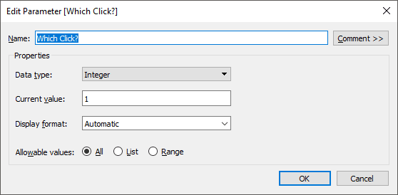
Then I have some calculated fields that will provide some instructions based on this value. If the value is 1, then the workbook will be ready to set the origin point. If the value is 2, then the workbook will be ready to set the destination. As it’s waiting for the first click, it looks like this:

When you click on the overlay map, a parameter action fires which adds 1 to the Which Clickparameter, making it 2. The calculated fields then adjust based on this; the screen’s instructions change to ask for the destination location and the source destination is shown in the top right (Note: I tried to click somewhere around Cincinnati and just happened to hit Hebron, KY, my hometown!)

When I click the second time, the parameter action fires again, adding 1 to Which Clickto make it 3. The workbook then notes the destination city and state, draws the line between the two points, and uses the haversine formula to calculate the distance between them.

Of course, there are more parameter actions here than just determining whether the user is selecting the origin or the destination. Depending on which point we’re setting, parameter actions are being used to set the latitude and longitude of the origin and destination points.
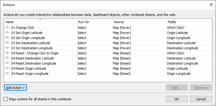
Finally, to allow the user to start over, I’ve included a Reset button. When this button is clicked, it fires 5 parameter actions to reset the latitude and longitude of both the origin and the destination and to reset Which Click back to 1.
In all, this dashboard has 10 separate parameter actions:
Here it is in action.
Color
Let’s switch gears a bit and talk about how we can do some interesting things with color. In my brother’s blog, he showed how you could use a color wheel control to change the background.

Using this same exact technique, we can change the color of our chart as well.
Okay, so that was a total rip-off of Kevin’s idea but I thought it was important to mention that this could be used for more than just a background color.
We can also take this one step further and use visual controls to change the entire color palette. I remember seeing something like this done by Jacob Olsufka and Rody Zakovich in their Triple Play Art visualization. The technique they used was a bit tricky. But, with parameter actions, we can make this much easier.

To do this, I created one data source to control the pie charts. When you hover over one of the pies, it sets a color palette parameter. That parameter is then used in the sankey data source to change the color. Pretty slick huh!!
Toggle Switches
I have one last use case before I let you go—toggles. Ever since seeing the toggle technique Jacob and Rody used in Triple Play Art (the same one which changed the color palettes), I’ve used the same basic technique in my own work. To create the toggle effect, the data must include multiple options—for example, one option for each of three color palettes. Then filter actions are used to change the option each time you click. To create this setup, however, the data has to be duplicated multiple times—once for each possible option. That works just fine for most data sources, but if you have a lot of data, it means your data source will double or triple in size, which may not always be ideal.
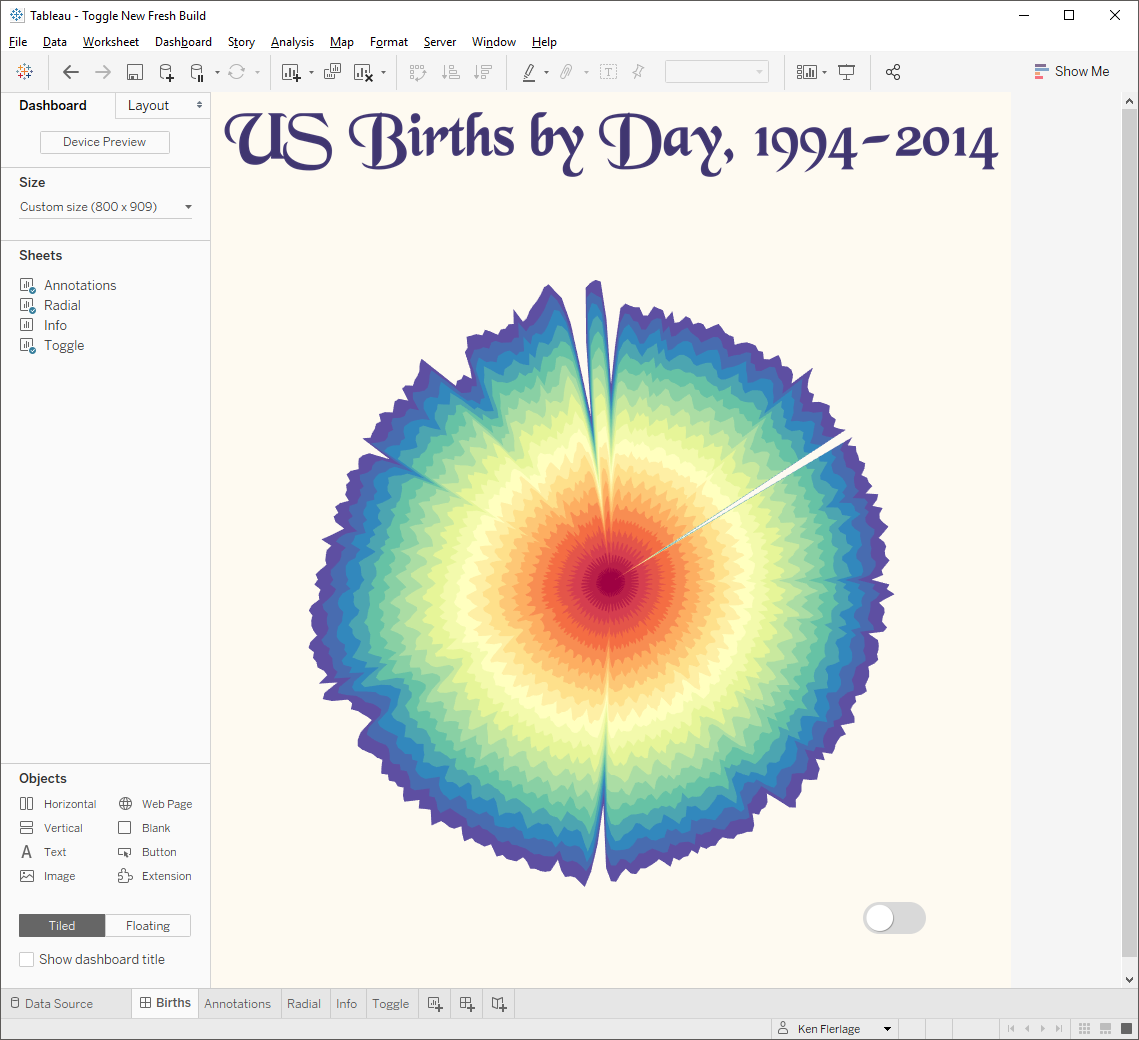
But, with parameter actions, we can take a slightly different approach to creating these toggles. As an example of how to use this technique, I’ll use my US Births by Day viz, which has a toggle to turn on annotations.
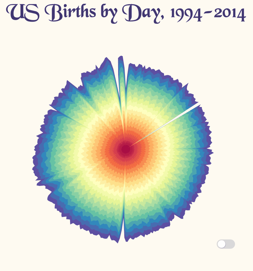
Note: This uses transparent sheets. The annotations are a sheet that sits behind the main chart. We essentially hide everything on this sheet if the option is turned off. I’ll address this in more detail in a moment.
So, let’s recreate this using parameter actions.
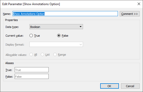
First, we’ll set up a parameter that controls whether or not the annotations are visible.
Now we’ll create a separate data source that does nothing but control our toggle button. It’ll look something like this:

Note: You can use this same technique for non-boolean options as well. You’d just enter all of the different options as rows in this data set and make adjustments to the rest of these steps accordingly.
Next, create a new data source from this data.
Then create a calculated field like this:
Next Toggle
// Next filter on the toggle field.
IF [Toggle]=TRUE THEN
FALSE
ELSE
TRUE
END
Now, on a sheet, create an axis by typing 0 on the Columns shelf.
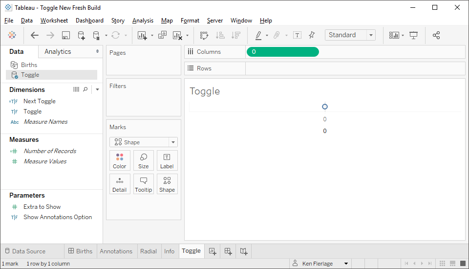
On this axis, turn off the headers, remove all lines, etc. Then switch the mark type to “Shape” and drag Toggle to the shape card. Once here, click the Shape card then select your custom shapes for the button (if desired, you can use my toggle images, which I’ve made public here: Toggle Images).
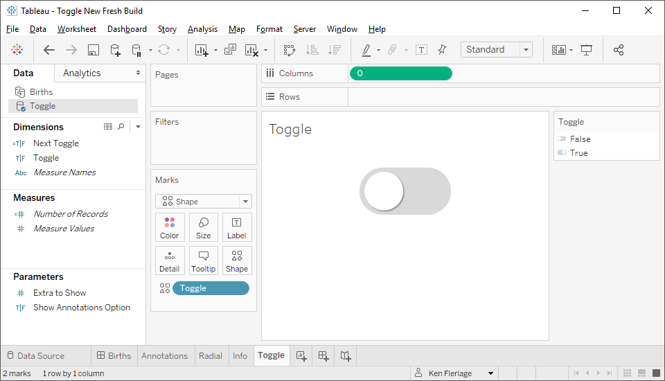
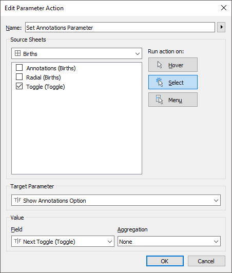
Even though it looks like only the FALSE option is showing, the TRUE option is there as well—it’s just hidden behind FALSE. We’ll need to set it up so that, when you click on it, it swaps the two shapes. The easiest way to do this is to use a filter action. We’re going to set up this filter action so that it sets the value of Toggleto the value of our calculated field Next Toggle. Before doing this, we need Next Toggle to be available to us in the filter action, so drag it to detail. Now create the following filter action:

Now, when you click the button, it will filter to the other option and, therefore, swap the shape that is shown.
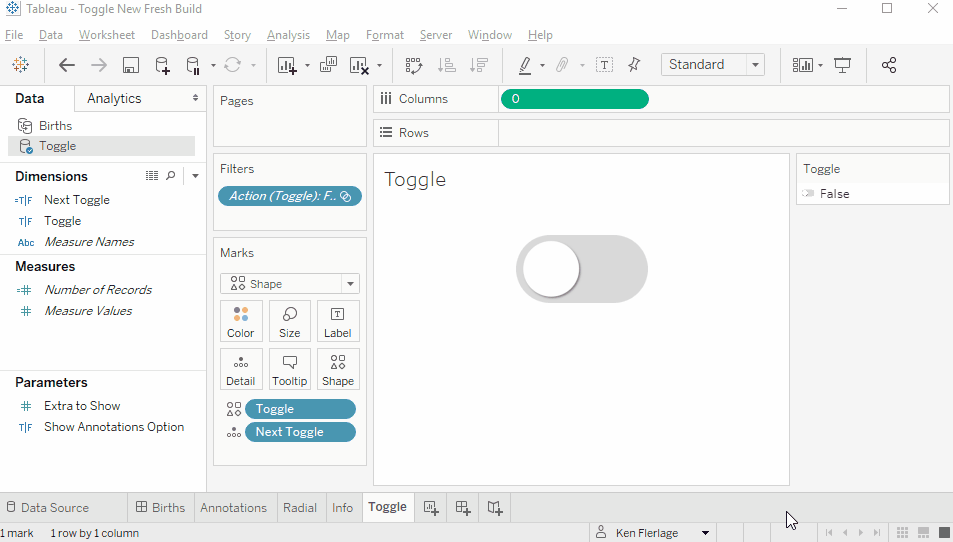
Next, we’ll add the toggle sheet to the dashboard.
Now we’ll create a parameter action to set the Show Annotations Option parameter to the value of the toggle. We want this to be the target toggle to which we’ll be switching to, so we need to use the Next Toggle field.
Finally, we’ll put a filter on the annotations sheet so that it will only show the chart when this parameter is True.
And that’s all there is to it. The steps are relatively easy to execute and, because we can use the parameter across the data sources, we don’t need to do any complicated joins or duplicate our data to make it work
Wrap-Up
Well, that’s all I have for you. I realize that some of the examples I’ve shown are a bit strange and may not have any real-life applications, but I share them for a couple of reasons. First, the Tableau community is incredible and they always find a way to use techniques like these in really powerful ways. Second, these examples show the power of this new feature and help to illustrate how they can be used to do things we simply never could before. I am personally looking forward to putting them into action in my own work and I look forward to seeing how everyone else uses them as well!
Quick reminder that all the workbooks used in this blog are available for download on my Tableau Public page: Fun with Parameter Actions
Quick reminder that all the workbooks used in this blog are available for download on my Tableau Public page: Fun with Parameter Actions
Ken Flerlage, May 27, 2019


Hi,
ReplyDeleteCan we create multi select parameter in tableau 2019.2.
No, but there are typically other options that may work for what you're trying to do.
DeleteCould you please tell me those ways to achieve multiple selection using parameter.
DeleteI'd need to know more about your data and your workbook. Can you please send me some further details via email flerlagekr@gmail.com
Delete