
Creating a Sankey Funnel in Tableau
I’ve become fairy well-known in the Tableau community for my sankey templates, but everything I’ve created was based on the work of others ahead of me. In particular, Jeffrey Shaffer, who was the first to build a sankey in Tableau, and Olivier Catherin, who built upon Jeff’s work to create the polygon-based sankey that most of us use today. Of course, there are many others who have innovated with sankeys—Chris Love, Alexander Mou, Chris DeMartini, Ian Baldwin, and Merlijn Buit—but the work of Jeff and Olivier has been the basis of most of my templates. That being the case, I was thrilled to finally meet Olivier at the 2019 Tableau Conference and for all three of us to take a photo together.

Left to Right: Jeff, Olivier, Ken (Yes, it does appear that I have my eyes closed)
Olivier was even kind enough to bring us t-shirts and laptop stickers!

So, fresh off of spending some time with two fellow sankey-lovers, what better blog to write than one about a new type of sankey—what I’m calling a sankey funnel.
Sankey Funnel
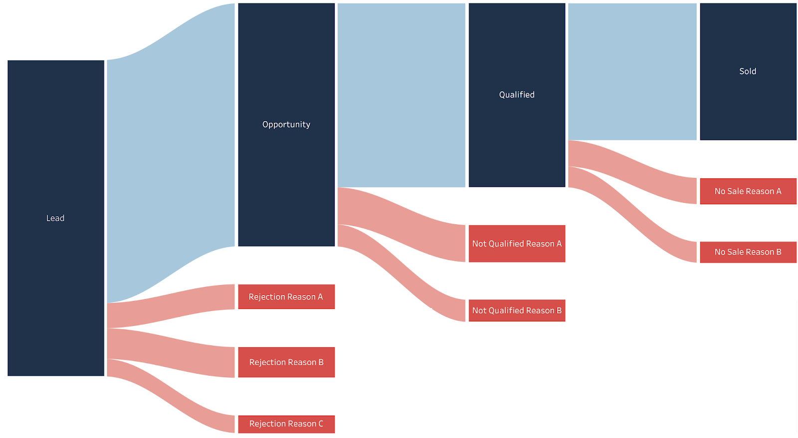
So what is a sankey funnel? The idea first came from Terry Dehart and the Progress Bible team. He had used my multi-level sankey template to build something like this (I’m using some sample lead generation data, but the concept was the same).

While this wasn’t bad, what he really wanted was for the flows to end at appropriate spots. For example, after Rejection Reasons A, B, and C, the lead is dead, so there is no need to flow to the next step. So, ideally, we’d have something more like this:

The removes the visual clutter of the first version, making it much easier for us to focus on what’s happening as we flow from left to right. I’ve chosen the name “Sankey Funnel” because this sankey works in a similar fashion to a funnel chart, while allowing for a bit more detail about each phase.
After working with Terry a bit, we were able to develop a method to hide the unnecessary flows and both he and I were happy. But since that time, I’ve gotten a number of additional requests for sankeys with this capability, so I decided to provide a new template, as well as explain how you can add this functionality to sankeys built using my prior templates.
Sankey Funnel Template
If you’d just like to plug-and-play your data, you can use my template. The Tableau template can be found here: Sankey Funnel Template. And the Excel data file is the same as used in my multi-level sankey template. The key difference in how you use this template is that some of your “Step” values will be NULL. For instance, the data for the sankey shown above looks like this:

Notice that there are numerous blanks in the file. So, when you want the flow to stop (for example, after Rejection Reasons A, B, and C), you just leave the rest of the steps NULL (blank in Excel). Calculations within the Tableau template will then take care of the rest for you. Other than this, the process for using the template is exactly the same as the multi-level template (See the How to Use The Templates section of the multi-level sankey blog).
I should also note that your NULLs can appear at the beginning as well. By doing this, you can have new values added into the flow in the middle of the process. For example, you could create something like this:

I should also note that your NULLs can appear at the beginning as well. By doing this, you can have new values added into the flow in the middle of the process. For example, you could create something like this:
Adjusting an Existing Multi-Level Sankey
If you’ve already used my multi-level sankey template but want to apply this technique to it, you have a couple of options. First, you could put your data into the template as explained above. If your sankey is relatively simple and you haven’t built up a lot of extra functionality around it, then this might be the best approach. But, if you feel it will be too much work to create from scratch, the following steps will guide you through updating your calculated fields to hide the NULL flows. Before doing that, I need to share some of the underlying details of the calcs used in the workbook:
- Each “Bar” sheet is driven by a calculated field called N1 Bar Position(for the first bar), N2 Bar Position (for the second), etc.
- These calculations are based on additional “helper” calculations, which are all then grouped together in one of the Bar folders.
- Each “Curve” sheet is driven by a calculated field called Curve 1-2 Polygon, Curve 2-3 Polygon, and so on.
- Like the bar calculations, these also have helper calculations and are grouped together in one of the Curve folders.
- Since the N Bar Position and Curve Polygon calculations drive the plotting of the bars and curves, our goal is to modify these such that, when the value is NULL, we return NULL so that nothing is plotted.
- Because the curves connect two bars, we need to check both the starting point and the ending point for NULLs.
- Finally, my approach accounts for both NULL values and empty strings (“”). Technically, these are two different things, but I’ve included both to reduce any confusion.
With the above out of the way, here’s how you can modify your calculations to account for NULLs:
1) Modify all N Bar Position calculations, adding an IF statement to check for NULLs. For example, N2 Bar Position will look like this:

Note: The statement after the ELSE is the same as what is already there in the template, so no changes are required except wrapping it in the IF/ELSE statement.
The above changes will need to be made to all N Bar Position calculated fields, swapping out Step 2 for the appropriate step.
2) Make similar changes to the Curve Polygon calculated fields. For example, Curve 2-3 Polygon should become.

Like the Bar Position calcs, the only change here is to add the IF/ELSE statement. It is, however, critical that the IF statement check for NULLs/blanks in both the source step (e.g. Step 2) and the target step (e.g. Step 3). Similar changes must be made to all of the Curve Polygon calcs.
As always, thanks so much for reading! If you have any thoughts or comments, please leave them in the comments section below.
Note: On January 6, I posted a blog which details a new approach to drawing sankey curves which ensures that the width of flows remain constant from start to finish (rather than narrowing in the middle). I suggest transitioning to this new method to ensure greater analytical integrity. Equal-Width Sankey: A New Approach to Drawing Sankey Curves
Update February 4, 2020: One question I get pretty regularly is how you can extend the template so that it has additional flows. I won't go into a lot of detail here, but the process basically entails the following:
1) Add a new "Step" to the spreadsheet--you can just call it Step 6 for consistency.
2) In Tableau, copy the "Bar" calculations. For instance, copy the calcs in the "Bar 5" folder to create "Bar 6" calculations. Then edit each of those new calculations to refer to the "6" version.
3) Similarly, create copies of the calcs in the "Curve 4-5" folder to create "Curve 5-6" calculations.
4) Copy the Bar 5 sheet to one called Bar 6 and Curve 4-5 to Curve 5-6, then edit the fields used on those sheets to use the Bar 6 and Curve 5-6 calculated fields.
For a more detailed explanation of how to add additional curves, see the following post on the Tableau Community Forums: Adding Steps to a Sankey
A note of warning: Often, when you copy the sheets then switch the calcs to use the new ones you've created, you may find that one of the table calcs turns red, indicating an error. If you hover over the calc, it will say that a field is missing. Despite all your efforts, you won't find a way to fix it. I've found that advanced table calculations, especially those with lots of nested calcs, sometimes get errors like this even though everything looks good under the covers. My best guess is that there is some missing pointer somewhere that causes it to get confused. The only way I've found to deal with this is to right-click on the red pill then set it to compute using some field (any field will do). You then have to go back and edit the table calculation, setting all the nested calcs to compute as desired. It can be a bit of a painful process, but it works.
A note of warning: Often, when you copy the sheets then switch the calcs to use the new ones you've created, you may find that one of the table calcs turns red, indicating an error. If you hover over the calc, it will say that a field is missing. Despite all your efforts, you won't find a way to fix it. I've found that advanced table calculations, especially those with lots of nested calcs, sometimes get errors like this even though everything looks good under the covers. My best guess is that there is some missing pointer somewhere that causes it to get confused. The only way I've found to deal with this is to right-click on the red pill then set it to compute using some field (any field will do). You then have to go back and edit the table calculation, setting all the nested calcs to compute as desired. It can be a bit of a painful process, but it works.
Ken Flerlage, December 1, 2019


Hi Ken, thanks a lot for this post--it's tremendously helpful! I am trying (with moderate success) to adapt your approach and your templates to my own dataset. I have 3 problems in particular, and would appreciate any tips you may have:
ReplyDelete1) I have 7 Steps in my Sankey Funnel, and have successfully created sheets for Bars 6 and 7. I can't do the same for the Curve 5-6 and Curve 6-7 sheets, as 'The table calculation requires a field that is missing'. I have updated the Colour pills and the Curve Polygon table calculation to compute using Steps 5 and 6, and 6 and 7 respectively, as I did in the Bars sheets, but this doesn't fix the problem.
2) In a similar way to how there are rows exiting the funnel at each step (like 'Rejection Reason A' and 'Not Qualified Reason A' in your example), I am also trying to have rows joining midway along the funnel (i.e., new customers being introduced in Step 3). In my dataset, these rows currently have nulls for Steps 1 and 2 and non-null values from Step 3 onward.
3) Is there a way to have one box at the final stage of the funnel 'holding' or aggregating all the customers at each stage lost through the funnel by bypassing the intermediary stages? Put differently, if I have 60 customers dropping out at Step 2, 40 at Step 3 and lose no further customers in the funnel, I'd like a box with those 100 customers without them having to move through red boxes at Step 4, Step 5, Step 6 and Step 7.
Thanks in advance!
Keith
Hey Keith. Any way you could shoot me an email? These comments just don't allow enough flexibility. My email address is flerlagekr@gmail.com
DeleteKen,
DeleteI'm getting the same error that Ken is getting in #1 above. I keep getting the error that the curve #-# Polygon field is missing a field that is required. I even tried to re-create your exact tabs for Curve 1-2 and Curve 2-3, but continue to receive the same error. Is there something we are missing? Maybe a setting that isn't obvious? Thanks.
I've found that advanced table calculations, especially those with lots of nested calcs, sometimes get errors like this even though everything looks good under the covers. My best guess is that there is some missing pointer somewhere that causes it to get confused. The only way I've found to deal with this is to right-click on the red pill then set it to compute using some field (any field will do). You then have to go back and edit the table calculation, setting all the nested calcs to compute as desired. It can be a bit of a painful process, but it works.
DeleteKen - Thanks for the feedback. I tried an individual field, but it still wouldn't work. I finally tried at the table level, which turned the pill from red to green. I was then able to go back and reset each of the nested calcs again with success.
DeleteGreat!!
DeleteHi Ken, I have downloaded the Sankey funnel template and the multi-level dataset to see the funnel in action. But the multi-level dataset is not the same as your screenshot above. The dataset I downloaded has values A-Z across all steps, rather than Lead, Opportunity, Rejection, etc. Can you put the Sankey funnel dataset out on the share drive?
ReplyDeleteSure. I uploaded the file here: https://www.amazon.com/clouddrive/share/0pb9r9EVnY0sFoqDZeqPXAHVGbBPNJt08YFphBpeTnQ
DeleteHi Ken! The link doesn't seem to be working anymore - would you mind re-linking? Thank you!
DeleteThe Excel can be found here: https://docs.google.com/spreadsheets/d/1rsu5QLnwUWZ4VeyjKzVxkbo6fiAFlhG-/edit#gid=770545987
DeleteHi Ken, thanks for your guidance to build a Sankey funnel! Im interested in plotting a session funnel and there are optional steps that might be skipped by some users, how can I plot this situation in a multiple Sankey funnel? In your example: Connecting 'Leado' directly to 'Customer Retained' without intermediate steps. Thank you so much!
ReplyDeleteI don't have a great solution for that, unfortunately. One option would be to have "Customer Retained" in multiple "steps". That wouldn't be great, but might be a workable solution.
DeleteThank you Ken! Is there any way to calculate the % customers at step 1 that reached step 2 in order to show it as a label in each bar? Thanks again!
DeleteYes, that would definitely be possible. Any chance you could send me a sample workbook? flerlagekr@gmail.com.
DeleteAny chance you can share te workbook with us? Looking for this as well
Deletehttps://public.tableau.com/app/profile/ken.flerlage/viz/SankeyFunnelTemplate/Sankey
DeleteThanks Ken. But i'm looking for the percentage. So in your example I see that 429 cases out of the 7753 leads went to rejection reason C. I would like to show 5,5% in the flow in this example.
DeleteWould love to know if this is possible^
DeleteHi Ken,
ReplyDeleteThank you for this amazing visualization, it is quite useful for plotting streamlines/pathways. I have a 5-Step Sankey, with data refreshing every day. However with every refresh as the data changes, color coding of the bars and curves also goes back to the default tableau color scheme. This seems to be more of a tableau problem -https://kb.tableau.com/articles/issue/colors-change-after-replacing-data-source?lang=de-de. Would you have any recommendations to deal with it ?
Thanks,
Vishakha
That should not happen when you simply refresh the data. Are you just refreshing or replacing the data source? Any chance you could email me at flerlagekr@gmail.com?
DeleteThank you Ken, just refreshing data source works perfectly fine.
ReplyDeleteHi, if I want to add more levels, do I have to change anything in Model sheet in datasource?
ReplyDeleteThanks in advance
Nope. That will stay the same. You just need to create the calcs and sheets as detailed above.
DeleteHi Ken - Is there an order to follow when adjusting the curve table calculations? When I come across the 'missing field' issue and select a random "compute using" then edit table calculation to specific dimensions step x, step y the end result varies depending on what initial "compute using" I selected, none of which actually give the correct result for that curve. I tested this on one that was already working in the workbook and got the same result. No idea how to correct it :(
ReplyDeleteThe initial "compute using" that you choose should have no impact on the results as you're just going to be changing all of the table calcs. My guess is that you're not changing all of the nested calcs. Be sure to select each nested calc in the drop down, then change the way those compute as well.
DeleteHi Ken - Do you have a template of your workbook with NULLs at the beginning of the funnel? The one pictured with Step 2A, Step 3A, Step 3B. When I have NULLs at the beginning I lose the entire first bar. I'd love to see how you built that one!
ReplyDeleteWhy would you have NULLs at the beginning? Would you be able to email me with further details? flerlagekr@gmail.com
DeleteHi Ken,
ReplyDeleteThanks very much for this template, unfortunately when I try to make a copy to extend to steps 6 - 9 my curve 5-6 doesn't align with bar 5. Though any new bars and curves I made do align. The only misalignment is when I add the first new step.
So I remade bars and curves 1-5 and they all align apart from Bar 1 which for love nor money will align with curve 1 -2!
Do you have any idea why this might be? Any help would be much appreciated!
Not sure. Any chance you can send me the workbook? flerlagekr@gmail.com.
DeleteHi Ken, amazing work! This view fits perfectly for what I am trying to portray! I do have the same problem that Maria had..Was her issue something specific? I have only 6 steps, it appears the calcs are correct, everything seems to be set up perfectly but my Curve 5-6 does not align to my Bar 5 sheet? It may be worth noting that my Bar 6 does align to my Curve 5-6. Thank you for any assistance!
DeleteI don't recall exactly, but I'd have to assume that it was a problem with the way the nested calculations were computed or the way the pills were sorted. I'd be happy to help if you could send me an email. flerlagekr@gmail.com
DeleteI had the same issue as above where my Bar 1 was not matching up with the start of the curves for Step 1. My solution was as simple as modifying the Sort in the Bar 1 tab for the Step 1 Label to Alphabetic -> Ascending.
DeleteI think there was a custom sort in the template for that first sheet that is messing it up.
Hi Ken,
ReplyDeletemany thanks for this great template. As a short note to everyone who is working with it.
There several calculations hidden in the nested calculation window. If you change e.g. the calculation bar position according to the approporiated settings, please go to the little drop down an adjust the other calcs as well. This has caused me hours to find this out....
Thanks so much for this blog post, Ken!!! So well-written and easy to follow, and folks at work were really impressed with my resulting viz.
ReplyDeleteI noticed the bars and flows in the template are manually sorted. I was wondering how you'd deal with a dynamic sort? Conceptually, it makes sense for the "success" flow to be on top, with Reason A and Reason B sorted below, but what if that conceptual sort didn't apply and you wanted the bars/flows to dynamically sort in descending order?
I'm having trouble with this, and I think it's because of the nulls - for example, Bar 2 doesn't have any nulls, so it's no issue to sort by the [Step 2] field on [CalculationN] (though you have to choose a sort order of ascending to achieve a descending sort in the viz?); however, Bar 3 does have nulls (Rejection Reasons A, B, C), and the viz takes them into account in the sort, making the spacing of the flows/bars look very off. I'd like to retain the visual spacing that the nulls provide, but not have them taken into account in the sort.
Your thoughts would be appreciated! Thanks!
Any chance you could reach out to me via email? flerlagekr@gmail.com
DeleteWow, after writing this out and sleeping on it, the solution was so clear - I just needed to create a new [CalculationN] for each [Step] without the nulls and sort on that! Funny how that happens. Thanks for your time, Ken!
DeleteSolution calc, in case it's helpful to anyone:
IF NOT ISNULL(MIN([Step 3])) THEN [CalculationN] END
Ah, I see what you were talking about now. Yes that makes perfect sense!
DeleteHi Ken,
ReplyDeleteThanks again for the template. My data is too large to use the pre-densified method, so I'm exploring how to translate the calculations from this template to use the bin method outlined in your Intro to Data Densification post. It's proving to be complicated...any suggestions of what to focus on?
Thanks!
Katie
I don't think you want to use the bin method for a large data set. While I haven't tried it, I suspect the performance will be worse with the bin method than the pre-densified method due to the addition of even more complex table calculations. When you have a large data set, the best approach is to perform some pre-aggregation of that data. Is that possible?
DeleteHi Ken,
ReplyDeleteI love your blog and everything on this site! I was wondering if you could give some insight into how you calculate the Size field in your data source. I created a dataset in the same format as you have in your template, but I'm hitting a wall when it comes to figuring out how you calculated what the size for each record should be.
Thanks,
Seth
Could you send me an email? flerlagekr@gmail.com
DeleteHello Ken - Thanks so much for your article it is an amazing viz
ReplyDeleteI'm stuck doing curve charts, curves just not appear and bars (for different status or values) are stacked. I've tried for two days but i did not get success :( . Is there a video or post to show how built it from zero using new calculated fields and so on?
Thanks so much in advance
Why are you trying to build this from scratch?
DeleteHi Ken,
ReplyDeleteThank you for another amazing template!
I was wondering if it is possible to show % of specific segment in the tooltip for Curves? For example, Lead is 7753 which is 100% and maybe there is a way to show Opportunity (5956) as a percent of the Lead?
Thank you in advance,
Aiste
Could you send me an email with further details? flerlagekr@gmail.com
DeleteBumping this
DeleteHi Ken,
ReplyDeletecould you give me the workbook files? 375006985@qq.com
The Excel template can be found here: https://www.amazon.com/clouddrive/share/vFiR4FSxm3h5qB9xrSGC2fRlNVBOMTjatJimbr5bIlN/folder/Bseq5mk2SNCG1_5422Ffxg?_encoding=UTF8&*Version*=1&*entries*=0&mgh=1
DeleteAnd the Tableau template is here: https://public.tableau.com/app/profile/ken.flerlage/viz/SankeyFunnelTemplate/Sankey
great work!
ReplyDeleteHi Ken,
ReplyDeleteThanks for the amazing article! Your skills on Sankey are absolutely crazy.
I tried to apply it to a process flow displaying monetary values and encountered a small issue as the previous 'steps' have to be larger than the latter ones. So I was just wondering if you would have any suggestions on modifying this template such that the prior categories can be smaller than the later categories? (for example, step 1 with a value of 10 can flow to multiple step 2 values bigger than that)
Thank you so much!
Any chance you could email me? flerlagekr@gmail.com
DeleteHi Ken,
ReplyDeleteThank you for this blog. It is brilliantly written and digestible and was just what I had been looking for for weeks. I do have a few queries for you. The Sankey Funnel is fully functional at the moment but when I try to change anything it seems to have a negative impact on the Sankey.
1. I am trying to sort the pillars of the first bar by the "Size" value (Descending). When I do this however, the lines no longer line up. Is there a way I can sort bars in descending order based on the size value and the lines will stay attached to the relevant blocks making up the bar.
2. The values that carry the whole way to the last bar (bar 5) are very small. Thus, the blocks in Bar 5 are very small. Is there any way I can make these bigger? I know the nature of the Sankey is set up so that the Bar Value's are smaller and smaller each time, but I am losing insight as cannot see their label at the moment.
Thank you for your help.
Could you email me? flerlagekr@gmail.com
DeleteHi,
DeletePlease may the solution to question 1 be shared? I'm also struggling to understand how it sorts the orders of steps in the bar worksheets. With the data set I've got, it places the equivalent of "Rejection Reason A" above "Opportunity" and I'd like to have it below.
Thank you.
Click on the "Step" pills on all the marks cards and set the sort order. Make sure you do it on the marks cards for the bar and curve sheets. If you get stuck, email me. flerlagekr@gmail.com
DeleteHi Ken, this is a fantastic template but I think i'm having a similar problem to others but not sure I understand the proposed solution.
ReplyDeleteFor me the Curve 1 -2 is not matching up wth step 1 on the left, and all data goes to a single point on the right side. Everything else looks perfect apart from this. Have no idea what I've done wrong here.
Thanks for your help in advance
DT
Edit the table calculation then be sure to check all of the nested calcs in the dropdown list.
DeleteHi Ken,
ReplyDeleteThank you for the post and template. Using your template, I was trying to build a multi-level Sankey visual for my company's P&L statement. So basically the data has multiple revenue buckets which flow into a single revenue bar, that bar is then split into Gross Profit and Costs, the gross profit is then split into Net Profit and Expenses - a total of 4 steps. So to get this, I tried modifying the excel template to have multiple size values for each steps (size1 for step1-2, size2 for step2-3,size3 for step3-4) and modifying the bar position and flow size calculation. However it works for 2 of 3 curves and fails for either one of the curves. Not sure if this template can be used to get this, any direction would be helpful.
This is how the data looks like: Sum of Size 2 = Sum of Size1, Sum of Size 3 = Sum of Size 2, but the values for step2 do not directly flow from buckets in step1 and so on.
Step 1 Step 2 Step 3 Step 4 Size Size2 Size3
Revenue 1 Revenue 1500 0 0
Revenue 2 Revenue 1000 0 0
Revenue 3 Revenue 225 0 0
Revenue COGS 0 2000 0
Revenue Gross Profit New Profit 0 225 225
Revenue Gross Profit Expenses 0 500 500
Thanks for your help in advance.
Best,
Amogh
Could you email me? flerlagekr@gmail.com
DeleteHi,
ReplyDeleteThanks for the detailed article, templates and continous help to everyone. I'm trying to use multi level funnels and two of the flows end at same stage, but one flow has fewer stages. So, basically I need to create curve 3-5.
As far as I understand the process, I would need to change excel data in model sheet as well. Can you help with this? Please let me know if there's a community discussion I can refer to.
Thanks in advance.
That would not be possible with this template.
DeleteHey Ken! I recently discovered this Sankey Funnel (and a variation created by ProfDrKSchulte). I really like the layout and how clean the dashboard looks, but upon reverse-engineering the workbook (to tailor to my use-case), I'm missing the 'Model' sheet tied to the source data.
DeleteI cannot create a version without the Model piece. Any advice?
My email is kf.me@icloud.com if email is preferred! Looking forward to your advice (if possible).
MANY thanks in advance for all of your hard work and contributions in the data viz world!!!
You'll need the model in order to draw the curves. You can find that data in the spreadsheet template that is linked in this blog. I'm not sure if that answers your question, but if not, please let me know. Also feel free to email me at flerlagekr@gmail.com
DeleteHi Ken,
ReplyDeleteI was wondering your thoughts on the possibility of creating a Sankey chart all on one sheet? I recently discovered the wonders of map layers and have messed around with your template trying to do this but discovered that table calculations are an issue. Curious to see if you've already gone down this rabbit hole to see if it's something I shouldn't even bother trying ;)
Anything is possible! But it would be pretty tricky and a lot of work.
DeleteHi,
ReplyDeleteI really like your template, thank you very much for sharing!
After changing some values and loading the new excel file into the template, I am getting skewed angles for some of the curves (especially the smaller ones). Is there a way to fix that?
https://ibb.co/92s2Qhj
Could you send me an email? flerlagekr@gmail.com
DeleteI have sent you an email from my web.de account, I hope google spam filter does not filter it.
DeleteDo you have a video on how to use the template with the google sheet? I am a bit of a visual learner. Thank you
ReplyDeleteNo, I don't unfortunately.
DeleteHi Ken,
ReplyDeleteI used this template a while ago to great effect, thank you. I was trying to refresh my memory for somethign new and encountering an issue. I have created an additional bar and curve, and all works OK apart from one thing: the curve seems to condense all the lines to a single point and overlap rather than match up with the bars. This seems to happen whether im using my own workbook or your template. Any idea what Im missing? Thanks
It's likely a problem with how the table calcs are computed. Be sure to check those as well as all the nested table calcs. If you are still stuck, feel free to send me an email. flerlagekr@gmail.com
DeleteIs there any explanation on how to calculate the 'Size' for the records? I want to apply this method for my own data but I'm struggling to understand 'Size' measure
ReplyDeleteSize is the measure you're visualizing. So, imagine you have students and major changes. Step 1 might be Biology and Step 2 is Chemistry. Size would be the the number of students who changed their majors from Biology to Chemistry.
DeleteAnother way to do this would be to list each student on their own row. In that case, Size would simply be 1 and the data would be aggregated within Tableau.
Delete