
Plotting Multivariate Numerical Data

Recently, I encountered these charts a couple of different times and just found them difficult to read and understand. That led me to ask the following question on Twitter:
I don't have a lot of experience with parallel coordinate charts but I've encountered a couple recently. My general opinion of them, at this time, is not positive. Seems like there are much better options. So change my mind! Anyone have any good use cases or good examples?— Ken Flerlage (@flerlagekr) February 7, 2019
This led to some great conversation about the charts, their use cases, and their alternatives. While I still don’t love parallel coordinates charts, I definitely feel they have their place and are often much better than the alternatives. Feel free to read the thread above. Big thanks to Jeffrey Shaffer, Daniel Zvinca, and others for their expertise and wisdom!
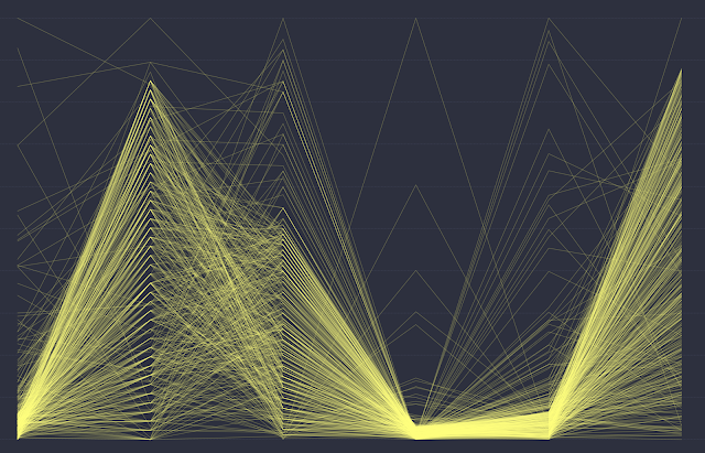
After having this discussion, I realized I had never built one of these charts before, so I decided to build one. While exploring my data in Tableau, I decided to try a number of different alternatives for plotting multivariate numerical data and that turned it to a full-blown visualization of these different options. So, if you’d like to see some of these different methods, feel free to explore it further. Click on the image to interact with it further.

If you have any other methods for visualizing multivariate numerical data, then please feel free to share them in the comments.
Thanks for reading!
Ken Flerlage, December 15, 2019


No comments: