
Creating a Parliament Chart in Tableau

Parliament charts are a common method for showing the
results of an election or the current makeup of a parliamentary government. These
charts show each seat of the parliament in a semi-circle, similarly to the way
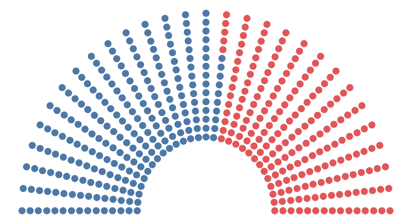
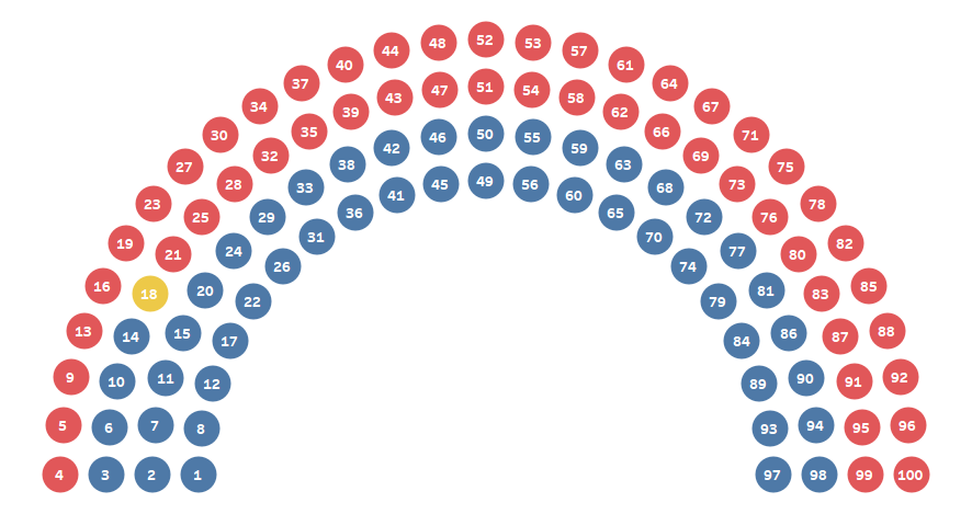
seats might be arranged in a parliamentary chamber. For example, Wikipedia uses
the following chart on their page for the 116th Congress of the
United States:

In January of 2019, I created a visualization analyzing the diversity of the 116th Congress and
used a parliament chart show the difference between representational and actual
gender diversity.

Before I even started this visualization, however, I
had been working on some way to templatize these charts for use in Tableau. My primary
goal was to make it completely flexibly so that you can show any number of
seats and control the number of rows, the spacing between rows, the size of the
dots, and the ordering/coloring. Unfortunately, this proved to be really difficult
(for reasons I’ll get to shortly), so I never quite reached the finish line
until now.
Iterations
As is normal for a complex chart like this, I went
through a number of iterations to reach the final product. My first attempt was
to use some fairly basic trigonometry
to create the chart.
In this version, you can specify the number of rows,
then it simply plots an equal number of seats on each arc. While this is okay,
it had a couple of fundamental problems. First, it looks a bit strange when you
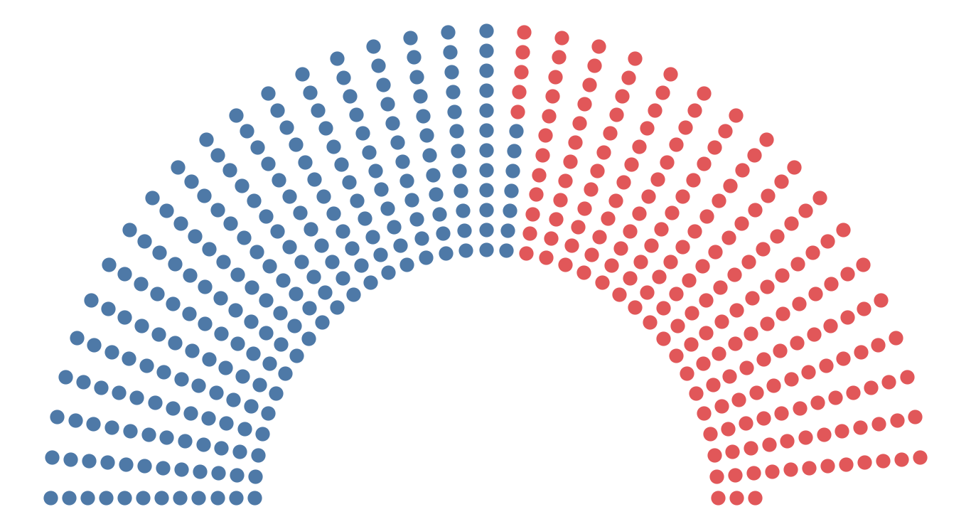
don’t have enough seats to fill each row. For example, here’s the same chart
with 12 rows instead of the 15 shown above:
A second issue is that, as you extend outward, the space
between each dot gets greater. This is all space that could be filled and
leaves the chart looking a bit sparse. So, I set out to come up with an option
that would do the following:
1) Fill each entire row automatically.
2) Ensure equal spacing between each dot.
And here’s where it gets tricky. Because we’re drawing
dots on multiple arcs that increase in radius, we’ll need to draw a different
number of dots on each arc in order to maintain consistent spacing. Thus we
need some math to determine how many dots to place on each arc, depending on a
variety of different parameters being made available to the user (number of
seats, number of rows, spacing, etc.).
To work through this, I started out by thinking how
this would work if we were to draw each dot along a single horizontal line,
kind of like this:

What would then happen if we were to break these up into
multiple rows and wrap them around a semi-circle? To do this, we first need to
know the number of arcs (or rows), so I created a parameter allowing the user to
specify this number. We then need to know the length of each of those arcs. We
can do that using the math to calculate the circumference: C=2πr. Since this is
just half a circle, our formula becomes: C=πr. To get the radius, I created a parameter
for the radius of the first row (set to 1, by default) and another to specify
the spacing between each row. Using these, we can determine radius and,
therefore, the length of each arc.
From here, we’ll get into some much more complex math,
which I personally haven’t encountered since high-school. I’m not going to go
into a ton of detail here due to the complexity, but I’ll do my best to explain
it at a high level. In order to solve the number of dots which will go on each
row, we can solve triangle numbers for a total of n different rows. In this case, however, the
equation results in mixed n and n² numbers. This is called a quadratic equation
and, to solve it, we need to use the quadratic formula.
Have I lost you? Sorry, this is tricky stuff and it
took me a very long time to work through it myself. I’m not going to go into
any further detail about the quadratic formula, but feel free to read through
the link provided above if you’re interested in gaining a better understanding
of how it works.
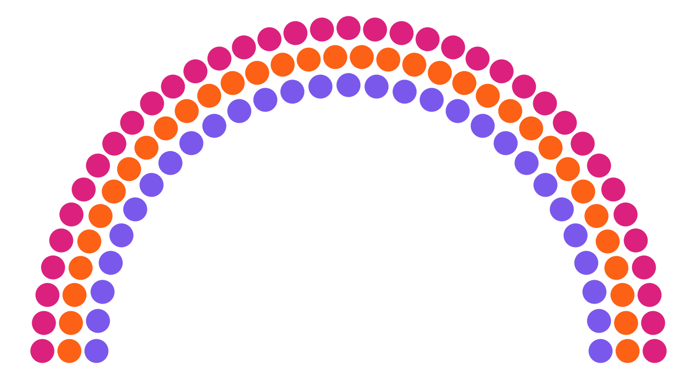
Having used the quadratic formula to solve my equation,
I now knew how many dots to place on each row. Here is the same flat line
colored by row (3 rows):

Notice that the number of dots increases for each row,
exactly as we had planned.
In order to plot these on arcs, we’ll perform some
trig. For that, we need the radius and the angle. We already have the radius
for each row, so we need to determine an angle (from 0 to 180°) for each dot. We
can do this by dividing 180 by the number of dots on the row. With that, we can
complete the trig to plot them on their arcs.
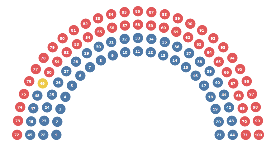
When we connect to some real data (in this case, the 116th
US Senate), we get this:

This has one fundamental flaw. Ideally, as in previous
examples, each party would be confined to one area. We’d start with say the
Democrats (blue) then fill in from the left, then add in the Independents (yellow),
then fill in the rest with Republicans (red). But the above starts from the
bottom up, rather than left to right.
The problem is that this is how the arcs are drawn—starting
with the first arc and drawing left-to-right, then moving to the next arc, etc.
as shown below.
My data set was organized with a seat # and ordered
the way I wanted to show them on the chart. So, in order to get them ordered
properly, I’d need to either manually number each seat to force the grouping or
find a new way to solve the math.
And that’s where I got stuck…
A Solution
This sat on the shelf for over a year, but after
completing another project, I recently decided to take another look. Once
again, I poured over the math, in an attempt to find away to reorder the
numbers. I realized that I could use an INDEX table calculation, computed by
the Angle in order to essentially renumber the dots in the desired manner.
Ideally, I’d be able to then place each seat # (from
the data) in the right location. To do that, I ended up performing a Cartesian join (or cross-join) of the data to itself. A Cartesian join essentially
matches each record in one table with each record in another. So, this gave me
each seat matched up with every other seat. I then wrote a calculated field to
throw out the records that are not needed (those which don’t match the chart
order shown above). This finally gave me the order I needed.

Unfortunately, this solution still had one flaw. In
order to populate the chart in the right order, the data needed to be sorted
and numbered sequentially according to that sort order (in the case above, the
party). While it’s probably not unreasonable to ask people to perform such data
prep prior to building one of these charts, I decided to take it one step
further and make it the sortable by any dimension. For instance, if your data
had gender in it, you might want to sort and color by gender instead of party.
To do this, I created another INDEX calculation to determine the proper
ordering of the data, then updated the calculation noted earlier which filters
out the unneeded record.
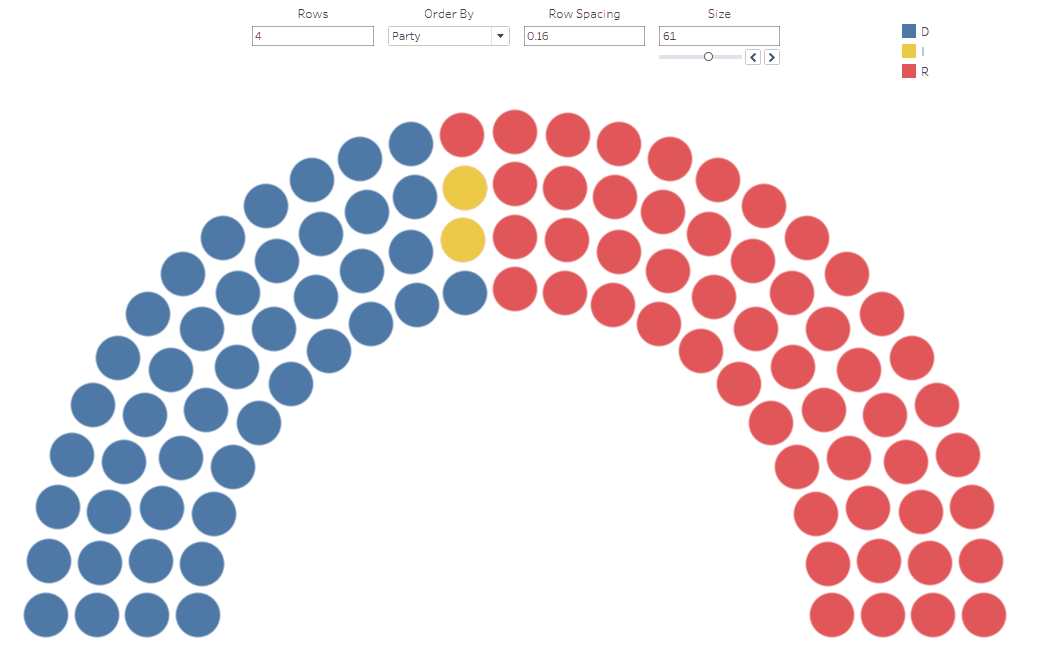
The Template
As promised, I’ve created a template for this chart. As
with all of my templates, it includes an Excel workbook and a Tableau workbook.
The Excel file looks like this:

Note: The template comes pre-populated with members of
the 116th US House of Representatives.
It contains the following fields:
Seat # – Unique
identifier for the seat. No specific order is required—just make sure you have
the ID and that it is sequential (don’t skip any numbers) and unique.
Party – Political party.
Member – Name of the
member.
Dimensions 01-10 – These are user-defined dimensions you can use for whatever you like. My
example above uses them for State, Gender, Race, Age, Religion, and
Orientation. These are built into the sorting/coloring capabilities of the Tableau
template, so be sure not to change the names in the Excel file (you can
change them in Tableau, if you like).
Once you’ve populated all of your data, download the
Tableau template, edit the data source and connect to your new data. In
Tableau, you have a few different options for tuning the look and feel of your
chart, using the following parameters:
Rows – Number of
rows/arcs.
Inner Radius – Radius of the
innermost arc. You can adjust this in order to push the inner arc outward or
inward.
Row Spacing – Spacing between
each row/arc. This is added to the inner radius to get the radius of each
subsequent row/arc. Adjust this in conjunction with the inner radius in order
to create the perfect spacing.
Size – Size of each
dot. Ranged from 1 to 100.
Order By – Dimension on
which you wish to order/color the chart. The parameter automatically includes
Party and Dimensions 1-10. By default, the values will be sorted in ascending
order. If you need to change the sort order, modify the sorting of the Order
Field pill on the detail card.
Note: Dimensions 1-10 are all on the detail card in
Tableau. This is to simplify the ordering/sorting if you choose to use one of
these dimensions. It’s best to just leave all of them on detail to avoid the
need to modify how the table calculations compute.
And that’s pretty much all you need to know. I will
tell you that, due to the need for a Cartesian join—which significantly
increases the number of records in the data set—and the table calculations—which
add a lot of complexity—the performance isn’t always great. For smaller data
sets, you won’t see many problems, but larger parliaments may take a few seconds
to compute the calculations.
Alternatives
As you’ve seen, this was incredibly difficult to
create. It’s certainly some of the most complex math I’ve applied to a chart.
Additionally, as noted above, the need for a Cartesian join and multiple table
calcs results in a chart that doesn’t perform quite as well as might be desired.
But, perhaps more importantly, this simply may not be the best chart type for
visualizing parliamentary makeup. The biggest problem with the chart is that
its curvature makes it somewhat more difficult to read than other chart types
(similarly to a pie chart). Thus, there are other alternatives that probably
work better. And, as a bonus, they are much easier to create! So, let me
provide a couple of those alternatives here.
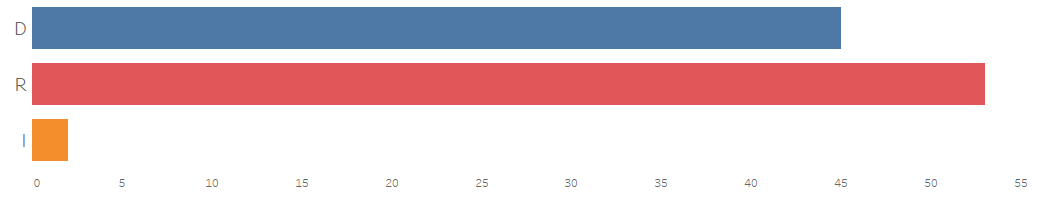
In some case, you may just want to show aggregate
totals, with no concern for individual members. In that case, a simple bar
chart would be more than sufficient.
If the part-to-whole relationship is really important,
then a stacked bar chart (or even a pie chart) might work.

I’d personally avoid this option for parliaments with
more than 2 or 3 parties, unless your goal is to show some huge party
juxtaposed with many other very small ones.
If you need to show individual members, then both of
these charts can easily be converted into unit charts, allowing you to hover
over each individual member for further details.


All this being said, I think there are times when a
parliament chart might make a lot of sense. For one, it is something we
generally recognize because of the shape—when I see one, I immediately assume
that I’m looking at a country’s parliament. Ultimately, I think the problems
with the chart are quite similar to the problems with pie charts, so following
some of the same guidance is advisable. For instance, they can be effective
when showing 2 or 3 parties (as with the US system), but there are much better
alternatives for countries with more parties, such as Brazil, whose Chamber of
Deputies currently has 25 different parties, resulting in a parliament chart,
which is very difficult to read.

A bar chart is clearly a better alternative here.

I’d just advise you to think very carefully before using this chart type. As always, closely consider your data, your goal, and your audience first.
I’d just advise you to think very carefully before using this chart type. As always, closely consider your data, your goal, and your audience first.
Ken Flerlage, January 27, 2020


Many thanks! I actually realized the utility of Parliament charts now :-)
ReplyDeleteI tried to create it in R and its actually possible to do it out of the box as I've described in this post
https://blog.mypad.in/creating-a-parliament-chart-in-r/
Many thanks too - for sharing this incredible fine tableau-art and all the work behind!
ReplyDeleteAn easier way to index is simply sort by angle, especially with less number and larger size of parties represented
ReplyDeleteHow can I draw the parliament chart on graph paper?
ReplyDeleteGood question! Probably going to need a protractor!
DeleteWhat is your email address so I can send you a message?
Deleteflerlagekr@gmail.com
DeleteThank you so much for that! I'm a beginner user of Tableau and I was able to input the data and get the correct results.
ReplyDeleteI wonder if there's a way to use 2 filters at once, if there is, could you point me on how to do it?
For example, when sorted by party, to sort by gender inside each party.
Could you email me? flerlagekr@gmail.com
DeleteThanks for your work, which helped me to solve it in excel as well, where this chart type is some kind of a x-y scatter chart or as I used to make , a waffle chart. Stefan
ReplyDeleteGreat! Yeah, it's scatterplot in Tableau as well.
DeleteHi Ken. Thanks for the awesome viz! I have a quick question. I tried to recreate this chart for the current itteration of the US House of Reps, where we currently have 4 vacant seats. When I plot it though, the viz only shows one dot for "Vacant", which I'm assuming beause Tableau treats 4 identical "Vacant" rows as a single entry. What would be the best workaround? Thank you again
ReplyDeleteI would think that should still work, as long as you have a row for each Vacant seat and they each have a unique Seat #. Is that the case? If so, could you email me your spreadsheet and your Tableau workbook so I can take a closer look? flerlagekr@gmail.com
Delete