
Traveling Salesman Art

The Traveling Salesman Problem is a classic
mathematical problem that asks the question, “Given a list of cities and the
distances between each pair of cities, what is the shortest possible route that
visits each city and returns to the origin city?" (https://en.wikipedia.org/wiki/Travelling_salesman_problem).
The problem dates back to at least the 19th century and continues to
be a challenge for mathematicians and computer scientists to this
day.
In February, 2009, Robert Bosch—the Robert and
Eleanor Biggs Professor of Natural Science at Oberlin College, who's
primary research is the use of optimization techniques to create
artwork—created a 100,000-city version of the traveling salesman problem which
replicates Leonardo da Vinci's Mona Lisa (http://www.math.uwaterloo.ca/tsp/data/ml/monalisa.html).
Since that time, researchers have worked to find the most optimal “tour” for the
Mona Lisa’s cities. Additionally, new artworks have emerged including a 140,000-city version of Botticelli’s The Birth of Venus and a 200,000
city rendering of Vermeer’s Girl with a Pearl Earring (http://www.math.uwaterloo.ca/tsp/data/art/).
Having just learned of this interesting challenge and
seeing the results drawn as static images, I couldn’t resist downloading the
data for some of the best known solutions and visualizing them in Tableau.
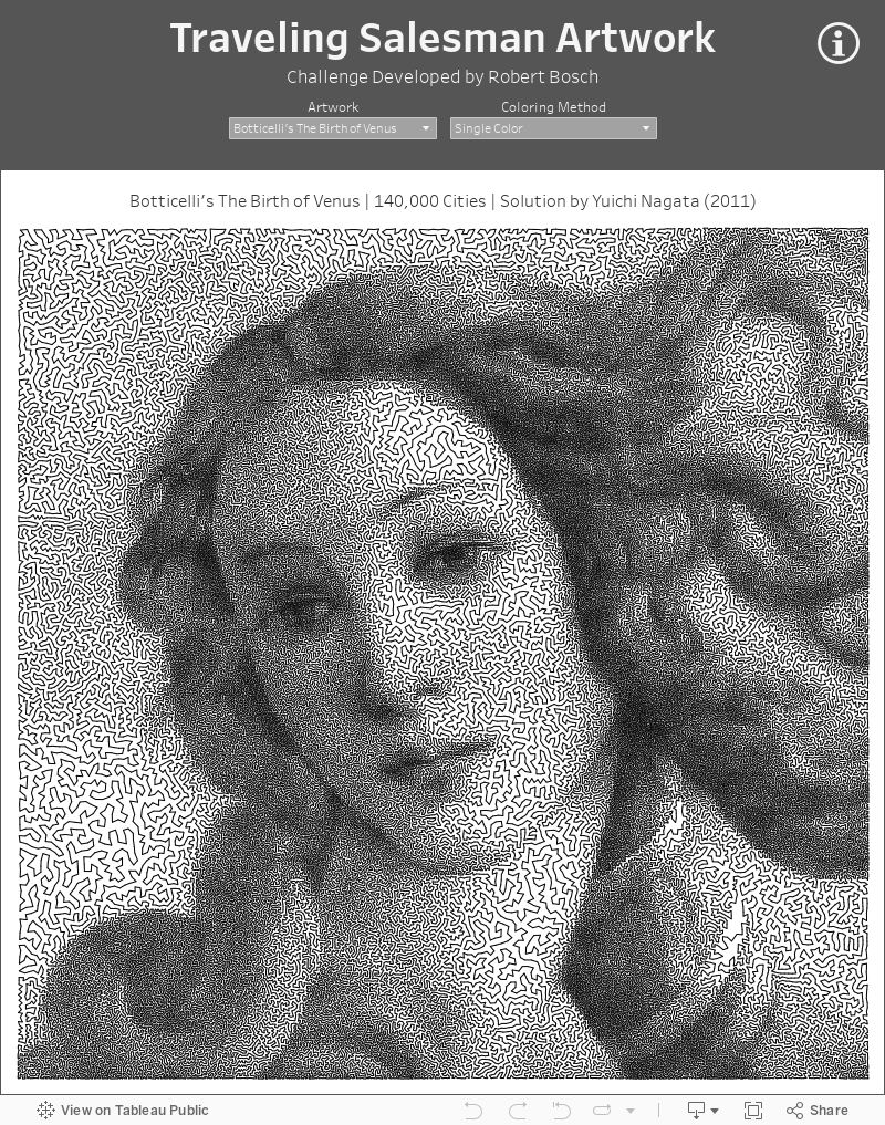
The visualization allows you to choose from six famous works of art. By hovering over the art, you can see each individual
point and its location within the overall path. In addition, you can choose how
to color the lines:
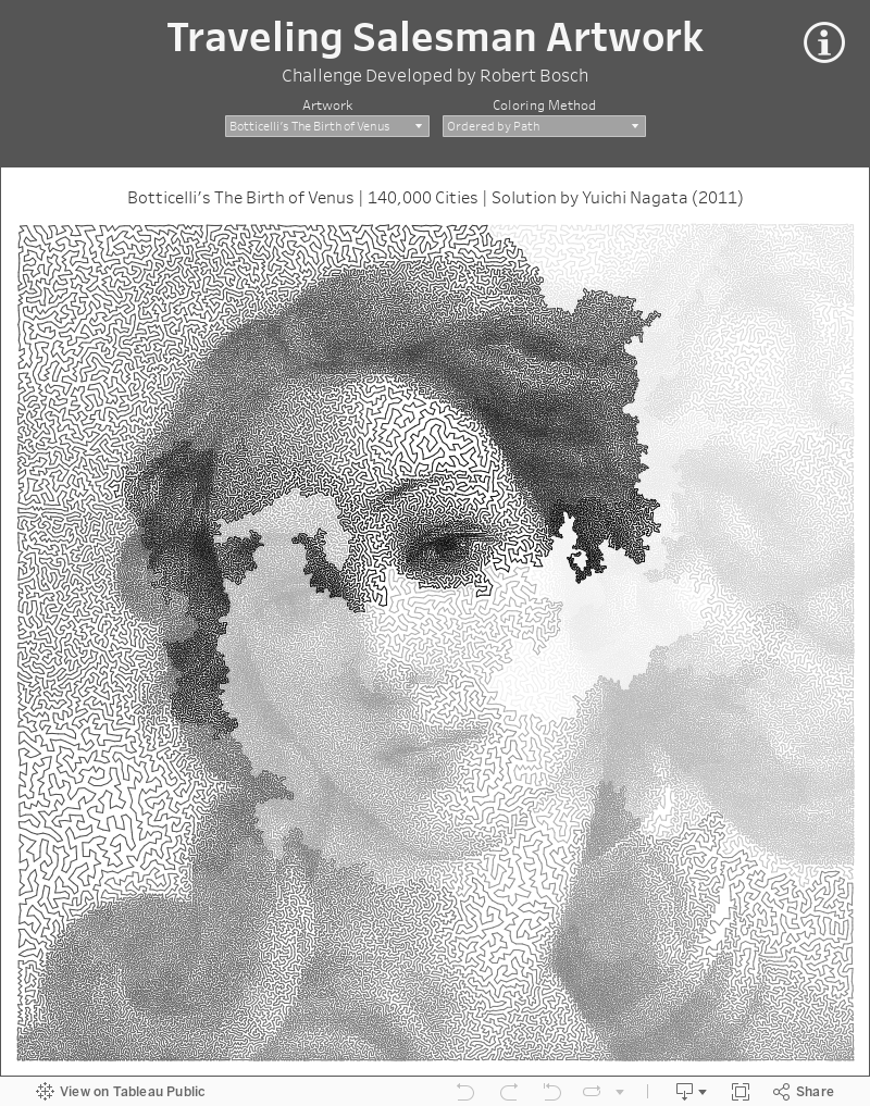
Single Color - Colors the entire tour using a single color (shown above)
Ordered by Path - Colored by the
path in which the "cities" (points) are connected, from light to
dark.
Ordered by Point - Colored by the city numbers, from light to dark.
For example, here’s The Birth of Venus colored
by path.
And, as an added bonus, I've created an animation showing the connection of points, this time using the Mona Lisa.

Hope you enjoy these! And please take some time to
read through the articles I’ve linked to above. The challenge is fascinating,
as is the work of Robert Bosch and his colleagues. Thanks for reading!
Ken Flerlage, March 4, 2020


Hi,
ReplyDeleteHow order column was created?
I opened the data in Excel then just added a sequential number column.
DeleteHow was this animation developed?
ReplyDeleteI grouped the line segments into groups of a few thousand, the used pages to animate. I captured all of that with a screen recording tool called ScreenToGif.
Delete