
Packed Bubble & Pie Art in Tableau

In the past, I’ve created
a number of artistic techniques in Tableau, including Loom Art and Geometric Art. But, for a long time, I’ve wanted to be able to create two additional
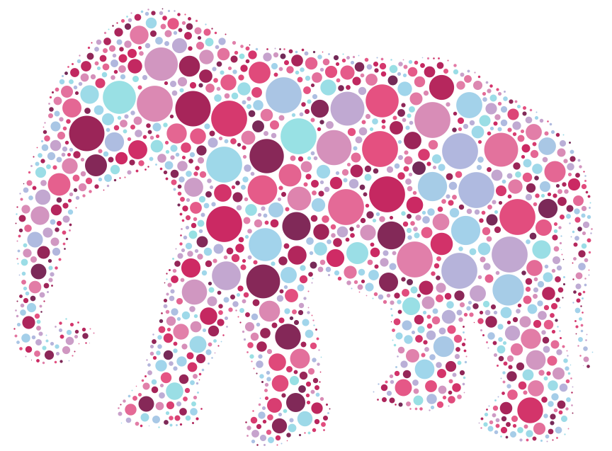
types of art. The first is what I’d call “packed bubble art”. For example, the
following image is taken from a discussion on circle packing on Stack Exchange:
I was beginning to
explore creating my own circle packing algorithm in Python when I discovered
the Online Shape Packer by Arjan Westerdiep.
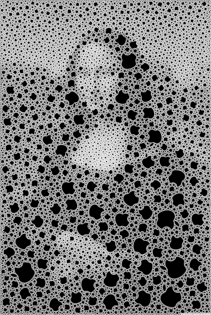
The tool allows you to upload an image and choose (or upload) an SVG shape to
use for the packing, then creates a shape-packed image. For example, here is
the Mona Lisa packed using Apple logos.
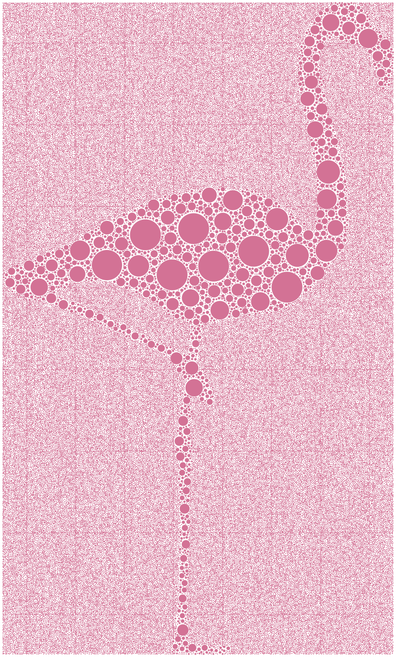
I wanted to create
something more like the elephant above, so I took the following royalty-free
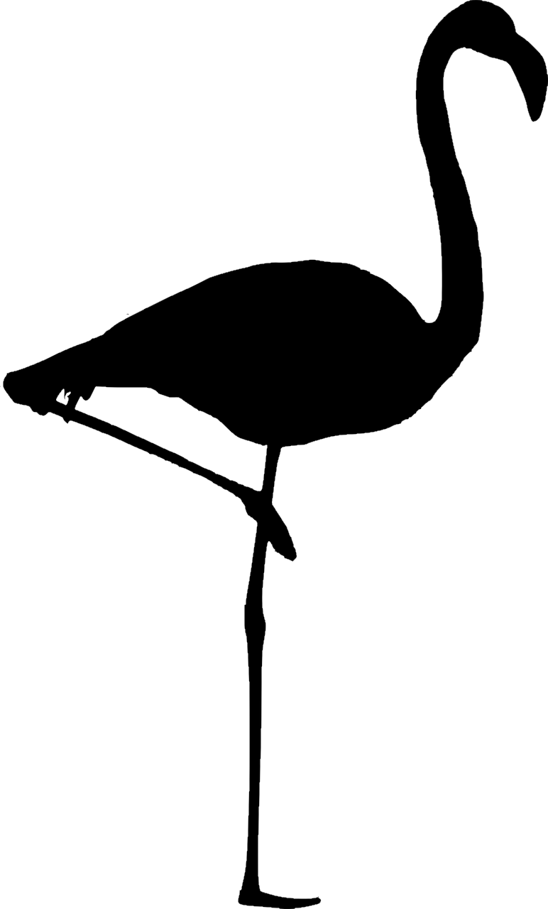
image of a flamingo and uploaded it to the tool:
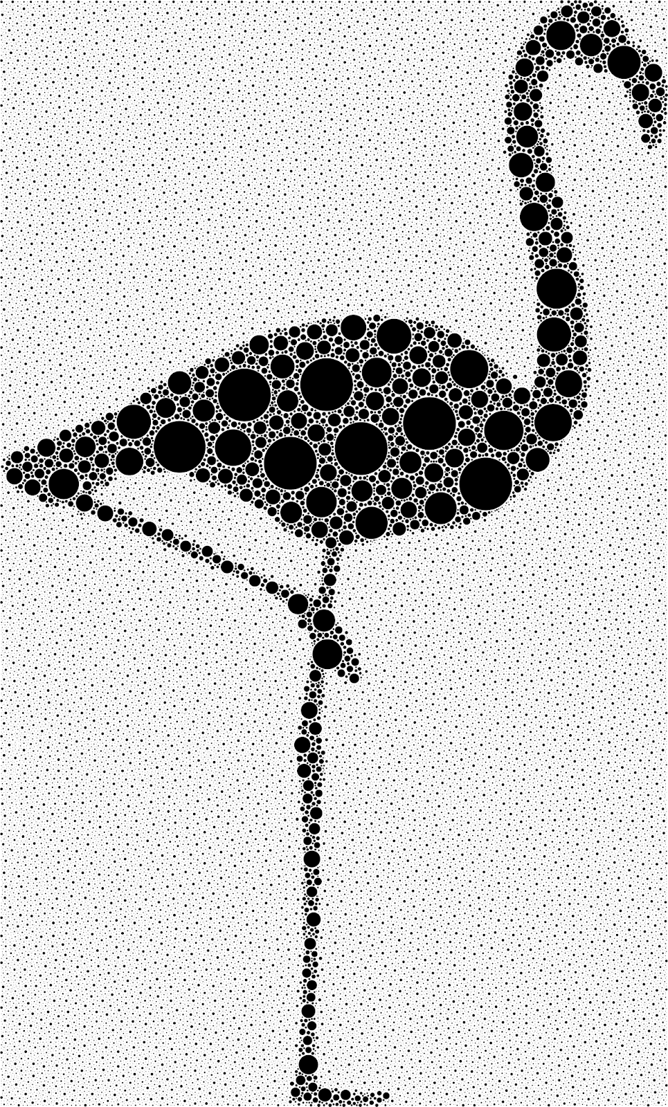
I wanted to pack my image
with simple bubbles/circles, so I just chose the circle image for packing. The
result was beautiful:
But how to get this into
Tableau? Fortunately, the tool allows you to export your image as an SVG. As I’ve discussed before, SVG files are basically XML-based files which define an
image. An SVG file defines a variety of shapes that are used to build an
image—basic shapes, lines, polygons, etc.—as well as coloring, shading, and a
lots of other components of images. Because they are XML, SVG files are text-based
and, for the most part, readable by humans. So, I should be able to read one of
these SVG images, parse out the coordinates then create them using a scatterplot
in Tableau.
To do this, I modified
some Python code I’ve used previously to parse SVGs and write the coordinates
to a file (more on this shortly). I was then able to create the following in Tableau:
But, I only wanted the
circles packed inside of the image—not the background. Fortunately, these
bubbles are all very small so removing these simply required me to filter out
very small bubbles, resulting in:
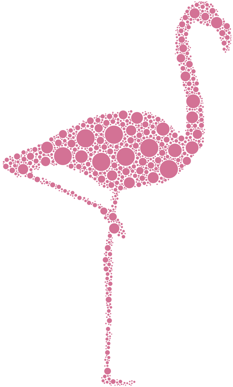
Then, so that it was more
like the elephant, I used Tableau’s undocumented RANDOM(). I dropped it on the color
card, then assigned a discrete color palette.

I then wondered how it
would look if we changed the circles to pie charts. To do this, I joined the data
to another data set that had four records—A, B, C, and D—then changed the mark
type to Pie and dropped another RANDOM() pill on the Angle card to create a flamingo
packed with pie charts.

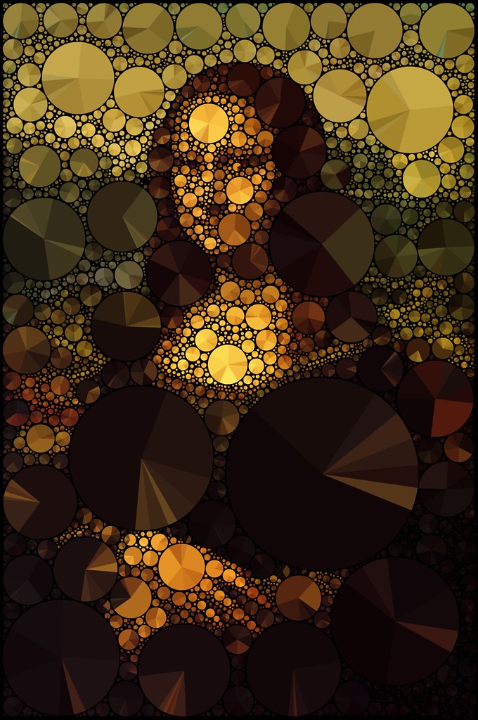
I was pretty happy with
this, but the pie charts gave me another idea. I had long admired the work of Mario Klingemann, who has recreated famous
works of art using pie charts. For example, here’s his rendering of the Mona
Lisa:
Having
created a pie-packed flamingo, I wondered if I could take this one step further
to create pie-packed works of art. I went back to my Python code and made some
adjustments:
1) As it reads the position of each circle, look
at the original image and get the color of the pixel in that position.
2) Randomly adjust that color to create slightly
different colors for each pie slice.
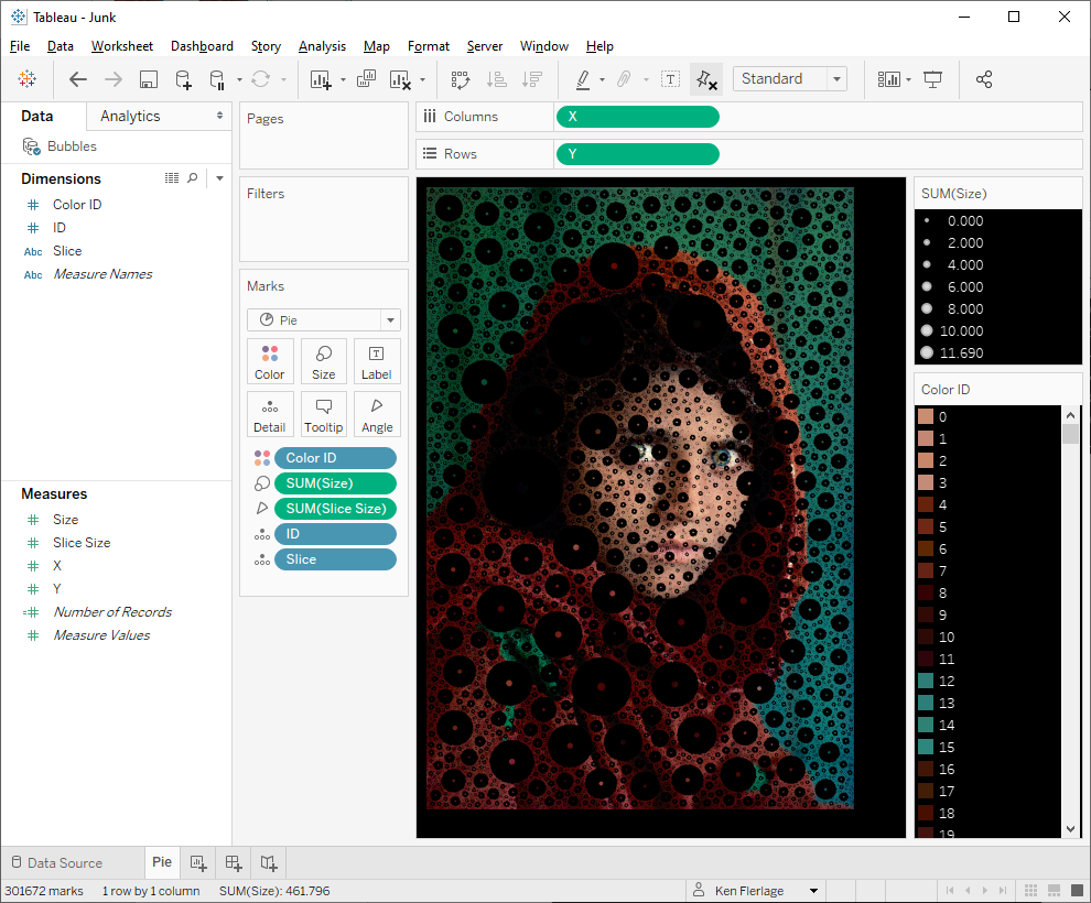
With
that code working, I was able to create The Girl with a Pearl Earring using
84,000+ pie charts.

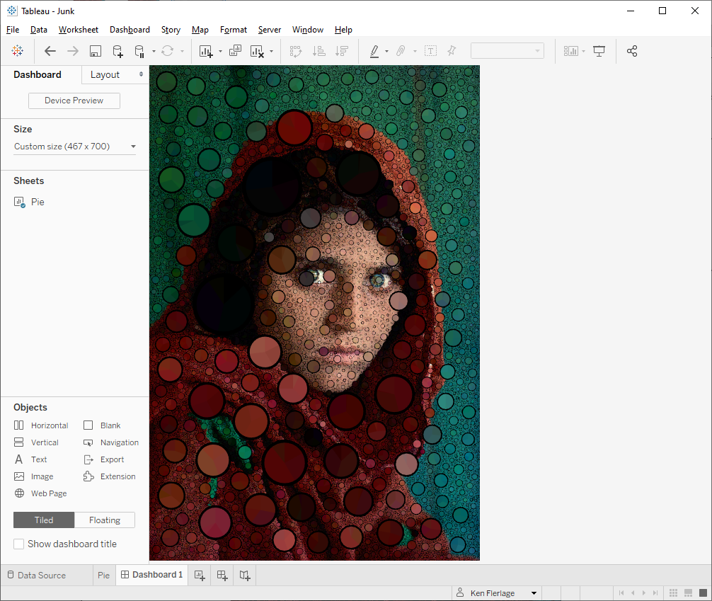
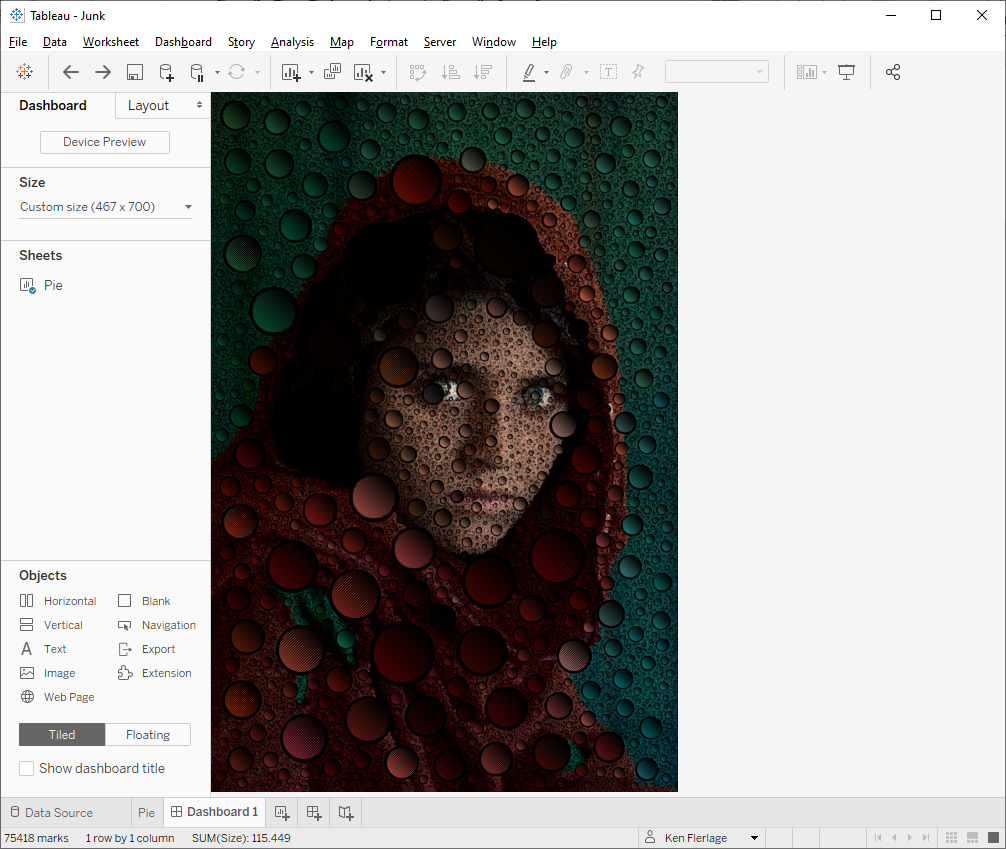
I had so much fun with
this that I couldn’t help but recreate one of my favorite photographs, Afghan
Girl by Steve McCurry. Below I’m showing the original image transitioning into
the pie chart version.

How To
OK, so here’s how you can
create your own bubble or pie art in Tableau. First, let’s get the Python code
and/or executable package needed. If you’re familiar with Python, you can
download the Python Code from Github. If not, you
can download the executable package, Pie Art.zip. Extract all the files to your computer, then run Pie Art.exe.
Sorry Mac users, but I think this will only work for Windows, but if you really
want to try this, I’m happy to help you get Python set up on your machine.
Now follow these steps:
1) Upload an image to
the Online Shape Packer and select the plain filled circle SVG shape. You can fiddle with
the Maximum Shape Size if desired, but leave all other settings as the
defaults.
2) Let the shape
packer run until the image starts to take shape (OK, that was a bad pun but I
couldn’t resist). The more shapes you include, the more detailed the image will
be, but it will also be more complicated in Tableau.
3) Once the image
looks good, click the Save SVG button.
4) Run the Pie Art Python
program. The program will prompt you for an SVG. Select the SVG from step 3. It
will then prompt for an image. Select the original image used to generate the
SVG.
5) The program will
then do its thing. Depending on the number of shapes, it could take a few
minutes to complete. Once done, you’ll get a message indicating so and telling
you the location of the 2 output files—Colors.csv and Bubbles.csv.
6) Colors.csv looks
something like this:

Copy the Hex Color
column and create a new custom Tableau color palette.If you’re not familiar
with creating a custom color palette, read this.
7) Bubbles.csv looks this:

The file has 7 columns:
ID – Unique ID for the bubble/pie.
X – X coordinate for the center of the bubble/pie.
Y – Y coordinate for the center of the bubble/pie.
Size – Area of the bubble. The SVG file
contains the radius, but the Python code converts this to area since Tableau
sizes shapes based on area.
Slice – Slice identifier. By default, the
Python program creates four slices—A, B, C, and D. If desired, you can change
the number of slices by changing the value of sliceCount in the Python
code.
Color ID – In order to avoid creating a huge
color palette, the Python code assigns an ID to each unique color used. We’ll
use this to assign the color palette we created earlier.
Slice Size – Randomly chosen size
for each slice.
8) Connect to the
Bubbles.csv file in Tableau. For performance reasons, go ahead and create an
extract.
9) Click over to a
new sheet. Also for performance reasons, pause Auto Updates. Drag X to
the Columns shelf and Y to the Rows shelf. Change both to dimensions.
10) Fix both the X
and Y axes so that they start at 0 and match the width/height of the original
image. Also, reverse the Y axis.
11) Turn off all lines
and set the background to a default color. I typically use black but you can
experiment with different colors.
12) Drag ID
and Slice to the detail card; Drag Size to the size card; Change
the mark type to Pie; Drag Slice Size to the angle card. You should now
have something like this:
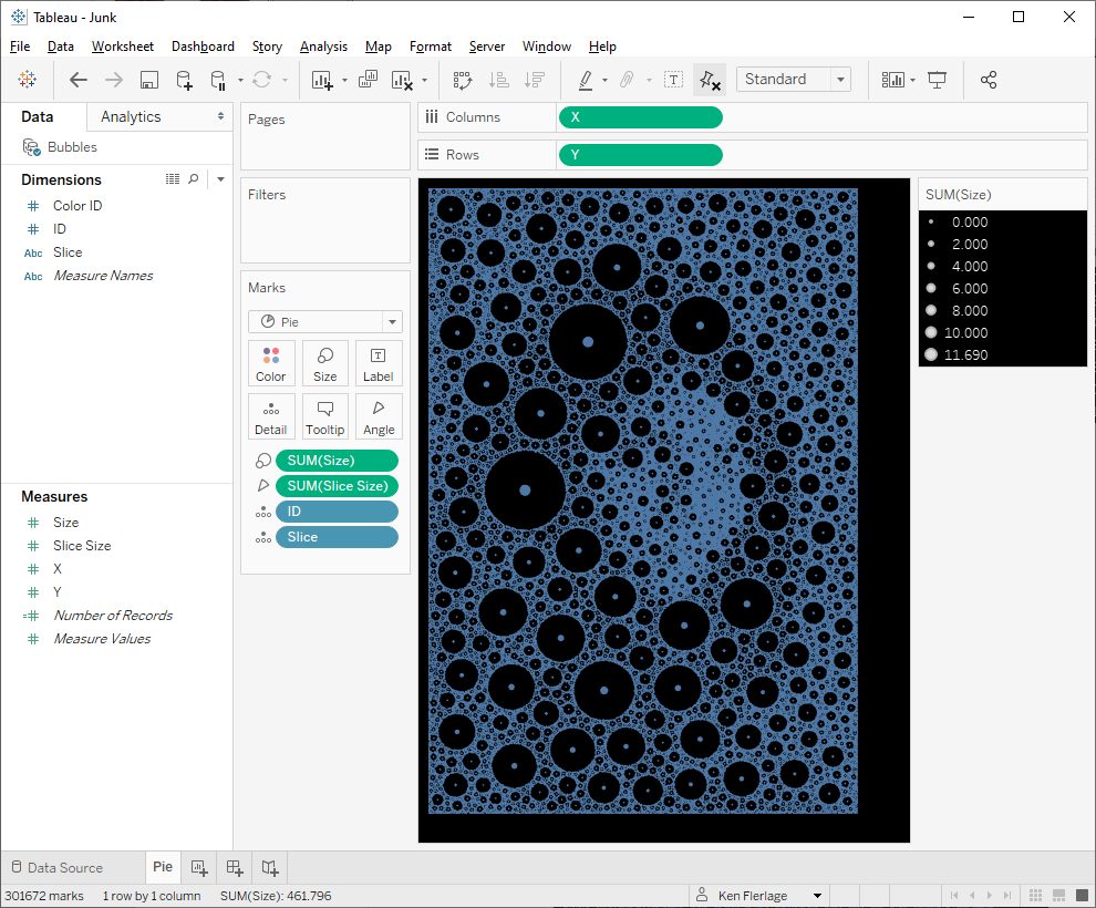
13) Drag Color ID
to the color card, then click on the color card, choose the palette created earlier
and click Assign Palette. This will assign the colors in the proper
order.
14) Create a new
dashboard. Set the dimensions to equal the dimensions of the original image (or
just ensure you maintain the correct aspect ratio). Remove the color legend and
float the size legend.
15) Edit the size
legend so that the pies fill the space. I personally like to leave a bit of
black around each pie as it adds a nice effect.
And that’s all there is to it!!
Note: If you want to just create packed bubbles, instead of a
pie chart, follow these same steps, then just filter on Slice, keeping
only “A”. Then, if desired, you can even use custom shapes. For example:
And, of course, if you’d like to create a more mono-chrome
image like the flamingo, you can choose a single color or use the random color
technique I discussed earlier.
Hope you enjoyed reading this post. If you create any bubble
or pie art using this technique, please let me know.
Ken Flerlage, April 6, 2020


Amazing. Thank you so much for the posting it!
ReplyDeleteOne Question- How do I blend Bubbles.csv to my own data? do I need to add a new column for that?
Thanks again,
Yaron
The Bubbles.csv file will be generated based on the image you provide. What other kind of data are you trying to add to it?
DeleteI am hoping to take a car picture and use the bubbles to plot information about car accidents
DeleteThis is just for artistic purposes at the moment--it cannot be used to encode real data, unfortunately, though that's something I'm considering doing at some point
DeleteHi Yaron, in order to tie your data to the bubbles you have to map your data to the X and Y coordinates in the data. Here is an example I build recently with this post as my inspiration. I did a picture of a vaccine bottle and tied my data to certain bubbles showing the correlation between covid 19 vaccine acceptance and socio-demographic factors in the US! https://tabsoft.co/3xyXfwq
DeleteWell, it was still a lot of fun :-) Thanks again!
ReplyDeleteRan Pie Art.exe but the Colors.csv and Bubbles.csv are empty :(
ReplyDelete(SVG file is ok with the correct image (53127kb), so ist the original picture, what else could've gone wrong?)
Hmmm. Not sure. Could you email me the SVG and the original image? flerlagekr@gmail.com
DeleteSame problem from my end .Output files after the pie art python program ran are looking empty.
ReplyDeletePlease send me an email with the original image and the generated SVG.
DeleteI am facing same problem too.
DeleteI'd have to see the files. Can you email them to me? flerlagekr@gmail.com
DeleteHi Ken,
ReplyDeleteGreat tutorial, thank you :)
What settings did you use on the online shape packer tool? I'm using a PNG black shape (white background), but the circles in the white space are sometimes bigger than those in the black
You need to use the plain filled circle SVG shape that is already available on the shape packing tool.
DeleteMy windows firewall won't run the package. My antivirus hates it too. :(
ReplyDeleteDo you have another computer you can use?
DeleteI got it to work! I had to adjust some firewall settings, but I took a screen shot and now its my profile pic. Thank you so much for this tutorial! This was fun!
DeleteGreat!!
DeleteHello Ken, where and how should we enter the path of the svg ?
ReplyDeleteWhen you run the Python program, it will prompt you to select the svg file.
DeleteLove the flamingo! :-) I would love to be able to fit circles to a map; but I need to be able to control the size and colour of the circles individually (they refer to the size of something).
ReplyDeleteThat's really tricky to do!!
DeleteGreat tutorials, thank so much!! I had a lot of fun on geometric arts and loom arts in Tableau following your other two blogs but no luck with this one. The online shape packer is not working well at my end. The "Save Svg" button is not responding at all. Guess I will have to try another time.
ReplyDeleteFeeling thankful for being in this excellent community and hats off to you and all many other experts.
Strange. Maybe try another browser?
DeleteThese graphics are great ! I tried to replicate with my data, I don't need to overlay an image, I just need non hierarchical bubble chart with 2 data series filling the bubbles. However I cannot get there. Using a data structure like in bubbles.csv , with no X-Y coordinates, when I use a mark=pie I get a single pie, when I change to mark=circle I get all the circles with the same colour, but no pies. How can I solve this issue ? any help is greatly appreciated.
ReplyDeleteI'd need to see a workbook. Could you contact me via email? flerlagekr@gmail.com
Delete