
Dynamically Change Your Drop-Down Menus Based on a Selection

My colleague Jennifer Dawes, who just made a permanent transition from our HR department to Analytics (yay!), recently shared a public visualization focused on Gallup’s Strengths Finder. If you are not familiar with Strengths Finder, it is an incredible way to determine the top strengths of your team members, which allows all of us to better understand how others on our team think, feel, and behave. It’s an incredible tool and you can learn more by visiting their website.
Jennifer developed this visualization for work then anonymized it to share publicly. In the actual visualization, it included about 100 people and showed the top five strengths of each person – 500 strengths total. Each strength was plotted as a circle by the type of strength as well as the ranking of that strength (top strength would be one, second strength would be two, etc.). When you hover over a circle, it highlights the five total strengths for that person (five circles).
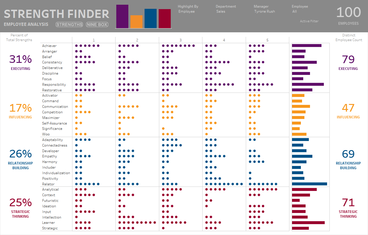
The intention of this tool was to allow managers and
leaders as well as individuals to gain a better understanding of how their team
members and colleagues “think, feel and behave”. Jennifer decided to add some drop-down menus
to allow users to dig into the details.
She set up a parameter to allow users to highlight sections based on
Department, Manager, or by Individual Employee.
She then set up three additional parameters, one for each option. The user would select the type of highlight
in the first parameter then choose a value from the associated parameter. To make it clear to the user, she noted which
parameter menu was “active”. Below is a
GIF of what this looked like:
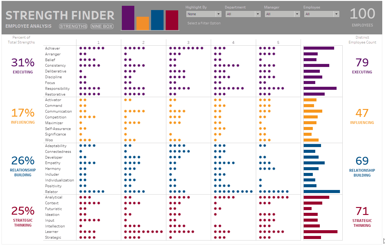
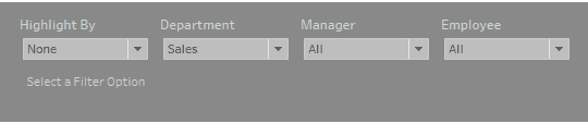
This may be a bit small, so here is a version zoomed into the parameters:
After a bit of user testing, we learned that this was quite confusing. She was showing these three parameters at all times, but only one of them was actually active. It just wasn’t intuitive. This isn’t a jab at Jennifer in any way, we originally worked together to build this solution.
In a meeting between Jennifer and me, she brought up
this issue and we worked toward a solution.
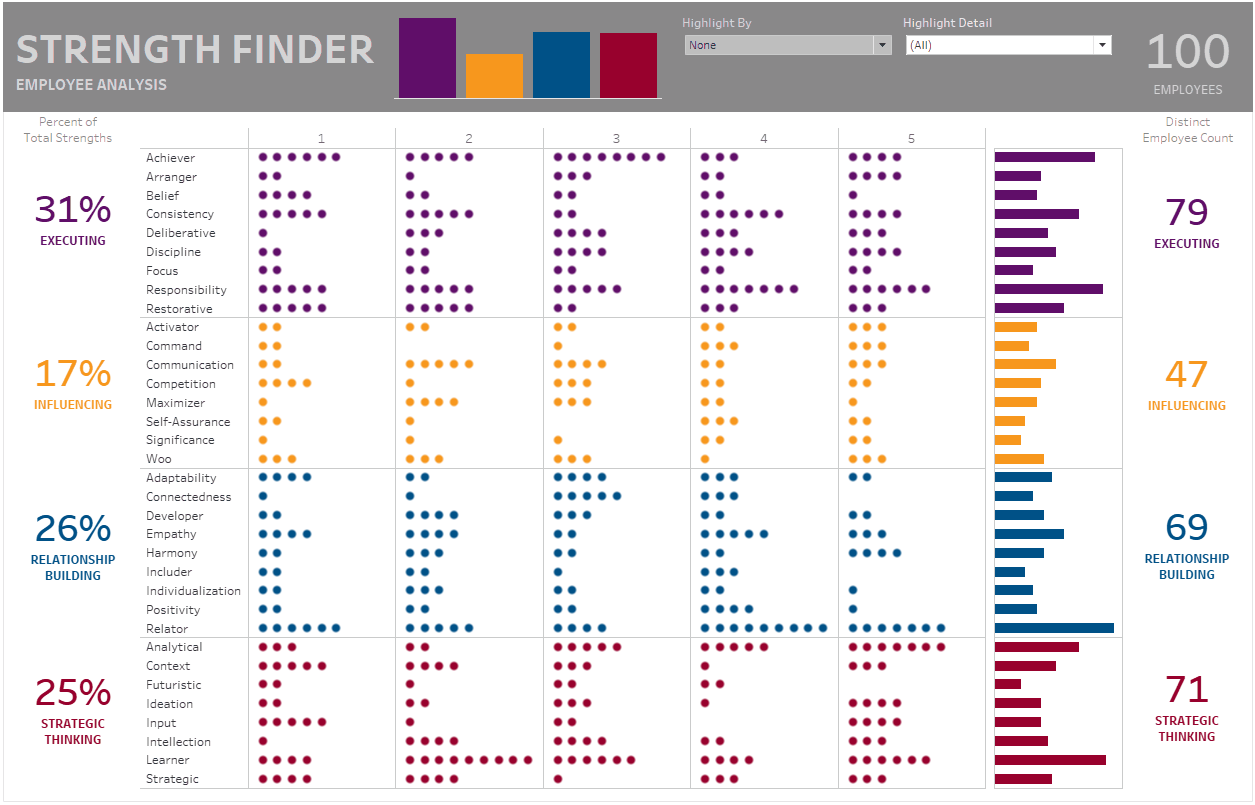
We ultimately landed on a technique that would provide the first
parameter to select how to
highlight then a second drop-down to allow users to highlight by values specific to the first drop-down
menu. This parameter changed
dynamically based on the first. This
means we eliminated the confusion of three additional drop-downs when only one
was active and in addition, we cleaned up the view, trimming the number of
drop-downs from four down to two. Check
out how it now works:
Again, this is a bit small, so here is a zoomed in version:

Okay, so how do we build this? It’s actually quite simple and will utilize
some of the new functionality released by Tableau in 2020. To demonstrate this, I’ll be using data from gapminder.org looking at
birth rate versus life expectancy. But,
rather than reinvent the wheel, I borrowed the work of someone else. I want to give a big shout out to fellow
Tableau Zen Master, Marc Reid who allowed me to use the base of his Gapminder viz that he used to
demonstrate animations in Tableau. If
you haven’t seen this viz, it’s incredible and I recommend you check it out
here: How has the world changed since 1962? (based on the work of the great Hans Rosling). Thank you,
Marc, for allowing me to utilize your viz.
Okay, let’s check out the data and then look at how
the drop-down menus work. First, please
go to my Tableau Public viz. We will focus on the sheet
based on highlighting, not filtering. Feel
free to play with the controls before to gain a better understanding of the user
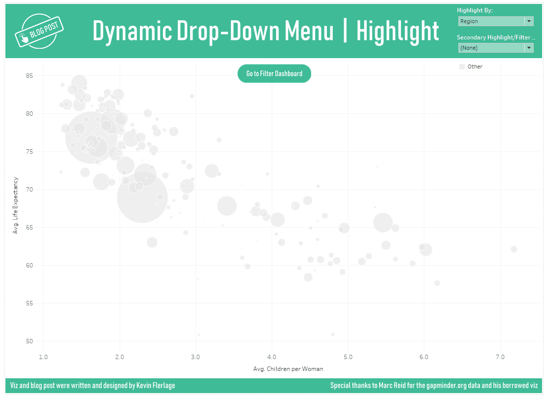
interface. As you can see, we are
looking at birth rate (namely average number of children per woman) versus
average life expectancy. Each country is
shown in the scatter plot as a circle and sized based on population. The color represents region. In my viz, however, only the South Asia
region is highlighted and all others are gray.

In this viz, we want to give the user the ability highlight by Region, Country, Life Expectancy Range, Children per Woman Range, and Population Range. We could use five parameters (remember, they are single select) or we could use the five set controls to do this. However, this could get quite confusing as one may interfere with another. For example, let’s say you first highlighted the East Asia region then tried to highlight the United States. We could control this using relevant values for set controls (available in 2020.3 – see #2 in my New Features blog post for more information) or we could force the user to go back and clear out previous selections. But in general, it would be nice to not have to do either of those. So let’s solve for that problem.
First, let’s create a high-level parameter. It should be a string, list parameter – let’s
call it “Highlight By”. In the
parameter, I included values for Region, Country, Life Expectancy Range,
Children per Woman Range, and Population Range.
We then add this to our view.

Now we need to build the secondary, dynamic drop-down
to allow us to highlight by specific values within that list of values (for example,
the South Asia region or the country of Canada). To do this, let’s create a calculation to
toggle the list of values:
Secondary Highlight/Filter Calculation
CASE [Highlight By:]
WHEN 'Region' THEN [Country Group]
WHEN 'Country' THEN [Country]
WHEN 'Life Expectancy Range' THEN [Life Expectancy Ranges]
WHEN 'Children per Woman Range' THEN [Children per Women Ranges]
WHEN 'Population Range' THEN [Population Ranges]
END
This calculation is pretty simple; it just says that
when that particular value is selected in the parameter, use the corresponding
dimension. (Please note that for the
three “range” dimensions, I manually created ranges – like bins – to group
them). Now if we added this calculation
to a table, the values would change as we toggle the parameter:

Okay, now we need to allow the user to pick any of
these different values to highlight on.
To do this, we are going to use Set Control. For a quick overview on Set Control, check
out #2 of my this blog post (note that this
blog post focuses on relevant values within set controls, but provides a quick
overview of set controls themselves). So
let’s create a set on this new calculation.
Right-click on the “Secondary Highlight/Filter Calculation” pill and
choose Create à Set. Name the set “Secondary
Highlight/Filter Set” and for now, don’t add any values to the set (we will do
that later).
Okay, we are almost to the finish line. As you know, we want the user to be able to
use the parameter then this set control to highlight different portions of the
viz. As we mentioned before, we are
highlighting…or changing color based on the region. Therefore, if we choose populations of over 1
billion, each country with a population over 1 billion will be shown in the color associated with its region. So let’s create a calculation to place on
color to only show the color when the value is in the set:
Color
ELSE 'Other'
END
So if the value is in the set, then highlight it based
on the region. We will then place that
onto the Color card. Click the Color
card and set the “Other” value to a very light gray. You can leave the other colors as is.
From here, we simply need a method to add values to
the set. As mentioned, we will use set
control. In the Side Bar pane, find the
“Secondary Highlight/Filter Set” pill and add it to the Detail card. Right-click
on it and choose “Show Set”. We can test
it here, but let’s first bring everything onto a dashboard. Add the “Dynamic Drop-Down – Highlight”
sheet, show the “Highlight By” parameter and show the “Secondary Highlight/Filter
Set”.
Okay, let’s give it a test run. Look at the Set Control values and check a
few to highlight the marks in the viz.
Now change the parameter to another value. See how the set values have
changed to correspond with the parameter selection? You should have also noticed that the
highlighting disappeared when you changed the parameter value…this is because
those originally selected values don’t exist in the updated set. Below is a GIF showing the functionality and
simple user interface.
Success! We now
have just two-drop down menus instead of five and the experience is much
cleaner for the end user. However, what
if we want to filter the view instead of just highlight? Well, as you probably guess by my car salesman
pitch, “I’ve got just the thing for you!”
Converting this over to a filter instead of highlight is
very simple. Just create a calculation
called “Filter by Set” and make it equal to the set itself. This will result in a True | False; either it’s
in the set (TRUE) or its not (FALSE).
Now place that calculation on the filter shelf and set it to TRUE only. Now when you choose items from the dynamic
set, it will show them and filter everything else out. You can check
this out on the filter version of my corresponding example viz.
Well, that’s all I have for you. Thanks so much for reading and if you ever
have any questions or comments, please feel free to reach out at any time.
Kevin Flerlage, October 5, 2020
Twitter | LinkedIn | Tableau Public


very well written article and useful trick(we use tableau 19.3 now but later we move to this version )
ReplyDeletethanks
Pouya