
How to Build Lovely Histograms in Tableau

At Tableau Conference 2022, Kevin and I did a presentation called How to do Cool Stuff in Tableau.
Note: This was an in-person only session so it’s not available to be viewed, but since we’ve had a lot of requests, we’ll look for an opportunity to do it again as part of a virtual event sometime this year.
At the beginning of the presentation, we suggested that you not take notes because pretty much everything we were showing was available on our blog…but that wasn’t entirely true. I did a section called “Cool Stuff with Histograms” and, while some of the tips used are on the blog, much of them were not. So, in this blog, I’m going to walk you through this histogram build, in detail. Hopefully, you learn a thing or two you can apply to your own histograms in the future.
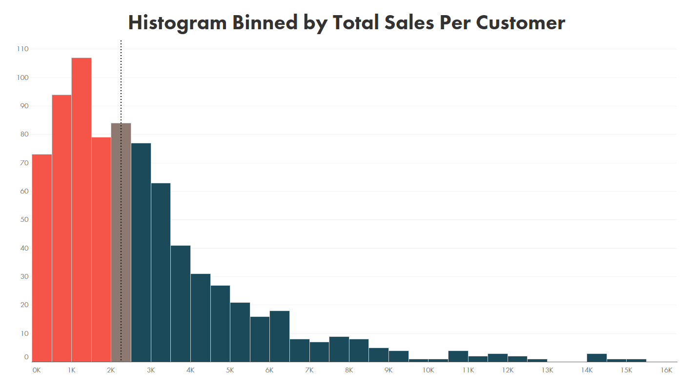
Target Histogram
We’re going to build the following histogram.

The histogram has three key aspects. First, it’s binned by total sales per customer. So we’ll have to first aggregate the sales for each customer, then bin those totals, then count the number of unique customers which fall into to those bins.

Next, we’ll add a reference line for the median, so that we can clearly see that center point.

Then we’ll color the bars based on their relationship to the median.

That seems simple, right? Not so fast…along the way, we’re going to run into a number of obstacles, so we’ll work to address those as we go. Additionally, I’m going to share some other tips and tricks which will help make this a really lovely histogram.
Building the Histogram
So where do you typically start when you want to build a histogram? You may go to Show-Me and let it do the work for you, but that’s cheating! I generally start by creating my bins field. So let’s try that. We’ll create bins on the Sales field.

Notice that I’ve used a parameter called Bin Size to define the bin size. I like to use a parameter because, if desired, I can make that available to my end users so that they can adjust the bin size as needed to aid in their analysis.
We now drag our bins field to the columns shelf and COUNTD(Customer ID) to the rows shelf.

We now have a histogram but it’s not quite what we wanted. This histogram is binned on the sales for each individual row of our data. So we’re counting the number of customers with at least one row of sales falling into each bin. That’s problematic both because it’s not the total sales we were shooting for and because it will count customers multiple times. What we need is to first aggregate the sales by customer, then bin based on that aggregate. So let’s try that. We’ll start by creating a calculation to sum the sales.
01. Sum of Sales
// Sum of sales.
SUM([Sales])
Now let’s try to bin it. Go ahead and give it a try…
Uh oh, it’s not allowing us to create bins on this field…why? The reason is that you can’t create bins on an aggregate field in Tableau. So what now? Here’s where we can use one of my favorite LOD calculation tricks. As explained in # 11 on my blog, 20 Uses for Tableau Level of Detail Calculations (LODs), FIXED LOD calculations allow you to aggregate data, but the end result of the calculation always acts as a non-aggregate. Because the result is a non-aggregate, we can create bins on them. So, let’s start by creating an LOD to give us the total sales by customer.
02. Sum of Sales
// Sum of sales by customer.
// LOD allows us to use this as a non-aggregate.
{FIXED [Customer ID]: SUM([Sales])}
Now, because this is a non-aggregate, we can create bins on it.

Now let’s use this new bins field on our view.

That’s much better! We now have bins defined by total customer sales and we can see the distribution we’re expecting.
With that resolved, it should be all smooth sailing from here, right? 😉
OK, let’s add our median reference line. We’re not actually looking for the overall median here, but rather the median of total customer sales, let’s use another LOD to get this value:
06. Median Sales
// Median sales per customer.
{FIXED : MEDIAN([02. Sum of Sales LOD])}
We’ll drag this to the detail card (so that it’s available for use), then we’ll right-click the axis to create the reference line:

Argh!! We don’t have the option to add the reference line. Why? Unfortunately, this is one of the limitations of built-in Tableau bins. So…maybe we can find another approach? Time to introduce a “Bring Your Own Bins” technique developed by Joe Mako, which I first learned about from Jonathan Drummey’s blog. This technique entails the use of a relatively simple calculated field instead of built-in bins. The calc looks like this:
INT([Value]/[Bin Size])*[Bin Size]-IIF([Value]<0,[Bin Size],0)
We just need to plug in our measure (Value) and our bin size.
03. Sum of Sales LOD Bin
// Bin the sum of sales.
// Technique by Joe Mako by way of Jonathan Drummey.
// See http://drawingwithnumbers.artisart.org/wiki/tableau/bins/
INT([02. Sum of Sales LOD]/[Bin Size])*[Bin Size]-IIF([02. Sum of Sales LOD]<0,[Bin Size],0)
Now, for the final time, let’s use this bins field instead of the previous one. Note: If your view is set to use an automatic mark type, it’ll choose a line instead of a bar. If this happens, just change the mark type to bar.

Now, as you can see, we have the ability to add the reference line!! Let’s go ahead and add the line.


Success!!
Before we go any further, we should acknowledge the problem with the bar sizes. When I build histograms, I like the bars to be tightly packed together, with nothing but a thin border separating them. We had that until we switched to the BYOB technique so let’s see if we can get back to that.
We’ll start by fiddling with the size. If we increase the size, we can get close.

But this isn’t a great option because the sizing is not dynamic. Notice what happens if the chart dimensions change.

The bar sizes do not change and we end up with this weird overlap. If we were to increase the chart dimensions, then we’d end up with larger spacing between the bars. I suppose we’ll just have to live with it…
Joking, of course! Here’s how we can make sure we have tightly packed bars that adjust dynamically. First click the size card and select the “Fixed” size option (instead of “Manual”). Next, drag the Bin Size parameter to the size card.

Yay! That’s much better!
Next, let’s add some color. As detailed previously, we want to color the bars based on whether or not they are equal to the median, above the median, or below the median. We can write a calculated field to do this, but we need to be careful. We don’t want to compare to the overall median as that lies somewhere along the range of the median bin—comparing the bin values to the raw median will never result in a match. Instead, we need to compare to the value of the median bin itself. We can create another LOD for this:
07. Median Sales Bin
// Median binned sales per customer.
{FIXED : MEDIAN([03. Sum of Sales LOD Bin])}
Now we can create a calculated field to compare the values of each bin to the median bin.
08. Color
// Color based on whether value is more or less than the median.
IF [03. Sum of Sales LOD Bin]=[07. Median Sales Bin] THEN
// This is the median bin.
"Median"
ELSEIF [03. Sum of Sales LOD Bin]<[07. Median Sales Bin] THEN
"Lower"
ELSE
"Higher"
END
Now drag this to the color card and select your favorite color palette. For my colors, I’ve leveraged the Datafam Colors palette crowdsourcing project and have chosen “Exotic and High-Impact,” submitted by Neil Richards.

Not sure about you, but I think this looks quite nice.
Next, let’s clean up our axes, formatting, and tooltips a bit. These are relatively simple formatting techniques, so I won’t address each of those in detail.

The tooltip is set to show the number of customers at the top and the bin at the bottom. But, this only shows the bottom value of the bin. The bin referenced above actually goes from 3500 to 3599. Many people get confused by this single value, so I like to display the full range. The simplest way to do this is to create a calculated field for the top bin value:
Bin Max
// Top value of the bin.
[03. Sum of Sales LOD Bin] + [Bin Size] -1
We can then add this to the tooltip card and format the tooltip to show the range.
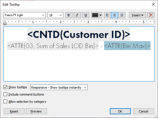
But I want to show you a slightly different method simply because it allows me to introduce a cool REGEX technique. First, I’ll create a string field that shows the range:
04. Bin Desc
// Bin range for tooltip.
STR([03. Sum of Sales LOD Bin]) + " - " + STR([03. Sum of Sales LOD Bin] + [Bin Size] -1)
We now use this in our tooltip.

We now have a nice range in our tooltips. But I’m a stickler for formatting and I really want to add thousands separators to the numbers. This is easy using the separate field approach mentioned earlier as we can just individually format both numbers, but again, that wouldn’t allow me to show you this nifty REGEX technique which adds commas as thousands separators to a number:
REGEXP_REPLACE(STR([Number]), "\d{1,3}(?=(\d{3})+(?!\d))", "$0,")
We can leverage this to add thousands separators to our bin range calc:
05. Bin Desc Formatted
// Bin range for tooltip.
// Format a number with thousands separators.
REGEXP_REPLACE(STR([03. Sum of Sales LOD Bin]), "\d{1,3}(?=(\d{3})+(?!\d))", "$0,") +
" - " +
REGEXP_REPLACE(STR([03. Sum of Sales LOD Bin] + [Bin Size]-1), "\d{1,3}(?=(\d{3})+(?!\d))", "$0,")

Perfect!
The final thing I like to do is add a bit of color to the tooltips to match the bar colors. But, as I noted at TC22, we showed how to do this in our virtual TC21 presentation, so I’m going to give a cheap plug for that session—if you want to see how to add this coloring to the tooltip, go check out Make It Better: Tips for Better Dashboard Design.
With that, we have our final histogram, which I think is pretty nice.
And there you have it. I hope these tips have been valuable and that you have an opportunity to apply them to your own histograms in the future. If you’d like to download the workbook, you can find it at flerlagetwins.com/coolstuff.
Ken Flerlage, May 31, 2022


Wow, respect Combining Bins + RegEx!
ReplyDeleteHa! Totally unnecessary here, but I love this Regex technique so I just had to throw it in there.
DeleteCool stuff.
ReplyDeleteWhy has Tableau not added this? It seems like a basic feature of a histogram?
ReplyDelete