
Peter Fakan: How I Created this Isometric Map in Tableau

I’m excited to have another fellow Forums Ambassador, Peter Fakan, join us this week for a guest blog. When he first posted this beautiful map, I immediately messaged him and asked “How did you do that?” and he graciously explained his whole process. Not only is the viz itself very cool, but the techniques Peter used are quite useful in a variety of other areas. So, of course, I asked him to join us for a guest blog!
Peter is a Tableau Developer in the Australian Government’s Department of Veterans’ Affairs. As mentioned above, Peter is also a Tableau Forums Ambassador; he has a deep knowledge of Tableau and is one of the top contributors on the Tableau Community Forums. You can get in touch with Peter on the forums.
The Viz
I recently saw a data visualization that
projected a map using an isometric view. After seeing this, it struck me that I
hadn’t seen anything like this done in Tableau. I also thought it might help me
with the eternal problem of managing 5 data points on the eastern side of
Australia, versus the one on the Western side. To add a bit of complexity, the
Australian Capital Territory is nested completely within one of the states. So,
I decided to see if I could actually create something like this in Tableau.
With a bit of help from Airtasker.com, I was able to do just that.
Use Case
Before I show you how I created this,
let’s talk about the use case. Generally speaking, I wouldn’t recommend this
for mainstream visualisations as the overhead to create it puts it in the
category where you would want a professional developer maintaining it. That
said, I think it has the essence or “oomph” you might be looking for inside a
flagship visualisation where you are looking for that additional “pop” to make
your viz stand out. Plus, it’s fun to try to stretch Tableau to see if we can
do something a bit out of the ordinary.
Map Image and Data Prep
First things first, I needed to obtain
an image using this projection. Fortunately for me, this is where Airtasker.com
came in. Airtasker is a site where you can post any type of task you need and
find a qualified person to do it for you (it’s similar to sites like fiverr.com,
which I know Ken & Kevin have leveraged in the past). I was lucky to find a
great graphics design student who whipped up some quick comic-style polygon
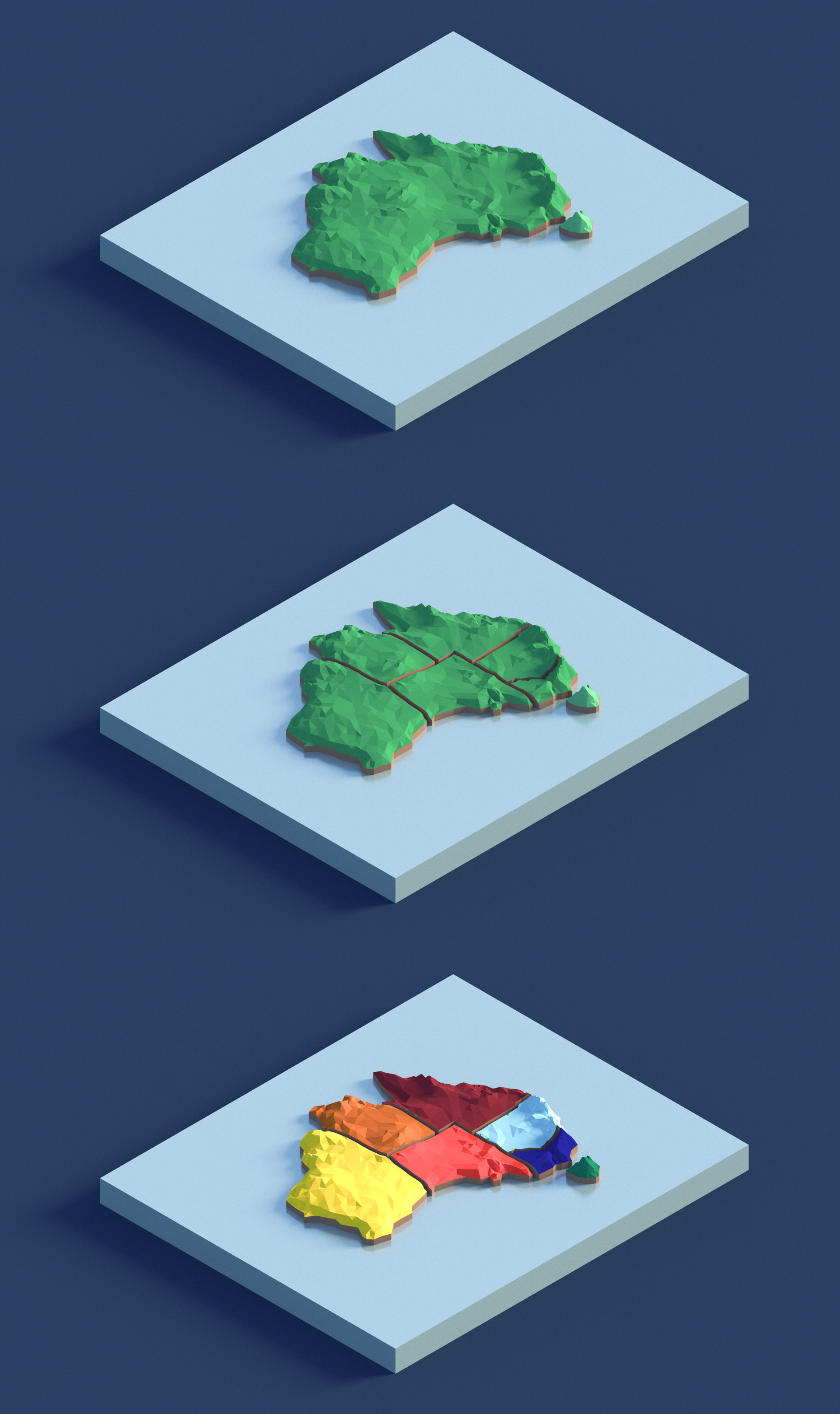
images of Australia for me. I ended up getting three different variations created
as we were discussing future uses where we might want the whole landmass, the
states broken apart, and then the states and territories coloured.
The graphic designer did more than just draw
the pictures for me. Collaborating with the designer really helped me to plan
out what I wanted to do with the viz, including helping me to realize that I
had a congestion problem on the east coast.
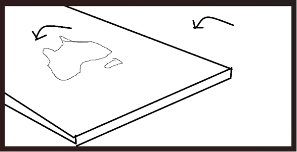
To address this problem, we realized
that we could rotate the map to the left in order to create some extra space on
the east coast, allowing us more space to label the different geographic
locations. This, of course, is a technique you could use with more “standard”
maps as well.
In the end, we had the following images:
Next, I created polygons using the Custom Background Image Studio
utility from Interworks, which allows you to create a data set of points by
simply clicking/tracing on an image (Ken actually used this in his blog on
creating a social
distancing floor plan).
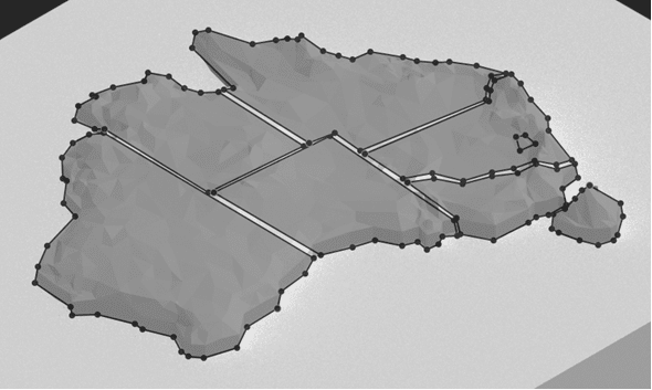
I ended up with something similar to the
above, though I tweaked it a bit and forgot to capture a screenshot of the
final version. The Interworks utility then allows you to extract the data
points as either an Excel or csv file which can easily be loaded into Tableau
and blended with other data.
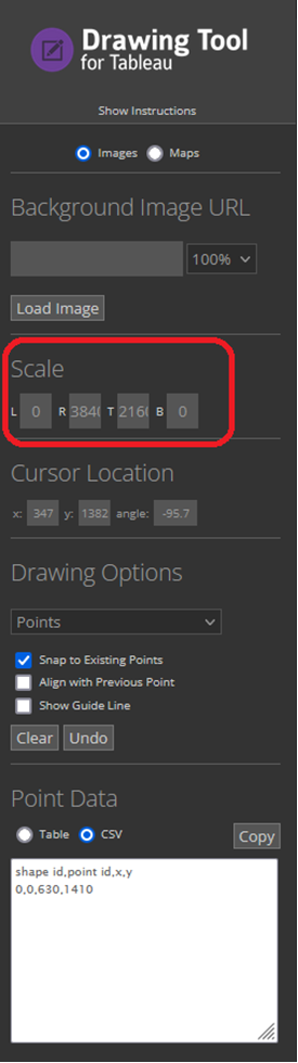
Note: When using the utility, be
sure to capture the values in the “Scale” section as we’ll need these when we
get to Tableau.
I also created some transparent callout
bubbles that I could use to label each geographic area on the viz. You can create
these pretty easily using PowerPoint.

Note: If you dig into you the final
viz, you’ll see that I actually went a slightly different direction for these
shapes.
Tableau
With data preparation complete, now it
was time to hit Tableau. First, connect to the data set you generated in the
previous step. This will give you cartesian
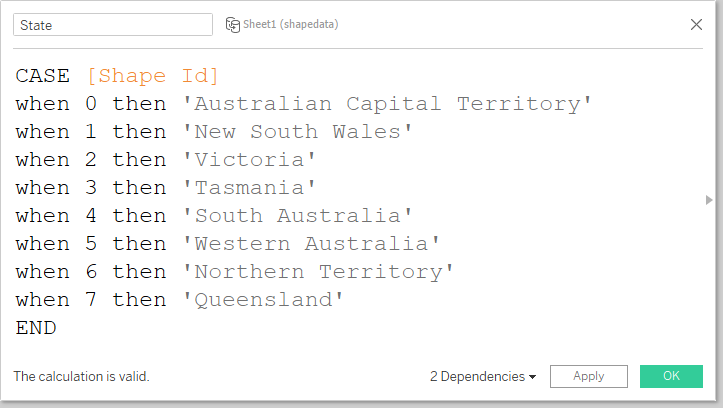
coordinates (x, y pairs) needed to draw the polygons. You will need to
identify each polygon as one of the states. You could do that directly in the data
file, if you like, but I chose to just create a calculated field:
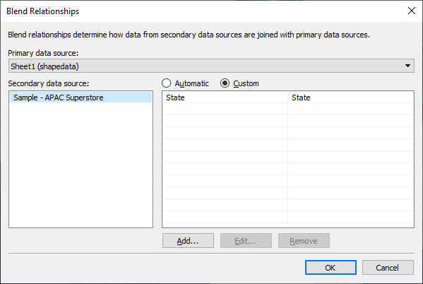
But this data set only gives us the
coordinates for each state—you’ll also need another data set for the actual
data you’ll be visualizing. I chose to use the APAC Superstore data set and
brought it in as a new data source. I then set up a blend relationship based on
State.
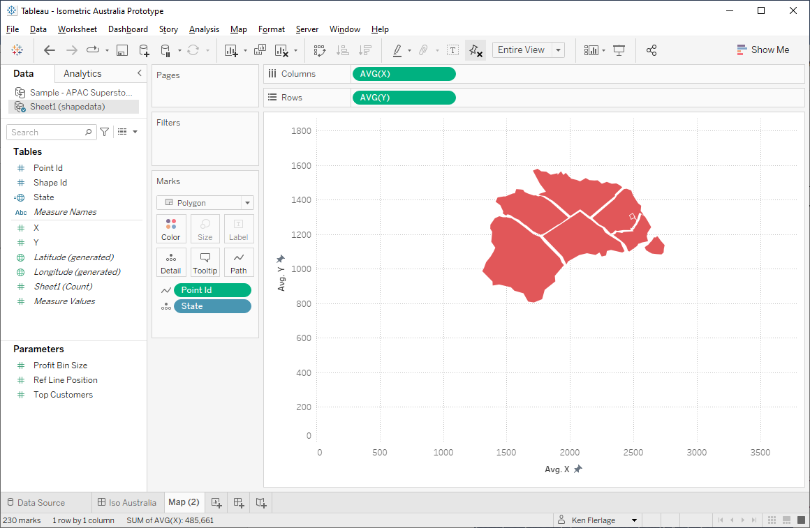
Now, on a new sheet, we place AVG(X)
on the columns shelf and AVG(Y) on the rows shelf, drag Point ID
to the path card, and add State to the detail card.
Next, we’ll add the image as a background
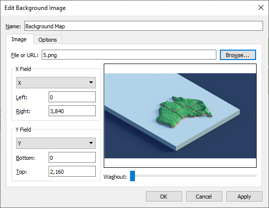
map by selecting Map > Background Images > <Your Data
Source Name>. Set the X and Y ranges to match the “Scale” we captured
when using the Interworks tool.
You’ll now have something like this:
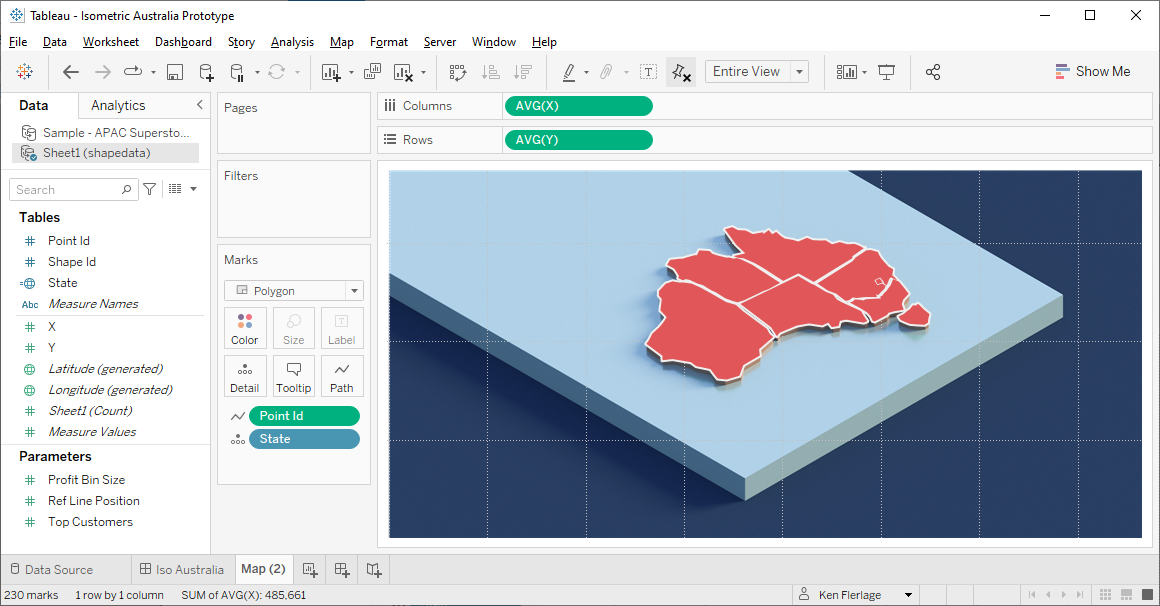
As you can see, our polygon is
overlapping the background image. We still want that polygon there so we can
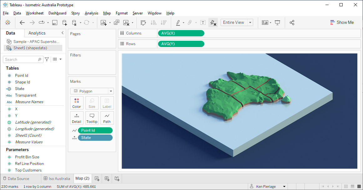
interact with it. To correct this, just change the opacity to 0%. Or, as an
alternative, use a transparent
colour. You’ll now see the full background map, but will still be able to
interact with the polygons.
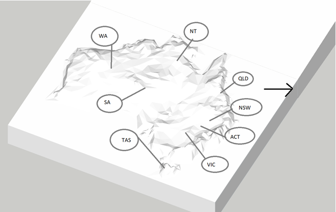
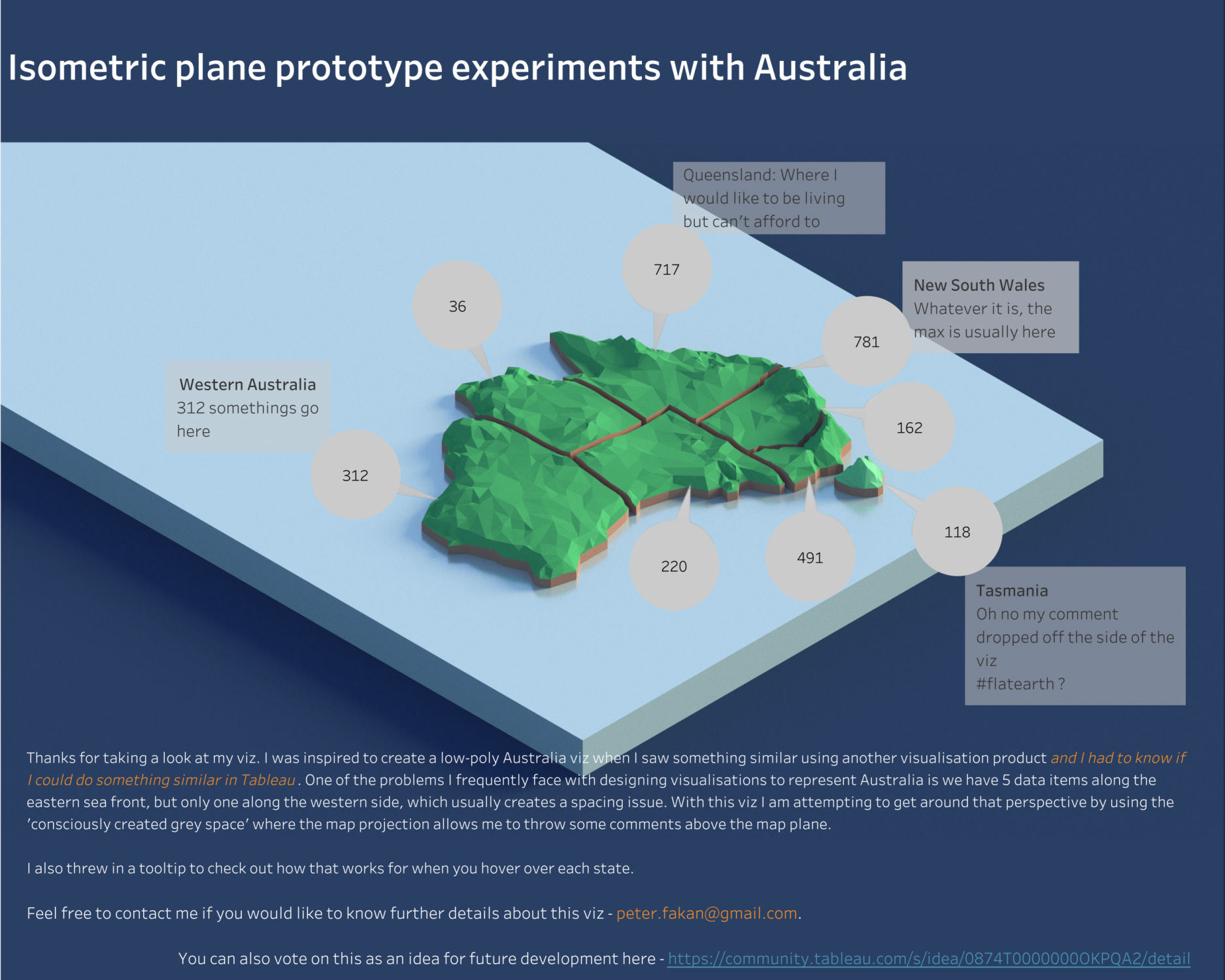
On my final viz, I added labels so you
can see the value of the rotation, which frees up space on the right side. Here’s
my final viz. Click on the image to see the interactive version:
Closing
Again, I wouldn’t recommend this for
mainstream visualisations, but I think it has the essence or oomph you might be
looking for inside a flagship visualisation. I also believe some of the techniques
used here could be of value in other use cases. I had a lot of fun with this
build and am excited to see where other developers might take the concept.
Thanks for reading!
Peter Fakan
June 27, 2022


No comments: