
How to Create a Gradient Area Chart in Tableau (Kizley Benedict)

This week, I’m excited to welcome Kizley Benedict as a guest author. If you’re not already following Kizley on Tableau Public, stop right now and go follow him—I promise you won’t regret it. He has a rare talent for creating well-designed and insightful data visualizations. When Kevin and I first saw the lovely Shaded Area Chart on Tableau Public (see below), we immediately reached out to see if he would be willing to write about it. While there are some similarities to what Kevin and I did with gradients in the past, his method is easier and cleaner than what we’ve done, so we’re excited to have him share it.
Kizley
is a Data Visualization Consultant for Intelligent Cricket in Delhi, India. He has worked in the field of Data Analytics for the past eight years and has been using Tableau since 2016. As
noted above, he is a very popular author on Tableau Public. You can follow him
on Twitter @kizley and LinkedIn. Thanks so much for sharing
your knowledge with us today, Kizley!
Inspiration
If
you have ever googled the name of a company stock, chances are that you would
have come across a trend line chart that shows the stocks historic performance.
For example, a quick search query of ‘Tesla stock’ displays the below google
result:
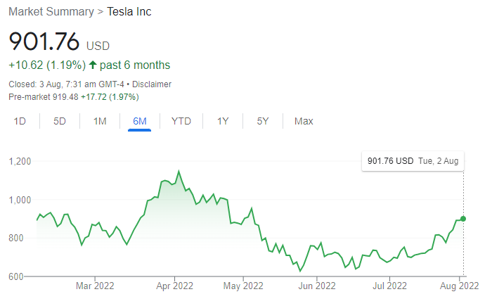
Source: google.com
What
caught my eye was the light green gradient visible below the line. Does it add
any value to the overall graphic? Not really, but it looks quite aesthetic and
I thought it would be an interesting challenge to try to build something
similar in Tableau.
Here
is what I managed to create in Tableau. Click on the image to view the
interactive version.
Note: The above
visualization was built using map layers and it everything was built using a
single sheet. However, in this tutorial we will be using the dual axis method as
it’s a bit simpler and more straightforward. The underlying concept is
essentially the same for both.
Use Case
The
gradient area chart can be used to display any measure over time provided all
values are on the same side of the horizontal axis (all positive or all
negative). E.g., Weekly Sales Trend. Conversely, a metric like profit over time
would likely have both positive and negative values and hence would not be a
suitable use case.
I
would also not recommend this method where dashboard performance is required
to be optimal or if the workbook contains large volumes of data. While the
calculations used in the method are relatively simple, adding background images
to the views might have a slight performance implication.
Approach
Since
the gradient is mostly an aesthetic choice and does not add much insight, I wanted
to avoid using complex calculations or other performance-intensive operations
like data densification. The next logical option was to use a background image
as a gradient. However, the tricky part is that the gradient should only be
visible below the line so the part of the image above the line would need to be
hidden.
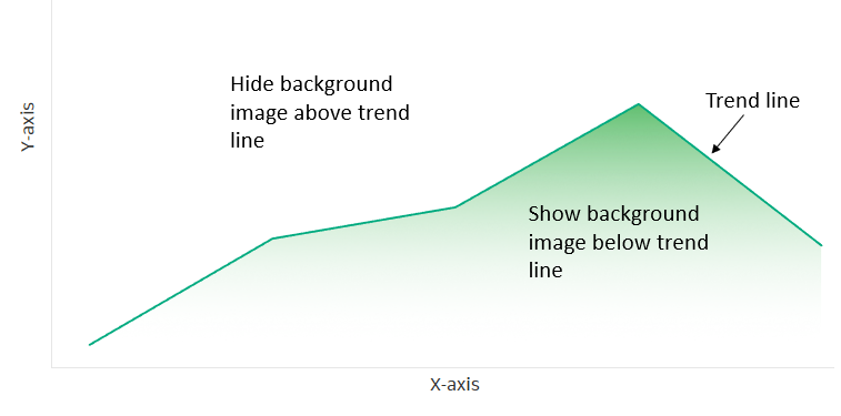
If
only I could stack a reversed area chart above the line and color it white that
would do the trick!
Background Images
Before
we start with Tableau, we would first need to create a couple of background
images which would serve as the gradient for our area chart. I used Figma to
create the gradients but you could also easily create these in PowerPoint or
any other image editing tool.
Below
are the two gradient images in .svg format I will be using for this tutorial
(.png works as well). The blue gradient will be displayed in case of positive
values and red in case of negative values. We want the color intensity to
correspond to the value of the measure used, i.e., the intensity is highest at
the top and the transparency increases as we move downwards.

Note: If you'd like to use these yourself, you can download them here.
Now,
let’s open Tableau and start building the view. We will be using the
Sample-Superstore dataset to:
1) Show a YTD weekly sales trend as a gradient area chart.
2) For a selected Sub-Category, show a red gradient in case of negative YoY variance and blue gradient in case of positive YoY variance
Part
1: Create Calculations for the X and Y Axes
1) Create a calculated field called Week Date using Order Date.
Week Date
// Get the week.
WEEK([Order
Date])
Since our X-axis is required to display YTD values,
it needs to be dynamic. This presents a challenge while adding the background
images which requires us to input fixed start and end points for the axis. The
way around this issue is to normalize our date values so that it lies between a
fixed range such as 0 to 1.
2) Create the following calculations to normalize the date values:
// Minimum Date
WINDOW_MIN(MIN([Week Date]))
Max Date
// Maximum Date
WINDOW_MAX(MAX([Week Date]))
Note: As mentioned
before, the above steps are only required for dynamic axis values. If your date
axis is fixed, you can skip the above steps and directly input the start and
end dates while positioning the background image. Also, if the frequency is
monthly then you can input the start and end points as 1 and 12 respectively
without having to normalize the axis.
3) Finally,
we need to normalize the Sales values by the same logic. So, let's create the
following calculations:
Min Sales
WINDOW_MIN(SUM([Sales]))
Max Sales
WINDOW_MAX(SUM([Sales]))
Sales Normalized
// ...giving us a fixed start and end point for the Y-axis.
Sales Reversed
(1-[Sales Normalized])
Note: The above will truncate the Y axis, which is
often not something you want to do. If you wish to avoid truncating the axis,
then simply set the Min Sales calculated field to equal zero.
Part 2:
Creating the View
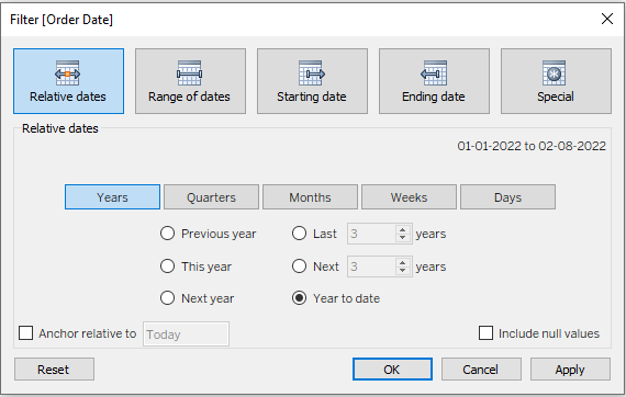
1) In
a new sheet drag Order Date to the filters shelf as a ‘Relative Date’
field. Click on ‘Years’ and select ‘Year to Date’. Make sure the anchor is set
as relative to ‘Today’. This will be the YTD filter.
2) Add
Week Date field to ‘Detail’ on the Marks Card. Click on the drop down
and change the mark type to ‘Line’
3) Drop
Date Normalized in the columns shelf as a continuous field and compute
it using Week Date.
4) Add
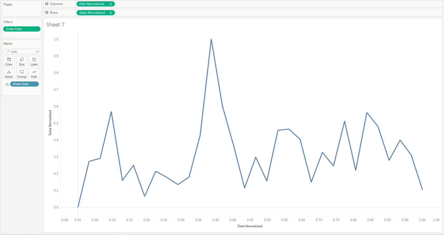
Sales Normalized to rows and compute it using Week Date.
The
view should look something like this, with both axes in the range of 0 to 1:
5) Add
Sales Reversed to rows next to Sales Normalized. Compute it using
Week Date.
6) Edit
the axes for both Sales Normalized and Sales Reversed setting
them to go from -0.05 to 1.05. This will ensure that the two axes are aligned.
7) Under
Scale select the ‘Reversed’ checkbox.
8) In
the Marks dropdown for Sales Reversed select ‘Area’. Change the color of
the area chart to the background color of the sheet. In our case it is white.
Set color
opacity to 100%.
9) Click
on the Sales Reversed pill in the rows and select Dual Axis. Note: If
Tableau adds Measure Names to the color card, then go to the All marks
card and remove it.
10) Right-click on the Sales Normalized axis > Move marks to front
After executing
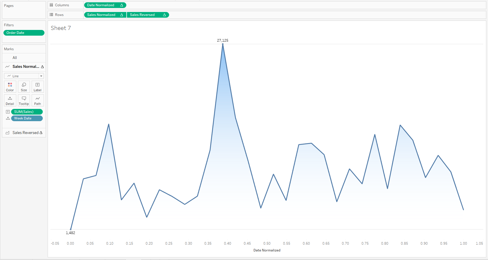
the above steps, you should be seeing the below view:
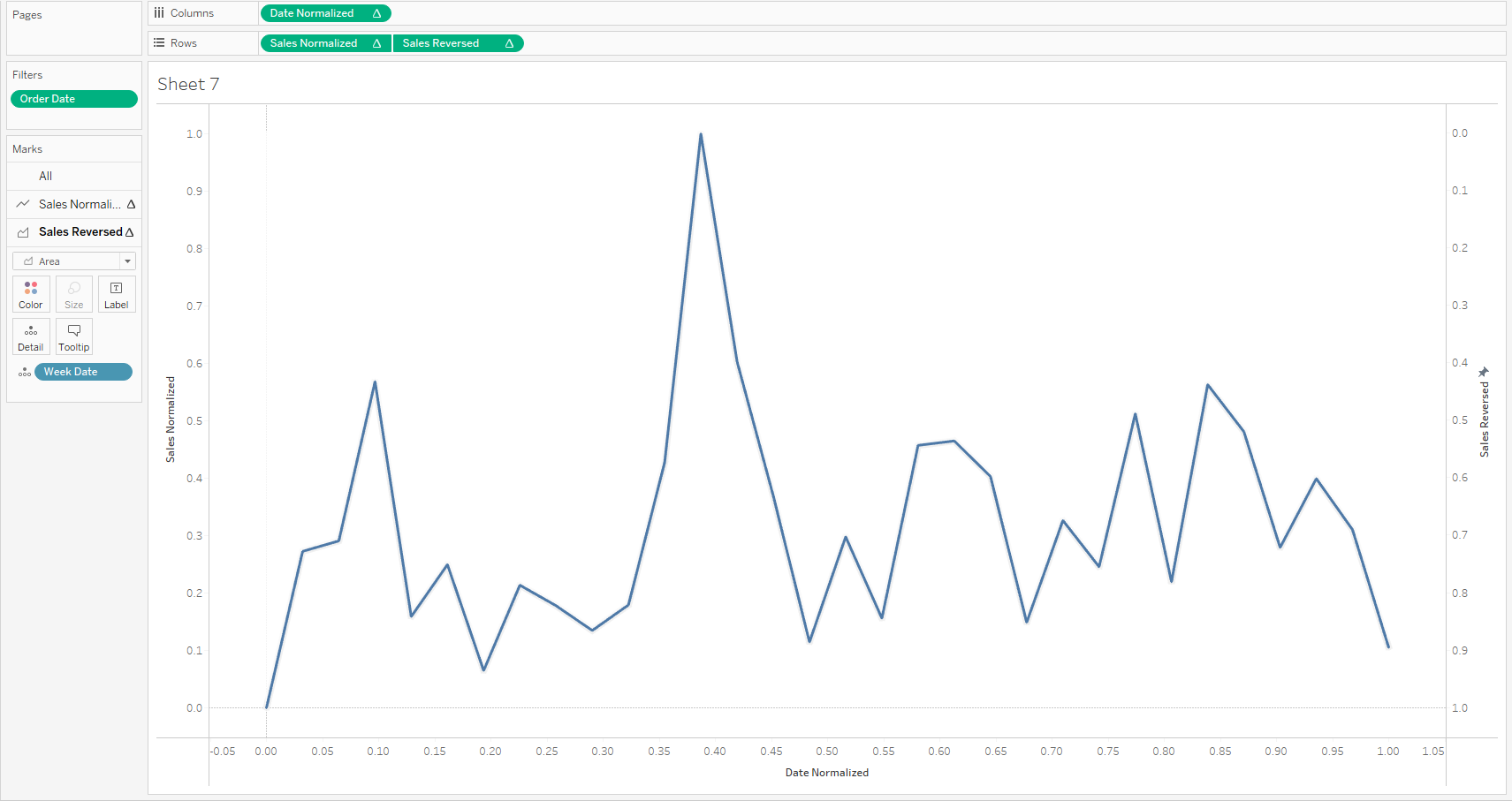
The
part of the sheet above the line is covered by the white area chart. The area
below the line is where we want the background image to be visible.
Part 3:
Adding the Background Image
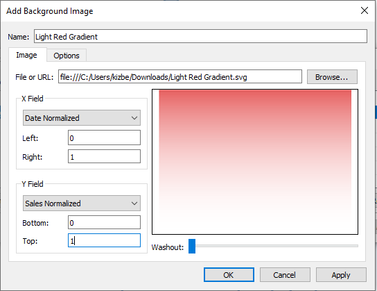
1) Go
to Map -> Background Images -> Sample-Superstore -> Add Image
2) In
the dialog box which appears, under the ‘Image’ tab add the location of the
blue gradient image.
3) In
the ‘X Field’ dropdown select Date Normalized. Set left to 0 and right
to 1.
4) In
the ‘Y Field’ dropdown select Sales Normalized. Set bottom to 0 and top to
1.
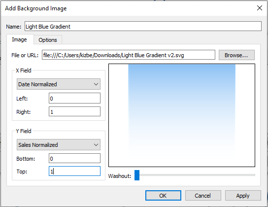
5) Click
on ‘Options’ and make sure both checkboxes under ‘Image Options’ are unchecked.
Click OK and close the dialog box.
If
all goes well you should see a gradient area chart as shown below:
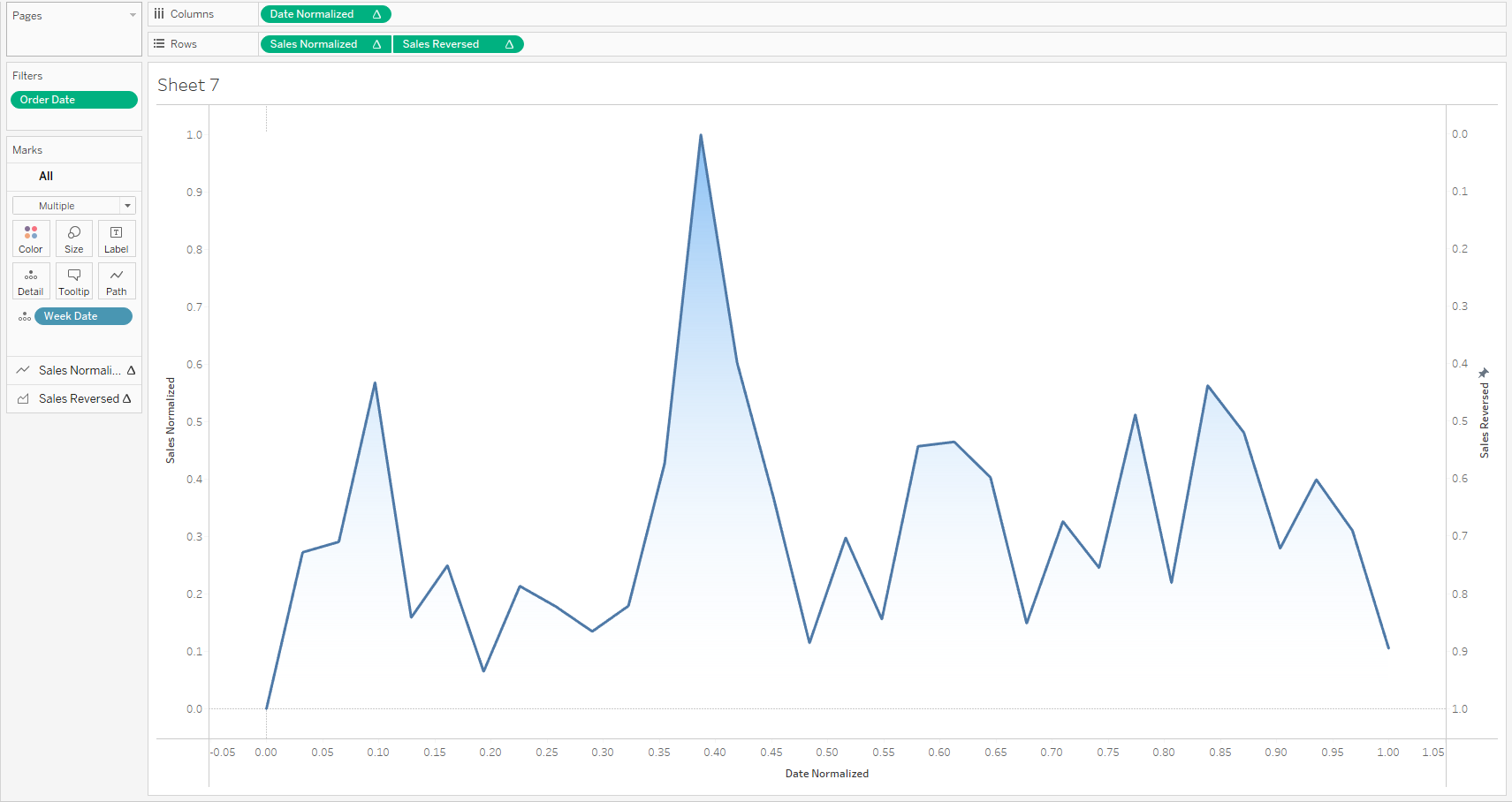
Since the Y-axis does not show the actual Sales values, we are going to hide it and instead, add reference lines and labels to show the maximum and minimum values in the view.
6) Drag
SUM(Sales) to the Sales Normalized marks card and drop it on
Label. Click on Label and select ‘Min/Max’ under Marks to Label.
7) From
the Analytics pane drag ‘Reference Line’ into the view for the Sales
Normalized axis. Use the ‘Band’ option to add minimum to maximum reference
lines.
8) Right
click on the Sales Normalized axis and uncheck ‘Show Header’,
9) Turn
off row/column dividers and zero lines for both axes.
We
finally have a gradient area chart with labels showing the minimum and maximum
Sales values.
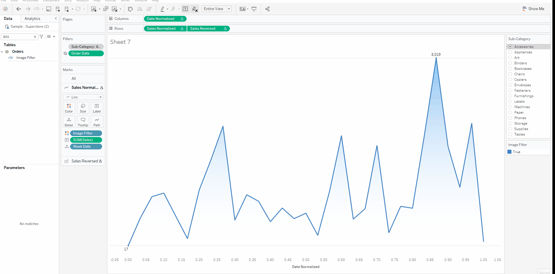
Part 4: Making the Gradient Dynamic
The
next challenge is to make the gradient colors change based on a measure value. To
accomplish this, we are going to create a YoY sales variance calculation and
for a selected Sub-Category, display a blue gradient for positive variance and
red for negative variance.
1) Drag
the Sub-Category field to filters and select ‘Accessories’. Click on the
pill and ‘Add to Context’.
2) Create
the following calculated fields:
CY Sales
// Sales for current year only.
IF YEAR([Order Date]) = YEAR(TODAY()) THEN [Sales]
END
PY Sales
// Sales for prior year only.
IF YEAR([Order Date]) = YEAR(TODAY())-1 THEN [Sales]
END
YoY Sales Variance
// Variance between current year and last year.
(SUM([CY Sales]) - SUM([PY Sales]))/SUM([CY Sales])
3) Create
another calculated field called Image Filter: This will be used to
switch the background image to blue or red depending on the YoY sales variance
Image Filter
// We'll use this to switch the background image to blue...
// ...or red depending on the YoY sales variance.
{ FIXED [Sub-Category]:
[YoY Sales Variance] } >=0
4) In
the Sales Normalized marks card drop the Image Filter field on
Color. Assign red color for False and blue for True.
In
order to make the images dynamic we are going to use the Image Filter field and
set a condition to show or hide each image.
5) Edit
the previously added blue gradient image. Click on the ‘Options’ tab in the
dialog box. Click ‘Add’ and choose Image Filter from the list of fields.
Set the value to True.
6) Next,
we are going to add the red gradient as a background image with exactly the
same inputs as the blue gradient. As with the first image, make sure both the
checkboxes under the ‘Options’ tab are unselected.
7) Click
on the ‘Options’ tab in the dialog box. Click ‘Add’ and choose ‘Image Filter’
from the list of fields. Set the value to False.
8) As
a final step we are going to add the actual Week Dates on the Y- axis in a
separate sheet and place it below the area chart on the dashboard.
And
we are done! Our area chart is now dynamic showing a red gradient for negative
YoY variance and a blue gradient for positive YoY variance.
Click
on the image below to view the interactive version.

I
hope you had fun following along this tutorial. I’m excited to see what others
come up with using this concept. If you have any questions, please feel free to
reach out to me on Twitter (@kizley) or Linkedin (linkedin.com/in/kizleyb/).
Thanks for reading!
Kizley
Benedict
September 6, 2022


So clean! I love it. FYI - My sample superstore data source didn't have any 2022 values so I couldn't exactly replicate the YTD functionality. had to improvise a little on that part.
ReplyDeleteDid you get it working?
DeleteKen, Thanks for posting this! I ran into a couple of issues: 1) when I drag Order Date to Filters it makes the whole chart disappear. When I click on Order Date in the Filters shelf it is set to Exact Date. Is it supposed to be that? 2) When I drag Image Filter to the Sales Normalized color mark the filter doesn't show as True/False, it just has Null. So I can't change the colors.
ReplyDeleteI'm using Tableau Public so maybe that has something to do with it. I appreciate any help.
Might be easier if you could email me. flerlagekr@gmail.com
DeleteVery cool stuff. Thanks so much for this!
ReplyDeleteHi Ken. My results are different. Part steps 1 to 4 do not show me a line. Instead, I'm looking at Y axis only.
ReplyDeleteI don't understand. Could you email me? flerlagekr@gmail.com
DeleteThis was terrific, but I couldn't overlook this: "The above visualization was built using map layers and it everything was built using a single sheet" - this is wizardry!
ReplyDeleteHi ken, can this be somehow done for two different colors in the same graph? Suppose I am highlighting last month with one color and other months with gray?
ReplyDeleteThat would be pretty difficult, I think.
DeleteHow was the date axis done on the final visualization?
ReplyDeleteBy the way, thanks for a great demo!
Hey there!
ReplyDeleteThis was an awesome tutorial and I began using it without issue a month or so ago. It's really spruced up the dashboards I deliver to my business. However, I just hit a roadblock that I can't figure a solution for. For simplicity, I'm measuring tasks by their completed date, with a time horizon parameter as well as a single date parameter to give the user lots of date manipulation. Everything is operational, but I can't get the tooltip to show an accurate date. It accurately reports the task value and everything else. The call date returns the correct date number, but when I bring in my completed date field, I get the attribute *. When I try to do any version of MIN/MAX-ing or any other idea that's come to mind, I'm getting values outside of my date range. The MIN/MAX are considering the entire dataset, not what is used by the normalization. Window-MIN/MAX also isn't working. So, I'm pretty stuck and not sure how I can fix it, if at all.
This is long-winded and maybe not solvable on a public forum but figured I would try. I'm preparing to abandon the gradient and just wish for Tableau to make gradient fill native (fingers crossed)
If you have any ideas, I'd be thrilled to hear them!