
Using “Set Rankings” Instead of Table Calculations (Guest Post from Kasia Gąsiewska-Holc)

This is a guest blog post is from our regular contributor, Kasia Gąsiewska-Holc. Based in Poland, Kasia works remotely as a Senior Data Analyst and data visualization consultant at SageData, a data analytics company based in Berlin. She is also a Tableau Public Ambassador and she loves using Tableau as a creative outlet for data viz experimentations.
Please note that some of these GIFs may appear small on the screen. They are, however, recorded in a higher resolution. For a closer look, you should be able to simply zoom into your web browser or right-click and open in a new tab (which will show it as it was recorded).
Using “Set Rankings” Instead of Table Calculations
In today’s blog post we’ll have a closer look at calculating ranks and performing top N calculations in Tableau. This concept has been already thoroughly explored and well-documented online. For example, in this post by Ken you can learn four different methods of performing a top N filter.
In this tutorial we will expand on the idea of using sets to calculate ranks. We’ll learn not only how to perform calculations, but also why we would choose the method using sets over, for example, table calculations to calculate ranks.
So buckle up and let’s dive into it!
Challenges of performing rank calculations
Before we look into a step-by-step tutorial, it’s important to understand when typical ranking calculations might fail. While rankings based on table calculations are pretty effective in simple views, they do not come without limitations. In the example below, instead of looking at totals, we will explore rankings of different categories over time.
Using Sample Superstore data, I have created a chart showing Sales by Region over time (for an interactive version, see slide 2 of this workbook):

Right away, we can spot some issues with labels on the chart. Labels for Central and West regions are missing at the end of lines corresponding to these two regions. The reason for this is that the label settings, which by default are based on a table calculation, were adjusted so that they only appear for the maximum value of Order Date:

The maximum, in this case, is calculated using a table calculation. It is based on all regions and is not calculated for each region separately. We can see that we only have sales data for West up till May, therefore the global maximum (December) does not exist in the data for West.
A very similar issue would occur if we tried to calculate the rank of each Region based on Sales. Before we have a closer look at it, let’s check what overall sales by region look like (for interactive version details, see slide 1 of this workbook). This will give us a better understanding of what the expected results should look like:

Now that we’re equipped with this knowledge, we can try to build a ranking view of Sales by Region over time (for interactive version, see slide 3 of this workbook):

In the view above, we are showing a calculation called Ranking which is a simple ranking of sales ( RANK(SUM([Sales])) ), calculated using the Region field:

Unfortunately, this gives us unexpected and incorrect results. The ranking seems to be taking into consideration not only Region, but also month of Order Date. See the data for January, where Central is assigned with a rank of 1, just to drop to 3 in February. Instead, for Central we would expect to see 3 across all months. We can change the way in which the table calculation is set up, but we still have a problem caused by values that are non-existent for some months.
Since we want to return one rank value for each region (based on the overall performance of that region), we can try to adjust our Ranking calculation and use either WINDOW_SUM or LOD (Level of Detail Expression) instead of SUM(Sales). This should provide us with total Sales per Region, ignoring Order Date months, so that we can return the same rank for each line. Let’s try that out.
We can swap SUM(Sales) in the Ranking calculation with either one of the following calculations:
- WINDOW_SUM(SUM([Sales])) (Compute Using: Table Across)
- MIN({EXCLUDE [Order Date]: SUM([Sales])})
- MIN({FIXED [Region]: SUM([Sales])}) (Note: Make sure that all appropriate filters are added to context if you use this calculation)
All of these calculations will result in the following (for interactive version, see slide 4 of this workbook):

Now this looks much better. Looking at Central again, it started off great. It’s given the correct rank of 3 in January then again in February, March and following months. But wait, what happened in August and September? It suddenly changed to 2. South Region is also affected by this. It actually has three different ranks assigned to it throughout the time (4 in Jun and Jul, 3 in Aug and Sep, 2 in Oct, Nov and Dec).
What’s more, in June and July we can see that there are 4 ranks in total, corresponding with the number of regions on the chart. But any other month there are only up to 3 ranks present. Again, this is because data for some Regions does not exist for certain months. For example in November we only have data for East and South. Since ranks are calculated based on all available data in a given month, the ranks will be re-calculated based on Regions that we have the data for in a given period of time.
These challenges led me to explore different options that did not involve table calculations.
SETS to the rescue
In his post, Ken explained how to create a Top N filter based on a set. Let’s try to expand on this idea and use sets to define specific ranks that could be easily applied on trend charts and other more complex views.
Sets have a lot of advantages, besides just allowing us to correctly calculate ranks on e.g. a trend chart. Knowing the exact rank gives us more control over formatting of categories in a chart. For example, if we want to give a different color to a top performing category with a rank of 1 and a different color for rank of 2 and 3, we will first need to establish which category has each rank. If we go further, we might want to use the same color formatting of a certain categorical attribute on more than one chart, so, in order to avoid confusion, we need to make sure that the color is consistent across multiple visualizations. Set rankings can help with this.
Going back to our example of Sales by Region trend chart, let’s try to use a top N calculation, based on a set, to modify the chart from the example above. We’ll start with creating four sets corresponding to our regions:

We’ll then create a calculation that logically compares our newly created sets to decide which rank should be given to each region:
Now let’s use that calculation as a label on our chart and see how it looks (for interactive version, see slide 5 of this workbook):

Ranks are now correctly assigned to each Region across all months, regardless of whether we had any data for some of the regions in a given month or not. And all this was done without any table calculations or LODs.
You might have noticed that a certain disadvantage of this method is that we need to know in advance the total number of categories that we want to rank. While this might be an issue for more elaborate charts, where we need to rank more than 5 categories, users are typically interested in rankings of top categories and not all of them, so in the majority of cases this method should suffice. This is especially true when we want to use ranks to only color top N categories. Let’s try to explore this idea further in the following tutorial.
A step-by-step tutorial
In this tutorial, we’ll use ranks based on sets, to create a highly interactive view with custom selection coloring. We’ll look at a dashboard showing Sales by Sub-Category. The goal is to create a view that allows users to select up to 5 Sub-Categories from a bar chart and display them on another trend chart. Each selected Sub-Category is assigned with a distinctive color, based on a Sub-Category rank, allowing users to easily identify each category on the trend chart. If a user wants to clear the selection, they can click on the reset button and start all over again. Here’s what we’ll try to create:

Let’s jump into a step-by-step tutorial. And you can also reference my workbook on Tableau Public.
PART 1: Create your charts and a dashboard view
1. Create a bar chart showing Sales by Sub-Category. Sort bars by Sales.

2. Apply minor cosmetic changes, edit tooltips, add labels.

3. Create a simple trend chart showing Sales by Sub-Category over time. This chart will be slightly modified later on, to ensure we only show selected Sub-Categories.
Note: I am intentionally using very delicate colors, as I only want to draw attention to categories that will be later selected.

4. Create a new dashboard and add two sheets to the view. Add titles, headers etc. This is how I ended up formatting my baseline view:

PART 2: Create sets and add set action to the dashboard
1. Create a set called Sub-Category Set based on the Sub-Category field. By default, this set is empty, but combined with a set action on the dashboard, it will store information about selected Sub-Categories.

2. Go to the dashboard and create a set action, that will carry information, on which Sub-Categories bars were clicked on (and therefore were added to the set). We will use Sub-Category values in this set to further rank values of the Sales field (as we do not want to rank values that were not clicked on).
Note: on the screenshot below I replaced Sales labels on the bar chart with set values only to illustrate the functionality of the set action.

3. One issue is that bars get highlighted whenever they are clicked on. Let’s use a super handy trick to remove that highlight. To learn more about this technique, check out the original blog post by Mark Bradbourne, which thoroughly covers this topic. This is the final result
:

4. Create the Selected Sales calculation that only returns Sales for values in the Sub-Category Set (clicked bars). This way our rank calculation will ignore any non-selected Sub-Categories.
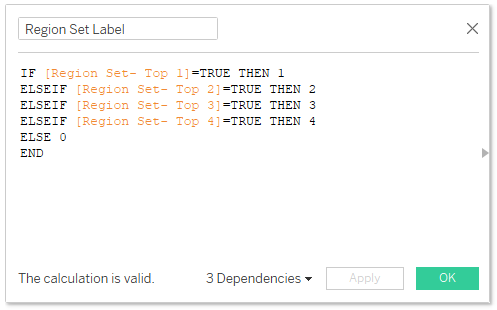
5. Create Top 1-5 sets based on the Selected Sales value (5 new sets in total). We will then use these sets to create ranks that will allow us to color selected Sub-Categories across multiple sheets.

6. Create a Selected Sub-Categories Rank calculation that logically compares all 5 sets and assigns appropriate rank to each of the clicked Sub-Category. This calculation will return the exact rank for our top 5 selected Sub-Categories.

7. Convert the Selected Sub-Category Rank to a dimension and drag it to the Color pill on both bar and trend charts. Edit color legends so that values of 1-5 are given distinctive color shades and value of Null and 0 are kept very delicate.
Note that if you’re not seeing all 5 values in the legend, you just need to click on a few more bars on the dashboard to ensure your Sub-Categories Set has enough values in it.
8. Let’s also create a custom label calculation, which will show all labels if Sub-Category Set is empty and will only display labels for selected Sub-Categories, when the Sub-Category Set is not empty (some bars were clicked on). We will then replace SUM(Sales) on the Labels card with Selected Sales Label.

Here’s a final look at the dashboard so far:

9. Final step in this part of the tutorial is optional, but I recommend creating a dropdown that allows users to specify if the Grand Total Line should be displayed on the chart or not. We’ll create a parameter and a quick filter for that.

Also using the following calculation as a label on the trend chart, will allow us to display Sub-Category or Grand Total name on the chart.
IF ISNULL([Selected Sub-Categories Rank])=TRUE THEN 'Grand Total'
ELSE [Sub-Category]
END
PART 3: Create a reset button
We are almost done, there’s only one more important step left to do. We need a way of clearing selected Sub-Categories in the Sub-Category Set so that users can start all over again with a new selection if needed. Normally, we could control this via the Set Action settings, but because we’ve removed a highlight when bars are being clicked on, we cannot easily control what happens with the set upon clearing the selection.
In order to combat that we are going to create a separate sheet which, when clicked on, will remove all values from the Sub-Category Set.
1. Create a new sheet with a “RESET SELECTION” string pill and the Sub-Categories field on the Details shelf.

2. Add a Reset Sheet to the dashboard, as a floating object. Make sure that little squares are hidden, as we only want the user to interact with the “Reset Selection” string cell. Format the sheet according to your preferences and add another Filter Action to remove highlight from the Reset Sheet (link to the original tutorial).
3. Create a new Set Action tied to this sheet, which removes all elements from the Sub-Category Set.

PART 4: Further optional adjustments:
We can further jazz-up the view a bit more by editing the reset button. The Reset Sheet can be changed to fully transparent and we can float a shape underneath it, to make it a bit prettier. We can also edit the trend chart to allow users to choose whether the Grand Total should be displayed. When no values are selected, we will display the Grand Total line. You can also use the Selected Sub-Category Rank field to color Sub-Categories on any other sheets on your dashboard- colors will be consistently assigned to the same Sub-Categories across all of them. These changes are not a part of this blog post, but feel free to explore the interactive workbook saved on my Tableau Public, to better understand all calculations and mechanism behind this viz.
And that’s a wrap!
Set rankings are a great way to enhance your charts with additional functionalities that could otherwise be impossible to implement. Although very powerful, they come with limitations and it’s important to understand when to use them. I think it’s best to start with the simplest method of calculating ranks based on table calculations and use rankings based on sets only when you need a way to easily implement the same rank across multiple charts and views and when you don’t mind that the number of ranked categories must be known up front.
I hope you found this tutorial useful and- as always- in case you have any questions do not hesitate to reach out to me 😊
- Kasia
October 17, 2022


Great and detailed article, I can see use cases for this! Note I'm a boolean pedant - the "=TRUE" is unnecessary in the formula, removing it does exactly the same thing :-)
ReplyDeleteYes, the = TRUE is redundant, but most of the time, we tend to write out the full statement like this in our blogs because it's easier for most people to understand. Boolean logic isn't always straightforward to everyone. So we choose readability/understandability over conciseness.
Delete