
Tableau Set Control Part 2: Use Cases

In the first part of this blog series, Tableau Set Control: The Basics, I shared some of the history of sets and then introduced the set control and its most basic use case, simple filtering. Now we’re going to build upon that foundational knowledge and dive into some more complicated use cases for set control. (If you haven’t read the first blog, I’d suggest going back and reading it before moving on to this one.)
Use Cases
I’ve
found that set control use cases generally fall into one of four categories:
1) Filtering without Filters
2) Multi-Select Parameters
3) Compare Populations
4) Listing Filter Selections
As
we’ll see, many use cases fall into multiple categories, but I think these do a
fairly good job of explaining the different types of uses we’ll be dealing with.
In this blog, I’ll address the first two categories; the final blog in this series
will address the last two categories. We’ll dive into each category, then
provide a couple specific examples of each.
1) Filter without Filters
Have
you ever added a filter then found that it had a negative impact on some
component of your chart? Sometimes filters just don’t quite work for you
because they end up filtering everything on the sheet. In these cases,
it’s likely that set control can help to solve the problem. Let’s take a look
at a couple of examples:
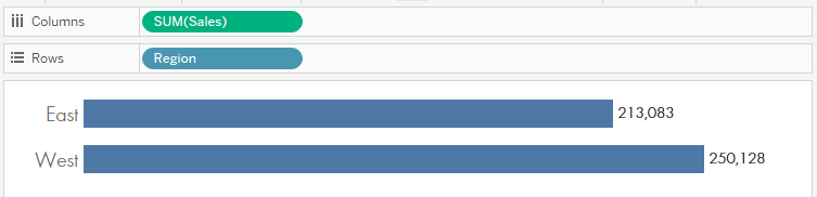
1a. Separate Filters for Different Dimensions
Imagine
that you are working with superstore sales and want to compare sales in the
East and West regions. We could start with a simple bar chart.
But
the sales director is focusing on different sub-categories in each region and
would like to be able to compare those different sub-categories. In other words,
the director needs to have one set of filters for the East and another set of
filters for the West. We can’t do this with a regular filter because it will
filter everything in the view. But we can use sets and set control. We’ll
create two separate sets on sub-category—I’ll call one East Sub-Category
and the other West Sub-Category. We’ll add both of those to the filter
pane as “In/Out” filters, but then we’ll choose the “Use All” option.
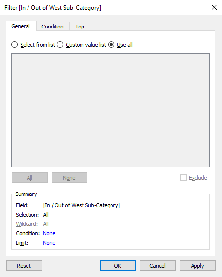
The
reason we’re doing this is that we don’t actually want to filter anything out
of the entire view—we’re simply adding these to our view so we can get to the
set control. To do this, we’ll right-click each of these In/Out filters and
choose “Show Set.” We should now have something like this:
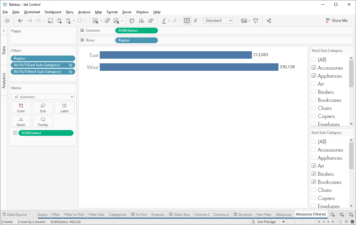
The
set control allows us to add and remove items from the two sets, but because
we’ve chosen “Use All” in the filter, it has no impact on the view whatsoever.
But now we’ll create a new measure to account for these sets.
Sales Filtered
// Filter sales based on the sets.
IF [Region]="West"
AND [West Sub-Category] THEN
[Sales]
ELSEIF [Region]="East" AND [East Sub-Category] THEN
[Sales]
ELSE
0
END
This
will only count sales if the sub-category is in each region’s set. We then use
this new measure in place of Sales. In the following screenshot, I’ve
placed Sub-Category on the color card so you can see the effect of the
calculated field.
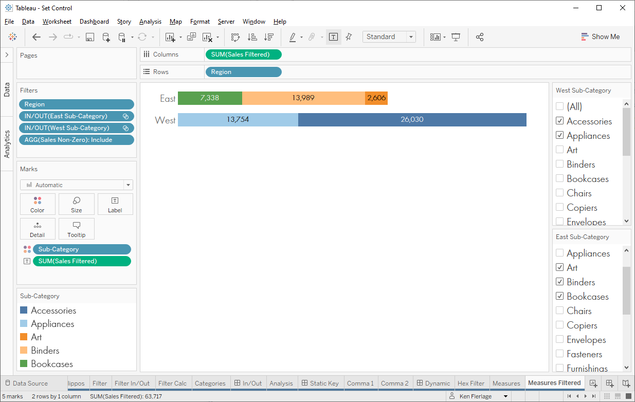
And
there we have it—we’ve use set control to create separate filters for two
different dimensions. You could also do this using Measure Names and Measure
Values as detailed on this forums post: Compare the same
measure with two different versions of filters
Note: We could also do something very similar using
different filters for completely different measures.
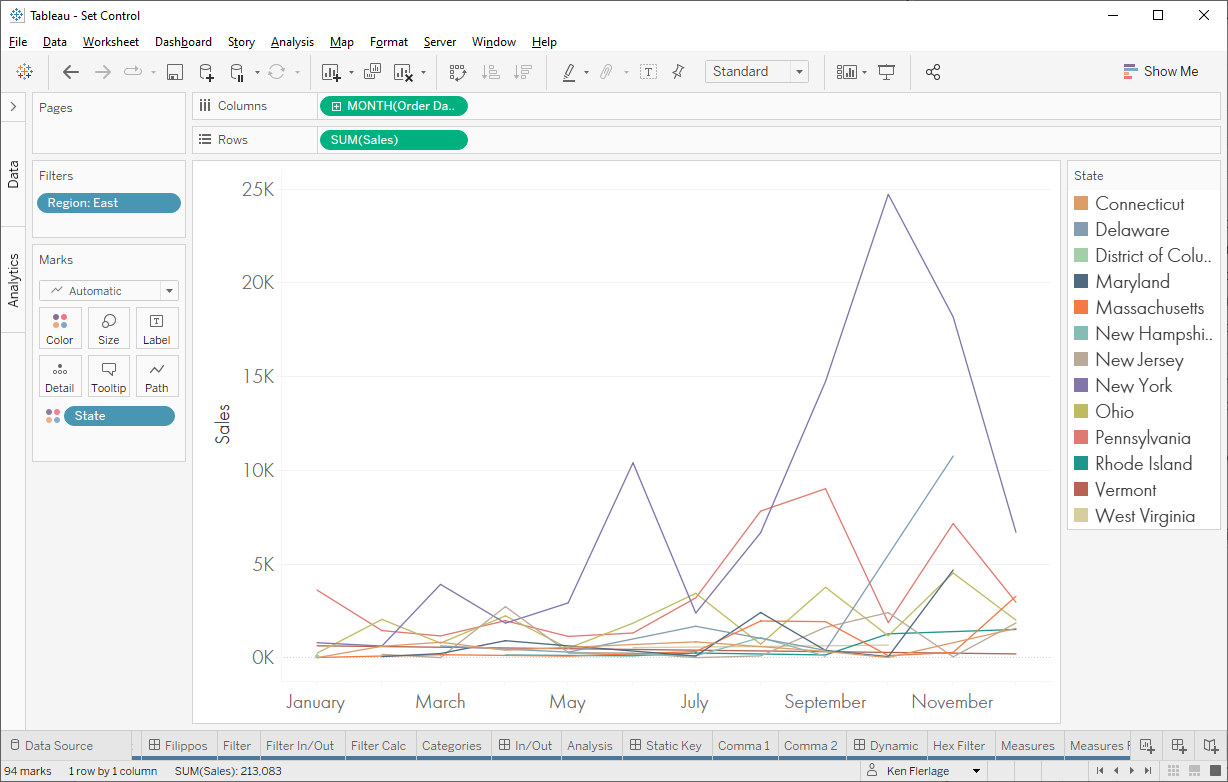
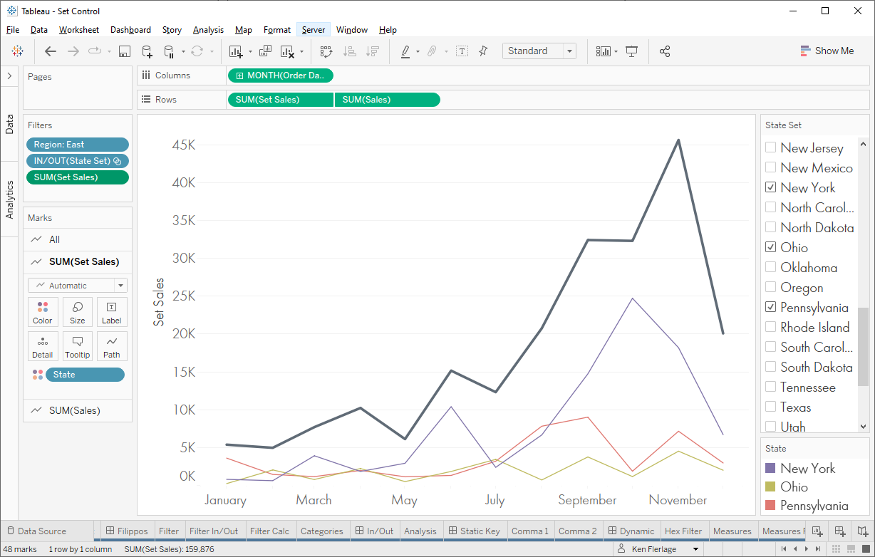
1b. Compare Part to Whole
In
this scenario, we’ve been asked to create a line chart that shows each state in
the East region along with another line for the region as a whole. We want our
users to be able to specify which states they want to show, but it will always
show the line for the entire region. There are a couple of ways to do this,
such as LODs, but
we can also leverage set control.
We
start out with a chart showing sales by state filtered on the East region:
Now
we need a line for the entire region. We can do that by duplicating the Sales
pill on Rows and creating a dual axis chart (note: We need to remove State
from the color card on that new axis).
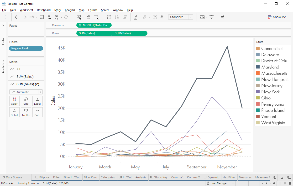
But
how do we allow our users to filter the list of states without impacting the
total line? Set control to the rescue! We’ll create a set on state, add it as
an In/Out filter with the “Use All” option selected, then show the set control.
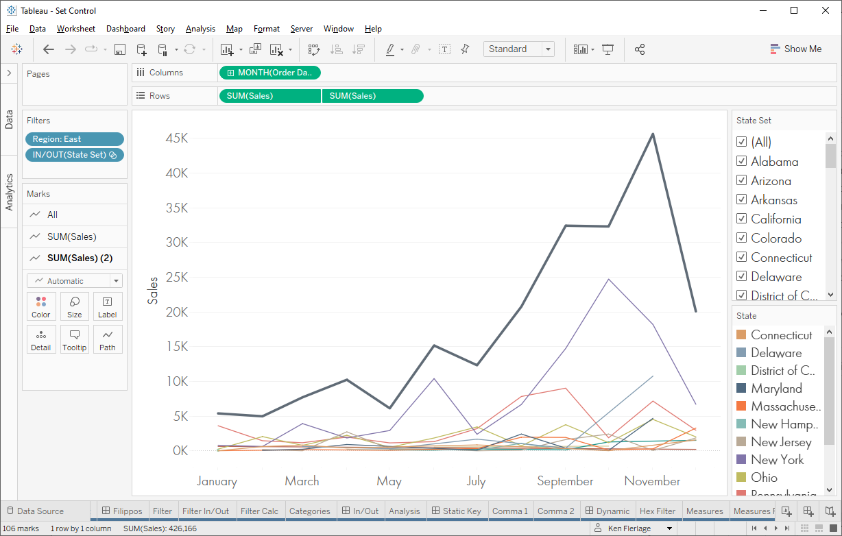
Then
we’ll create a new measure to account for the set control.
Set Sales
// Sales for members of the set only.
IF [State
Set] THEN
[Sales]
END
We’ll
use this on the axis showing the state breakdown, while leaving the other axis
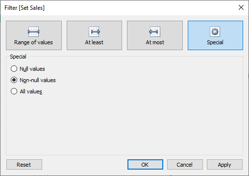
to use the unfiltered Sales measure. As a final touch, we can create a
filter on SUM(Set Sales) to include only non-null values. This will
remove unselected states from the legend.
With
this in place, your users can change which states are shown, while not
affecting the total line.
1c. Scaffolding
One
last example is using sets to act as a data scaffold to
help fill in gaps in your data, particularly when those gaps are caused by
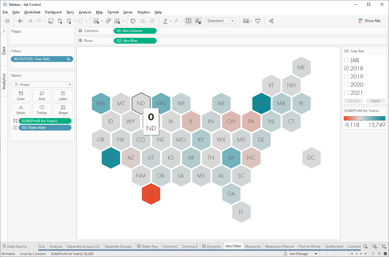
filters. Take, for example, this hex map showing profit by state.
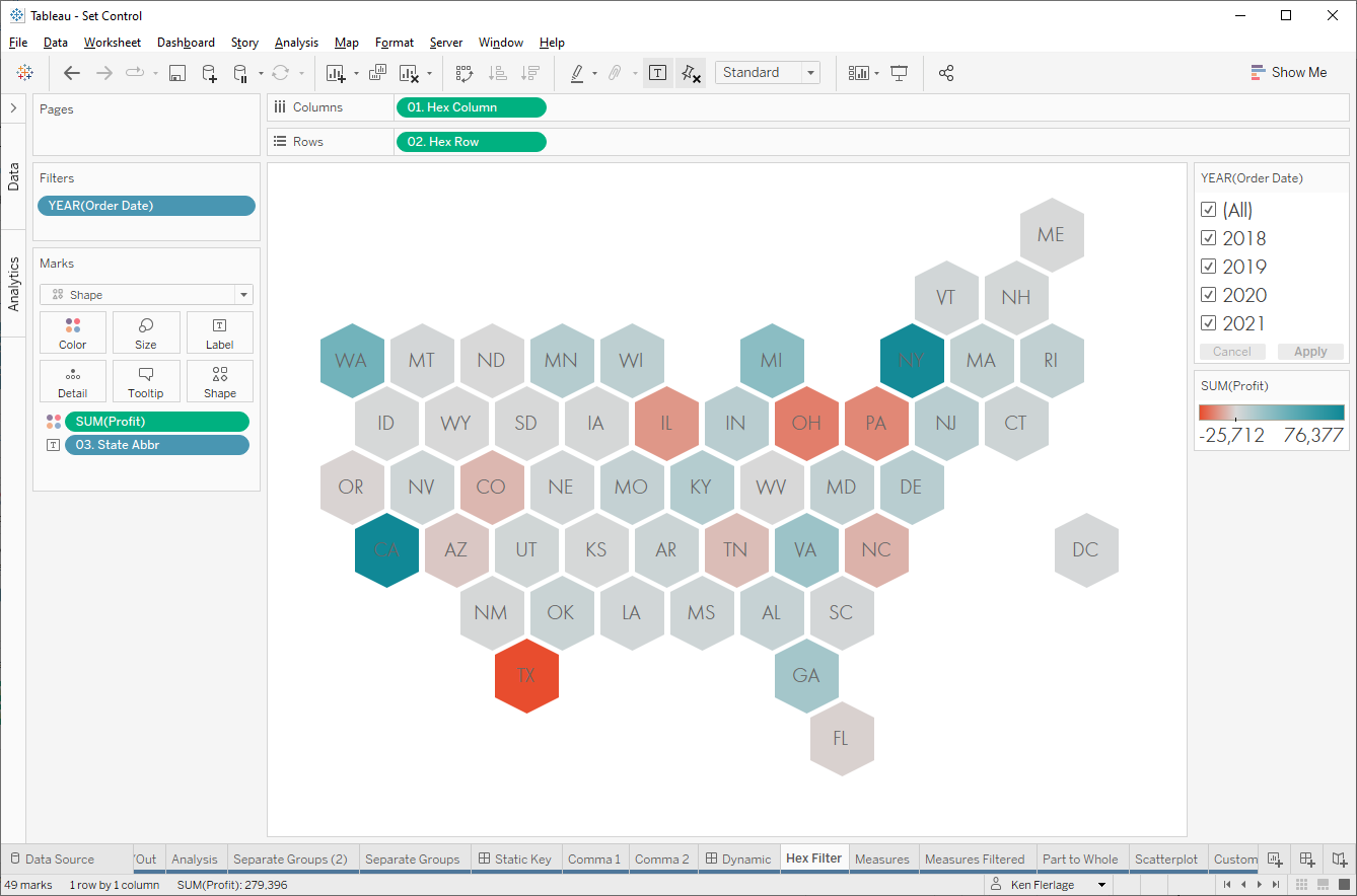
This
works nicely, but watch what happens when we filter to just 2018.
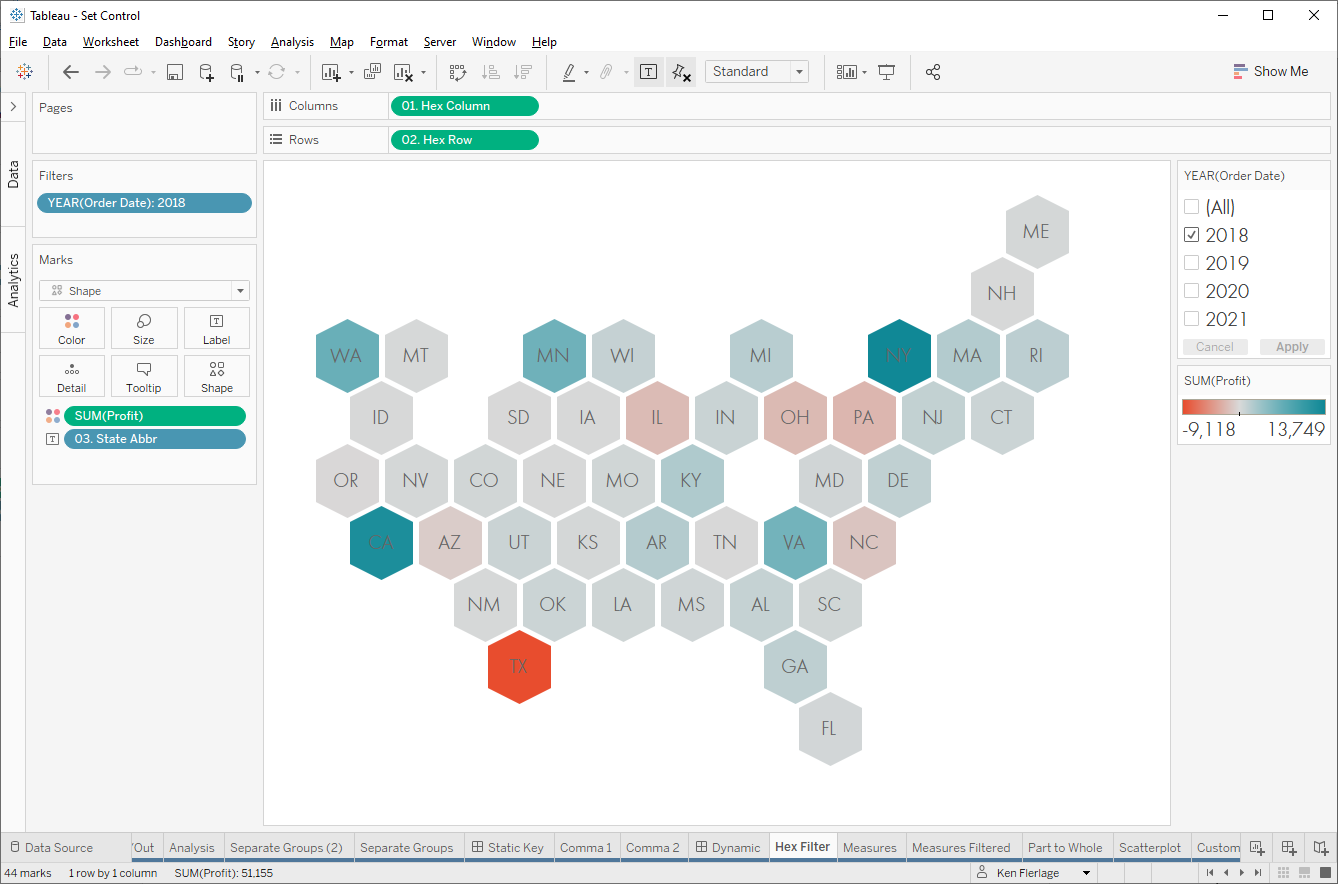
We
end up with big holes in our hex map. It’s also hard to tell that some states
disappeared because, like Vermont, they lie on the edge of the map or, like
Washington DC, they are floating off to the right. I don’t like these hexagons
disappearing completely—I’d much rather show those hexagons with 0 profit
instead. Once again, set control to the rescue. We’ll remove the filter on
year, create a calculated field to give us the year of the date, then create a
set on this new Year field.
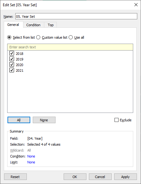
Next,
we’ll create a new measure to show the sales for only the years in the set.
Profit for Years
// Profit for the selected
years.
IF [05.
Year Set] THEN
[Profit]
ELSE
0
END
We’ll
add the set as an In/Out filter, with “Use All” and show the set control, then
we use our calculated field, Profit for Years instead of the regular Profit
measure.

Remember
that we’re not filtering the view here, so we don’t have the holes in our hex
map. Instead, we’re filtering the measure within the calculated field. Those
states with no records for 2018 will, therefore, still have a mark, but they’ll
just show 0 profits.
This,
in my opinion, is a huge improvement over having holes in my hex map, but it
still feels imperfect because I feel like no records at all is a little
different than zero profits. Ideally, we could show the hexagons, but
have some visual indicator that there are no records for the selected years. To
do this, we can drop the Year set on the shape card then select a different
custom hexagon shape as shown below (if you’d like to use this shape, you can
find it here).
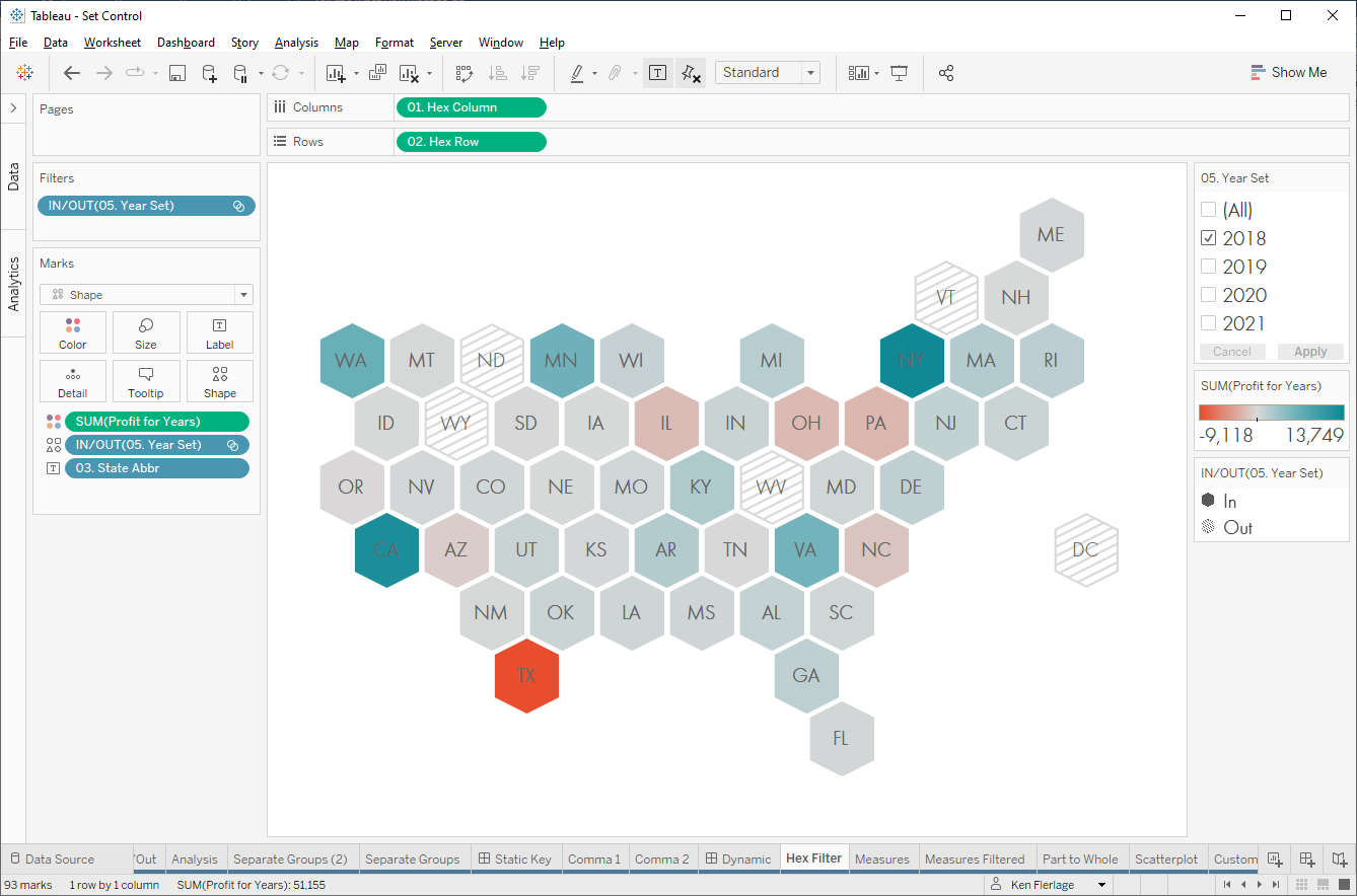
I
think this is a huge improvement as we no longer have holes in our map, but we
can clearly see those states with no records in 2018.
Note: When you drop the set on the shape card, those
states with sales in 2018 and other years will end up with two separate marks
on top of each other—one IN and one OUT. It works fine in this case as both
shapes are hexagons and the IN shape sits on top of the OUT shape, but just be
aware of this as it could cause you problems in other scenarios. In those
cases, this can also be done using a dual axis map or map layers.
Of
course, this scaffolding technique can be used in many other ways as well. For
an additional, non-map example, see the following post from the Tableau
Community Forums: Display a Filled
Circle with Count 0 When No Data After Filter
2) Multi-Select Parameters
Parameters
are truly amazing. I use them in every single Tableau workbook I create. But
have you ever wanted to be able to select multiple items in a parameter?
Unfortunately, that’s not possible today. However, we can often use sets and
set control to handle these types of use cases.
Let’s
say we have a scatterplot comparing Sales and Profit for each of our
sub-categories.
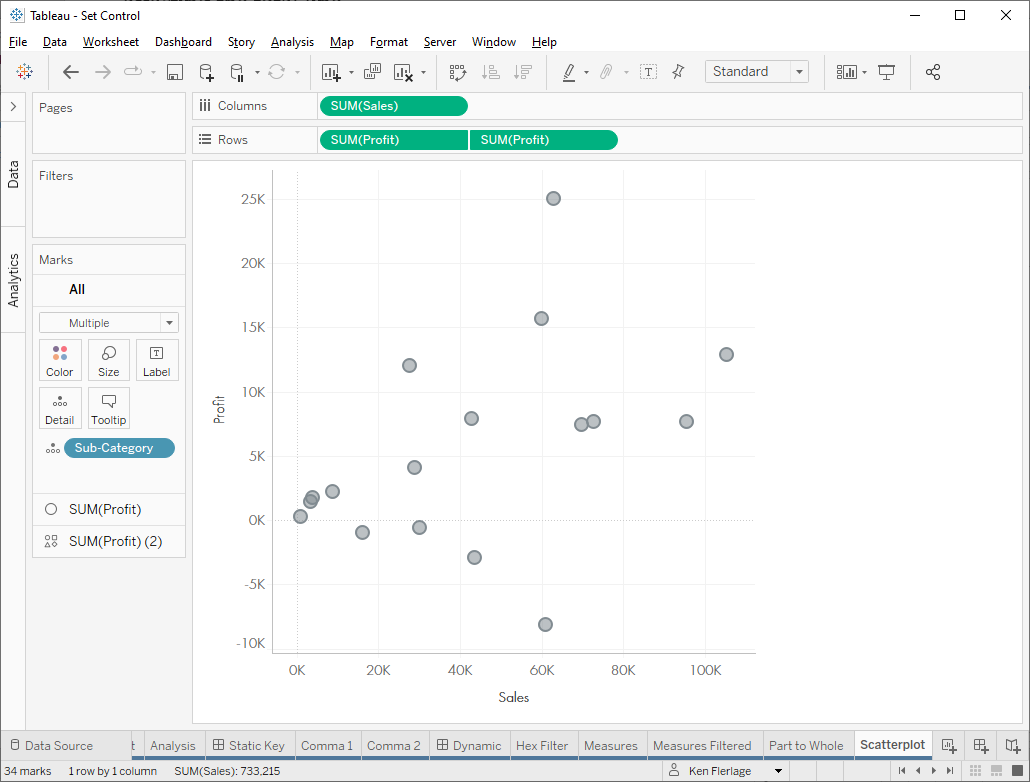
Currently,
each mark is a grey, but perhaps we’d like to be able to “highlight” specific
sub-categories. If we only wanted to highlight one at a time, we could easily
use a parameter. But, if we want to highlight more than one, we can leverage
the set control. We start by creating a set on Sub-Category, using it as
an In/Out filter with “Use All” then showing the set control. Next, we drag the
set to the color card. It will now use different colors for those
sub-categories that are “in” the set and for those that are “out”.
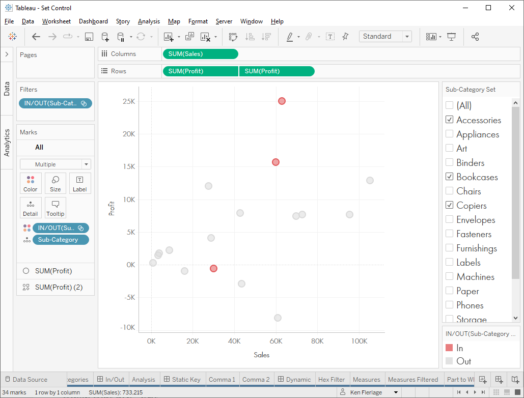
We
can also do this with labels or size if desired.
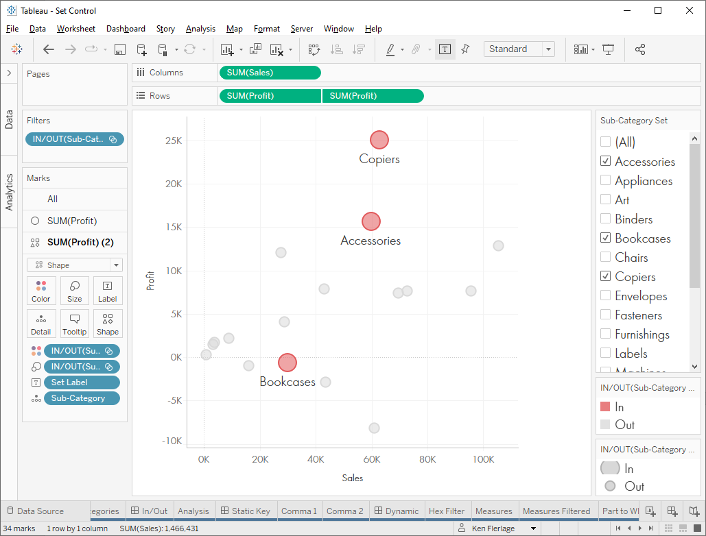
Note:
For the labelling, I created a calculated field like this, then dropped it on
the label card.
Set Label
// Show label only if in set.
IF [Sub-Category
Set] THEN
[Sub-Category]
END
2a. Filter at Higher Level
Let’s
look at a bit more involved example. Let’s say you want to see all customers’
sales by category. You start with a simple bar chart like this:
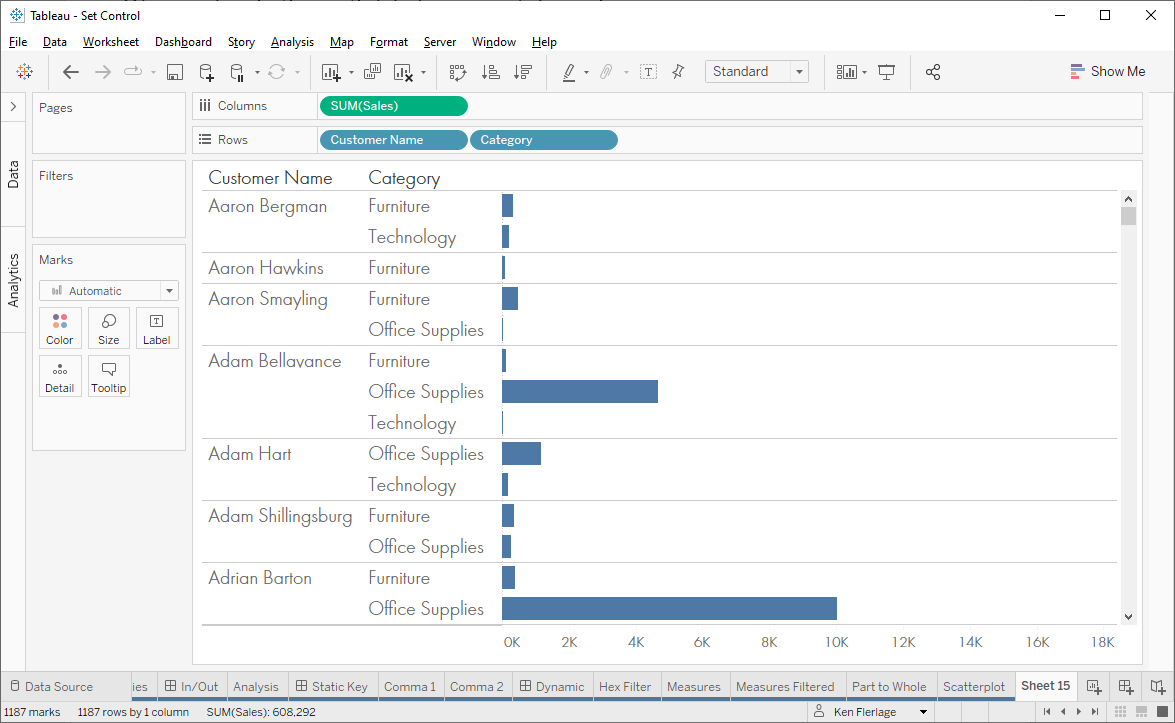
But
you only want to show customers who have purchased a given list of categories.
For example, perhaps you only want to show customers who have purchased Furniture
or Office Supplies. You might start by creating a filter:
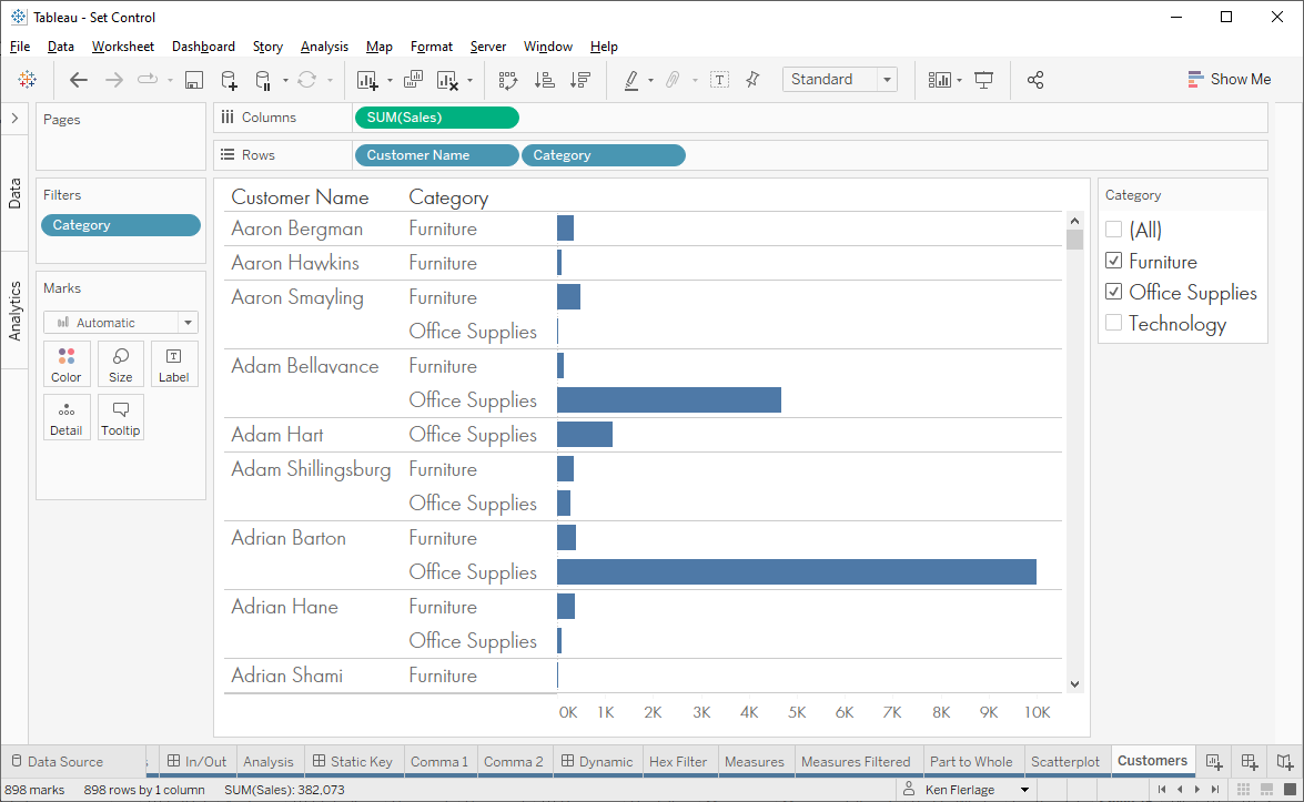
This
works great, but your sales director asks you to show all categories on the
chart. In other words, they want to see all categories, but want to narrow down
the list of customers to only those who purchased a specific set of categories.
In that case, the filter breaks down because it will remove all unselected
categories. Instead, we can use set control. Start by adding the set control as
we’ve done in previous examples. We’ll then need to use the set to filter the
overall list of customers.
Customer Filter
// Filter to only those who purchased selected
categories.
// Note: MAX of TRUE and FALSE is TRUE.
// So if any of these are TRUE the result will
be TRUE.
{FIXED [Customer Name]: MAX(
IF [Category
Set] THEN
TRUE
ELSE
FALSE
END
)}
Note: For more on FIXED LODs, see 20 Uses for
Tableau Level of Detail Calculations (LODs).
We
then use this as a filter, keeping only TRUE values.
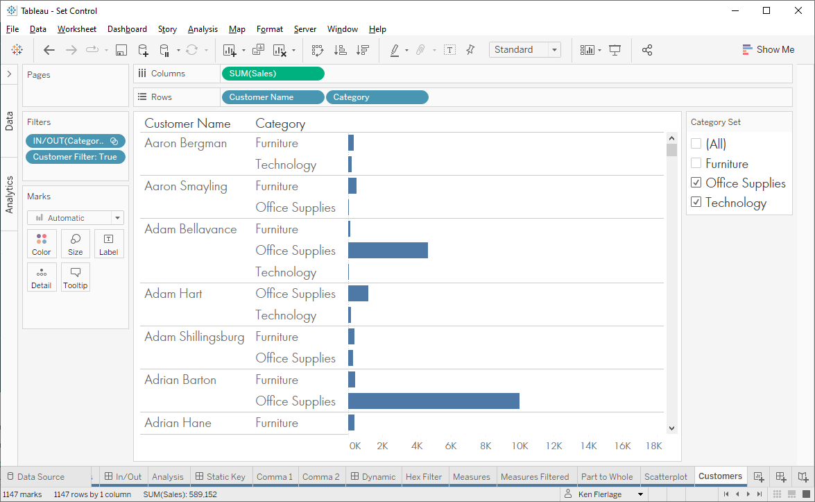
Notice
that those customers who only purchased Furniture (e.g. Aaron Hawkins) now fall
off the chart, but it still shows Furniture sales for those who purchased either
Technology or Office Supplies.
Note: Before closing this section, I do need to
point out that, unlike parameters, sets cannot operate between multiple
unrelated data sources. Thus, set control won’t work in every use case where
you want multi-select parameters.
Coming
Soon
OK,
that’s enough for today. I’ll be back soon with the final blog in this series,
in which I’ll address the last two categories—Compare Populations and Listing
Filter Selections.
Thanks
for reading! If you have any questions or comments, please let me know in the
comments.
See the companion workbook here: Tableau Set Control Use Cases
Ken
Flerlage, November 1, 2022
Twitter | LinkedIn | GitHub | Tableau Public


nice
ReplyDelete