
Automatic Default Chart Granularity (Guest Post from Kasia Gąsiewska-Holc)

This is a guest blog post from our regular contributor, Kasia Gąsiewska-Holc. Based in Poland, Kasia works remotely as a Senior BI Analyst at Ecovadis, a data analytics company based in Warsaw. She is also a Tableau Public Ambassador and she loves using Tableau as a creative outlet for data viz experimentations.
In this blog post, we’re going to look into a quick tip on how to automate the default granularity level of your charts based on the volume of data available in the data source.
Sounds a little bit complicated, but what does this mean in practice?
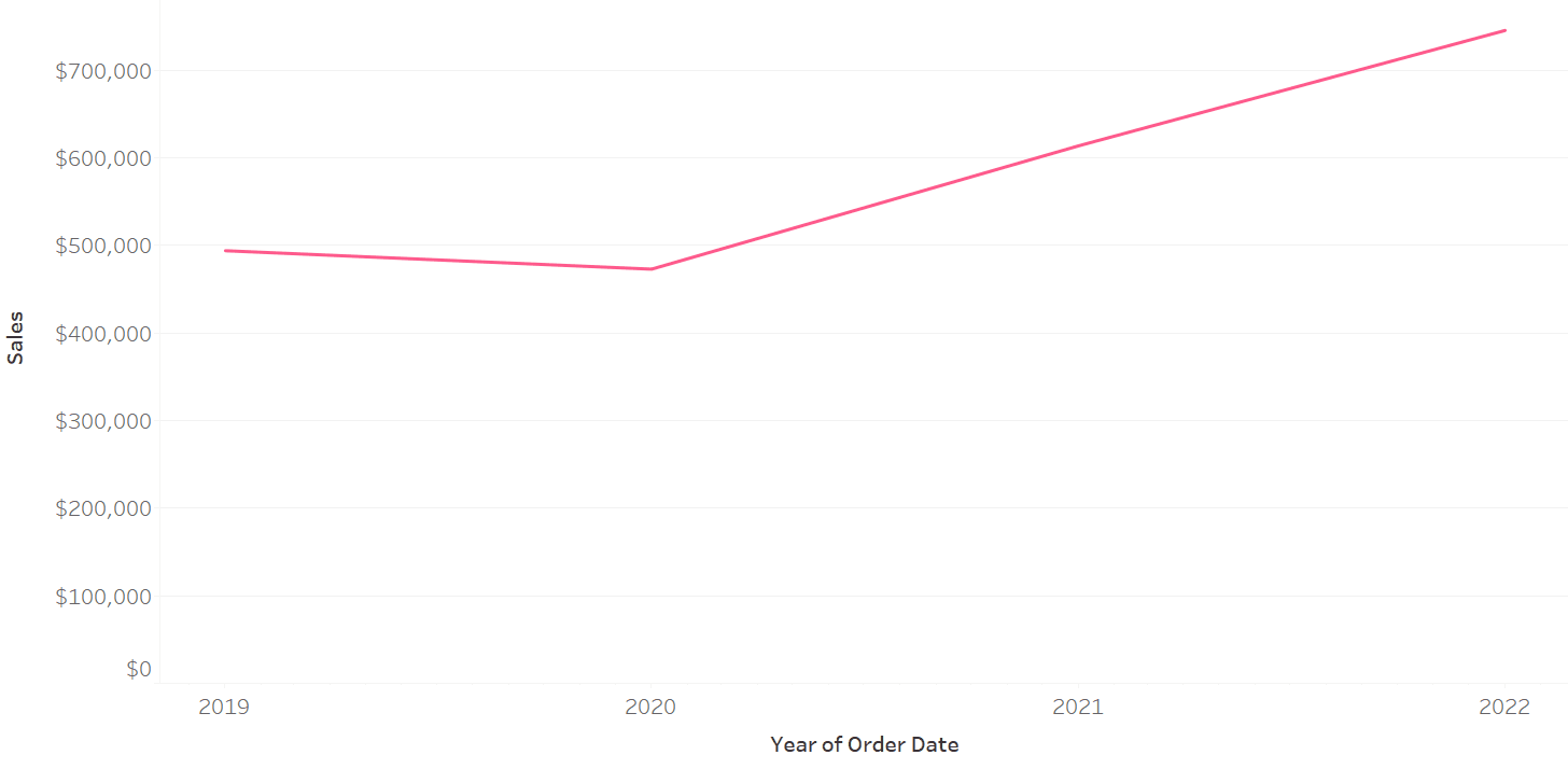
Let’s look at the example of the Sample Superstore data. Below is a trend chart showing [Sales] by [Order Date]. The underlying data is of a decent size, as we have sales records since Jan 2019. Having so much data allows us to create meaningful breakdowns of [Sales] by year, quarter and month of [Order Date].
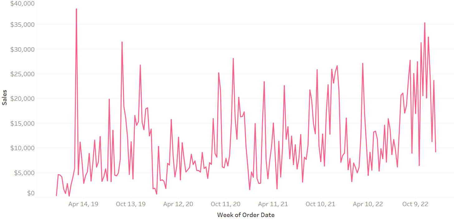
Of course we can also create a weekly and daily breakdowns, but these views would look rather cluttered if we decide to report on the entire date range available:
However, some companies might not have as much data as the Superstore and for these companies it would actually make more sense to report on weeks or days, while monthly, quarterly and yearly views would not be as meaningful.
We could take into account these differences between various types of companies and their data maturity to display the level of granularity that is best suited to their needs. What is crucial, however, is to understand that these needs might change over time. A company that has only 2 months’ worth of data today might have over 1 year worth of data to report on in 12 months. Today they would prefer to focus on a daily view, while in 12 months they would like to see a monthly breakdown instead. So how can we automate the default granularity based on how much data is available, without a need of having this manually checked and changed by an analyst?
We can accomplish this with one quick trick in Tableau!
All we need is to build a trend chart based on a custom date parameter and play around with settings of this parameter a bit. Let’s look at a step-by-step tutorial using the Sample Superstore data:
1. Open a new sheet. Drag [Sales] to rows.
2. Create a [Custom Date] parameter with the following settings:

For the sake of simplicity, the only three levels of granularity I have set up are years, months and days, but you could easily add more.
3. Create a [Custom Order Date] calculation, which will allow us to connect values of the [Custom Date] parameter and different granularity levels of the [Order Date] attribute:

CASE [Custom Date]
WHEN 1 THEN DATETRUNC('year',[Order Date])
WHEN 2 THEN DATETRUNC('month',[Order Date])
WHEN 3 THEN DATETRUNC('day',[Order Date])
END
Note: We could have used a string parameter with values of year, month, and day, then wrote our calculation using the parameter as follows: DATETRUNC([Parameter], [Order Date]). I opted to use integers as they are more performant than strings.
Drag the [Custom Order Date] field to the Columns shelf. Right-click on the pill and select ‘Exact Date’.
4. Create a calculation that counts the number of data points for each granularity level:

{MAX(
IF {COUNTD(DATETRUNC('year',[Order Date]))}>=3 THEN 1
ELSEIF
{COUNTD(DATETRUNC('month',[Order Date]))}>=12 AND {COUNTD(DATETRUNC('month',[Order Date]))}<36 THEN 2
ELSE 3
END)}
Let’s dig into this a bit more. This calculation is an if statement that first checks whether the data source includes data three or more years (even if there’s data for only one date in each year). If true then it returns a value of 1. If that’s not the case then the calculation would check if there are 12 to 36 monthly data points (i.e. if there are 12-36 unique months in the underlying data). If true the calculation would return a value of 2. If neither of these conditions are satisfied the calculation would return 3. Note that the comparison values of 3, 12, 36 have been selected arbitrarily, based on how many data points are required for each granularity level (it’s up to you to pick these values and decide whether, perhaps 2 years instead of 3 years’ worth of data would be enough to display a yearly view).
So in essence, we’re asking Tableau to return 1 if the yearly view would be most appropriate for the default analysis (i.e. there’s enough data points for it), 2 if it should show a monthly breakdown and 3 in other scenarios. We want to align these numbers with corresponding levels of granularity set up in the parameter. 1 for years, 2 for months, 3 for days:

This calculation needs to be wrapped in LOD brackets because we need to return only one universal value across all rows in the data, regardless of any breakdowns that are potentially available. (Note that when you are fixing on an entire data set, you don't need the word FIXED - see #2 in this tips blog post).
5. Edit the [Custom Date] parameter, by changing the ‘Value when workbook opens’ option:

Now, what will happen is that every time a workbook is opened, Tableau would first check how many data points of each granularity are available in the data, and based on that it would adjust the value of the parameter and the granularity level of the chart. Once the workbook is opened, users will be still able to switch between different values of the parameter if needed (be sure to show that parameter on your view). This trick is only to adjust the default view that is loaded upon opening the workbook, while still allowing users to have flexibility in terms of how they can interact with the chart.
5. All done!
You can test this functionality by removing some data from the underlying Sample Superstore Excel files (for example, keep only data for last 12 months and check if the granularity level changes from years to months once you open the workbook again).
Simple yet effective! Let me know if you find this useful in your day-to-day work 😊
Happy vizzing!
Kasia
Kevin Flerlage, June 5, 2023
Twitter | LinkedIn | Tableau Public


Yes, I find it useful. In fact, I had been wanting to do this for a while but had not found the time to sit down and think through it. Thanks
ReplyDeleteGreat to hear!
DeleteThis is very clever. Thank you for the tip!
ReplyDelete