
Create a Splash Screen for Force Users to See Important Information

I've run across dozens of situations where I needed to provide important information to end users and force them to read it before interacting with a dashboard. For example, let's assume that the new year 2024 has begun and the business has decided to change how targets are structured. For that reason, the data in the dashboard will not be updated for the entire month of January and will continue to reflect data for the previous month (Dec 2023). If users are accustomed to seeing data for the current month, it would be important to let them know that they are viewing data for the previous month.
In this situation, you could certainly put a note on the dashboard somewhere, but how do you ensure that every user sees that note every single time. My solution to this problem is fairly simple, I create a collapsible container that is dark, but semi-transparent, I add the message to that container, and then I embed the show/hide button to close that container directly within the container itself. Below is an example of what it would look like when a user accesses the dashboard and interacts with it:
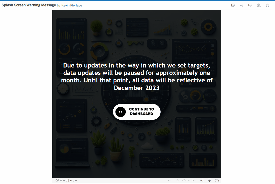
Seems pretty simple, right? They read the message then they click the continue button. But what this does is force the reader to read the message before they start interacting with the dashboard.
What I think makes this technique cool is the how the button is added to the dashboard. Typically when you create a collapsible container, you have a button that is floating that allows users to open or close the window. That button, however, is always there, always accessible, and always taking up space. In this scenario, reopening the message is likely unnecessary. So by embedding the show/hide button within the actual container it is opening and closing, that button disappears with the container. The user sees the message, they click the button, and the message AND THE BUTTON are both gone.
I've used this technique dozens of times over my career. It's fantastic for forcing the end user to read important information such as the example above, warning messages, details about the dashboard, and even instructional overlays (like this one when you click the How to Read button). In small deployments, I've used it to display an "under construction" message, so that users can still access the dashboard, but understand that some elements are still in development.
Although it's pretty simple, let's walk through how to build it. Below is a gif of my process, but I'll walk you through step-by-step in writing as well. (I'll show the gif and then the written instructions below).
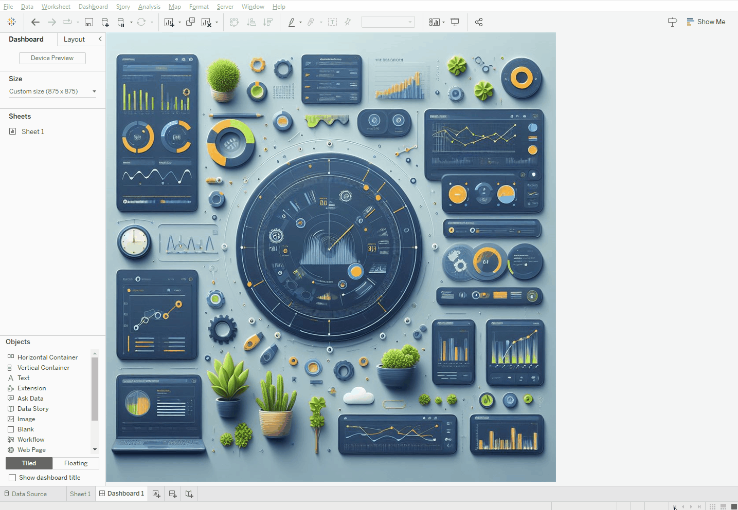
1) Add a vertical container with the same size of the entire dashboard
2) Add a couple blanks for spacing (you can use padding if you prefer)
3) Add your message text (I added left and right padding)
4) Add a show/hide button for your entire vertical container
5) Tile that show/hide button into the container below the text
6) Resize all the elements tiled in the container
7) Update the button (I used a "Continue to Dashboard" button)
And that's it! A simple technique to "force" your users to read important information BEFORE they can interact with the dashboard.
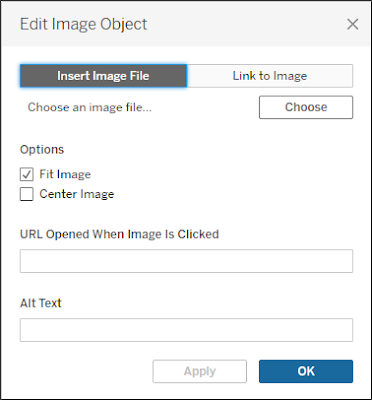
Although it's not exactly the same technique, I love to use this concept to direct users to other dashboards. For example, let's assume there is a popular dashboard that has been in place for many years, but your team has completely redesigned that dashboard from the ground up and saved it as a different workbook. You don't want users to interact with the old, outdated dashboard, but if you delete it, their saved links won't work and they simply may not know where to find the new one. And a mass email or communication will only work for some people. My preferred method is similar to the above. I leave the old dashboard in place and provide an overlay like above. For the message text, I simply tell users that this dashboard has been redesigned. Then instead of a show/hide button like I used above, I will tile in an image (it may say "Go to the New Dashboard"). I will then grab the URL of the new dashboard and put it in the "URL Opened When Image Is Clicked" box (as shown below). So we tell any user that accesses the old dashboard that there is a new dashboard and we direct them to it. I typically leave it up for a couple months, just long enough for people to understand where it lives and create new bookmarks, then I archive the old one.
Well, there you have it! A simple technique, but very effective, and one that I use time and time again. I hope you found it useful.


Is the "Splash Screen Warning Message" viz shown above available for download? I can't seem to find it on Tableau Public. Thank you!
ReplyDeleteYeah, you can access it here: https://public.tableau.com/app/profile/kevin.flerlage/viz/SplashScreenWarningMessage/Dashboard1
Delete