
Do I Truncate the Axis on this Line Chart or Not?

Have you ever built a line chart that simply looks like a flat line and provides very little value? Take the following line chart for example:
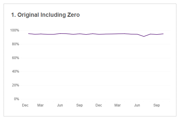
This chart shows values over time with very few variances...and this chart provides very little value. I bet I've run into this scenario at least hundred times and every time I do, I have to stop and think about the right way to handle it. I've done quite a bit of research on this topic and although there were some good resources, some were theoretical, many were complicated, and none of them really got me to where I needed to be, so I decided to write it myself. Once I walk through the problems, my thought process, my proposed solution (as well as how to do it technically within Tableau), I'd love to hear your feedback.
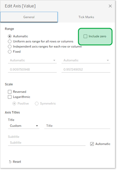
So, we have the chart above. There are very few variances in the data and because of that, it just looks like a flat line - it provides very little value. We know that the cardinal sin with a bar chart is to truncate the axis, but this is not considered a sin with a line chart. So in Tableau (and I'm sure it works similarly in any tool), we can edit the axis and uncheck the "Include Zero" checkbox as shown below:
And in doing so, we get this as the result:
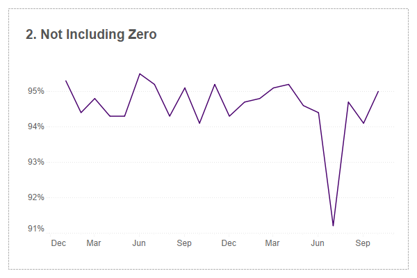
Do you like this? I don't. In fact, I absolutely hate it.
Instead of a range of 0% to 100% like before, we now show only a range of 91% to a little over 95%. The problem is that the drop in July. The change is only 94.5% to 91.2%, but it looks like it plummets to zero! One of the major goals of data visualization is to help people more easily (and more quickly) see insights. Let's say this chart showed results of a customer satisfaction survey. If you were a busy executive and just glanced at this chart, you'd probably have a heart attack wondering what happened in July. It was good then dropped to near zero!!!!
Simply not including zero causes this chart to be very deceptive and I would avoid this at all costs.
So what options do we have? We include zero and you can't see the variances and you don't include zero, and it over accentuates the variances. So how do we resolve this?
Well, I've done some research and also spoke with Jeff Shaffer. One article that I ran into...that Jeff also shared...was an article from Robert Kosara. In this article, Robert discusses the concept of 45 degree banking. Here is a quote from his article: "In a paper from 1988, Bill Cleveland, Marylyn McGill, and Robert McGill proposed the idea that the average line slope in a line chart should be 45º. This has been dubbed banking to 45º and has turned into one of the bits of common wisdom in visualization as determining the ideal aspect ratio."
Okay "average line slope in a line chart should be 45 degrees". I read a pile of articles that reference this and I admit, I don't quite understand what is being suggested. I even found a website (and Jeff referenced it as well) showing the math: Banking to 45 degrees: Aspect ratios for time series plots. I'm pretty good at math, but I honestly just didn't get it. Perhaps someone could give me an assist.
So if I don't get the math, what next?
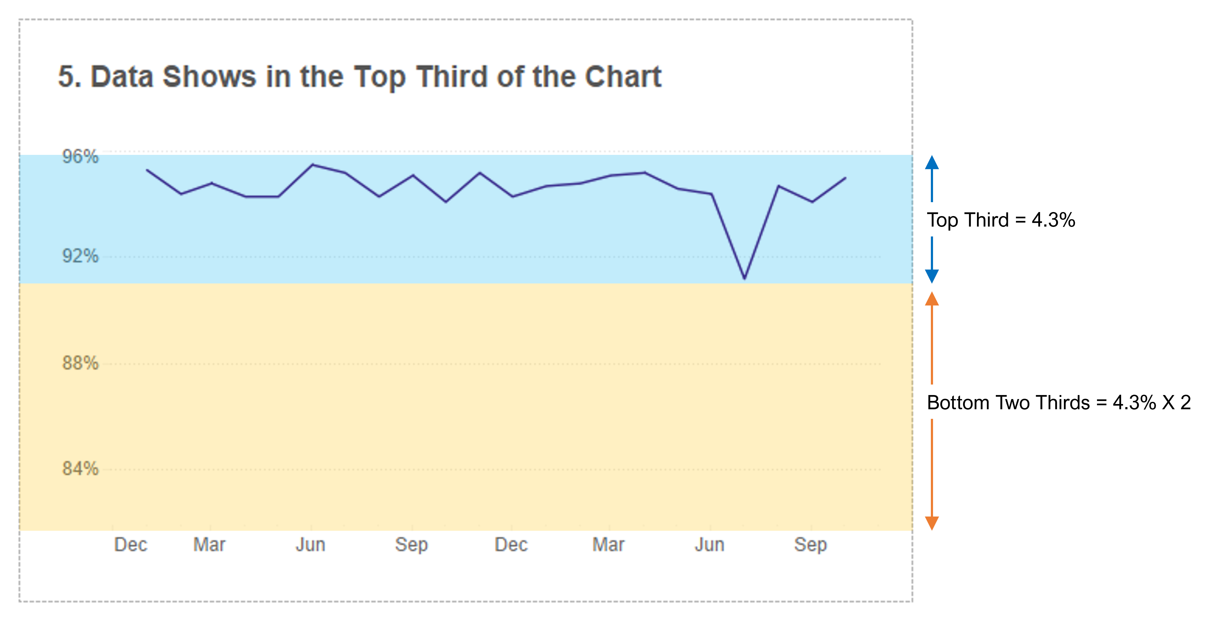
Well, we know that including zero was bad and not including zero was equally bad, just a different kind of bad. So, let's do something in between. (In fact, this is what I've always done in these cases, but I've never really methodically thought through what was best). Let's start by placing the data in the top two thirds of the chart and leaving one third of empty space at the bottom. Let me illustrate what I mean:
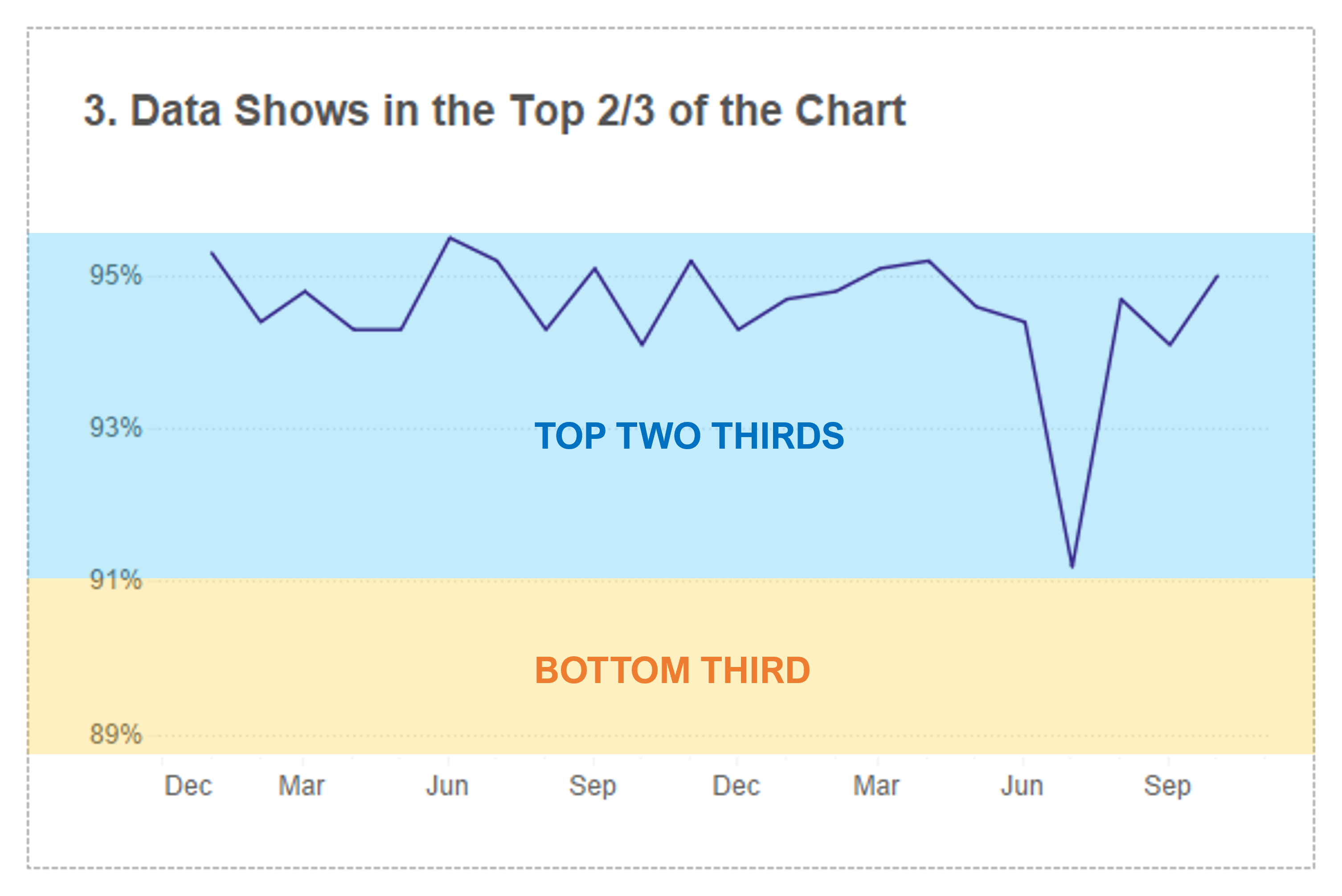
Here, you can see that the top two thirds (blue area) of the chart show the data itself and the bottom third (orange area) of the chart is completely empty. Let's show the chart without the highlighted areas:
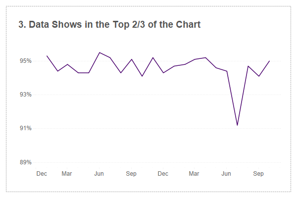
What are your thoughts on this? Well, I still don't like it. I still think that it over-accentuates that drop in July and I believe you, as an executive, may not have a heart attack, but definitely a panic attack!
So instead of showing the data at the top two thirds of the chart (with one third empty space at the bottom), let's try 50/50...basically the data in the top half with empty space at the bottom half:
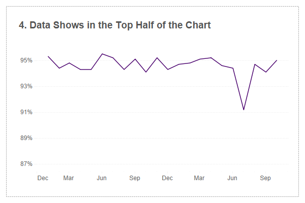
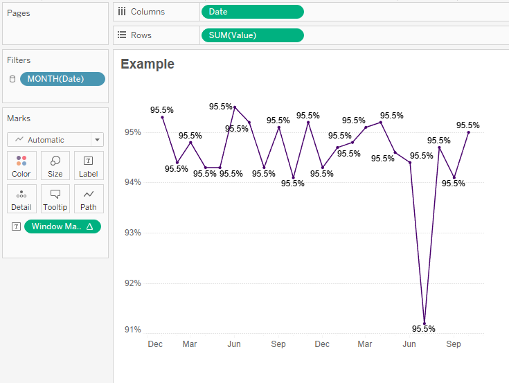
It's better...way better, but I still don't love it. It still feels like it is making that drop look more dramatic than it really is. So let's iterate again and show the data in the top third and show blank space in the bottom two thirds:
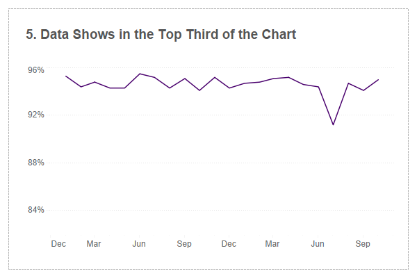
You know, I think we've got it! In this case, we can see the trend, we can see the variances over time and the July value doesn't seem to drop in such a dramatic fashion. I would, however, recommend one more addition - lets make it very clear to the end user that the axis is, in fact, truncated.
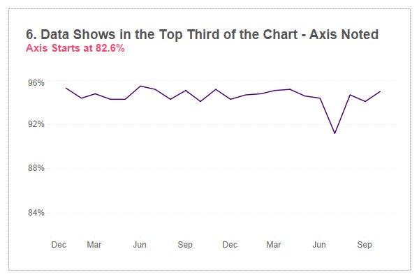
Now it is very clear to the end user that the axis does not start at zero.
Okay, now that we've "solved" this problem, let's talk about how we would do this in Tableau. Please download this workbook from Tableau Public and follow along.
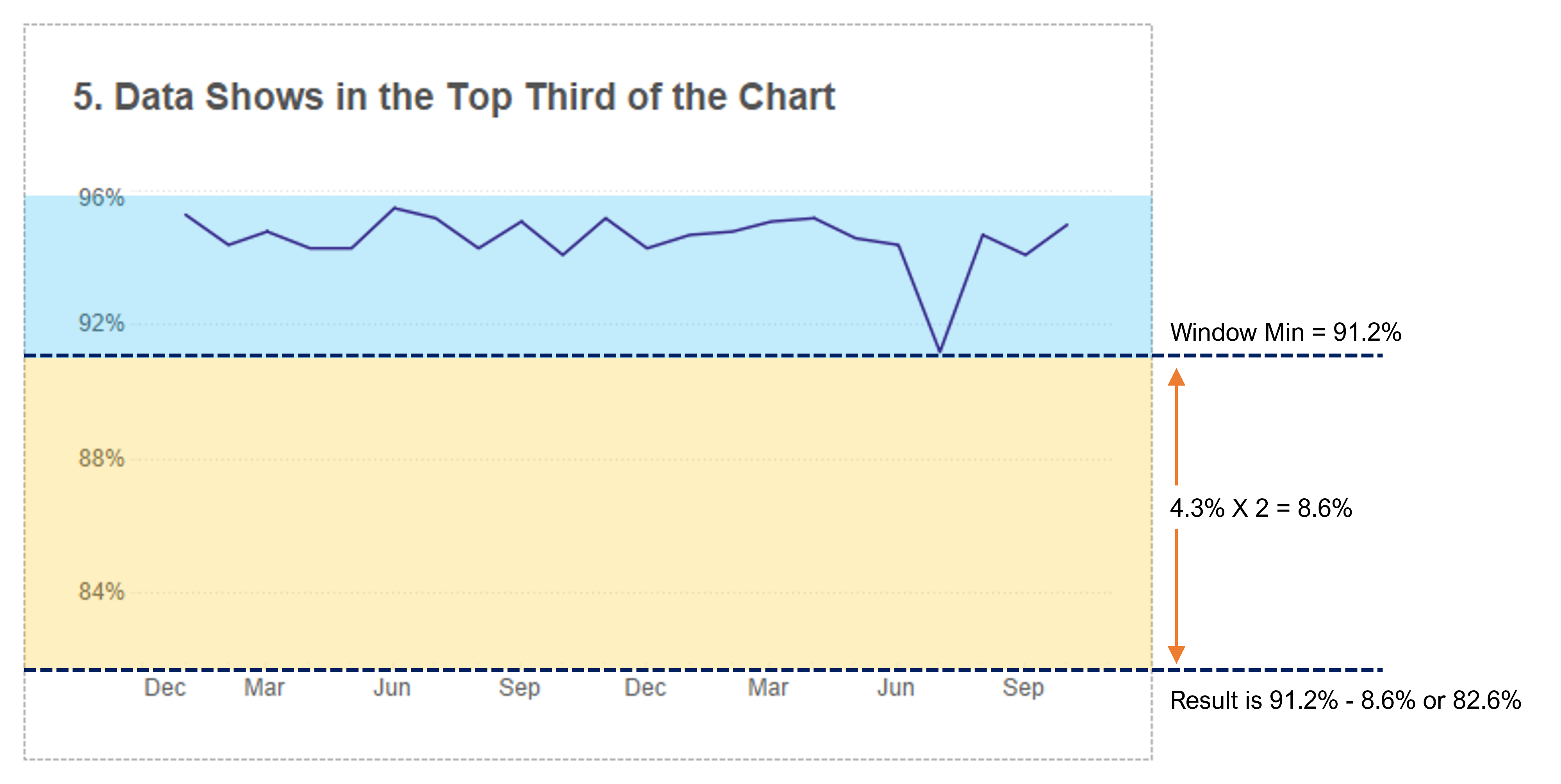
In the scenario we landed on, our data appeared in the top third of the chart and we had white space in the bottom two thirds. In order to accomplish this, we will have to uncheck "include zero" (as noted way earlier) and we will feed in an invisible reference line to pad out the bottom of the Y axis.
So lets first calculate the "range" of our data using a window_max and a window_min calculation.
Window Max Value
// What is the max value in the chart
WINDOW_MAX(SUM([Value]))
Window Min Value
// What is the min value in the chart
WINDOW_MIN(SUM([Value]))
To make sure they are doing what I want them to do, I just add them to the label card. Let's first start with the Max value.
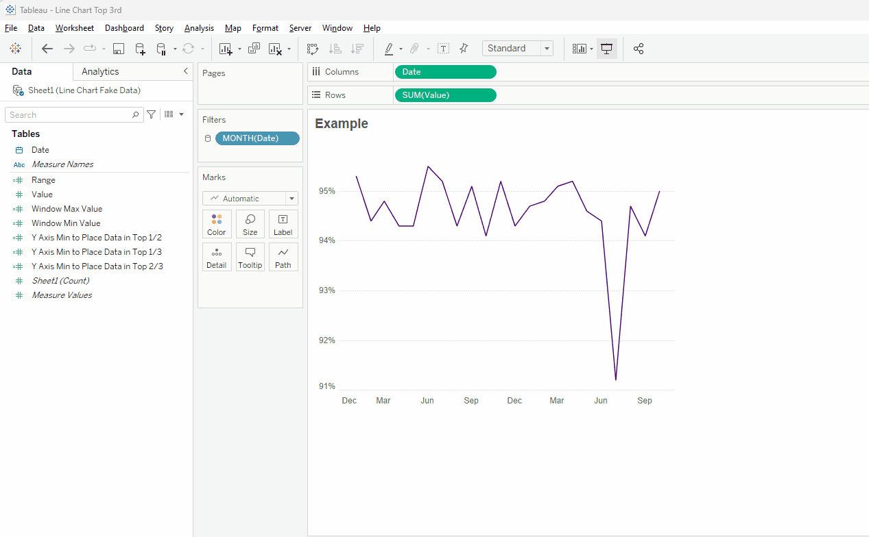
As our last step, let's add a subtitle to our chart. To do that, just add the red section to your title.
<Sheet Name>
Axis Starts at <AGG(Y Axis Min to Place Data in Top 1/3)>
And there you have it! Just a couple of calculations and you have a chart that shows the variances, but doesn't over-accentuate them to make them deceiving to your end user.
As a side note, in much of my work, I allow users to toggle between the option presented above and simply showing it on a full scale (in this case, 0 - 100). I like to provide them with the option to see the data in both ways. To do this, I create a parameter with two values, one to show the full range and one to "zoom in" (I am typically verbose in the parameter options to make it very clear). I then adjust my Y Axis Min calculation to be zero when "full axis" is selected and to use the calculation when "zoom" is selected.
As mentioned above, you can download this workbook from Tableau Public. The workbook contains all the iterations discussed above as well as all of the calculations. This includes not only the calculations required for the top third, but also for the top two thirds and top half (should you believe they are better than what I suggested).
As a side note, Jeff Shaffer mentioned to me that Excel applies something called the five sixths rule when determining how to scaled the Y axis. According to this really interesting article from Peltier Tech, "if Ymin is less than 5/6 of the Ymax, the automatic minimum Y axis scale value is zero. If Ymin is 5/6 of Ymax or greater, then the automatic minimum Y axis scale value is the first major unit less than or equal to Ymin – (Ymax – Ymin)/20 (the two MSDN articles have an unfortunate typographical error, showing the divisor equal to 2, not 20)." It seems to me (and to Jeff who shared this with me) that it accomplishes generally the same thing as my technique above. However, the problem is that it will do it on just about any chart, including a bar chart, where truncating the axis is, as mentioned, a cardinal sin. So be careful.
Okay, that's all for now. But I would love to hear your feedback. Do you agree with my assessment of showing the data in the top third? Or do you have a better option? I'd love to hear your feedback!


No comments: