
Population & GDP Adjusted Medal Counts

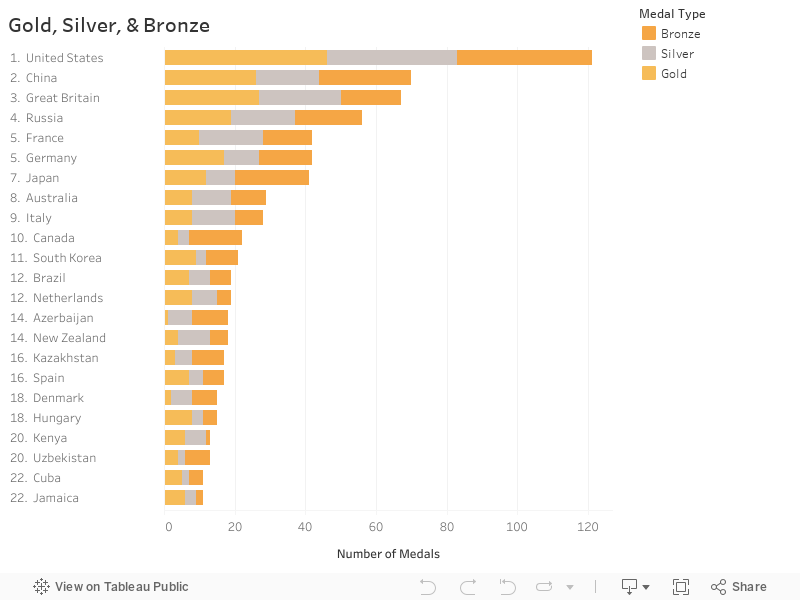
Well, the Olympics are over and the United States finished at the top of the medal count with a total of 121 medals (46 gold, 37 silver, and 38 bronze). The next highest was China, with a total of 70 medals, followed closely by the Great Britain with 67. I created the following medal count visualization in Tableau.
So clearly, the United States has the best Olympic team, right? Well, maybe not. I read an article yesterday about a little back-and-forth between Neil deGrasse Tyson, the world-famous astrophysicist, and a conservative radio host, Neal Larson. The argument partially stemmed from Tyson’s tweet on August 12, which read, “The USA has 3x as many Olympic golds as Hungary, but 30x the population. Adjusting for this, Hungary is kicking our ass.”
The USA has 3x as many Olympic golds as Hungary, but 30x the population. Adjusting for this, Hungary is kicking our ass.— Neil deGrasse Tyson (@neiltyson) August 12, 2016
Mr. Larson took offense, feeling that Tyson was denying the United States’ exceptionalism. But, I’m not here to comment on the argument. Rather, I thought Tyson’s claim required some further exploration. Sure, the US won significantly more medals than any other country, but we also have the third largest population in the world and our GDP is over 60% more than the next largest economy, China. So, what if we were to analyze the medal counts after adjusting for population and/or GDP? What story would that tell?
Well, I set out to do just that. I collected publicly available population and GDP estimates for 2016, performed the calculations, and then analyzed the data in Tableau. First we’ll take a look at the population adjusted medal count.

Interestingly, Grenada, a tiny island in the Caribbean, which won just a single silver medal, tops the list due to their minuscule population of just over 100,000. The Caribbean did quite will in the 2016 Olympics with the Bahamas and Jamaica ranking second and third, respectively. The United States, China, and Great Britain didn’t even make the top 15 (the US ranked 43rd, China ranked 76th, and Great Britain ranked 19th).
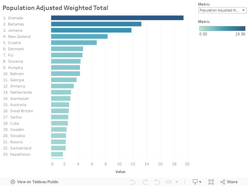
Interestingly, Grenada, a tiny island in the Caribbean, which won just a single silver medal, tops the list due to their minuscule population of just over 100,000. The Caribbean did quite will in the 2016 Olympics with the Bahamas and Jamaica ranking second and third, respectively. The United States, China, and Great Britain didn’t even make the top 15 (the US ranked 43rd, China ranked 76th, and Great Britain ranked 19th).
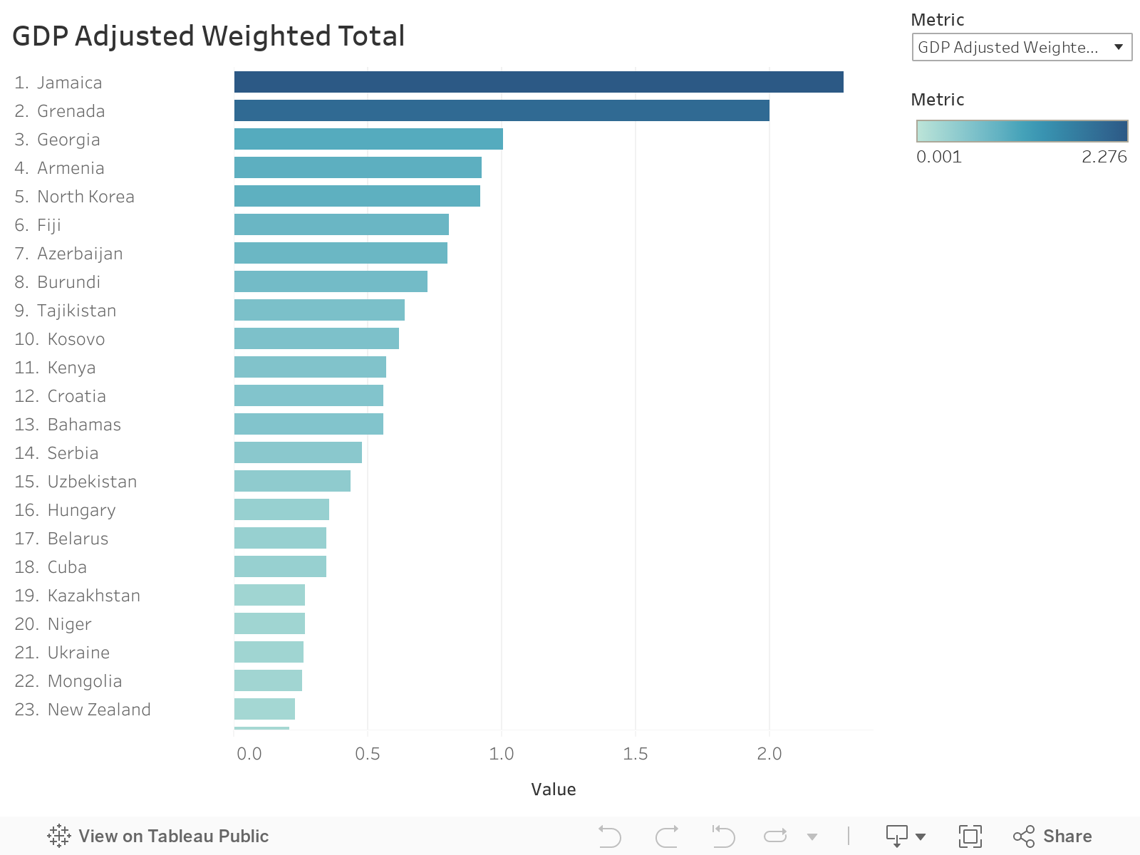
Next, we’ll look at the GDP adjusted medal count.

Once again, Grenada tops the list. We also see some other very small countries, such as Azerbaijan, Georgia, and North Korea, represented. Again, the US, China, and Great Britain are nowhere to be seen (the US ranked 73rd, China ranked 74th, and Great Britain ranked 44th).
So, there you have it. Neil deGrasse Tyson was correct in his assertion that the United States did not fair nearly as well as other countries when you attempt to normalize the data. Perhaps the only thing he got wrong was that the US is actually 33 times larger than Hungary (not 30)!
But…is that all? My problem with many of the medal counts is that they either rank them by total number of golds (and do not take into account silver and bronze) or they take into account the total number of medals (and do not weigh gold higher than silver and silver higher than bronze). Perhaps a better way to rank medal counts would be based on a weighted score. There have been a number of media outlets who have done just this, assigning various points to gold, silver, and bronze. I particularly like the exponential points system the New York Times created in 2008, which awards 4 points to gold, 2 to silver, and 1 to bronze. So I’ve used this system to weight the scores.
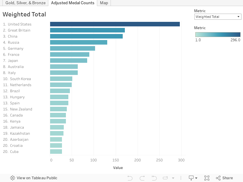
The weighting does change the ranks somewhat—the US is still the leader, but China and Great Britain switched spots due to Great Britain’s higher distribution of golds and silvers. Likewise, France and Germany also switched spots.
Again, let’s look at the weighted score adjusted for population.
No major changes here either. Grenada, Bahamas, and Jamaica are the top 3, as they were with the raw medal counts.
Finally, let’s take a look at the weighted total adjusted for GDP.
In this case, Jamaica takes the top spot, followed by Grenada and Georgia.
So, what does all this mean? Well, it’s still hard to deny the amazing performances of the teams from the United States, China, and Great Britain. But when we take into account population and GDP, it also helps to bring to light the fantastic, and perhaps easily overlooked, performances from much smaller nations. I’m not sure that any one of these metrics is best. Ultimately, which one you use would be largely dependent on the specific question you are trying to answer. In any case, we should all celebrate the incredible effort each and every country and athlete dedicated to these games, whether the country was at the top of the medal count or won no medals at all.
Ken Flerlage, August 25, 2016
As noted previously, you can check out this visualization on Tableau Public: https://public.tableau.com/profile/ken.flerlage#!/vizhome/2016OlympicMedalCount/GoldSilverBronze. The tool is designed to allow you to select one of the six different metrics discussed above. It also includes the raw medal count by medal type and a map that shows the ranks for each of the six metrics.


What about San Marino? With a population around 34000 and 3 medals they seem to absolutely sovereign in the total medal/per capita counting, aren't they?
ReplyDelete