
What's the Happiest Country in the World?

Each year, the United Nations Sustainable Development Solutions Network releases its annual Happiness Report, which attempts to analyze the happiness of over 160 countries. The report measures multiple variables, six of which are combined to create each country’s Happiness Index.
These six variables are:
- GDP per Capita
- Healthy Life Expectancy – Measure of life expectancy for members of the population in good health
- Social Support – Whether or not people have someone to count on in times of trouble.
- Perception of Corruption – Perception among citizens of government and business corruption.
- Freedom to Make Life Choices
- Generosity – Measured by recent charitable donations.
In March, just prior to “UN World Happiness Day”, they released their latest update. You can read all about it here: http://worldhappiness.report/ed/2016/.
The Data Set
The formal report included lots of details and various graphs and charts, but since this is such a rich and interesting data set, I decided to do some of my own analysis and data visualization. So, I downloaded the data and started working on the cleanup. The main data set I used included historical data for each of the variables measured. While the formal report performs a sort of average over the last several years, I wanted the ability to show the most recent values for each measure. Unfortunately, some of the measures are incomplete, leaving gaps, so I took the latest reported value for each measure and compiled the data together into a single table. Here are my results.
The top 10 most happy countries are:
- Norway
- Switzerland
- Denmark
- Iceland
- Finland
- New Zealand
- Canada
- Netherlands
- Australia
- Sweden
The top 10 least happy countries are:
- Liberia
- Burundi
- Yemen
- Afghanistan
- Syria
- Rwanda
- Guinea
- Haiti
- Madagascar
- Benin
And there are numerous other notable countries who fall somewhere in between:
14. Germany
16. The United States
18. Ireland
22. Singapore
27. Brazil
29. The United Kingdom
37. Saudi Arabia
40. Mexico
57. Japan
84. China
115. Iran
126. Iraq
134. India
Visualization
Once I had my cleansed data set, I created a series of visualizations using Tableau Public. This included maps, bar graphs, line charts, and scatter plots, all of which allow you to view each of the different measures, including the happiness score. I’ll share a couple of interesting charts here, but feel free to check out the entire visualization on my Tableau Public page: https://public.tableau.com/profile/ken.flerlage#!/vizhome/WorldHappinessIndex_0/Map.
Maps
First is a map showing the happiness score for each country. The colors range from dark green (very happy) to dark red (very unhappy).
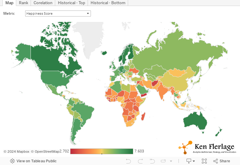
It is instantly obvious that the least happy countries of the world fall largely in Africa and Western Asia.
Next is a map showing perception of corruption. Interestingly, many of the happier countries in the world also have a high perception of corruption.

Likewise, many of the happier countries also have a very low confidence in the national government, as shown below. We’ll compare some of these variables more closely when we look at the scatter plot.
Likewise, many of the happier countries also have a very low confidence in the national government, as shown below. We’ll compare some of these variables more closely when we look at the scatter plot.

Historical Charts
Here is a visualization of both the top 5 and bottom 5 countries (based on their average happiness score) measured over time.
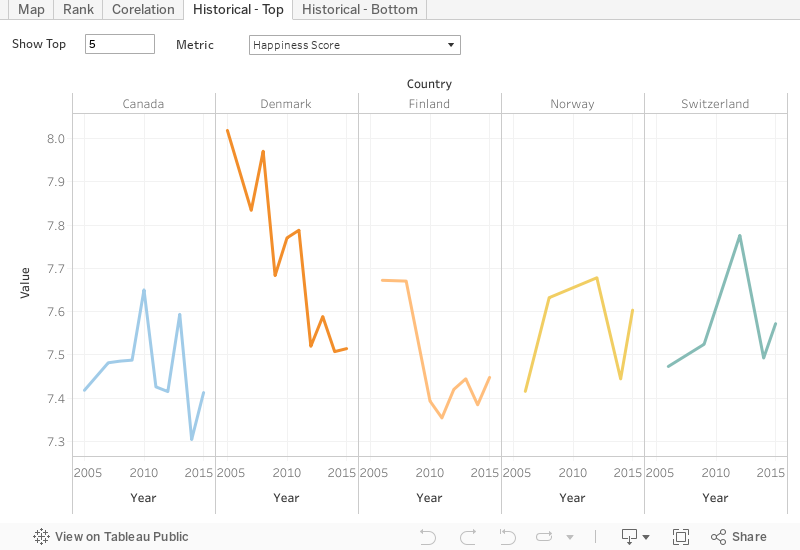
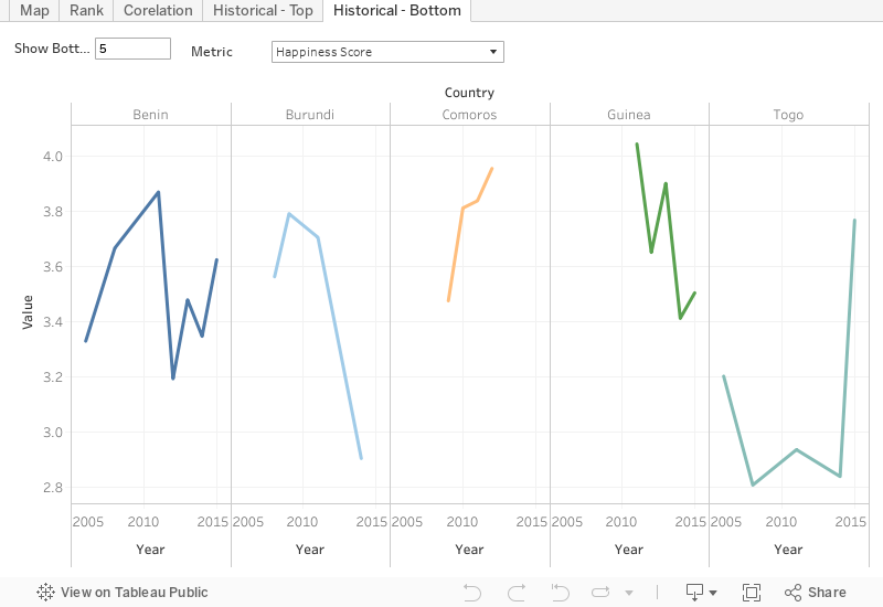
Interestingly, the happiness score of a country can change quite dramatically from one year to the next. While Denmark ranks as the 3rdhappiest country in 2015, it’s score has declined quite significantly over the last decade, going from 8.02 in 2005 to 7.51 in 2015. Likewise, Togo had one of the lowest scores for the past decade, but seems to have made significant gains, going from a score of 2.84 in 2014 to a score of 3.77 in 2015.
Wrap-Up
Interestingly, the happiness score of a country can change quite dramatically from one year to the next. While Denmark ranks as the 3rdhappiest country in 2015, it’s score has declined quite significantly over the last decade, going from 8.02 in 2005 to 7.51 in 2015. Likewise, Togo had one of the lowest scores for the past decade, but seems to have made significant gains, going from a score of 2.84 in 2014 to a score of 3.77 in 2015.
Scatter Plots
Perhaps the most insightful way to analyze this data set is to look at the relationship between different variables. Below is a scatter plot showing the correlation between Happiness Score and GDP (the color of each point is based on the happiness score):

But comparing any of these measures with the happiness score is deceptive as they are all components in the calculation of the happiness score itself. It would be more insightful to compare the other measures. I personally wondered about the level of correlation between GDP and life expectancy.

Clearly, there a close correlation between the two. Generally speaking, the higher a countries GDP, the higher its life expectancy. This may seem obvious, but there are other measure who would seem to have an obvious correlation, which do not. For instance, one would think that a high perception of corruption would be highly correlated with confidence in national government (if you think the government is corrupt, you are likely to have a low confidence in it). Interestingly, this is not the case, as there is virtually no correlation between the two at all.

Wrap-Up
Since I’ve built in the capability to look at each metric, there are numerous variations I could show of the map, line graph, and scatter plot, but it’s time to wrap up this post for now. But as noted previously, feel free to check out this visualization on Tableau Public. And, if you discover anything particularly insightful, I’d love to know about it.
Ken Flerlage, August 21, 2016


No comments: