
Guest Blog Post: Tableau Design Tips

Are you surprised that my first post is about Tableau Design Tips? No, probably not.
INTRO
Hello and thanks for reading my first blog post on the Data Theories website. This is just the first of many articles to come. Let me know your thoughts and what you want to read about next!
Hopefully, by reading this you are aware of my Tableau Design Tip Series. If not, you can find each of them by searching for the hashtag #TableauDesignTips on Twitter.
If you would rather not dig through Twitter for them, I will have a nice surprise for you at the end of this post.
Either way, let’s get started!
WHY?
You can find inspiration everywhere. You can find it in the books that you read, the blog posts that you follow, but also in the signs that you see in public, the video games that you play, the shows that you watch.
I love design. I love finding new ways to think of something, to bring inspiration from multiple places and to then combine them into something unique. This was the reason for the design tips series.
I wanted to take my thoughts, ideas and inspiration that I’ve found and show new ways to think of Tableau. When it comes to the capabilities of Tableau and how we can integrate design practices into it, I feel we’ve only scratched the surface.
Each of the 25 tips that I’ve published so far (as of writing this), highlight something unique that you typically won’t find in other Tableau content. That or it showcases a best practice that can be used to take your dashboards to the next level.
In case you’re interested in hearing me talk about the tips in more detail, check out the #VizConnect video here.
EXAMPLES
Let’s get to some actual tips! Below, I’ve selected the 10 most popular tips, sorted them in order and added some more details about why they are useful. Don’t worry about the full steps on how to build them, you’ll see that later in the post.
# 10 – Home Page
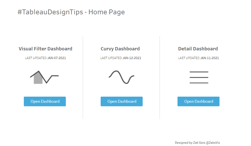
Sometimes we drop our users into a dashboard and rely on the built-in navigation. It’s often better to deliver them to a home page with easy direction and access to other pages. This one is very simple to build and relies only on the ‘Navigation’ buttons in the dashboard pane.
# 9 – Accordion
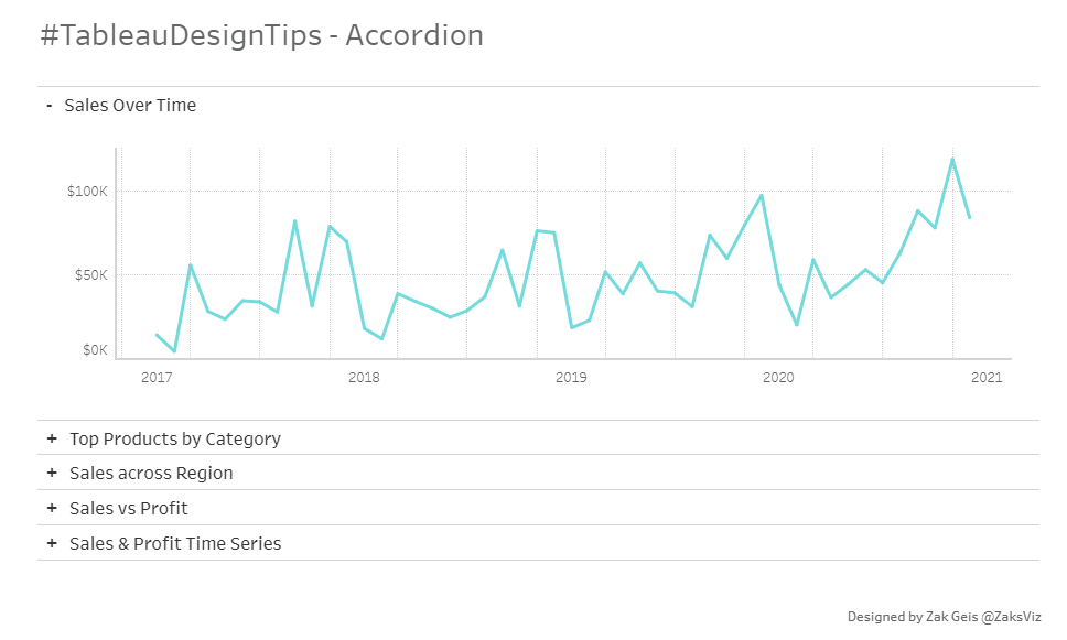
There are numerous ways to combine different charts into one view for the user. This method allows them to select the one that they want to see with intuitive expansion. Accordion design can be seen in many different applications and websites today. The way I built this leverages 10 different sheets; one for each title and another for each chart. The selected title updates a parameter which is then used to hide/show the sheets.
# 8 – Custom Highlighters
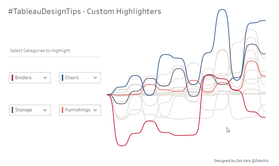
I’m not a big fan of quick filter & parameter options in Tableau. Although they make it easy to create them, they don’t have enough customization options. With this tip, build your own! By combining custom shapes with a hide/show container, you can create a fully custom drop down.
# 7 – Line Chart Slider
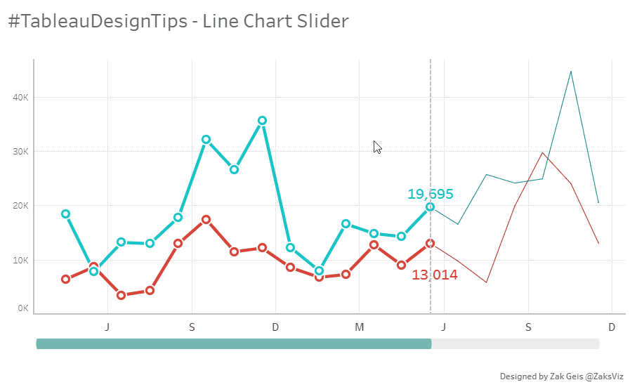
It’s often better to give the user greater control over what’s important to them. With this tip, you can allow them to pick the date they care about with a simple slider bar below. This is created with a parameter action, combined with layered sheets.
# 6 – Visual Filters

Filters are at their best when they provide context into what you should filter. This tip highlights the benefit of using additional charts to display the data behind the filter selections. This one is simple to build and just uses parameter actions and layered sheets.
# 5 – Tabs
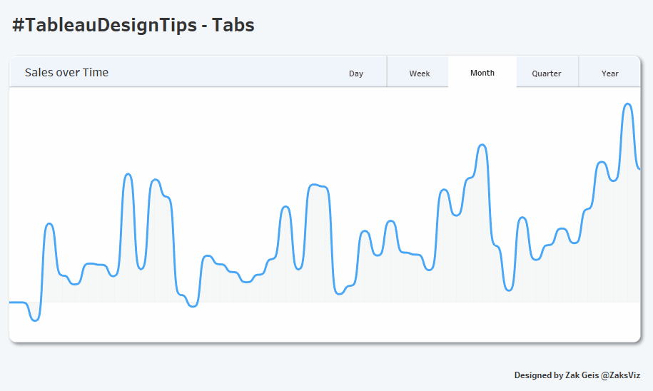
People like tabs. They are intuitive for the user and quickly enable them to toggle charts based on their selection. Unfortunately, this one can take some work to build in Tableau. This uses one background shape for the majority of the page, individual images for the on/off selection of the tab and parameter actions to flip the sheets. Sometimes it’s worth the extra work to give your users this experience!
# 4 – Customize Chart
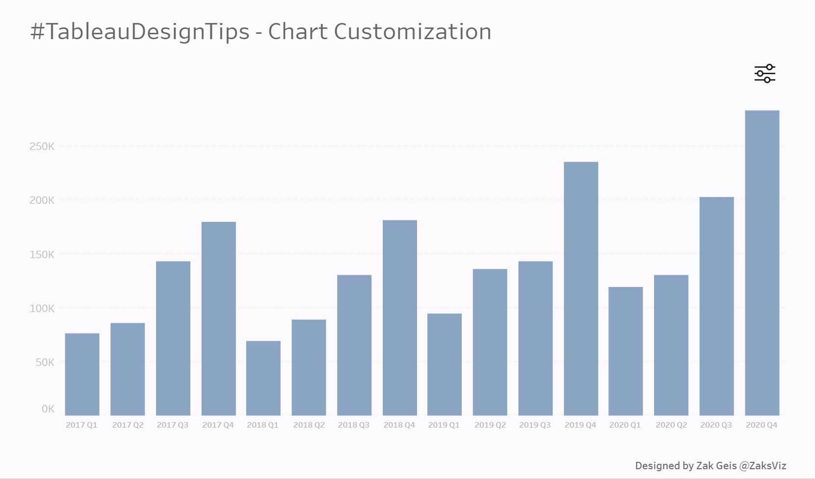
Who doesn’t like to customize their experience? Whether it’s websites, apps or devices, users like the control to set their own preference. This tip shows an example of how you can enable them to do just that. This one is pretty simple. Aside from the custom images and hidden container, you’ll use parameter actions to flip charts.
# 3 – Cards
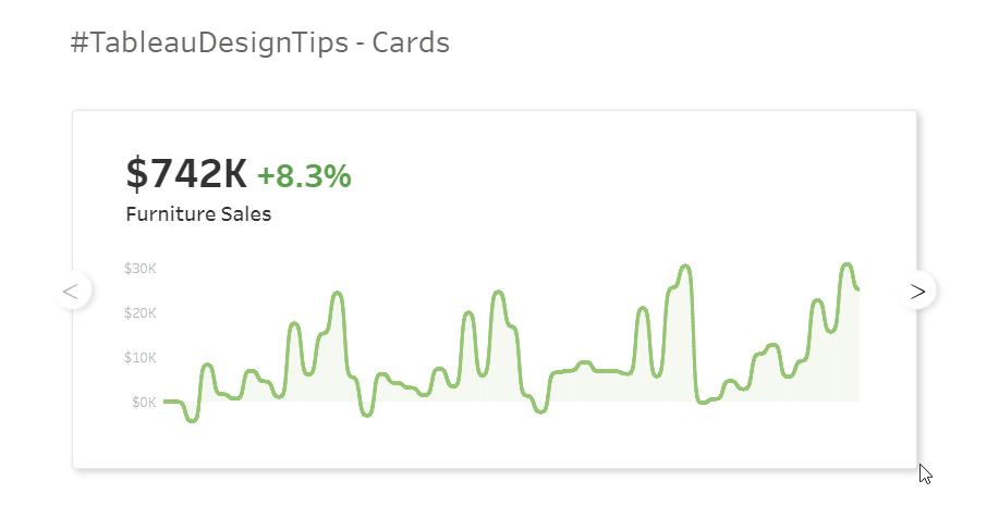
This one is fun! Like the tabs before it, this is just an alternative way to give the user freedom to move through content. This one has a custom image for the background, along with custom shapes for the arrows. Combine Parameter actions with some plus/minus logic and you’ve got it.
# 2 – Get Curvy
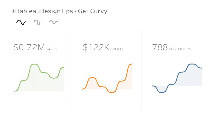
In most modern designs which show data, you’ll see curving lines as opposed to the default lines in Tableau. It’s known that people enjoy looking at curved things as opposed to rough and hard lines. In this tip, I give multiple options – curved, stepped, or points. This was done with parameter action-based chart flipping.
# 1 – KPI Filter

I was really happy to see this was the most popular tip. It’s not too fancy, not too extreme, but shows a simple trick to give your user more control. By using parameter actions along with transparent shapes, you can give your user an experience just like this!
WHAT I’VE LEARNED
Now that we’ve looked at some of the tips and discussed why, let’s review some of the most important things that I’ve learned in developing this series:
Find Inspiration: You can find inspiration everywhere. Some of my favorites are Dribbble, Behance, Muzli & even Pinterest! Start looking for design inspiration, regardless of what it’s for (websites, applications, etc) and take pieces into your visualization design.
User Experience is Everything: As developers and designers in Tableau, we’re used to the way the tool works. For new users, that typically isn’t the case. Focus your entire design around the users’ experience. It should always be obvious how, when & why you should interact with something.
Parameter Actions are King: When I started this series, I expected to leverage many advanced features of Tableau. Although I have used a few other techniques from time-to-time, Parameter Actions have been at the center of 20 of the first 25 tips. Unlike regular actions, these allow you to impact filters and calculations. That ability opens up a world of different scenarios. To expand your capabilities and enable exciting UI techniques, Parameter Actions need to be your best friend.
Think Outside of the Box: I never start a tip or project with ‘Can I do this in Tableau’. Instead, I find all the things I want to do and then figure out ‘How can I do this in Tableau’. With the aforementioned parameter actions, alongside set actions, map layers and other new features, there is very little you can’t accomplish inside the tool. Always start with the ‘what’, before moving to the ‘how’.
Expand on Others: I couldn’t have done all of these tips without leveraging the experience of others. Always look for ways to save time and use what others have done where possible. There is no reason to recreate something that already works. The three that helped me the most are:
Toan Hoang – tableau.toanhoang.com – Toan is an incredible Zen Master who blog posts on tons of outside-of-the ways to use Tableau. Specifically, I used Toan’s post on creating curvy lines multiple times.
Lindsey Poulter – lindseypoulter.com – Lindsey was one of the first to start showcasing new and innovative UI techniques with Tableau when parameter actions came out. I leveraged her add/remove logic from her Parameter Actions workbook on several of my tips.
Brian Moore – sonsofhierarchies.com – In almost every single data viz that I use today, I employ some version of the ‘No Highlight’ trick. Tableau has a tendency to highlight selections, which doesn’t always mix well with the UI patterns that we want to deliver. This trick gets us around that.
DESIGN TIP CATALOGUE
I mentioned a surprise at the beginning of the article. I’ve been asked many times about two things while creating and publishing these tips:
1) Instructions & Guides on how to do the tips & 2) One place to get to them all.
I’m excited to release the Tableau Design Tip Catalogue. This is one location to find all of the design tips, combined with how-to instructions, an easy-to-use interface and even bonus tips. Click the image below to check it out!

CONCLUSION
Still with me? I hope that you enjoyed this post and the series as much as I have in creating it. #TableauDesignTips will continue to live on, I just maybe won’t be posting as frequently as in the past. Until next time!
Thoughts, questions or feedback? Shoot me a message on Twitter @ZaksViz or on my new website. Thanks for reading.
Zak
Kevin Flerlage, March 3, 2021
Twitter | LinkedIn | Tableau Public


Hello. All of the links are not working for me 🤔
ReplyDeleteI'm having no issues.
Delete