
Guest Blog Post: Rapid Dashboarding - 5 Steps to Success

The following is a guest blog post from Julie Laux. Julie is a marketing professional, graphic designer, and web developer who decided to take a leap of faith in 2016 to change careers to go into analytics. She is a manager of a customer analytics team at a Fortune 500 healthcare company and specializes in data visualization. Julie is the leader of the Her Analytics Platform within her organization, encouraging more women to go into the space. She has spoken at Women in Analytics Conference and recently launched her website "Rapid Dashboarding" as a way to educate fellow corporate analysts on the most effective ways to build and launch business dashboards. Ken and I are excited to have her as a guest blogger on FlerlageTwins.com and also excited to help her promote her new site (which is already amazing). You can follow Julie on Twitter @rapiddashgirl. (And Julie and Kevin used to work at the same company!)
The Back Story
Five years ago, I decided to change my career and go into analytics. The first thing I did was hop on a plane to sunny California and attend the Storytelling with Data Workshop, led by Cole Nussbaumer Knaflic. I learned all about data visualization, how to choose the best graph types, and do’s and don’ts of dashboard design.

I came home and taught myself Tableau and Alteryx and I was well on my way to starting my new analytics career.
Then one day I got an email from one of our Sales VPs, and it said:
“Hey Julie, I was wondering if you can help us build a dashboard to show these three metrics on monthly basis. Seeing this data will really help us improve our sales team performance. “
Wow, my first dashboard request! I had just learned everything there was to know about dashboard design and data visualization, I thought to myself, “This is going to be so easy, I got this!” I responded back within minutes of receiving the email and said:
“Yes! No problem, I’ll have that dashboard to you by the end of next week.”
Then I did what any excited newbie in the analytics space would do, I jumped my little hamster wheel and spun. I not only built a beautiful dashboard with the three metrics he asked for, but I went above and beyond and added additional metrics I thought were relevant and even added an extra tab so they could filter the data by sales team.
“Wow, I really knocked my first dashboard out of the park. I’m so excited to share this with them!”, I thought.
Do you know what happened next?
Well, nothing happened to be exact.
A week went by and I still hadn’t heard back, so I emailed him and asked if he looked at the dashboard and if it was everything he wanted.
When he finally got back to me, he said:
“Sorry, our boss came back and said he just wants the three metrics as bullet points in an email every month. Can you do that?”
What?! Are you kidding me? I spent 50+ hours on a dashboard and all your boss wants is three bullet points?
I was devastated. I had completely failed my first analytics project. Man, this is way harder than I thought it was going to be.
So when I finally picked myself back up again, I thought to myself, “How can I prevent this from happening again?”
And that, my friends, is how Rapid Dashboard: a 5 step process to dashboard success was born.
As a Type A personality, I took my defeat and set out to create a process to follow every time I got a dashboard request. This process took several years to develop and refine, but it is now a well-oiled machine. Strange as it sounds, this process has actually prevented dozens of dashboards from being built. That may sound like the opposite of the goal here, but it is so important to align, among many things, on the end deliverable at the beginning. I promise if you follow this process you will not only have better outcomes for your dashboards, but you will also develop stronger relationships with your stakeholders.
Let’s walk through the process.

The Rapid Dashboarding Process

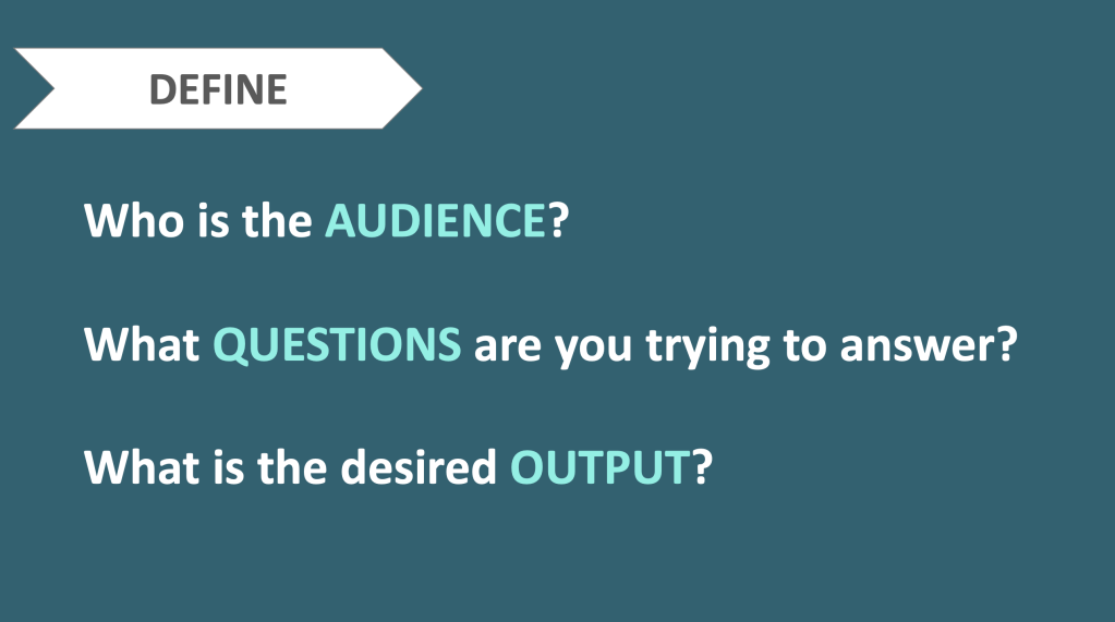
DEFINE
Whatever you do, do NOT skip this step. This is mission critical. You cannot pass go until you’ve thoroughly answered these questions and aligned with your stakeholder on all items.
Who is the AUDIENCE? This is now the #1 question I ask whenever someone asks me to do something – “Who is this for?” Like in my story, more often than not, the deliverable is not for the person asking for it – it’s for their boss, it’s for another team. You will get sooo much context when you find out the actual audience. And as you get to know your stakeholders better, you will understand their preferences. I know Person A wants everything in a slide deck. I know Person B wants everything in an email. Yes, you can push your stakeholders from time to time, but if you meet them where they’re at, you will be more successful.
What QUESTIONS are you trying to answer? Mistake #2 was allowing my stakeholder to tell me what data elements they need. Your stakeholder doesn’t know what they need! They think, oh data team, I will ask them for data. NO! Every request is an open invitation to a conversation (Shout out to Kathleen Maley on that one). If someone asks you to pull data, pick up the phone and ask them “What questions are you trying to answer?” What business problem are you trying to solve?” Tell them you are just trying to help them, but that you need a little more information on what they are trying to accomplish so you can deliver the best solution. Once you have a short list of questions, you can move on to the next step. These questions will be helpful later on to determine if your solution is successful and meets the need.
What is the desired OUTPUT? Mistake #3 – The Sales VP said he wanted a dashboard and I delivered a dashboard. So what did I do wrong? Well, you don’t need a dashboard for every project. Again, your stakeholder doesn’t know what they need. You need to guide them in the right direction. Building a dashboard should never be your first choice. Start simple, then move to complex. Is it bullets in an email? Is it a spreadsheet? Is it a presentation? Is it an infographic? Is it a screenshot of a dashboard (my favorite)? And finally, is it an interactive Tableau dashboard? Is this a one-time request or something that needs to be refreshed daily, weekly, monthly, quarterly? Don’t over-engineer your solution.
Define these three items upfront and you’ll be well on your way to a successful deliverable.
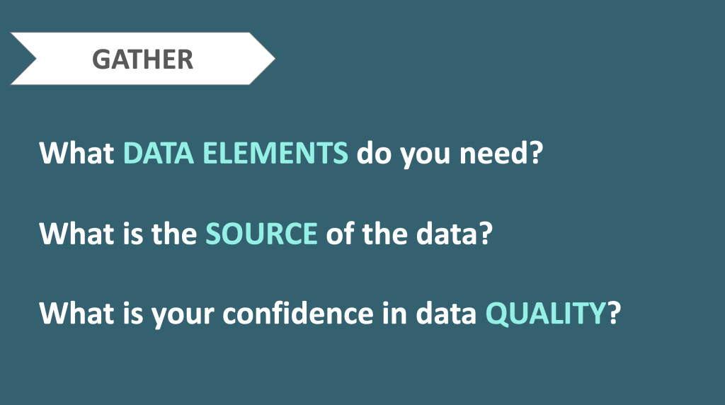
GATHER
“A beautiful dashboard with flawed data is like a rose with thorns.”

Now that you understand the request, it’s time to assess if you have the data you need to answer these questions. Why is this Step #2? Because the second most common reason I see dashboards fail is because of lack of data or quality of data. You’re being asked to pull sales data, when the entire company knows the sales data is off by 5%. Is your stakeholder OK with that? If there are any holes or concerns with the data, get those out in the public early on in the process. The more transparent you can be the better. Your pretty dashboard will mean NOTHING if the data is crap. If you determine you don’t have the right data at this time, maybe the answer is waiting until you do.
What DATA ELEMENTS do you need? You have the list of questions from the Define stage, now use them! What data elements do you need to answer those questions? You’ve got a guide, follow it! Bring in only data elements you think will be relevant. I highly recommend Alteryx to build a workflow to set up your data pull, because if you find later on you need more data, it’s super duper easy to pull it into your workflow and rerun your output file for Tableau.
What is the SOURCE of the data? What is the best data source for this information? Is your data scattered in different data warehouses? Do you need to blend it all together? Is this data available at the frequency you need it? Daily, weekly, monthly? You’ll know best where to pull data from, just consider all these points.
What is your confidence in the data QUALITY? Again, if there are concerns with the data, bring them up early and often. You want people to trust you and your dashboards.
SKETCH
“I don’t know what I want until I see it.”

How many times have you heard that?
Well, stakeholder, your wish is my command. I am a HUGE fan of sketching out your dashboard before you even open Tableau. If you want to get good at building dashboards, get accustom to drawing wireframes. It makes you more purposeful with your visuals, as well as fitting what you need to in a defined space.
Now, it was a little hard to do whiteboarding and sketching dashboards as a team during the Pandemic, so as many teams do, we flexed. I built out an entire Rapid Dashboard Wireframe Framework (Download here) in PowerPoint that allows you to mock-up a dashboard in seconds. It has all types of graphs, BANs, filters, titles, anything you need for your dashboard it’s on there. Simply drag and drop the elements you need to mock-up your dashboard, hit save, and email off to your stakeholder. Boom, done. Updated a wireframe takes 2 seconds. Updating a visual in Tableau can take 2 hours. Which would you rather do? Make sure your stakeholder approves the wireframe before moving on. It really helps to get all (most) of the kinks out in the wireframing stage. Your stakeholders will quickly learn this is the step they need to provide the most feedback.

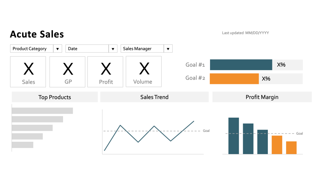
Example Wireframe
BUILD
“You have one job in the build phase?”
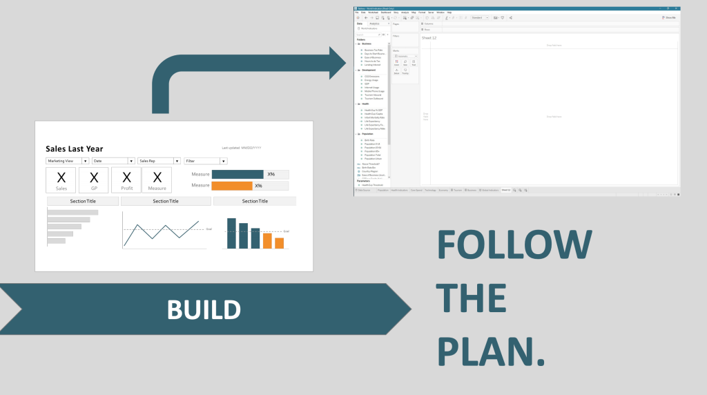
You’ll notice we are four steps in and we haven’t even opened Tableau yet. Ah, but here it is!
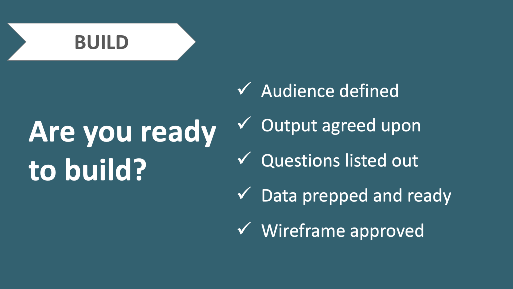
Wait let’s see if we’re ready:
Are you ready to build?
-Audience defined
-Questions listed out
-Outputs agreed upon
-Data prepped and ready
-Wireframe approved
If you can check all of those boxes, congratulations you are ready to BUILD!
That was a lot of work wasn’t it? Wouldn’t it be faster to just open Tableau and start building three steps ago? Of course. But moving through the past three checkpoints sets you up for success. You now know exactly WHO this is for, WHAT you are building, WHY you are building it (to answer specific questions), plus you have your data all ready and an approved mock-up. You’re golden. Now, whatever you do, just follow the plan. Do not deviate from the wireframe. Will your stakeholder have more changes after you build the dashboard? Of course, but you my friend are going to deliver exactly what was agreed upon, no different.
REFINE
Color | Consistency | Clutter

Such is life, when you deliver that final deliverable, even after going through this process, count on updates and changes from your stakeholders. Businesses move fast, so it’s understandable if you need to make a few tweaks here or there. But I can promise you, you and your stakeholders will be so much more on the same page by going through this process together. This isn’t just for you, it’s for them. Our clients need us to guide them through the analytical process. They know Sales, or Finance, or Marketing – they know the business – you know analytics. It’s about coming together to understand each other and work towards a common goal – the end dashboard, insight, or analysis needed to move the business forward.
Before you send over the dashboard to your stakeholder, remember the three C’s – Color, Consistency, and Clutter. I get so many complaints that my dashboards are “too grey” and I just laugh. When you work at a company with red as a brand color, and all dashboards are red, apparently everything is on fire, Ah! So much red! No, but Storytelling with Data taught me to be very, very mindful when using color on a dashboard. When you change everything to grey, and then only add back purposeful color, your stakeholder will be guided exactly where you want them to do.
I believe in a simple color palette of grey, navy, and orange. Do not use red and green. Just don’t do it. Even if your stakeholder asks for it. Nope. Color blindness is actually more prevalent in me – ask around your organization, more often than not you’ll find one or a few people that can’t decipher red vs green. Navy and blue is a color blind safe color palette that is universal.
Consistency is all about designing a professional dashboard – consistent fonts, whitespace, labeling, etc. A messy dashboard is distracting, so keeping things aligned and uniform. It also really helps if you brand all of your dashboards the same way – That way your stakeholders recognize your work. Use one of the Tableau templates I created for you to download below and brand it to your team.
Clutter is the concept of every single mark of ink on your dashboard needs to have a purpose. Grid lines, extra labels, borders, chart art (unless you’re The Flerlage Twins and you know how to appropriate include extra visuals), all of it needs to go. When you’re building business dashboards, simple is the way to go.
Man, that process seems really long! What about it being Rapid?
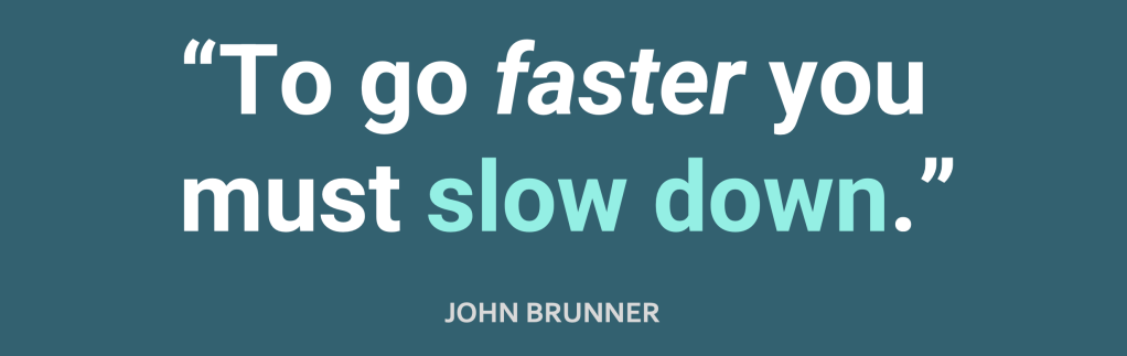
I love this quote “To go faster you must slow down” by John Brunner because it sums up my experience and what I did to overcome my failure. I know you are just as excited as I was to build a dashboard, but I promise if you pause, even for a few moments, and walk through these steps, you will actually be able to go faster in the long run. Once you get accustom to these steps, they will be a breeze for you.
I have used this process to build dashboards in 2 hours, in 2 days, in 2 weeks, and in 2 months, so it really can flex to meet your timeline. Don’t get caught up there.
Tips for Speed
Get organized and follow the 5 steps – Seems pretty straightforward, but having a plan in place and following it is your best bet.
Don’t complicate visuals – I only use three graph types: BANs (Big Angry Numbers), bar graphs, and line graphs. That all you really need anyway for business dashboards. The more complicated the visual, the more your stakeholder will tune out. If they cannot understand your graph in three seconds, they’re moving on. I also have three rules to pie charts. Rule #1 Don’t use pie charts. Rule #2 If you use pie charts, only use two slices and label each slice with the percentage always, always and Rule #3 Don’t use pie charts.
Focus on iteration, not perfection – I would rather get a stakeholder 80% of what they want need than wait until it’s “perfect.” Iteration is a good thing, and educate your stakeholders on what it means to have an iterative process.
And that’s it. I hope you leverage the Rapid Dashboarding process in your organization in order to improve the success of your dashboards and establish stronger relationships with your stakeholders at the same time.
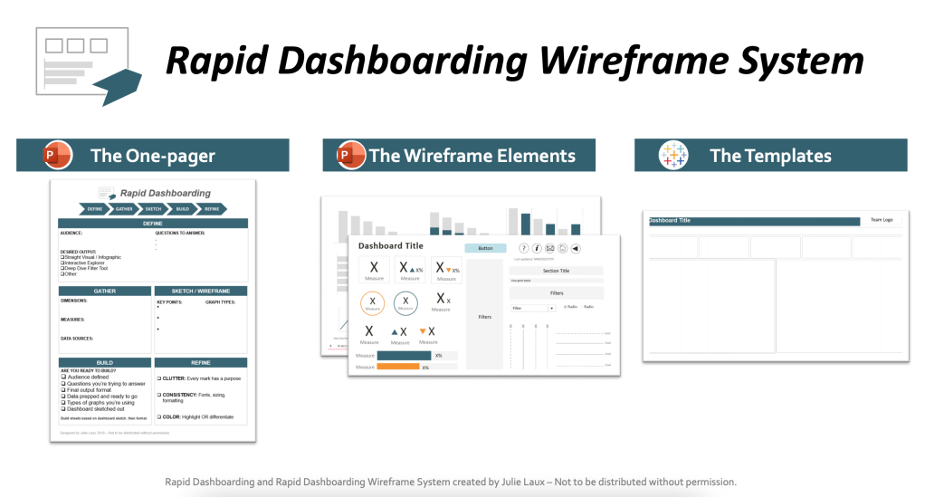
FREE DOWNLOADS
The One-pager
Use this handy template when you start every new project. | Download PDF
The Wireframing System
Gone are the days of sketching on paper. The Rapid Dashboarding Wireframe System allows you to develop a custom dashboard wireframe in PowerPoint in a matter of minutes with our drag and drop elements. | Download PowerPoint
Tableau Templates
No need to start from scratch! Use these pre-formatted Tableau templates and wireframe to drag and drop for easy peasy dashboards in no time! | Download Tableau Workbook
If you can't access any of the files or just want to shoot me a message, please contact me at julielaux3@gmail.com. Thanks for reading!!
Julie
Kevin Flerlage, September 7, 2021


Well done, many thanks for including the resources
ReplyDelete